BlueQueue - AI Meets Life's List
My Role
Responsibilities
I was, and continue to contribute to BlueQueue as the principal product designer working with the product founder and the development team through ideation and build sessions. My responsibilities included hosting brainstorming sessions, UX flow research, UX/UI design, front-end development, interfacing with integration and backend engineering, marketing and brand design, and most important of all;-) building out a scalable design system. All of the design work displayed here was done by me, I was the sole designer involved in the project.
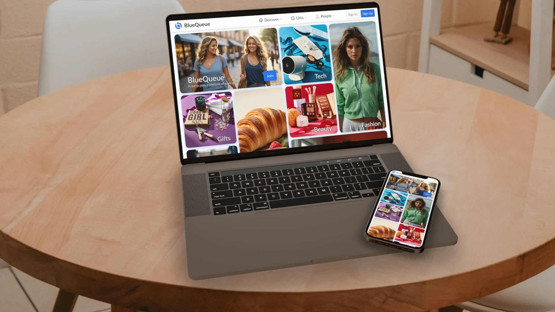
Discovery Page - dynamic masonry blocks for top level nodes
Collaboration
I worked closely with Matt the founder as well as their dev front and back-end teams. Acting as the glue between the ideation concepts Matt and I would conceive, and the workflows and component parts for the development team to build out.
The Project
Challenge
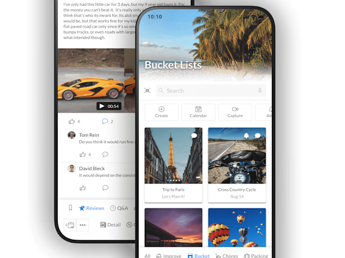
Matt approached me to create a personalized experience to help users manage all of life's lists, using AI and smart connections. The goal was to empower listers to build and automate complex processes with simple drag and drop, list management skills. We also wanted to build an app that would naturally reward its users in proportion to their use and contribution to the community.
How We Made It Happen
Throughout the project, we were focused on designing screens that would make power listers feel right at home. We collaborated with the BlueQueue team and worked through multiple iterations to reach our final goal, which was to create a frictionless and intuitive user experience.
We worked very closely with the BlueQueue team to gain an in-depth understanding of how the product should work, as well as put ourselves in the users shoes to understand their pain points and struggles.
Out of the 6 month initial engagement, we spent the first few days meeting with the BlueQueue team to understand the business goals, constraints, and user needs. Then we dove right into things by walking through the application workflows and iterating on screens to become deeply familiar with it.
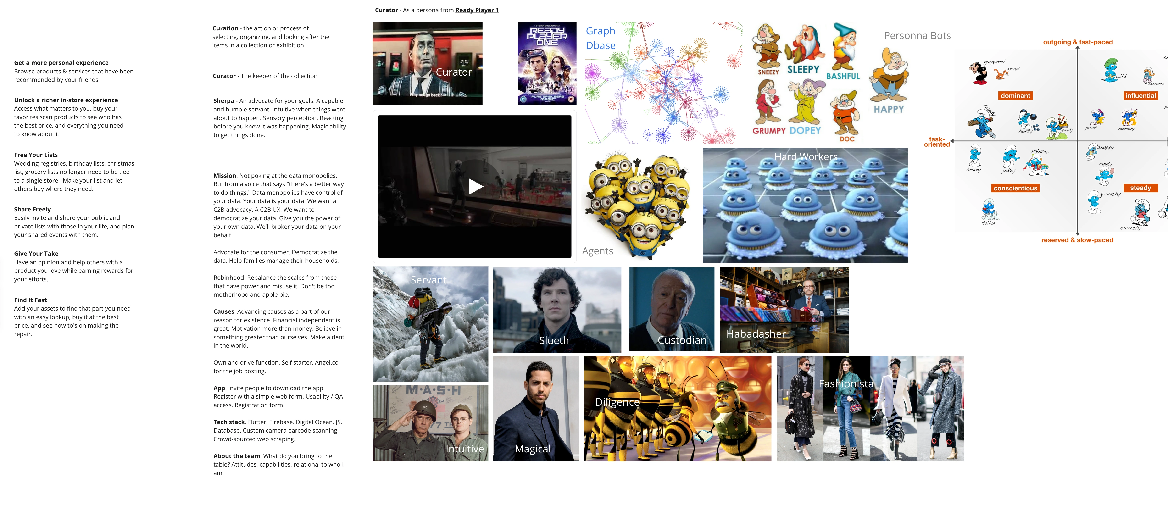
Brand mood board
Organized Chaos
Over the first two week period, we delved into the exploration of product thinking and updated UI treatment.
Throughout this phase, we built out the branding for the company, ensuring adherence to these new brand guidelines to maintain brand integrity, while innovating within these parameters.
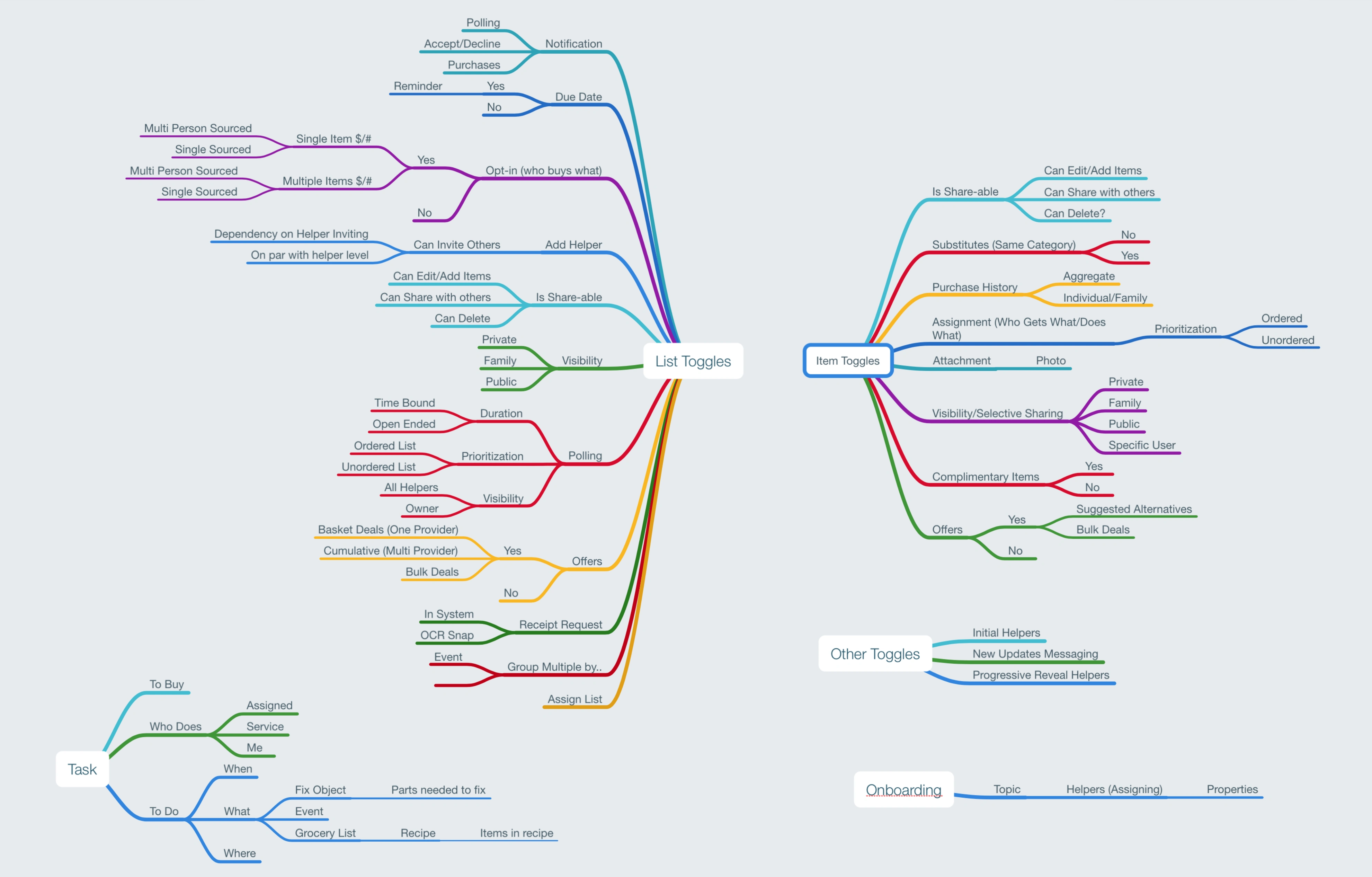
List - Feature Mapping
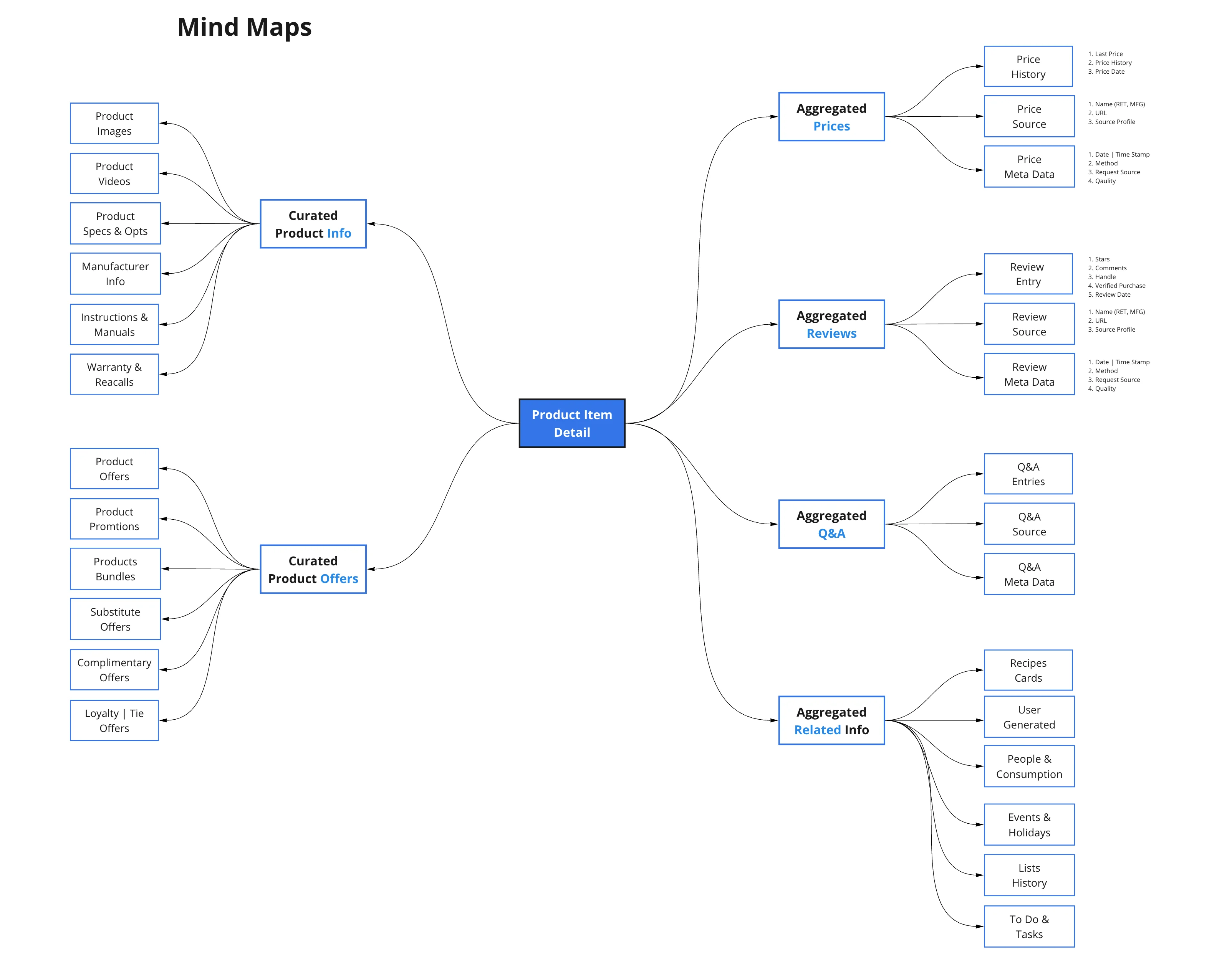
Product - Feature Mapping
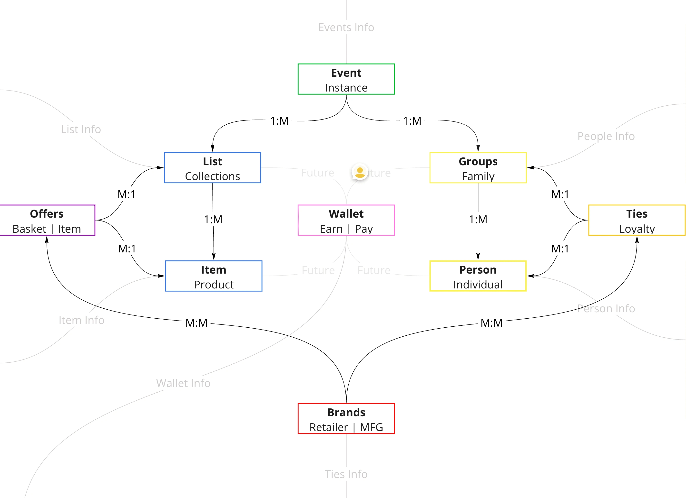
High Level Concepts
Usability Flows
The main problem with such a complex lifecycle is the ease of use and navigation. In many situations there’s a major learning curve, and not enough guidance on how to build lists. We solved this by making inputs and outputs more accessible, as well as providing guidance in the empty state.
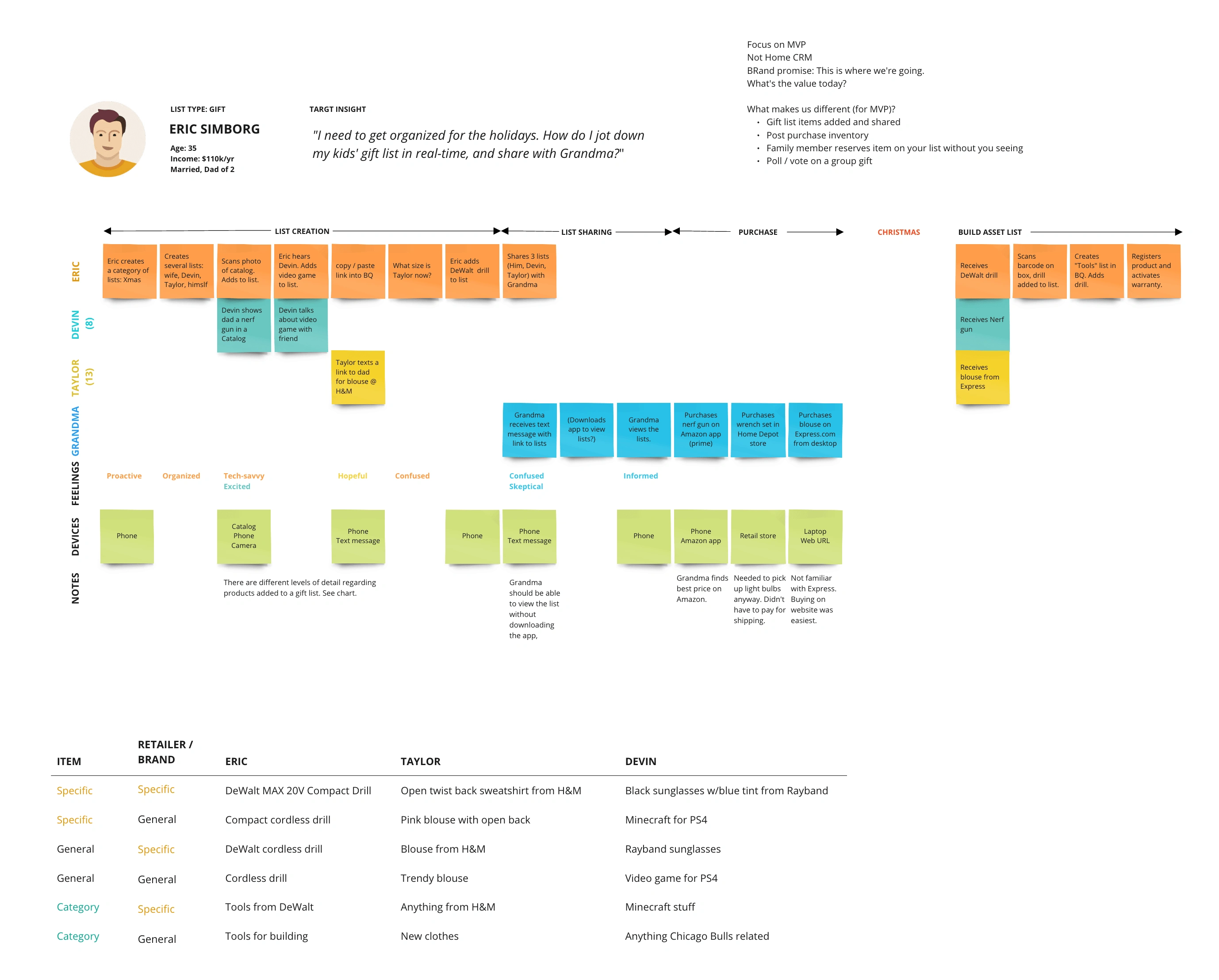
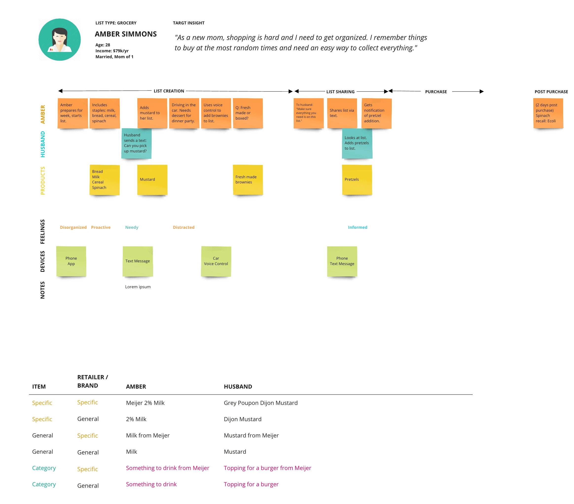
List Lifecycle - Usability Flows
Low/Medium Fidelity Prototypes
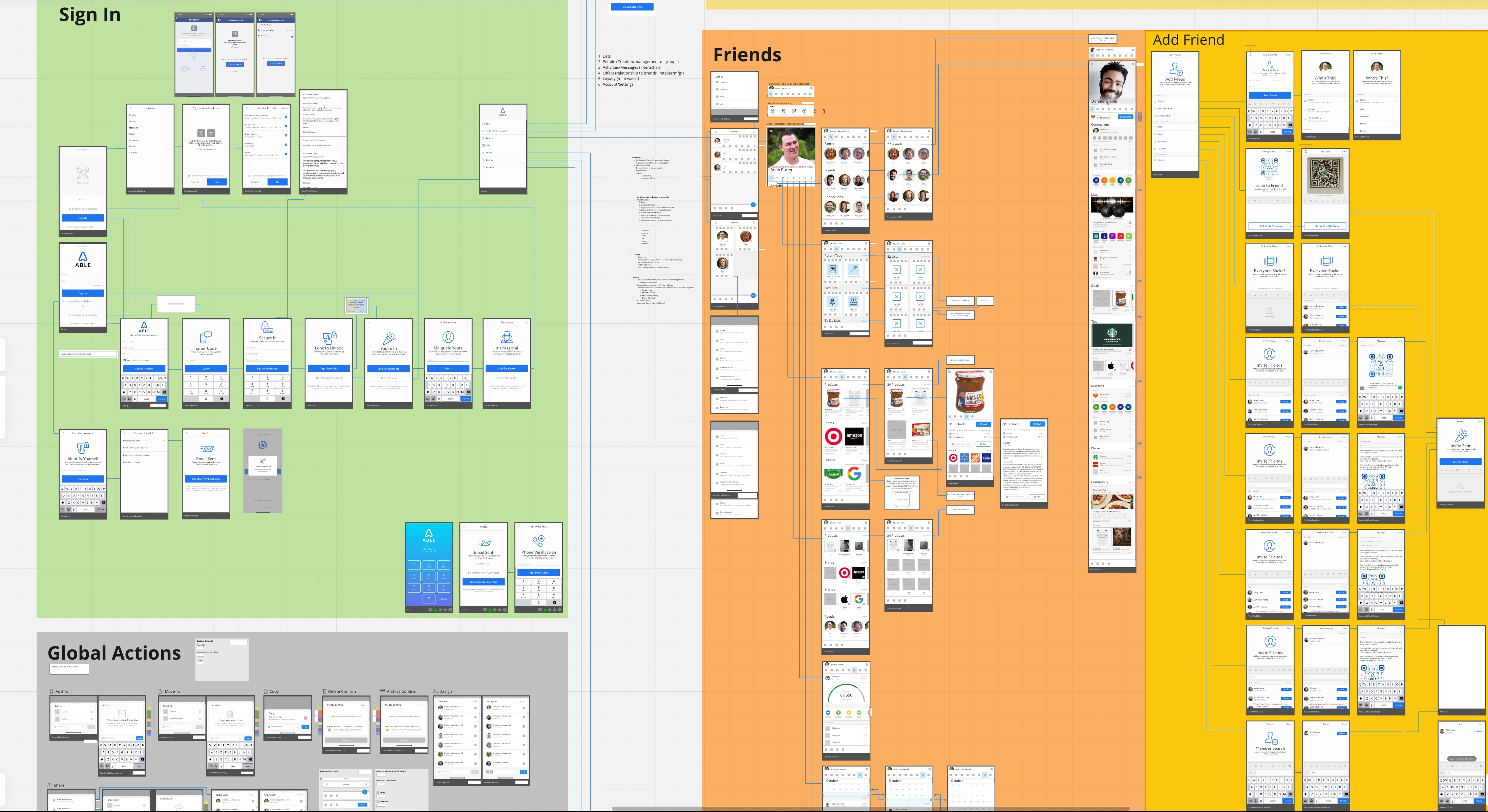
Miro - Early mobile sign in/up, profile, and connecting with friends and family screens and flows
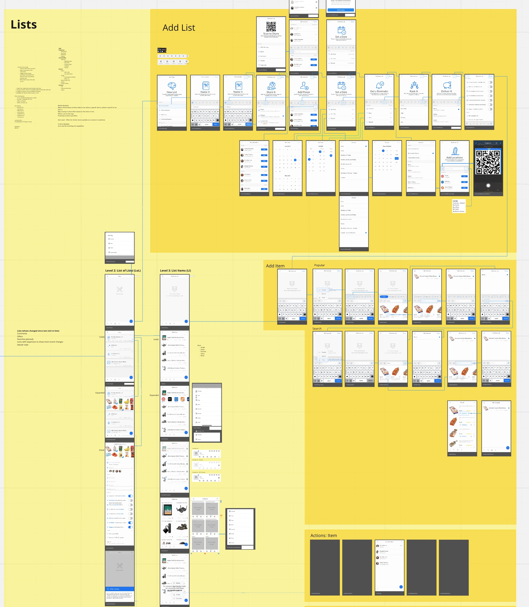
Miro - Early listing management mobile concepts
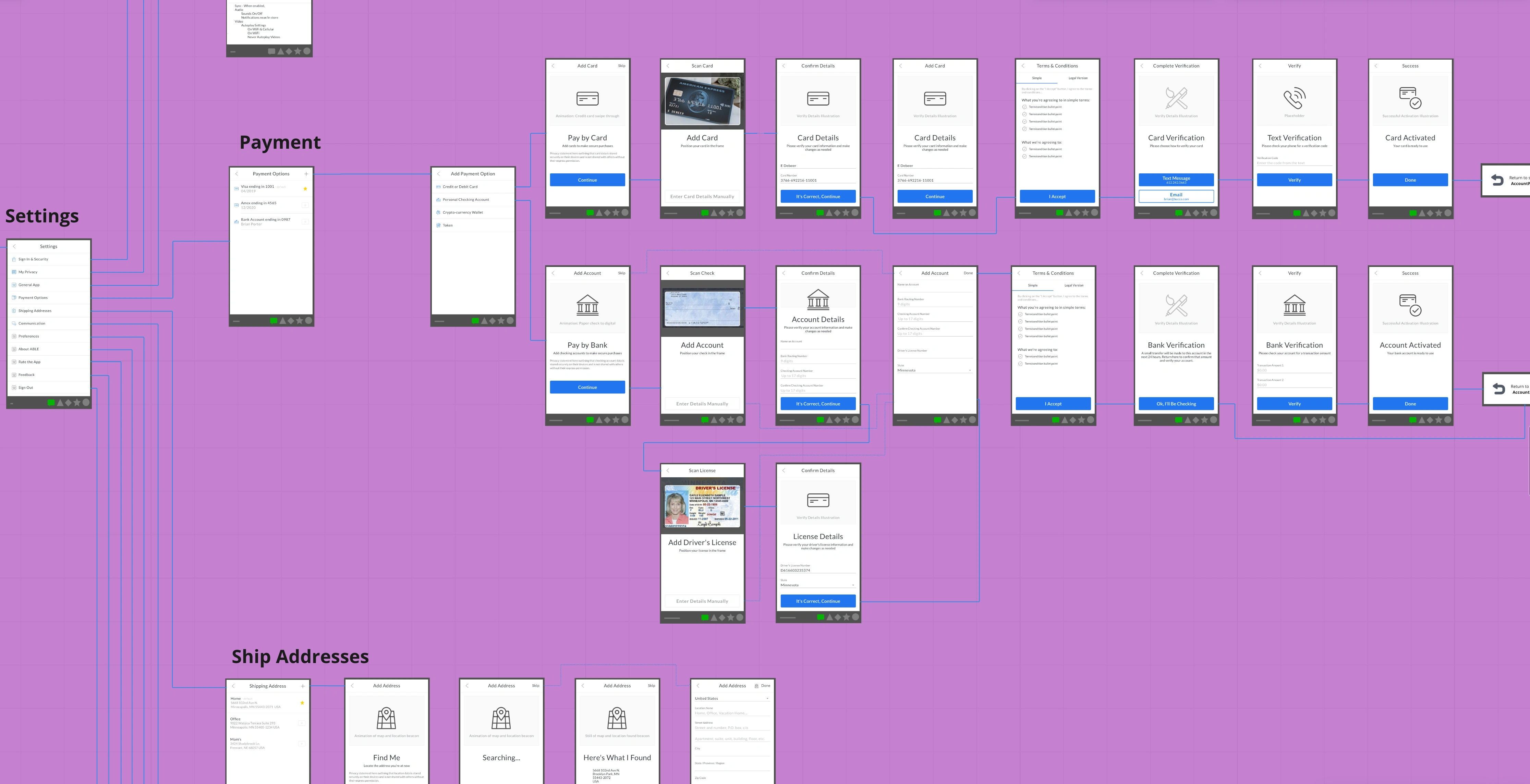
Miro - Early account settings architecture and flow concepts
The Design System & Components
This project was the birth of the ABLE design system. I wanted to have a systematic process for building complex applications. Having built iFactr, a mobile app framework for seven device platforms, I knew what we needed. The goal was to speed the design to development handoff, while also empowering non-technical stakeholders to build with it as well.
Initially I built version one in Figma adding in component variables to alter the form and function at an atomic level. Having the design system streamlined our brainstorming sessions in Figma and keep consistency in the application, which increased our velocity on the concept to click-able prototype phase.
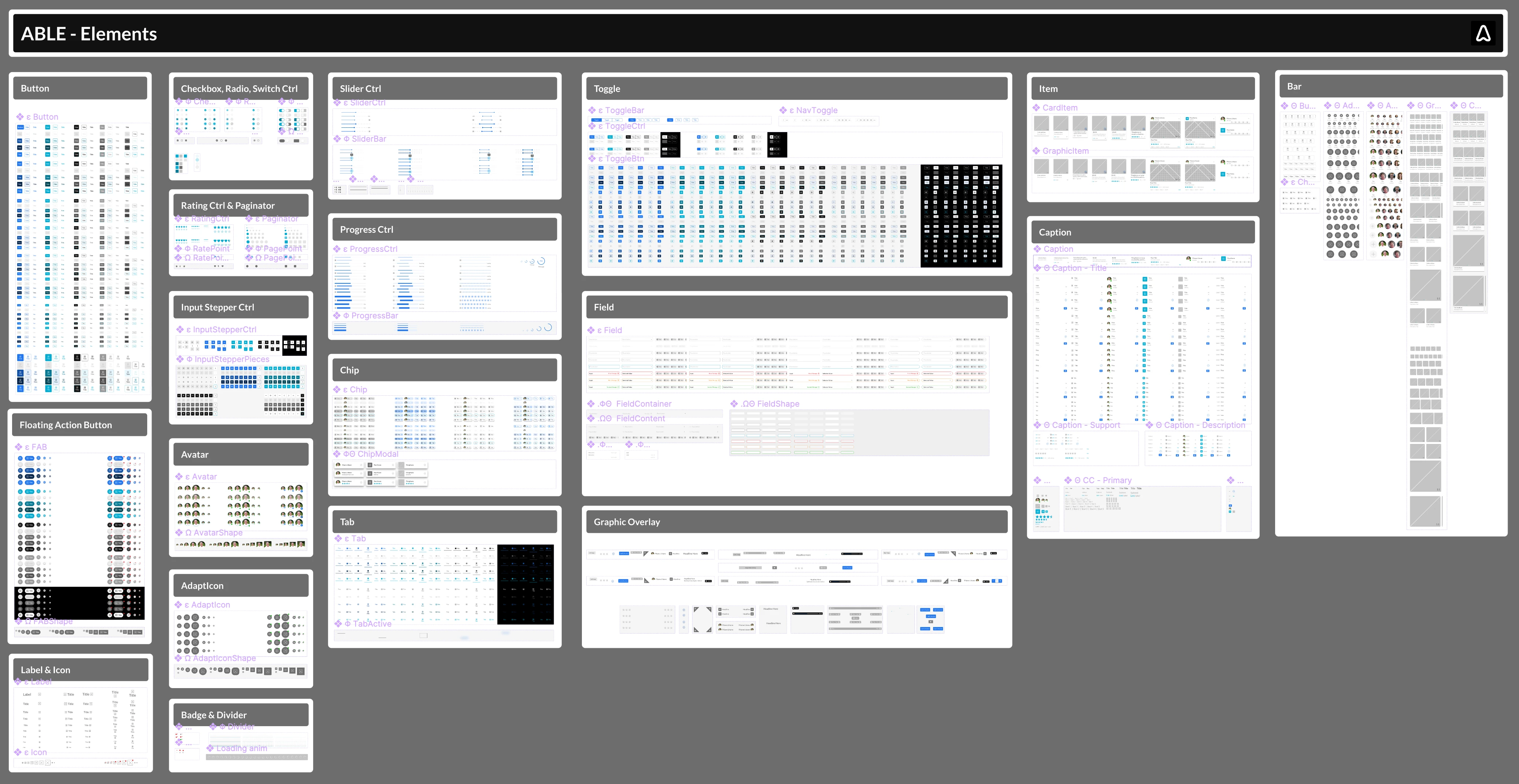
Figma - ABLE design system, elements level
Figma Designs
The application started as a mobile only app and later expanded to be multi-modal. Luckily I had been designing for the smallest of those form factors, so scaling up for desktop was a breeze Below are a few screenshots from the Figma boards from our early work. As you can see I like to include details next to each screen to cover non-visual aspects of the design. These help the developer understand the context of the screen and any interactive aspects.
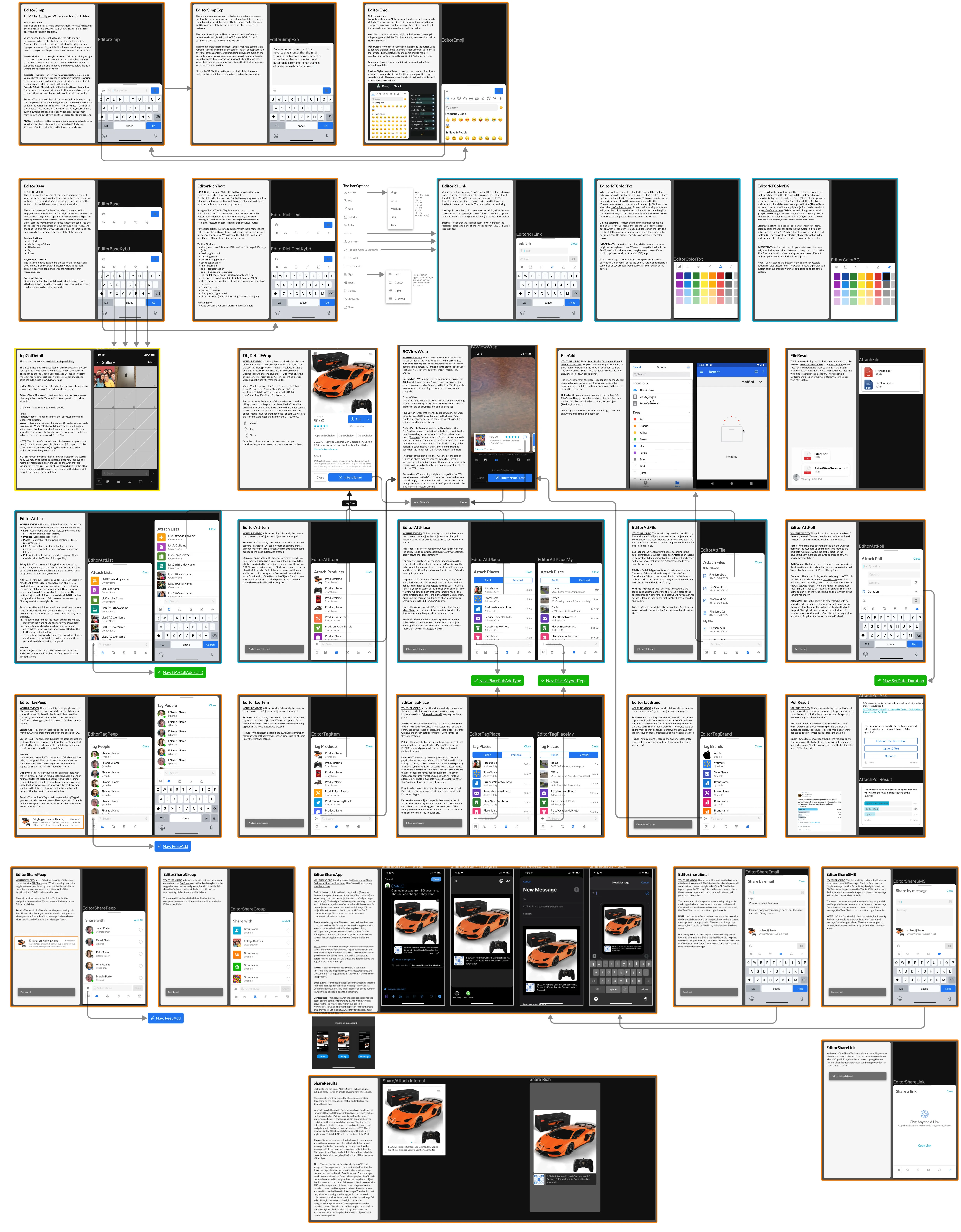
Figma - "Editor" Screen Flows
This is just a small sampling of screens for the "Editor" module, as I can't show you everything. With this project there are another 60+ sheets just like this, covering the different aspects of the application.
FrontEnd Development
Upon completion of a V1 in Figma, the team was looking for front-end developers to build out the design system in React and I ran across Webflow as a tool for the design to development handoff. So, I translated the design system into functional code using Webflow and Devlink.
Here's an example of an "Avatar" Element from the design system, I built out in Webflow with its many properties. These props give anyone from a non-coder stakeholder, to the React.js developer the ability to adjust the Avatar component to fit different use cases. Not only can you adjust the size, shape, and source image but also any nested components. In this case there's one called "Badge" with its own properties that have been passed to the Avatar element.
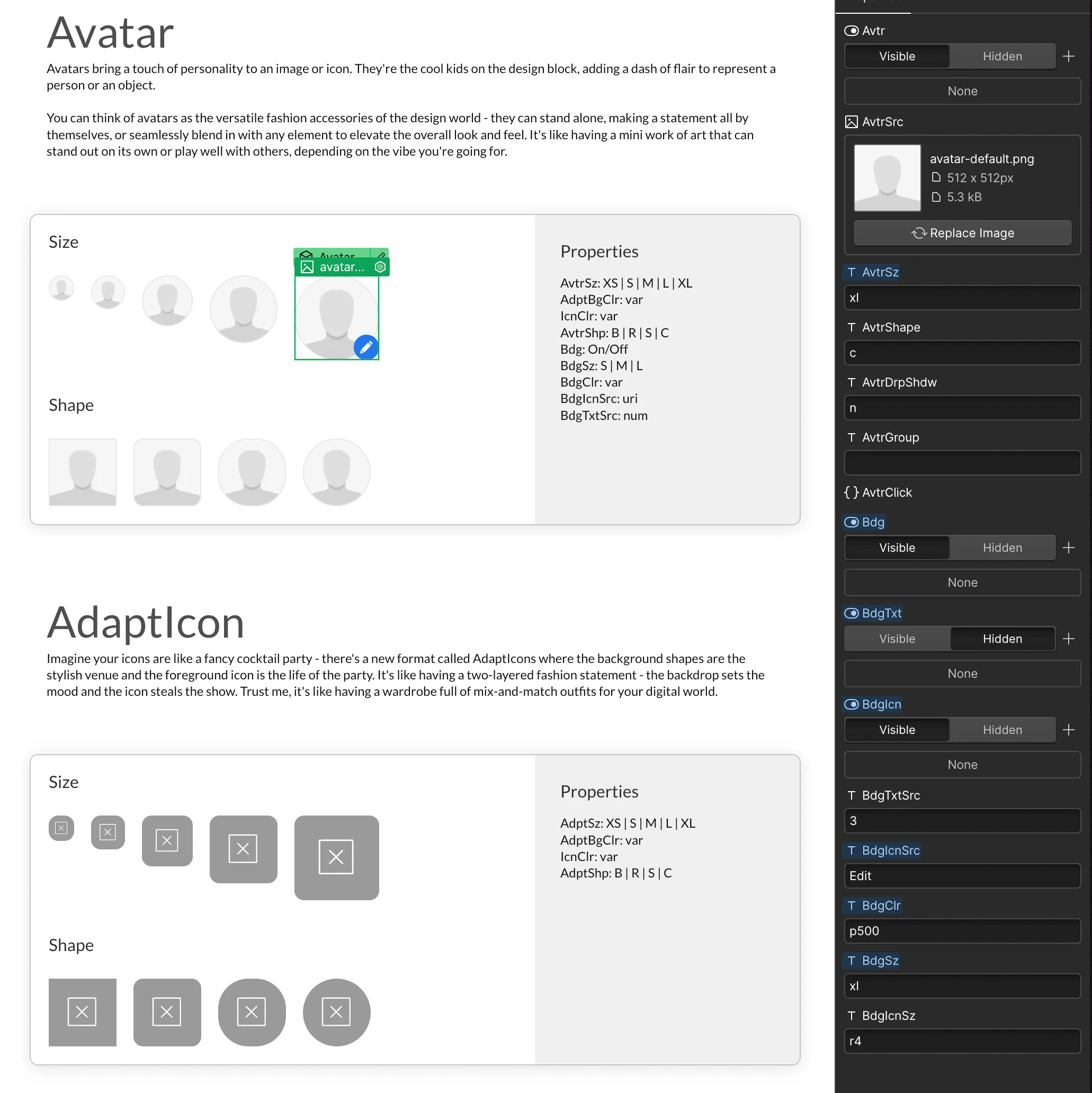
Webflow - Component Library (Avatar) with properties passed to Next.js
As both the designer of the system and frontend coder we keep all of the pixel pushing and property controls with me, which frees up engineers to work on integration with API endpoints, and interactions... which I know they appreciate! Even though the control is with me, I still discuss updates and changes with the engineering team on a daily basis, to keep us both on the same page, ensure I'm not making any breaking changes, and to tap into their frontend expertise.
Modules
Having built a universal library of components (Which I can now use with any client;-) We're now able to quickly put together task specific modules to be used throughout the site/app. Below are a few of those modules for the BlueQueue application (Create, Copy, Move, Reorder, Delete, Archive, etc.). I like to create what I call "Screen Sheets" to keep the project organized. These sheets exist in a infinite canvas where we can then have have our iterative brainstorming sessions, and visually begin to see the flow of the application from screen to screen.
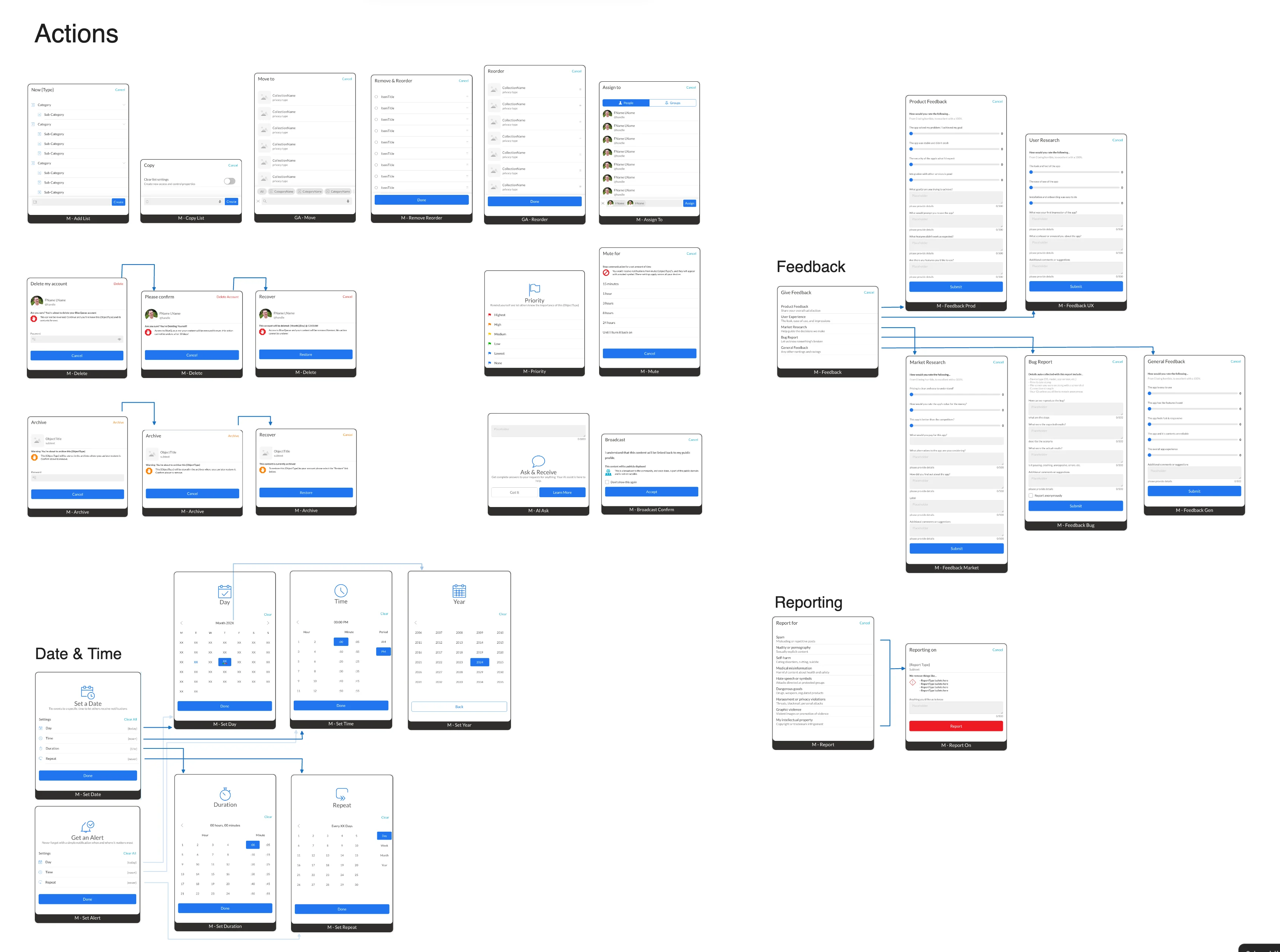
BlueQueue - Actions "Screen Sheet" on an infinite canvas
Flow Maps
Taking the modules to the next level we start to add in the interactions and movement from screen to screen or even module, state to state (which is shown in the above image for the delete and achieve flows). I'm a very visual person and find it easier to have discussions around screen flows with stakeholders on an infinite canvas where we can work up from simple boxes and arrows, to fully built out modules and screens.
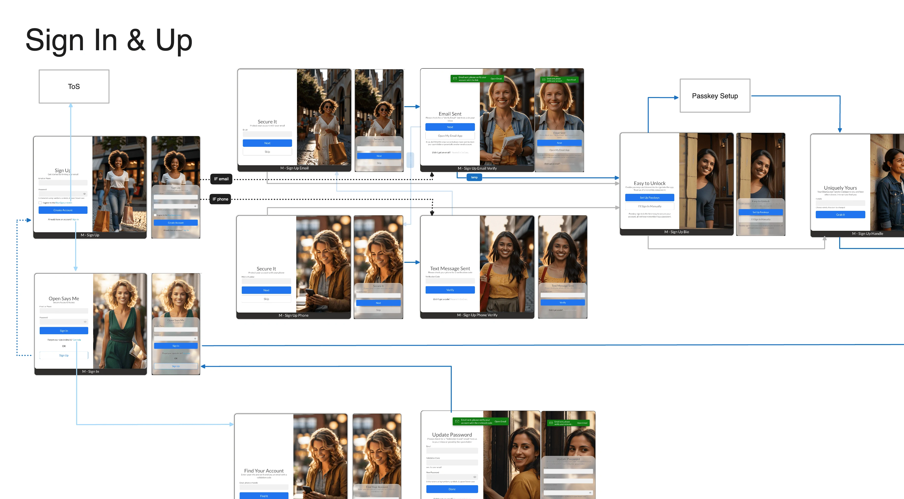
BlueQueue - Sign In & Up screen flows
Here you can see part of the flow for the BlueQueue sign in and up process. At this stage I also like to give an idea of how the experience changes from a large format desktop experience to the small form factor mobile app experience. Once validated and approved to move into development these flows then help engineers understand the intent of screens, and the navigation between screens/modules.
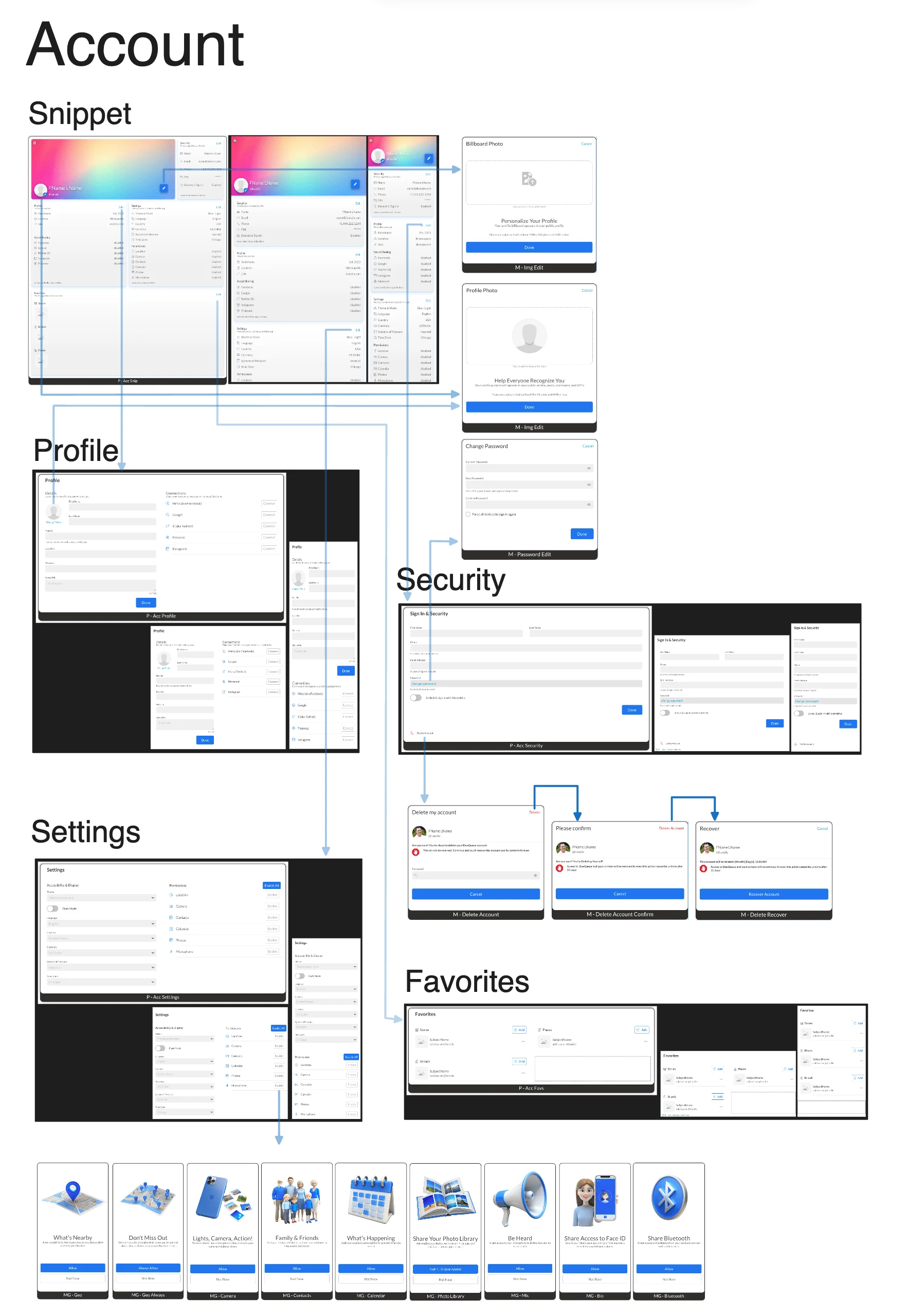
BlueQueue - Member Account screen flows
Here's the flow mapping for the members account area of the application. This is just the beginnings, there are plans to expand on this with additional content.
App Teasers
Initially the app was mobile only, but has since turned into a multi-platform solution. Saying that, here are a few videos I put together to demo a few of the functional aspects of the app. The team is still hard at work preparing the application for GA, so stay tuned.
Like this project
Posted Jun 19, 2024
My responsibilities included brainstorming host, UX flow research, UX/UI design, front-end development, brand design, and building out a scalable design system.
Likes
0
Views
90

