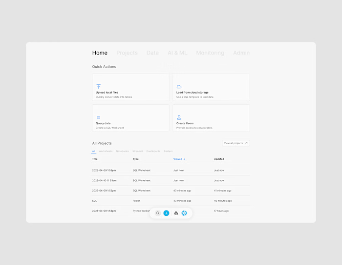
The Databricks Data Catalog: Enhancing Usability and Trust
Overview
Problem: While the Databricks platform excelled at processing data, its highly technical interface prevented users from easily finding and understanding the data. The lack of a user-friendly catalog led to costly reliance on “tribal knowledge” and created a significant bottleneck for data access. Ultimately, this inefficiency undermined data trust and discouraged widespread adoption of the platform's full capabilities across the enterprise.
The Solution: A user-centered redesign that transforms the catalog into an intuitive, trustworthy, and accessible hub for all users, from the highly technical to the completely non-technical.
Key Results: Proposed improvements to core metrics like time to insight, reduction in support requests, and increased data adoption across the enterprise.
Research / UX
User Personas
During my research phase, I created 3 user personas to simulate what a customer's journey might look like on the screen, given their experience level. I focused on the Data Engineer (Expert), the Data Analysts (Core User), and the Business User (Explorer).
Persona 1: The Data Engineer - Alex
Role: Technical expert responsible for building and maintaining data pipelines.
Goals: Ensure data quality, automate processes, and optimize performance.
Pain Points: Spends valuable time answering repetitive questions from other teams about data definitions and locations.
Needs: A self-service system that reduces support requests and allows him to focus on complex engineering tasks.
Persona 2: The Data Analyst - Maya
Role: A core data consumer who analyzes data to find business insights and build reports.
Goals: Quickly find and understand trusted, well-documented data to answer business questions.
Pain Points: The current UI is intimidating and not useful for her needs. She struggles to understand a table's purpose, owner, or its columns without interrupting a data engineer.
Needs: A straightforward, searchable, and descriptive interface that acts as a single source of truth for the data she needs.
Persona 3: The Business User - Ben
Role: A non-technical explorer who needs to create simple reports or validate business metrics.
Goals: Access simple, reliable data with minimal technical effort.
Pain Points: Finds the complexity of the current UI a complete barrier to entry. He defaults to requesting data from others or using spreadsheets, limiting his own ability to perform analysis.
Needs: A consumer-grade experience with clear, human-readable descriptions and a high level of trust in the data he finds.
Heuristic Evaluation
To gain a deep understanding of the product's usability, I conducted a heuristic evaluation of the original data catalog UI. This process allowed me to identify inconsistencies and failures against established design principles, providing key evidence for our proposed redesign. My analysis focused on two key areas: the overloaded navigation and the inefficient layout of the main data discovery component.
Failure: The UI's layout and information hierarchy are not designed for data consumption. The interface is cluttered with technical details, and the most important information is not visible at a glance. It pushes users to recall information rather than recognize it.
Evidence:
The product lacks visual hierarchy for essential metadata, like ownership, clear description, and usage statistics, which are hidden or not immediately visible.
The navigational structure is overloaded with technical options and designed for complex management tasks, rather than for simply browsing and finding data.
Impact: This mismatch between the system's design and the user's mental model for simple data access is a key reason for low adoption. It creates an intimidating and inaccessible experience for anyone without a technical background.
Summary
The heuristic evaluation confirmed that the primary usability issues were not with the core function of the lineage graph, but with the surrounding UI. The design’s overloaded navigation and inefficient layout were the key contributors to a poor user experience. This analysis provided a clear foundation for a redesign focused on strategic simplification and layout optimization to serve a broader audience.
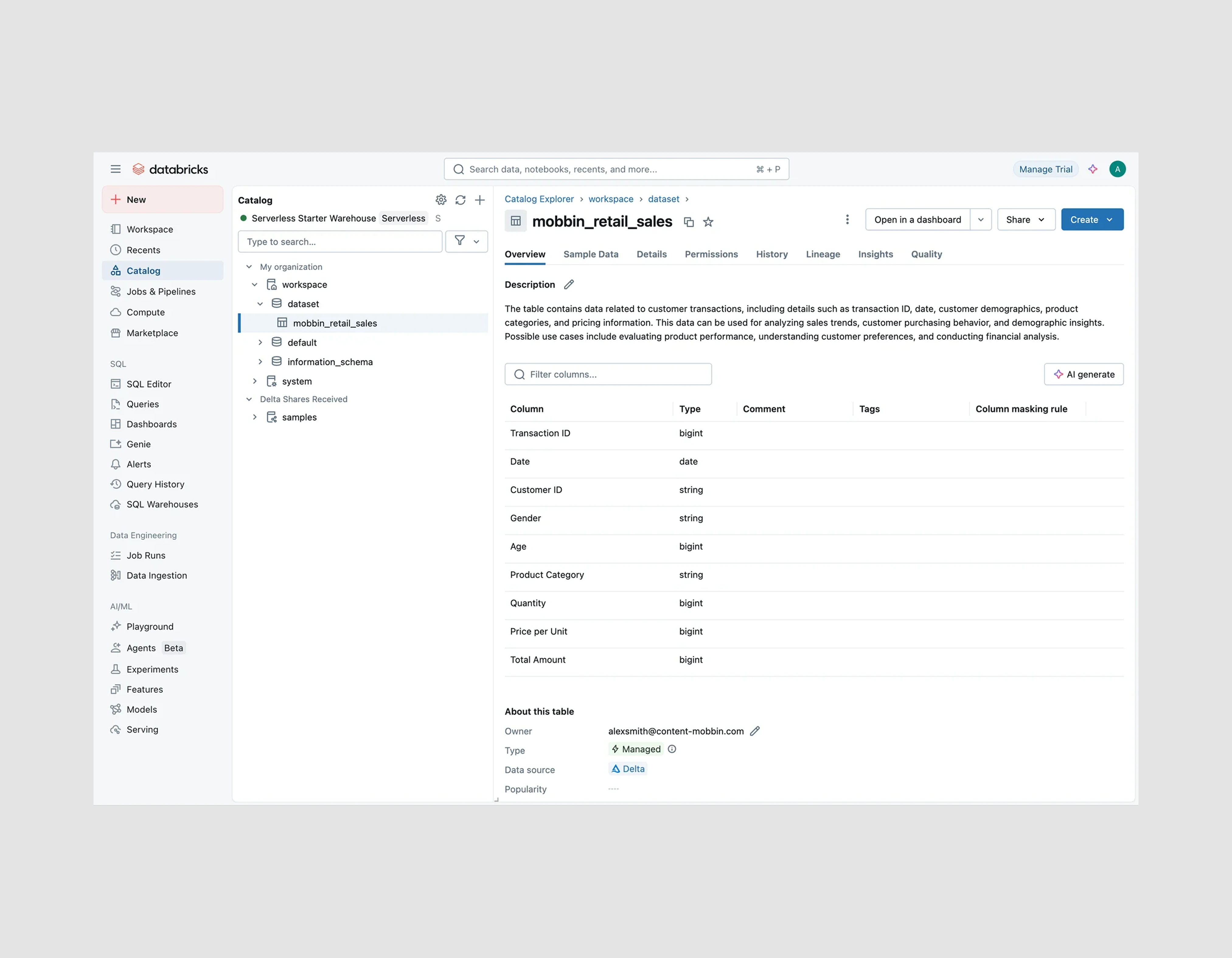
Original Databrick Data Catalog screen
Design Process
Given the complex nature of the Databricks platform, I wanted my redesign to remain subtle, preventing disruption of learned behavior for long-term users.
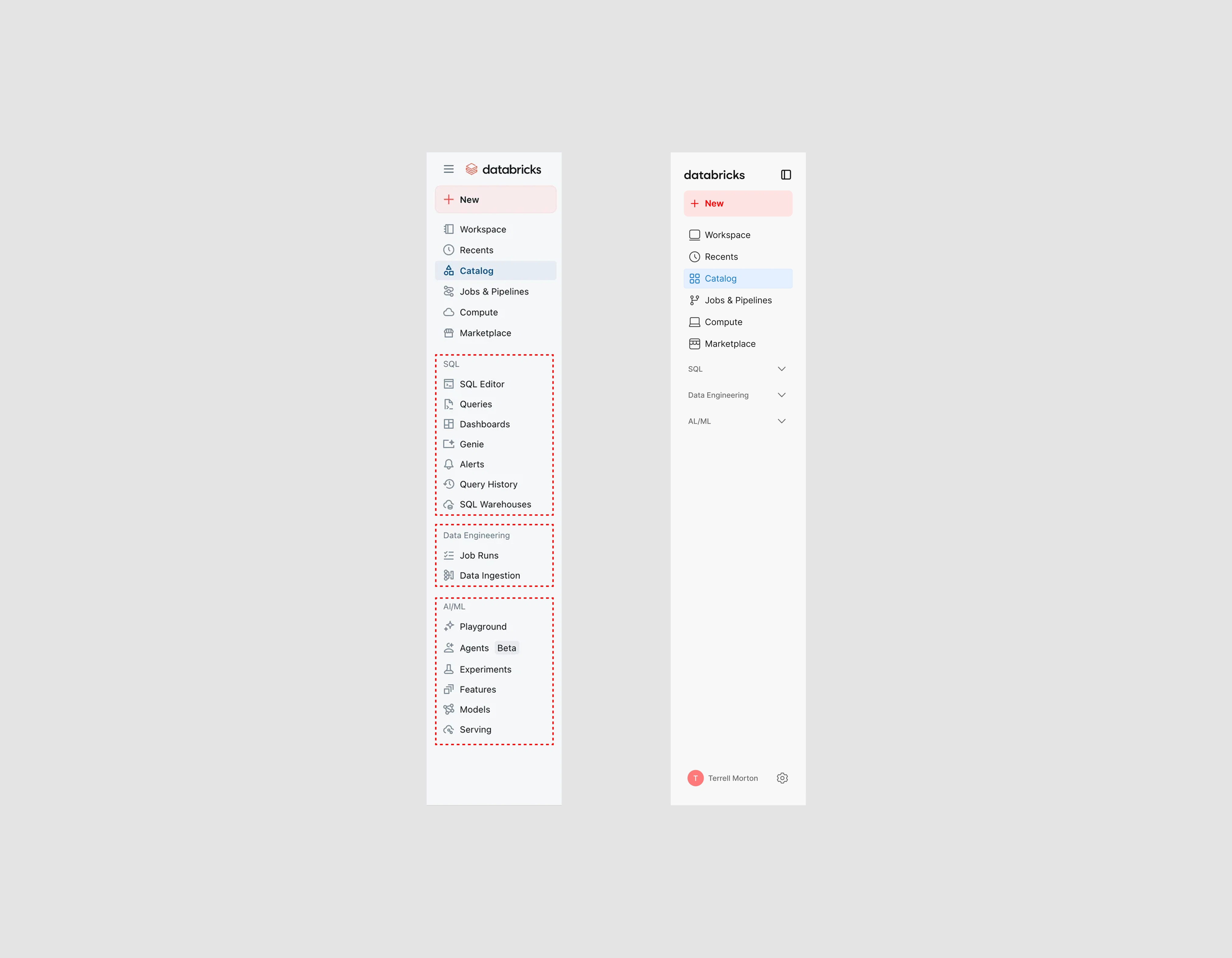
Navigation comparison (old v. new)
First, I started by redesigning the navigation. As a result of the evaluation, I found that 71% of the navigation options were advanced flows, and more than 80% of the navigation was filled with content at all times. Because of this, I wanted to give users the option to reduce potential overload & decrease time spent navigating. To achieve this, I added dropdown functions to Databricks' original grouping sections. This created a choice for users who may not need the advanced features presented to them.
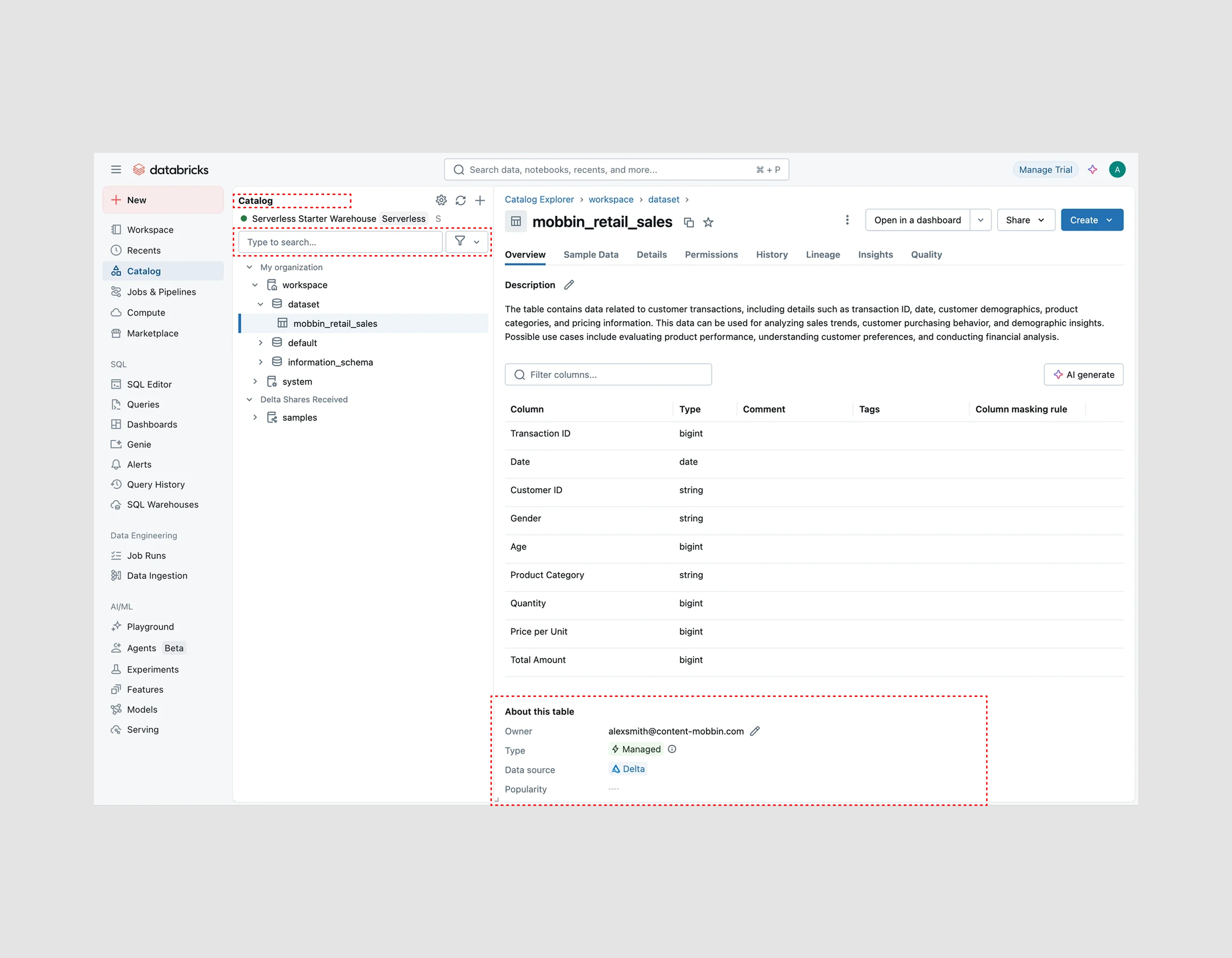
Original Data Catalog Screen w/ Highlights
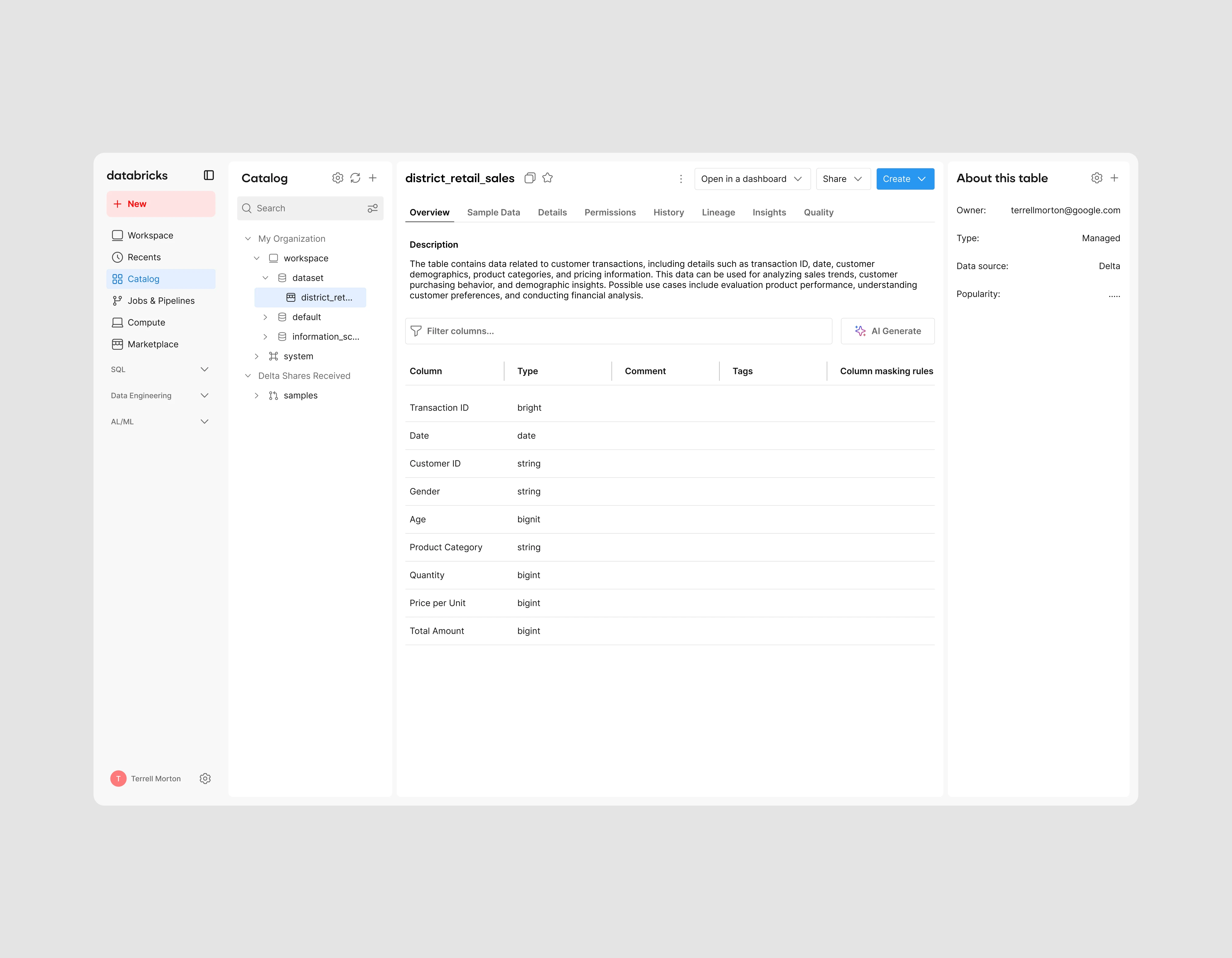
My next step was to modernize the central content area. The goal was to keep everything original but optimize the placement of specific components. Components like the search and filter were combined into one element, and the title of the Catalog was realigned to create consistency. The core functionality maintained the same styling, with small tweaks to establish consistency. One change implemented was the creation of a 3rd section titled “About this table”, which displayed relevant information regarding the current table in view, making it easier visible for users who need information quickly.
Solution
Overall, by simplifying the product, not only are we able to decrease the discovery process & reduce friction, but we’re also able to appeal to a wider range of users, significantly boosting user adoption and engagement. This redesign also takes many technical elements and makes them optional for users who may not require the complexity, which will decrease support tickets, specifically, frequent low-value tickets.

Final Redesign
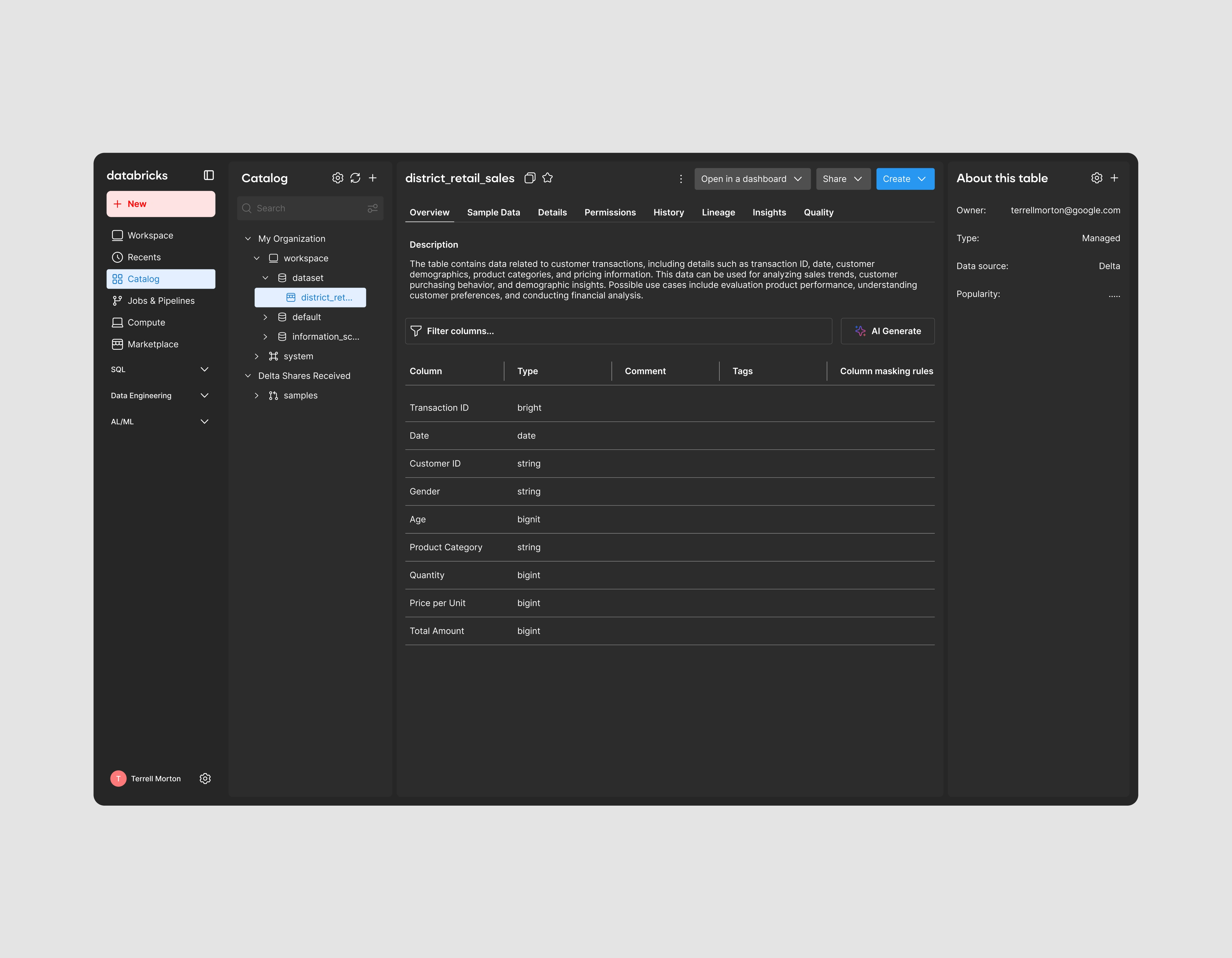
Final Redesign (Dark)
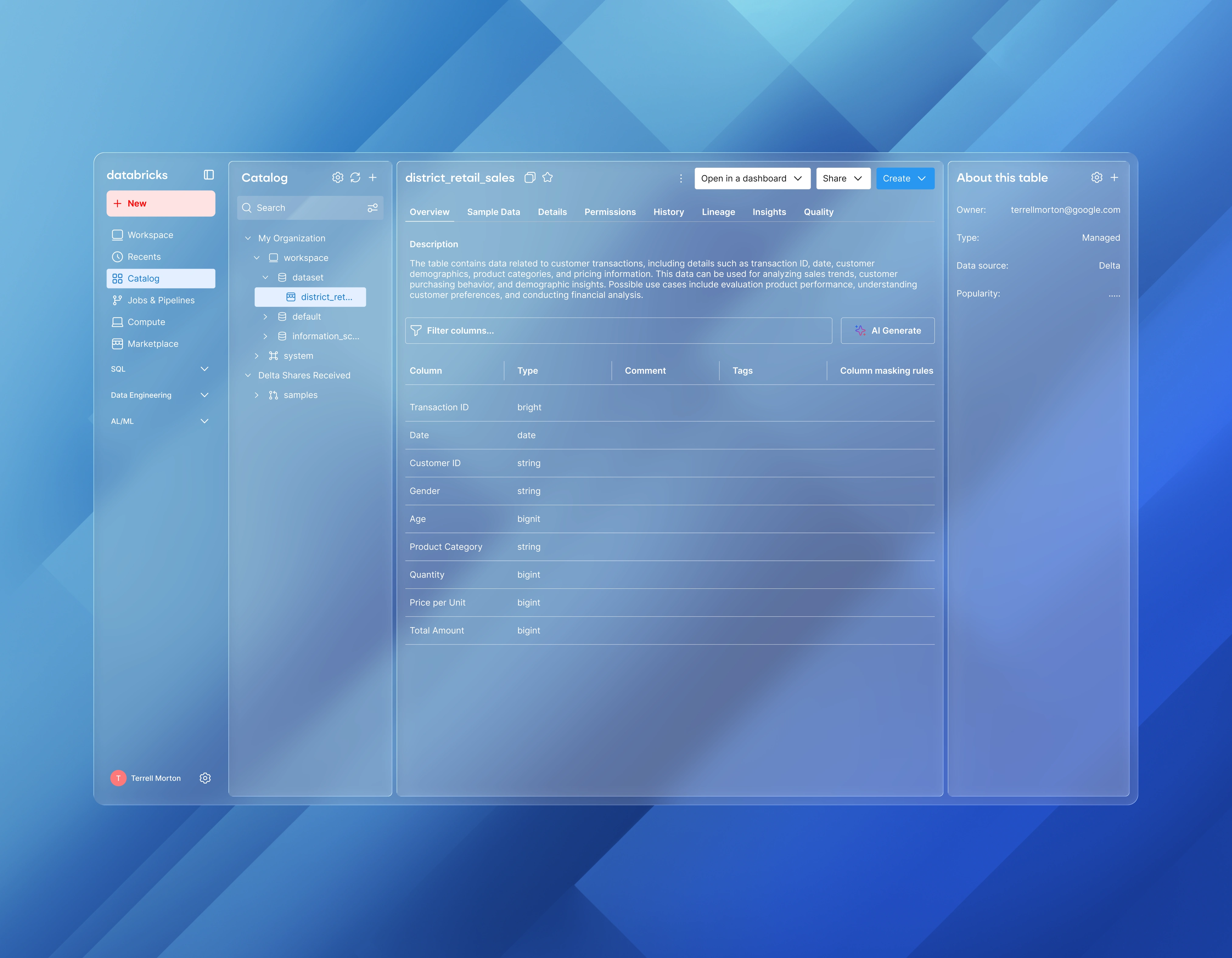
Final Redesign (Glass)
Reflection
This project widened my skillset for better handling data-heavy interfaces, designing components like tables and data lineage graphs, and creating designs that prevent learned behavior disruption. As a UX designer, this case study significantly enhanced my ability to analyze qualitative insights and convert them into concrete UI solution proposals. Overall, this project built a core foundation for solving complex problems for complex products.
Like this project
Posted Sep 4, 2025
A UX case study focused on Databricks, addressing a user experience bottleneck and expanding data access for a wider enterprise audience.
Likes
0
Views
18
Timeline
Aug 30, 2025 - Sep 3, 2025

