Identifying and Closing UX Gaps in Travel Platforms
Terrell Morton
The Overlooked Opportunity in Travel Booking Sites
Research shows the global parent-child travel market was valued at $15.2 billion in 2023 and is projected to reach $28.4 billion by 2032. This growth represents a significant opportunity to capture market share by addressing the UX friction points that currently drive families to competitors.
Our Target User
Our target users are Millennial parents seeking to book family getaways. This creates a unique business opportunity for booking sites to differentiate themselves not only as intuitive booking sites but also as trusted, transparent family travel experiences.
Project Goals
Eliminate planning stress for overwhelmed parents
Effortlessly plan and book family travel, ensuring a transparent, reliable, and stress-free experience.
Increase the rate of completed family travel bookings

Redesigned Search Result page
Designing for Projected Growth & Undermined User Groups
The significant opportunity lies in leveraging existing assets to construct a family-centric frontend that anticipates needs, simplifies complex decisions, and creates a sense of ease and reliability. This requires a strategic shift from a static, solo-travel-focused platform to a fluid, personalized, user-centered travel platform.
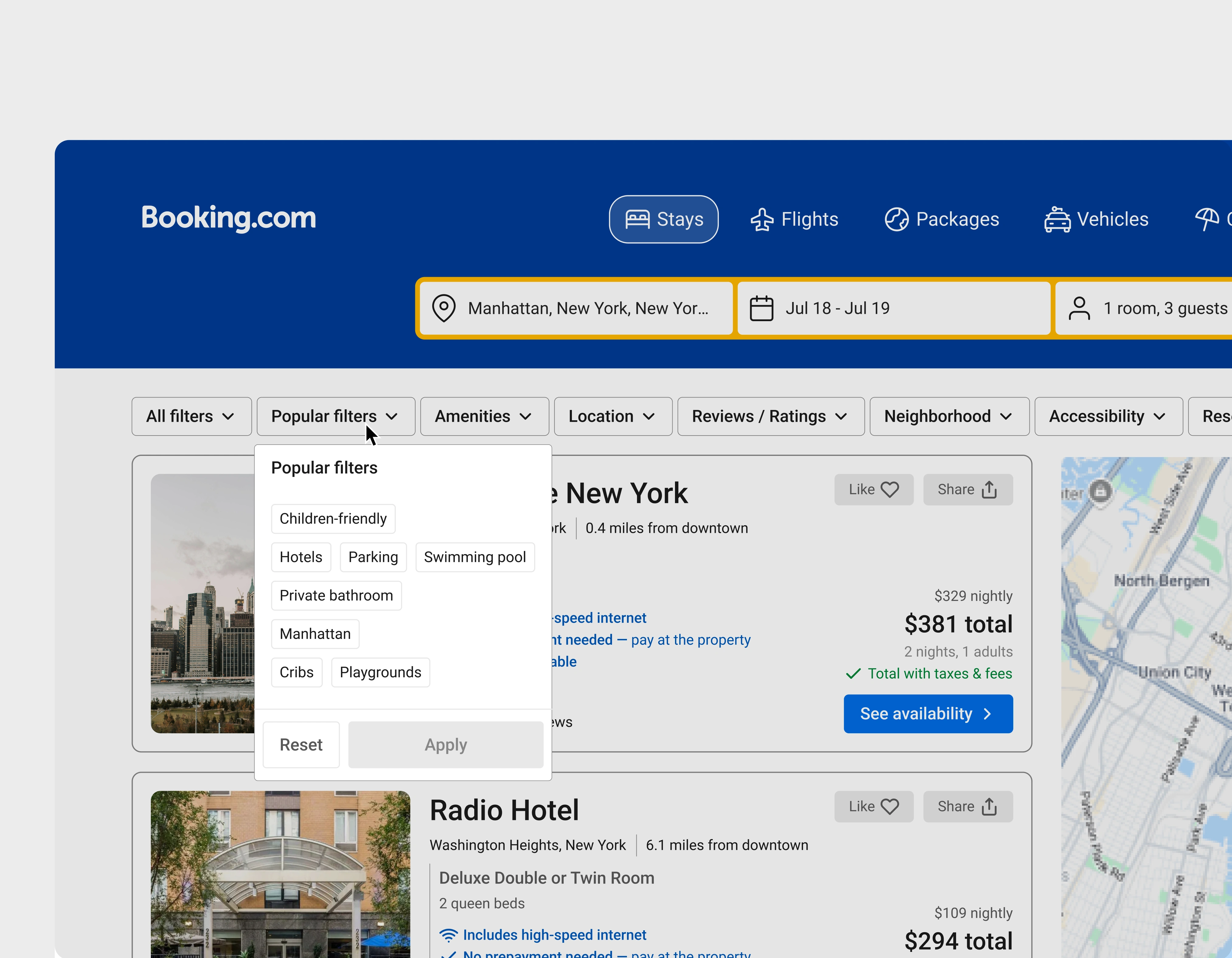
Implementing Customization to the Current Filter Component
A key factor in parents' frustration is the lack of family-centric design. An example of this within the Search Results page is the filter component. The current component is a vertical container hosting multiple filter groups, all of which are non-collapsible. The scrolling required to navigate this section induces cognitive load that could be prevented by slight tweaks in component choice.
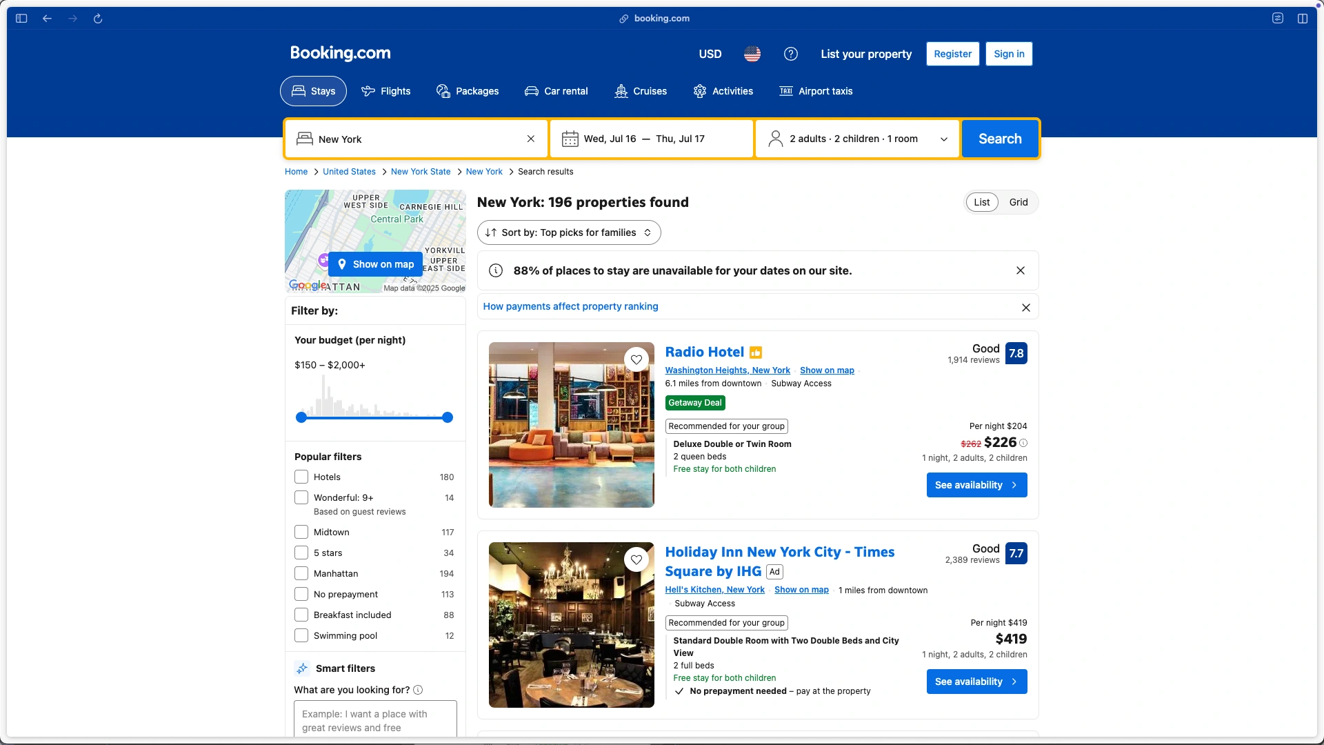
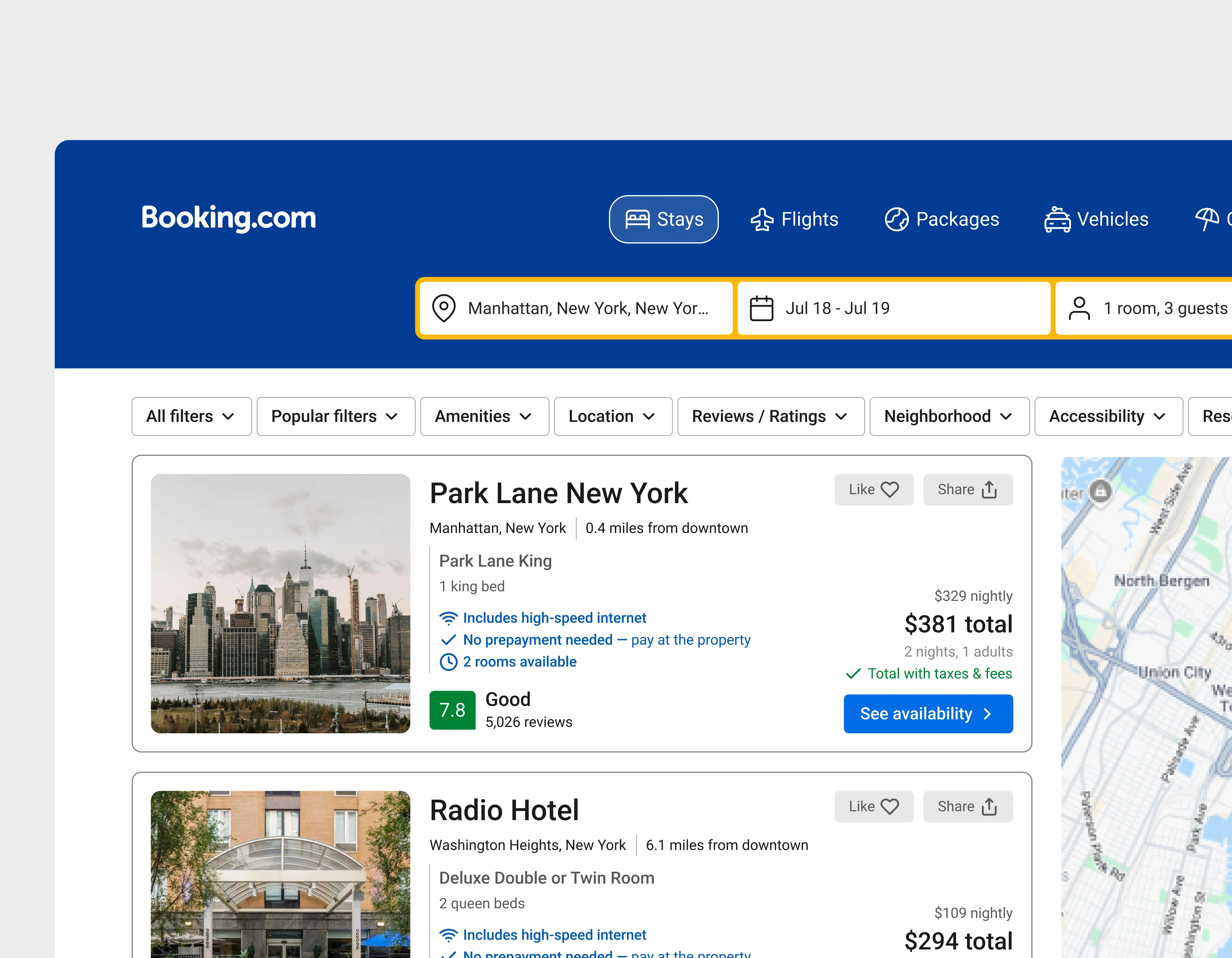
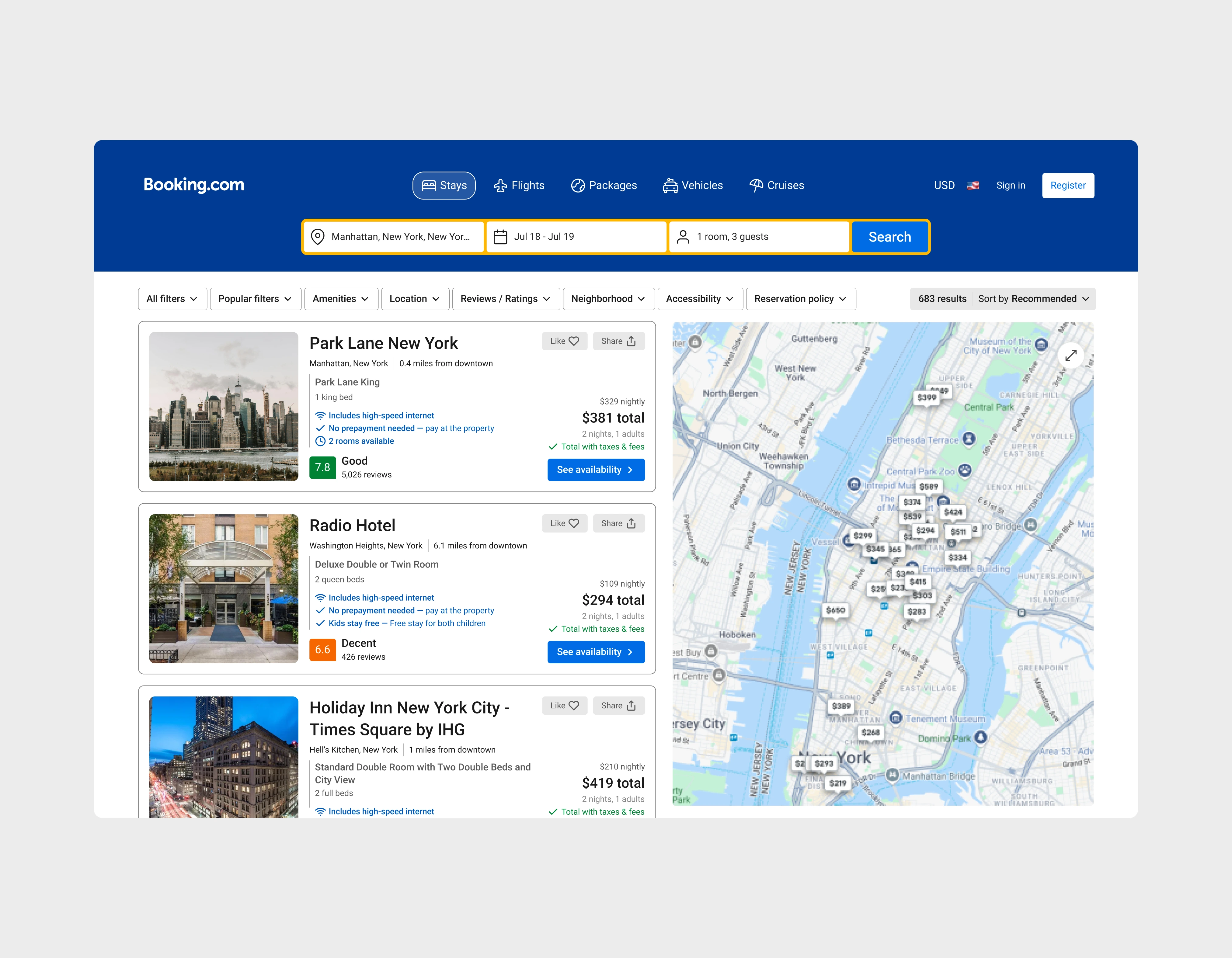
Current Booking.com Search Result page
I approached this following Nielsen's principle that users should have control and freedom over their experience. Opting for a linear row of dropdown chips created spacing to implement and improve other features while minimizing choice and cognitive overload for users.

Redesigned filter row feature
*Ideally, our back-end would adapt to user search criteria and reorganize dropdown options, prioritizing the most relevant information for users
Redesigned filter feature (onClick)
Expanded Interactive Map View
Research indicates that top-performing platforms implement a dual-pane design, balancing detailed listings with prominent map integration. However, Booking.com features only a small map thumbnail (253x150px) that functions more as a navigation link than an integrated discovery tool. This unnecessarily extends our users' journey, increasing the likelihood of dropoff.
With this knowledge, I designed multiple iterations implementing dual-pane interfaces with an integrated map discovery tool.
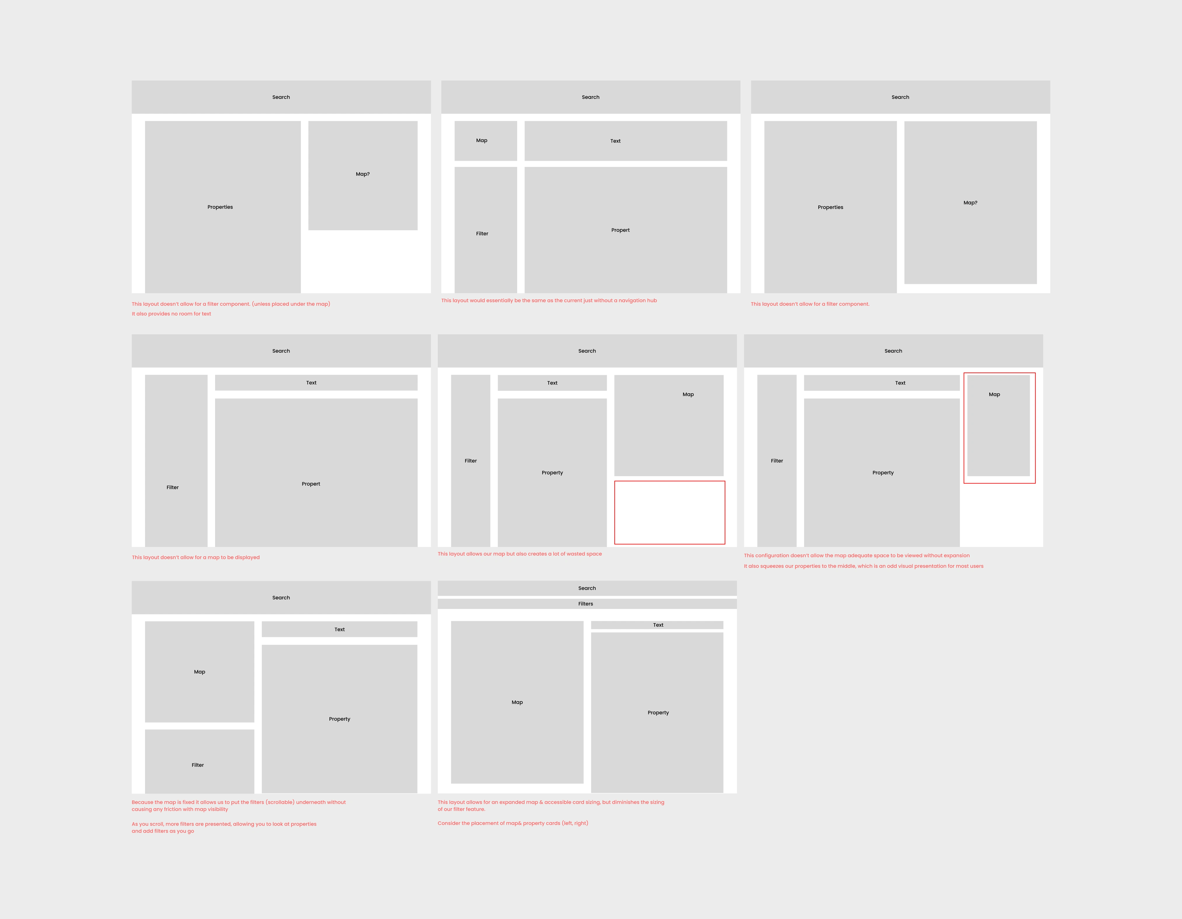
Early wireframing for dual-page layout
The outcome is an integrated browsing experience that eliminates page transitions, delivering a cohesive dual-pane interface where users can explore properties and their locations simultaneously.
Redesigned dual-pane interface
Redesigning Inconsistent Card Elements
During research, I noted Booking.com's card components were severely inconsistent and often hard to navigate due to a lack of or poorly placed information. I highlighted key pain points and prioritized these points when redesigning the component.
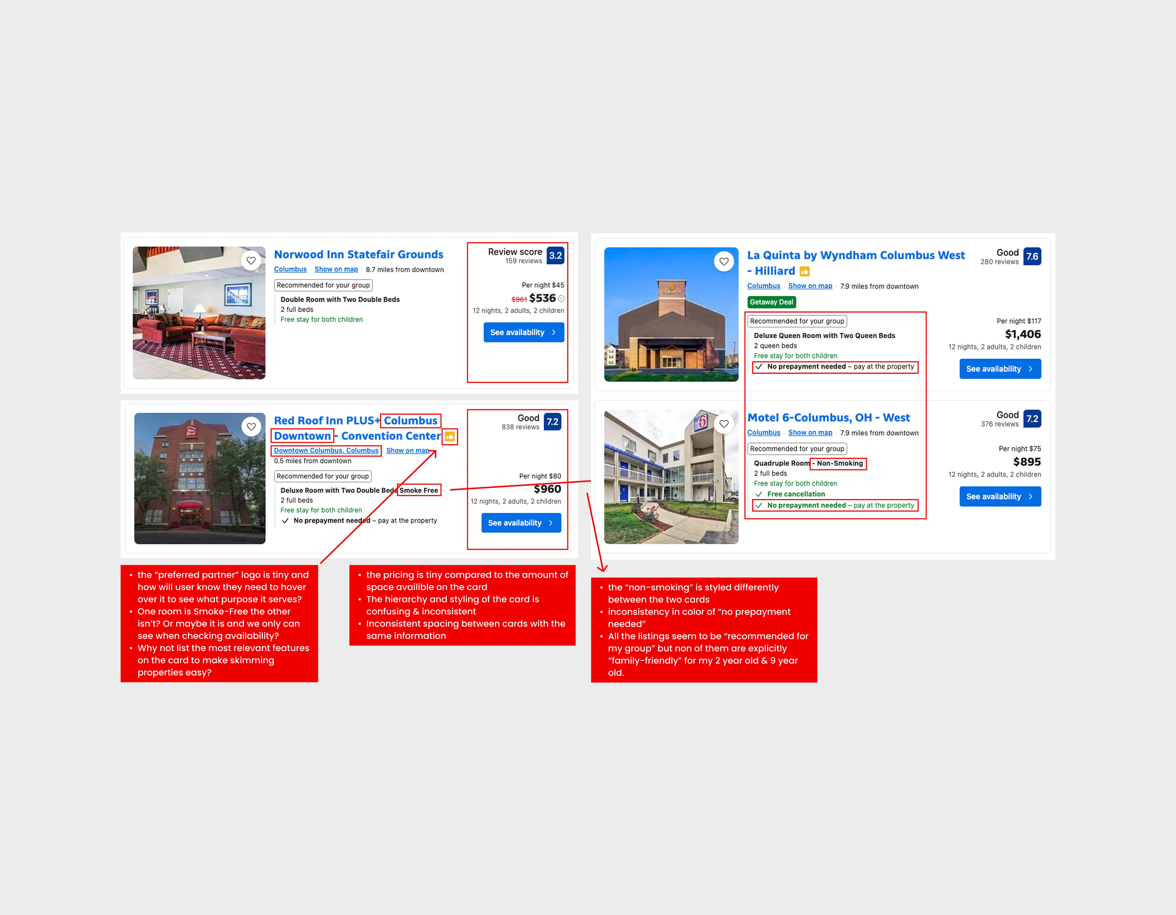
Overview of the current card components
The card redesign emphasizes scannability over detailed content. Enhanced visual elements, including larger images, improved text contrast ratios, and consistent layout composition, allow users to quickly identify relevant details without disruption.
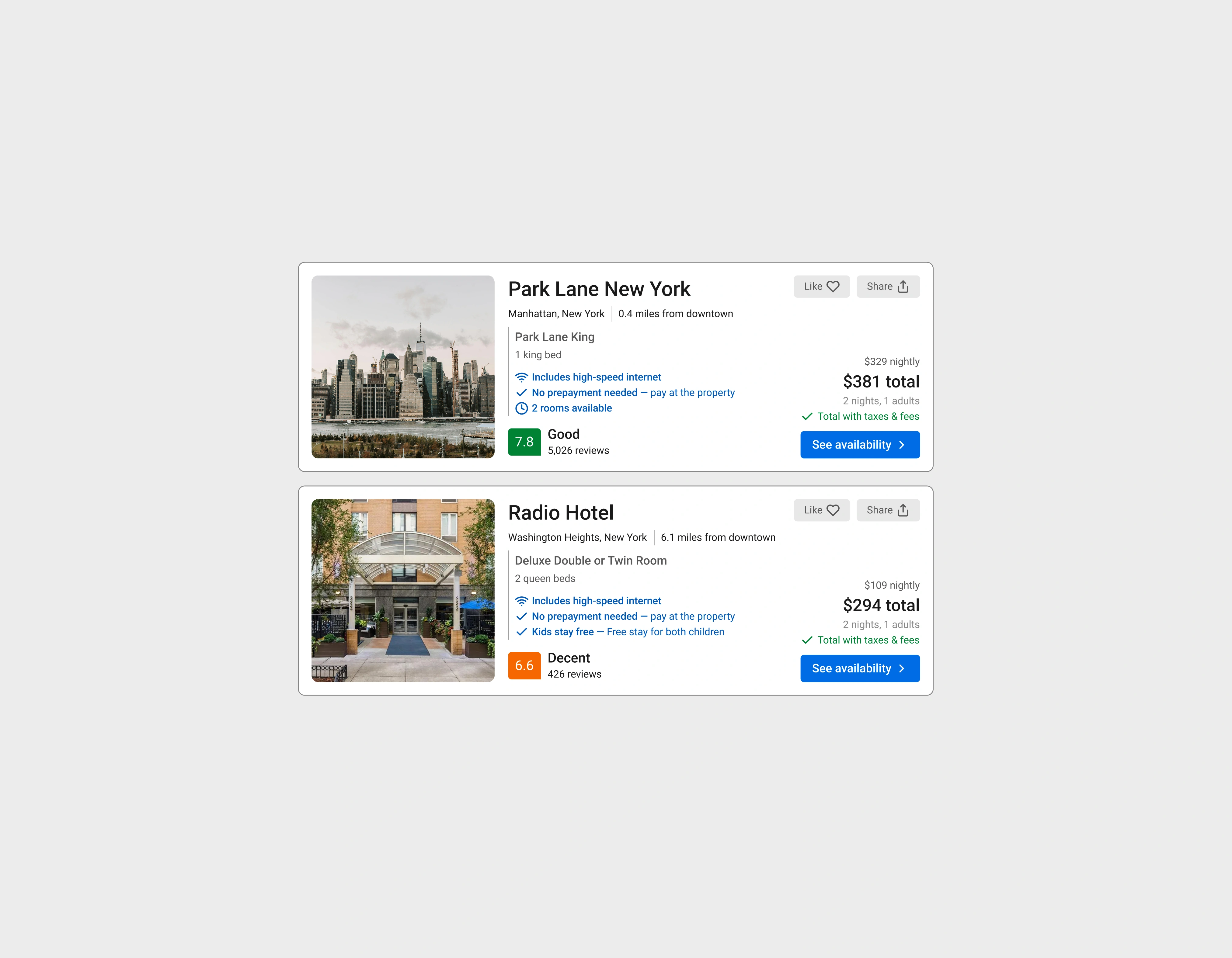
Redesigned card components
In Conclusion
The result is a family-focused design that aligns with busy parents who value simplicity, but also a site that benefits all other users with improved consistency, intuitive page navigation, and modern industry-standard practices.

Final Design
Important note: This case study was written in 2025, and there's a possibility for revisions to the interface that I originally wrote about. Keep in mind that my suggestions were specific to the version of Booking.com I had access to. This is just insight into how I'd approach improving the site, and not a shot at Booking's current design team. If you have any questions about anything you see or are simply curious, feel free to reach out to me.
Like this project
Posted Aug 13, 2025
Conceptual Redesign⏤Website Design
Likes
0
Views
27
Timeline
Jul 9, 2025 - Jul 30, 2025