Snowflake: A UX Case Study on Brand Innovation Through Design

Introduction
This case study outlines an innovative conceptual redesign of the Snowflakes' main product dashboard. The goal is to push the boundaries of what a data warehousing platform could look like and design a new user interface that would embody innovation through a user-centric design approach.
Problem
The initial Snowflake user interface, while reliable, presented a user experience that no longer felt innovative. In a competitive market where the look and feel of a product are critical to user adoption and perception, the old UI appeared dated and lacked the modern aesthetic expected from a leading technology company. The core challenge was to reimagine the product's visual identity and user interactions, not only to enhance functionality but also to embody a new, forward-thinking spirit.
Discovery & Research
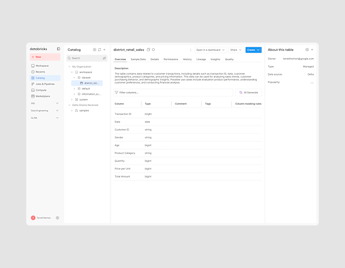
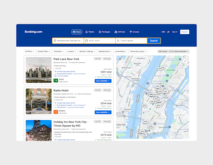
The discovery and research phase was minor because the project's primary objective was to refresh the product's visual identity and user feel, not to reinvent its core functionality. The focus was on keeping existing features and workflows consistent while introducing a new, modern aesthetic. I looked at innovative products, such as Notion, to inform and inspire my approach to elements like table design and general visual aesthetics.
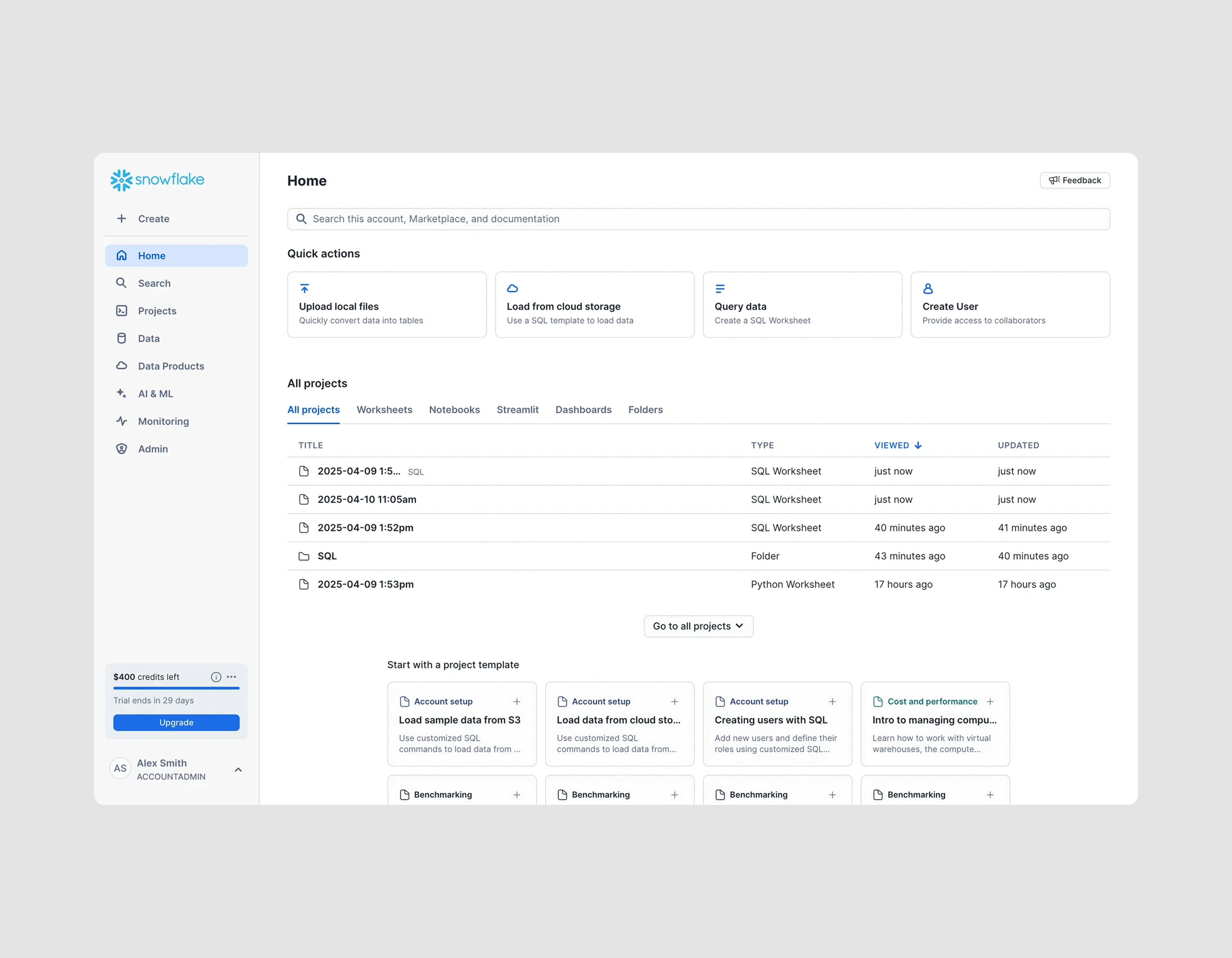
Snowflakes' Original Design
Design Process
Instead of traditional wireframing, I created multiple high-fidelity design iterations to test different layouts and component stylings. This allowed me to quickly visualize and test how a new color palette, typography, and component-level designs (like buttons, cards, and input fields) would impact the overall "feel" of the product. My focus was on creating a modern, professional, and elegant aesthetic that felt both familiar and new.
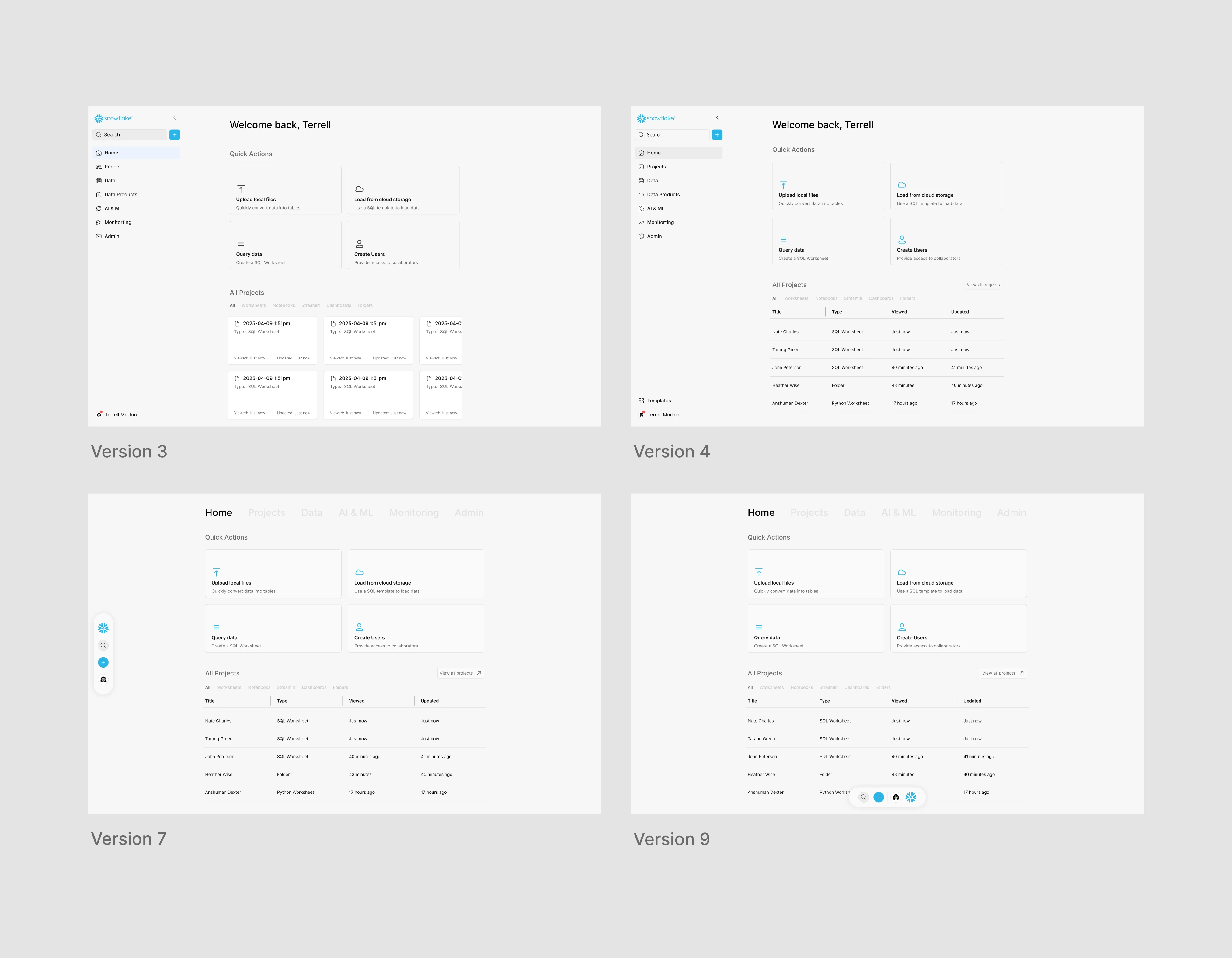
Multiple iteration stages
I redesigned the navigation to be more logical and intuitive, creating a centralized "Home" dashboard and grouping related features under clear sections like "Projects," "Data," and "Admin." This new structure was designed to reduce cognitive load and make the application feel more unified and less overwhelming for users. I established a new visual language for the interface, using a clean color palette, modern typography, and a consistent iconography system. This new system was created to not only improve aesthetics but also to enhance clarity and brand consistency.

Final Redesign
Solution
The final design, which I call Snowsight, introduced a completely new user experience. This redesign isn't just a surface-level change; it's a strategic move to alter user perception and increase engagement. By shifting from a cluttered, dated aesthetic to a clean, modern one, I aim to make the user feel like they are working with a truly innovative product.
Better visual hierarchy and intuitive interaction patterns reduce friction, encouraging users to explore more features and adopt the product more deeply into their daily workflows. The result is a more engaging experience that makes the user an advocate, not just a consumer.
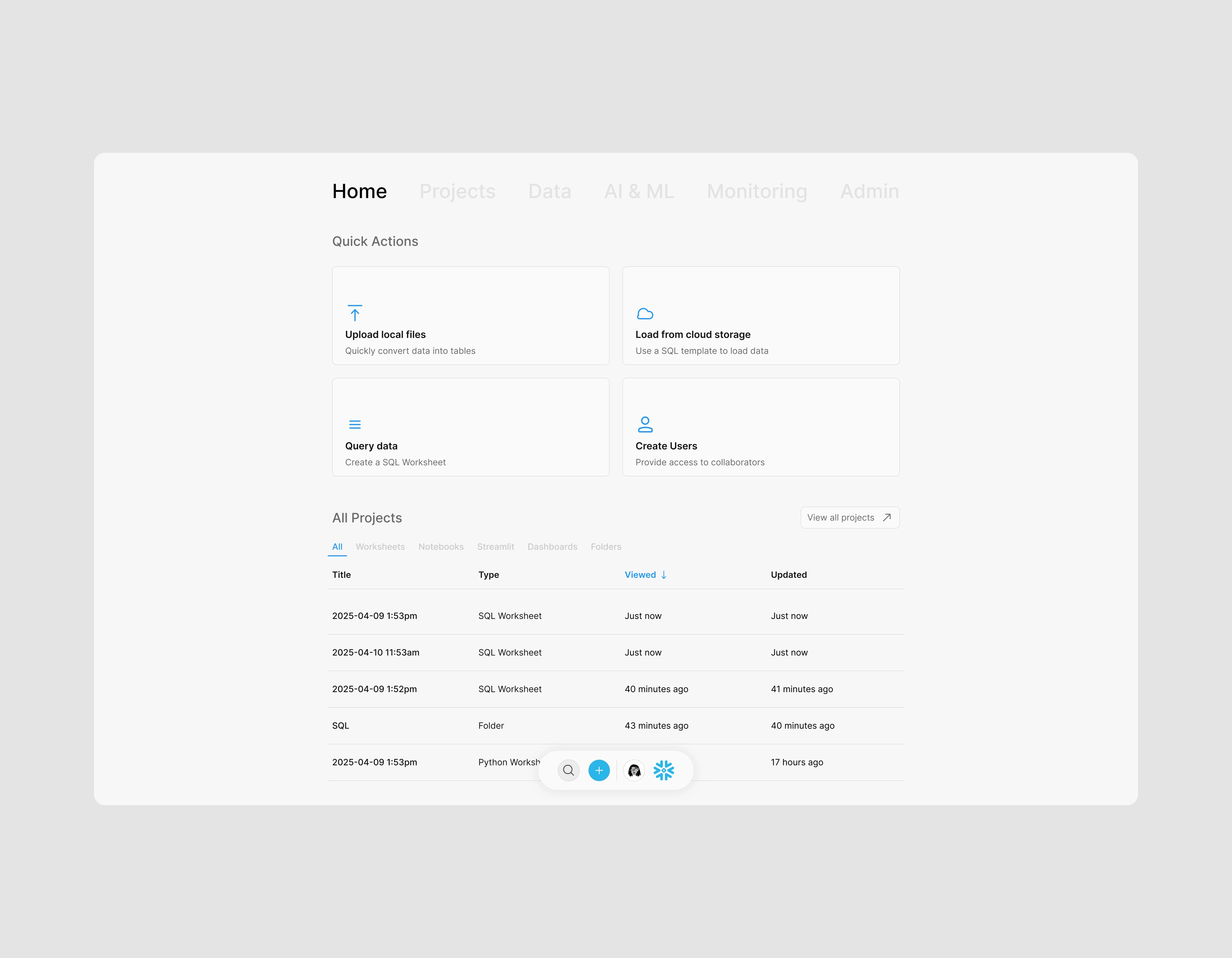
Final Redesign
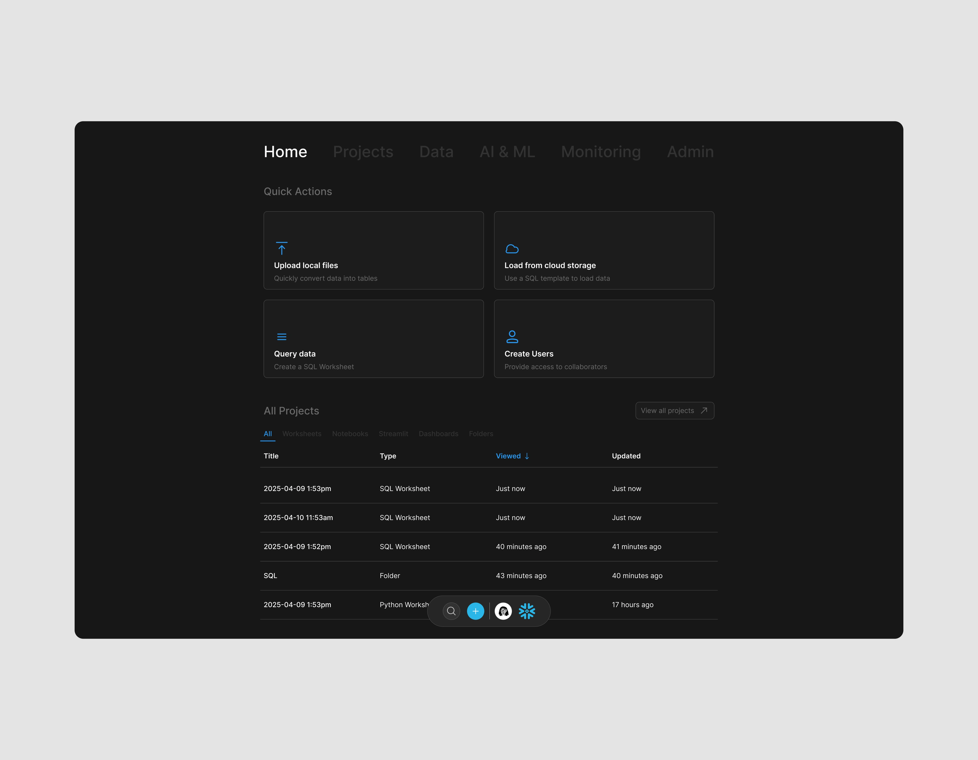
Final Redesign (Dark)
Reflection
This redesign project helped me push my creative boundaries for designing within existing limitations while still creating something that feels new & original. Given the time constraint for this redesign (24-hour turnaround), I was able to create a concept that can be easily scaled throughout the rest of the product, providing a completely refreshed brand perception. Overall, this project built critical skills in designing under strict time constraints, while also maintaining product functionality.
Like this project
Posted Sep 6, 2025
A UX case study focused on Snowflake and how innovative design shifts perceptions and user engagement.
Likes
0
Views
26
Timeline
Sep 1, 2025 - Sep 2, 2025

