Oops Ice Cream
For this assignment brief, we were challenged to create organic food packaging using lino prints of our creation. When I got this brief I was thinking of teas and honey that I have seen to have an organic feel or pasta packaging but I found the word organic to be associated with delicate and light which to me personally is not my style. I still love the ornate and botanical feel of lino prints but I personally would like something bold and out there as a lino print to really catch my eye as a viewer and designer.
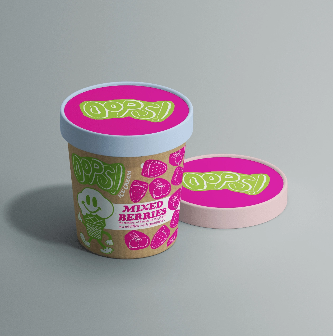
MockUp - Mixed Berries Flavour
This is when I decided to do it on ice cream packaging. The ice cream tubs at the supermarkets always have something to do with the cold or snowflakes and the picture of the ice cream itself on the packaging. Very straightforward and consumerism-esque. I wanted to create something interactive and something to add to the visual interest in looking for ice cream for a movie night or after a breakup. I have always been inspired by the retro or overly saturated colours used in packaging so I wanted to combine the textured lino prints with bright colours to bring the package altogether.
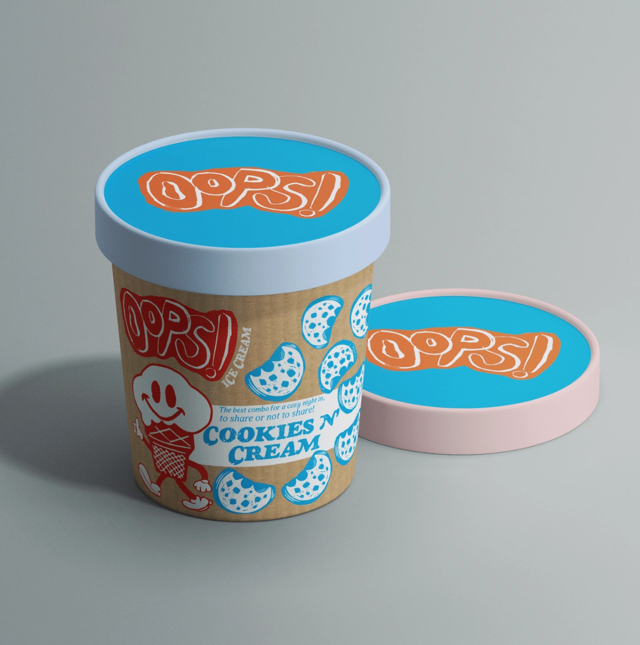
MockUp - Cookies N' Cream
I found the monoprint and lino printing workshops before thinking about ideas refreshing because they gave me the freedom to experiment without having an expectation. I found this overall brief to be experimental and perfecting a lino print was something I had to do through trial and error which happens to be my favourite way to learn a new skill. In addition, going to the print museum gave me a real appreciation for printmakers in the days before us and now especially.
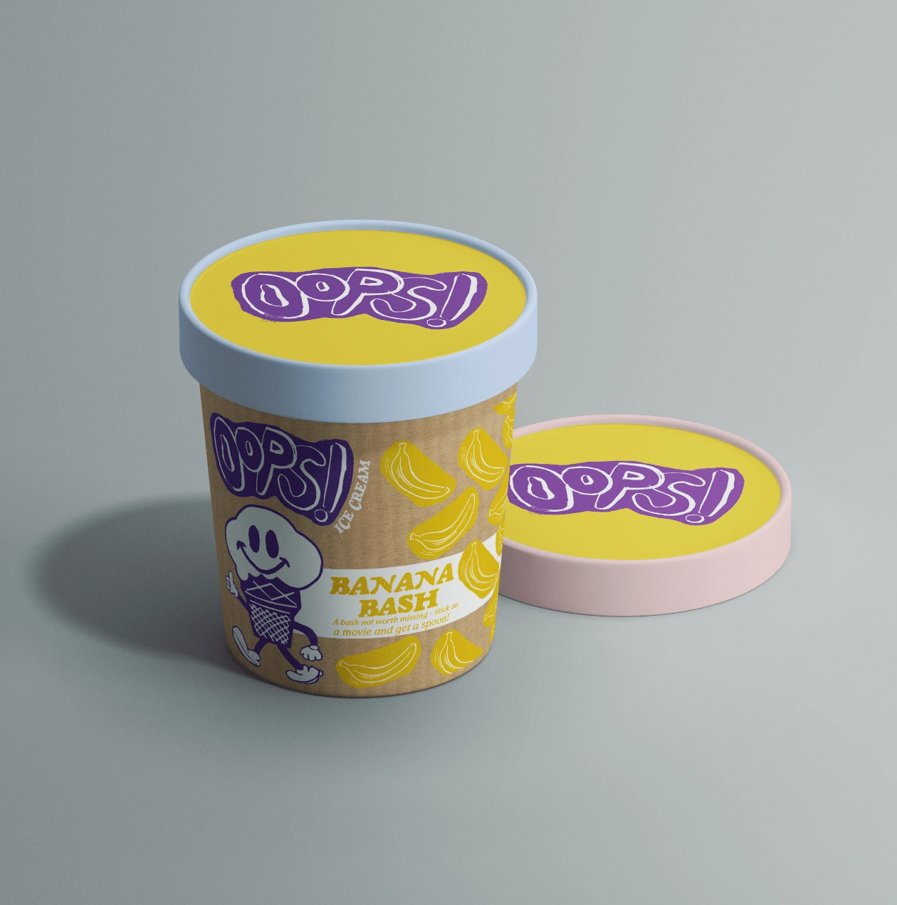
MockUp - Banana Bash
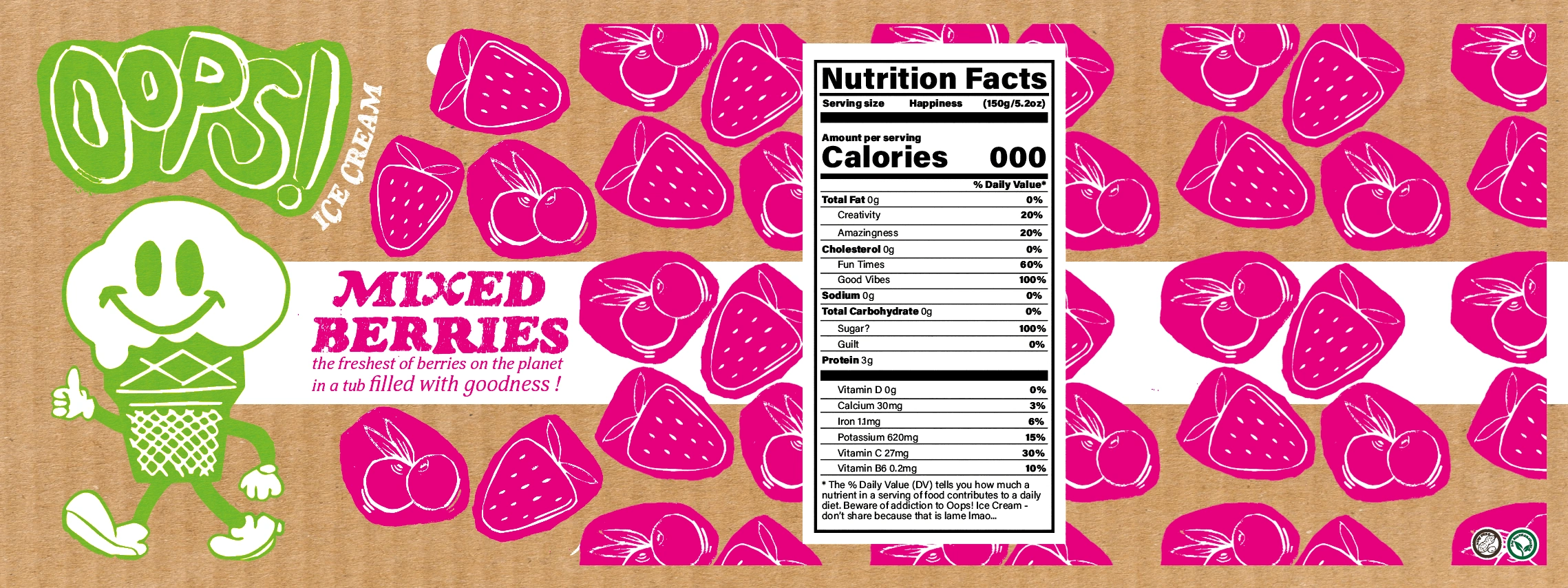
Mixed Berries Label
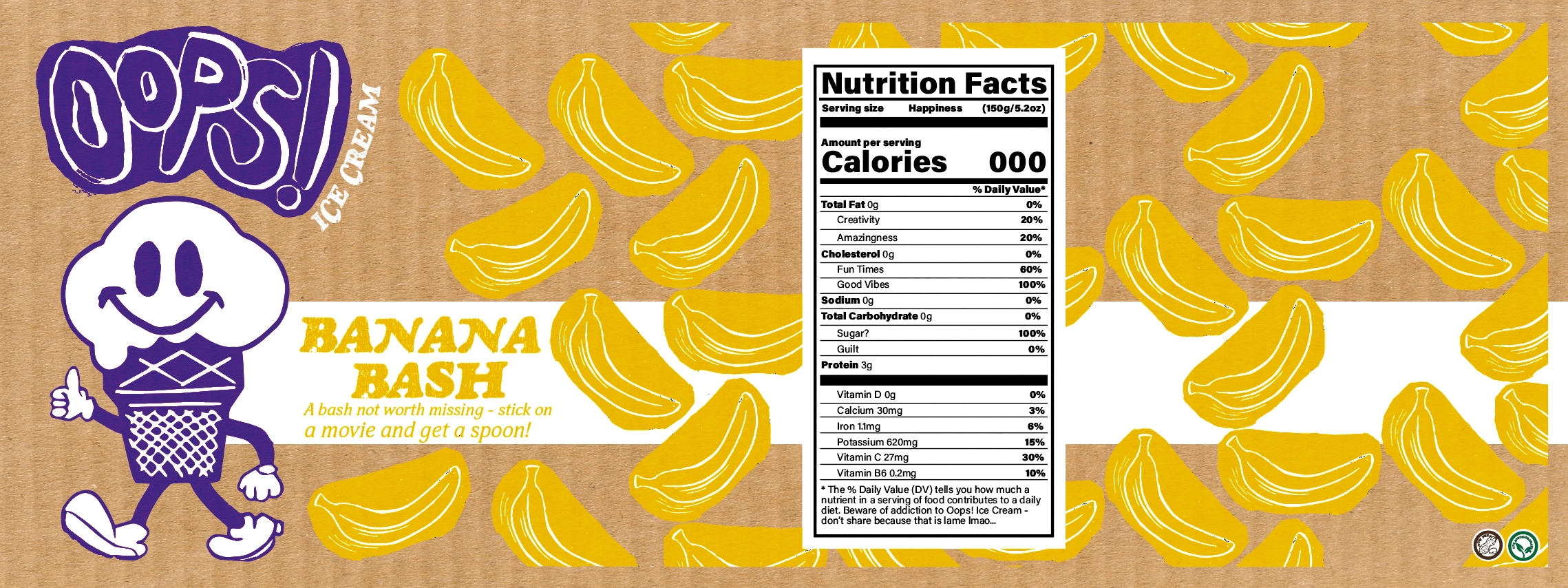
Banana Bash Label
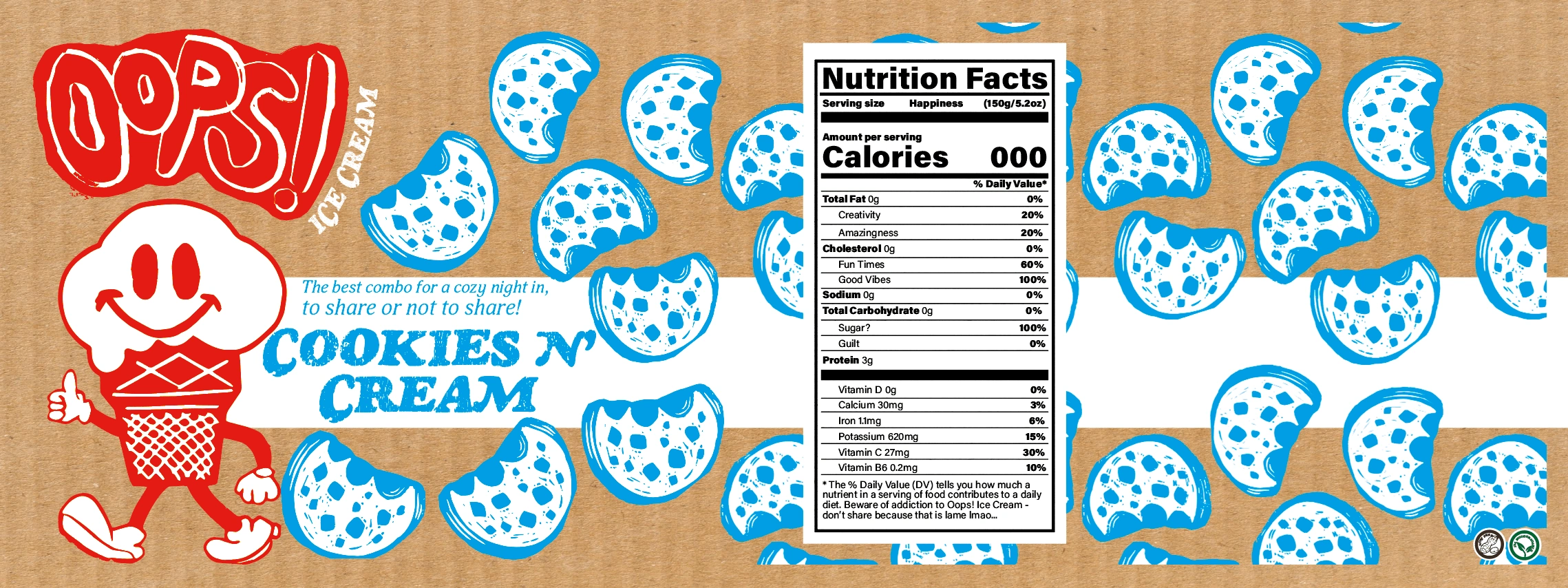
Cookies N Cream Label
Like this project
Posted Feb 23, 2023
I wanted to create something interactive and something to add to the visual interest in looking for ice cream for a movie night or after a breakup.
Likes
0
Views
30
Clients

.College


