Maze: Product Design + Research
User Research
User Interviews
Journey Mapping
Sketching
Wireframes
User Flows
Visual Design
Interaction Design
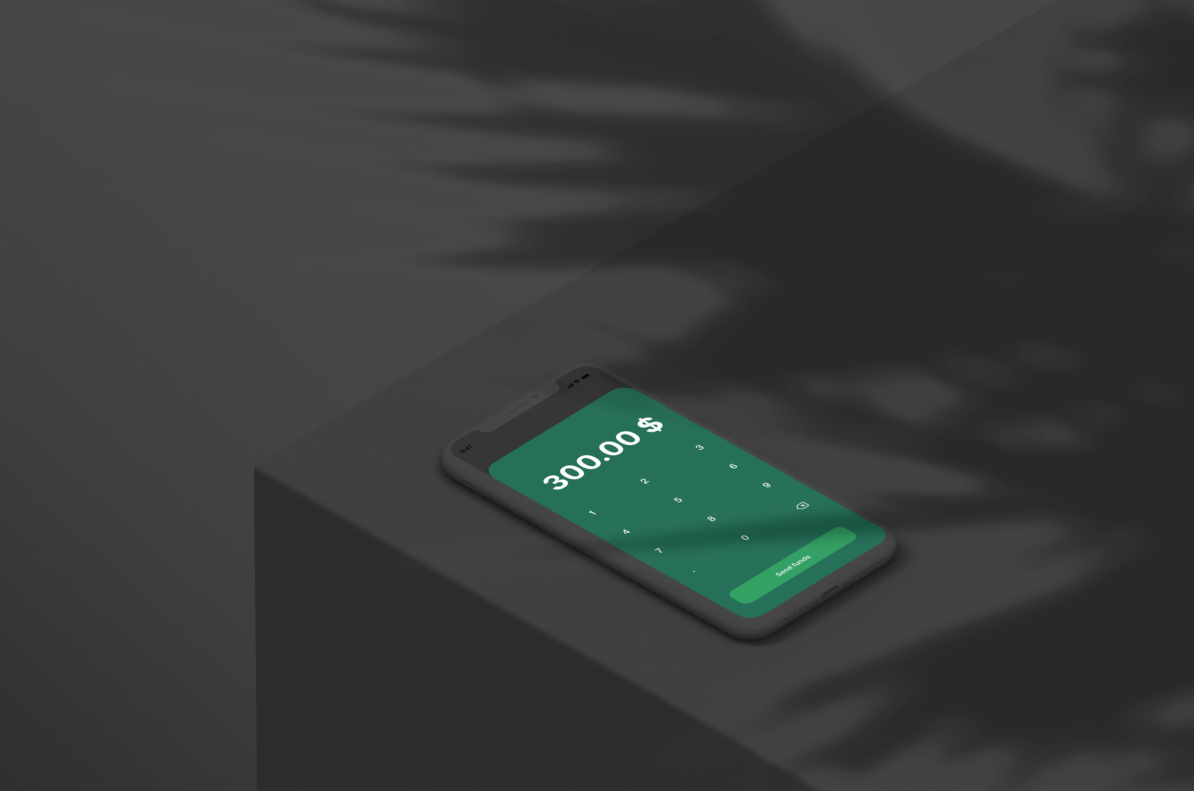
Objective
The world is a global playground. Due to the pandemic we have realized how connected and far apart we are at the same time. When sending money to family and friends who live overseas we may encounter difficulties when converting currency.
Users want the ability to transfer money friends and family who live abroad, and have the ability to transfer the currency based of the recipients current location.
Goals
The goals are to accurately convert the currency for the user in a way that is ease of use. Additionally create ways for the user to make the currency conversion process fun using tactics that gamify the process and promotes returning users to the product.
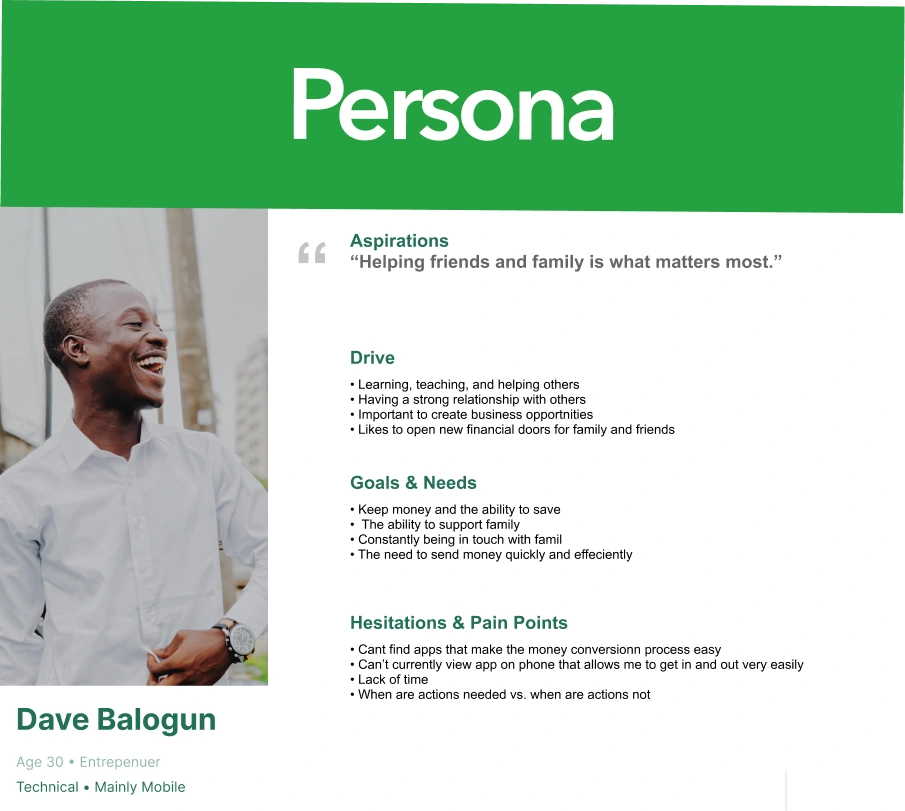
Persona
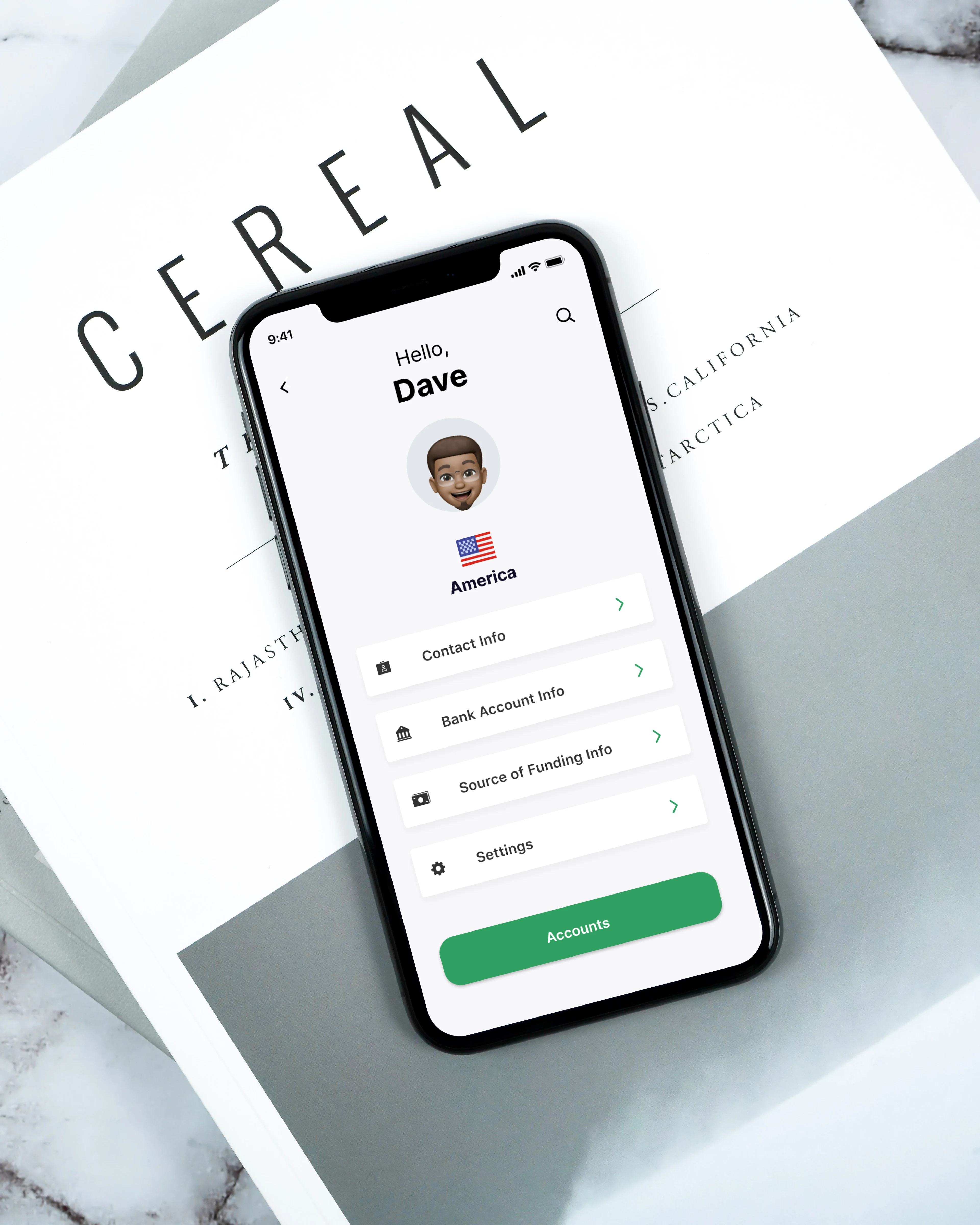
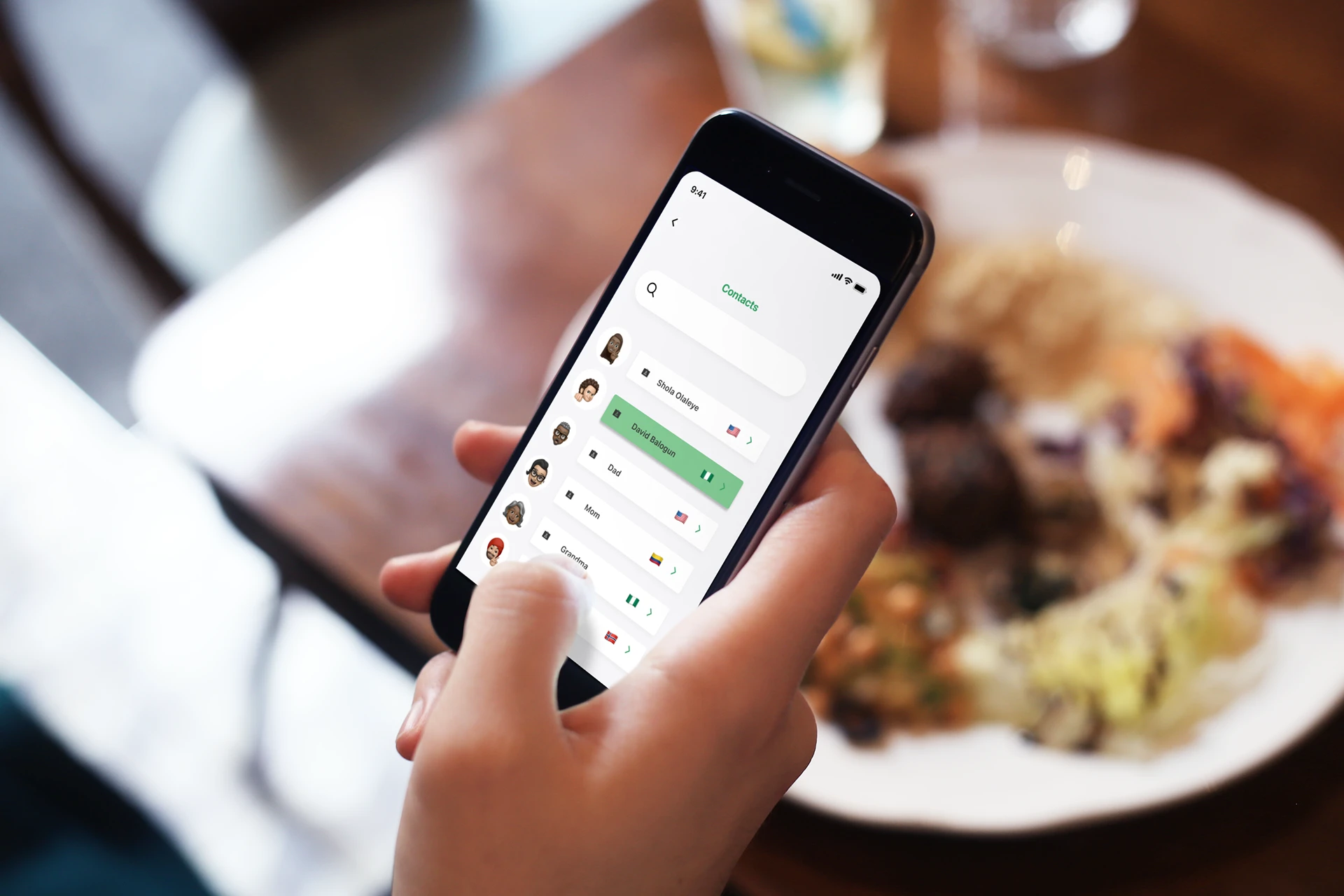
I created a persona based on a user named David who his family and friends who live in Colombia and Nigeria, but would like the ability to send money to then and transfer currency in a seamless process that will allow him to stay in the app. He's and entrepreneur so he needs things to be quick and efficient.
SWOT Analysis
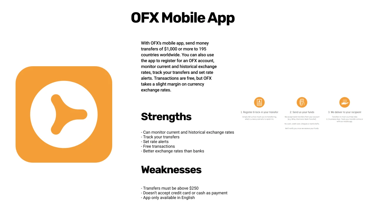
After working on a Persona it made sense to continue working on a SWAT analysis to look deeper at the competitors in this nice of this product. We looked at the OFX mobile app as a main competitor in this market.
The biggest weakness of this app are that transfer shave to be more than 250.00. For young users and people who don't have that much to transfer, this could be a barrier of entry for an individual.
User Flow
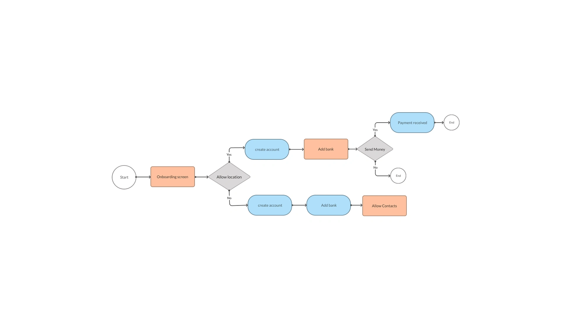
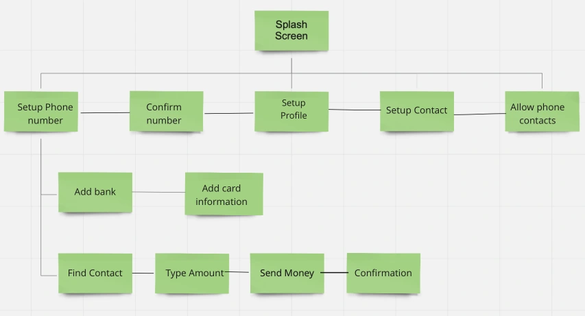
While looking at potential competitors, we thought it would make sense to look at creating a user flow that would guide the experience of what we needed as essentials for the product. The goal was to look at creating a minimal viable product.
Site Map
The sitemap allowed us to see how the screens would branch off from each other in way that is cohesive and that makes sense. This allowed to see the essential screens in peer to peer payment process flow.
We wanted to make sure we didn't have unnecessary screens that stopped us from getting to solving the end users pain points.
Surveys
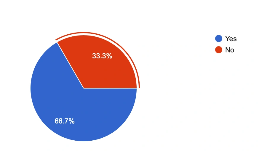
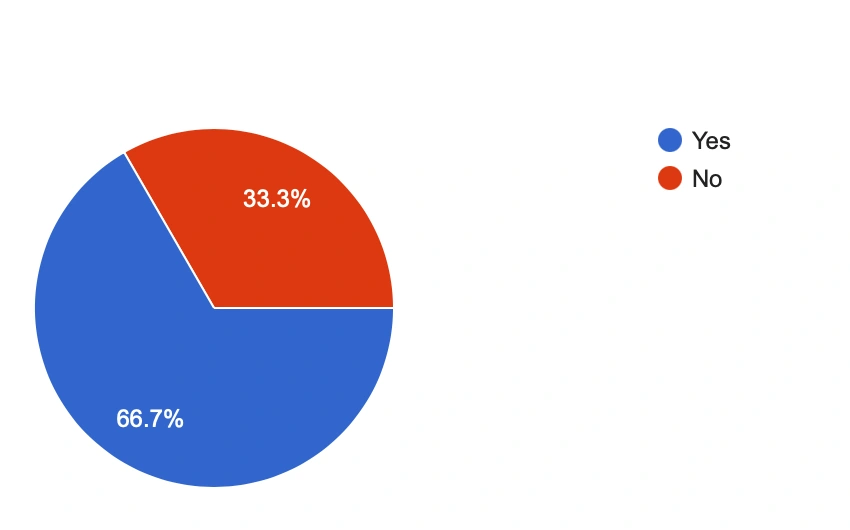
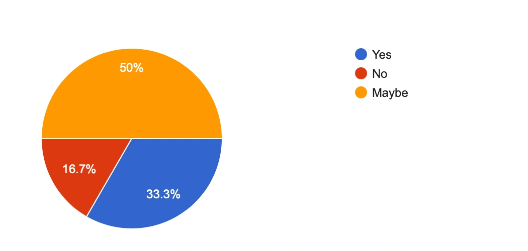
To validate the process for a firm visual design, the team decided to create surveys to properly gauge potential users and whether they would actually use a product similar to this. We used Google Forms to capture this empirical data. We gained over 20 responses from the survey through Slack and in person reach outs to my peers.
I've highlighted some key questions that I think are important in validating the product and the pain points that users are facing.

User Interviews
To gain better insight on the questions we posed in the survey, we decided to start conducting user interview with participants that we thought represented the persona we developed earlier. We conducted the interviews in person, and recorded the process using an iPhone with the user written consent.
The user who was interviewed was 30 a year old male. These are a sample of the questions that were asked.
Which of the peer-to-peer mobile payment apps, which one do you use the most??
"I use Cash app because I enjoy how easy it is to use to send money to friends and family."
Would you use a mobile payment app to send money to friends or family that live internationally?
"Yes, I would definitely use an app to transfer money to friends and family overseas, but it just needs to be easy and not complicated to use. I have had bad experiences in the past when sending money internationally. I'm scared I'm going to make a mistake in the process."
Concepts, Sketching, Wireframes
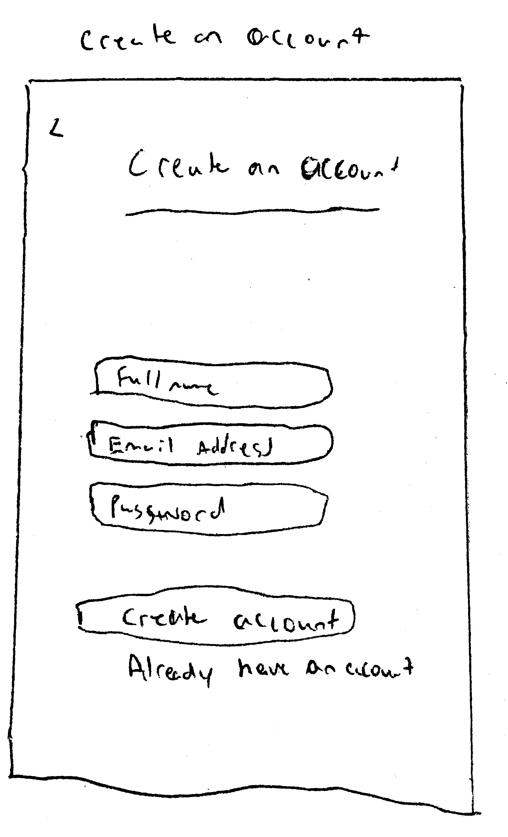
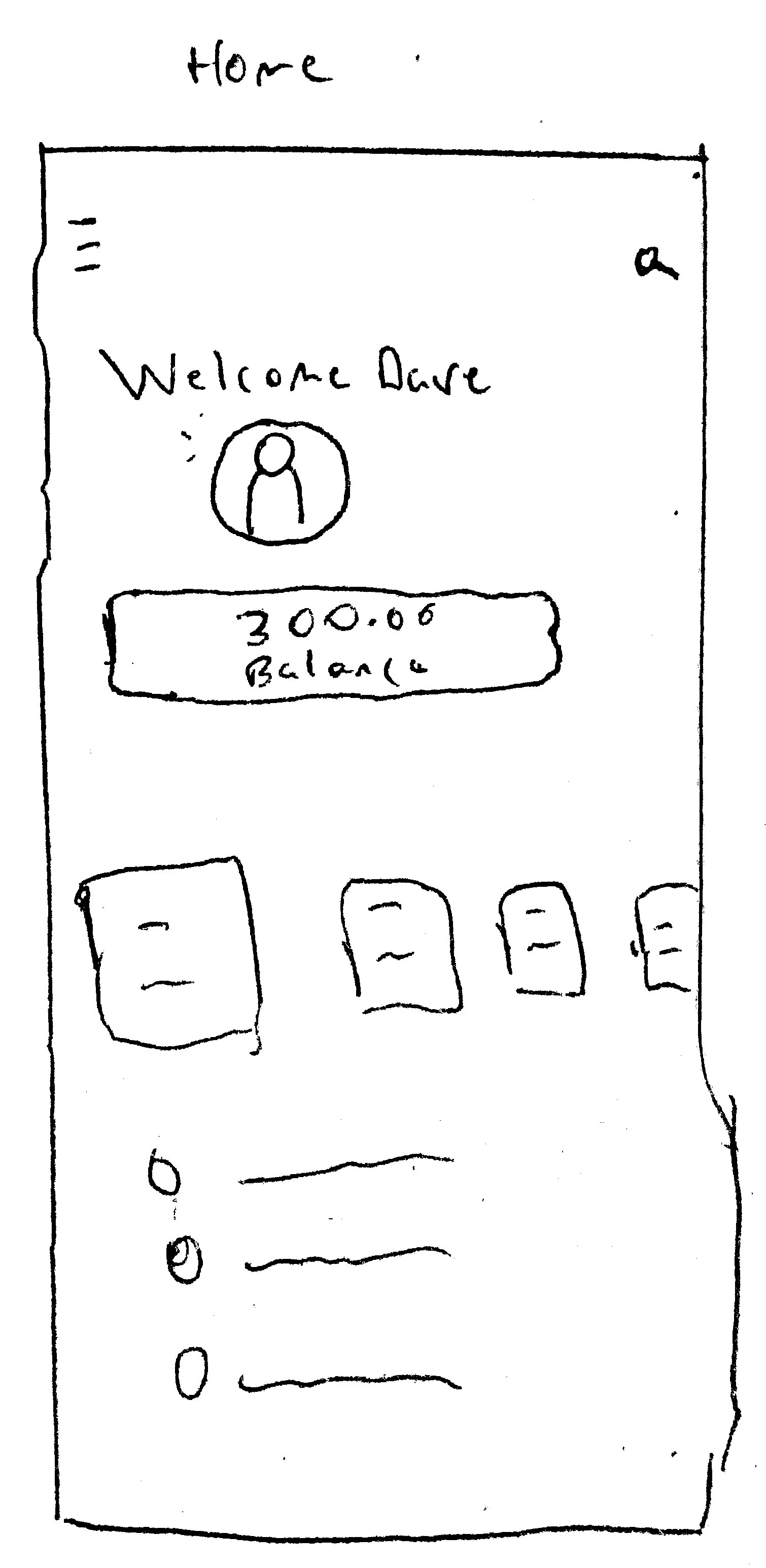
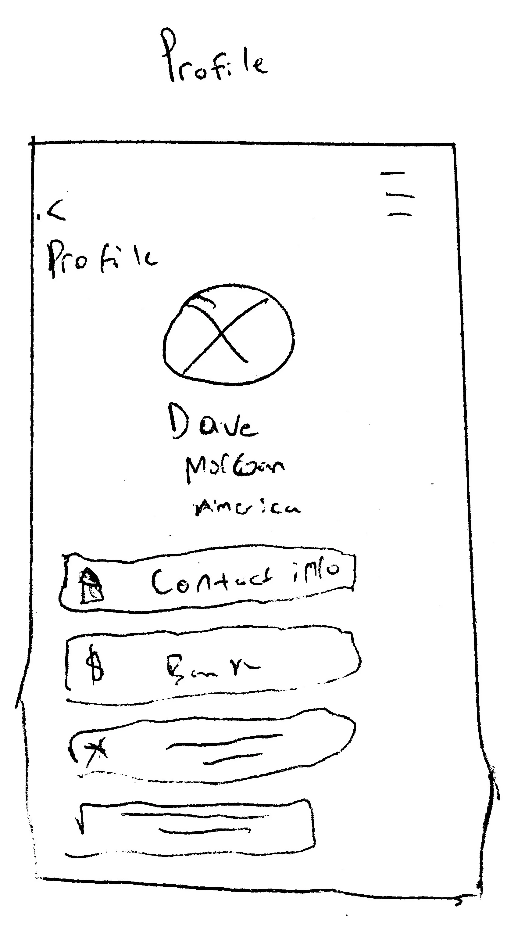
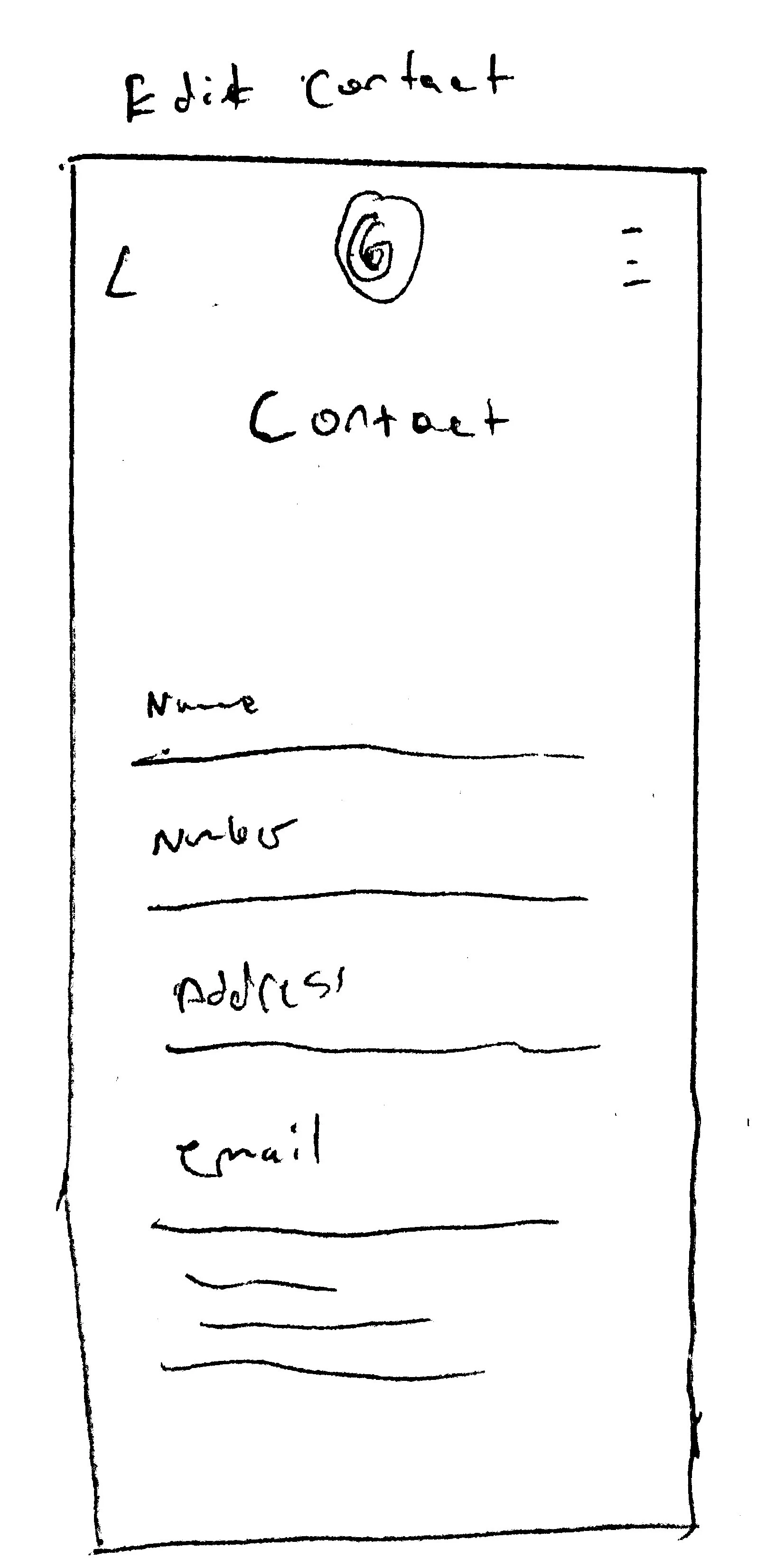
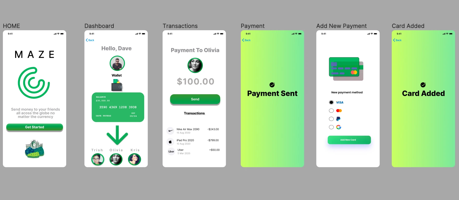
The next step was to begin the ideation process and putting together the nuts and bolts of the visual design. The site map and user flow allowed the team sketch out a minimal viable product with 5 of the essential screens that we thought we would look great with starting out the process flow of the app.

Visual Design + Prototype
The MVP of the sketches allowed us to create a more sophisticated process for our product that led to creating a prototype of low fidelity wireframe. The is allowed us to see interactions that would work best with our current user flow. Furthermore we then created the first iteration of prototype with some colors that we thought could work.
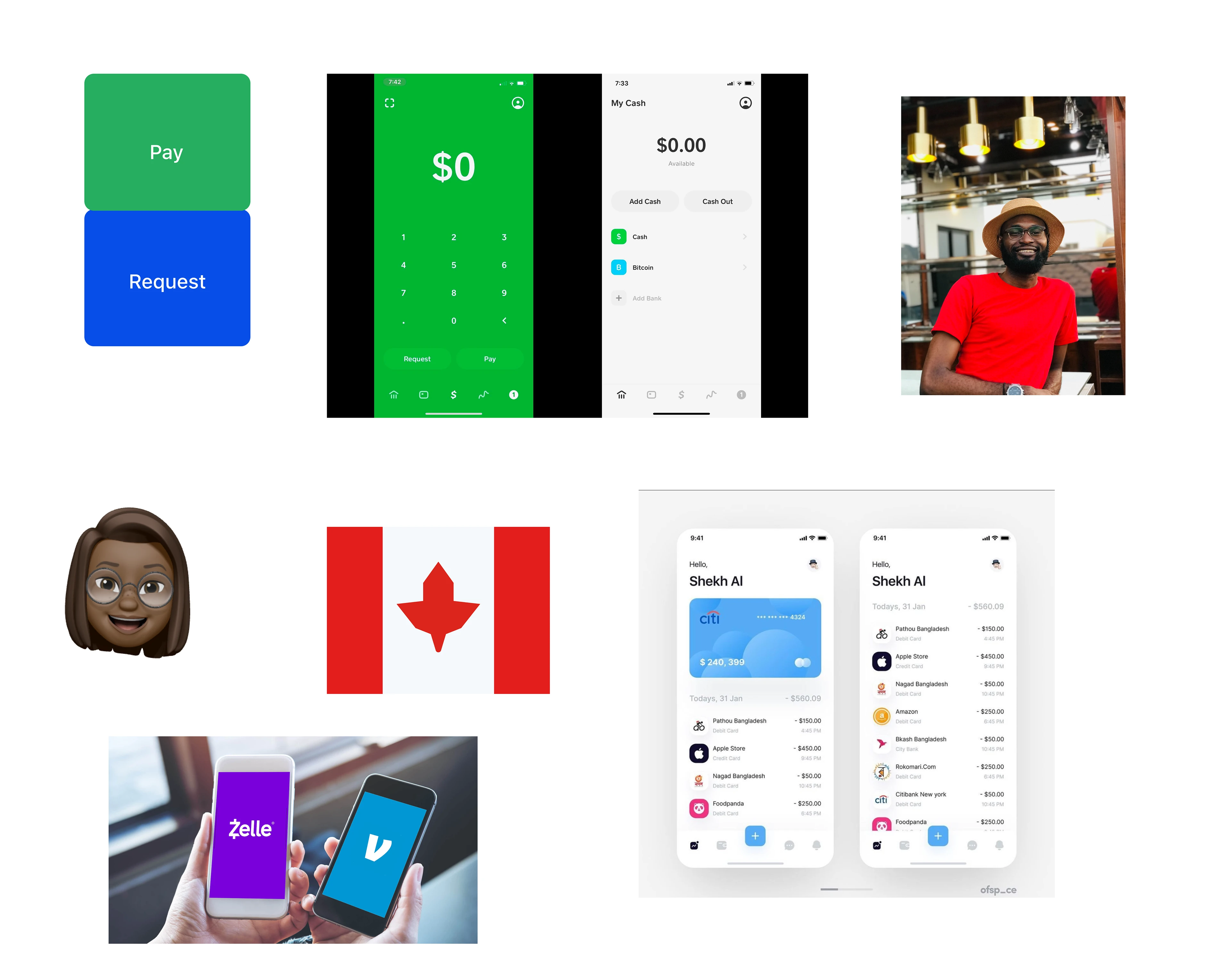
The first iteration didn't come out to our satisfaction, so we decided dig a little deeper into the process and create mood board. The mood board allowed us to focus more on the colors that could enhance the product in a simple and visual appealing manner.
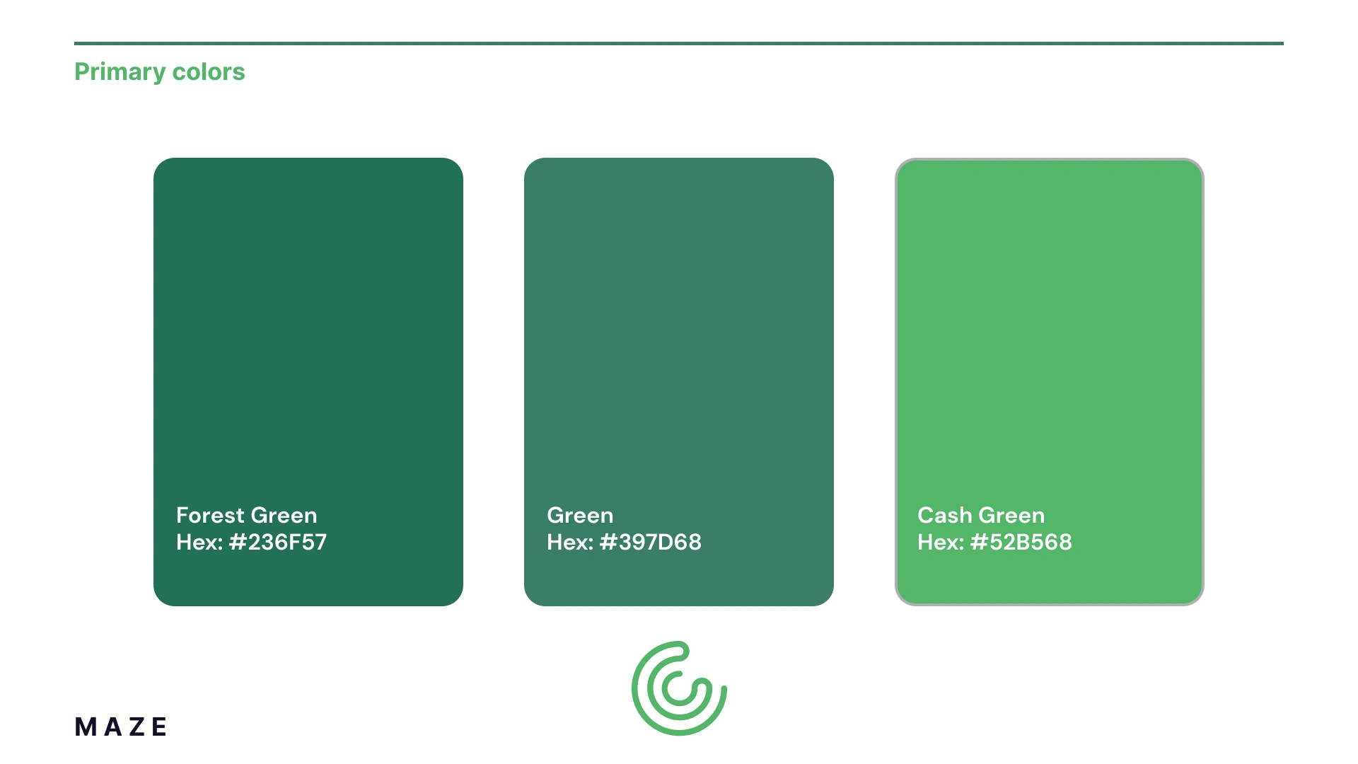
We created a color palette based on the aforementioned mood board that was developed. We chose colors that brought out out some of cool/calm emotions we want to invoke while the user was immersed in the product. We created logo iterations based off the colors with developed logo marks and logo types for the device.
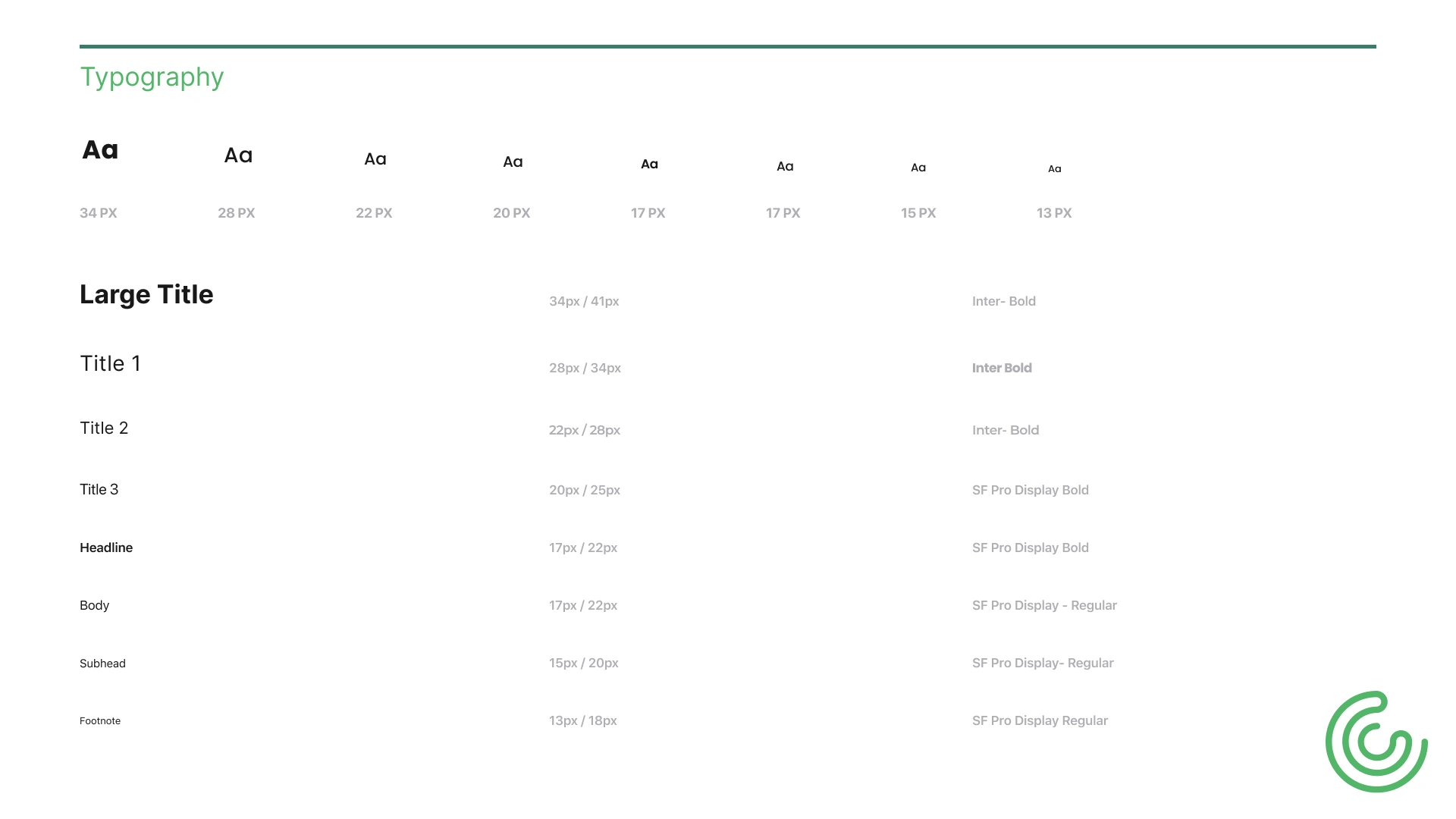
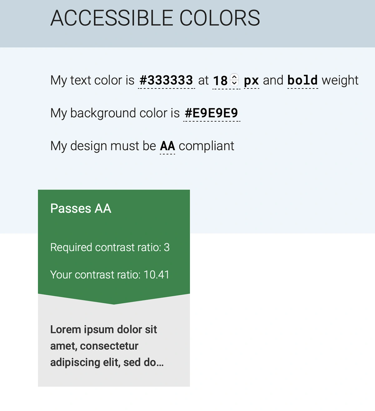
Furthermore, this led us into developing the Typography and picking fonts that were clear and accessible for users. We used a combination Inter and SF Pro Display. We ran these deliverable for the visual design https://accessible-colors.com and it passed on our first time without little adjustment needed.
Prototype 1 + 2
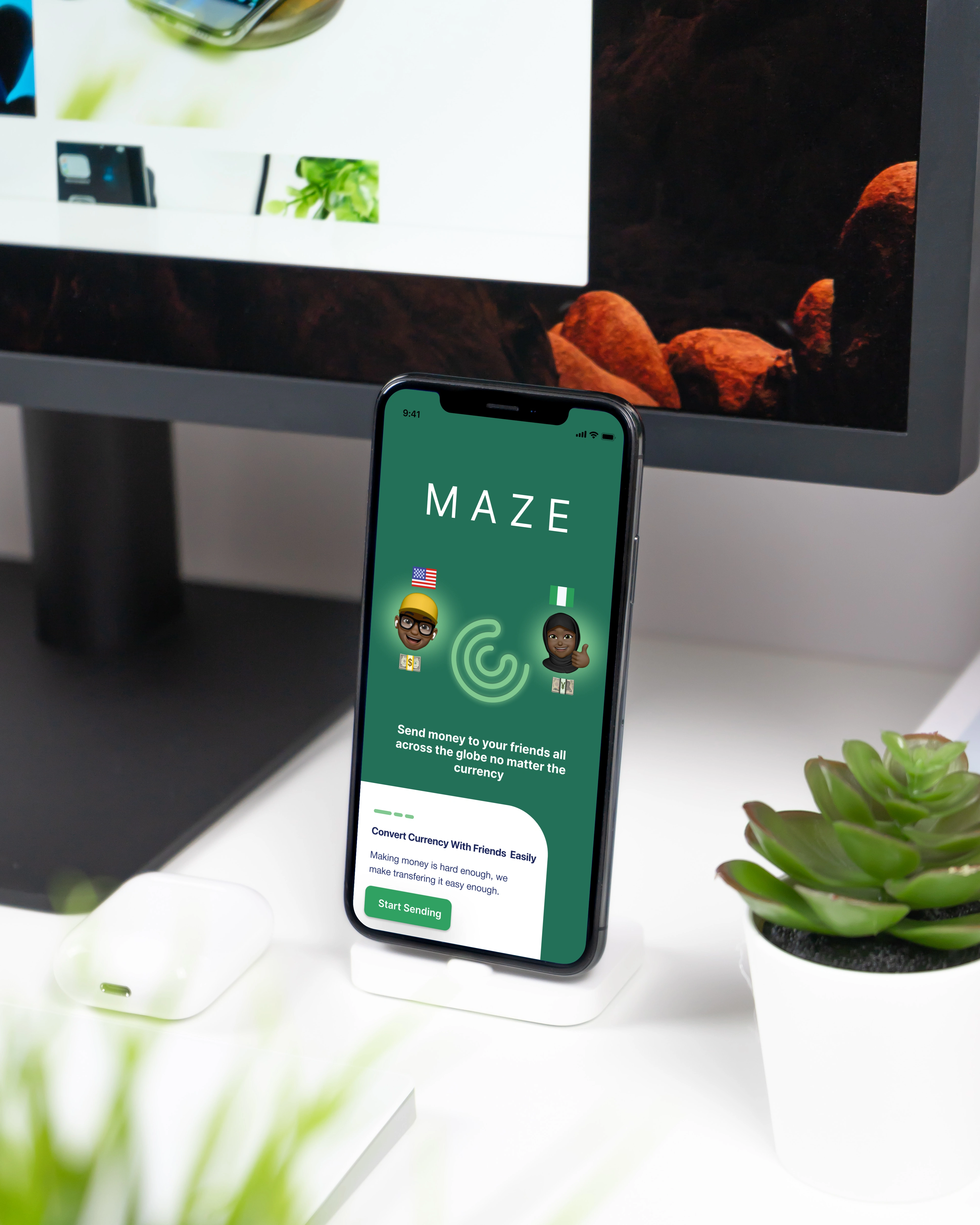
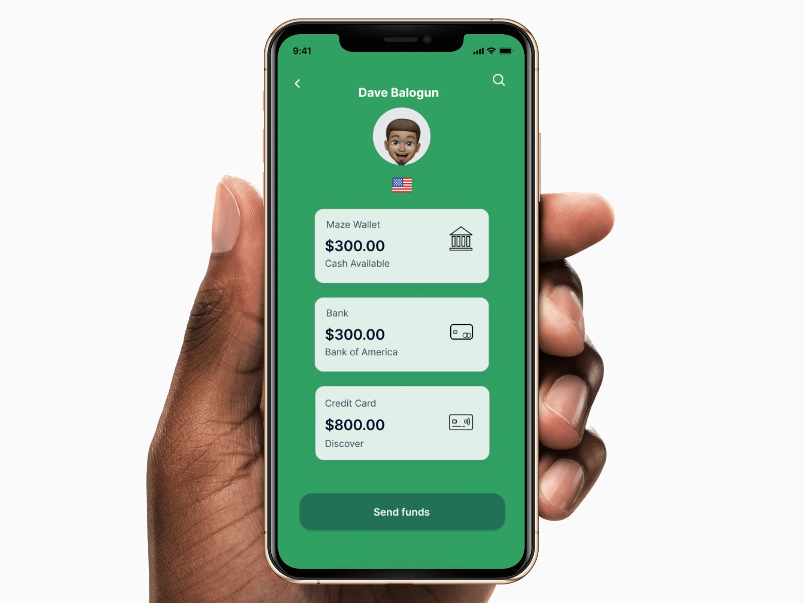
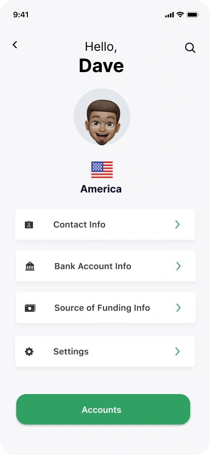
Once we had these segment in the visual design fleshed this gave us the opportunity to create a well developed prototype for our products. The interactions were vibrant and minimalistic and allowed the user to focusing on completing the task of converting currency and transferring funds to other users. Once we got to this point, it looked like we had a winner!
Test: Validation, Usability, Feedback
The final part that we thought was essential was generating some direct feedback on our product through extensive user testing. We decided to in person testing and gained written consent from the person to conduct the research.
We used Figma mirror, a timer, and recorded the interaction with an iPhone to adequately capture the first time usage. Below we listed some of the thoughts from the user who was a black male in their mid 30's:
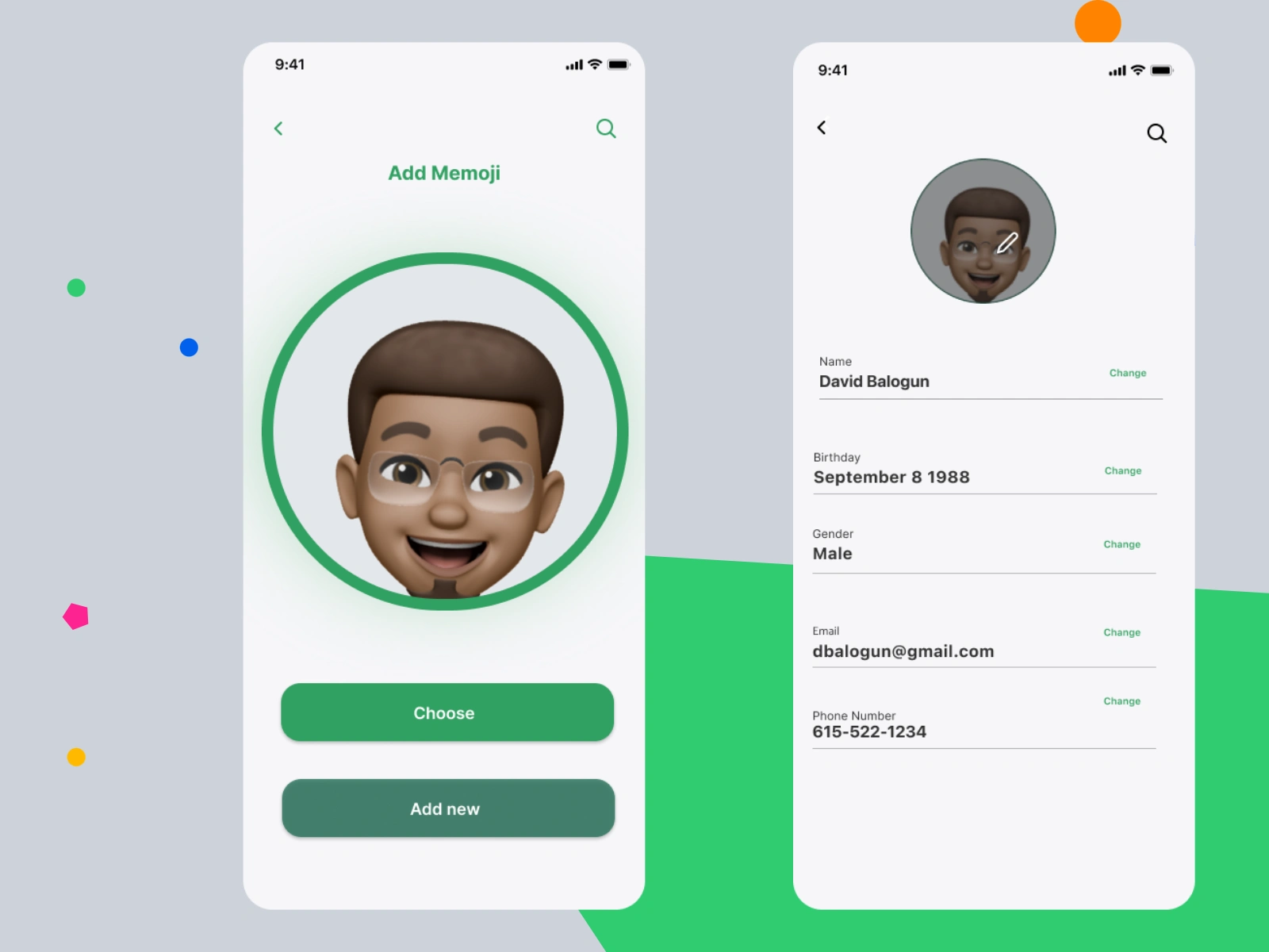
On the screen for the add memoji, they wanted to see more options for memoji's, even through its prototype, they expected to see a row of options to pick through before they got a final version.
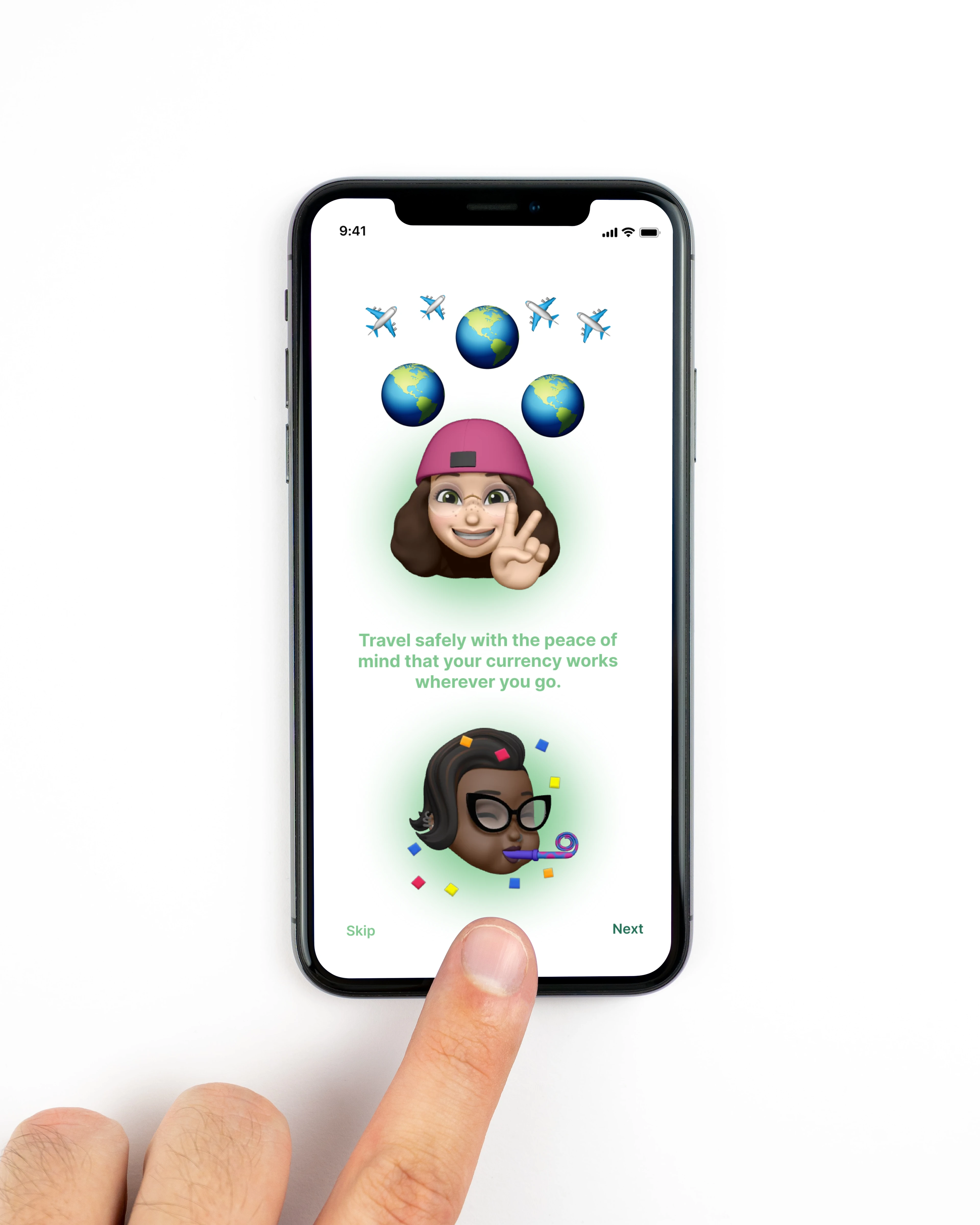
Additionally, he thought there was an opportunity to speed up the flow of sending cash and converting the currency In the first screen, He wanted to immediately send cash and have some of the onboarding saved until after you make your first transaction.
My final thoughts on the process was that it was extremely exciting bringing this idea to life. We definitely needed work once we got to the visual design and getting something that accessible and as well as appealing.
However, one of the things we will need to work on is simplifying the onboarding process and allowing user to send fund a little quicker. We hope to add more definition to the profile screen with additional features.
Thank you for your time! Below I have the prototype embedded so that you have the ability interact with it. Hit the contact form if you have any further questions!
Like this project
Posted Jul 28, 2023
The goals are to accurately convert the currency for the user in a way that is ease of use.
Likes
0
Views
6
Clients
Freelance
