Alera Group/Give A Fresh Start: Web Design + Strategy
Objective
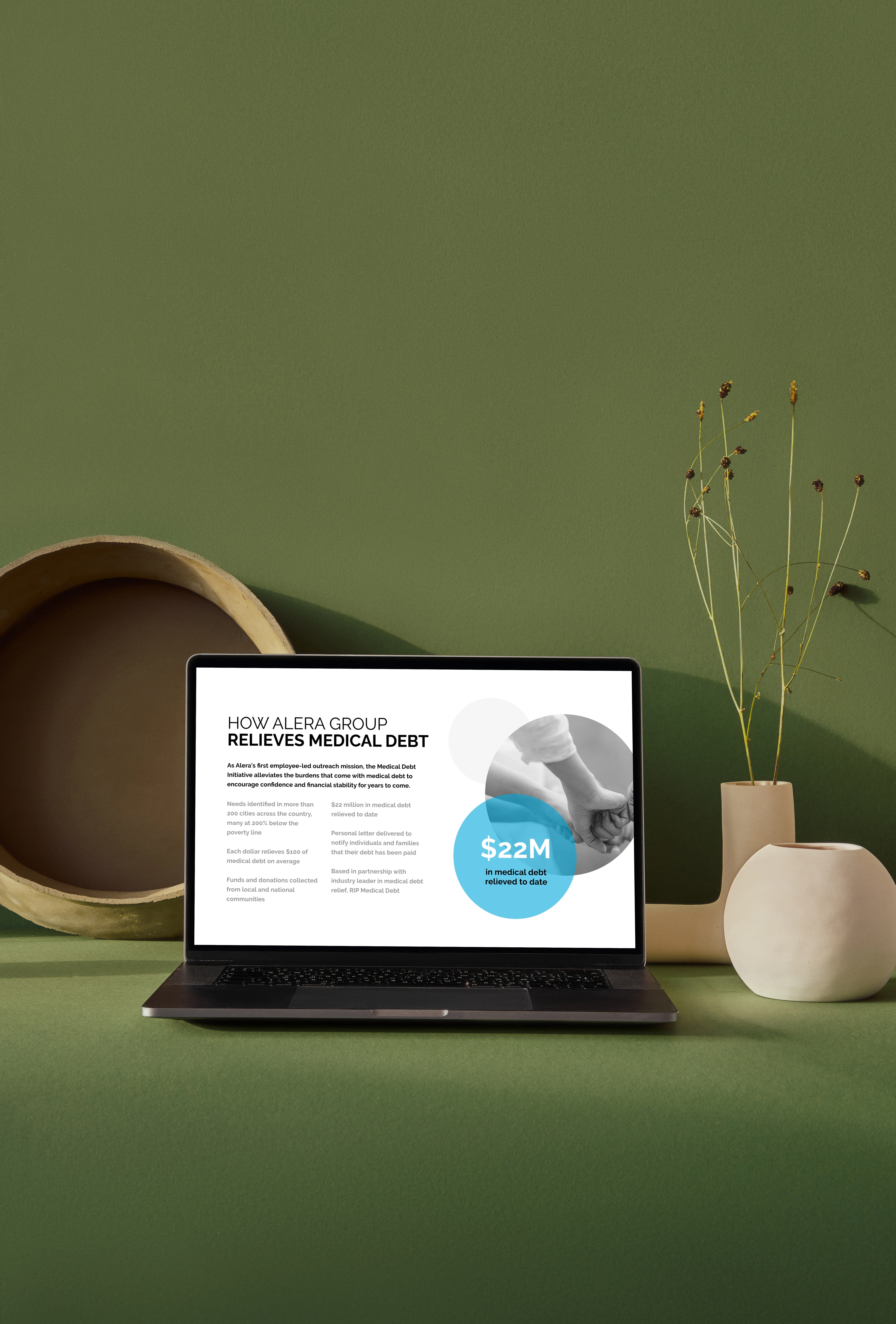
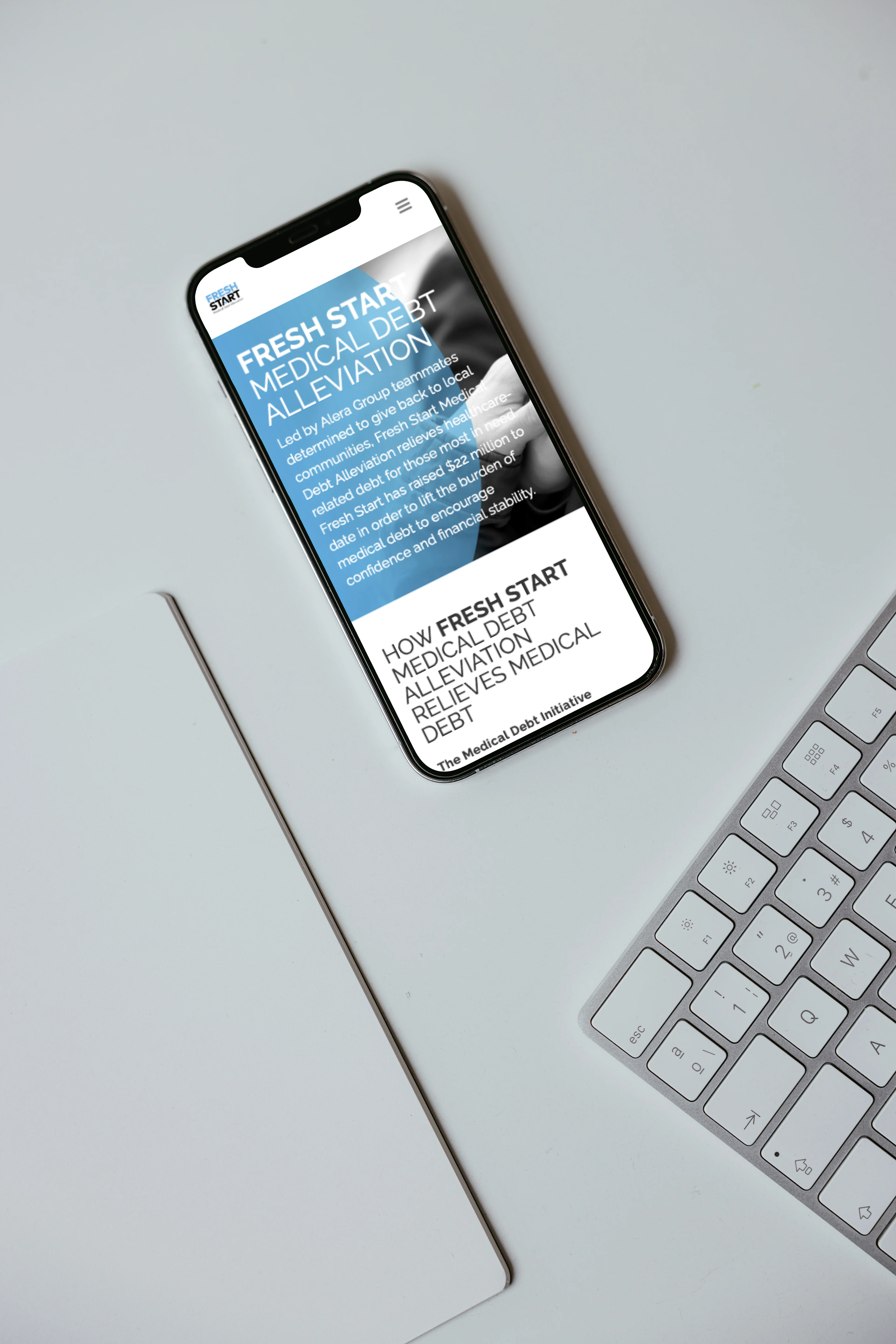
Alera employees worked directly with the debt-forgiveness nonprofit, RIP Medical Debt, to help individuals and families with healthcare-related bills in more than 200 cities located in 35 counties across the country.
RIP is able to purchase medical debts for those most in need in bundled portfolios for a fraction of their face value. One dollar donated relieves $100 of medical debt on average.
Goal
The goal for creating this micro site was to aid the Alera Group stakeholders in creating a website that would direct their employees to donating funds aimed at alleviating medical debt for people in need.
Content Map + Wireframes
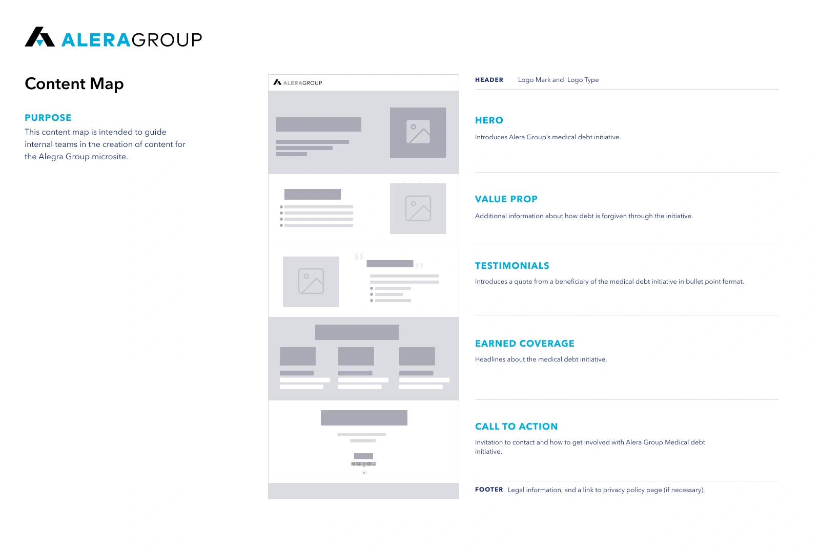
The first step in designing the micro site was to create a content map that would help the team on how we would visually structure the information on the page. Additionally in order to take a closer look at the actual dimensions of the layout, we created wireframes to accompany the content map.

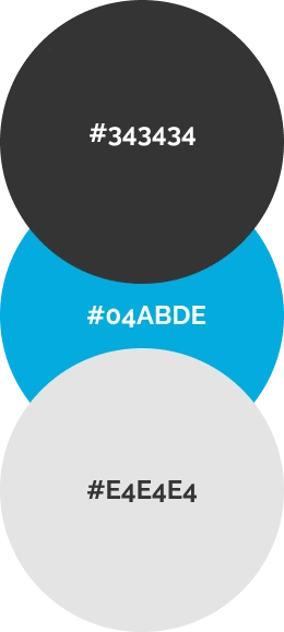
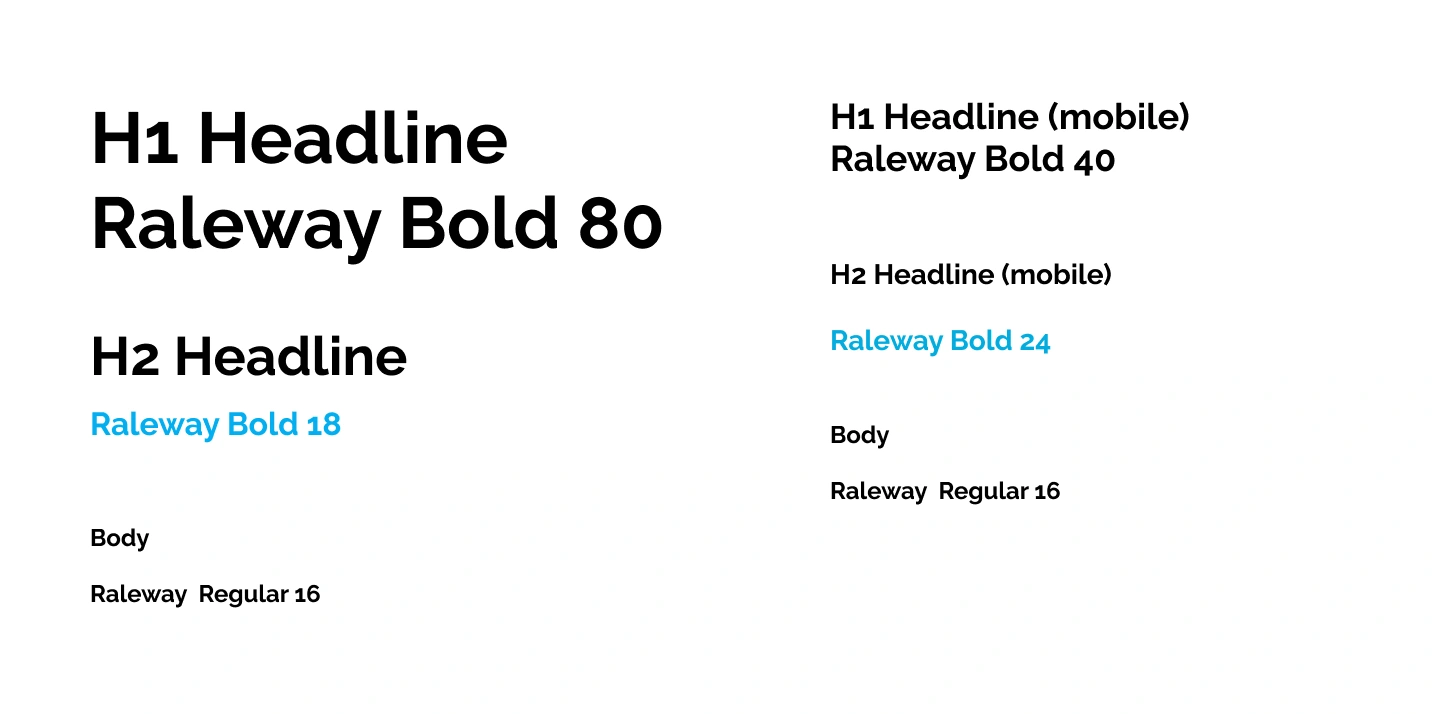
Colors + Text Styles
The stakeholders wanted us to stick closely with the branding that they had set in place. We continued to use the current branding in the Alera Group website for the microsite as well. Later on this posed a challenge when we actually began creating iterations of the actual design.
Design Iterations
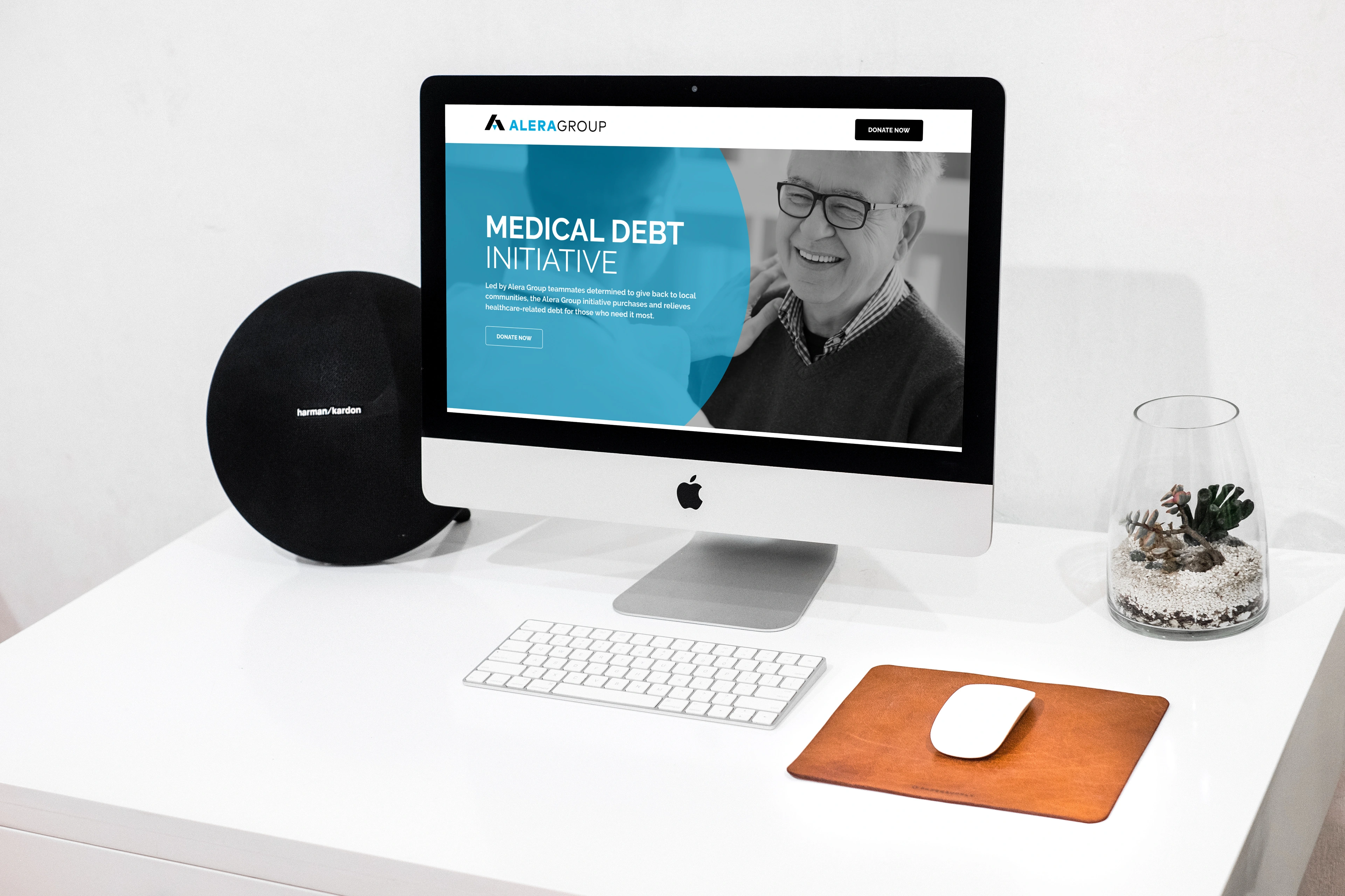
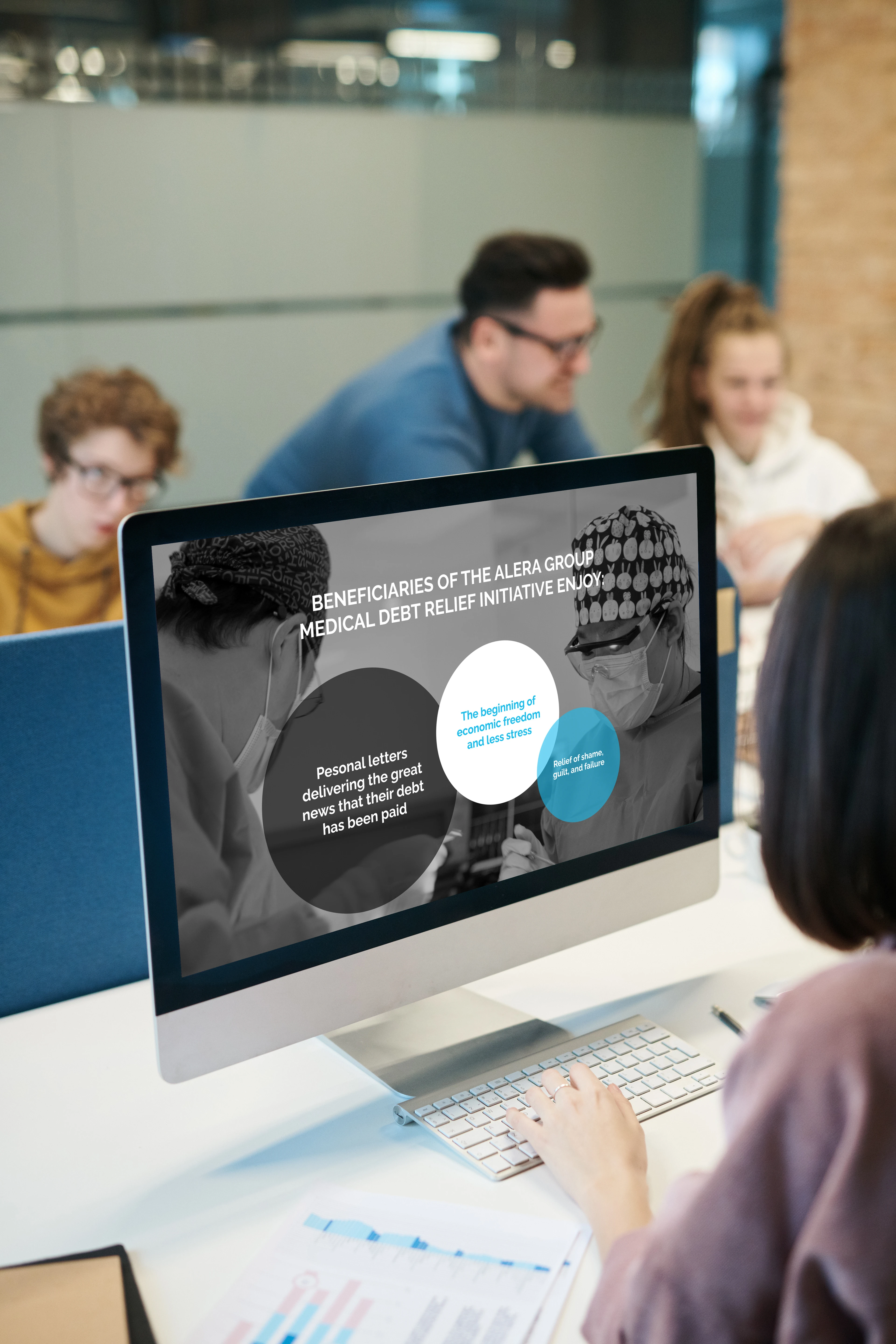
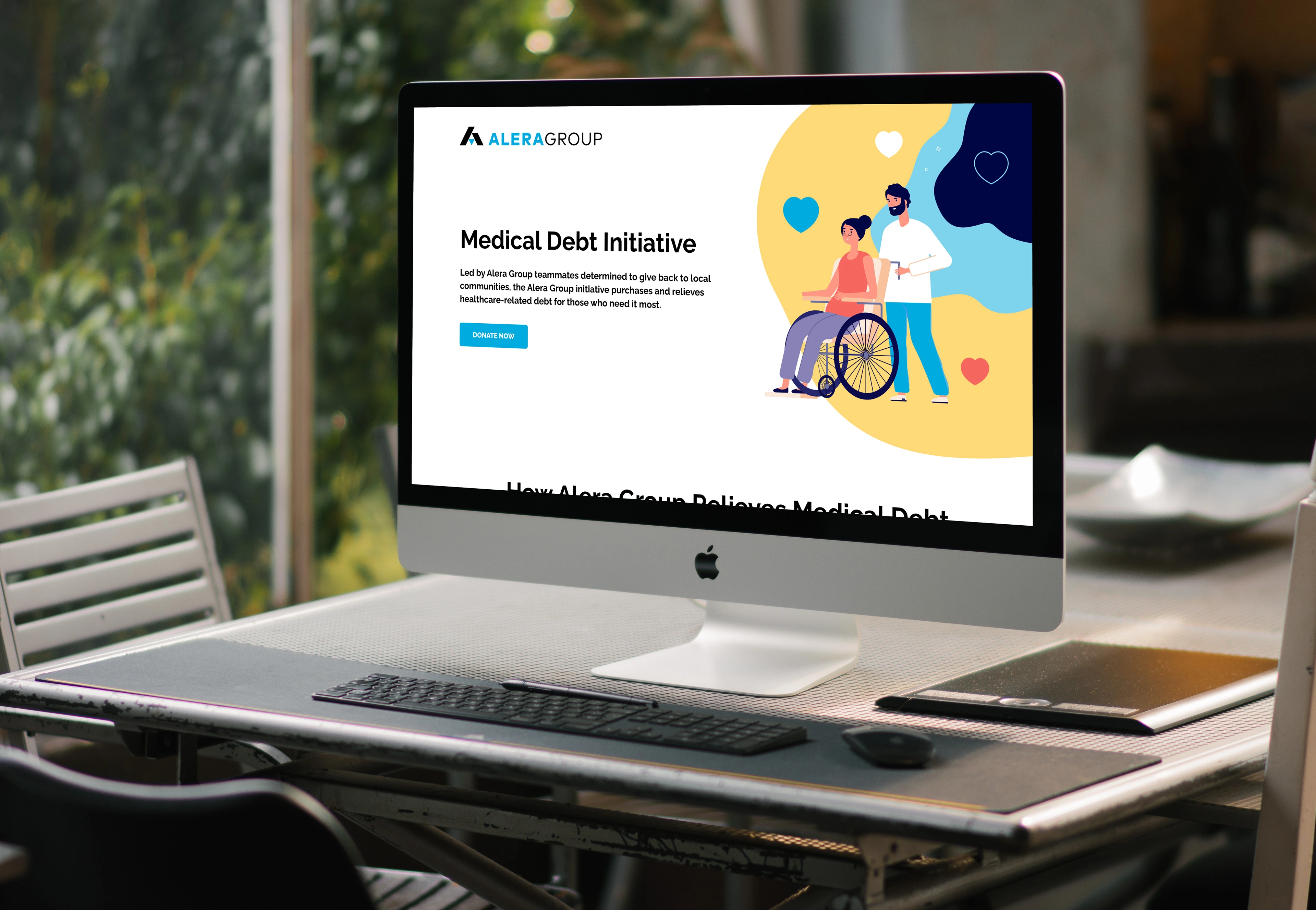
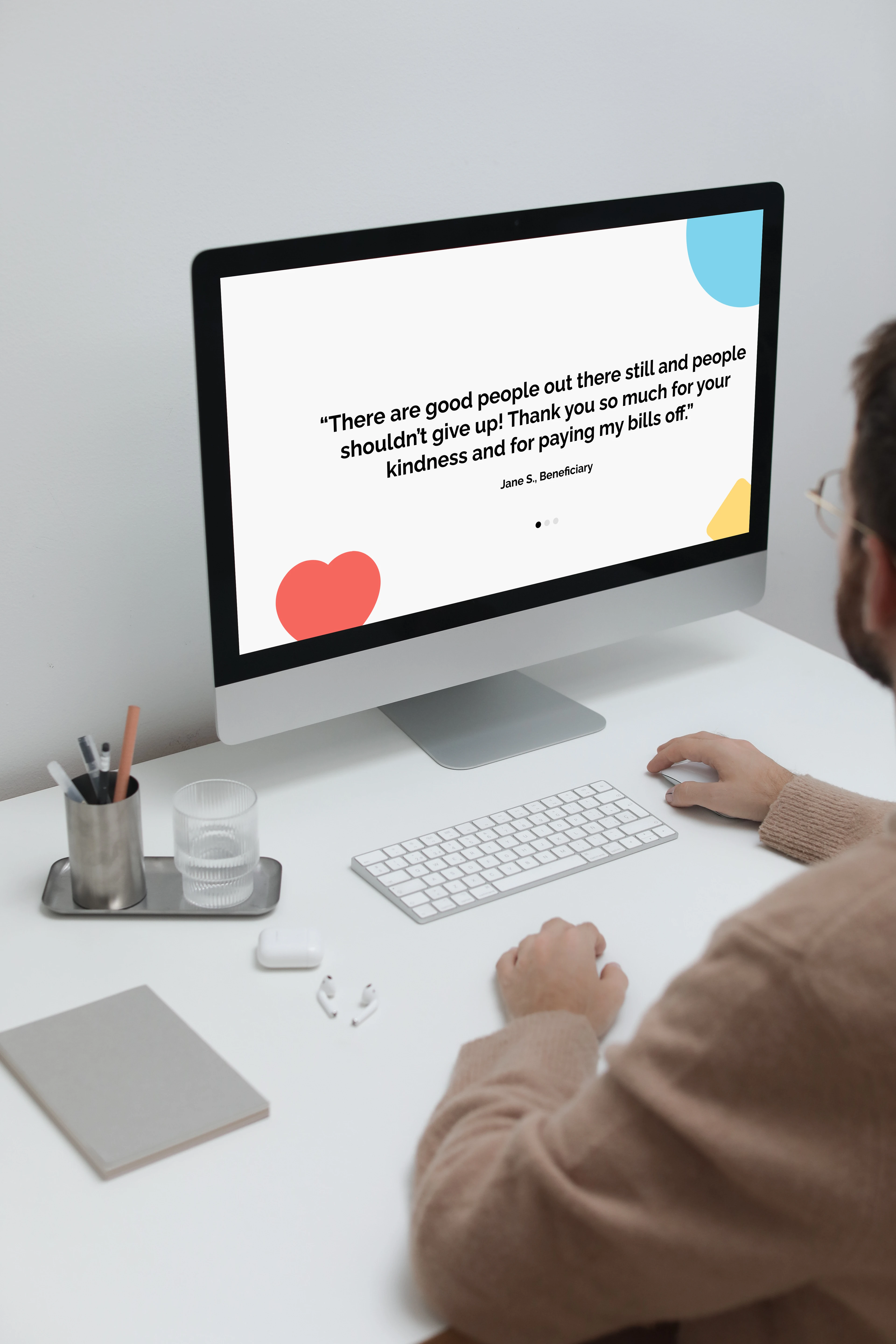
We decided to come up with two different mockups so that we had different options for the Alera Group stakeholders to choose from. We wanted one option to to have a lighter tone and to be more vibrant so we decided to use illustrations and use black and white images and a more serious and corporate tone for another version.


After going through a few different mockups we settled finally on versions that had paired down and muted elements.


Decisions
When presented to the Alera Group stakeholders we expressed the difference in the 2 directions. I sensed during the meeting that the version with illustrations may have been preferred, however, the minimalistic direction seemed to fit the brief they gave us and the branding of their current website.
A couple of weeks went by and we received word from the Product Managers that employed a more serious tone was the version that was chosen. Both me and the Creative Director were devastated that the version with the lighter tone and illustrations wasn't chosen. However, this provided valuable lesson of nature of the design process.
Development
I worked solely with the developers in Jira to make sure that the designs were matching what we created in Figma. Also, one of the key things that needed to be done was to make sure that the mobile version of the micro site was as responsive as possible. I worked diligently with the developers to make sure we created an ease of use experience.

Lessons learned
I learned to pivot as a designer when you are trying to balance meeting the stakeholder needs and also trying still create a great design, sometimes its not about what you want as a designer. However I do wish I had more time to maybe have created a 3rd option that combined elements from the illustrations and elements from the more conventional version being able to pitch it to the team.
Overall it was a fun project for a great cause and I would love to take on more non-profit ventures like this in the future.
Like this project
Posted Jul 28, 2023
The goal for creating this micro site was to aid the Alera Group stakeholders in creating a website that would direct their employees to donating funds.
Likes
0
Views
11
Clients

GS&F
Alera Group Orange County

