Full Brand Redesign and Marketing Collateral for Daryl-Evans
Andre Somov
Case Study: Daryl-Evans Mechanical Ltd.
Brand Identity, Stationery System, Pocket Folder & Corporate Brochure Design
Overview
Daryl-Evans Mechanical Ltd., a long-established mechanical contracting firm in British Columbia, needed a unified, modern, and credible visual identity — one that reflected their reputation for technical expertise, reliability, safety, and progressive thinking.
My mandate was to redesign their logo, build a complete brand system, and produce a full suite of marketing collateral, including stationery, a pocket folder, and a multi-page corporate brochure.
1. Logo Design & Branding
Challenge
The existing identity lacked consistency and didn't fully reflect the company's scale, professionalism, or forward-thinking nature. Daryl-Evans needed a brand that communicated confidence, structure, and technical precision—something clean, modern, and instantly recognizable across print, vehicles, uniforms, and job-site signage.
Solution
I created a refreshed visual identity anchored by a strong, engineered wordmark. The new logo utilizes a bold typeface with a modern industrial character, reinforced by a signature blue–green colour palette.
This palette became core to the identity system and is visible consistently throughout all marketing materials, including the pocket folder and brochures, where clean bands of blue and green define the brand's hierarchy and rhythm (visible on the cover designs and interior spreads).
The brand direction also leaned heavily into Daryl-Evans' positioning: "Progressive by Nature — Excellence in People and Products", a message consistently integrated across the collateral, including full-page spreads and section headers in the brochures.
Press-ready files for printing the pocket folder and the brochure.
2. Marketing Materials
A. Stationery System
The stationery suite (business cards, letterhead, envelopes) extended the brand language established in the logo redesign. Clean grids, strong alignment, and the green/blue banding system created cohesion and professionalism throughout the set.
The result was a corporate stationery package that felt modern, practical, and unmistakably Daryl-Evans.
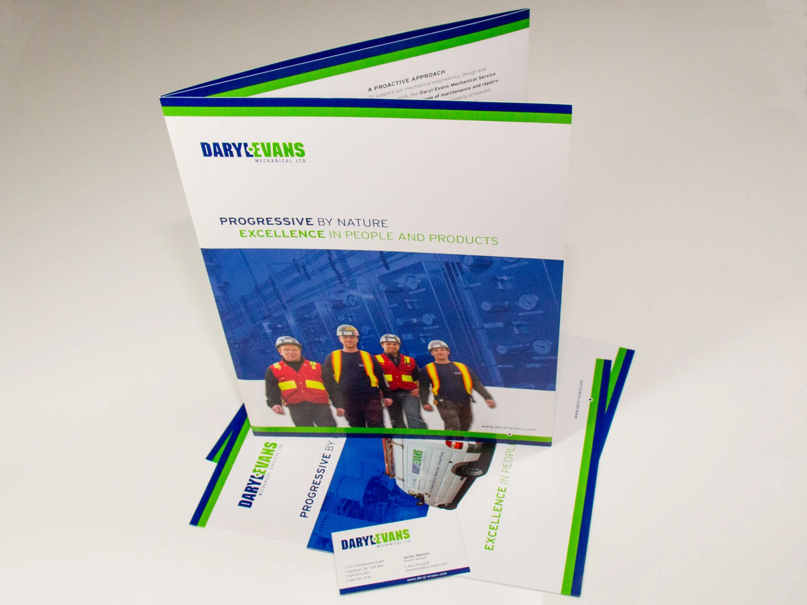
B. Pocket Folder Design
See reference: Pocket Folder
The pocket folder needed to function as an all-purpose presentation tool for proposals, project packages, and field documentation.
Key Creative Decisions
Full-bleed photography showcasing real technicians, equipment, and project sites adds authenticity (front and back panels).
Brand colour bands across the top and bottom create a strong visual spine and unify the document.
The interior spread (page 1 of the PDF) features structured sections on Service, Maintenance, Safety, and Company Values, making the folder itself a branded information piece rather than just a container.
The folder reinforces the company's commitment to people, professionalism, and technical excellence.
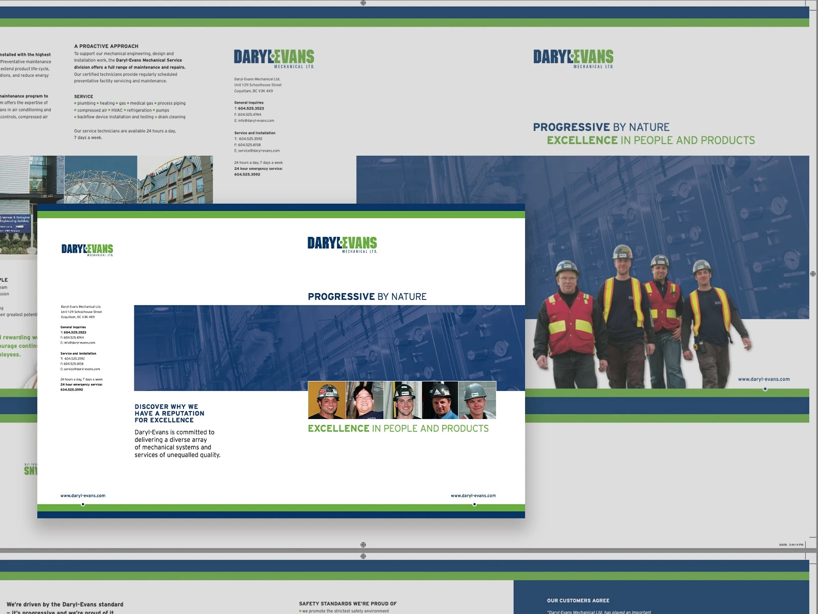
C. Corporate Brochure
See reference: Main Brochure
The company brochure was the core deliverable—a full corporate profile used for business development, RFP responses, and client onboarding.
It needed to communicate the breadth of their capabilities while humanizing the brand through the stories and faces behind the work.
Design Approach
Cover: Strong banding, the tagline "Progressive by Nature," and a wide photographic panel create an immediate sense of professionalism and structure (page 1).
Interior Layouts:
Consistent use of the blue overlay panels to unify imagery and emphasize the technical environment (page 1–2).
Multi-column grids for clarity and easy reading.
Large photo sequences across spreads (such as the series of project buildings on pages 2–3 and 6–7), reinforcing the depth of Daryl-Evans' portfolio.
Human-Centred Imagery:
Real employees appear throughout—on job sites, performing installations, and in portrait-style images. This supports the company's messaging around people, training, safety, and culture (pages 4–7).
Content Integration
The brochure strategically organizes content into clear sections:
The Daryl-Evans Standard
Progressive Approach & Tailored Solutions
Services, Maintenance & Repairs
Safety Standards
Affiliations & Certifications
Customer Testimonials
The result is a brochure that presents Daryl-Evans as a capable, trustworthy, technically advanced, and people-focused mechanical contractor.
Outcome
The completed branding system and marketing materials gave Daryl-Evans a powerful, cohesive identity across all print and presentation touchpoints.
Impact
A recognizable visual brand with consistent application across all materials
Stronger credibility in proposals, RFPs, and client presentations
Marketing collateral that reflects the company's core message:
Professionalism, safety, technical excellence, and a people-first culture
The combination of a logo redesign, stationery, a pocket folder, and a 7-page corporate brochure established a long-lasting brand foundation that continued to support Daryl-Evans' growth and industry reputation.
Like this project
Posted Dec 5, 2025
Brand identity, stationery, pocket folder, and brochure design for Daryl-Evans Mechanical, showcasing a modern, credible, and people-focused visual system.