Custom design brochure following strict branding guidelines
Andre Somov
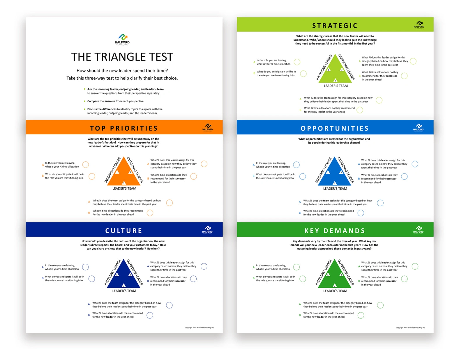
Designing The Triangle Test Brochure for Halford Consulting Inc.
Client: Halford Consulting Inc.
Project: Design of a multi-page leadership tool + marketing brochure
Role: Graphic design, layout strategy, visual system development
Overview
Halford Consulting needed a polished, professional piece that could serve two functions at once:
A client-facing marketing asset that communicates their structured, strategic approach to leadership transition.
A practical working tool used directly by leaders, teams, and consultants during engagements.
The challenge was clear—create something visually strong enough to represent the brand publicly, yet structured and functional enough to be used as an assessment workbook inside real consulting sessions.
Design Objectives
Present the Triangle Test framework in a clear, simple visual format.
Build a layout that allows leaders, outgoing leaders, and teams to compare perspectives easily.
Use color, spacing, and hierarchy to clearly divide the five core categories:
Top Priorities, Culture, Strategic, Opportunities, Key Demands
Create a repeatable visual system around the triangular model.
Ensure the piece works digitally (PDF) and in print.
Design Approach
1. Visual Hierarchy & Structure
Each section required equal visual weight but a distinct purpose. I designed a modular grid so every page followed the same pattern:
Headline band with a unique color for instant category recognition
A central triangle graphic showing the three stakeholder perspectives
Supporting questions are arranged with consistent spacing and alignment
Ample white space to avoid cognitive overload during real-time use
This gave the brochure a clean, predictable rhythm and made it effortless for users to navigate.
2. The Triangle System
The triangle graphic is the centrepiece of the framework.
I refined it so each point clearly represents one group — incoming leader, outgoing leader, leader’s team.
Colors and labels remain constant across pages to reinforce familiarity and reduce interpretation errors.
3. Brand Alignment
The piece reflects Halford Consulting’s brand:
Confident color palette
Sharp typography
Minimalist aesthetic
Professional, structured layout
The brochure doubles as a marketing tool because it communicates expertise through both design clarity and conceptual depth.
4. Practical Usability
This isn’t just something to look at — it’s something to work with.
Every question is arranged to capture written responses or guided discussion notes.
Circles act as visual anchors for scoring, prioritization, or conversation prompts, depending on how the consultant uses the tool.
5. Print + Digital Flexibility
I designed the final assets to work in multiple formats:
High-resolution print layout with bleed
Screen-optimized PDF
A design system that scales easily for slide decks or workshop screens
Outcome
The finished brochure is a polished, multi-purpose asset that enhances Halford Consulting’s brand while delivering a functional leadership assessment that consultants can use during client engagements. It positions the firm as structured, thoughtful, and methodical — mirroring how they guide transitions and leadership development.
Halford Consulting now uses The Triangle Test brochure in their onboarding conversations, leadership coaching sessions, and marketing outreach. The unified visual system makes the tool memorable and easy to adopt, strengthening both the consulting workflow and the client’s understanding of the framework.
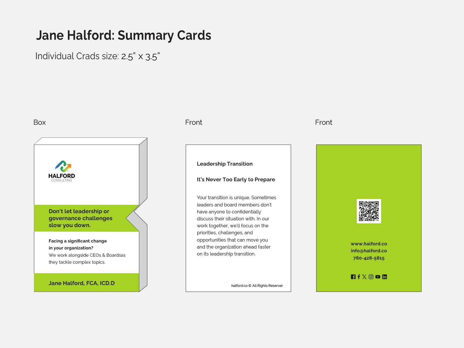
Summary Cards
Another print design for Halford Consulting.
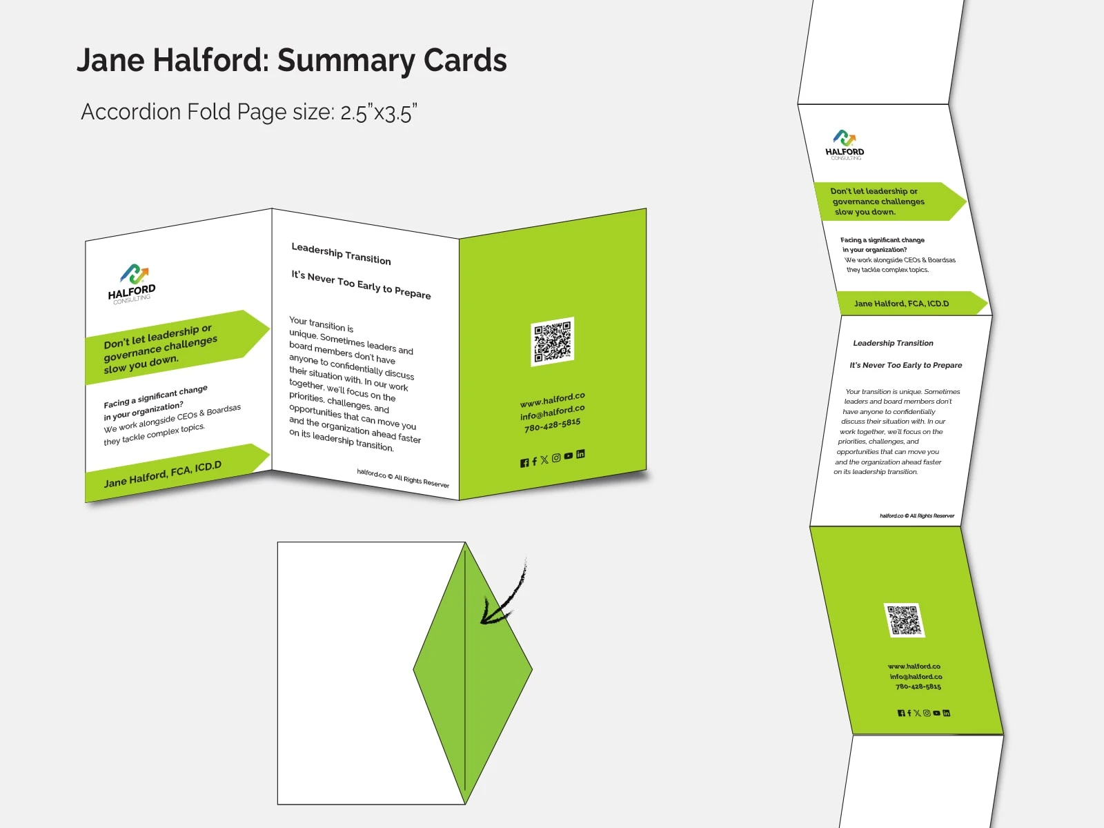
Design option 1.
Design option 2.
Like this project
Posted Dec 5, 2025
Designed a marketing and leadership brochure in a high-resolution print layout with bleed and a screen-optimized PDF