mPokket Product Branding and Logo Design
Sourav Maity
🎨 mPokket Brand Identity Design
This project showcases the brand identity design system for mPokket, a fintech platform. The goal was to create a strong, modern, and trustworthy brand language that communicates confidence, accessibility, and innovation — aligning with the company’s mission to empower young professionals and students.
🎯 Key Deliverables
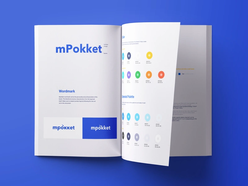
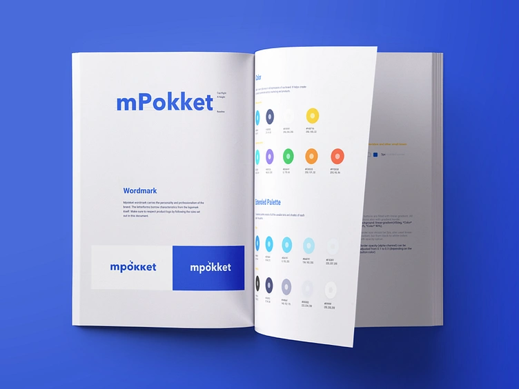
Logo & Wordmark: A clean, geometric wordmark built to reflect reliability and modernity. Subtle typographic refinements were made to ensure balance and brand recognition.
Color System: Developed a primary palette centered around shades of blue to evoke trust and technology, complemented by a secondary palette for flexibility in marketing and UI applications.
Typography: Defined a clear type hierarchy combining modern sans-serif fonts for digital usability and readability across platforms.
Brand Guidelines: Created a comprehensive brand book detailing logo usage, clear space, color codes, typography rules, and extended applications for print, digital, and social media.
Visual Consistency: Ensured the brand identity works cohesively across app interfaces, marketing assets, and communications.
🧠 Design Approach
The design system focuses on clarity, confidence, and adaptability. By simplifying the visual elements and maintaining consistent spacing and contrast, the brand achieves a clean and contemporary aesthetic — one that scales seamlessly from digital screens to print materials.
💼 Tools Used
Figma • Adobe Illustrator • Photoshop • InDesign
Like this project
Posted Nov 7, 2025
Brand identity for mPokket. The delivery included the logo, wordmark, color palette, recommended typeface family, etc.