Brand Reimagination of Tapal for Gen Z

Naveera Aftab


What If Tapal Was a Gen Z Brand?
A few weeks ago, a thought crossed my mind: What if Tapal, the iconic Pakistani tea brand, was reimagined for Gen Z? Known for its deep-rooted connection to family, tradition, and chai culture, Tapal has historically appealed to an older demographic. But with shifting preferences among younger audiences, I wanted to explore what it could look like if Tapal spoke directly to Gen Z.
This project is a speculative rebrand that keeps the essence of Tapal intact- its core product, black tea- but updates the experience, aesthetics, and messaging to resonate with a younger, more digitally native audience.
Concept Overview
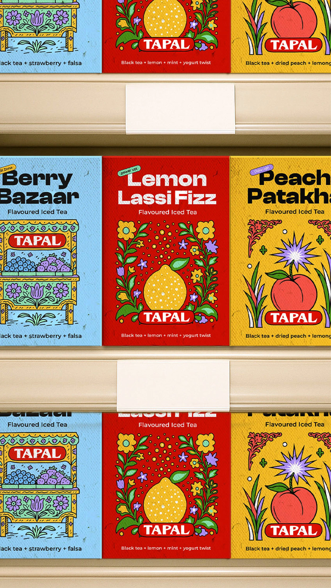
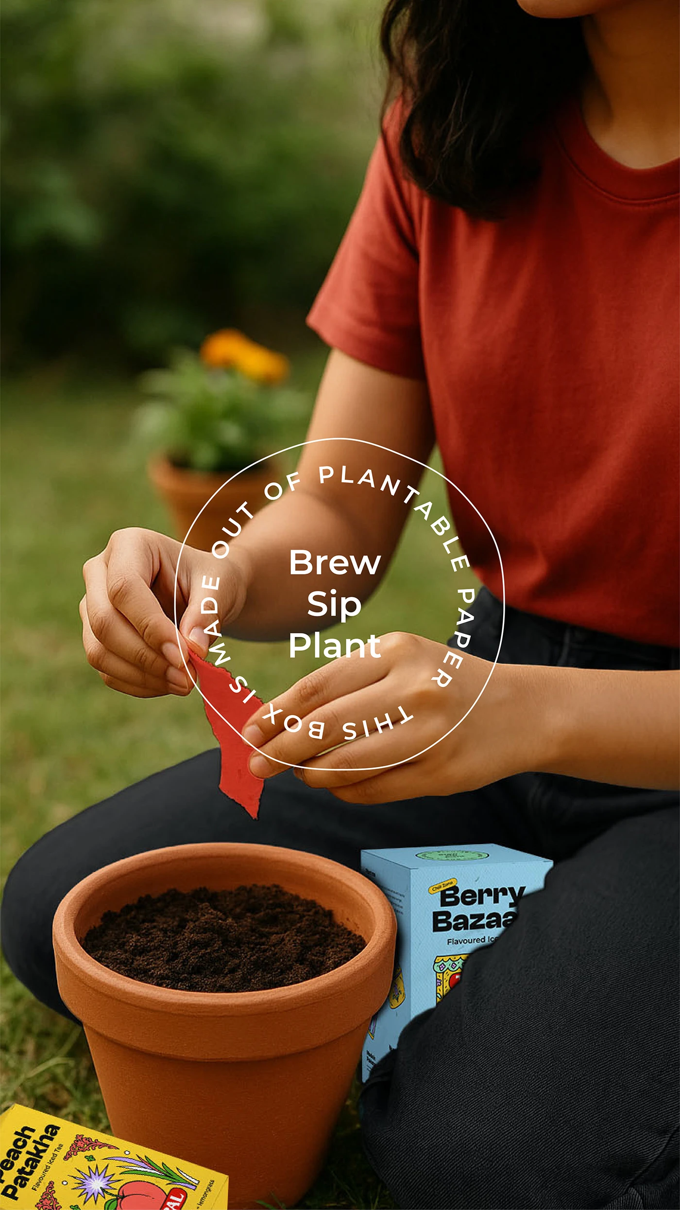
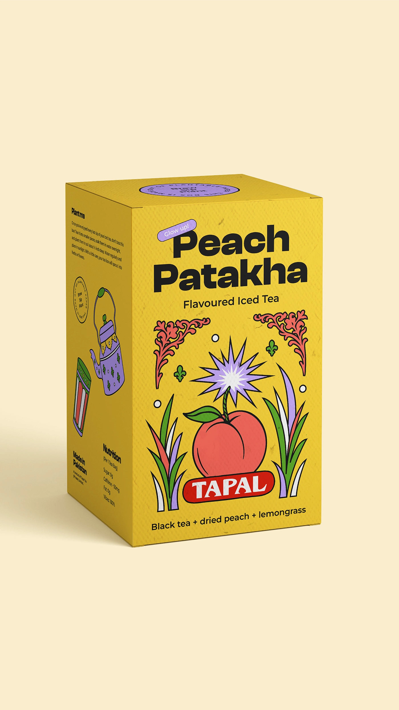
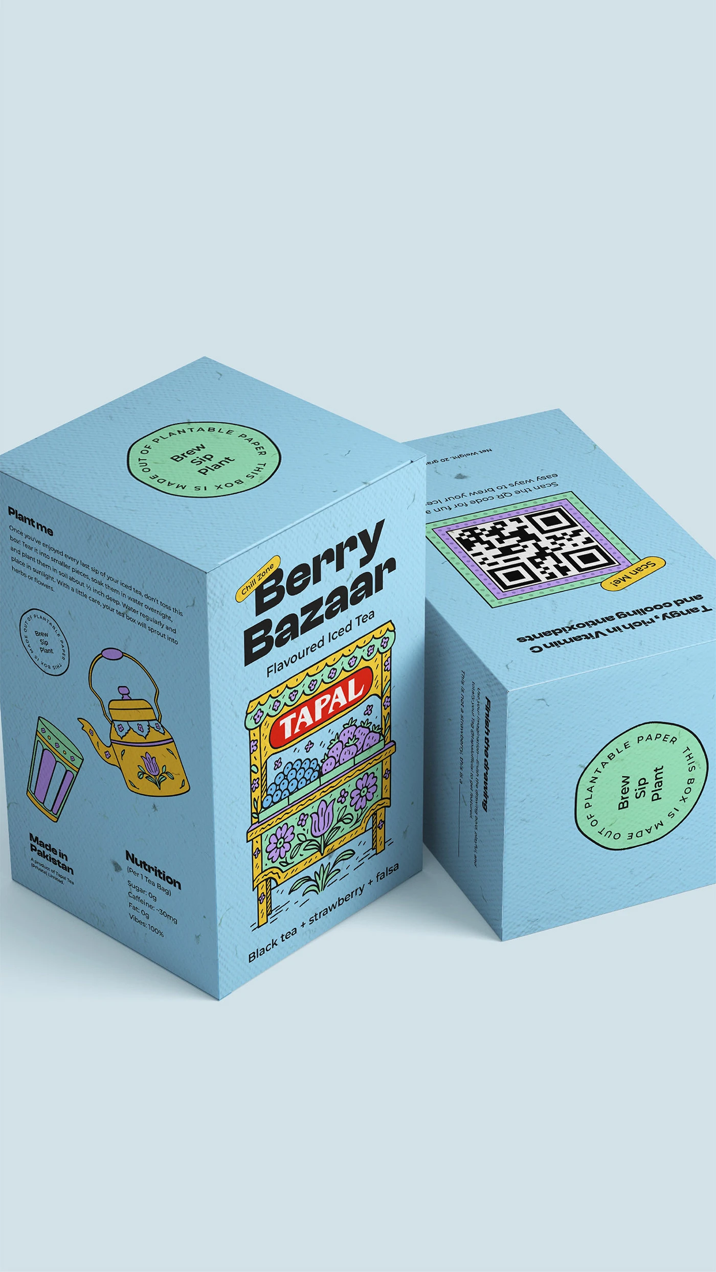
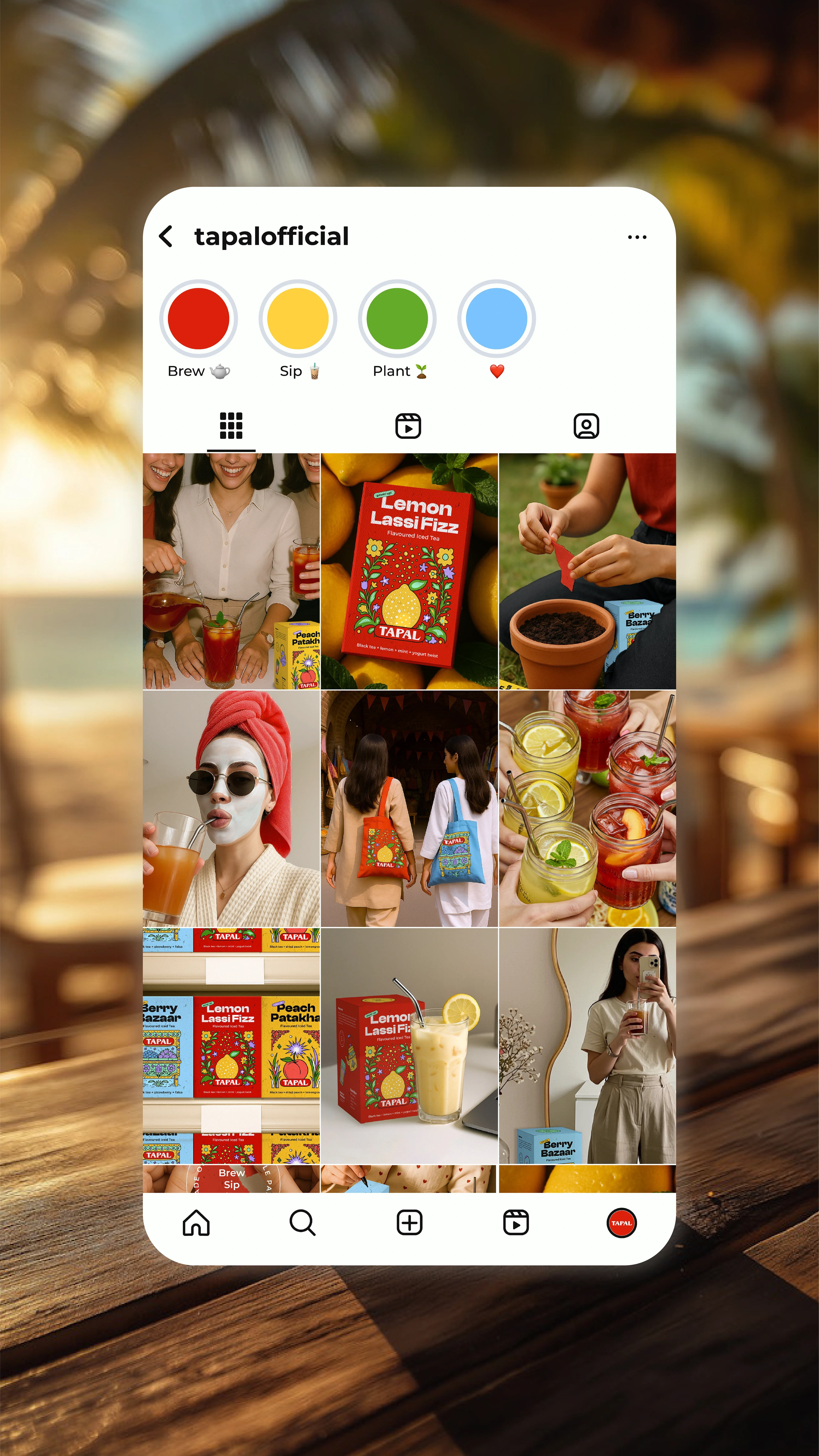
Gen Z is curious, values-driven, and visually fluent. They’re open to new experiences, drawn to bold aesthetics, and deeply care about the environment and health. With that in mind, I envisioned a new product line: flavoured iced tea with a desi twist and health benefits.
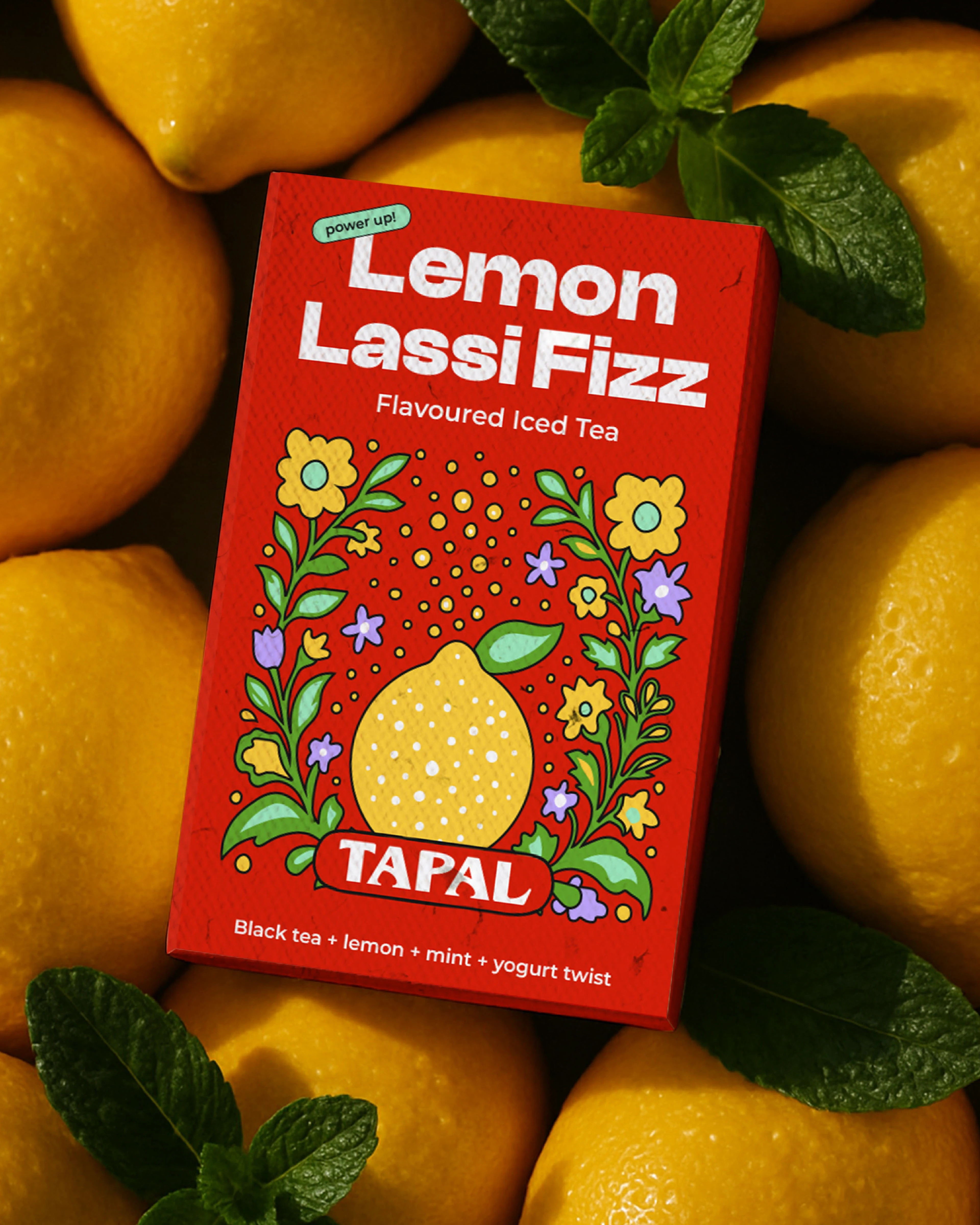
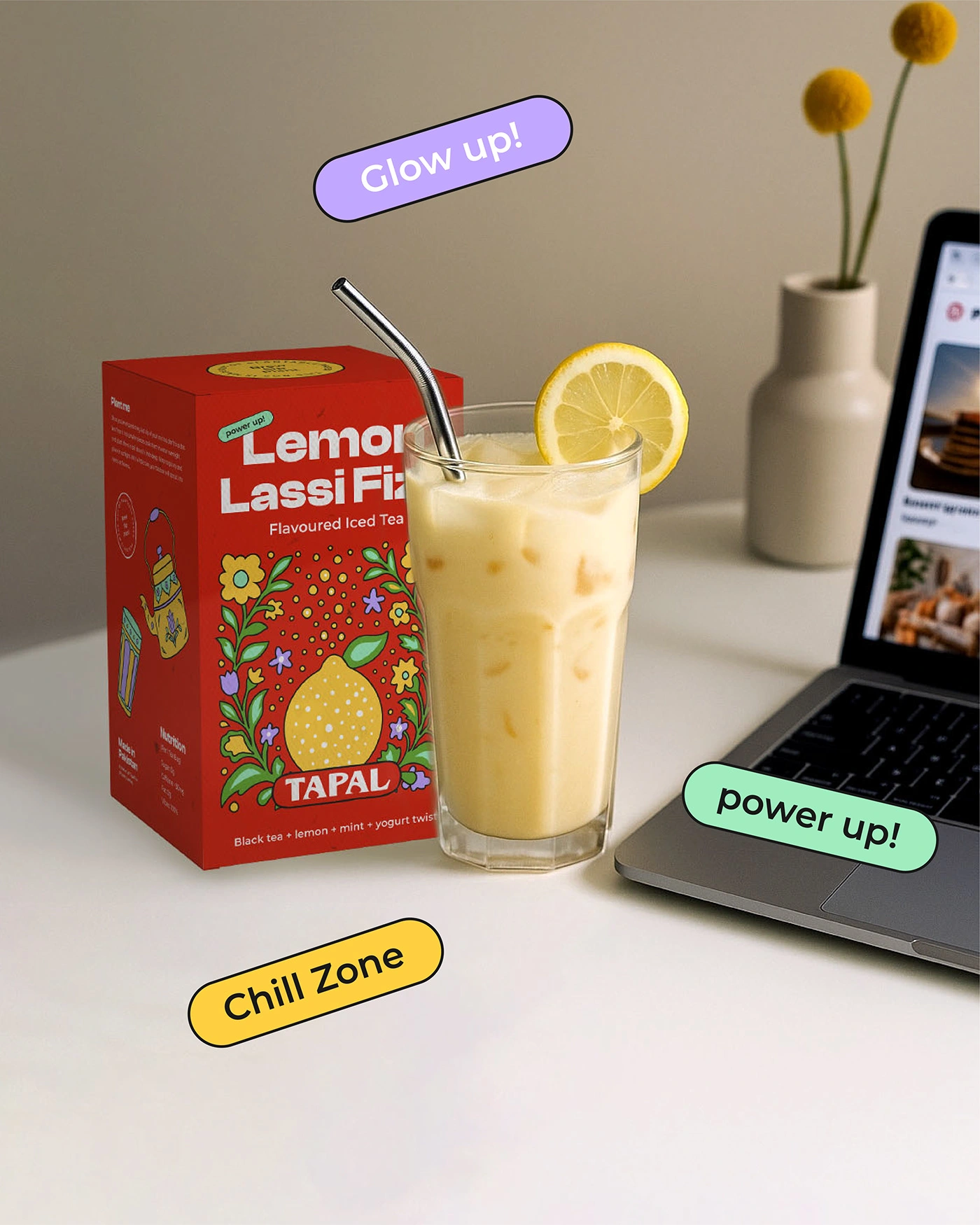
Imagine a flavor like Berry Bazaar - a blend of black tea, strawberry, and falsa. It’s cooling, antioxidant-rich, and rich in vitamin C-perfect for a younger audience that wants both flavor and function.
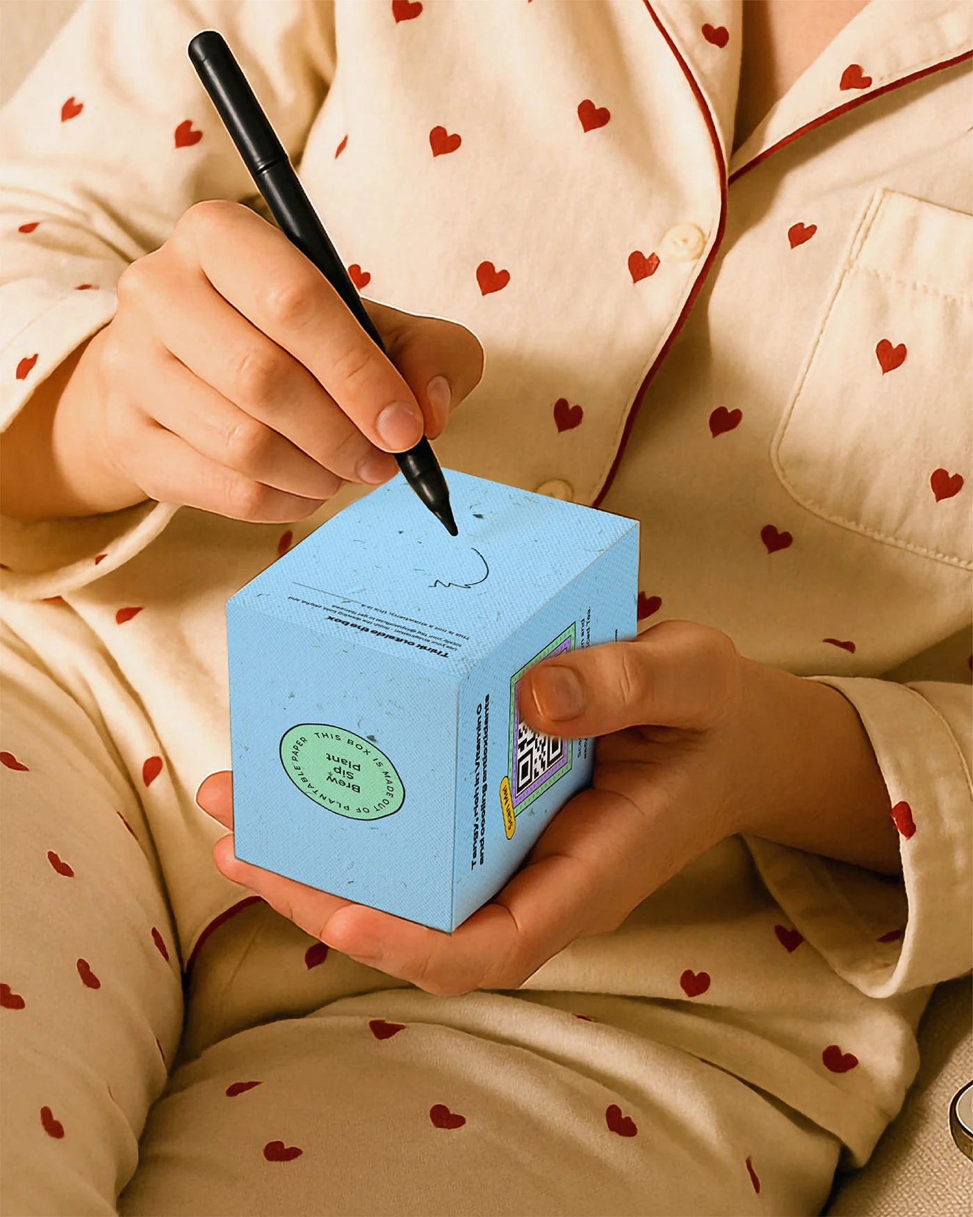
To align with Gen Z’s eco-conscious values, the packaging is made from plantable paper-a tactile, sustainable experience that goes beyond the product itself. Once you’re done with the tea, you can tear up the box and plant it.
Design Breakdown
Logo
I debated a full redesign, but the original Tapal logo has distinctive typographic elements—especially in the “A” and “P.” Instead of reinventing, I opted for a refined evolution: increased letter spacing for better readability, softened edges for a more welcoming look, and retained the signature letterforms to preserve brand recognition. It’s heritage, refreshed.
Colour Palette
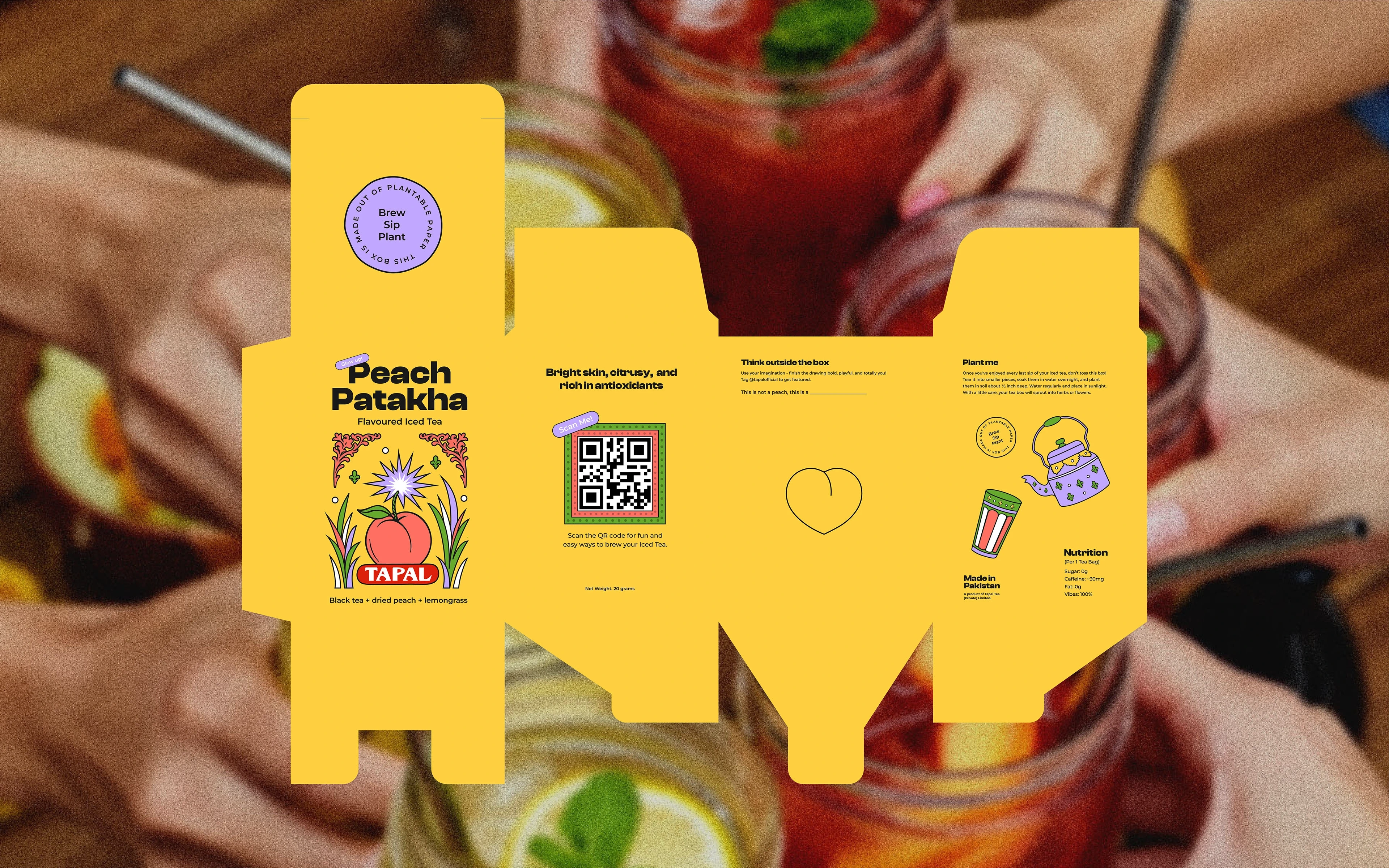
Tapal’s original color scheme - red, yellow, and green - was important to retain for continuity. But to add youthfulness and shelf presence, I introduced complementary colours. The result is a bold, cohesive palette that feels vibrant and fun without straying too far from the brand’s roots.
Packaging Design
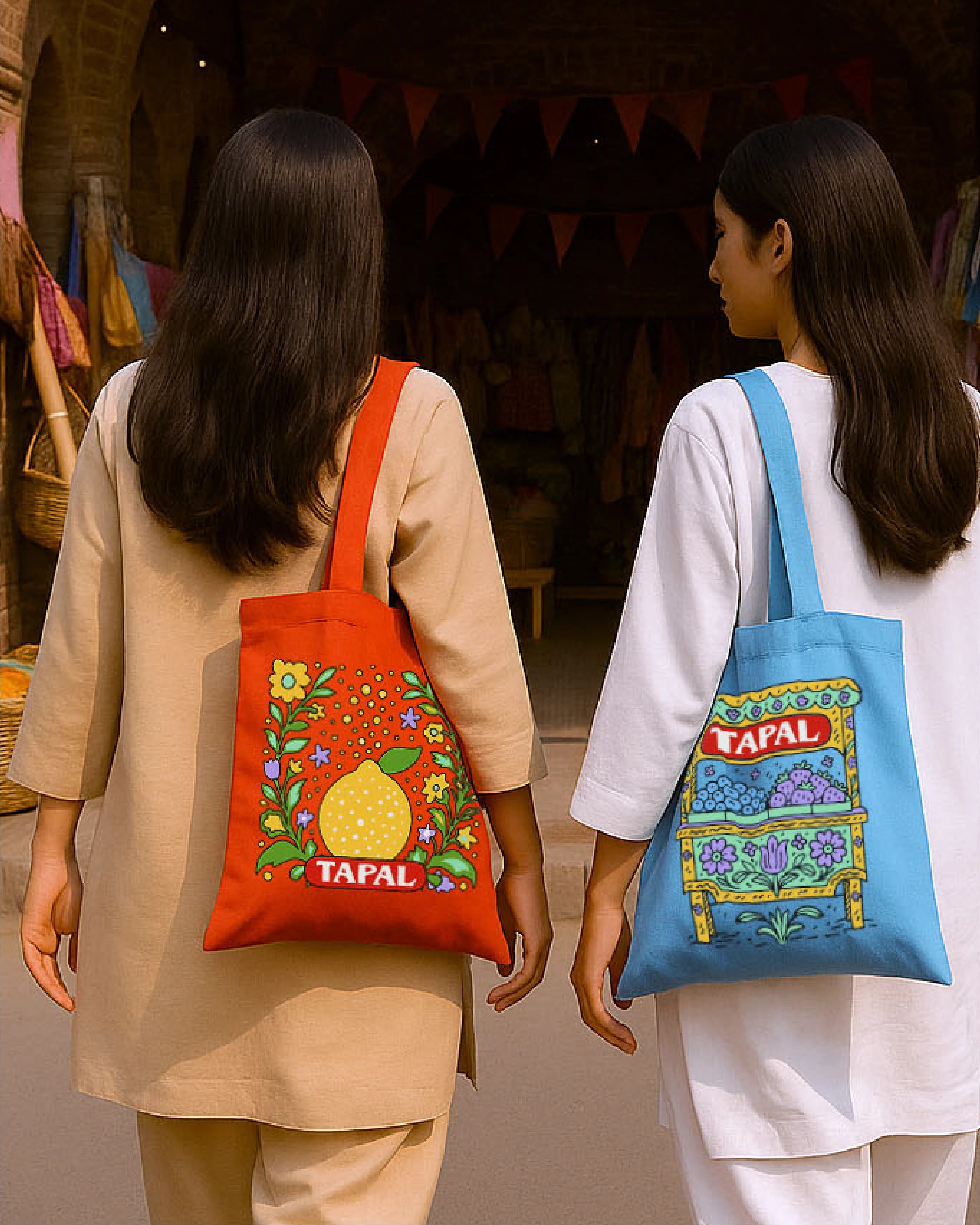
With a desi twist in the product itself, the visual language had to strike a balance between traditional and modern. Truck art became the perfect inspiration - but reinterpreted. I translated its usually complex motifs into minimal doodles with clean lines, solid fills, and playful energy - just enough to nod to culture without overwhelming the eye.
The box is fully functional and layered with intent:
Front: Flavour name, product category (e.g., Chill Zone), and flavour notes.
Left Side: Planting instructions, nutrition label, and a “Made in Pakistan” stamp.
Right Side: A QR code linking to Tapal’s social content and brewing guides.
Back: An interactive activity titled Think Outside the Box - a creative prompt inviting users to complete a drawing and tag Tapal for a chance to be featured. It encourages engagement and makes the unboxing experience more shareable.
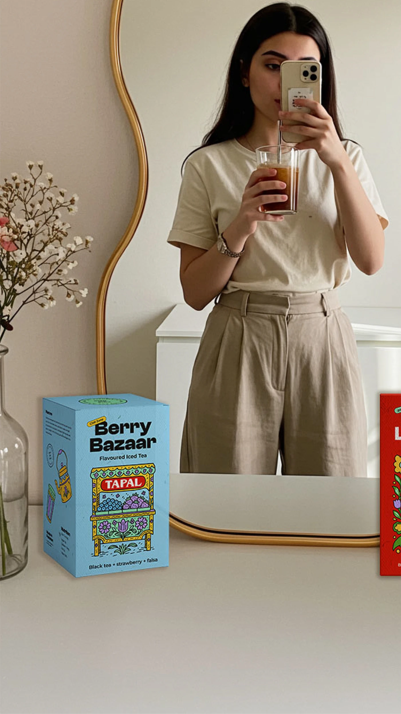
Photography Style
The visuals aim to reflect Gen Z's everyday aesthetic - raw, relatable, and real. Think:
Mirror selfies
Friends hanging out
Cozy moments in PJs
Urban backdrops and natural light
The photographic style embraces film-style edits, flash, and authentic styling that mirrors what Gen Z already posts. The goal is for them to see the campaign and think, “That looks like me.”
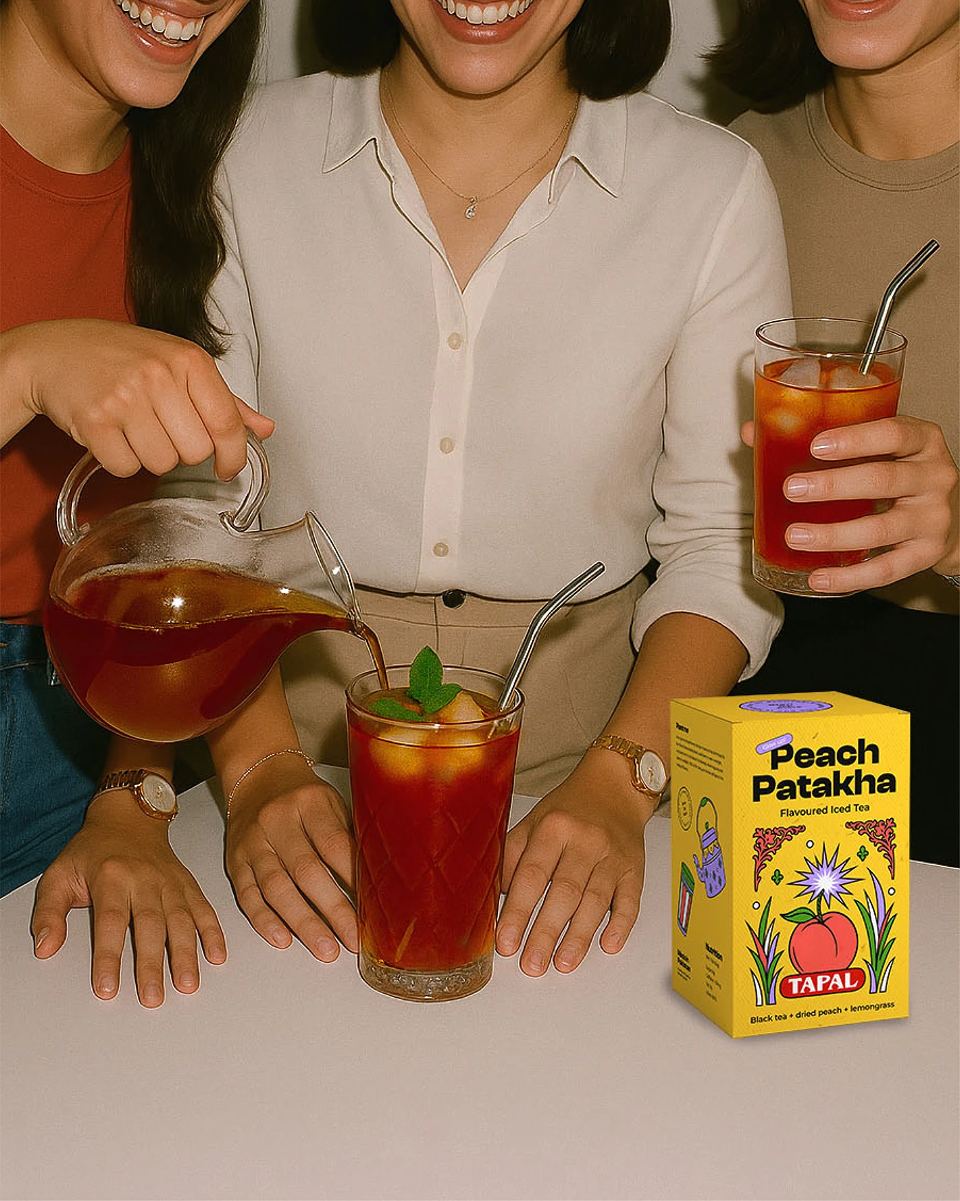
This was a fun exploration in brand evolution - rethinking not what Tapal is, but how it could be perceived by the next generation. It's a fusion of cultural familiarity and future-forward thinking, designed to make tea feel exciting, relevant, and Instagrammable again.
Like this project
Posted Oct 26, 2025
Speculative brand reimagination of Tapal (Pakistan's leading tea brand) for Gen Z, focusing on aesthetics and messaging.