Logo and Brand Identity Design for YNO Beauty
Naveera Aftab
Say yes!
About the Brand
YNO Beauty is a skincare brand committed to creating products that are both healthy and effective — designed to treat, rejuvenate, and improve the skin while helping customers feel confident and beautiful in their daily lives.
The Challenge
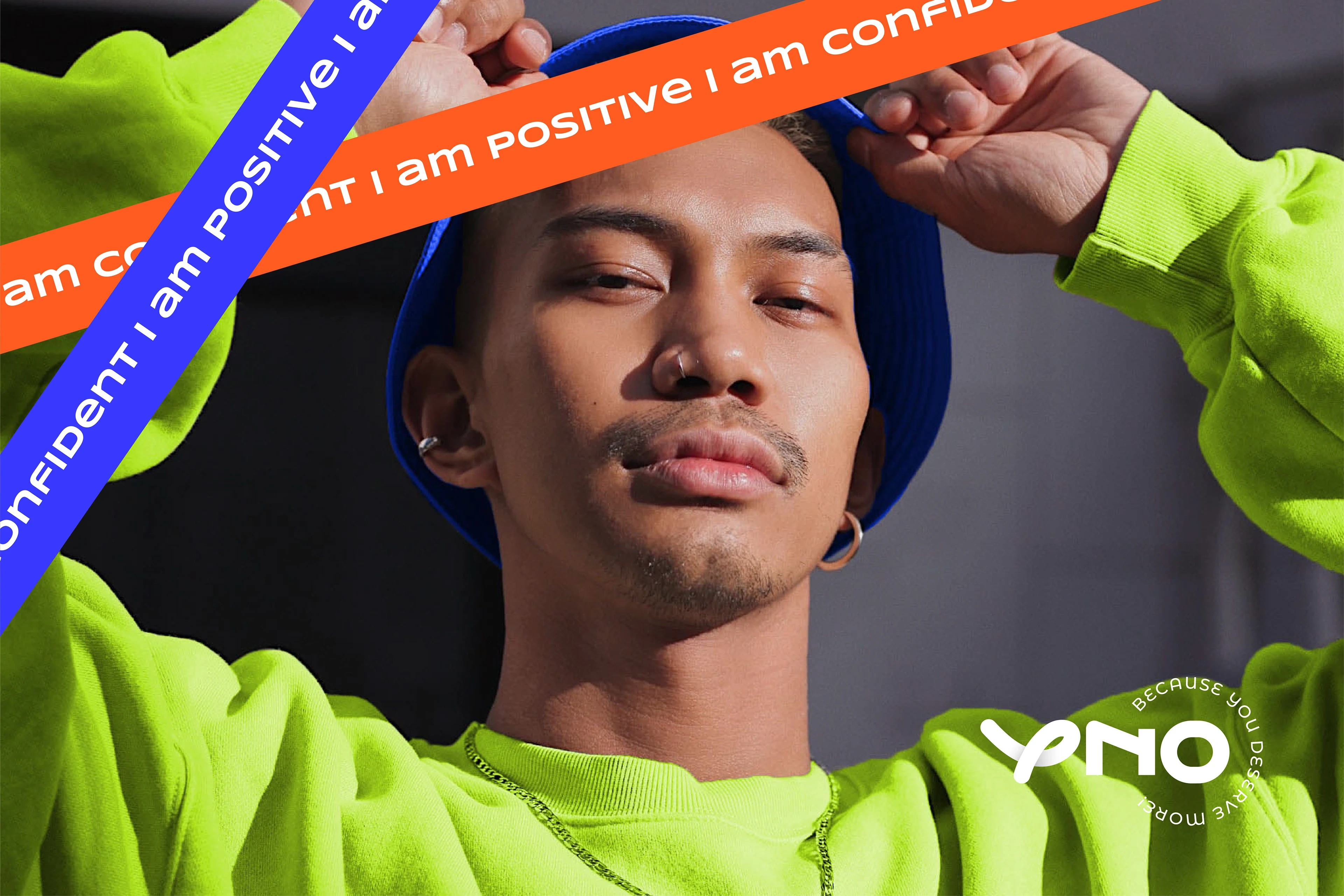
The brand needed a dynamic identity that would resonate strongly with Gen Z and Millennial audiences. Their goal was to craft a modern and inclusive brand that appealed equally to men and women, while reflecting values of diversity, authenticity, and self-confidence.
The Solution
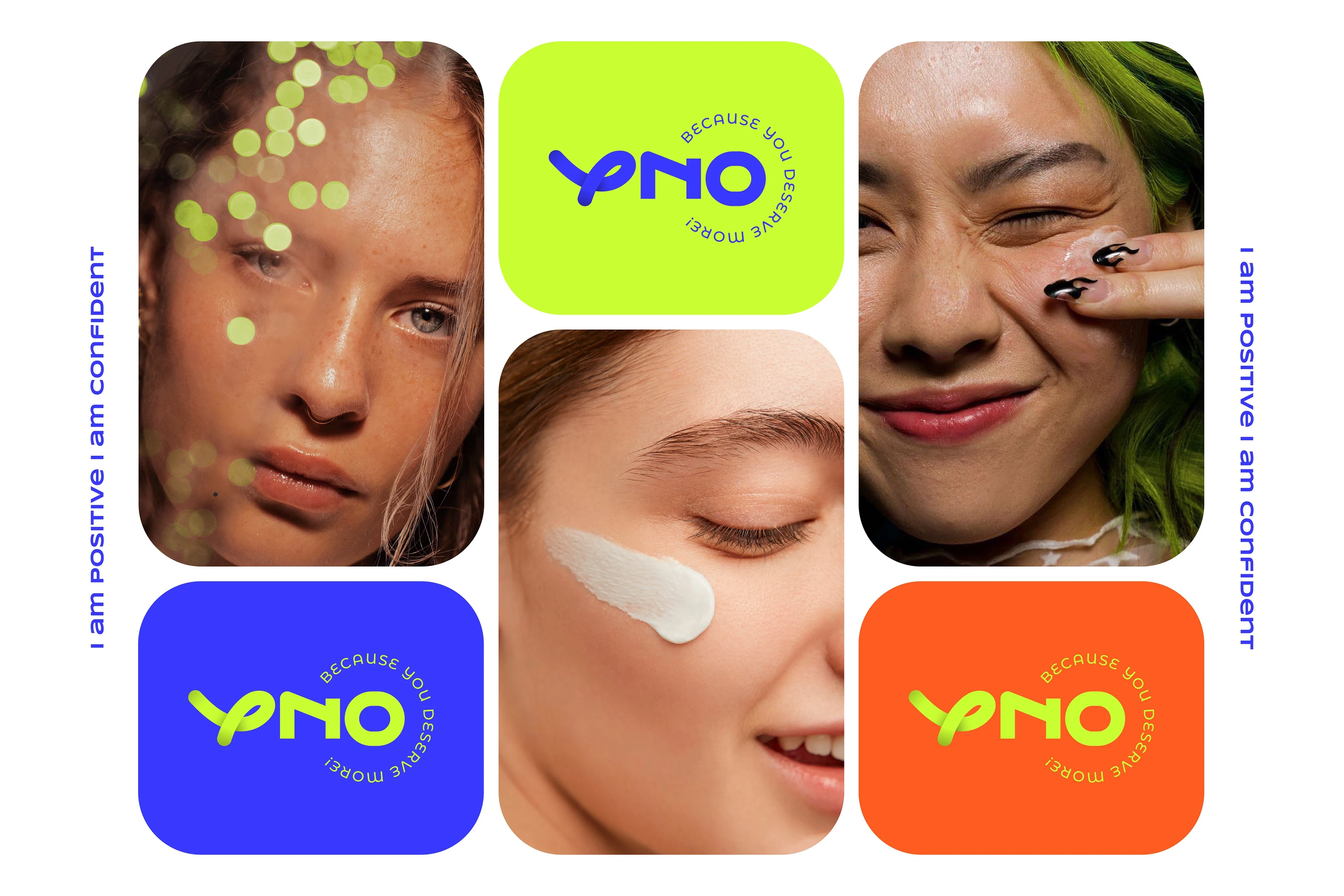
The logo design became the centerpiece of YNO Beauty’s identity. A custom typography system was developed, with each letter carrying symbolic weight:
“Y” : inspired by the brand name “YNO” (interpreted as Why No), the letter combines a soft, fluid form with a subtle feminine touch. It doubles as a versatile sub-mark, functioning as a simplified, recognizable brand icon.
“N” and “O” : structured and balanced to convey inclusivity and appeal across genders.
The “O” : intentionally imperfect, representing authenticity and the idea that confidence, not perfection, defines true beauty.
“Y + X” : the cross incorporated into the “Y” symbolizes Why No, reinforcing the brand’s playful and bold positioning. The resulting identity feels modern, inclusive, and authentic — a reflection of YNO Beauty’s mission to empower individuals to embrace their uniqueness.
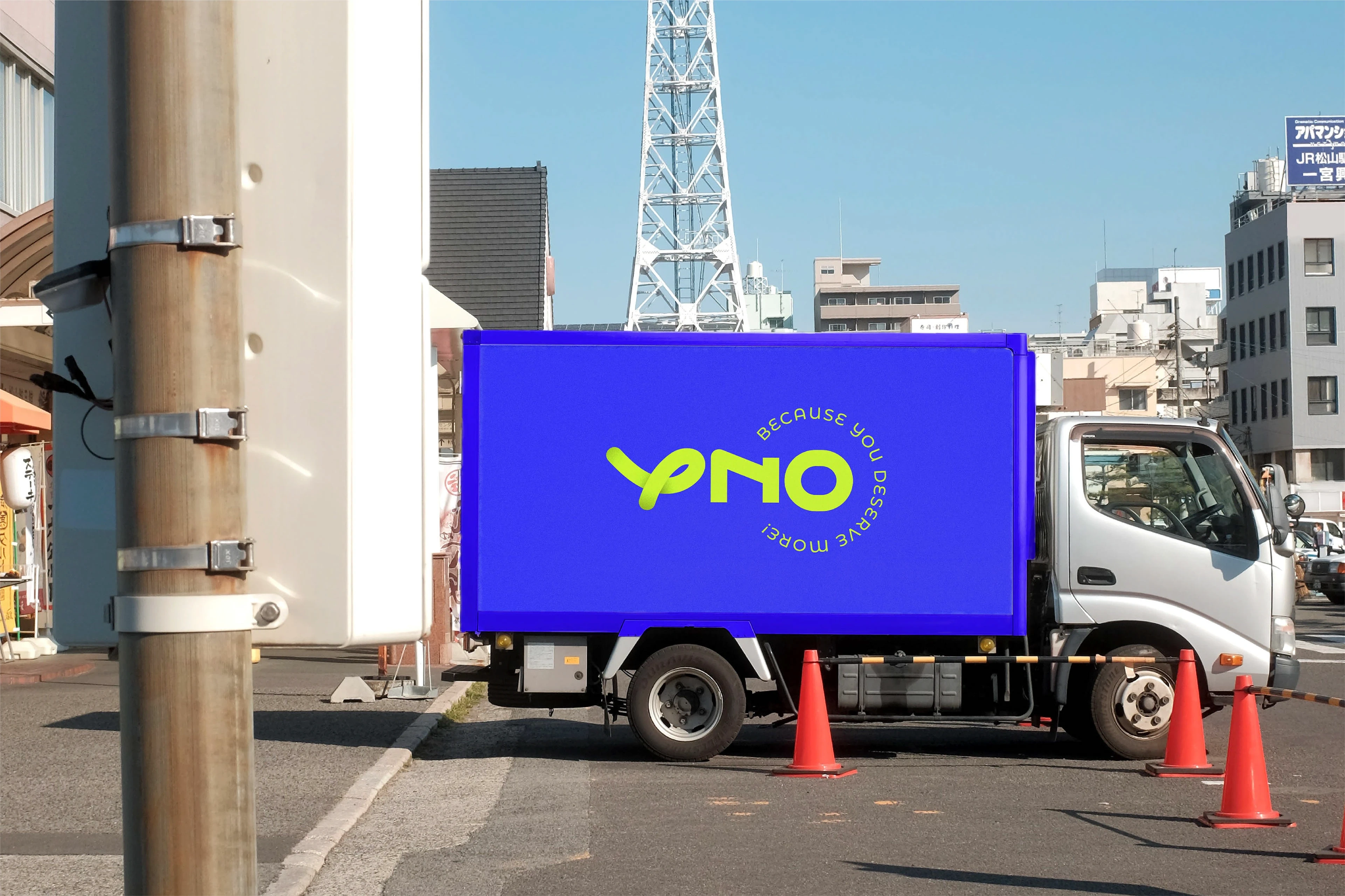
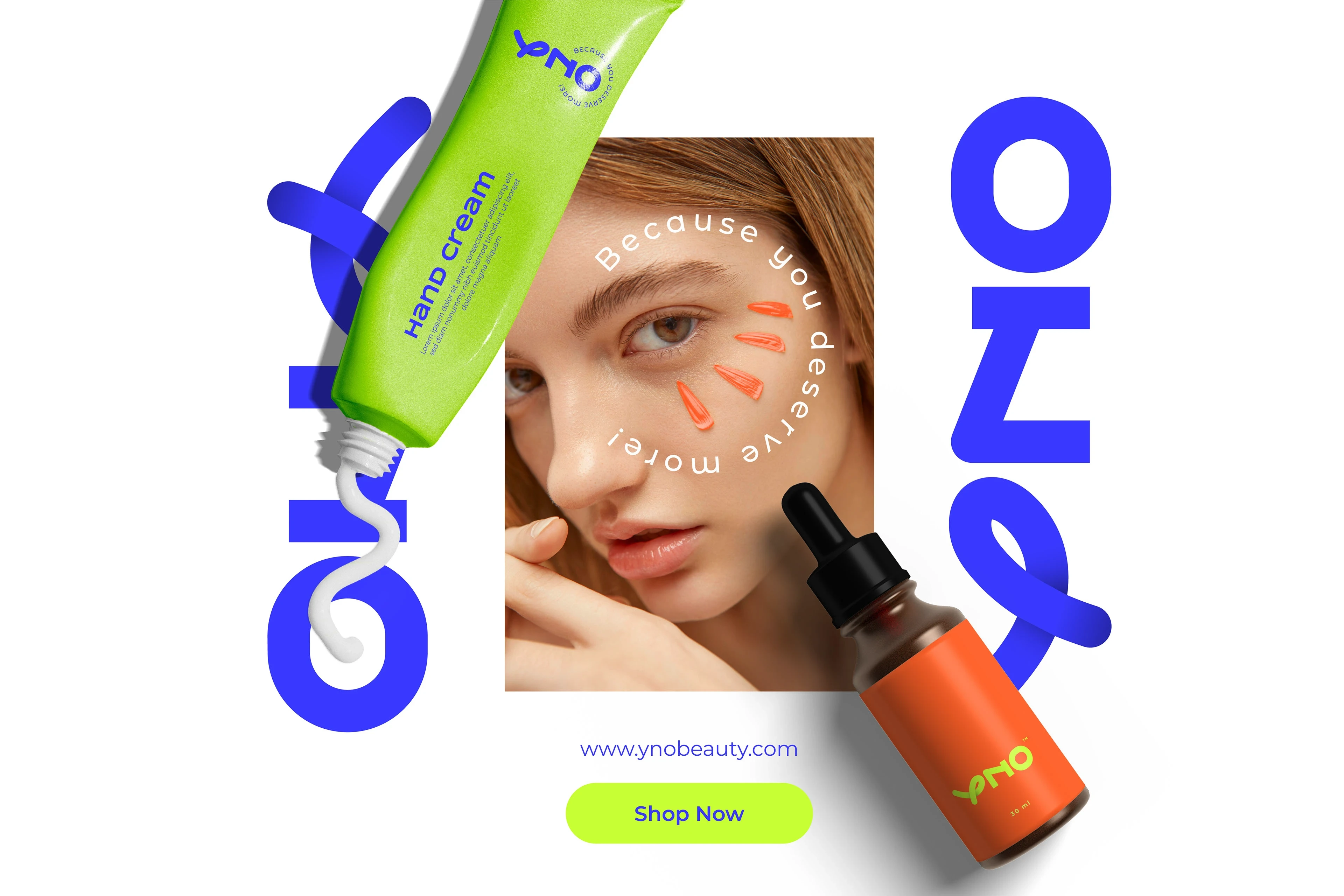
Deliverables Logo Design & Colour Palette

Like this project
Posted Oct 26, 2025
Created a bold brand identity for YNO Beauty targeting Gen Z and Millennials.
Likes
0
Views
13
Clients
YNO Beauty