Scribble to Streetwear Logo Design
Naveera Aftab
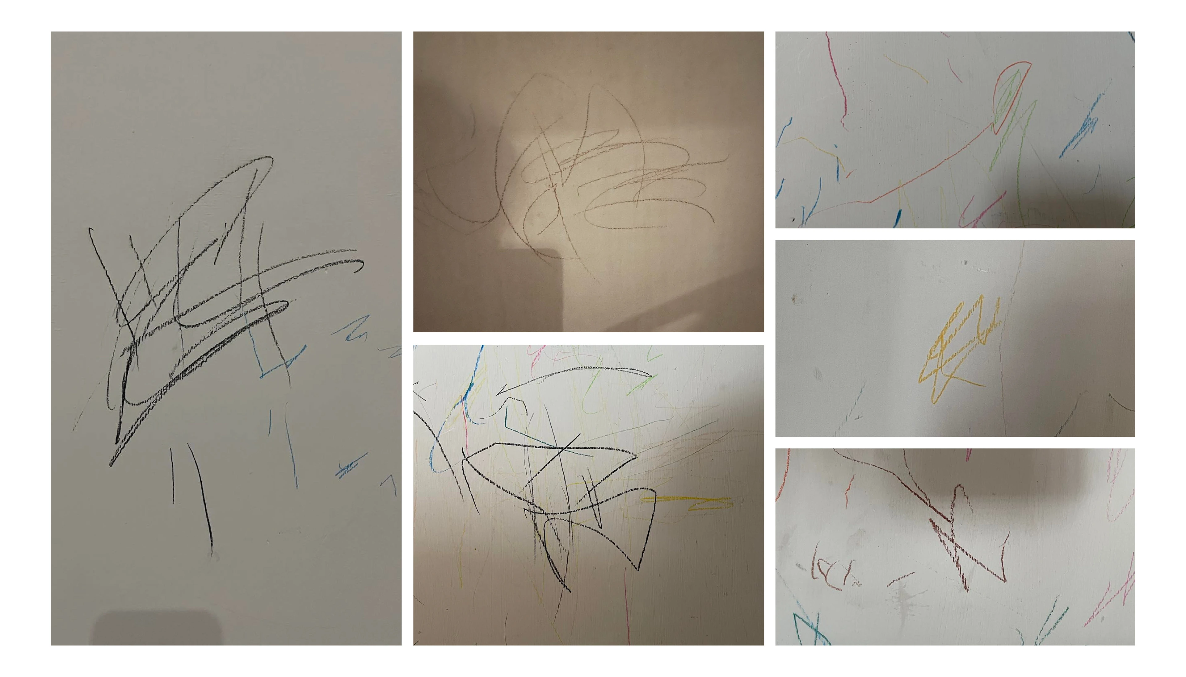
My niece's scribbles on the wall
Scribble turned Streetwear Logo
A project I have been very excited to share. This was something I did because I wanted to create something cool out of nothing. My niece loves scribbling, and her scribbles inspired me to do this project, because when I saw her scribbles, I thought they were pretty cool and if refined could be a great logo as well.
Goal
The goal was to convert my niece's scribbles into a streetwear logo, and incorporate different things she like, but in a mature way rather than childish or kid-like. The brand that I had in my mind was a playful yet serious clothing brand. That offers funky, colourful, statement style pieces for people who think that they are different, are bold and confident enough to carry such a style.
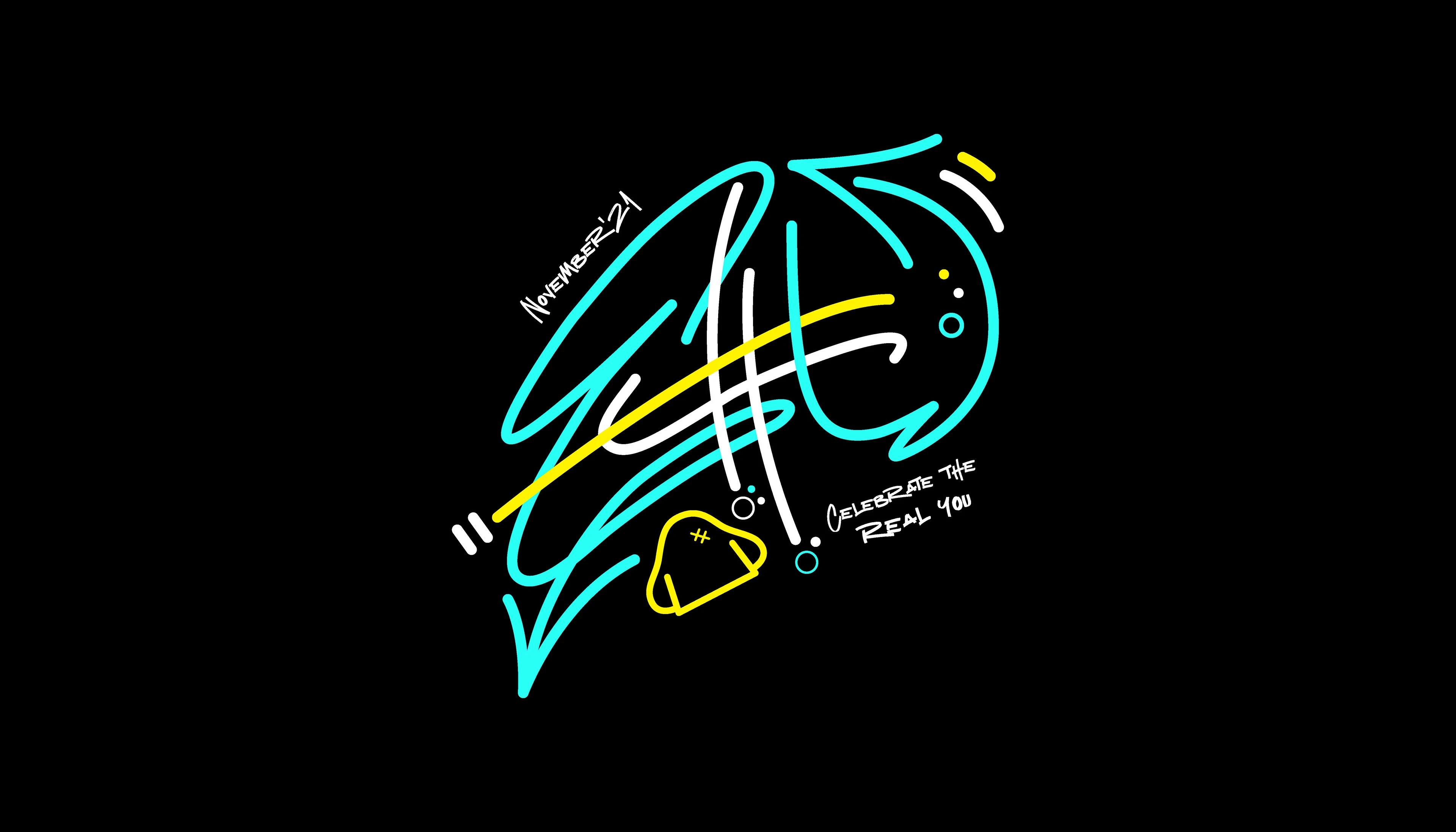
Visual demonstration of how I picked out the letters from the scribble
Process
I first tried if I could find any letters in all the scribbles I had, and once I did there were two ways of doing the logo. Either I could have selected different letters from different scribbles or I could just go with one particular scribble. So I tried both and the second idea worked the best.
The letters that I found for the above logo were E, c and H. The next thing was to form a word. After much thought and researching on what could be the name of the brand, I came across the word “Echt” which is a german word, meaning real or authentic. That sounded perfect to me and I moved ahead with it.
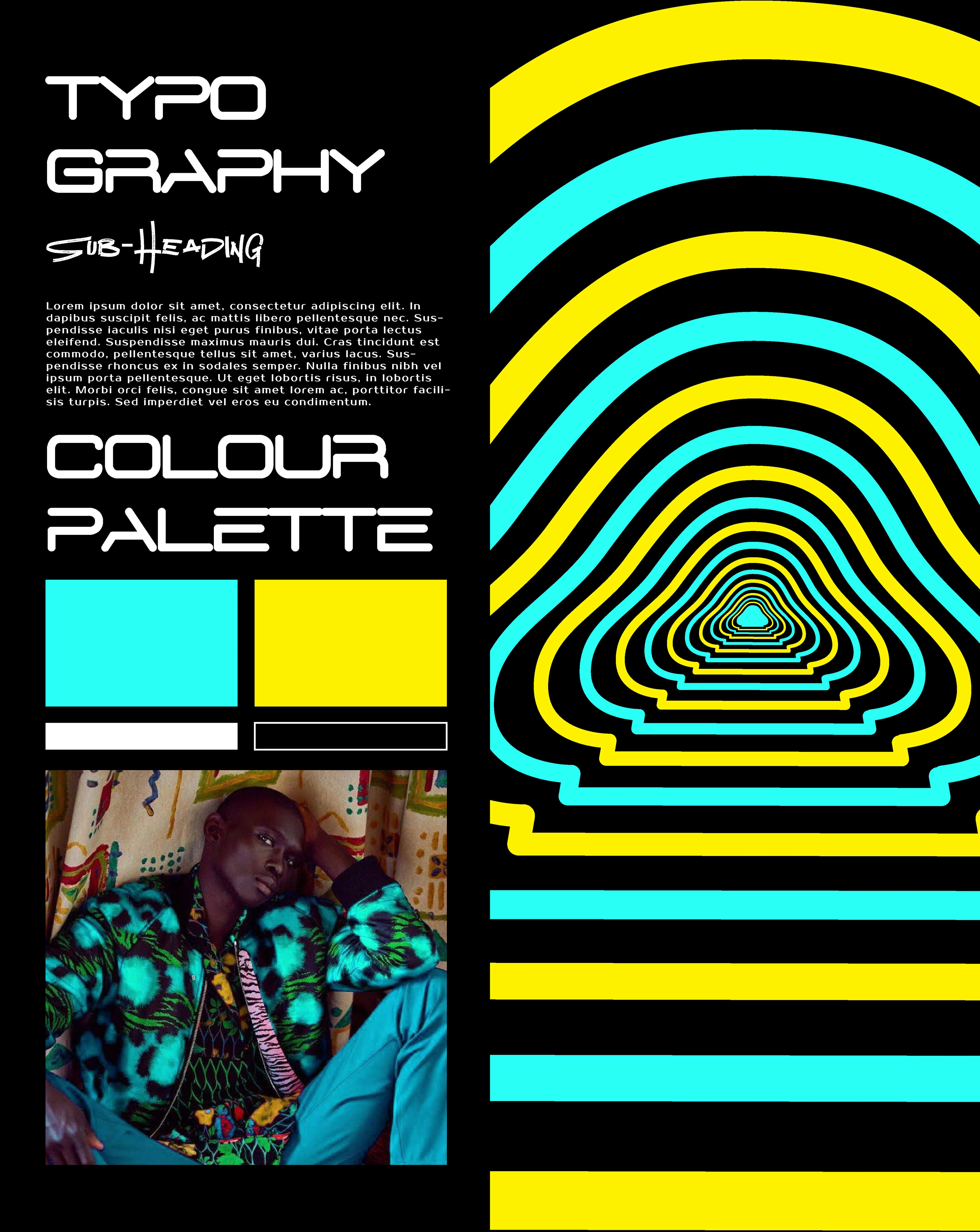
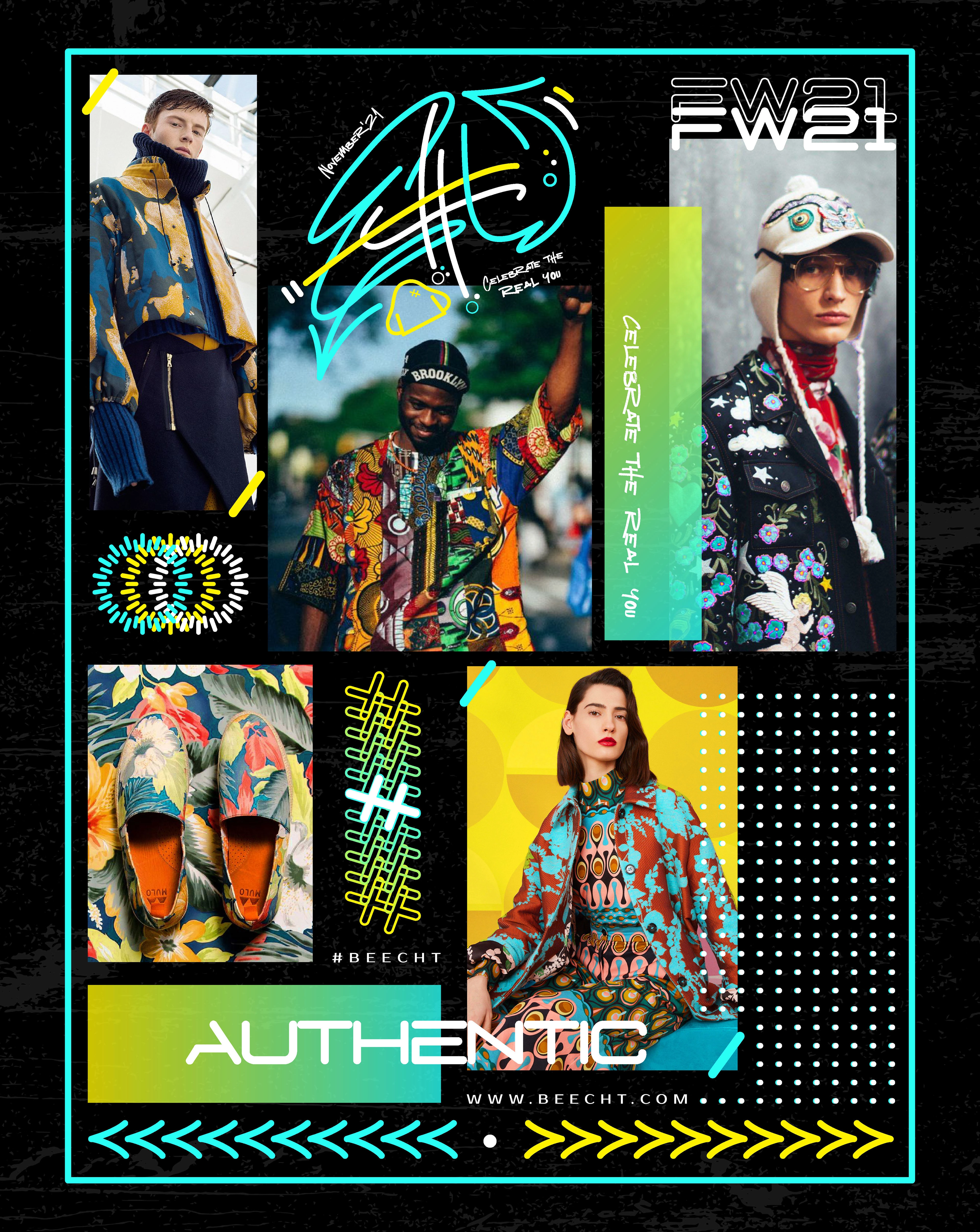
Brand Board
The Concept
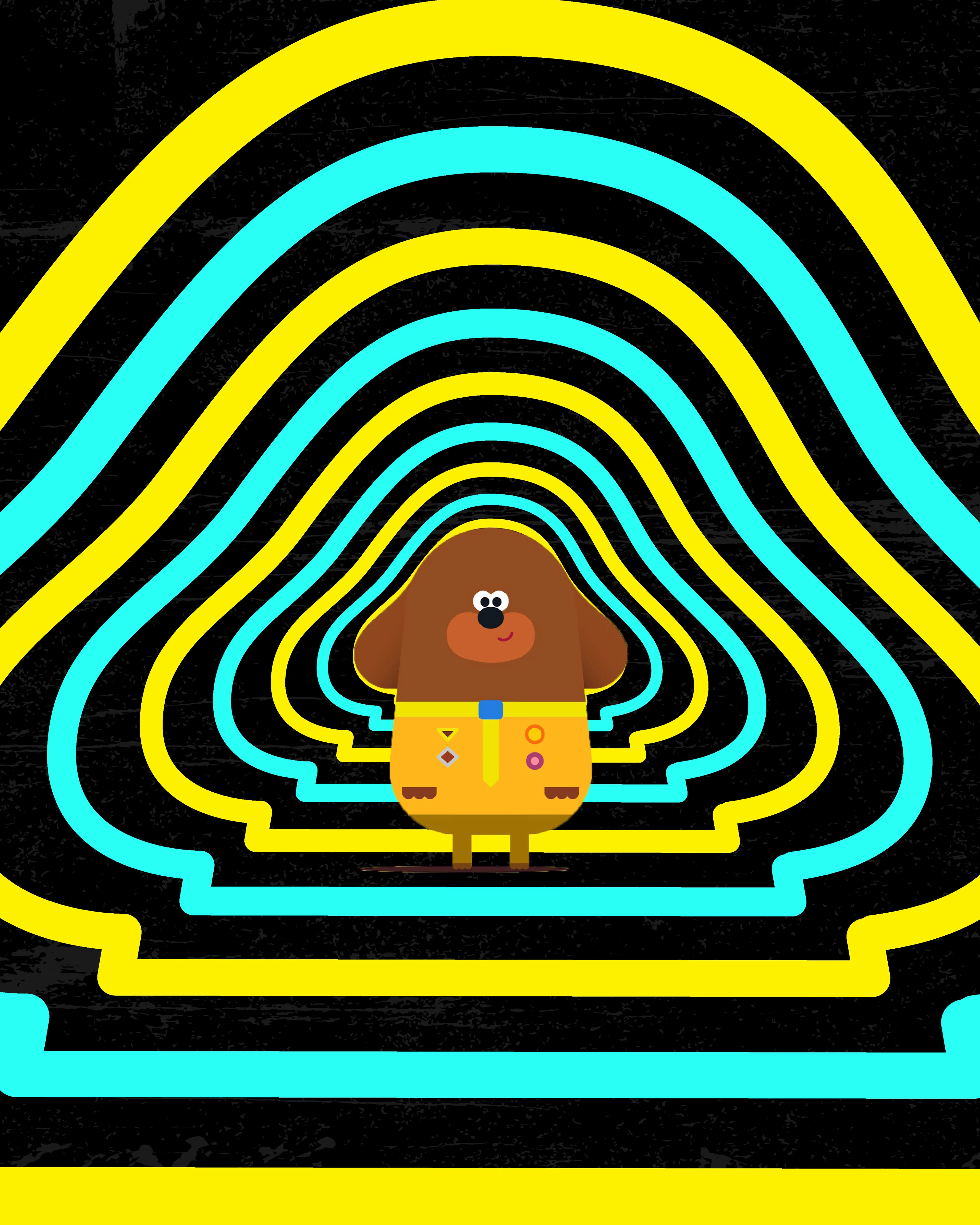
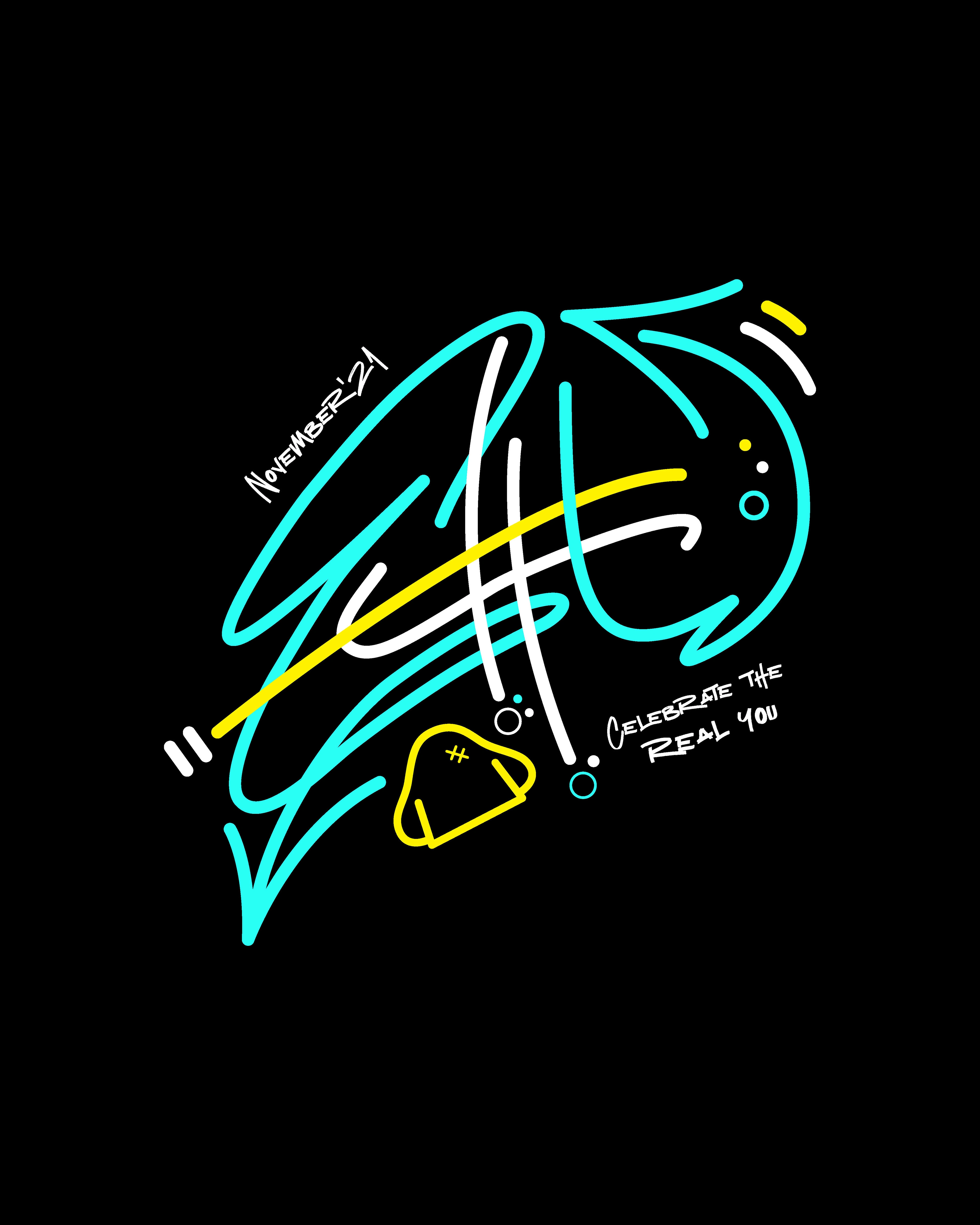
The overall style of the logo is a graffiti signature. Elements around the word include some bubbles because my niece loves bubbles, an outline of her favourite cartoon “Hey Duggee” (second last image). Opted for an outline version with stitch marks on it so that it doesn’t look too cute or a cartoon and has a streetwear vibe to it. I also added the time I did this design at the top and a made up slogan at the bottom. For the colours I opted for blue because again my niece likes blue, yellow for contrast and white to balance the two very bright colours. Lastly, the arrows are driven from the graffiti style I opted for.
View what my followers on Instagram had to say about this project.
Your Vision is bold, but your brand isn't showing it yet. If that's you, lets change that with a strategy built to lead. Reach out below 🌻
Like this project
Posted Oct 28, 2025
Designed a streetwear logo inspired by niece's scribbles.