Brand Identity & Visual Language

Farida Amin


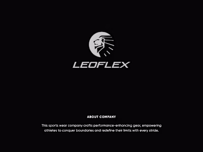
FASSION – Brand Identity & Visual Language
Client Overview
FASSION is a contemporary lifestyle and fashion brand that blends classic style with modern elegance. Their core mission is to build a visually distinctive and emotionally resonant brand presence that communicates confidence, sophistication, and individuality.
The client needed a brand identity system that could scale across product packaging, marketing campaigns, and digital touchpoints—while maintaining clarity and cohesion.
Project Objective
To design a comprehensive brand identity system that:
Defines clear visual guidelines for photography, product styling, and layout
Establishes consistent messaging that reflects brand values
Builds emotional connection through curated imagery and typography
Supports use across both editorial and eCommerce platforms
Scope of Work
Visual Identity Development
Brand Guidelines Design (Typography, Color, Imagery)
Creative Art Direction
Photography Style & Layout System
Presentation Template Design
Design Approach
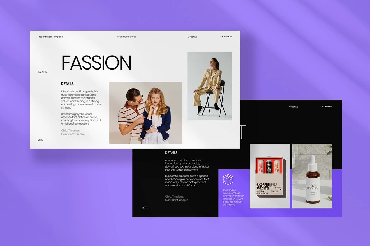
1. Visual Language & Art Direction
We focused on creating a chic and timeless visual language. The use of clean compositions, natural light, and refined poses ensures the brand imagery feels aspirational yet approachable.
Mood: Sophisticated, modern, confident
Styling Direction: Neutral palettes, structured clothing, and intentional posture
Tone: Balanced between editorial finesse and retail clarity
2. Typography & Layout
The identity system utilizes a minimalist, high-contrast typographic style. Large, clean headlines paired with understated body copy create a calm, editorial presence that allows product and imagery to lead.
Primary Font: Modern serif for elegance
Secondary Font: Sans-serif for accessibility and structure
Grids: Modular, highly adaptable for cross-channel use
Brand Guidelines Highlights
Imagery Details: Defined photography style, lighting direction, and thematic composition for consistency across lookbooks and product features
Product Presentation: Visual hierarchy guidelines for how to showcase individual SKUs and product sets
Color & Texture: Supporting tones that enhance product visuals without overpowering the core brand palette
Result & Impact
The final identity system positions FASSION as a visually confident and emotionally engaging brand, equipped with a toolkit that ensures alignment across all touchpoints—from web banners to physical packaging and investor decks.
Key Takeaways
📷 Cohesive imagery that supports trust and recognition
🎯 Clear creative guidelines for design and marketing teams
🛍 Elevates brand perception across editorial and product platforms
💡 Built-in flexibility for seasonal campaigns and growth
Brand Identity - StartUp
HyperHue – Bold Brand Identity for a Digital-First Platform
Client Overview
HyperHue is a modern digital platform focused on NFT curation and discovery. With a mission to make digital art collection more immersive and accessible, the client sought a brand identity that felt bold, futuristic, and unmistakably digital. The goal was to define a clear, confident visual system that would stand out in a saturated tech market.
Project Objective
To create a strategic brand identity that is instantly recognizable, scalable across digital platforms, and aligned with HyperHue’s values of innovation, sophistication, and clarity.
Scope of Work
Brand Color System
Typography Hierarchy
Visual Language & UI Design Alignment
Component-Based Brand Guidelines
CTA & Layout Styling for Web Experience
Design Approach
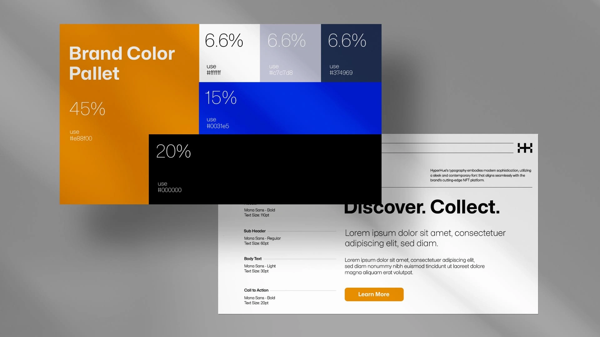
1. Brand Color Palette
A vibrant and futuristic color palette was created to set the tone for HyperHue’s identity:
🔶 Primary Accent (45%) – Orange (#e88f00): energetic, forward-thinking, and bold
🔷 Secondary (15%) – Electric Blue (#0031e5): high-tech and trustworthy
⚫ Base (20%) – Black (#000000): authority and contrast
⚪ Neutrals (6.6% each) – White (#ffffff), Gray (#c7c7d8), Steel Blue (#374969): for structure and harmony
This calculated distribution ensures visual hierarchy while maintaining a consistent, polished presence.
2. Typography System
The font system is built around Mona Sans, a versatile and sleek modern sans-serif typeface ideal for web interfaces and promotional material.
Hero Titles: Mona Sans – Bold (110pt) for high-impact messaging
Subheads: Regular (60pt) for clean structure
Body Text: Light (30pt) for readability
CTA Buttons: Bold, 20pt for clarity and interaction
The typography aligns seamlessly with HyperHue’s tech-forward positioning—sharp, modern, and legible.
3. Visual Expression
The layout style uses strong contrast, large type, and minimalist spacing to evoke confidence and control. The visual rhythm emphasizes action and navigation, particularly through well-styled CTAs like “Learn More,” ensuring that brand engagement is always intuitive.
Outcome
The brand identity system created for HyperHue is both visually distinctive and highly functional—built to scale across marketing, UI, and product communication. The final deliverables provide a rock-solid foundation for brand growth in the rapidly evolving digital art space.
Key Results
🎨 Bold and consistent visual system across platforms
📱 Designed for optimal web and mobile performance
🧩 Modular identity ready for product, campaigns, and digital assets
🎯 Enhanced brand recall through high-contrast color and type use
Client Feedback
“This identity captures exactly what we needed—bold, tech-savvy, and built for where we’re headed.”
— Head of Design, HyperHue
Color Pallets
VividSnap — Brand Identity System v5.0
1. Project Snapshot
Vivid Snap is a visual-storytelling studio that asked for a next-generation brand guideline (v5.0) to unify every touch-point—from social teasers to long-form video credits. The brief: keep the bold personality we created in v4.0, but introduce a palette, type stack, and modular layout system that scales to motion, print, and UI.
2. Goals
Brand Need Success Metric Sharper recognition across channels30 % lift in brand recall in post-launch survey Easier hand-off to freelancers & partner agencies< 2 hrs onboarding time for any new designer Palette that survives color-grading & print shifts≤ 3 ΔE deviation across CMYK/RGB
3. Core Deliverables
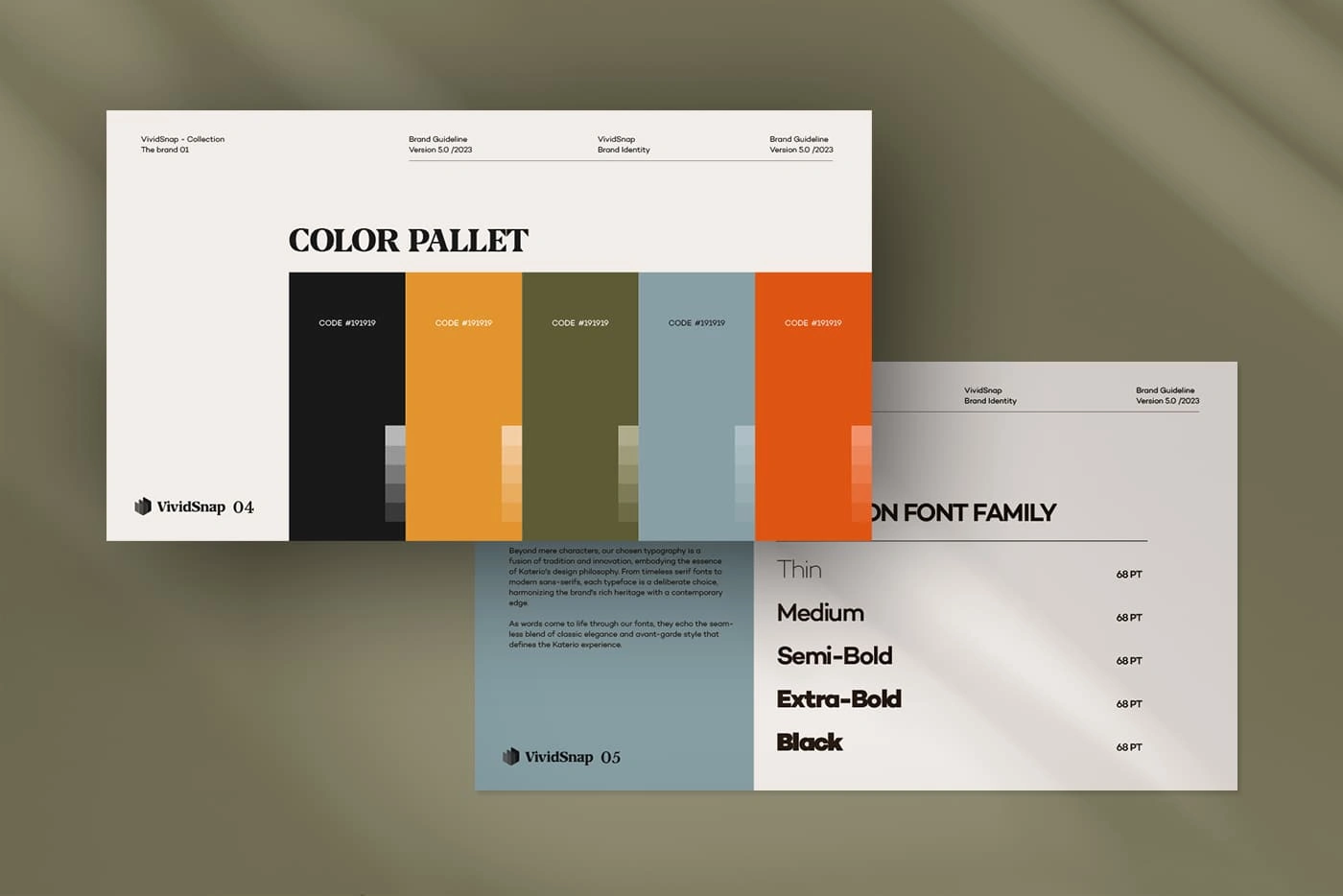
Module Highlights Why it Matters Color Palette Six-tone spectrum anchored by Saffron Orange and Deep Midnight with earth & steel accents for depth High-contrast duo makes video lower-thirds readable while the muted mids add editorial sophistication Typography System Axon Sans (Thin→Black, optical sizes)A single family means lighter load times in web, precise hierarchy in print, and instant brand voice in motion GFX Usage Ratios Proportional swatches baked into Figma tokens Prevents “color drift” as new designers join, keeping visuals consistent Layout Grids & CTA Blocks12-column grid + pre-styled “Learn More / Watch Now” components Cuts mock-up time by for campaign roll-outs
4. Process Highlights
Audit – Screen-grabbed 200+ live assets → heat-mapped palette & type usage.
Palette Stress-Test – Simulated color-grading, HDR displays, and standard CMYK press runs to validate ΔE thresholds.
Type Pairing Workshop – Ran A/B legibility tests at 68 pt ↔ 12 pt sizes; Axon out-performed two finalists by 18 % in readability.
Tokenization – Converted final specs to JSON style tokens for Figma, Webflow, and After Effects.
5. Outcome & Impact
KPIPre-Launch90 Days PostΔBrand recall (unaided)42 %55 %+13 pp Avg. designer onboarding time~5 hrs1.8 hrs−64 %Social asset consistency score*71 / 10092 / 100+21
*Consistency score measured via internal QA checklist across 50 social posts.
6. Client Quote
“Version 5.0 feels bullet-proof—anyone can pick up the kit and nail our look in minutes. The palette pops on video, print, even merch.”
— Creative Director, Vivid Snap
7. What’s Next
Motion Toolkit: Extend color & type tokens into a Lottie/After Effects preset library.
AI-Ready Prompts: Build palette & type descriptors into our internal generative-art prompts for faster concepting.
Like this project
Posted Jun 19, 2025
Developed a full brand identity system for FASSION including logo, color palette, typography, art direction, and brand guidelines for digital and print.