Building a Cohesive and Trust-Driven Visual Identity
Ton Oor
Branding for Secuurio Suite: Building a Cohesive and Trust-Driven Visual Identity

Project Overview
An extensive brand identity created for Secuurio Suite, including a core master brand and multiple sub-brands within the same ecosystem. The branding balances strategic clarity with visual strength, resulting in a cohesive system that communicates trust, professionalism, and scalability.

1. Context & Challenge
Secuurio Suite, a corporate service/product suite that required a strong, flexible brand identity. The main objective was to design a visual system that could support a central master brand while seamlessly extending to various sub-brands, without losing consistency or recognizability.
Key challenges included:
Defining a clear brand essence for a multi-layered corporate suite.
Designing a visual language that feels professional, modern, and approachable.
Creating a scalable system where sub-brands feel distinct yet clearly connected to the parent brand.
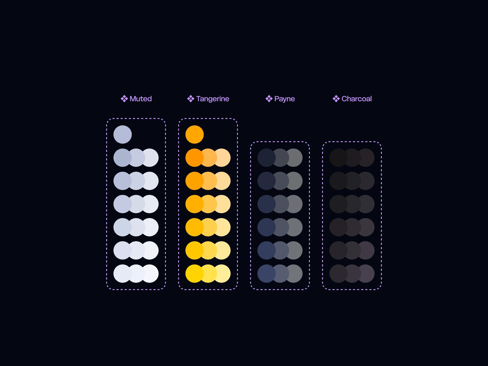
Color pallete used for all logo states
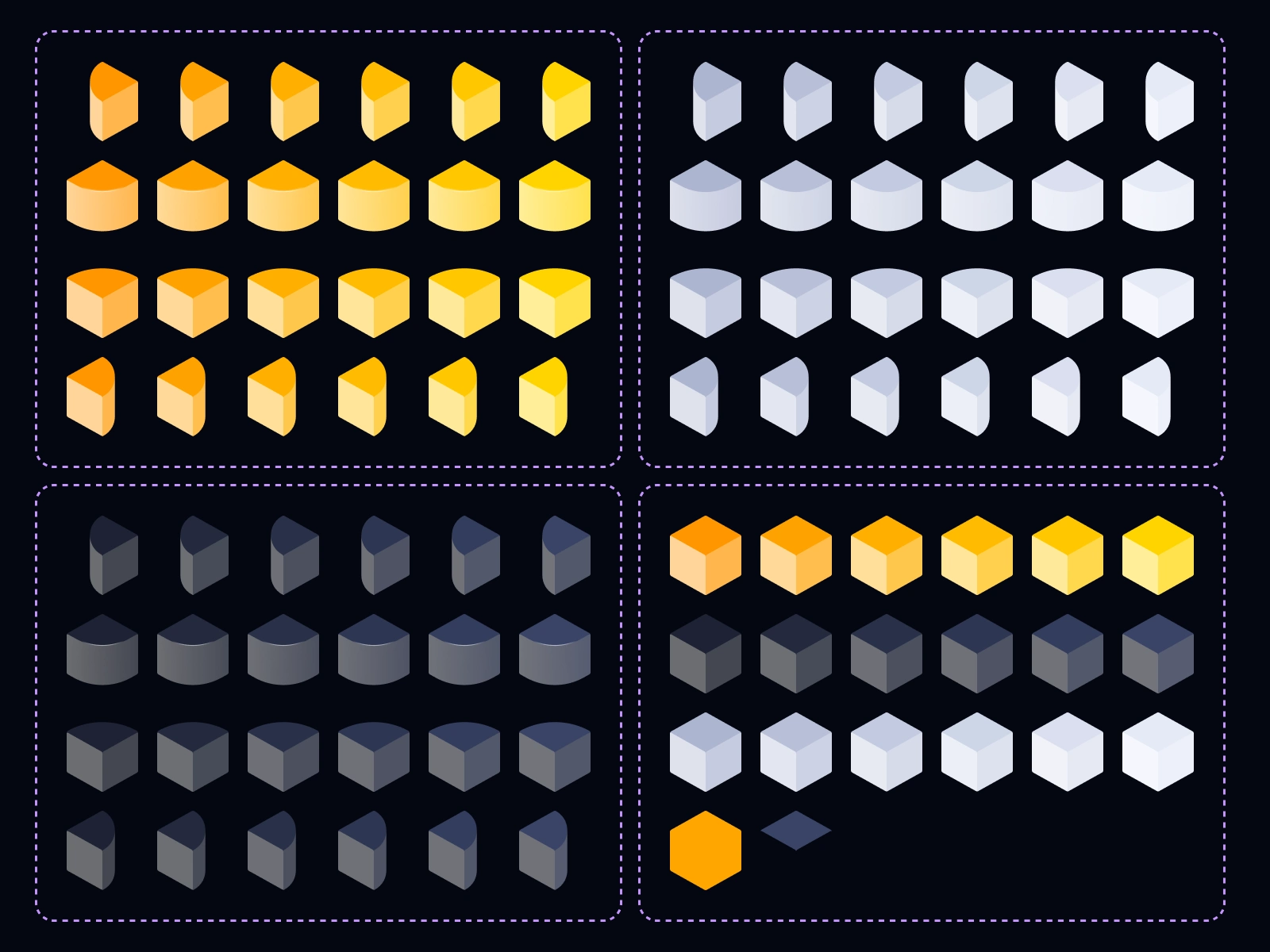
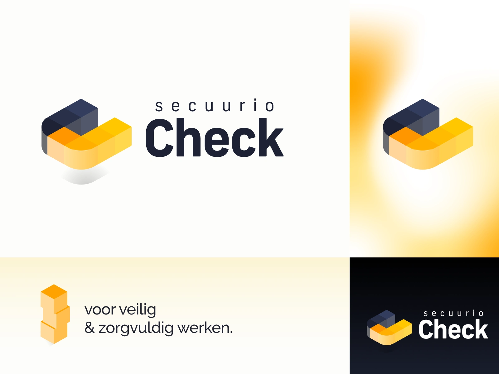
The different elements used throughout the suite brand logos
2. Strategic Approach
Brand Discovery
Audience analysis: Understanding the expectations and needs of the target audience.
Core values: Reliability, clarity, modernity, and flexibility formed the foundation of the brand.
Competitive landscape: Analyzing similar brands to identify opportunities for differentiation.
Concept Development
Translating brand values into visual principles such as color, typography, and layout.
Designing a clear brand hierarchy: a strong master logo supported by adaptable sub-brand variations.
Iterative design process using Figma and Adobe Photoshop, allowing for refinement and consistency across all elements.
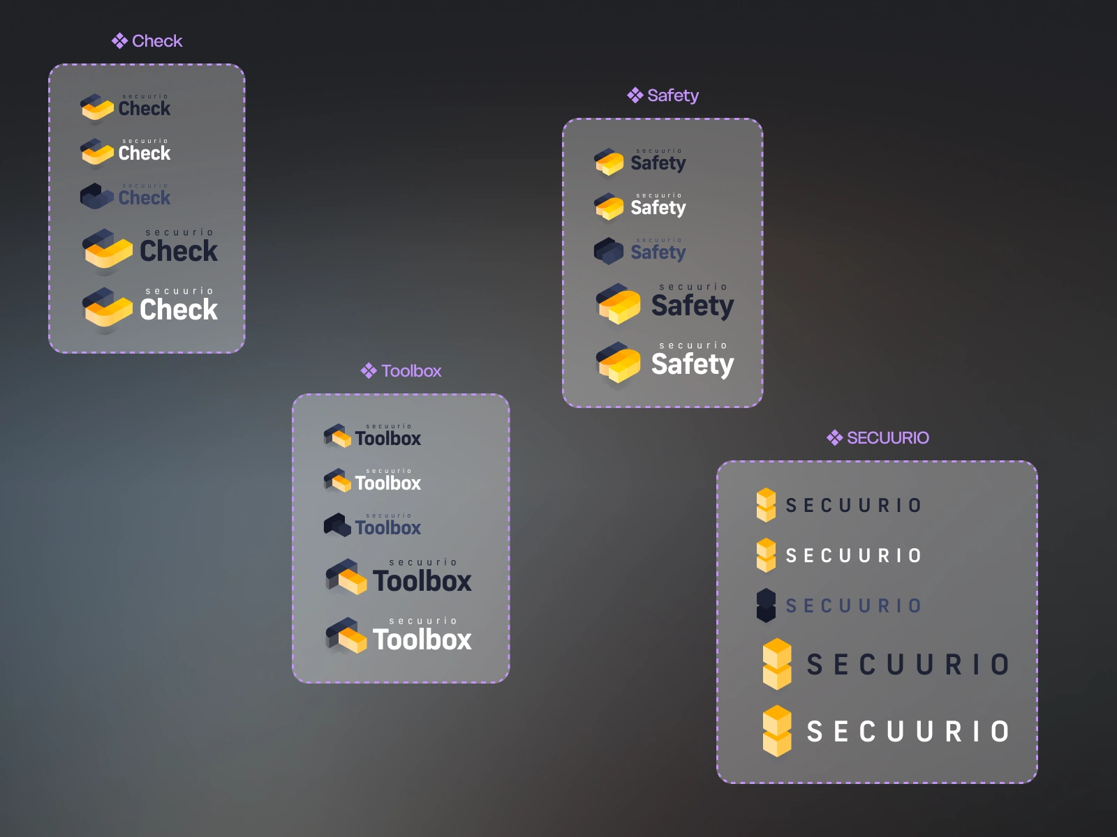
The Secuurio brand and the 3 sub brands
3. Visual Development
Logo & Symbolism
A strong, minimal master logo that communicates professionalism and confidence.
Sub-brand logos derived from the same visual DNA, with subtle variations to reflect functional differences.
Color & Typography
Color palette: A combination of solid, corporate base tones with accent colors to enhance recognition and usability.
Typography: Clean, modern, and highly legible typefaces to ensure clarity across digital and print applications.
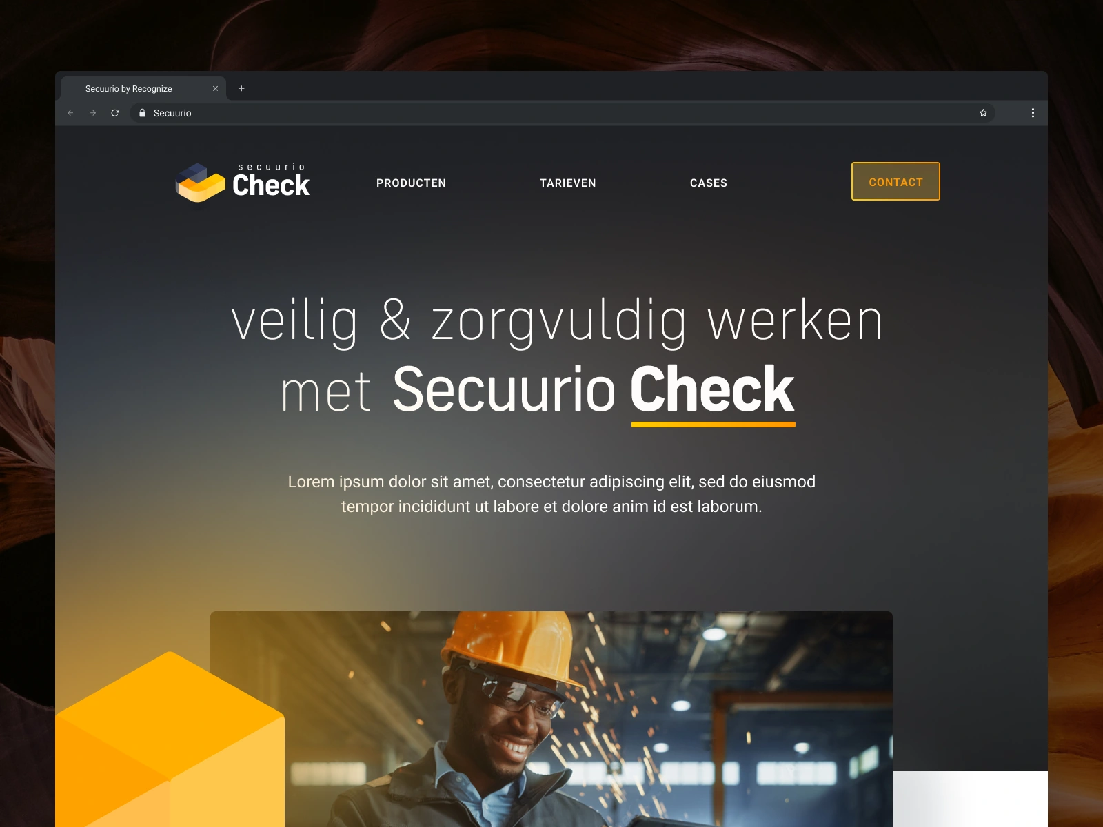
Applications & Mockups
Brand applications designed for digital environments, including interface elements, presentations, and social media visuals.
Realistic mockups created in Figma to demonstrate real-world usage and scalability.
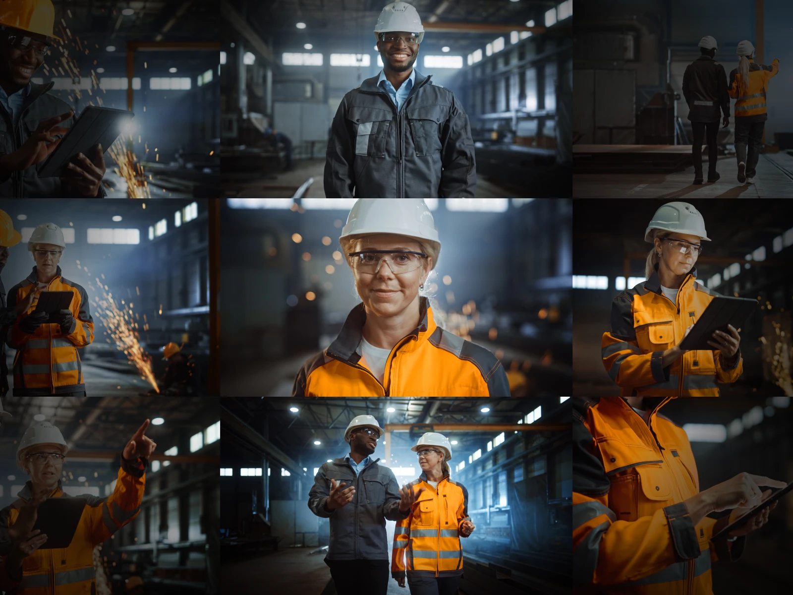
The brand colors return in the photography used for the suite
4. Results & Impact
Clear brand identity: A visual language that immediately communicates trust and structure.
Flexible branding system: Easily extendable to new sub-brands while maintaining visual consistency.
Professional presentation: Ready for use across marketing, sales, and digital touchpoints.
Although recently published, this project demonstrates a strong foundation for corporate branding systems that require clarity, modularity, and long-term scalability.
5. Reflection & Learnings
Designing a modular brand system requires strong strategic decisions early in the process, these decisions significantly simplify future extensions.
Using Figma as a central design tool enabled efficient iteration and ensured consistency across all brand components.

Like this project
Posted Jan 22, 2026
A modular branding system built around a strong core identity and flexible sub-brand variations. Combining strategic brand thinking with a clear visual language