Built with Jitter
Flexible Card Interface Design for Fintech Dashboards
Emmanuel Okolie
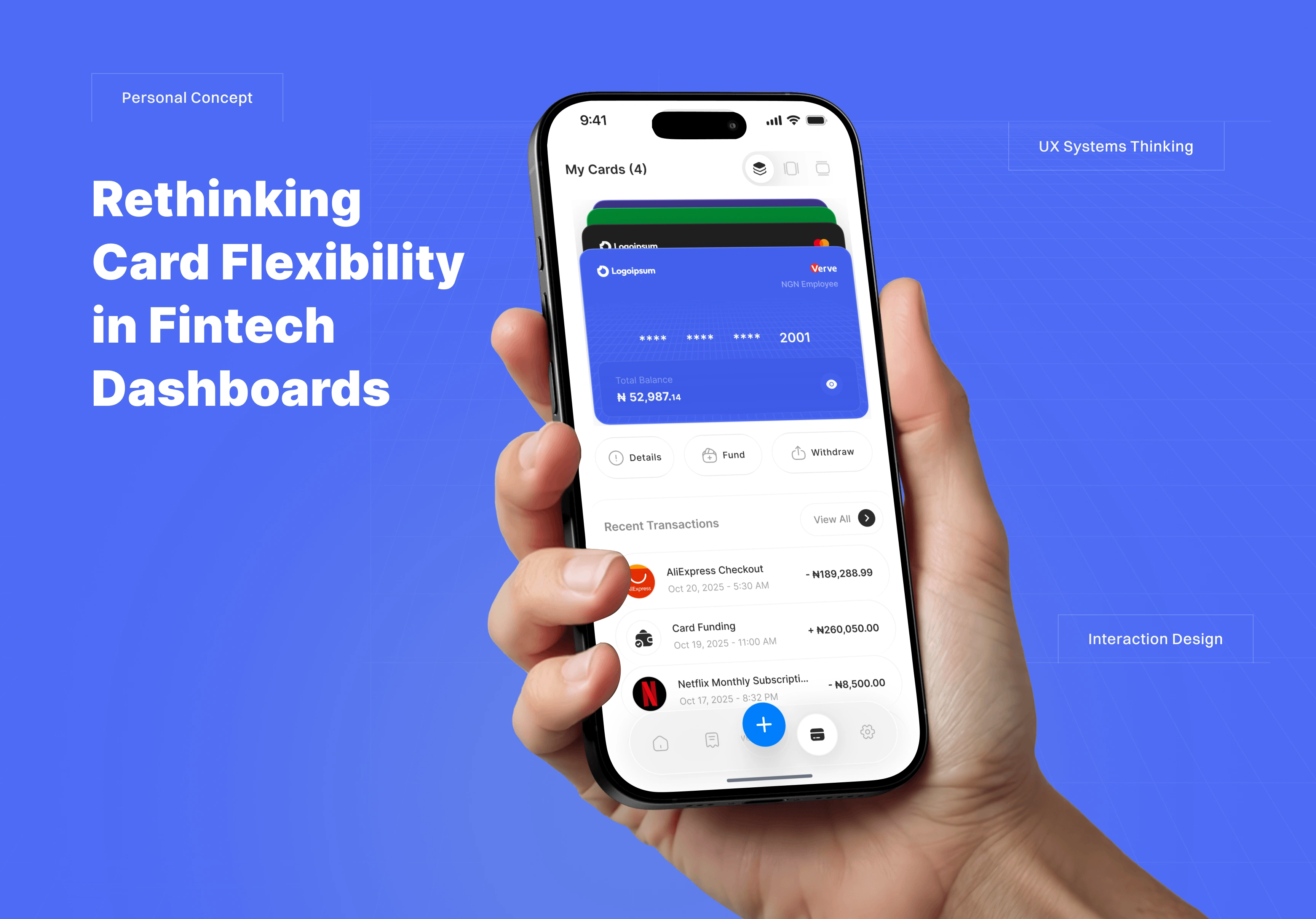
The Starting Question
Maybe it’s my mild alignment OCD talking, but what if multi-card fintechs were designed for people who care how things line up?
Most dashboards go horizontal, and I get why. Familiarity drives functionality. But that same comfort zone also limits exploration.
Different users have different visual rhythms. Some like tidy stacks, others want everything visible at once.
So what if they could choose?
Horizontal, vertical, or stacked, and the system remembered their preference.
A small shift in interaction. A big nod to human choice.
The Challenge
Design a flexible card interface that:
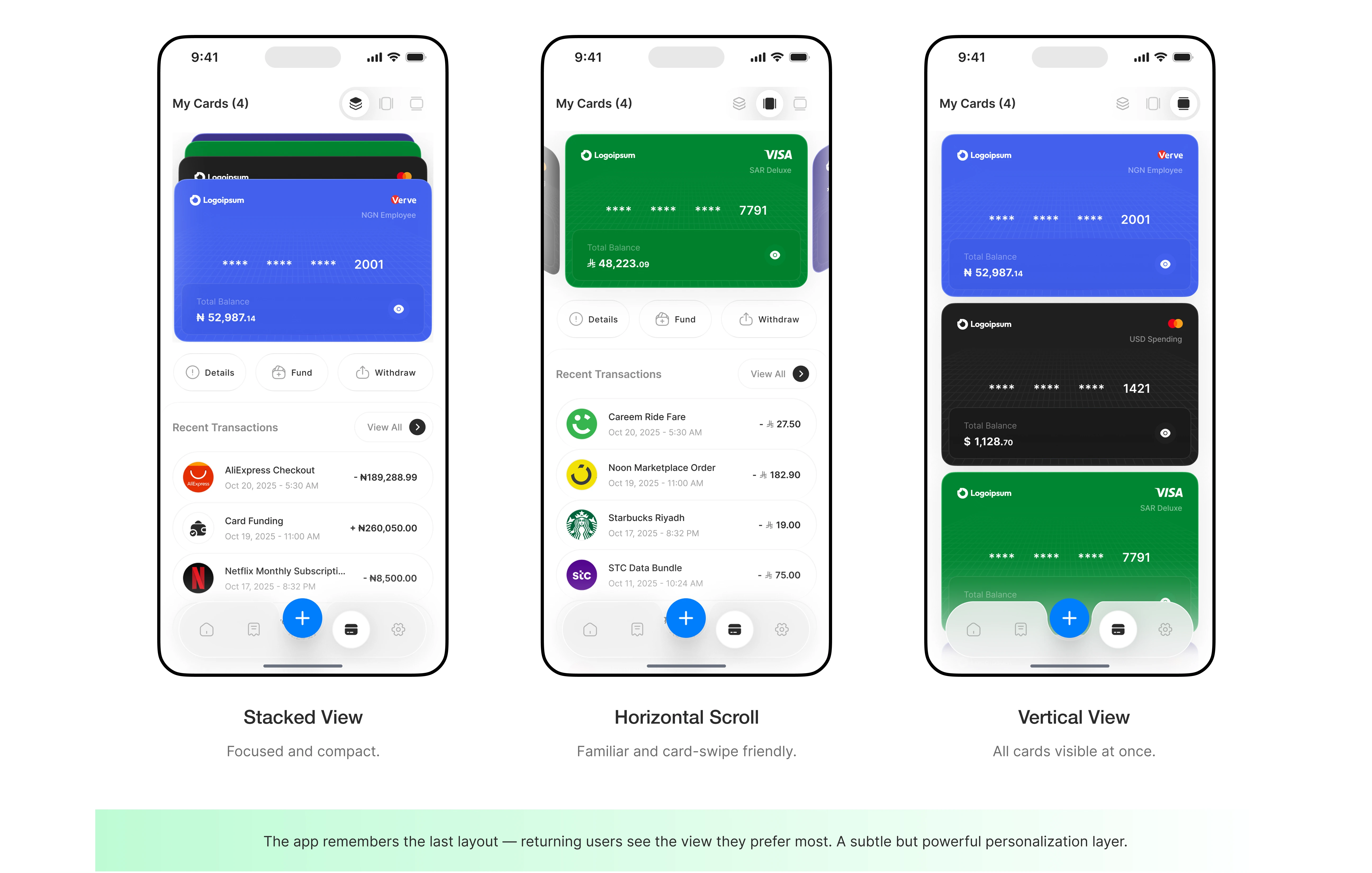
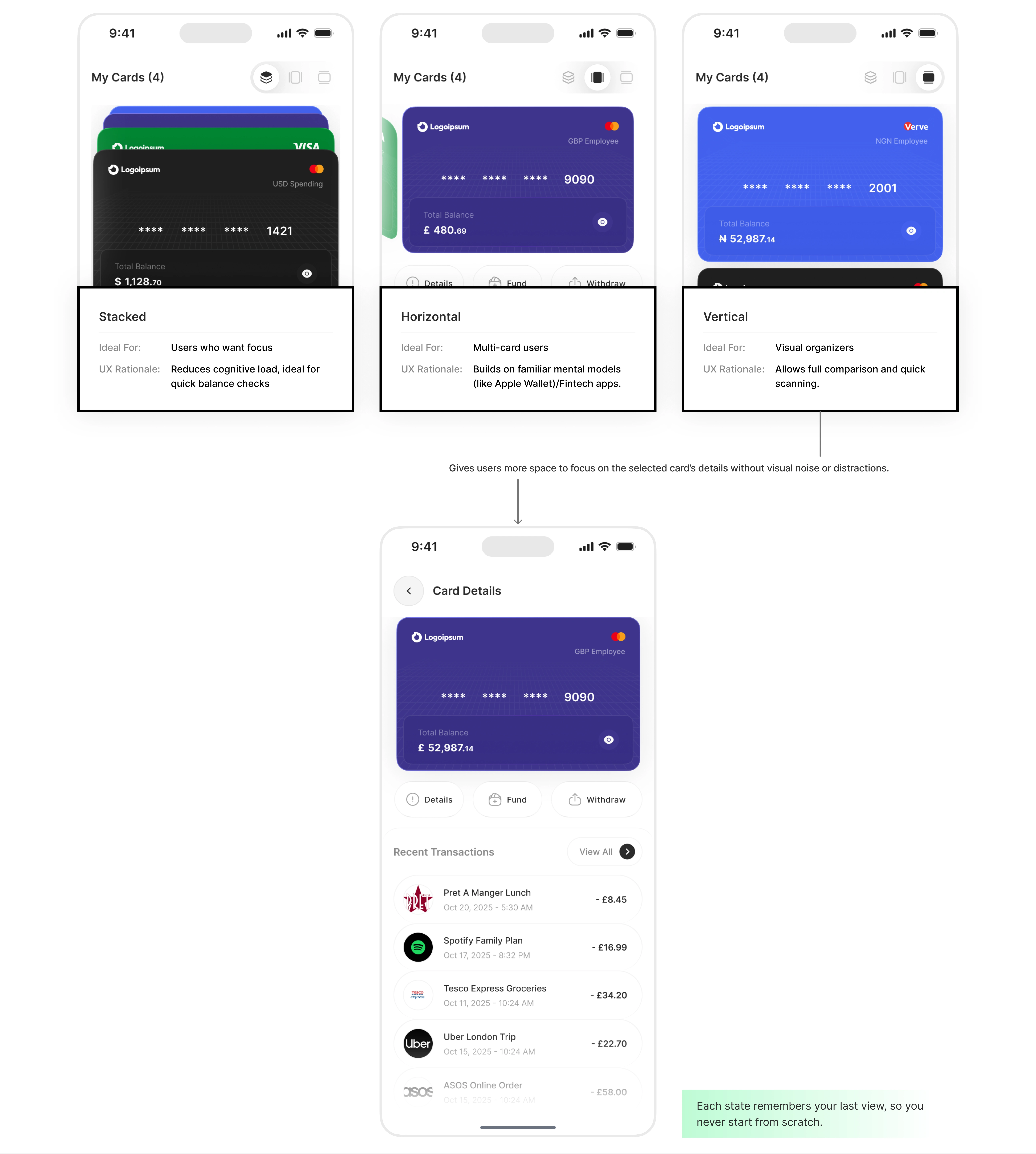
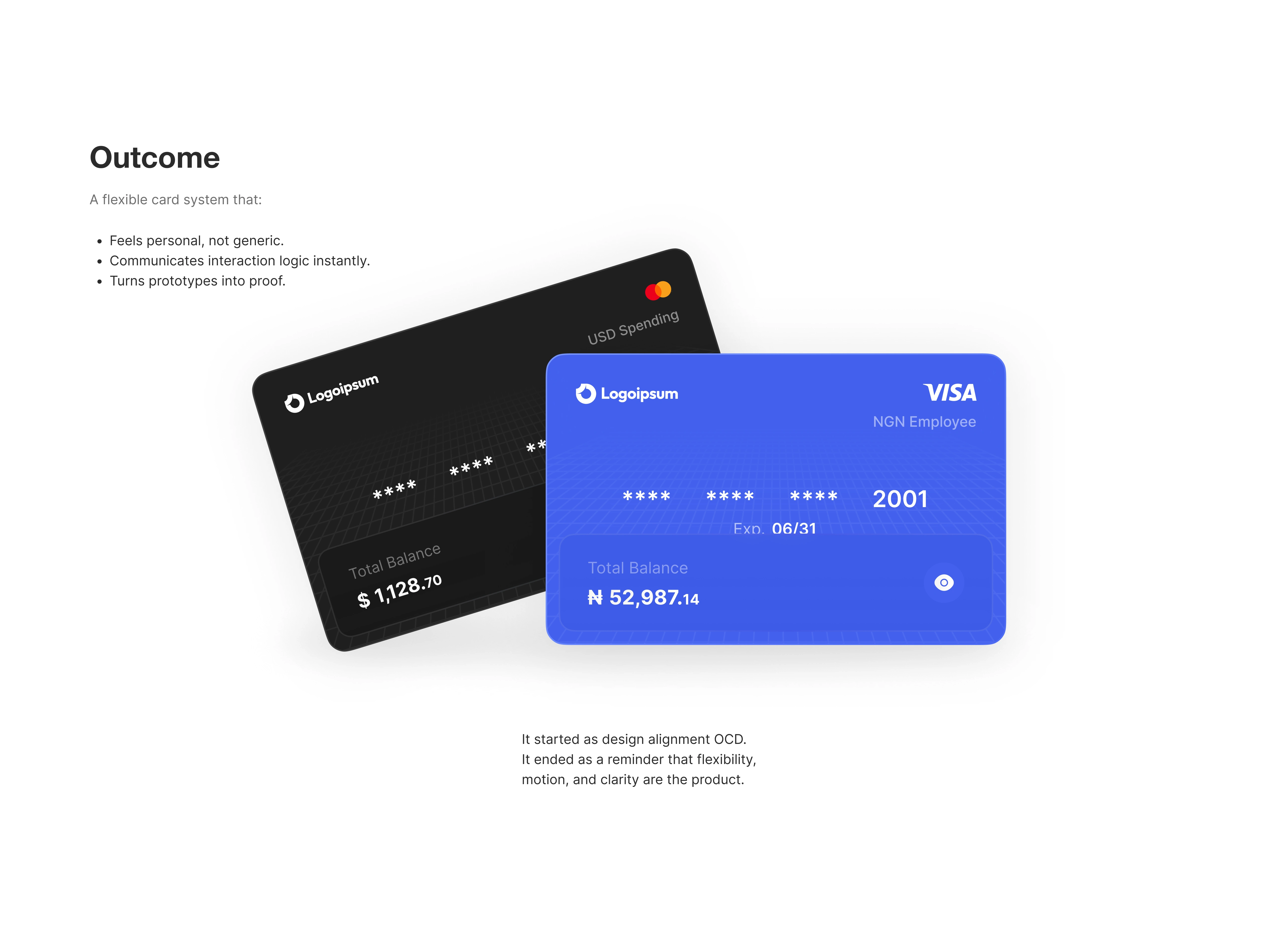
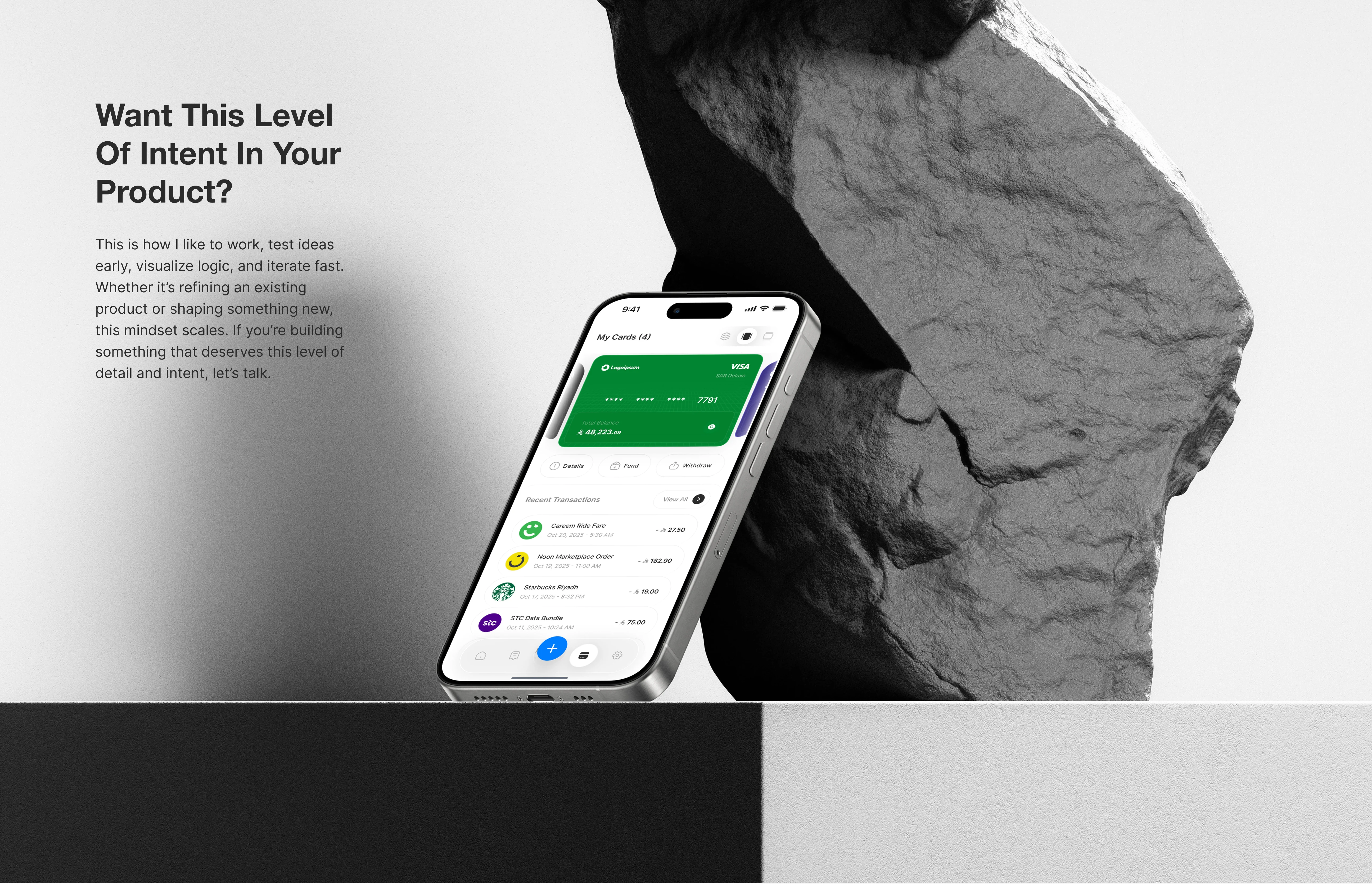
Adapts to user preference (horizontal, vertical, or stacked).
Feels consistent and learnable across all views.
Helps users understand transitions and scroll directions through micro-interactions.
Reduces complexity, not adds to it.
The Concept
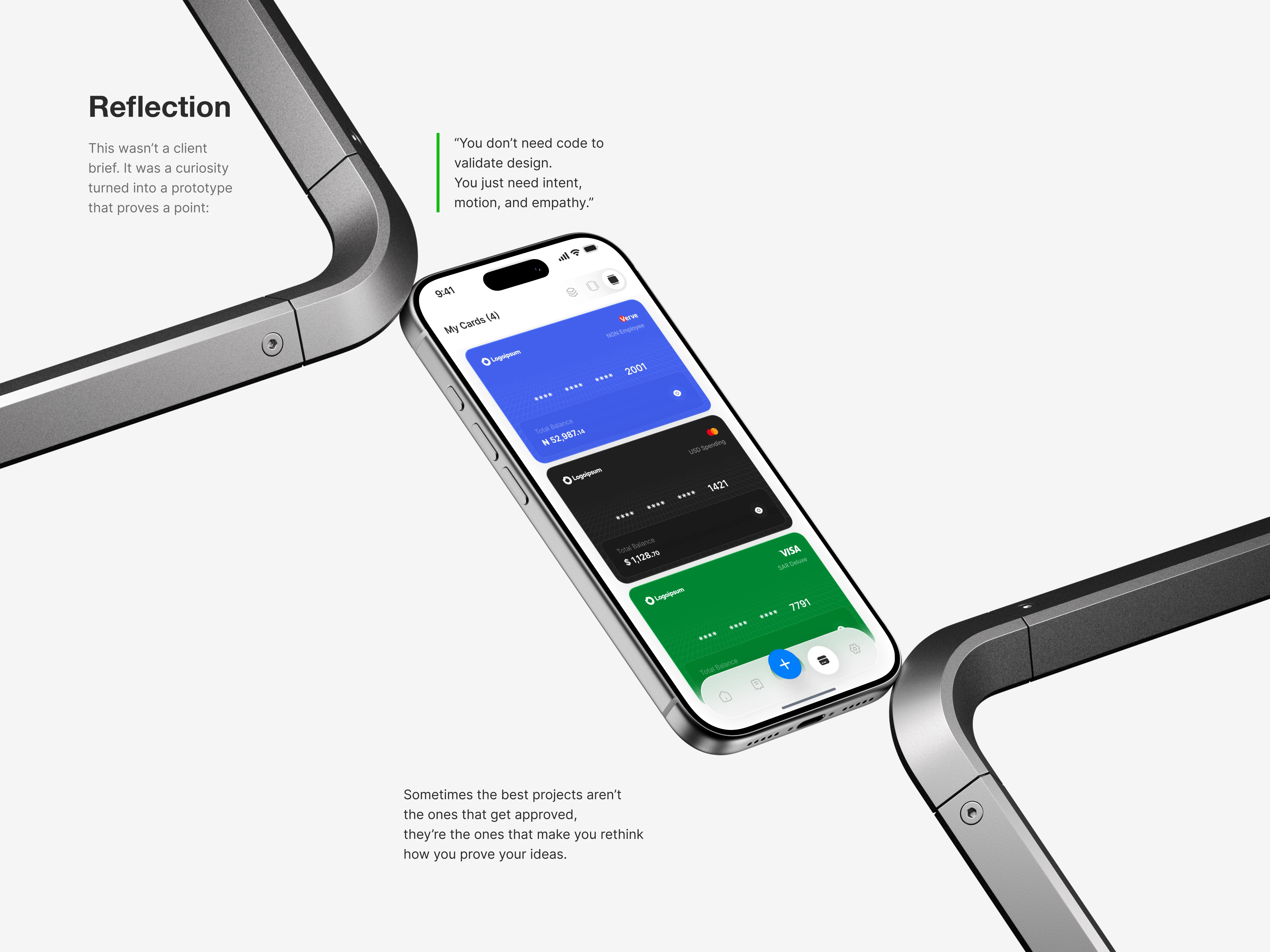
I approached this as a validation exercise, not just a UI concept.

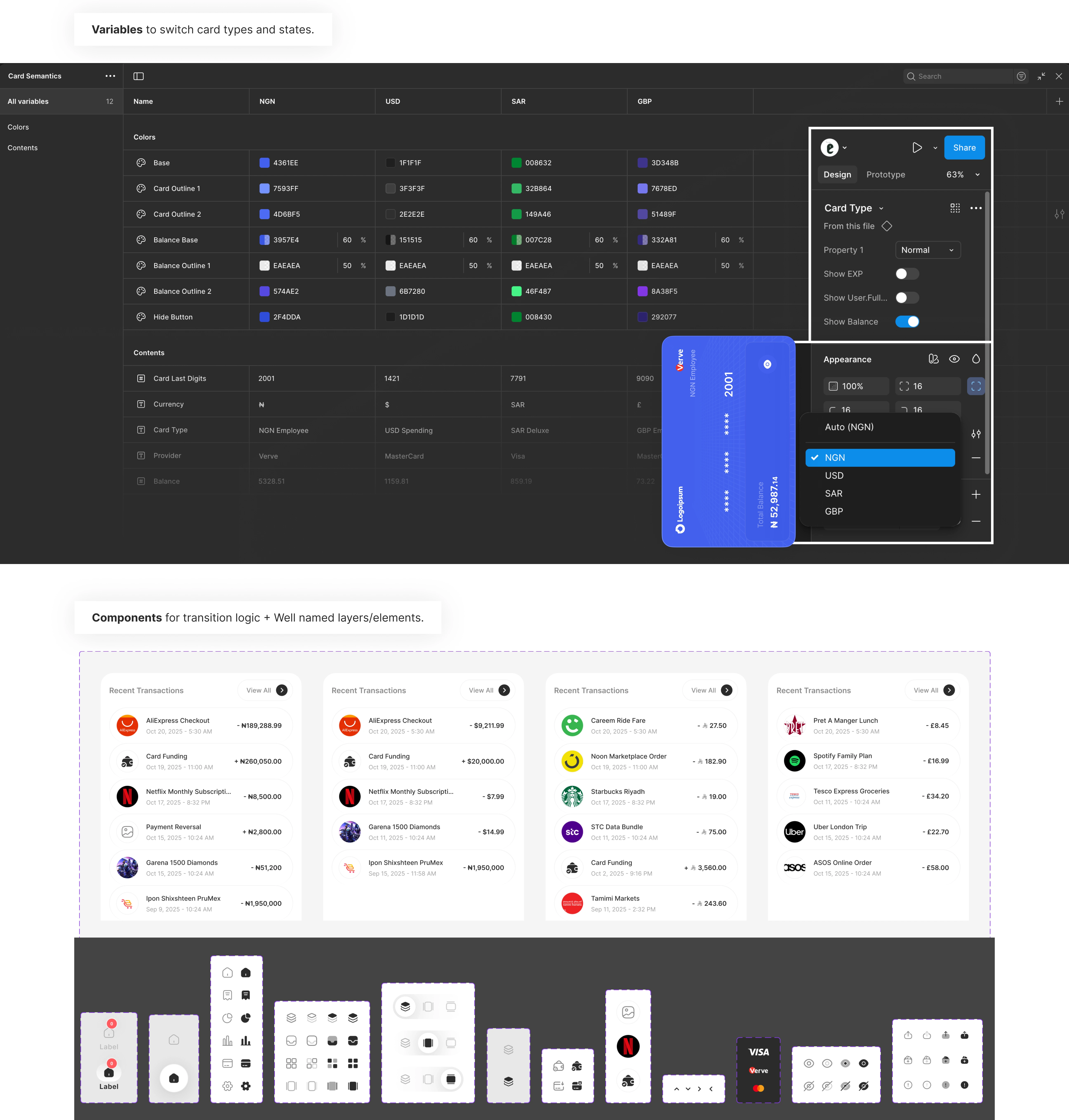
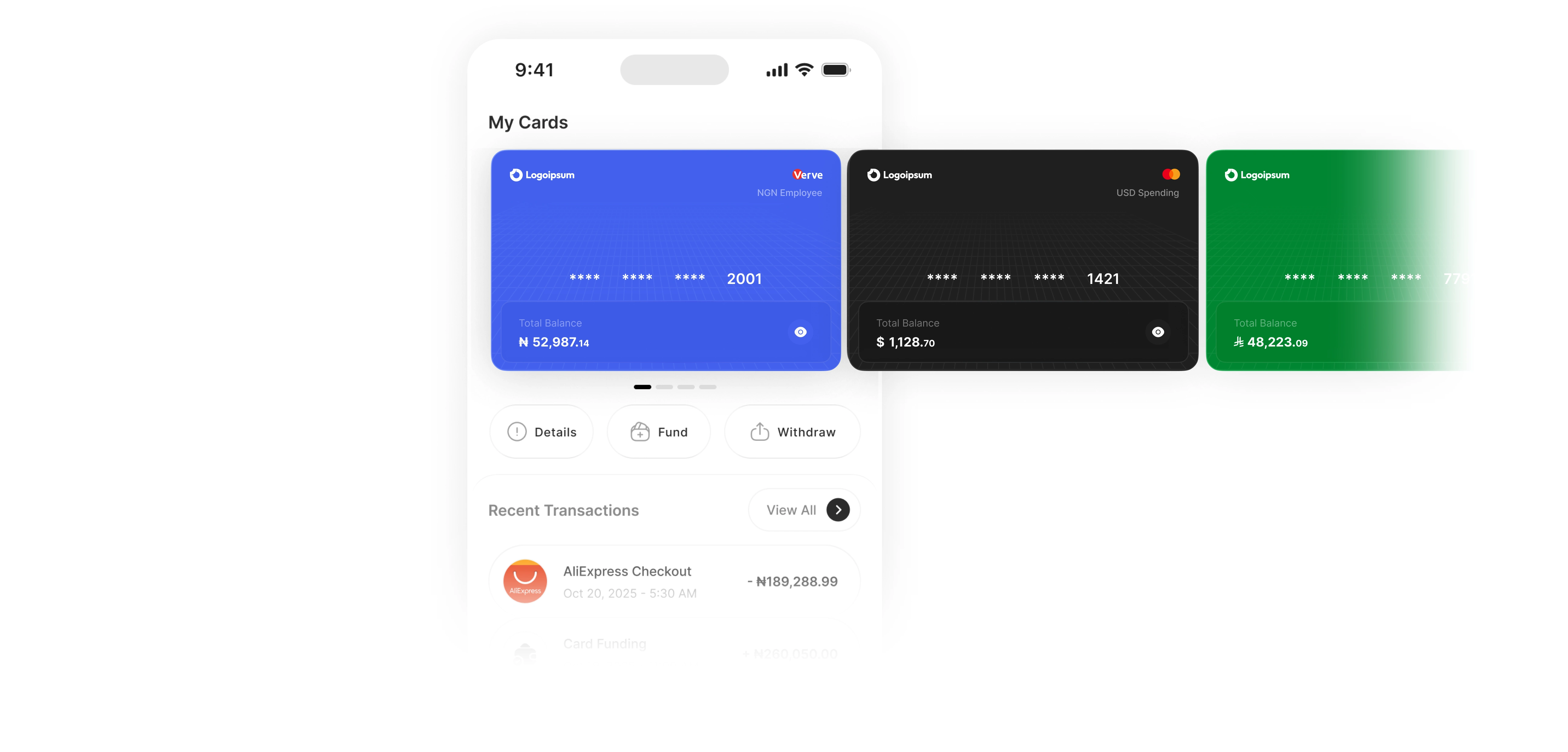
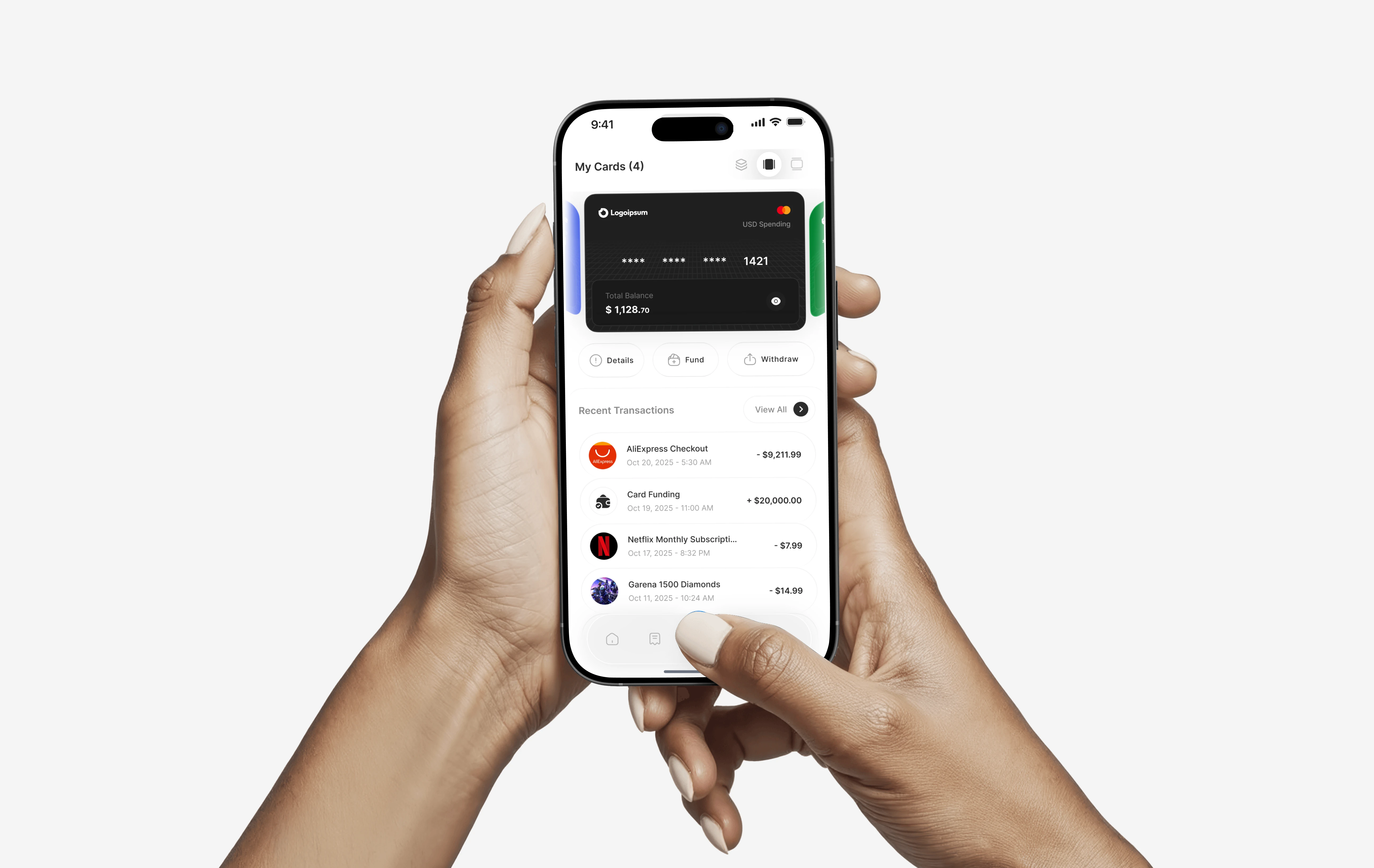
Design Breakdown
View Flexibility
Users can toggle between:
Interaction Clarity
Switching layouts introduces a small directional animation cue.
Users instantly learn how to scroll in that view (horizontal or vertical).
This micro-animation bridges the cognitive gap between layouts, no tutorial needed, just smart motion.
Why Each Layout Works
Prototyping the Idea
While the original plan was just a quick snapshot, feedback from the design community and potential users made one thing clear, they needed to see it in action. So I mapped the states, variables, and components, and brought it to life in under 48 hours.
Like this project
Posted Oct 28, 2025
A visual and motion-driven exploration of how interface rhythm shapes trust, speed, and comfort in multi-card fintech apps. Built to validate ideas before code.
Likes
5
Views
84
Timeline
Oct 20, 2025 - Oct 24, 2025