Enterprise UX for Modern Finance: Inside the Moola Redesign
Emmanuel Okolie
Verified
🧠 The Challenge
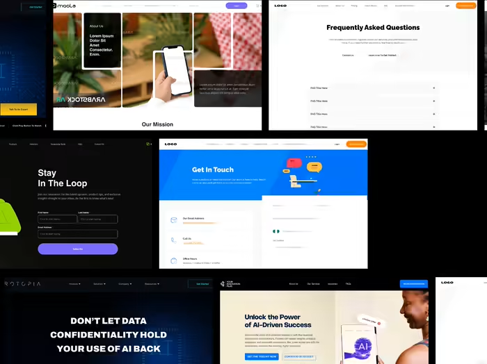
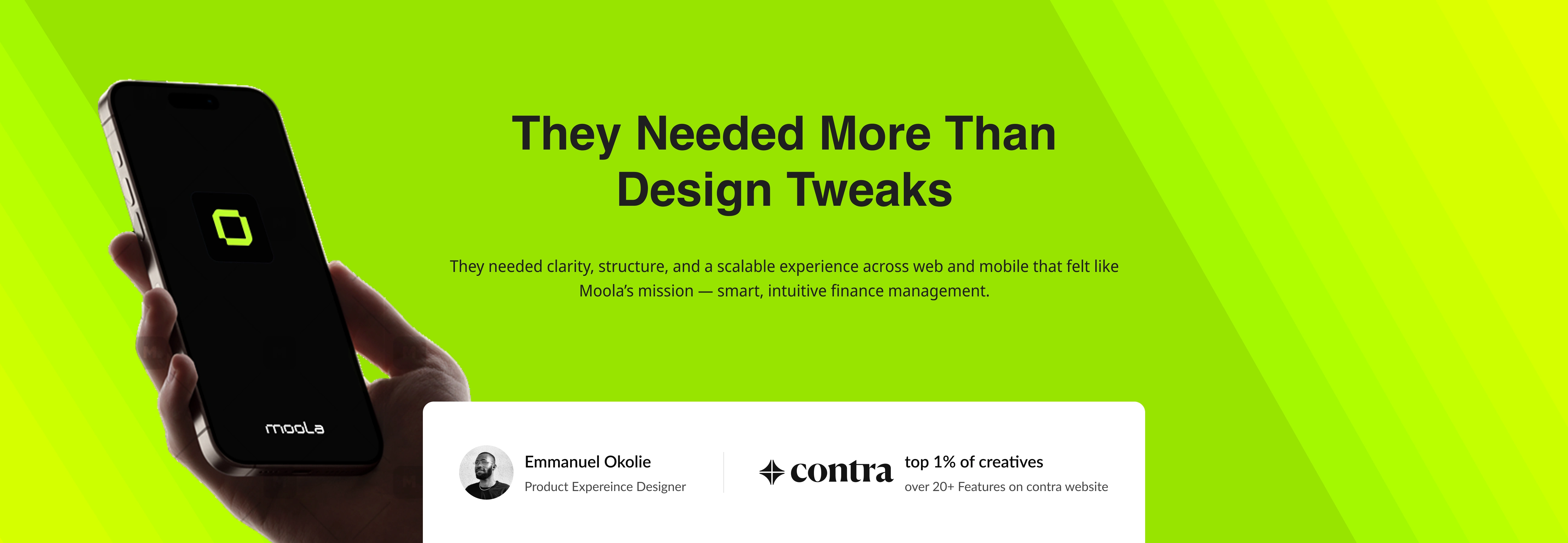
Moola is a modern finance operations platform helping Saudi companies manage employee spending, requests, and corporate finances — fast and transparently. But as more organizations onboarded, the cracks in the product experience started to show:
Confusing approval flows for Admins
Limited oversight into company-wide fund distribution
Disjointed mobile experiences for employees
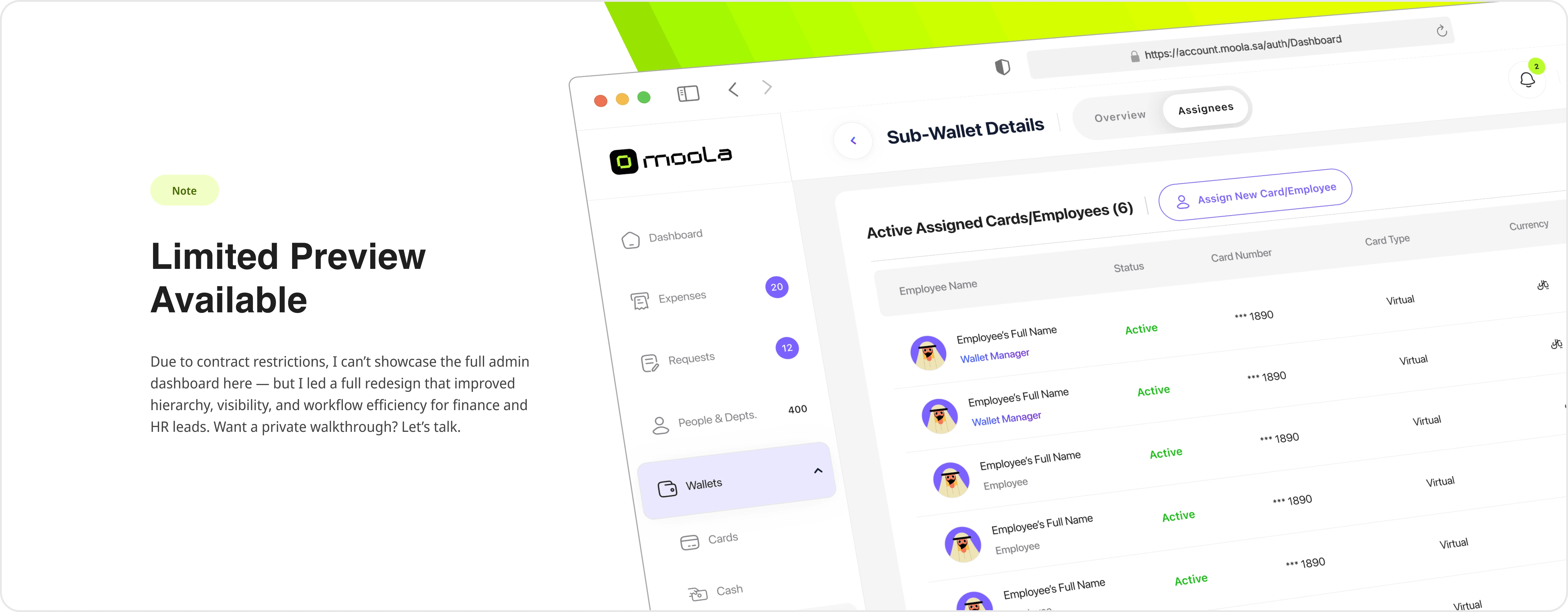
Poor visibility into Sub-Wallets, Pools, and transaction history
🎯 My Role & Scope
I was brought in to revamp Moola’s core user experiences across web and mobile, with a special focus on:
Admin Dashboards — Approval hierarchies, wallets, transaction oversight
Employee Mobile App — Request flows, visibility, and actionability
Design Systems — Structure, reuse, and clear interaction patterns
Empty States, Modals & Feedback — Tone and clarity at every touchpoint
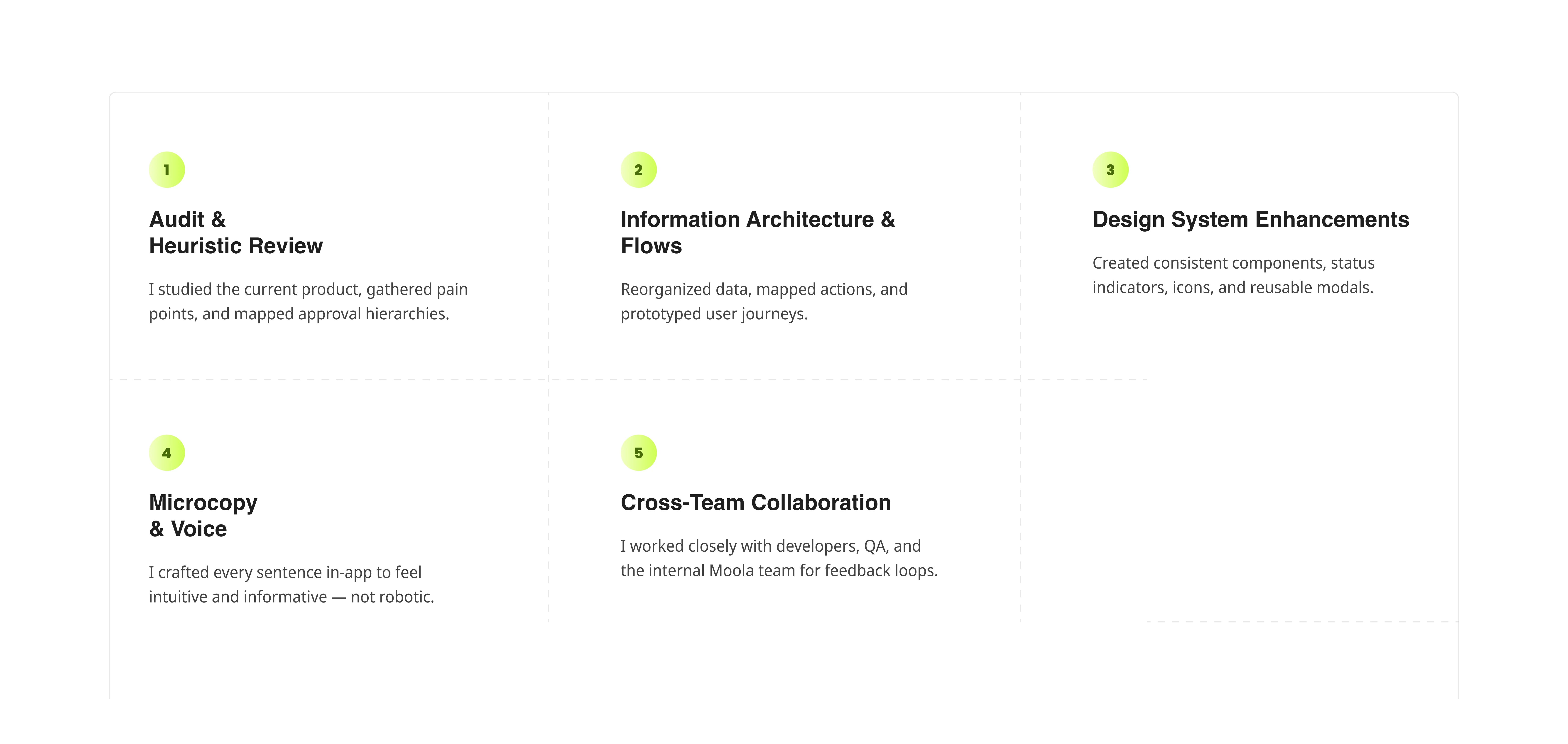
This was more than UI. I collaborated directly with stakeholders to reshape the product’s information architecture, redesign key journeys, and refine copy to be crisp, functional, and human.
🚀 What I Did
1. Redesigned the Admin Experience
Admins were drowning in scattered data. I introduced:
Clear navigation labels like “Requests in Progress”, “Sub-Wallets”, and “Funding Balance”
Modular dashboards with high-clarity cards and actionable summaries
Status architecture that matched their mental model (e.g., “Pending,” “In Progress,” “Final Approval”)
Bulk user actions, modals, and approval flows simplified to reduce decision fatigue
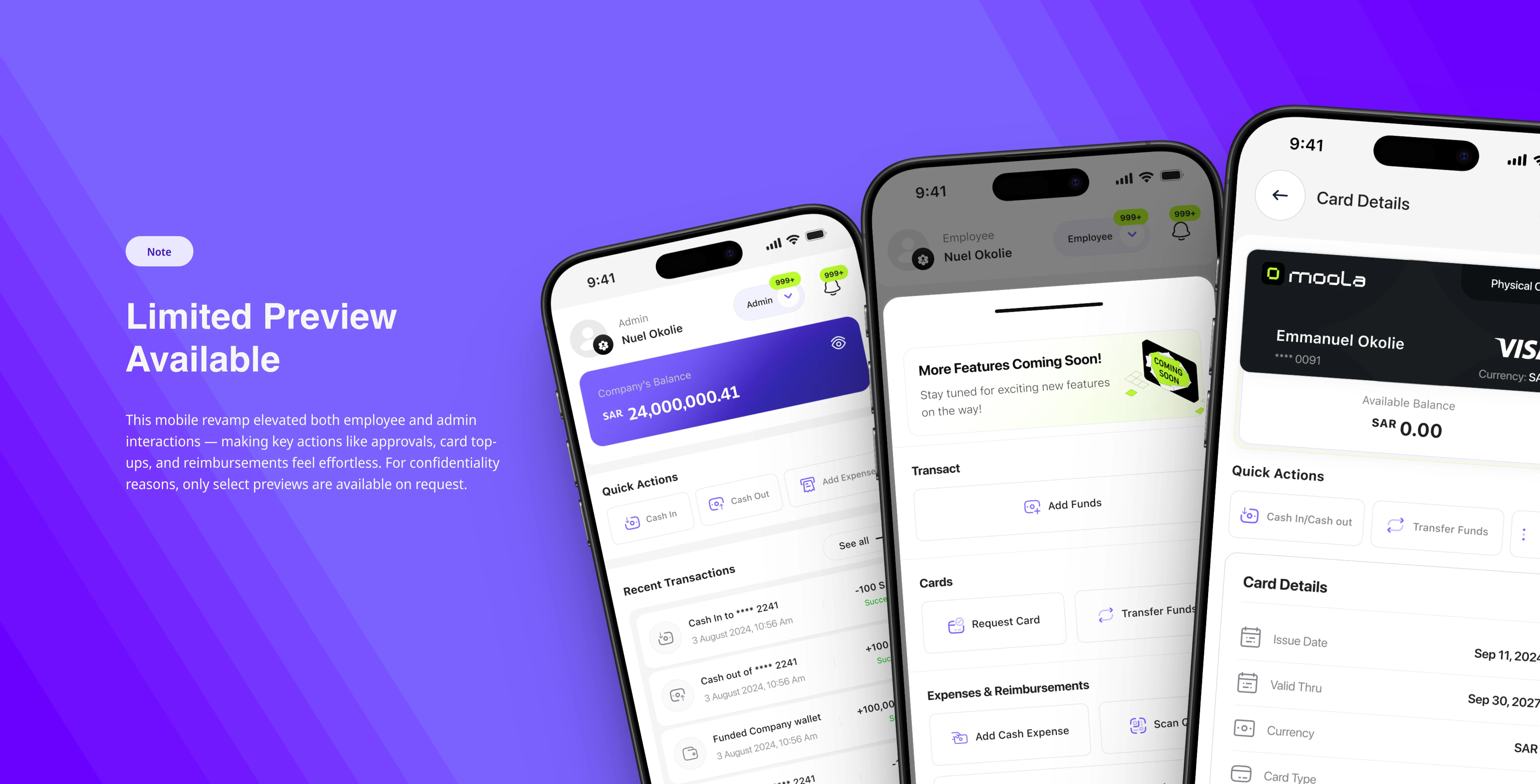
2. Mobile Experience Overhaul
For employees, I simplified:
Crafted a mobile experience tailored to both Admins and Employees.
Employees could now request funds, monitor approvals, and see real-time updates.
Admins gained the ability to manage teams, assign budgets, and approve requests—all on the go.
Viewing transaction timelines, statuses, and approvals
Instant feedback and notifications with clean, responsive UI patterns
Contextual onboarding and inline tooltips
3. Approval & Request System
Designed a multi-step request/approval flow for financial actions—optimized for clarity and accountability.
Introduced “Pools” for shared spending—great for departments and events.
Created status indicators, manager hierarchies, and notification flows that removed ambiguity and improved speed.
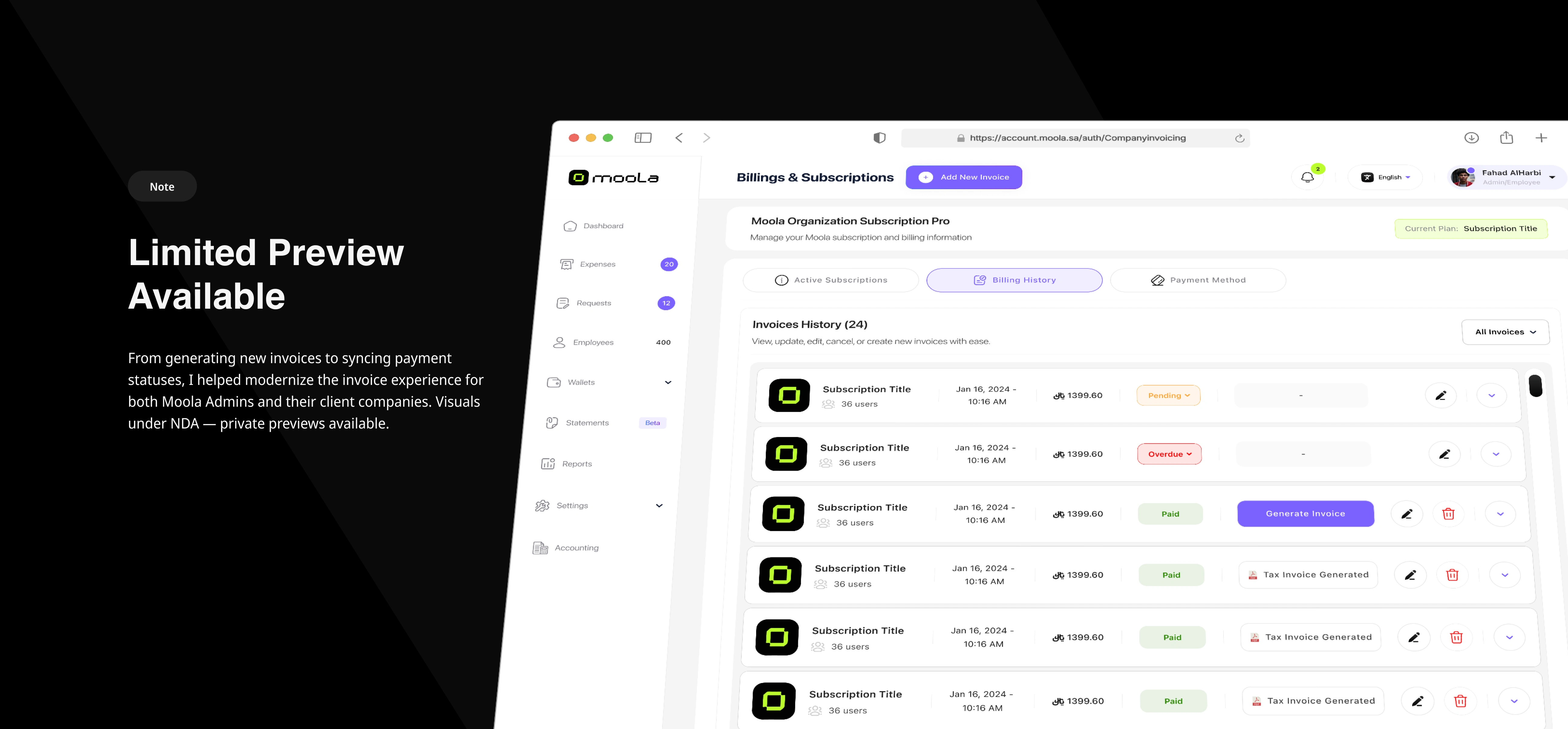
4. Invoicing System Redesign
Revamped invoice creation, status tracking, and payment flows.
Built feedback modals, success pages, and empty states to guide users intuitively.
Added tax invoices, offline payment handling, and company-to-company tracking features.
My Workflow
My design process guarantees a great result — every time. I adapt the stages depending on the project’s needs, staying flexible and focused on delivering the right solution.
💡 The Results
Faster Admin Decisions — Clearer approval stages and status tags led to quicker turnarounds.
Higher Wallet Engagement — Clear distinctions between Pools and Sub-Wallets drove feature usage.
Improved Mobile Satisfaction — Employees could now request, track, and manage transactions effortlessly.
Scalable UI — Design decisions now scale with company growth and usage.

You’re not just hiring a designer — you’re hiring someone who turns complexity into clarity. I bridge user logic with business goals, and I write with the product’s voice in mind. The Moola project was proof that fintech doesn’t have to feel like a spreadsheet — it can feel human.
✉️ Ready to Simplify Your Product?
If your platform feels overwhelming, inconsistent, or underutilized, I’d love to help. Let’s create something people want to use — and understand in seconds.
Like this project
Posted Feb 19, 2025
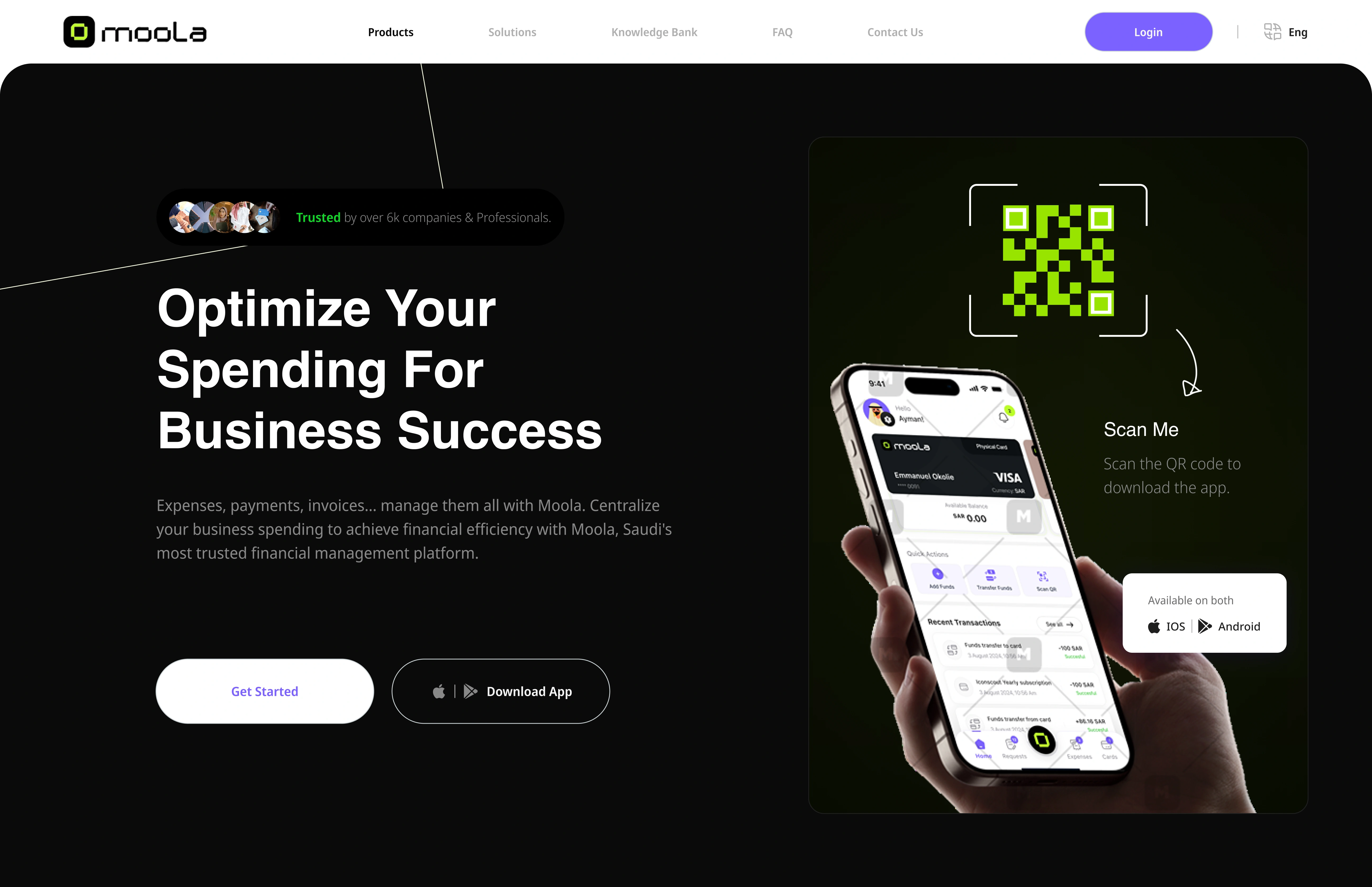
Moola – A digital finance platform for Saudi companies to manage employee requests, spending, and internal wallets.
Likes
5
Views
157
Timeline
Aug 27, 2024 - Ongoing
Clients
MOOLA