GiftsBazaar.in Website UI/UX Redesign
Alok Yadav
GiftsBazaar.in — Reimagining a Premium Home Décor E-commerce Experience
Project Overview
GiftsBazaar.in is an Indian direct-to-consumer e-commerce platform offering home décor, gifting items, and decorative accessories. While the product catalog itself had potential, the existing digital experience did not reflect a premium or trustworthy brand, especially when compared to leading competitors in the same segment.
This project involved conducting a comprehensive UI/UX audit of the existing website, identifying key usability, branding, and conversion issues, and then executing a full visual and structural redesign aligned with modern (2025) e-commerce UX standards.
The redesign was approached not as a cosmetic refresh, but as a strategic UX transformation focused on clarity, trust, emotional connection, and purchase confidence.
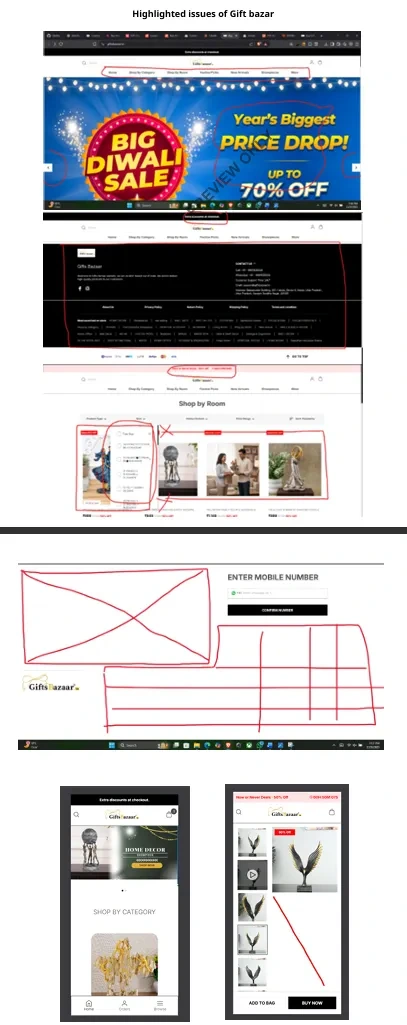
1. Problems Identified in the Original Interface
Based on the UX audit conducted earlier, the original website had several critical issues:
Visual Design Issues
The homepage was heavily cluttered with repeated discount banners, timers, and promotional messages.
Graphics quality was inconsistent; some banners appeared blurry or outdated.
Typography lacked hierarchy — headings, prices, and CTAs competed visually.
Branding was weak and inconsistent, reducing perceived credibility.
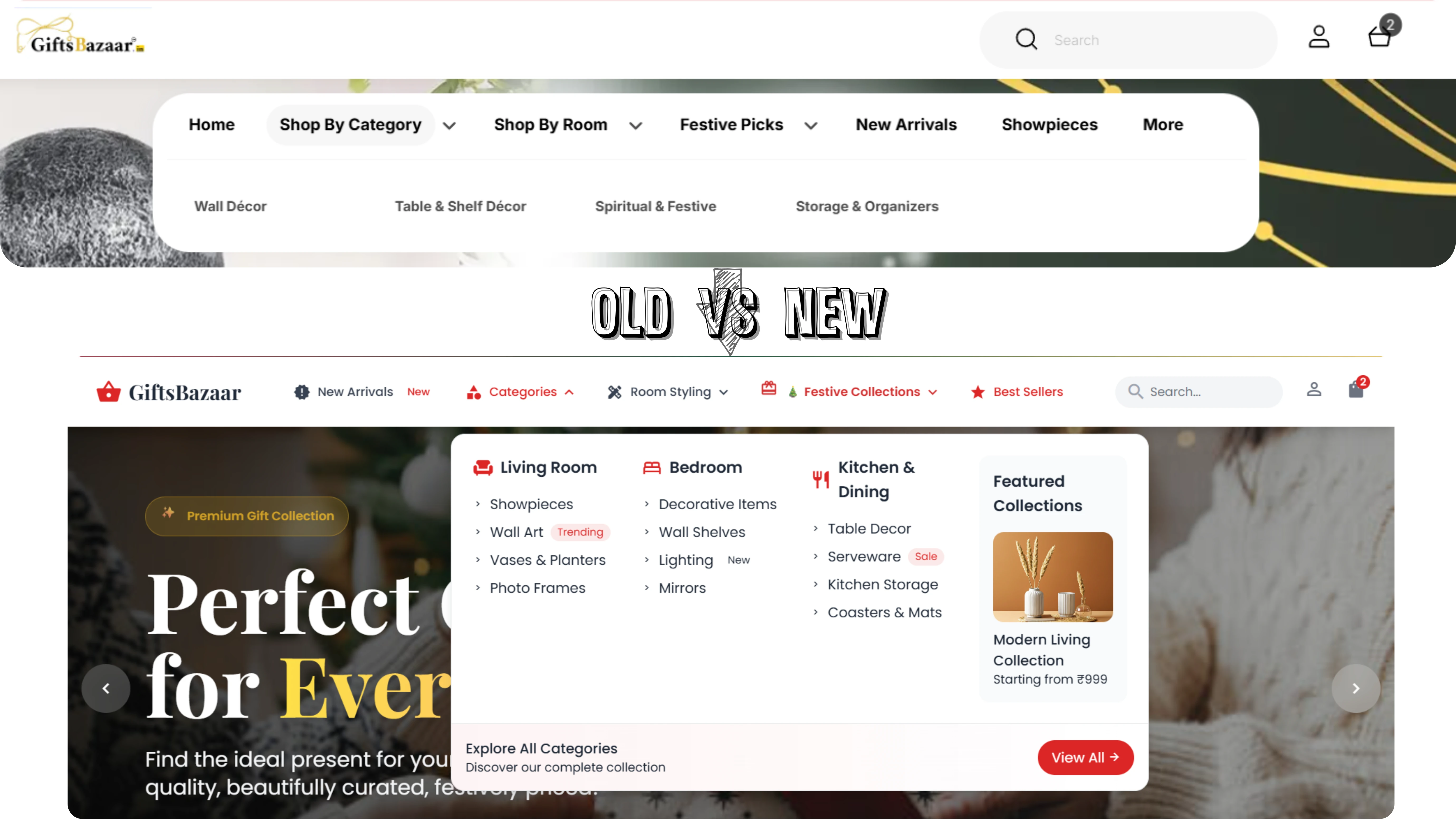
Navigation & Structure Problems
Navigation menus were confusing and fragmented (e.g., overlapping “Shop by Category” and “Shop by Room”).
Important sections like Best Sellers and New Arrivals were buried.
The search bar lacked prominence.
No breadcrumb system, making orientation difficult.
Product Presentation Weaknesses
Product cards were dense, poorly spaced, and visually inconsistent.
Images were small, sometimes low resolution, and not standardized.
Pricing, discounts, and CTAs were crowded together.
CTAs lacked visual prominence.
Trust & Conversion Gaps
Minimal trust indicators (reviews, secure payment cues, delivery assurance).
Footer looked outdated and overloaded.
No strong emotional or brand storytelling.
Overall, the experience felt dated, noisy, and untrustworthy compared to competitors like Pepperfry or Urban Ladder.
2. Redesign Goals
The redesign was guided by the following UX objectives:
Create a clean, premium, and modern interface
Establish a clear visual hierarchy
Make navigation intuitive within seconds
Improve product discoverability
Increase perceived trust and brand value
Optimize for mobile-first usability
Support faster and more confident purchase decisions
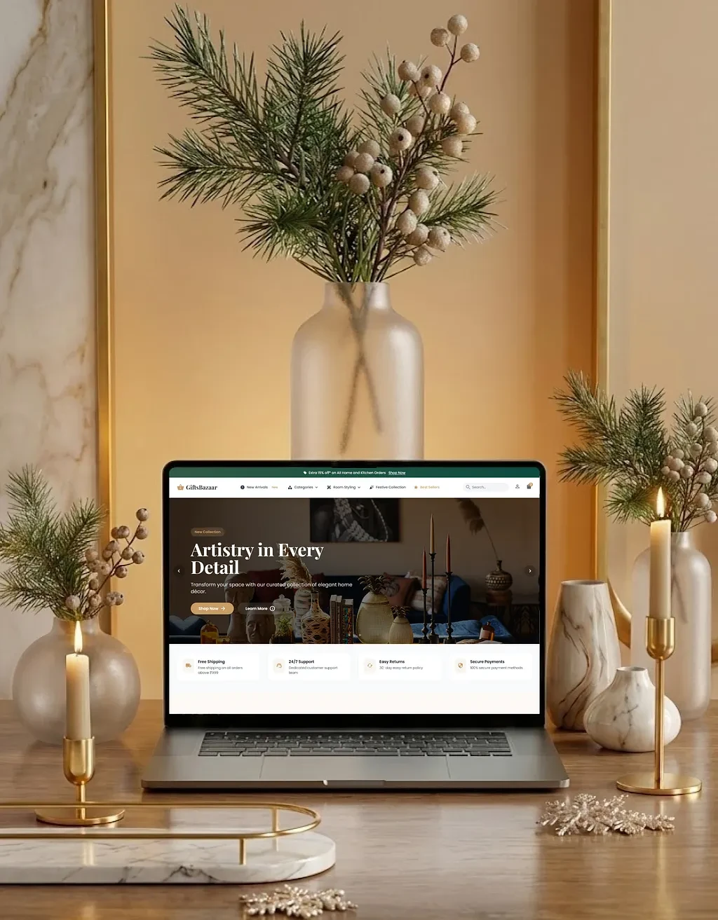
3. Visual & Brand System Redesign
A consistent design system was introduced to unify the experience:
Neutral background palette (warm whites and soft beige tones)
Single refined accent color (muted green / gold tones)
Consistent modern sans-serif typography
Increased whitespace and padding
Soft shadows and rounded cards
Subtle hover and interaction states
This shift immediately elevates the site from a “budget marketplace” feel to a premium, editorial-style brand presence.
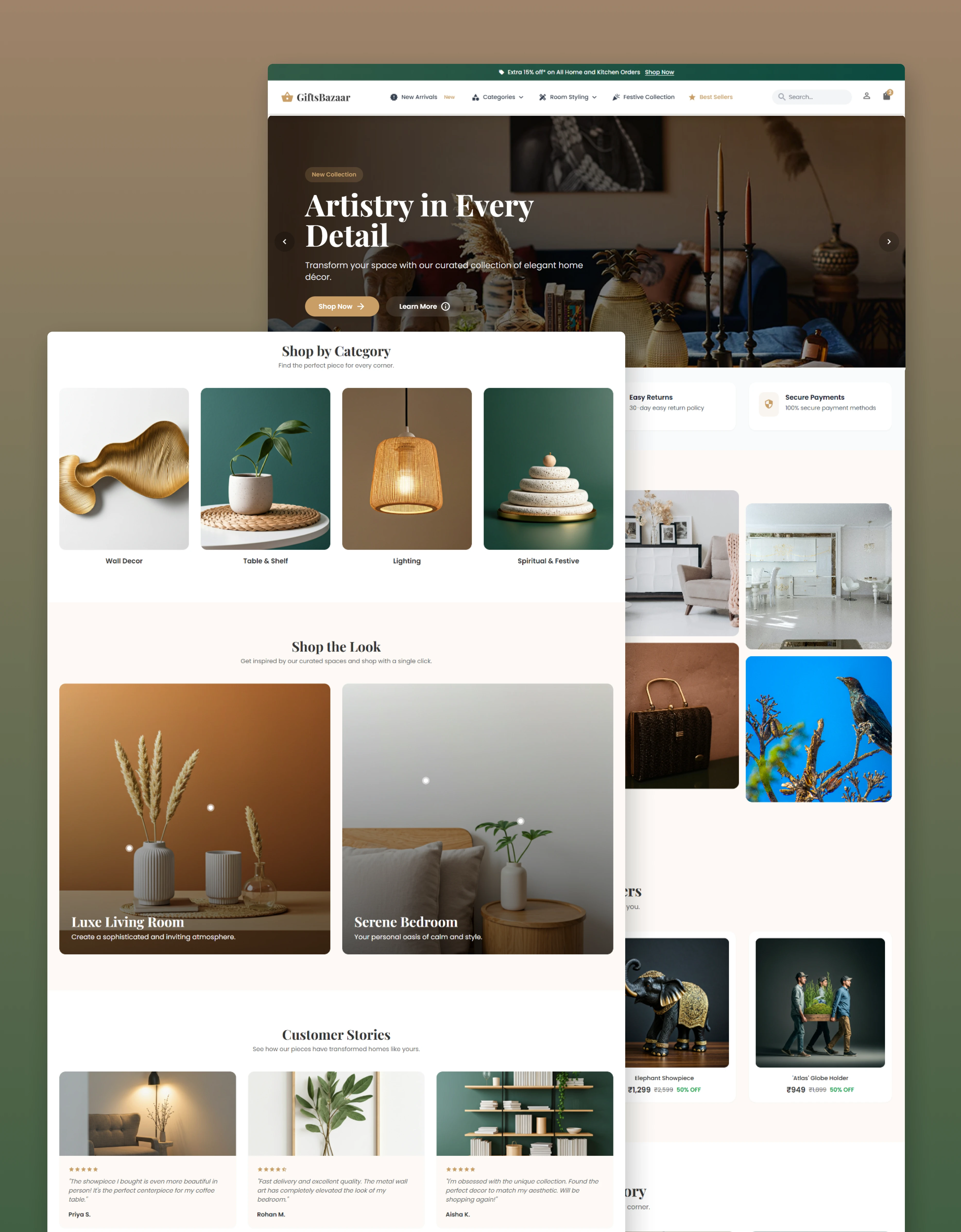
4. Homepage Redesign Breakdown
Hero Section
Replaced cluttered promotional sliders with a single focused hero
Large lifestyle imagery communicates brand mood
One primary CTA reduces distraction
Clear brand message instead of repetitive discounts
Impact: Stronger first impression and immediate trust.
Best Sellers Section
Clean, evenly spaced product cards
Larger imagery with consistent ratios
Clear price–discount hierarchy
Minimal visual noise
Impact: Faster scanning and higher product confidence.
Shop by Category
Image-based category cards instead of generic icons
Uniform sizing and spacing
Simple labels with hover feedback
Impact: Browsing feels intuitive and premium rather than overwhelming.
Shop the Look
Introduced lifestyle-based sections (Living Room, Bedroom)
Contextual storytelling replaces warehouse-style grids
Encourages bundled purchases
Impact: Higher engagement and increased average order value.
Customer Stories
Clean testimonial layout
Balanced use of visuals and text
Clear social proof without clutter
Impact: Builds trust and reduces hesitation.
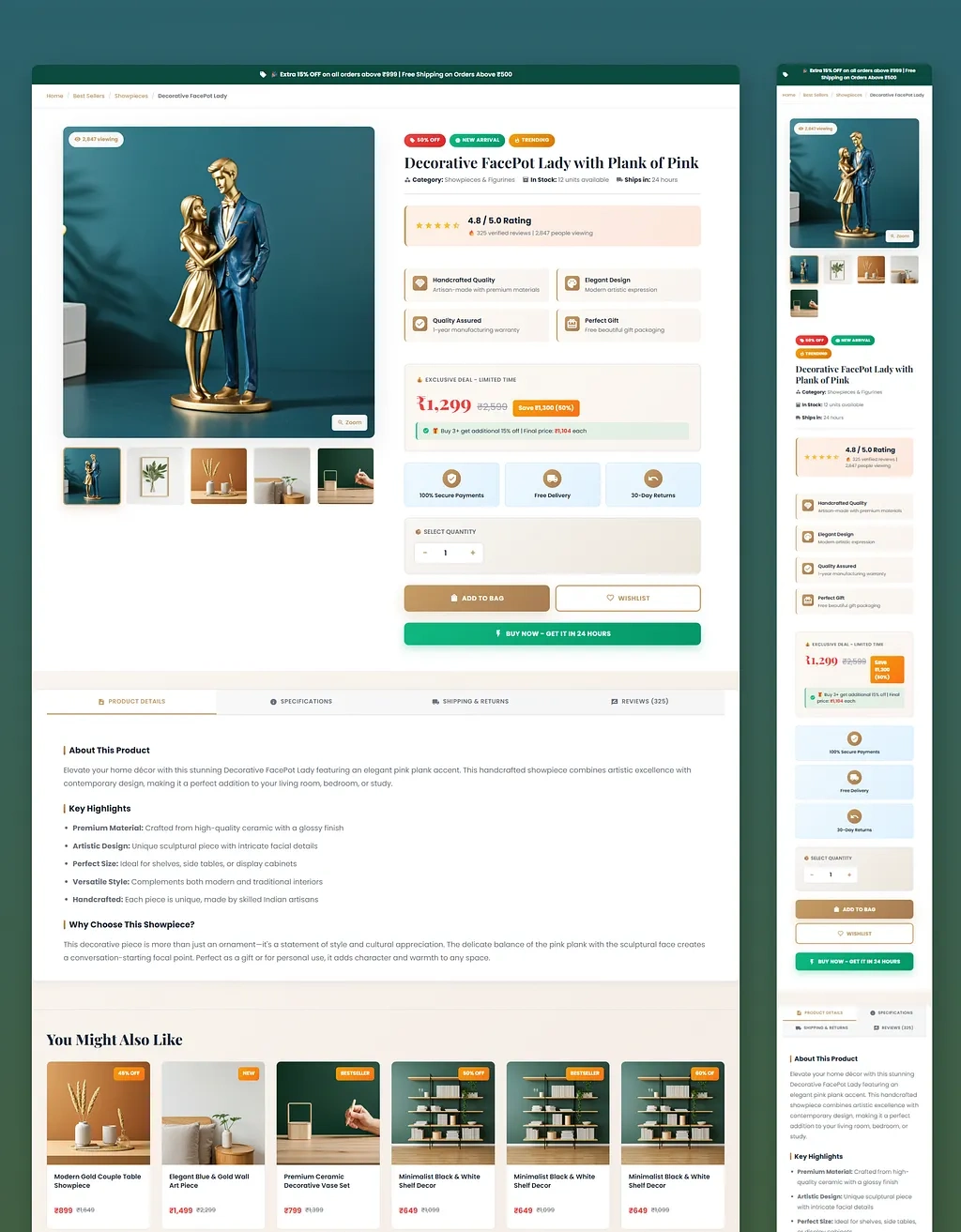
(The product detail page was redesigned to support confident decision-making)
Large hero product image with zoom
Thumbnail gallery for additional views
Clear product title and category context
Prominent rating and review count
Strong price hierarchy with discount clarity
Primary “Buy Now” CTA
Secondary “Add to Bag” CTA
Trust badges for payments, delivery, and returns
Structured tabs for details, specifications, and reviews
Every element is placed to answer user questions before doubt sets in.
Navigation & Usability Improvements
One of the most critical goals of the redesign was to remove friction caused by unclear navigation and poor orientation. In the original experience, users had to spend unnecessary time understanding where they were and how to move forward. The redesigned navigation system was intentionally simplified and standardized to create immediate clarity.
The top-level navigation now uses clear, well-defined categories that reflect how users naturally think when browsing for home décor and gifts. Each menu item has a distinct purpose, eliminating overlap and ambiguity. This allows users to quickly scan options instead of interpreting complex menu logic.
Menu behavior is predictable and consistent across the site. Dropdowns open in a familiar pattern, interactions behave the same on every page, and users are never surprised by hidden or shifting elements. This consistency reduces cognitive effort and builds user confidence.
To improve orientation, breadcrumb navigation was introduced on category and product pages. This gives users a constant sense of location within the site hierarchy and allows them to move backward without restarting their journey. It is especially helpful for deep browsing sessions, where users explore multiple categories.
Search and cart access were given strong visual prominence, ensuring they are always easy to find. These elements are positioned where users expect them and remain accessible throughout the journey. A sticky header further reinforces continuity by keeping essential navigation tools available as users scroll, eliminating the need to backtrack.
As a result of these changes, users can now understand the store’s structure within seconds, reducing confusion and improving browsing efficiency.
Mobile-First Experience
The redesign was approached with a mobile-first mindset, acknowledging that the majority of e-commerce traffic today comes from mobile devices. Instead of shrinking a desktop layout, the mobile experience was intentionally designed to feel natural, fast, and effortless.
Layouts adapt into single-column structures that prioritize vertical scrolling, which aligns with natural thumb behavior. Content is presented in a clear sequence, preventing overcrowding and ensuring readability on smaller screens.
Buttons and interactive elements were redesigned to be thumb-friendly, with sufficient size, spacing, and contrast. This reduces accidental taps and improves usability during one-handed use, which is common in mobile shopping scenarios.
Filters and navigation menus were made collapsible, allowing users to access advanced controls only when needed. This keeps the interface clean while still supporting detailed exploration for users who want to refine their search.
Images were optimized for performance without compromising quality. Lazy loading and responsive image sizing ensure faster load times, which is critical for mobile retention and conversion.
Importantly, the mobile experience maintains full content parity with desktop. No features, information, or trust elements are hidden or removed, ensuring that mobile users receive the same level of clarity and confidence as desktop users.
Together, these decisions create a friction-free mobile experience that supports both browsing and purchasing with minimal effort.
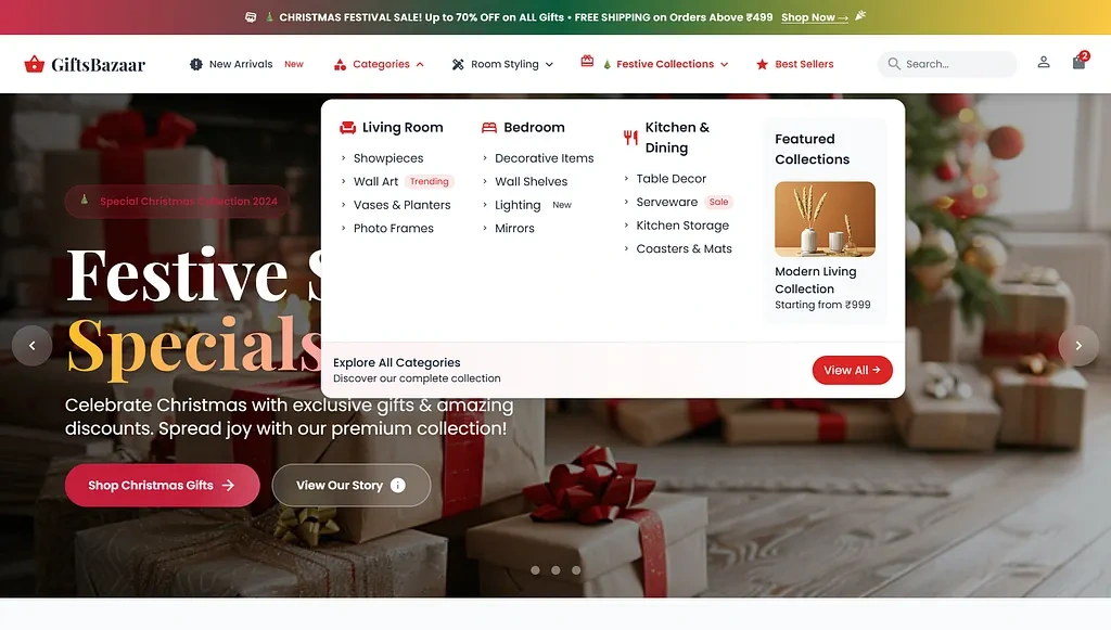
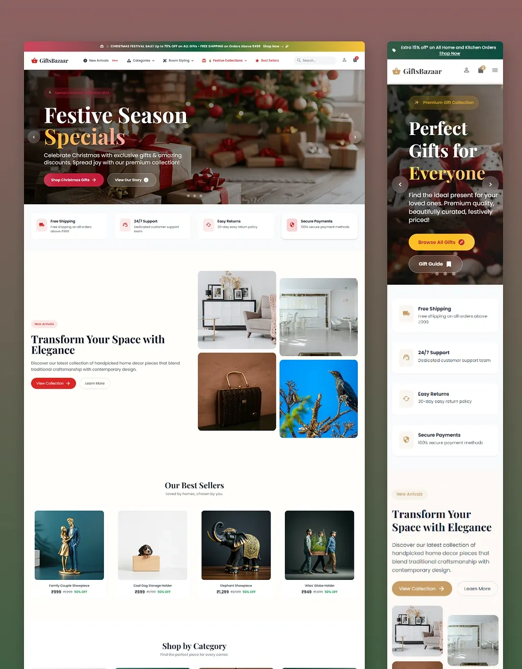
Festive (Christmas) Theme Design Objective
The Christmas-themed interface for GiftsBazaar was intentionally designed to leverage seasonal user psychology, where emotions, gifting intent, and urgency peak simultaneously. Rather than treating the festive theme as a surface-level visual change, the objective was to create a purpose-driven seasonal experience that enhances engagement, trust, and conversion without compromising usability.
Purpose of the Christmas Theme
The primary goal of the Christmas redesign was to:
Capitalize on high-intent seasonal traffic
Encourage gift-oriented browsing behavior
Create an emotional connection aligned with celebration, warmth, and generosity
Clearly communicate festive offers without overwhelming users
Maintain brand credibility while introducing festive excitement
During festive seasons, users are not just shopping for themselves—they are searching for meaningful gifts. The interface was designed to support that mindset.
Hero Section: Festive Emotional Hook
The hero section uses warm Christmas visuals, gift imagery, and a celebratory color palette to instantly communicate:
Season relevance
Gifting context
Limited-time opportunity
Instead of multiple competing banners, the design focuses on a single strong festive narrative (“Festive Season Specials”), paired with:
A clear value proposition
One primary CTA (“Shop Christmas Gifts” / “Browse All Gifts”)
Subtle urgency messaging
This ensures the user immediately understands:
“This is a Christmas gifting destination, not just a regular store.”
Festive Color & Visual Language
The color system shifts slightly to accommodate festive cues:
Deep reds, greens, and warm gold accents for celebration
Soft lighting and cozy imagery to evoke warmth
Festive décor visuals instead of abstract graphics
Crucially, the festive palette is layered on top of the core brand system, not replacing it. This ensures:
Brand consistency
Visual balance
No loss of readability or trust
The site feels festive without becoming chaotic or sales-heavy.
Gift-Focused Content Strategy
The festive layout emphasizes gift discovery, not just discounts.
Key UX decisions:
“Perfect Gifts for Everyone” messaging reinforces inclusivity
Clear gift-related CTAs guide users who may be unsure what to buy
Product imagery focuses on presentation and emotional appeal, not just product specs
This supports users who arrive with high intent but low clarity, which is extremely common during festive shopping.
Trust & Reassurance During Peak Buying Season
During festivals, users are more cautious due to:
Tight delivery timelines
Gift expectations
Payment concerns
To address this, trust indicators are surfaced prominently:
Free shipping
Easy returns
Secure payments
Support availability
These are not buried in the footer but placed where users naturally look, reducing purchase anxiety during time-sensitive buying.
Mobile-Optimized Festive Experience
Festive shopping traffic is heavily mobile-driven. The Christmas theme was optimized for mobile by:
Preserving clarity in smaller screens
Ensuring festive visuals don’t overpower content
Keeping CTAs easily reachable
Avoiding heavy animations that could slow performance
This ensures the festive experience remains fast, accessible, and conversion-friendly across devices.
UX Outcome of the Christmas Theme
The Christmas redesign achieves several strategic outcomes:
Instantly communicates seasonal relevance
Creates emotional warmth without visual clutter
Encourages gift exploration
Reduces hesitation through visible trust signals
Supports quick decision-making during time-limited shopping periods
Rather than being a decorative layer, the festive theme functions as a conversion-driven UX strategy tailored to seasonal behavior.

( Click above text to get the Full Redesign Report of GiftBazaar )
Final Outcome
The redesigned GiftsBazaar.in experience represents a complete shift from a cluttered, outdated interface to a modern, premium, and conversion-focused platform.
The new design feels trustworthy and refined, supported by consistent branding, high-quality visuals, and clear structure. Cognitive overload has been significantly reduced by simplifying layouts, improving hierarchy, and removing unnecessary distractions.
Product discovery is now faster and more intuitive, guided by clean category organization, improved navigation, and visually consistent product presentations. Users can explore confidently without feeling lost or overwhelmed.
The redesign also strengthens the brand’s identity, positioning GiftsBazaar as a curated home décor destination rather than a generic discount marketplace. The interface aligns with leading e-commerce UX standards and matches the expectations set by top competitors in the space.
Most importantly, the platform is now optimized for conversion and long-term scalability. Every design decision supports user confidence, reduces friction, and prepares the product for future growth.
Overall, this project demonstrates a research-driven, user-centric approach to UI/UX design, transforming an underperforming interface into a modern, conversion-ready digital experience.
Like this project
Posted Mar 24, 2026
Conducted a UI/UX audit and redesigned GiftsBazaar.in to enhance usability and brand trust.
Likes
2
Views
10