Built with Framer
The Rebrand · Template Reconstruction · Framer Web Dev 💻
Madison Green
Verified
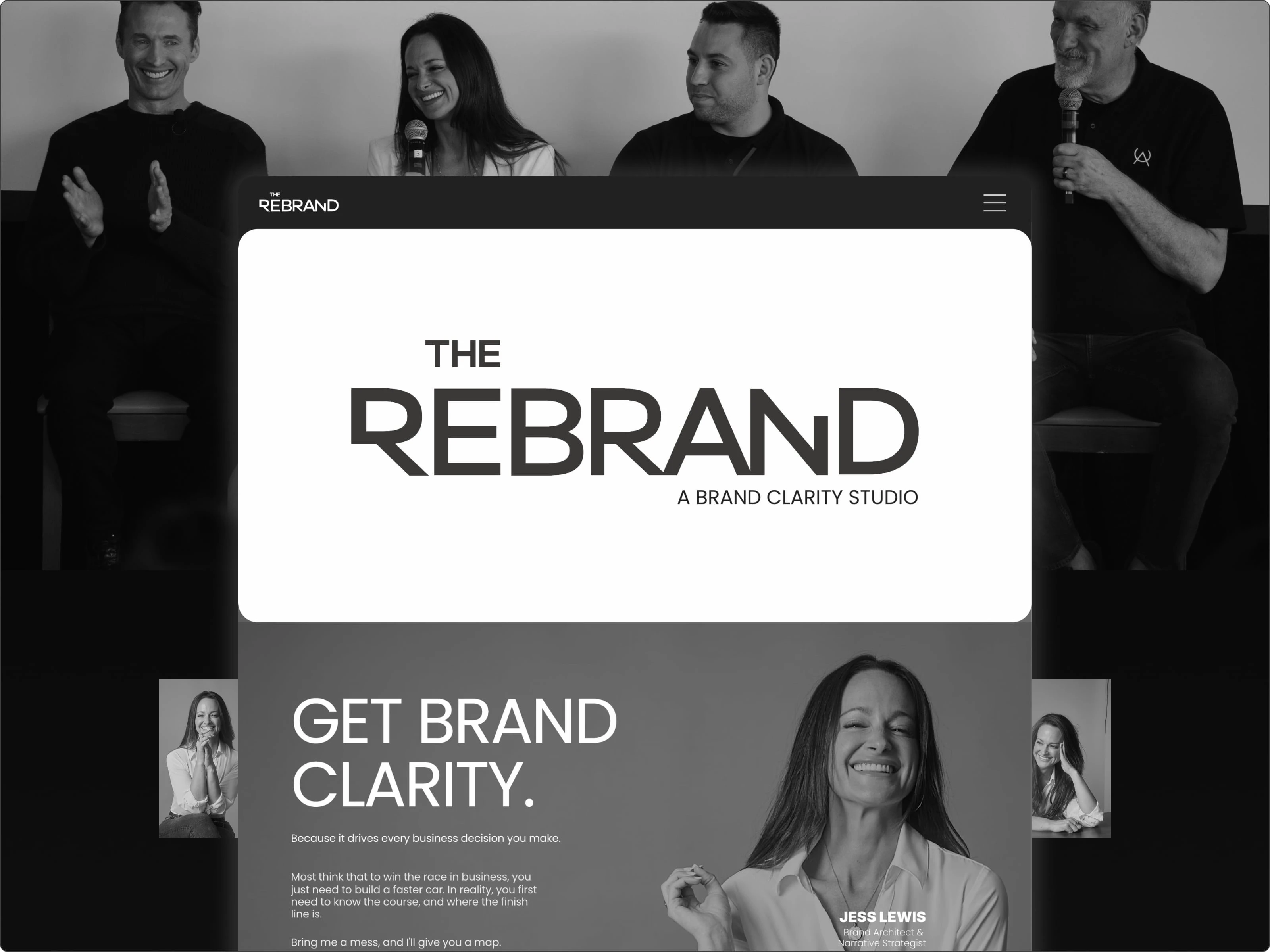
Jess came into this with a clear idea of what The Rebrand needed to be. Not just visually, but in how it reads. Her work sits in that space between strategy and storytelling, so the site couldn’t just look clean. It had to carry a point of view.
We started with the Swiss Minimal and Swiss Mono templates from Swiss Themes. We kept the bones, but pretty much everything else got reworked. Layouts shifted, sections got broken apart and rebuilt, spacing got dialed in so things could actually breathe. Instead of treating it like a standard portfolio, we leaned into something more editorial—less “scroll and skim,” more of a throughline you can follow.
A lot of the work was subtle. Not flashy redesign moments, just constant adjustment. Where does this section need to slow down? Where should it move faster? What actually deserves attention vs. what’s just taking up space?
By the end, it still runs on a template. It just doesn’t feel like one.
It feels like The Rebrand: clear, intentional, and grounded just the way Jess approaches her work:
Bring me a mess, I’ll give you a map.
And that’s kind of what this project was. Taking something structured, pulling it apart where needed, and shaping it into something that actually says what it’s supposed to say.
🚀 Check out the live site ⤵
Like this project
Posted Jul 10, 2025
Rebuilt a Framer template from the ground up to reflect The Rebrand’s luxe identity—transforming structure, style, and tone to match Jess Lewis’ bold vision.
Likes
12
Views
218
Timeline
Sep 17, 2024 - Sep 26, 2024
Clients
The Rebrand