Shelter - An Art Direction Case Study for AI-Driven Fashion

Shelter - An art direction case study for an AI-driven fashion brand.
01. Overview : Building the brand DNA
This project explores how architecture, minimalism, and machine intelligence can merge into a new design language for contemporary menswear.
SHELTER / STRUCTURE is a full visual identity and campaign built for a speculative AI brand that treats clothing as engineered protection — quiet, sculptural, and profoundly human.
This project began as an experiment in authorship.
Could an art director design an entire fashion house — not through traditional production, but through AI-driven image systems, conceptual direction, and cinematic storytelling?
The answer became SHELTER , a self-initiated brand and campaign that grew into a three-chapter exploration of human design logic. Each season expanded the same world — an aesthetic framework built around structure, isolation, connection, and release.
My role covered everything: from defining the visual DNA to crafting the campaign language, storyboarding film sequences, and curating the tonal evolution across collections. The result is a complete creative ecosystem that behaves like a real luxury label — built entirely from thought, vision, and machine collaboration.
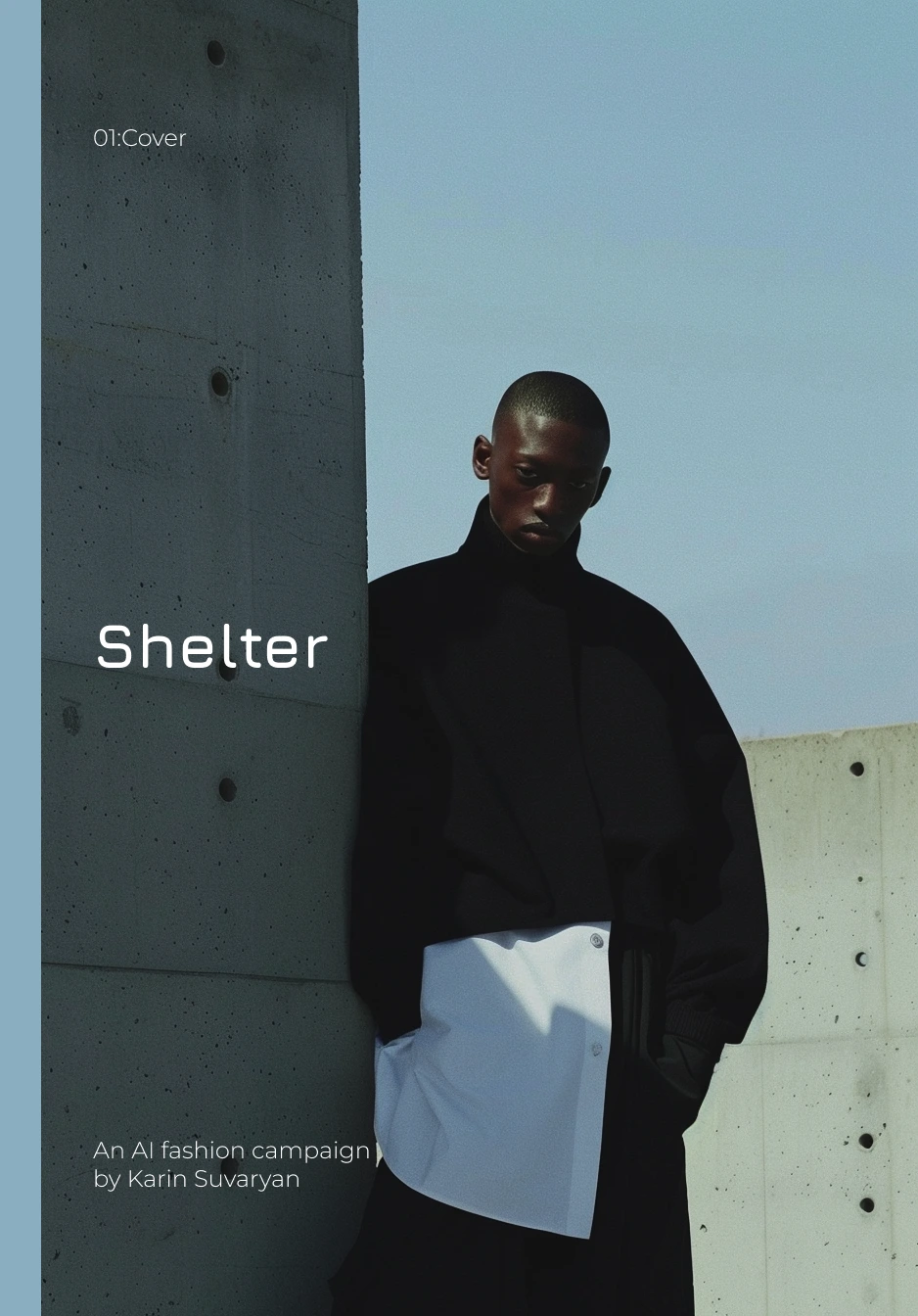
Brandbook:Cover
As Art Director, I built everything from the ground up: concept development, visual strategy, creative direction, shoot planning, and campaign execution. The goal wasn’t just to “design images,” but to architect an ecosystem — a believable brand universe that feels timeless, cinematic, and eerily calm.
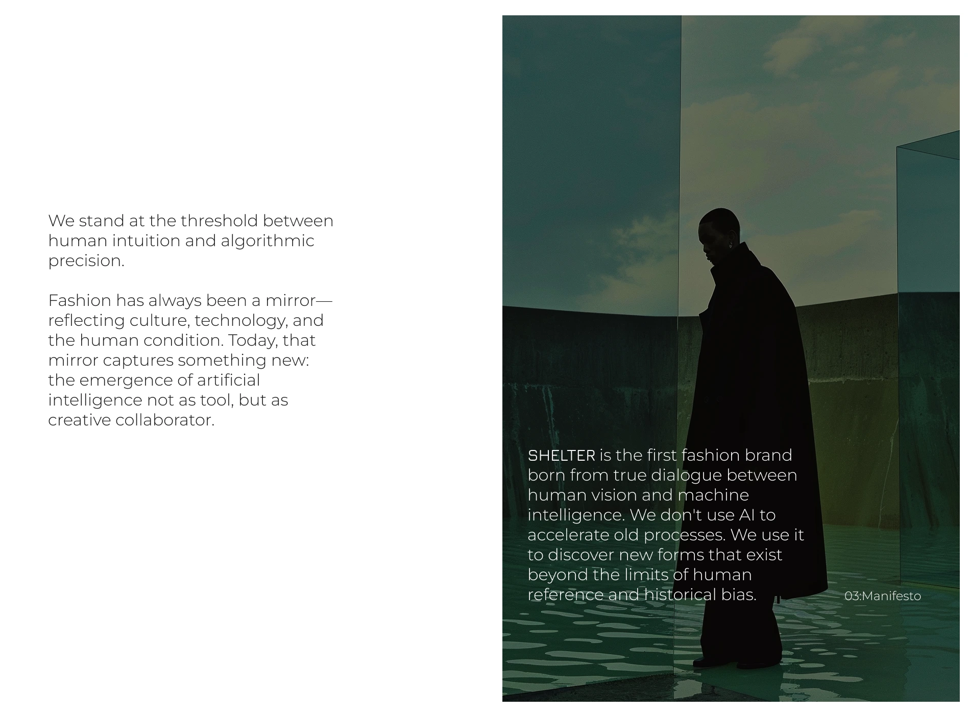
Brand Manifesto
PHASE 1: BRAND FOUNDATION & STRATEGY
BRAND NAME: SHELTER
BRAND ESSENCE: "AI-native fashion that explores the intersection of algorithmic precision and human emotion through landscape and architecture"
POSITIONING:
Category: Avant-garde technical wear
Inspiration: OAMC (Luke Meier's functional minimalism)
Differentiation: First fully AI-designed fashion brand that treats AI as co-creator, not just tool
TARGET AUDIENCE:
Primary: 25-40, early adopters, tech-forward creatives
Secondary: Fashion intellectuals, collectors of experimental design
Psychographics: Values innovation, sustainability, post-human aesthetics
1.2 Brand Pillars
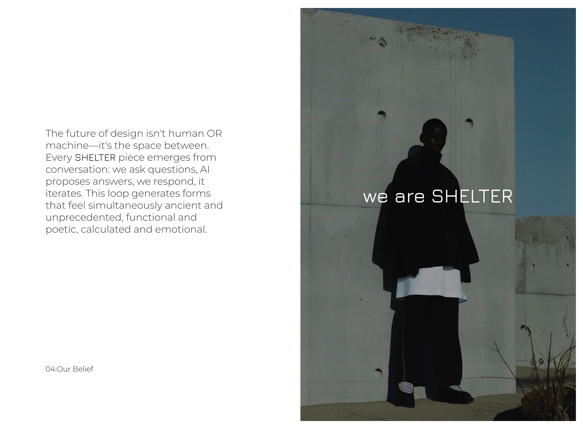
ALGORITHMIC DESIGN - AI as creative partner
ENVIRONMENTAL DIALOGUE - Fashion in conversation with landscape/architecture
FUNCTIONAL POETRY - OAMC-inspired utility meets emotion
POST-DIGITAL CRAFT - Where code meets couture
1.3 Visual Identity System
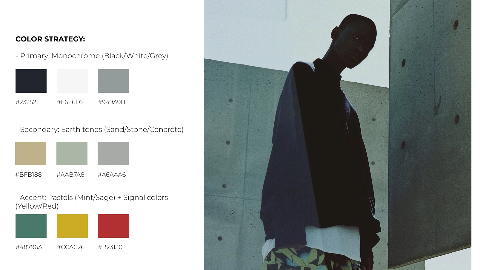
Layout: open space and heavy asymmetry to mirror the garments’ architectural proportions.
Photography: cinematic isolation — half portrait, half structure. Silhouettes framed by desert light or glass reflections.
Every decision — from cropping to color grade — was built to sustain emotional neutrality. The system had to make the viewer lean in rather than shout for attention.
02. The Challenge
How do you express an AI-born brand without leaning on clichés of chrome and circuitry?
The challenge was to humanize technology through emotion, texture, and restraint. The brand needed to live between two worlds — digital precision and organic imperfection.
The task: to create a campaign that could exist beside OAMC, Jil Sander, or The Row — but with a conceptual twist that hints at machine consciousness and functional beauty. The outcome had to feel luxurious, not futuristic. Quiet, not sterile.
03. Concept Development
I made the decision to treat landscape and architecture as collaborators. Brutalist concrete. Windswept moorlands. Desert expanses. Coastal rocks. These aren't backdrops—they're participants in the design process. Each environment shapes the algorithm's output, creating garments that belong to specific places while transcending location entirely.
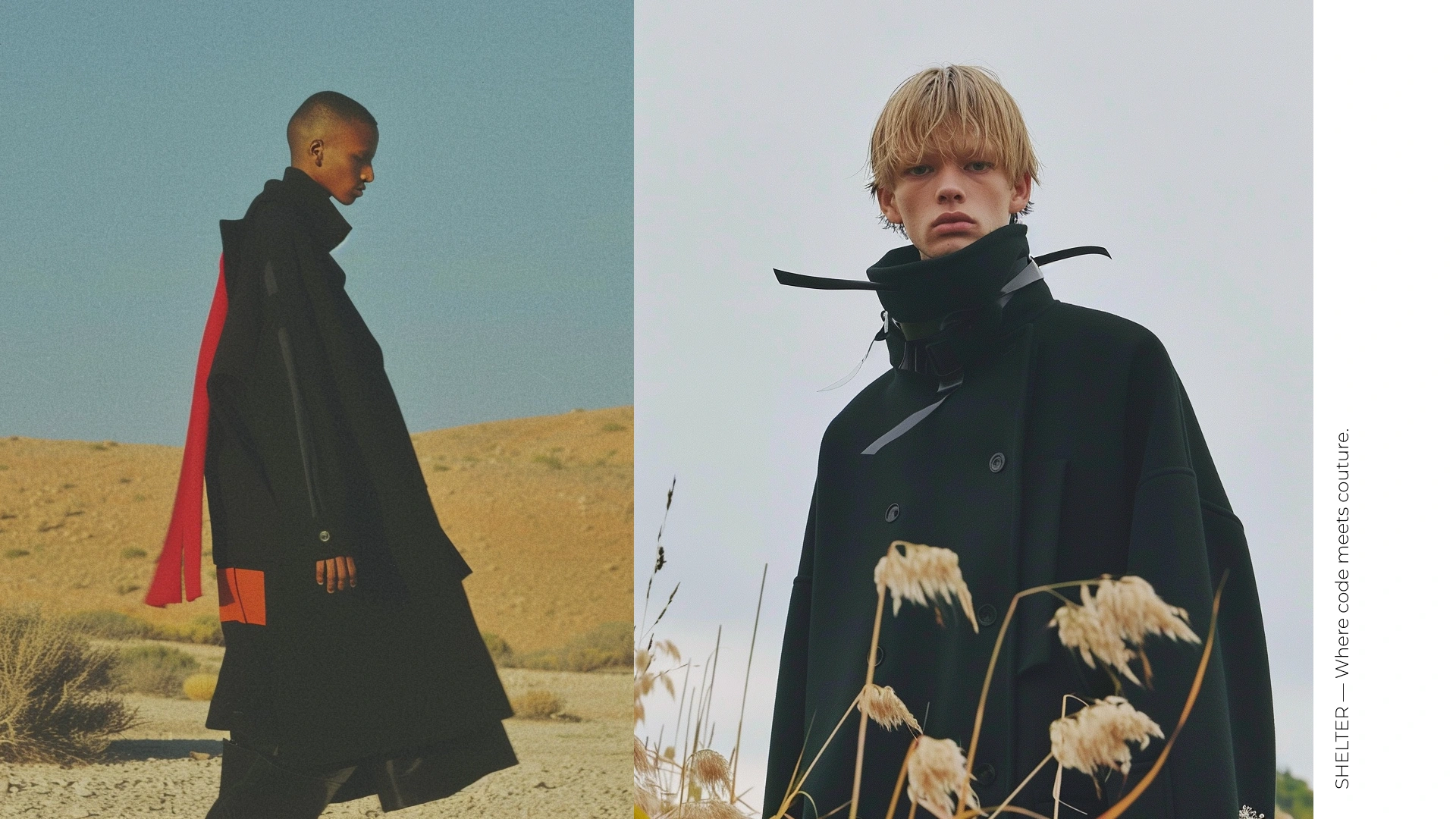
Brand Lookbook
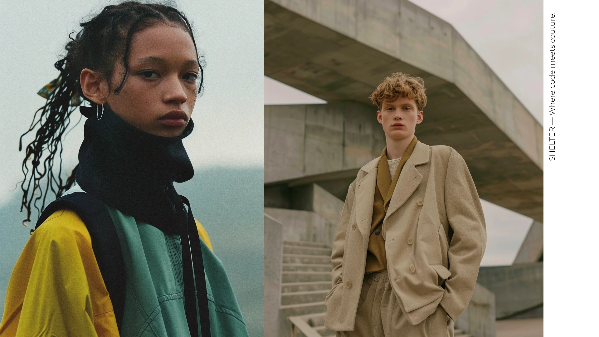
Brand Lookbook
SHELTER'S PROMISE
SHELTER makes fashion that:
Questions before it answers - Explores rather than assumes
Functions before it decorates - Purpose drives form
Evolves beyond human bias - Discovers what we couldn't imagine alone
Exists in physical reality - Digital tools, wearable results
The core idea became “Shelter as structure. Structure as identity.”
Every garment acts like a form of architecture — protection, geometry, and skin. The campaign interprets this through isolation, reflection, and monumental landscapes.
Three creative pillars defined the direction:
Architecture – clean silhouettes, brutalist and desert backdrops.
Human scale – individuals dwarfed by space, emphasizing stillness.
Contrast – matte black fabric vs sunlight, silence vs motion, AI precision vs natural texture.
Visual tension drives the story. The models aren’t styled as personalities; they’re almost architectural figures — shadows with posture and presence
My VISION
SHELTER is a prototype—an experiment in what fashion becomes when we surrender control without abandoning direction. When we invite the machine to co-create while maintaining human values. When we design for a world where artificial and natural intelligence are partners, not rivals.
This is post-digital craft. This is algorithmic poetry. This is fashion for the threshold.
SHELTER — Where code meets coutur
SLIDE 7: DESIGN PROCESS
STEP 1: ENVIRONMENTAL RESEARCH
Gathered reference imagery: brutalist architecture, landscape photography, OAMC collections
STEP 2: PROMPT ENGINEERING
Developed structured prompts combining:
Style references (OAMC, Lemaire aesthetic)
Environmental context (concrete, moorland, desert)
Technical parameters (composition, lighting, color)
STEP 3: ITERATIVE GENERATION
Generated 4-8 variations per concept Selected strongest outputs Refined through prompt adjustment
STEP 4: ART DIRECTION
Curated final selections Organized into capsule narratives Designed film-strip presentation format
STEP 5: BRAND INTEGRATION
Applied consistent visual language Developed storytelling framework Created campaign concept
KEY INSIGHT: AI accelerates iteration, but human vision drives curation
2: COLLECTION ARCHITECTURE
How SHELTER Came to Be
It started with a question I couldn't answer.
I was standing in front of a brutalist building in Berlin—all raw concrete, geometric precision, monumental scale. The kind of structure that makes you feel small but somehow more aware of your body, your movement, your presence in space. I took a photo, thinking I'd use it as inspiration later.
That night, I fed the image into an AI model with a simple prompt: "Design a coat for someone standing here."
What came back shocked me. Not because it was perfect—it wasn't. But because it showed me something I would never have imagined on my own. The algorithm had interpreted the building's VERTICAL lines as sleeve proportions, the concrete's texture as fabric weight, the void between pillars as negative space around the body. It wasn't just a coat. It was a conversation between architecture and garment that I, as a human designer, would have been too constrained by convention to attempt.
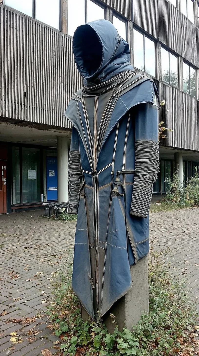
MidJourney generation
That's when I realized: AI doesn't think like we do. And that's exactly why we should work with it.
The Experiment
I decided to push the experiment further. What if I created an entire brand where AI wasn't just assisting—it was co-creating? Where every collection emerged from dialogue between human art direction and algorithmic generation?
But I needed constraints. AI without boundaries produces chaos. So I established rules:
RULE 01: Every collection must dialogue with specific environments
RULE 02: The aesthetic language must reference OAMC's functional minimalism
RULE 03: Every piece must be physically producible (no impossible fantasy)
Then I chose four landscapes that represented different relationships between human and environment:
Brutalist architecture — human-made environments that feel inhuman
Natural terrain — organic systems that follow their own logic
Elemental extremes — places where nature is overwhelming, sublime
Urban construction — cities as geometric frameworks for life
Each landscape would generate a capsule. Each capsule would explore what clothing means in that specific context.
3.COLLECTION NARRATIVES
CAPSULE 01: VOID
The absence that shapes presence.
VOID emerges from dialogue with brutalist architecture—raw concrete, geometric precision, monumental scale. The algorithm was trained on Tadao Ando's spatial philosophy and Le Corbusier's béton brut, then asked to generate garments for bodies moving through architectural void.
The result: all-black silhouettes punctuated by stark white layers. Oversized coats that create negative space around the body. Draped constructions that transform human form into walking sculpture. High collars that frame the face like building facades frame sky.
Every piece in VOID asks: what happens when we remove decoration and focus purely on volume, proportion, and the space between fabric and skin?
KEY PIECES:
Architectural coat with white underlay panels
Draped cape with asymmetric closure
Wide-leg trousers with structural waistband
Layered turtleneck system
MATERIALS: Heavy wool melton, technical cotton, bonded jersey
COLOR PALETTE: Black 100C, Stark White, Concrete Grey
INSPIRATION: Brutalism, minimalist sculpture, urban void
WEARERS: Those who understand that empty space is never truly empty
CAPSULE 02: TERRAIN
Where nature dictates form.
TERRAIN was generated through AI analysis of topographical maps, satellite landscape imagery, and organic growth patterns. The algorithm studied how erosion creates texture, how fields shift color seasonally, how weather leaves traces on surfaces.
The collection translates these natural processes into patchwork graphic prints, soft color gradients from sage to mint to pale blue, and utilitarian details that reference outdoor gear. Each piece feels like landscape made wearable—geological layers compressed into fabric, terrain mapped onto textile.
The graphic elements aren't decorative—they're algorithmic interpretations of specific coordinates, weather patterns, and elevation changes. Wearing TERRAIN means carrying a piece of Earth's data on your body.
KEY PIECES:
Patchwork shirt-jacket with topo-graphic prints
Multi-pocket utility coat in sage green
Technical windbreaker with gradient panels
Wide-collar shirt with abstract landscape graphics
MATERIALS: Organic cotton canvas, ripstop nylon, brushed twill
COLOR PALETTE: Sage, Mint, Pale Blue, Cream, Mustard Yellow accents INSPIRATION: Topography, field systems, geological strata, outdoor utility WEARERS: Those who see clothing as documentation of place
APSULE 03: MONOLITH
Elemental forms for elemental spaces.
MONOLITH explores the most extreme landscapes: where rock meets ocean, where desert meets sky, where human scale confronts natural monumentality. The AI was given a constraint: design only in white and cream, using draping and layering to create impact without color.
What emerged were sculptural, almost ceremonial pieces—flowing coats that move like water, draped constructions that reference ancient robes and futuristic uniforms simultaneously. The occasional red accent acts as signal flare: a human marker in an inhuman landscape.
These aren't garments for everyday life. They're garments for threshold moments—standing at cliff edges, walking into desert, confronting the sublime. MONOLITH is fashion as ritual, as armor against the overwhelming beauty of nature.
KEY PIECES:
Floor-length draped coat with irregular hemline
Layered cape system with asymmetric panels
Oversized shirt-coat with extended sleeves
Wrapped silhouette with structural shoulders
MATERIALS: Heavyweight linen, wool crepe, technical silk blends
COLOR PALETTE: Cream, Warm White, Chalk, Bone, Red accent details INSPIRATION: Coastal geology, desert monasticism, ceremonial dress, sci-fi mysticism
WEARERS: Those who need armor for beautiful, dangerous places
CAPSULE 04: CONSTRUCT
Architecture translated into motion.
CONSTRUCT began with a question: what if buildings could move? The AI analyzed brutalist architecture, deconstructivist theory, and tailoring history to generate garments that capture architectural principles in fabric.
The result is structured tailoring with unexpected proportions—coats with displaced shoulders, blazers with exposed construction, trousers with architectural volume. Every seam is visible, every structural decision exposed. These pieces don't hide how they're made—they celebrate construction as aesthetic.
The neutral palette (sand, stone, concrete, taupe) references building materials while remaining wearable. CONSTRUCT is for those who see fashion as spatial design, who understand that dressing is architecture at body scale.
KEY PIECES:
Deconstructed double-breasted coat
Oversized blazer with displaced collar
Wide-leg trousers with pleated volume
Structured overshirt with exposed seams
MATERIALS: Wool gabardine, technical twill, bonded cotton COLOR PALETTE: Sand, Stone, Concrete Grey, Taupe, Warm Beige INSPIRATION: Brutalist architecture, deconstructivism, Japanese tailoring, ind
4.Campaign Concept
CAMPAIGN: "RENDERED LANDSCAPES"
CONCEPT: Film-strip aesthetic showing AI's iterative process— multiple variations suggest algorithmic testing, contact sheet authenticity, process over perfection
ART DIRECTION PRINCIPLES:
LOCATION AS CHARACTER Brutalist architecture & raw landscapes as collaborators, not backdrops
MOVEMENT IN STILLNESS Static poses made dynamic through repetition and variation
HUMAN + DIGITAL Real models, AI-designed clothes, physical locations— bridging digital and material worlds
MONUMENTAL MINIMALISM OAMC's restraint meets sci-fi scale
REFERENCES:
OAMC campaigns (Luke Meier's direction)
Yohji Yamamoto's architectural photography
Caspar David Friedrich's romantic landscapes
Contact sheets from classic fashion photography
STRATEGIC IMPACT
WHY THIS MATTERS
CULTURAL RELEVANCE:
✓ AI is reshaping creative industries—fashion must respond
✓ Offers new narrative beyond nostalgia and historical revival
✓ Explores post-human aesthetics for post-digital world
DESIGN INNOVATION:
✓ AI enables exploration beyond human reference limitations
✓ Rapid iteration leads to more refined design outcomes
✓ Discovers forms at intersection of calculation and intuition
BUSINESS VIABILITY:
✓ Lower sample costs through digital prototyping
✓ Faster time-to-market with AI-accelerated design
✓ Data-driven approach to trend forecasting and demand
✓ Pre-order model reduces waste and overproduction
SUSTAINABILITY:
✓ Digital-first design reduces physical sampling waste
✓ Limited production prevents overstock
✓ Transparent supply chain through documentation
✓ Quality over quantity philosophy
COMPETITIVE ADVANTAGE:
✓ First-mover in AI-native fashion positioning
✓ Authentic integration vs. marketing buzzword
✓ Appeals to tech-literate, future-focused consumers
CHALLENGES & SOLUTIONS
CHALLENGE 01: Consistency Across Generations AI can produce wildly different outputs from similar prompts
SOLUTION: Developed strict prompt engineering framework with:
Locked color palette references
Consistent composition rules
Location-specific parameters
Style strength controls
CHALLENGE 02: Technical Feasibility AI-generated designs might not be physically producible
SOLUTION: Referenced existing OAMC/technical wear construction in prompts Consulted with pattern makers on feasibility Prioritized realistic proportions and silhouettes
CHALLENGE 03: Avoiding "AI Aesthetic" Clichés Risk of generic, overly digital-looking outputs
SOLUTION: Heavy emphasis on film photography references Grounded designs in physical landscapes Used brutalist/minimalist style references Focused on wearability over spectacle
KEY LEARNINGS:
AI is powerful for rapid iteration, but requires strong curatorial vision
Constraints (color, location, style) lead to better outputs than open prompts
The art director's role is more important than ever—curation is creation
Successful AI work requires understanding both technology AND craft
FUTURE VISION
PHASE 02: RENDER_02 Collection (Next Season)
Explore different environments: arctic, jungle, industrial zones
Introduce accessories and footwear
Collaborate with AI researchers on new generative models
SCALING STRATEGY:
Move from concept to limited production run
Partner with ethical manufacturers
Develop custom AI tools for customer co-creation
Build community of early adopters and brand advocates
COLLABORATION OPPORTUNITIES:
Partner with AI artists and researchers
Explore sustainability tech (material innovation)
Potential retail partnerships with forward-thinking spaces
Educational content: workshops on AI in creative practice
LONG-TERM MISSION: Position PROTO as the leading voice in AI-native design— not just in fashion, but across creative disciplines.
Prove that human-AI collaboration creates work that neither could achieve alone.
Build a brand that questions, explores, and evolves at the speed of technology while maintaining human values at its core.
Like this project
Posted Nov 12, 2025
Visual identity for speculative AI fashion brand exploring protection and isolation. Minimalist aesthetic blending fine art with contemporary editorial.

