Reimagining Starface visuals with generative design
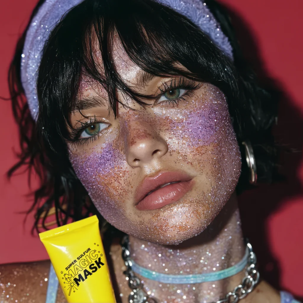
🌟 Starface AI Campaign Case Study
Title: Reimagining Starface with Generative AI
Author: Karin Suvaryan
Tagline: Exploring how AI-driven design can spark new brand narratives for Starface.
End result- Starface campaign
Animation of the AI generated portrait
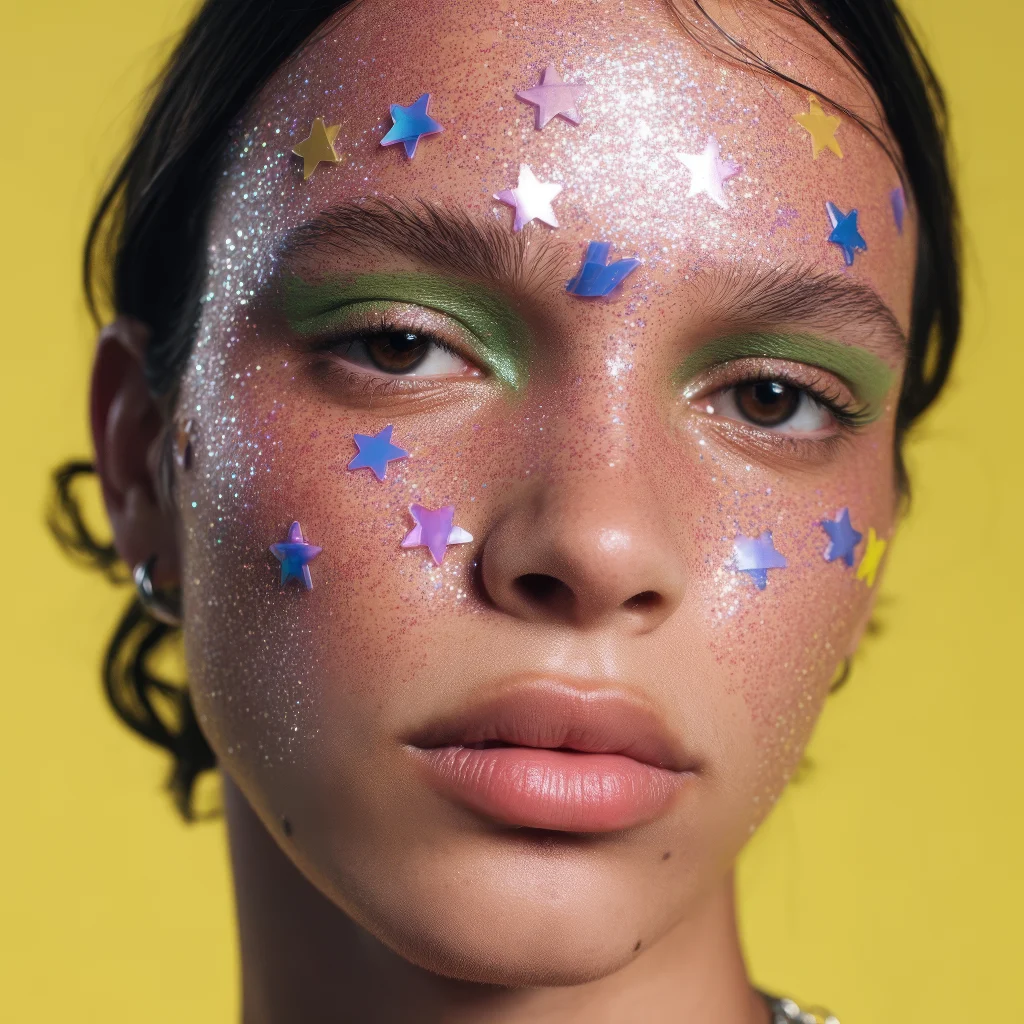
AI Generated image - Skin realism was the main focus
1. Project Brief & Objective
Starface is known for bold color palettes, playful cosmetics, and star-powered branding. My self-initiated challenge was to use AI to generate an original visual campaign from scratch, aligned with Starface’s quirky identity.
Objective:
The first goal of this project was to deeply understand the Starface brand before generating any visuals. I began by researching their existing campaigns, audience, and aesthetic language — then built a moodboard to capture their playful, cosmic, Gen Z identity.
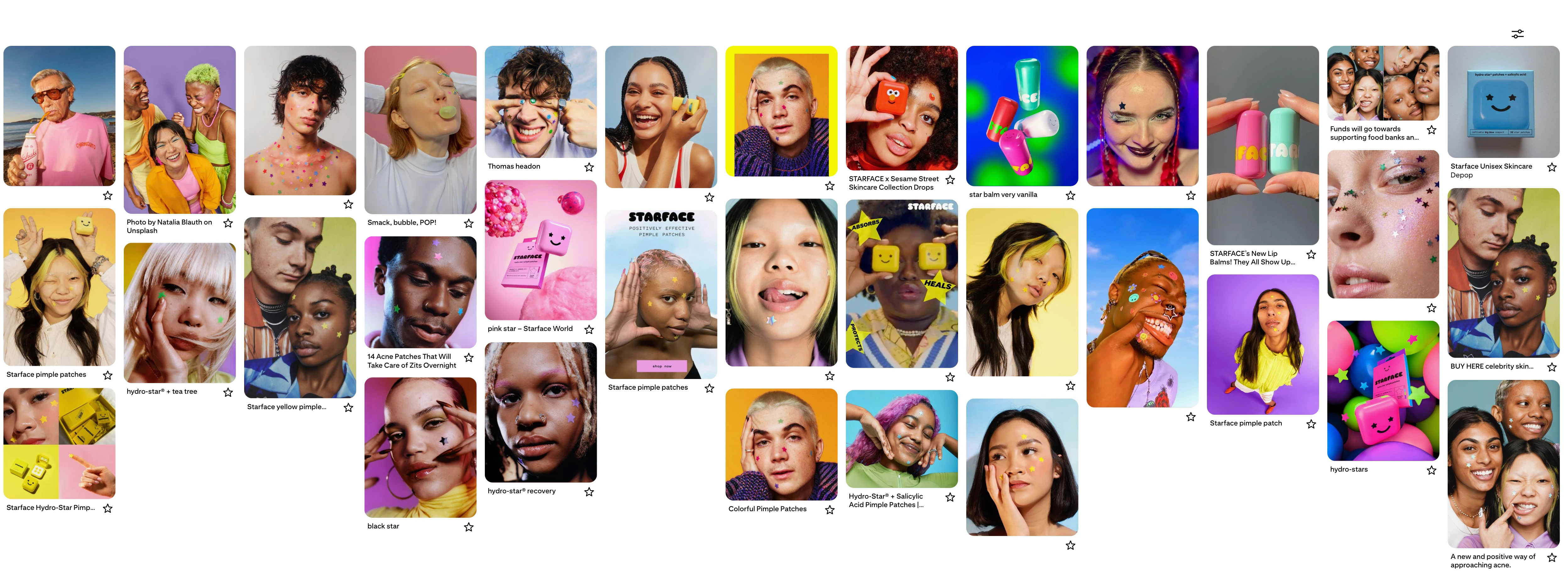
Research and moodboard creation on Pinterest
From there, my objectives were to:
Translate brand insights into AI prompts and mood directions, ensuring that outputs aligned with Starface’s quirky and inclusive voice.
Experiment with AI-generated models and visuals, testing how well AI could reflect a real brand’s personality.
Curate and refine outputs into a cohesive campaign system (consistent across backgrounds, models, and product shots).
Demonstrate how a designer can act as the bridge between brand research, AI experimentation, and campaign-ready assets.
2.Process & Methodology
My process started with brand immersion — understanding Starface’s DNA before creating any visuals. I broke it into four stages:
1. Brand Research & Moodboard
Studied Starface’s existing campaigns, website, packaging, and social media.
Identified key brand traits: playful, cosmic, inclusive, Gen Z-forward, and unapologetically bold.
Compiled a moodboard of references that captured their identity: vibrant backgrounds, quirky typography, glitter/stars as motifs, and authentic, diverse models.
Extracted core brand keywords (fun, cosmic, starry, bold, fresh, inclusive) to guide my design direction.
2. Prompt Ideation
Translated the moodboard and brand insights into AI prompts.
Tested phrasing that combined Starface’s voice with campaign aesthetics (“playful cosmic skincare visuals, glitter, star motifs, youthful models, bold colorful backgrounds”).
Iterated on language to balance brand consistency with AI’s generative creativity.
3. Generation & Selection
Generated a large set of images.
Curated outputs that best aligned with Starface’s personality, rejecting ones that felt “off-brand” or had AI distortions.
4. Refinement & Campaign System
Polished selected outputs: adjusted color grading, cropped compositions, enhanced consistency.
Grouped images by background color (yellow, pink, purple, green) to form a visual system.
Created campaign templates where new AI assets could easily slot in while staying cohesive.
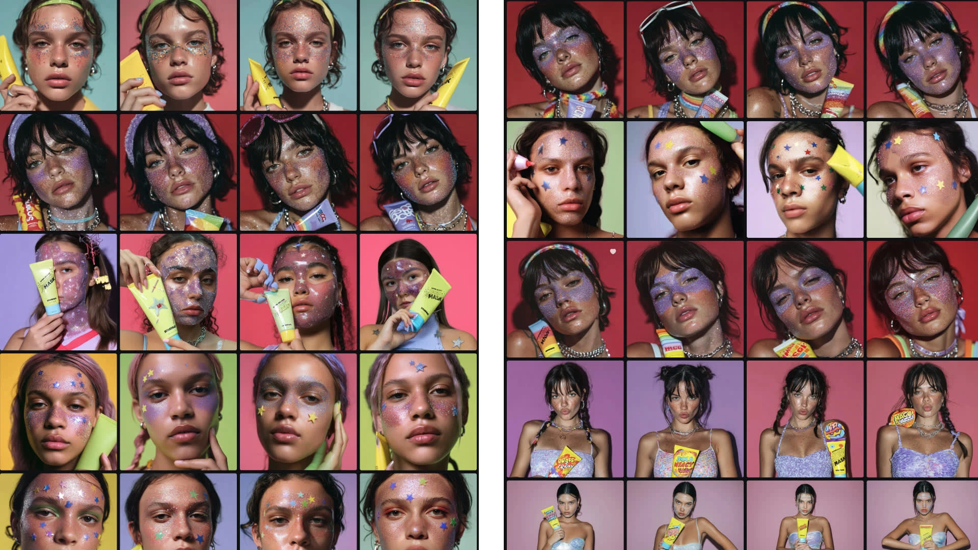
AI gave me a broad visual library to work with — bold colors, diverse models, and playful glitter effects. However, not all outputs were usable as-is. Many needed designer intervention: fixing text, curating the strongest poses, and establishing consistency across backgrounds and product shots.
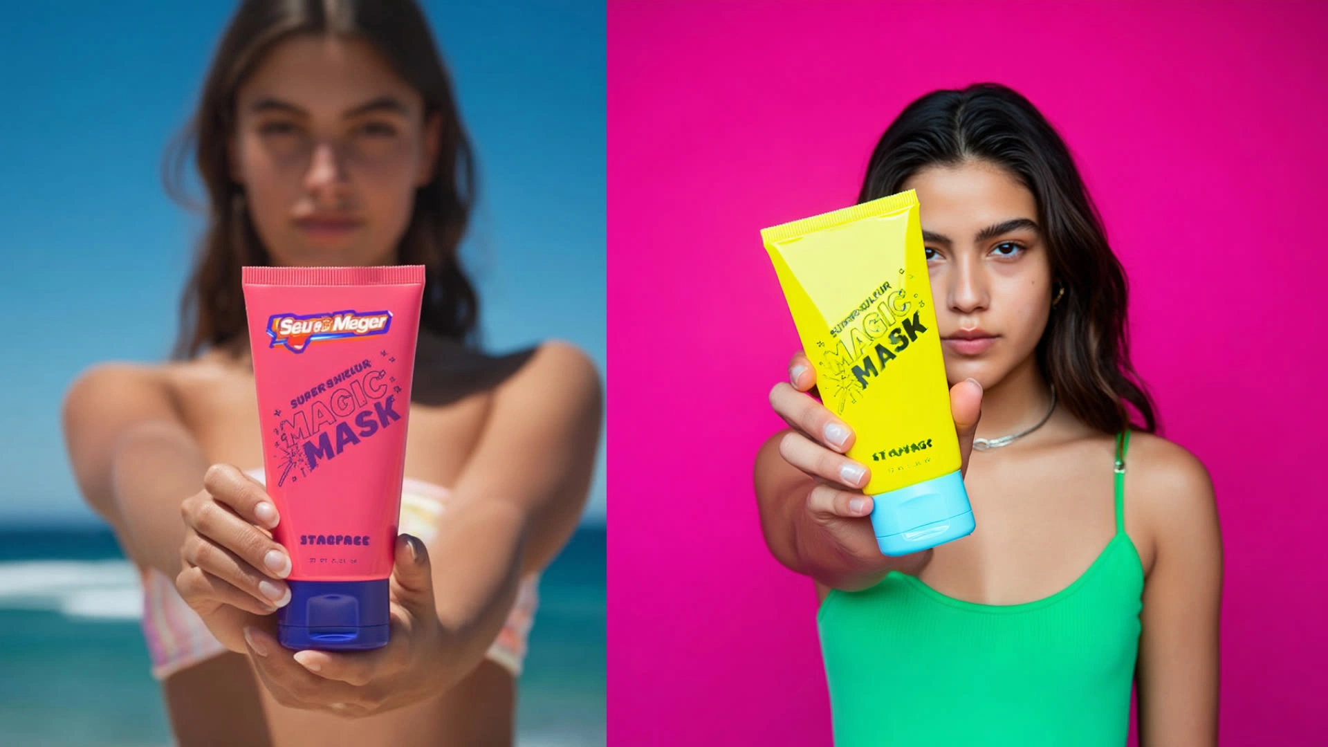
Raw AI outputs - these are clear examples of how AI sometimes misses the mark on product realism and branding fidelity.Fine details are missed here, examples include Typography accuracy (logos, brand names, product text).
Consistency of packaging design (layout, font weight, alignment).
Polish of realism (textures, edges, hands/labels).
3. Challenges & Constraints
Looking at these outputs, several hurdles became clear:
AI Consistency
The models, poses, and backgrounds varied widely, making it challenging to keep a unified campaign look.
Brand Product Integration
The product had to appear naturally in the models’ hands — but in many cases, the AI distorted hand grips or misaligned how the tube was held.
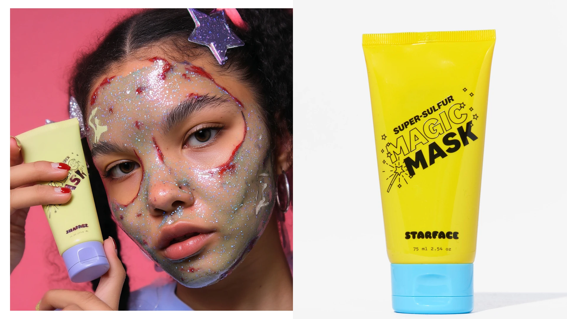
The product on the right is the existing product - have tried to use it in my image generations - as you see the results were not accurate
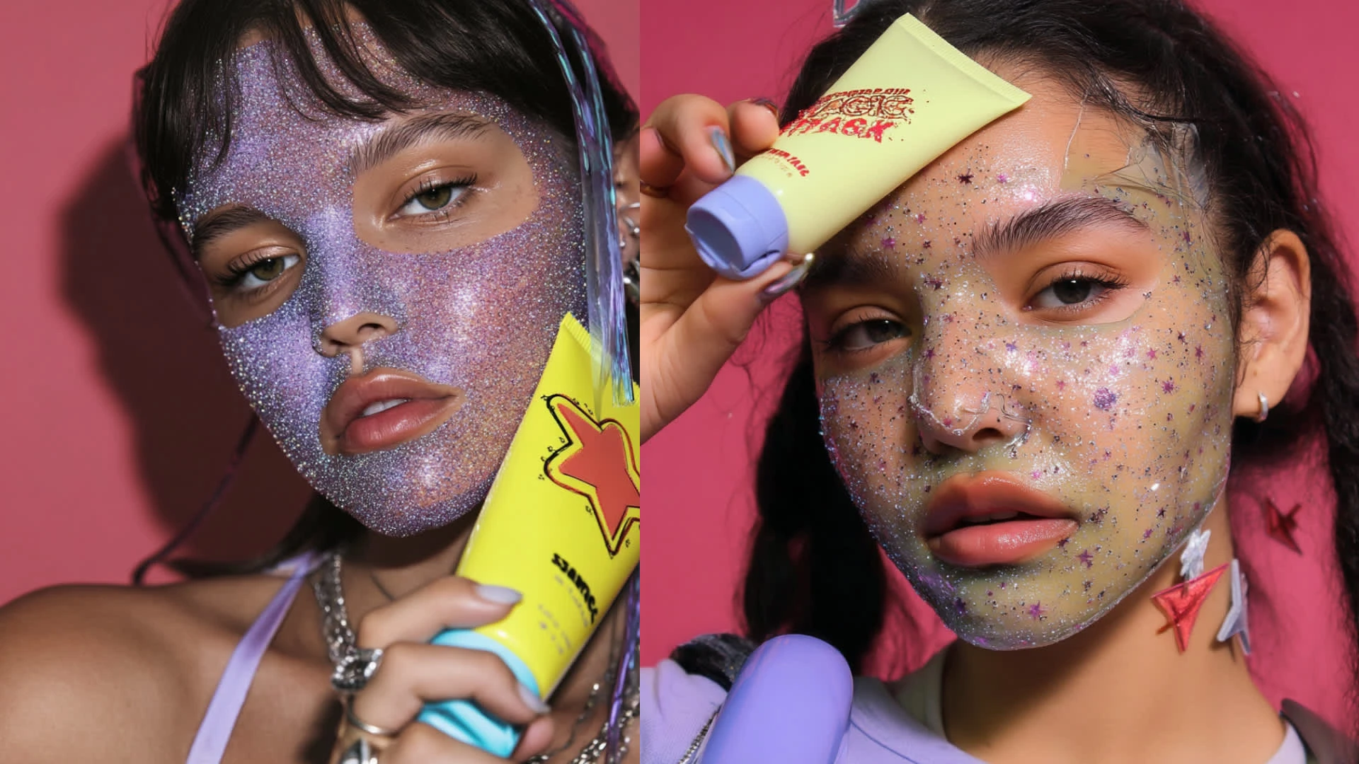
"AI-Failure" - product inconsistency across images
Product Accuracy
One of the biggest challenges was the tube itself. AI often produced distorted packaging:
Inconsistent shapes (sometimes bent or stretched).
Warped or unreadable typography.
Wrong or fabricated brand names/logos (e.g. “STAVAGE” instead of Starface).
Mismatched angles and inconsistent sizing.
This made the outputs unusable as-is, requiring me to refine, retouch, or imagine how they would look if built off the real product reference.
4. Prompt + Iterations
Prompt v1 (Starting Point):
“Close up of a young woman with a glittery face mask, holding a product tube up to her face.”
MidJourney Animation -Low Motion
Results:
AI nailed the composition (close-up, product in frame).
But there were major issues:
Product packaging was distorted, with fake or unreadable typography.
Glitter looked chaotic or plastic-like.
Expression/model didn’t always match Starface’s playful, fun vibe.
Good first step, but not brand-aligned yet.
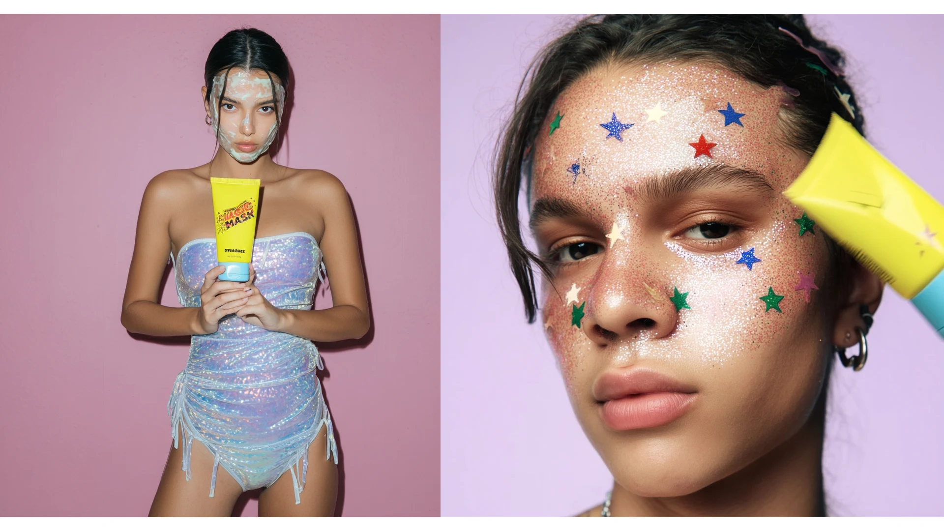
The Product is inconsistent and unrealistic in those images.
Prompt v2 : “Playful skincare campaign, Gen Z model with cosmic glitter face mask, holding yellow skincare tube. Bold background (pink or yellow), fun and bright mood.”
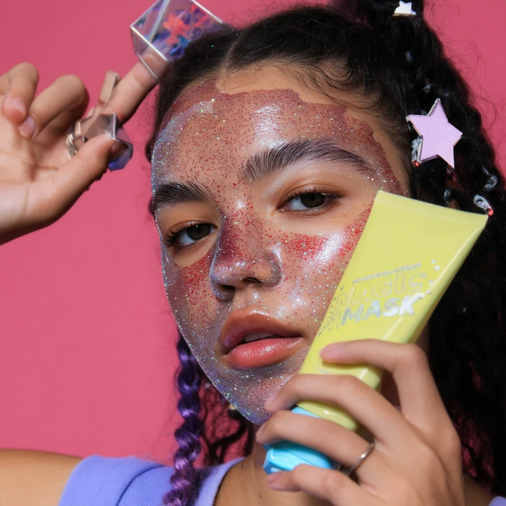
This image is better but the product is not accurate at this point.
5.My Workflow: From Exploration to Campaign-Ready Shots
After all my AI generations I realized that I should build a workflow across multiple AI tools, then refine outputs into usable, brand-consistent assets.
Step 1 — Ideation & Image Generation (MidJourney)
Tool: MidJourney
Prompt: “Close up of a young woman with a glittery face mask, holding a product tube up to her face.”

MidJourney Example
Output:
Dozens of model variations with glitter/stars + bold colored backgrounds (pink, yellow, purple, green).
Strong campaign vibe, but product tubes were distorted (warped text, fake logos like “STAVAGE”).
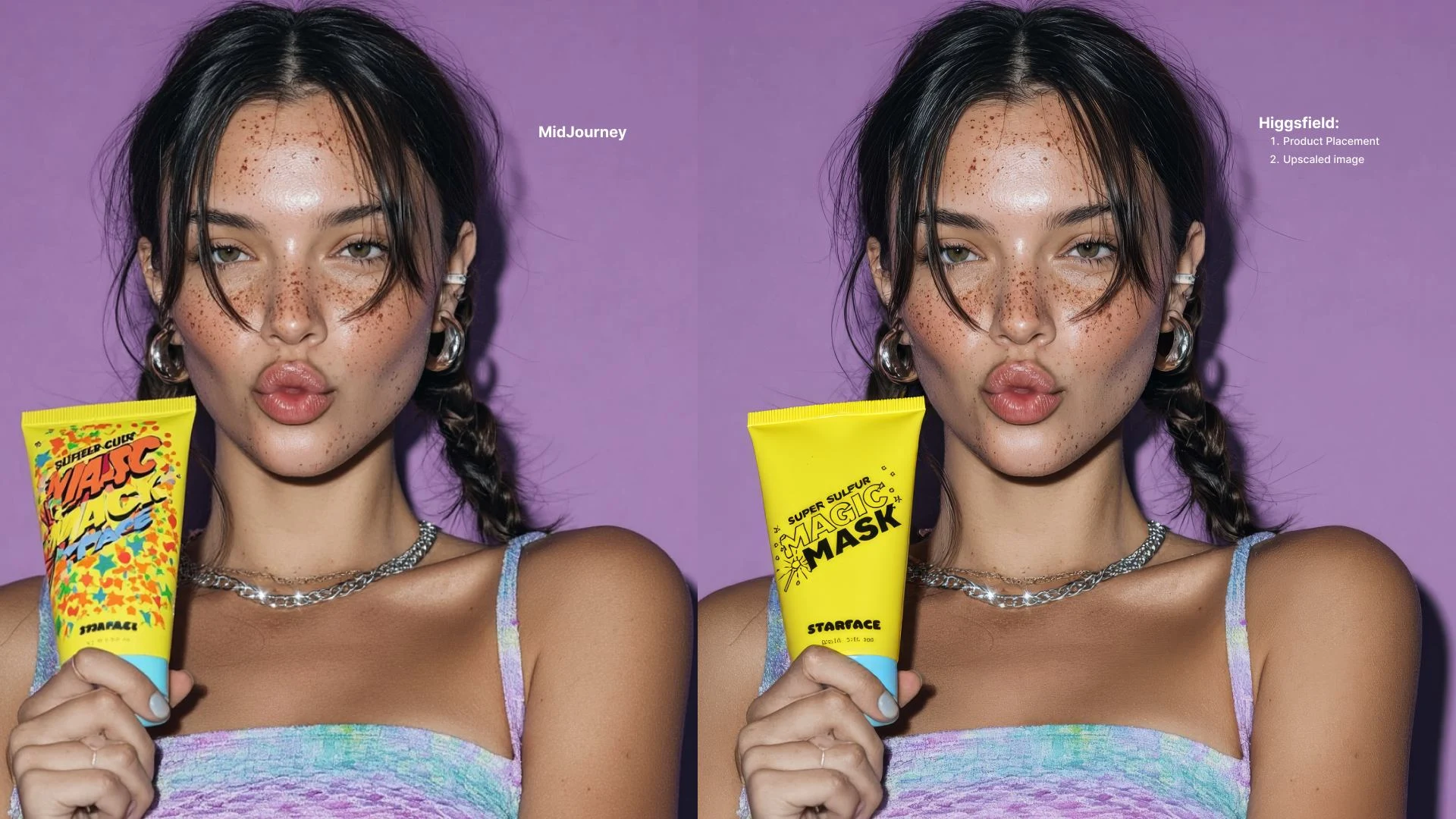
Step 2 — Product Placement & Refinement (Higgsfield)
Tool: Higgsfield
Method: Imported selected MidJourney images → replaced distorted AI product tubes with a consistent Starface-inspired yellow product.
Prompt: “Replace with the yellow product.”
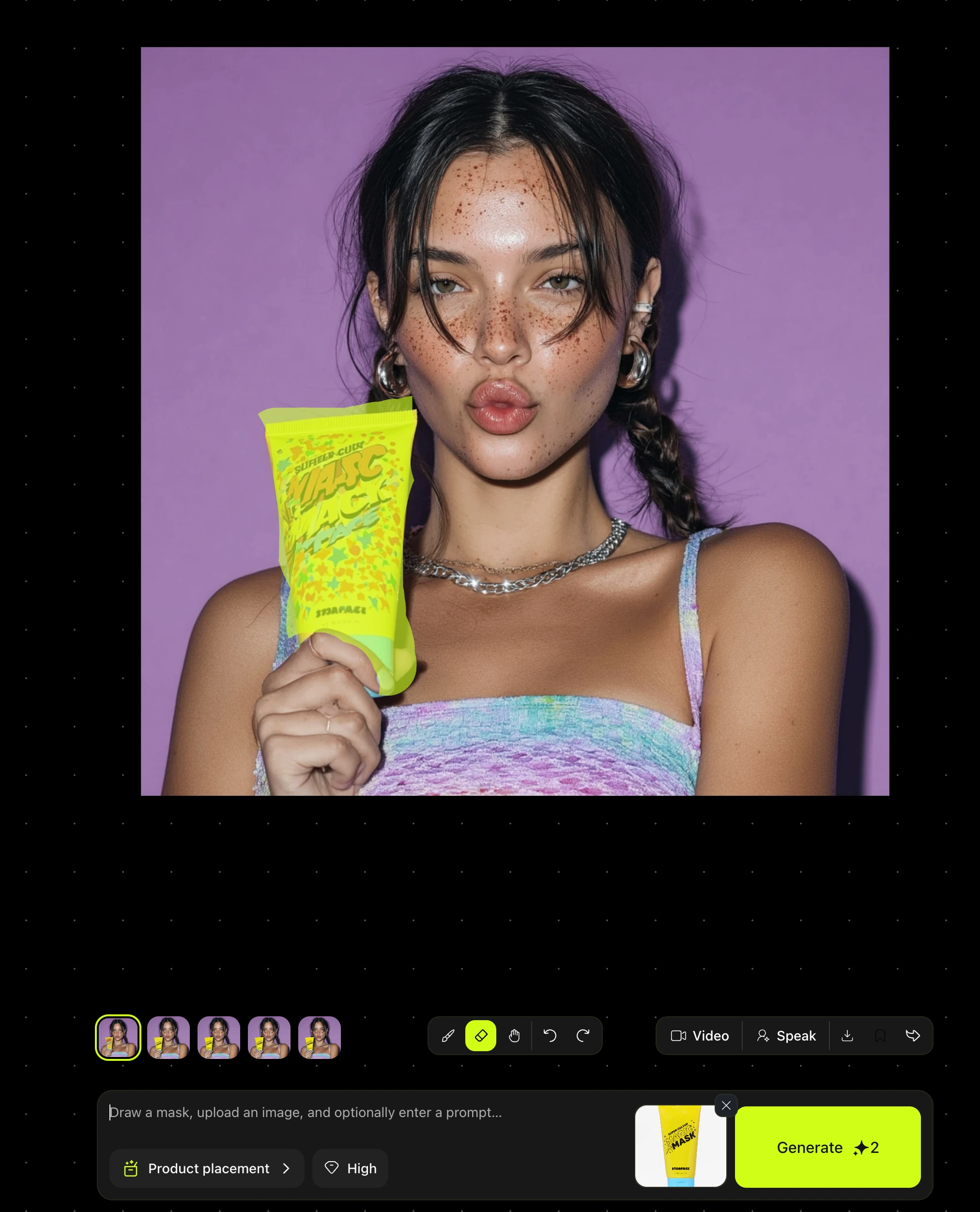
Inpainting technique to achieve product placement
Output:
Cohesive product placement across images.
Corrected inconsistent or fake packaging from MidJourney.
Made campaign look more realistic and brand-ready.
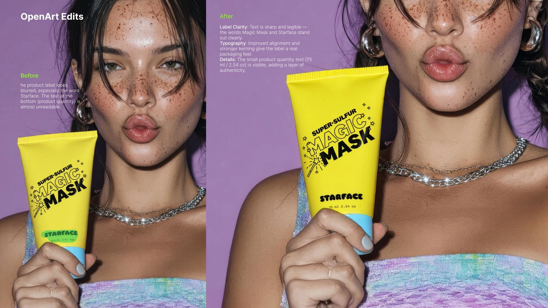
Step 3 — Label Refinement (OpenArt)
Even after Higgsfield replacement, text labels still looked inconsistent and unusable.
Took assets into OpenArt to manually improve the typography:
Corrected brand name and alignment.
Cleaned up warped or unreadable text.
Enhanced overall legibility so the product felt real and campaign-ready.
This ensured that the packaging not only looked like Starface’s signature yellow tube, but also carried on-brand, consistent typography.
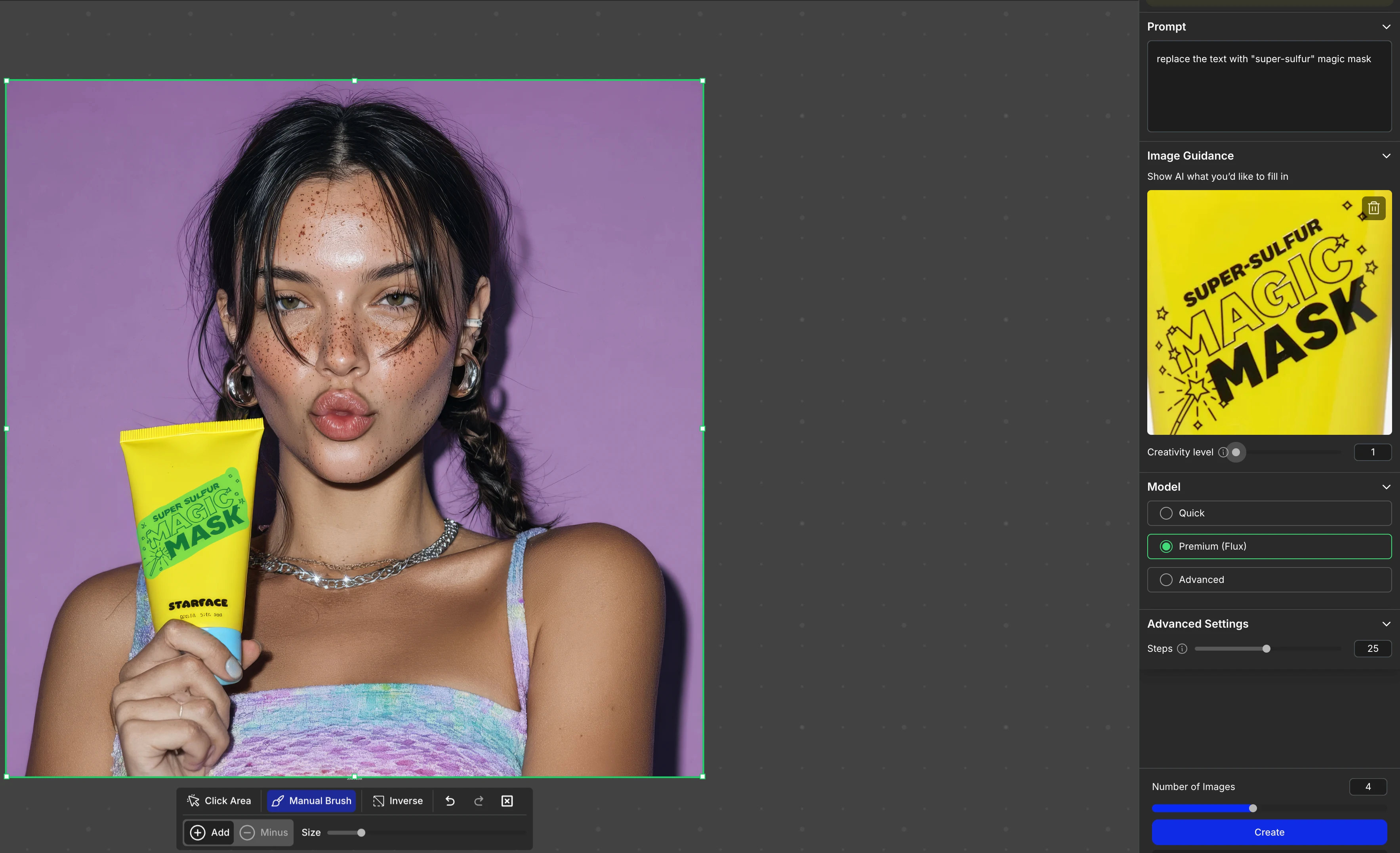
OpenArt workflow
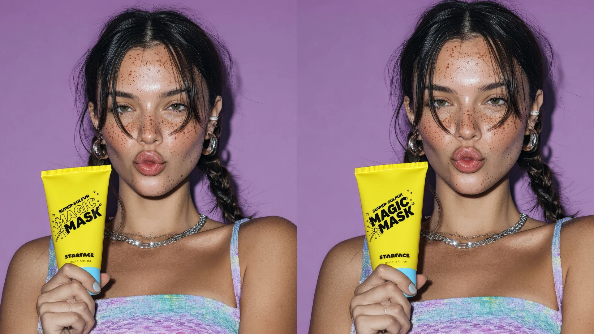
OpenArt Refinement: Product Label Correction- Left: “Tube shape corrected, text aligned, brand name visible.”
Right: “Typography still distorted — brand name needs designer finishing.”
What Worked: OpenArt helped me correct the most obvious distortions (tube warping, fake brand names). I was able to get closer to a Starface campaign asset by anchoring the label in a more believable way.
What Still Needed Work: Even after OpenArt, typography wasn’t perfect — kerning, crispness, and alignment were off. This highlighted a bigger truth: AI is powerful for concepts, but human refinement is still needed for brand-perfect outputs.
Refinement Workflow Applied Across All Selected Images
I applied the same workflow across a curated set of images. I carefully curated the ones that truly matched Starface’s identity before refining them through Higgsfield and OpenArt. I ended up editing all those images one by one.
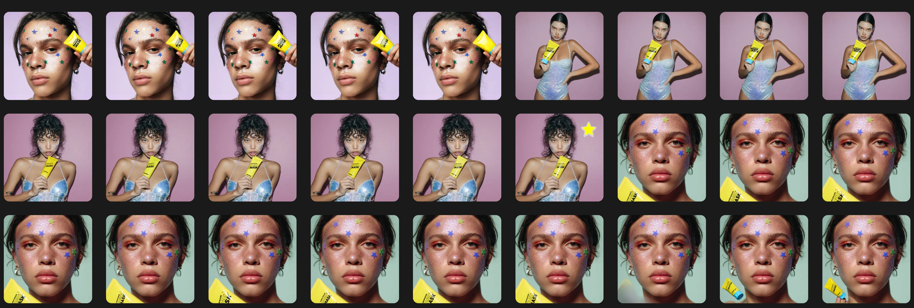
OpenArt product Placement shots #1

OpenArt Product Placement Shots#2
Visual flow:
1.Curated Image (raw MidJourney).
2.Higgsfield Step: Product tube swapped with clean yellow version.
3.OpenArt Step: Text label corrected + enhanced, product placement
4.Final Campaign Asset.
One last step before the image is "campaign-ready"
Final Polish Step: Detail Correction + Animation
After running the curated images through my MidJourney → Higgsfield → OpenArt workflow, I added one last refinement step to bring the campaign visuals even closer to brand-perfect quality:
1.Detail Correction with Accessories
On this specific image, AI had introduced small body/hand distortions.
To cover the inaccuracy and keep the image realistic, I added a Star-shaped ring on her finger.
This aligned perfectly with the Starface brand motif (stars are central to their identity) and turned a flaw into a feature.
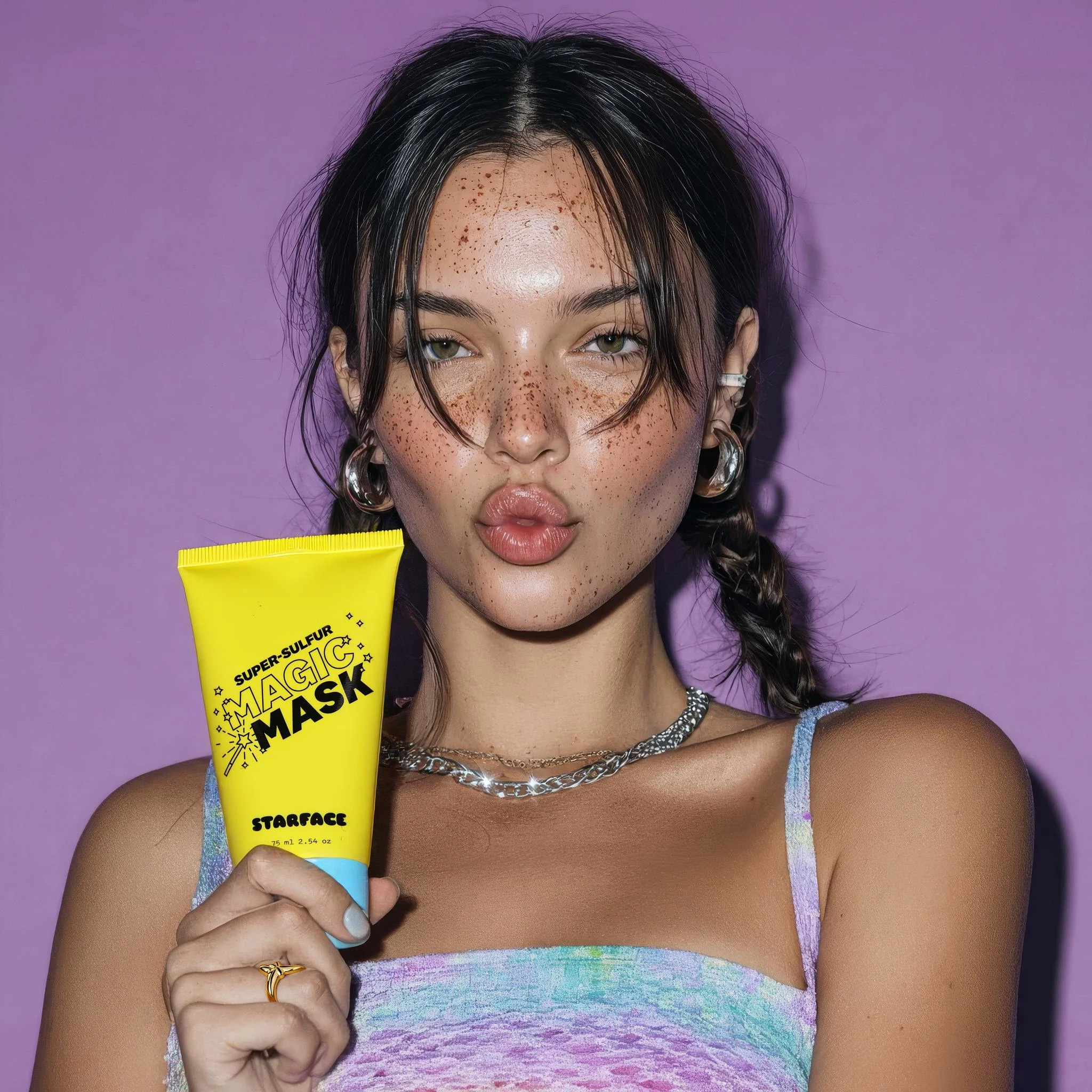
Star ring addition
Upscaling
Upscaled the final image for sharper detail, higher resolution, and professional campaign quality.
This step ensured the assets could be used across multiple formats: social posts, banners, even print.
Animation (Optional Extension)
Explored animating final outputs (sparkle effects on glitter, subtle product shine) to create motion assets for digital campaigns.
This adds versatility for Instagram, TikTok, and ad placements where motion is more engaging.
MidJourney generation . Prompt: beauty campaign photography, playful Gen Z aesthetic, confident young woman holding a bright yellow skincare mask tube, bold purple background, fun and cheeky expression, high-contrast studio lighting, glossy skin, sparkle and star accents, vibrant color palette, editorial yet playful, Starface brand vibe, cinematic detail, professional beauty ad.
As you see MidJourney attempted to animate this image but the problem is the text label - it is extremely inaccurate
KlingAI kept some accuracy
⭐️ Campaign Concept: “Glow Like a Star”
Core Vision
I asked myself the important question.
What do I want the audience to feel: Playful, confident, empowered, and seen.
Why: Starface is not just skincare; it’s a movement that embraces imperfections and turns them into something fun and empowering.
How: Through bold, colorful, cosmic-inspired visuals that combine close-up intimacy with dynamic, high-energy motion.
Afterwards I put together a Campaign Narrative Arc
1. Opening – Establishing Identity
Visual: Slow zoom-in on a model’s glittery face mask under bold neon pink background.
Camera Move: Slow push-in (creates intimacy + anticipation).
Text Overlay: “Skincare… but make it cosmic.”
Emotion: Curiosity, attention captured.
2. Rising Action – Transformation
Visual: Quick cuts between models holding the bright yellow Starface tube against different bold backdrops (pink, purple, yellow, green).
Camera Move: Whip pans between shots (injects energy + surprise).
Sound: Beat kicks in, fun and punchy.
Emotion: Excitement, momentum building.
3. Climax – The Glow Moment
Visual: Glitter/stars shimmering in animation; product tube rotates in 3D, label crisp and sharp.
Camera Move: Dolly zoom on model smiling → product hero shot.
Extra: The star-shaped ring detail sparkles as the hand lifts the tube.
Emotion: Peak confidence, joy, empowerment.
4. Resolution – Campaign Payoff
Visual: Group shot grid of diverse models with consistent product placement, each framed in bold color blocks.
Camera Move: Pullback reveal → shows campaign tagline.
Text Overlay: “Glow Like a Star. Be Seen with Starface.”
Emotion: Inclusivity, belonging, brand love.
Motion Strategy
Camera Movement:
Slow zooms → intimacy.
Whip pans → dynamic energy.
Dolly zoom → emotional connection with hero moment.
Pacing & Rhythm:
Start slow → quick cuts at climax → slow down at the end for resolution.
Visual Flow:
Sequence builds from intimate face shot → product showcase → collective celebration.
Psychological Impact:
Excitement + empowerment → Starface feels fun, inclusive, and iconic.
Like this project
Posted Sep 25, 2025
The goal of this project was to explore how AI-generated visuals could support a creative campaign concept for Starface, maintaining brand’s quirky identity.
Likes
1
Views
42
Timeline
Aug 14, 2025 - Aug 14, 2025
Clients
Starface
