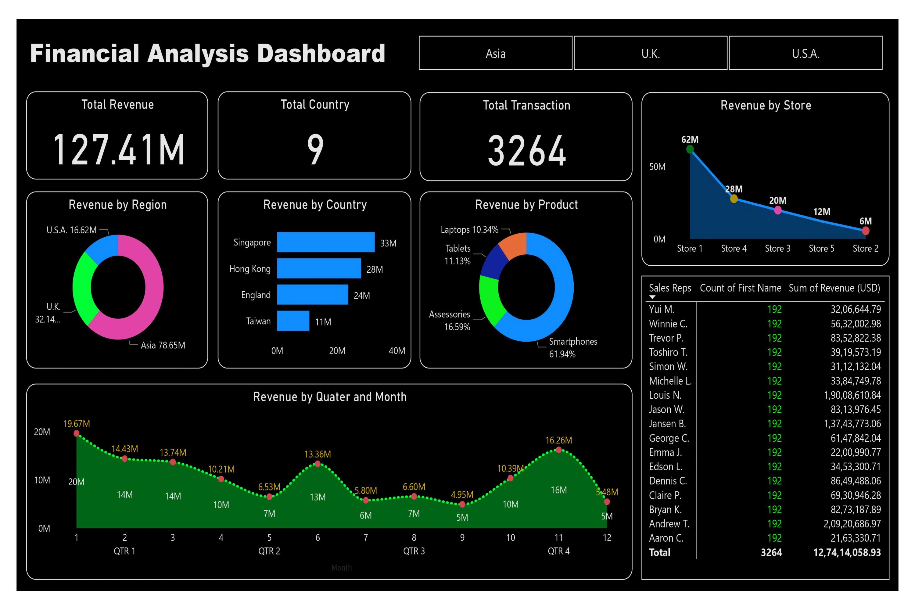
Financial Analysis Dashboard

Saurabh Shah


Thrilled to unveil my new Dashboard – the Financial Analysis Dashboard 📊✨
Use Power BI's Power Query Editor for data cleaning, I transformed raw data into actionable insights. 🚀 This project showcases my skills in data engineering and visualization.
👁️🗨Key Performance Indicators (KPIs) such as Total Revenue, Total Country, Total Transaction are seamlessly presented.
👁️🗨Donut Charts represent Revenue by Region and Product Respectivly.
👁️🗨📈 Stacked Bar Chart represent Revenue by Country (Top 5 Country), Stacked area Chart 📈 represent Revenue by Quater and Month.
👁️🗨Area Chart represent Revenue by Store, Matrix represent Total Revenue by Sales representative respectivly, and Slicer filter out data according to region.
This journey reflects my commitment to merging technical prowess with a passion for improving Financial insights. Let's empower data-driven decision-making! 💡🔗
from here you can access the dashboard :- https://lnkd.in/dfMg-DqP
Like this project
Posted Mar 4, 2024
Power BI Financial Analysis Dashboard to track store revenue across multiple countries, providing actionable insights for strategic financial decision.
Likes
0
Views
2


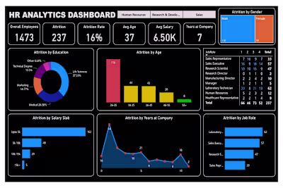
HR Analysis Dashboard
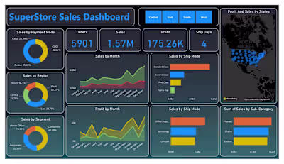
Super Store Sales Dashboard
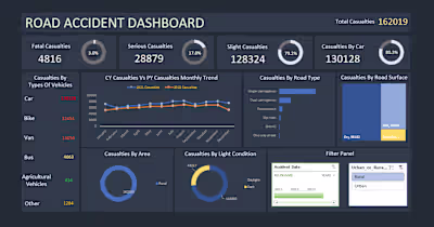
Road Accident Analysis