Built with Kajabi
Sales Page Redesign : Fixing a Page That Wasn’t Converting
Sneha Hiremath
Verified
Sales Page Redesign Case Study: Fixing a Page That Wasn’t Converting
The starting point — a page that looked “ready” but didn’t work
When the client came to me, they already had a sales page built for their ABA compliance membership.
From their perspective, it was ready to go live. The content was written, pricing was listed, and they were preparing to show it to industry experts.
But the moment I reviewed it, it was clear why the page would struggle.
The issue wasn’t the offer — the offer was strong.
The issue was how the page presented it.
The structure made the reader work too hard to understand:
what the service actually does
why it matters right now
and which option to choose
So instead of editing sections, we rebuilt it from scratch.
Why the original sales page failed
The page didn’t fail because of missing information. It failed because of how that information was structured.
No clear decision flow
The page introduced the offer before establishing the problem, which made the value feel disconnected.
Weak communication of compliance risk
There was no clear explanation of what happens if nothing changes, so urgency was missing.
High cognitive load
Users had to read carefully and piece things together themselves instead of being guided.
Confusing pricing structure
The pricing section required effort to compare options, which slows down decision-making.
For a compliance-based service, this creates hesitation — and hesitation stops conversions.
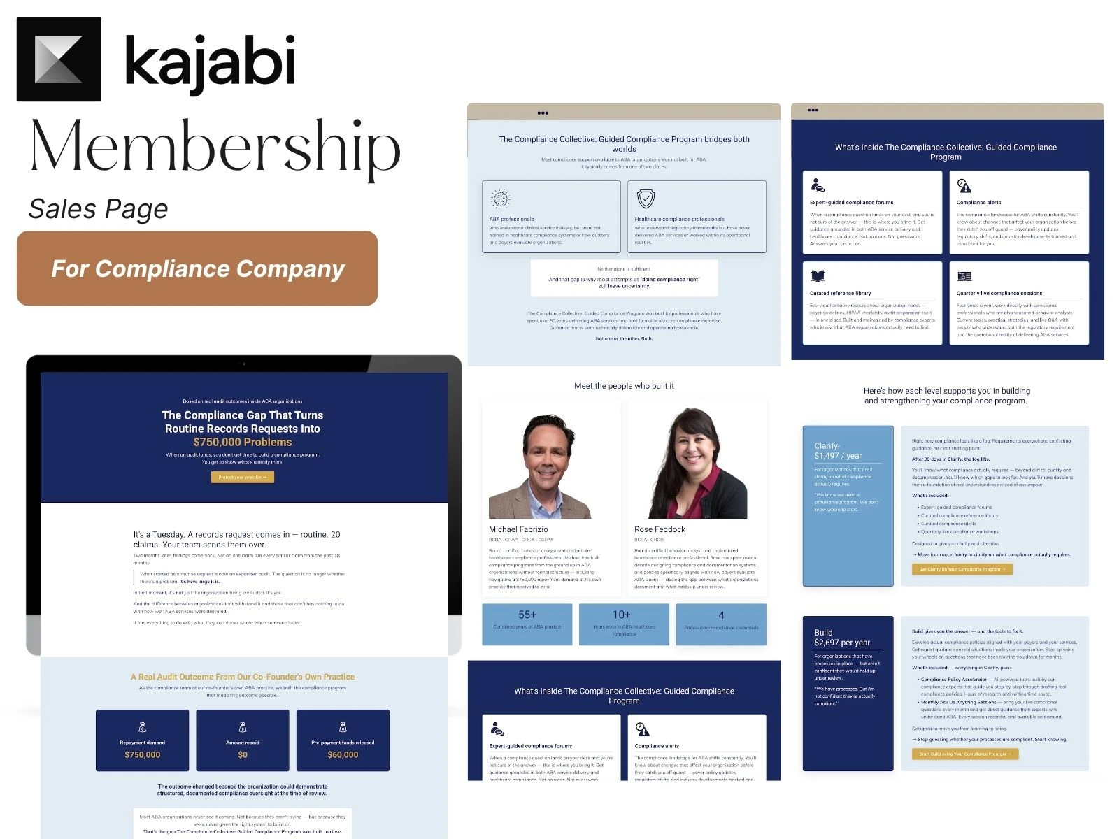
How I rebuilt the page (copy first, then design)
Step 1 — Rewriting the sales page copy
Before touching design, I rewrote the entire page.
The focus was not to add more content, but to fix the sequence.
The new structure follows a clear path:
Define the compliance risk
Show the consequence of ignoring it
Introduce the membership as the solution
Present pricing only after value is understood
& so much more...
This reduces the effort required to make a decision.
Step 2 — Designing the Kajabi sales page
Once the copy was clear, the design was built to support that flow.
Key design decisions:
Sections are spaced to guide attention
Important ideas are separated instead of buried
Layout supports both reading and scanning
Visual hierarchy makes next steps obvious
Pricing section redesign
The pricing section was simplified so users can:
understand each plan quickly
compare options without reading everything
choose without second-guessing
The result — a sales page that supports decision-making
The new page works because it removes friction.
Users can now:
understand ABA compliance risk quickly
see how the membership solves that problem
choose a plan without confusion
Nothing about the offer changed.
What changed is how easy it is to understand and act on it.
Key takeaway — why most membership sales pages don’t convert
Most sales pages in this space don’t fail because the offer is weak.
They fail because the structure makes users think too much.
When users have to:
interpret
compare manually
or connect ideas themselves
they don’t move forward.
Reducing that friction is what changes performance.
FAQ — sales pages, Kajabi, and conversion
What makes a sales page effective?
A good sales page helps the reader understand the problem, see the value of the solution, and make a decision without confusion. Clear structure, strong messaging, and simple navigation are key.
Why do many sales pages fail to convert?
Most sales pages fail because they overwhelm the reader or lack a clear flow. When users have to figure things out themselves, they are more likely to leave instead of taking action.
Should copy or design come first when building a website?
Copy should come first. The message determines the structure, and design should support that message rather than try to fix unclear communication.
How can you make a page easier to understand?
By simplifying the structure, reducing unnecessary text, and guiding the reader step by step. Clear sections and visual hierarchy make a big difference.
What is the role of structure in conversion?
Structure helps organize information in a way that matches how people think. When the flow makes sense, users can process information faster and feel more confident making a decision.
Can Kajabi be used for high-converting sales pages?
Yes. Kajabi can support strong sales pages when the structure and messaging are clear. The platform itself is not the limitation — how the page is built is what matters.
If your page feels unclear or isn’t converting, there’s a reason.
Let’s walk through it together — book a call.
Like this project
Posted Mar 31, 2026
If your sales page isn’t converting, See how I rebuilt a confusing page into a clear decision path that drives action.
Likes
0
Views
5