
Overview 🔎
Perfect Poke believes in creating high-quality poke bowls while honoring the history of where it all began. Perfect Poke prides itself on using delicious, seasonal ingredients while valuing aesthetics.
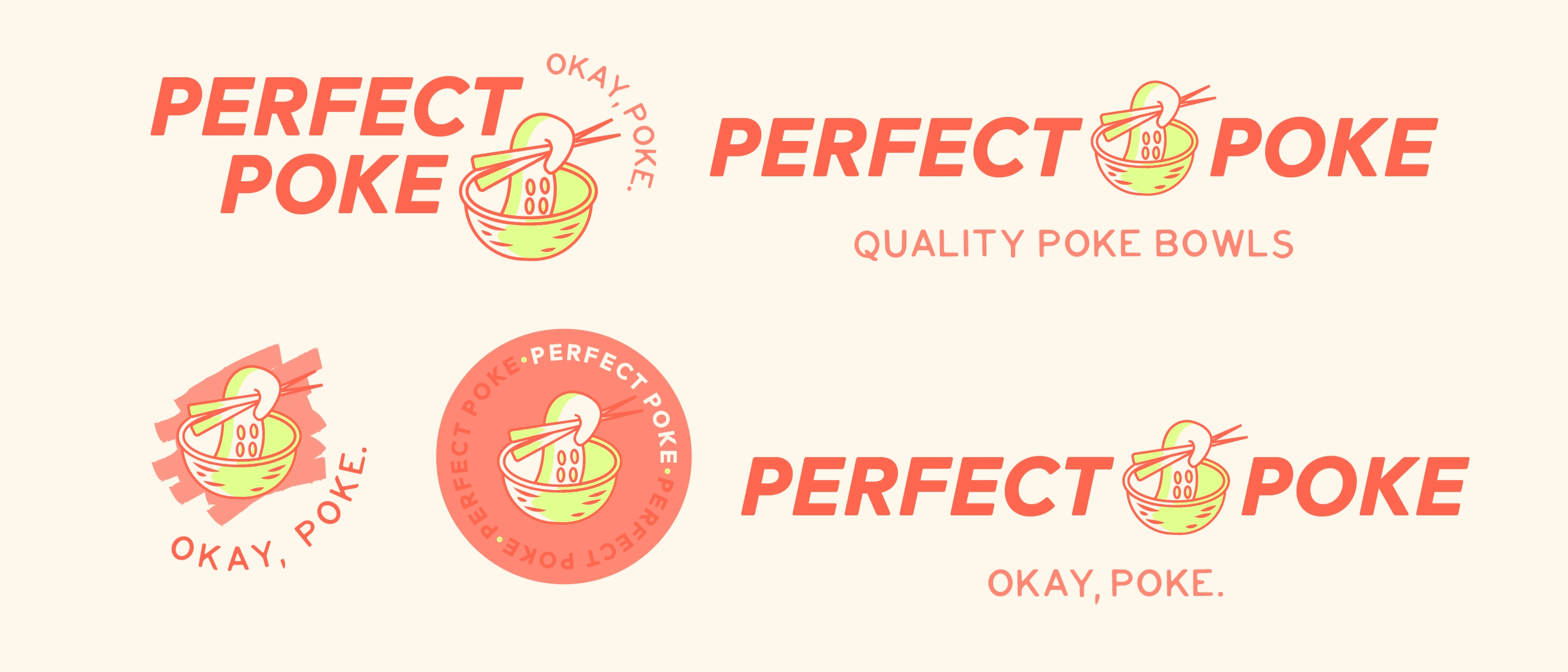
Logos for Perfect Poke
Problem & Solution 🤝
Problem: Perfect Poke wants to be a cut above the rest and stand out amongst hundreds of other poke bars. They pride themselves in using only the freshest ingredients and Instagram-worthy food. Perfect Poke is looking for a brand that is not your typical poke bar, just like how their bowls are not like other typical poke bowls.
Goals/Requirements:
• Create a logo, menu design, and bowl packaging while maintaining an Instagram-worthy and delicious aesthetic.
• Reference the origin of poke and have an educational component to the brand while maintaining aesthetics.
Brand Pattern for Perfect Poke

Color Palette for Perfect Poke
Design Strategy 🛣
Logo: Traditional poke is often made with he’e or “octopus.” I wanted the main logo to reflect this to truly honor the origin of poke and its roots.
Menu Design: There are several details of Hawaiian culture within the design. Most notably, the signature poke bowl dishes are named after the traditional Hawaiian word for each protein.
Colors: Because Perfect Poke values aesthetics and appearance, I wanted to use a color palette that was fun, vibrant, and unique.
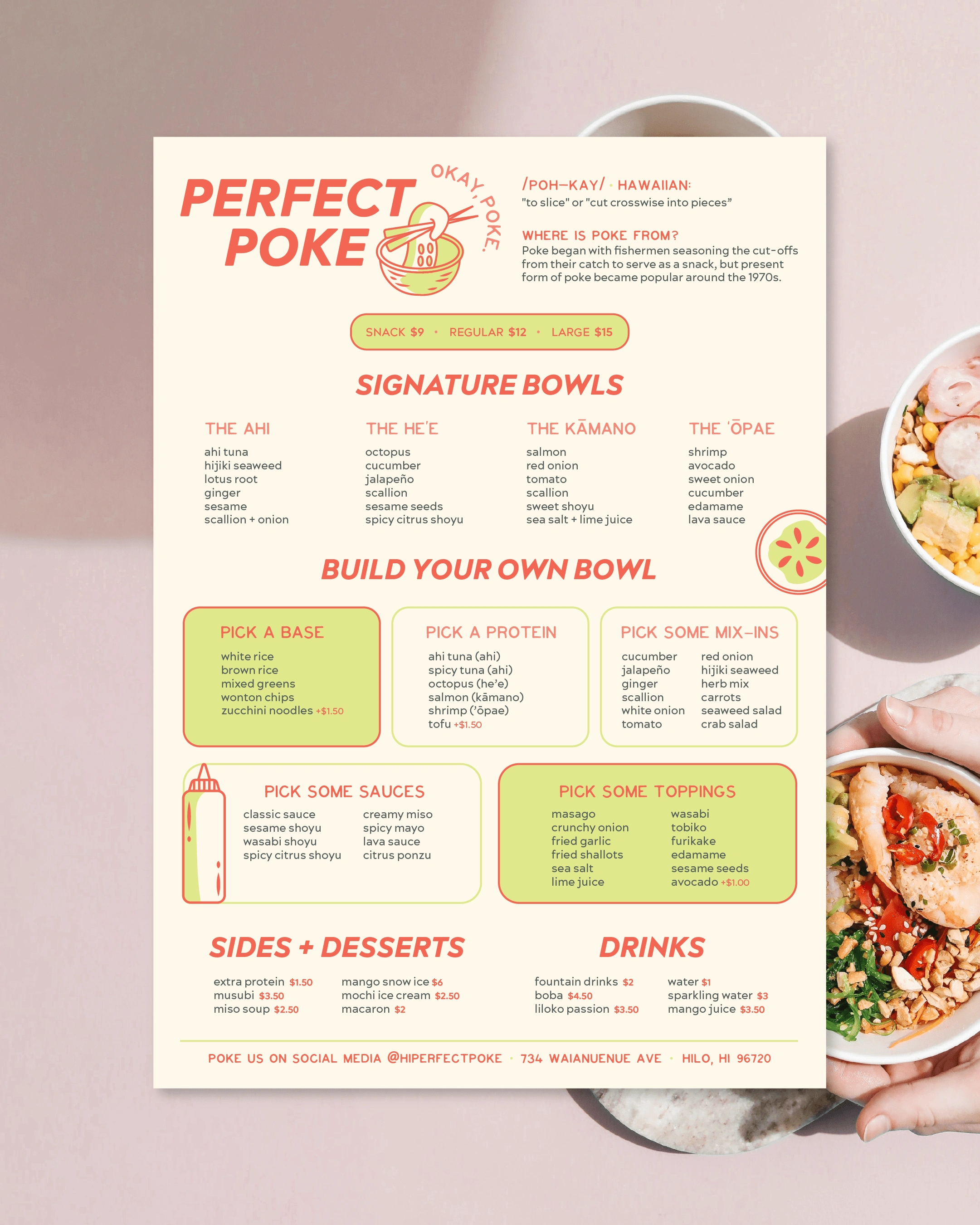
Menu Design for Perfect Poke
Takeaways 📣
This was a passion project that reminded me of why I love design. I let my creativity fly with this logo and menu design and created a brand that was both fun and aesthetically pleasing. If I saw this branding in a store, I would immediately have a high perception of this brand. I think brands that lean into the fun and vibey aesthetic are more likely to attract a younger crowd, who primarily uses Instagram and TikTok to share recommended spots.
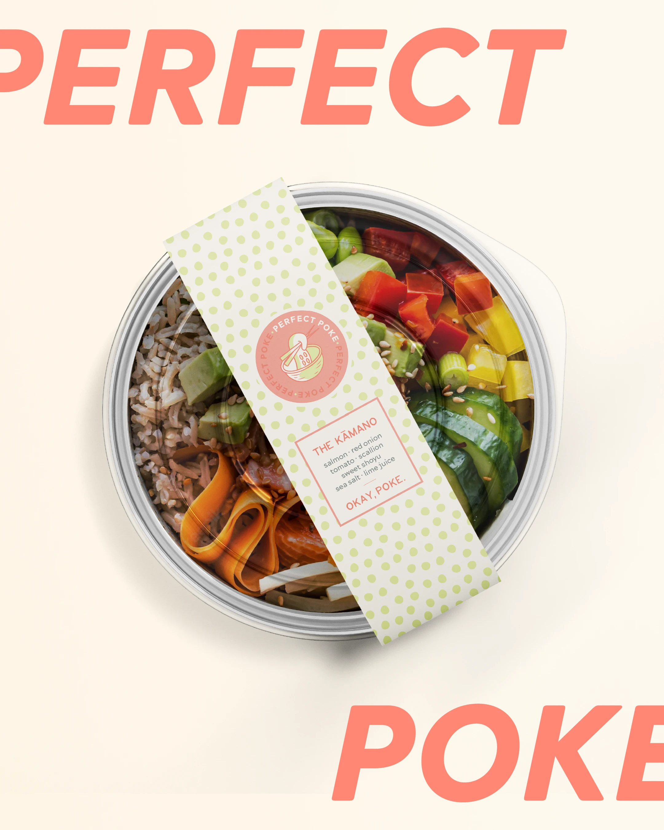
To Go Bowl Packaging for Perfect Poke
0 likes · 46 views · Mar 17, 2023
Brand Identity for Instagram-Worthy Poké Bar

