Improving Buy Now, PayLater Widget Discoverability on Tokopedia
👀 Overview
Tokopedia is an e-commerce with various services in it. One of the services is the buy now pay later service. This service offers multiple buy-now-pay-later providers that partner with Tokopedia as a payment gateway so our users can transact with various payment schemes such as buy now pay later or even monthly installments. And this project is about how fintech services in Tokopedia reach its targetted users and solve their problems.
Scope: UX Design, Prototyping, Testing, Detailing
Company: Tokopedia, E-commerce
Background
At the end of Q3 2021, we saw a problem with our Buy Now Pay Later or BNPL widget on the Product Detail Page (or PDP for short). The CTR of the widget is way too low, it's even below %1. That means, for each of a hundred people who saw this widget only one person clicked it. We do realize that PDP is one of the most visited and critical pages in Tokopedia.
below %1. That means, for each of a hundred people who saw this widget only one person clicked it. We do realize that PDP is one of the most visited and critical pages in Tokopedia. 🧪 Widget Assessment: Assessing underlying problems in BNPL's existing widget
⚙️ In the Flow
This widget is located on the Product Detail Page or PDP. A page that is shown to the user after the user searches and clicks on a product with the intention to seek further information about the product. The main goal of PDP is to help users decide whether or not he/she buy the product.
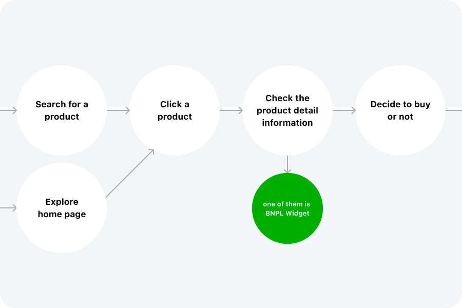
🚨 Widgets and the Priorities
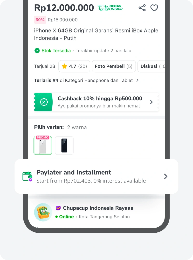
In PDP there are numerous pieces of information laid out. All of them have certain roles in helping users’ decision-making. Several of them are like:
Basic Product Info like product image, name, and price or discounted price.
Promo widgets like shop coupons and active campaign promos.
Logistic widget to show an estimation of the shipping of the products, this widget also offers if there is any free shipping available.
and there are many more
All of these widgets have their priority level based on user context, time, and availability of each offer and information.
Among these widgets, there is also the Buy Now Paylater or BNPL widget. A widget that offers different payment schemes for potential buyers with limited buying power.
🕵️♂️ Closer Look
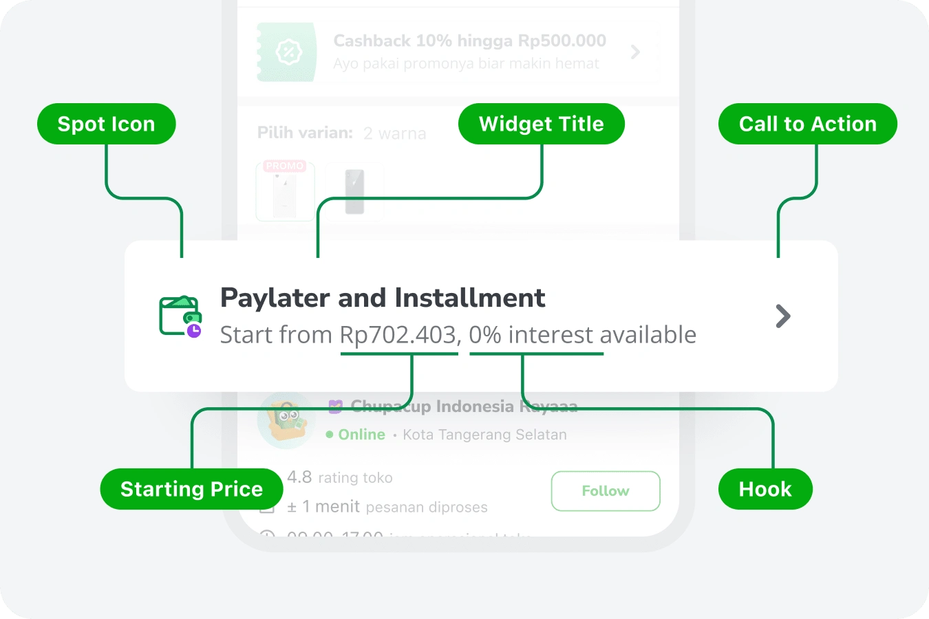
If we take a closer look, at the widget. The information composition is:
Spot icon as an attention hook,
Simple widget title
Subtitle with starting price and marketing hook
and chevron icon as CTA
It is simple, and straight to the point, but still not enough to get users’ attention.
Problem 01: We show the widget to irrelevant users
They are millions of people visiting PDP in a day. And from all those people, not everyone is interested in using BNPL services, especially Paylater or Credit Cards.
Remembering Indonesian Moslem culture where BNPL and Credit Card considered as
"Riba". Some of them prefer not to use it or are extremely against it. While some others who are the new user still being skeptical while using e-commerce, they prefer using conventional payment methods like paying through convenience stores (eg. Alfamart, Indomaret) and cash-on-delivery.Those who are moderate enough see Paylater and Credit Cards as a financial solution. And those are our most potential users.
Problem 02: We drown on the battlefield
PDP is one of the most visited pages in the whole of Tokopedia. Every service wants to show up to as much as a visitor they can get. And as one of them, BNPL is playing too slowly for the competition.
We see a lack of information that we can offer. We hide too much potential information that maybe our visitors need. We knew that our main value is to offer affordability to our potential buyers. An offer where they can buy some product at a lower price and pay it gradually to help them maintain their cash flow. But we don't really show it at a glance.
Related to the first problem, if we can target a more specific user we can offer more aggressively while still being relevant.
Problem 03: We let the hope hanging
We promise affordability, but when the visitor got interested in it we don't really drive them to do action. Although there is an action to get that affordability when come to how to use it visitors must go to the checkout page and apply the paylater by themselves. Which is like a
broken journey.We later realized that these conditions created by tech limitations built a counter-intuitive mental model for our users when paying using paylater or credit card.
This is a UX debt that we have to pay and a challenge that we have to solve now.
🎯 Goals and Objectives
To better align our vision, we define the goals and objectives of our current initiatives, covering:
-> How might we better target specific segmented users?
-> How might we provide more valuable information on the widget?
-> How might we support a better shopping experience?
The goals are clear, the possibilities are wide open. Now is the time how answer to those challenges.
The Users: The Middle Economical Financially Educated Young-Aged People
For all of you who doesn't familiar with Buy Now Paylater industries, maybe you are wondering “Who will use this feature anyway?”. Thus, let me explain a bit about who our users are.
Based on our regular research, most of our users are:
Live in a metropolitan cities
Come from middle to high economical level with spending 5 Mio IDR - 10 Mio IDR
Only use BNPL for expensive products
Using BNPL products because need to maintain monthly cashflow without hassle
The Needs are:
Deciding the product buy with ease
Quick estimation on monthly cashflow before checkout
Provided with the best offer for payment
Checking out products seamlessly

Competitor Landscape: E-commerce as Marketplace of Fintech Services
To understand where we stand, I decided to take look at how other Indonesian e-commerce displays their BNPL widget. There are 4 platforms that going to analyze. These 4 platforms are the biggest e-commerce sites in Indonesia excluding Tokopedia.
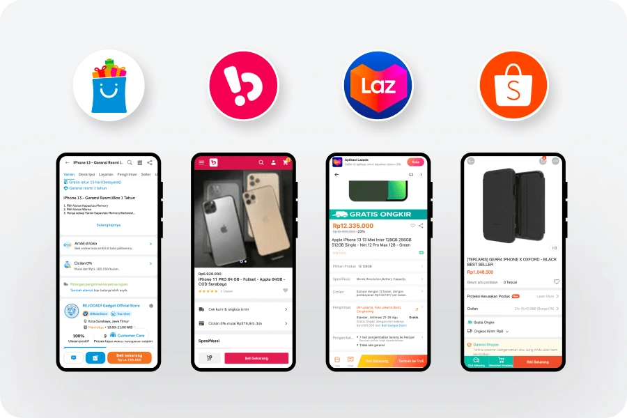
Most of these platforms are taking the role of a marketplace of fintech services. Meaning they integrate with third-party BNPL services like Kredivo, Indodana, and Home Credit Indonesia.
The different one is Shopee. Shopee didn't provide other BNPL services since they have their own service called Shopee Paylater. This difference will affect how they display the widget itself.
Meanwhile, Tokopedia is like both of them. We still provide third-party BNPL services, while also providing their own services from their sibling company GoPay called GoPayLater and GoPaylater Cicil.
In this landscape, we will take look at 3 aspects:
The widget layout
The widget information
The widget position
Let’s break it down!
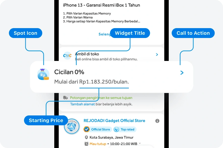
Blibli
The layout and information of the BNPL widget in Blibli are not much different from what Tokopedia had. Using horizontal two lines as the widget, a colored spot icon on the left to support user awareness, two lines of text with a title communicating what is the widget about adding a “0% interest” value to attract users, plus starting price as the subtitle, and chevron icon to indicate an action that can be taken.
Meanwhile, the position itself is about in the middle. As a user, I have to scroll at least 1 time before I can see the widget.
Bukalapak
The layout in Bukalapak is much simpler. One-line horizontal list with a basic icon on the left. Not too prominent, but enough for a user to recognize. The major plus of Bukalapak is the position.
The position of the widget is above the fold. Users can see the widget directly below the product name and price. This is a brave move from Bukalapak.

Lazada
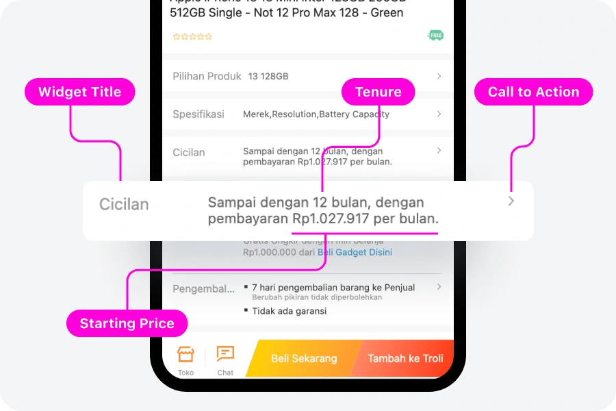
Even not using icons as anchors, Lazada used a table layout making the information is easier to scan along with other information.
Additional information Blibli and Bukalapak didn't have but Lazada is the maximum tenure. Although Blibli and Bukalapak also have tenure up to 12 months, communicating upfront can be huge differences if we take it from the user’s perspective.
Shopee
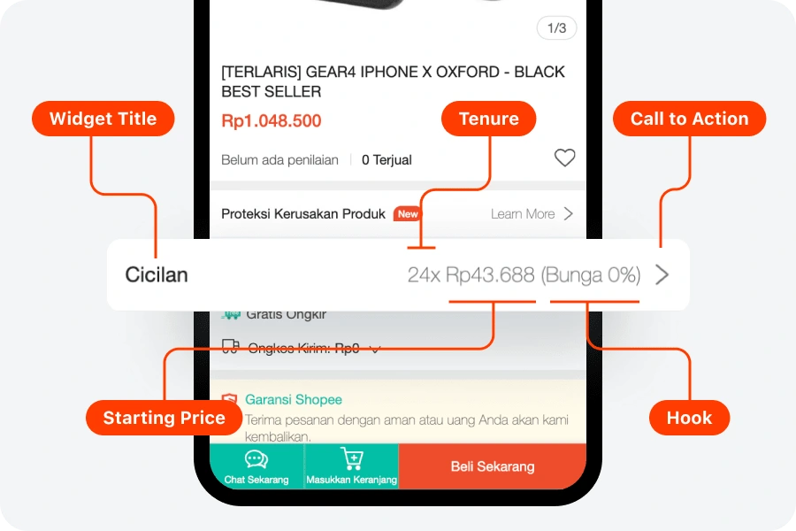
I could say Shopee has the simplest layout yet the richest information. Blibli separated the section title and starting price by making it two-line, this causing extra vertical space taken from this widget. Bukalapak tried to solve it by making it one line, but the trade-off is — it is harder to distinguish the section title from the starting price.
Shopee this issue by making it 2 column lists aligned left and right, still able to maintain all the 4 main information laid out nicely.
Bottom Line
In this competitive landscape, we’ve found that most of the competitors want to give the richest information they can to help users’ decision-making. While doing this, they are aware that this widget will take space and attention, so it’s they to make it not too big or too prominent. The widget has to be balanced with other widgets to serve various scenarios.
💡 Solutions: High-Level Concept on How We Solve the Problems
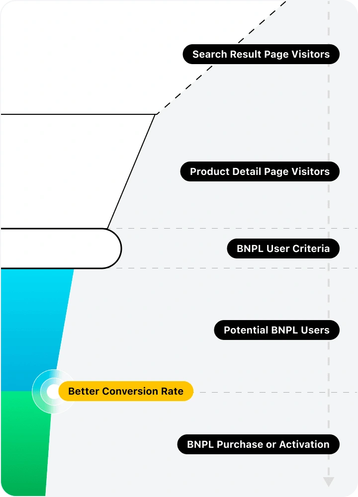
User's Affinity Personalization on PDP
To target a better user segment, we create a collaborative asynchronous project with the PDP team, logistic team, and other teams that have their widget on PDP.
The goal of this project is to define the user criteria of each segment. Who will be prompted with a free shipping widget, who will be prompted with a promotion widget, and in our case—who will be prompted with a buy-now-pay-later widget?
The affinity considers the user’s persona, product categories, price, and context of the current situation.
BNPL Widget Revamp
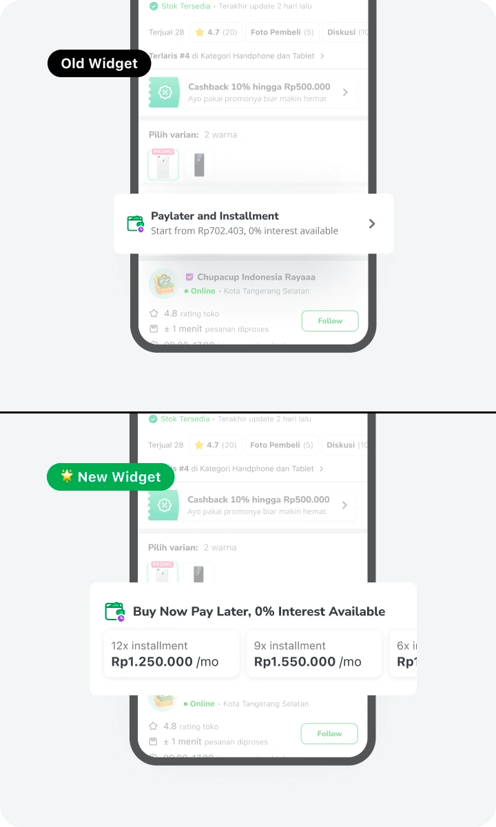
The second solution is gonna be revamping the BNPL widget itself. In this revamp we aim to:
Improve the visibility of the widget
Provide more valuable information to help user’s decision making
The increased adoption rate of BNPL user
And the end goal, of course, is to increase the number of payments using BNPL as a payment gateway
This case study will mostly talk about this initiative. We will take a look in more detail in the following sections.
Seamless Checkout
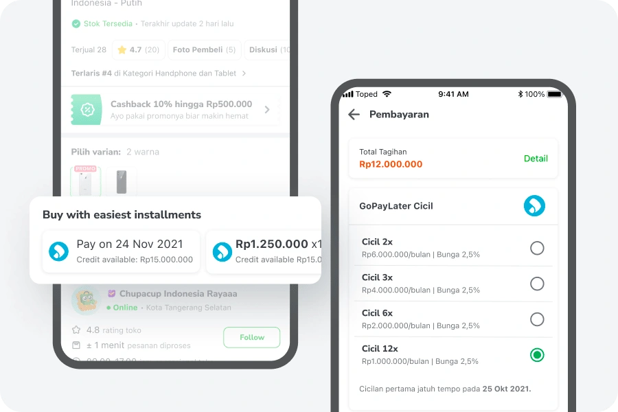
For users to start buying using BNPL, users need to select the payment option manually on the checkout page. While on the PDP, what they can really do is read how to do it on the checkout page. Which is not very pleasant.
This creates
broken experiences for our users. It’s like their action was blocked, and they have to find their way on their own.So the ambition is, how about we enable users to buy with the BNPL as the payment option directly from PDP?
Although it seems simple, the reality didn't. We have several back-and-forth discussions with One-Click Checkout or OCC team to discuss the workaround for current tech limitations.
🆕 Rationale Behind the New Widget
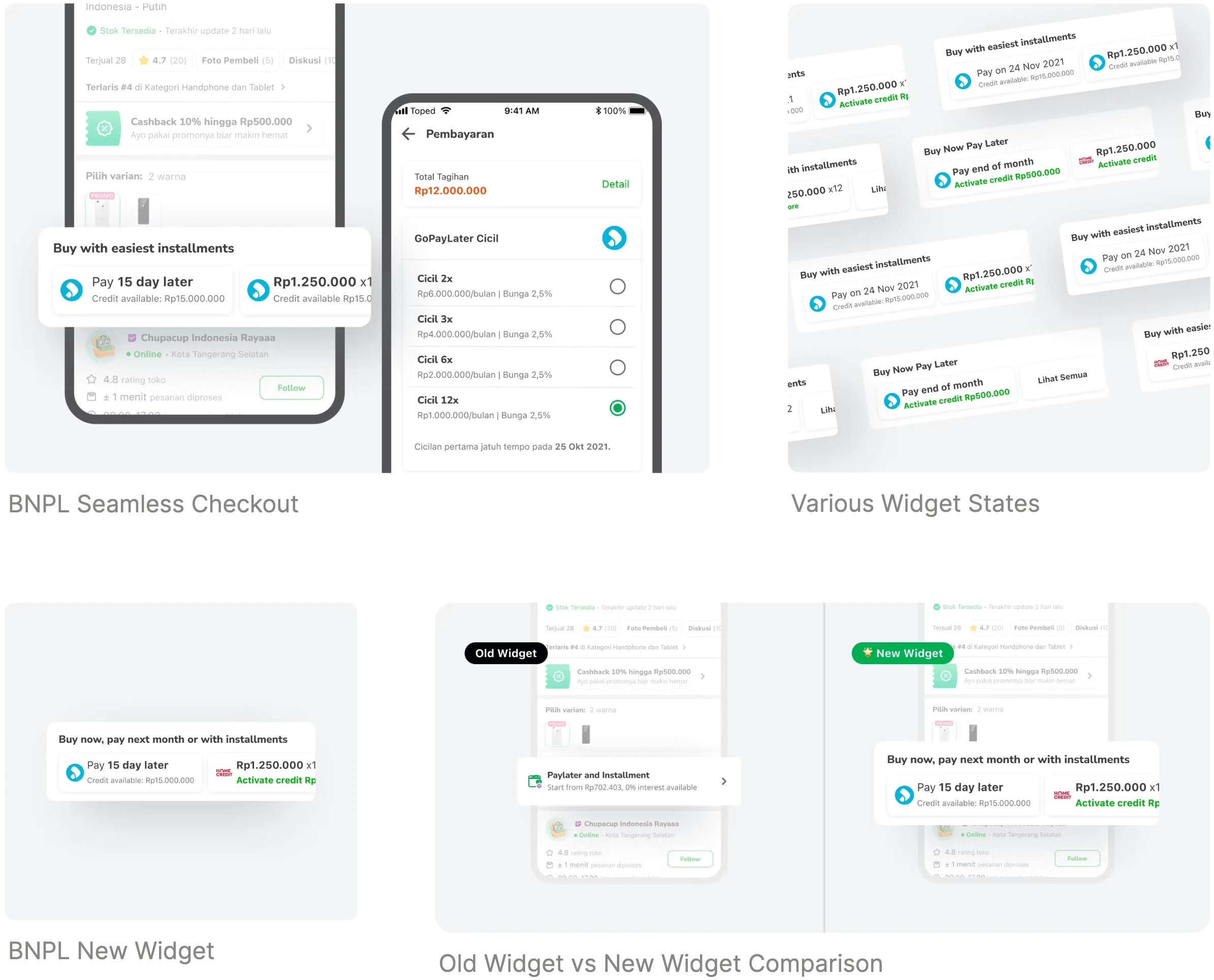
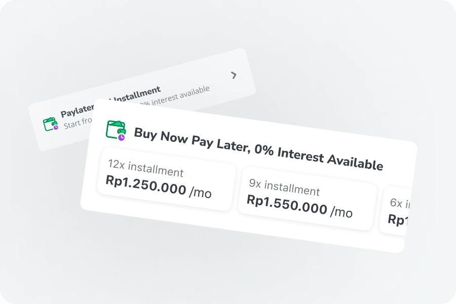
The approach in our new widget is to show not only the starting prices but all the prices for each tenure available.
This is because our users do not choose to use paylater as their payment option because the prices are lower.
In fact, they tend to avoid the longest tenure is possible because of the higher interest for a longer tenure. Their main consideration when choosing tenure is their free budget on their monthly spending. Which is not always the lowest price monthly installment, but the highest they can afford.
So the approach is to show the tenure option upfront with the goal so users can find their matched price easier.

🛠 Design Validation: Hit it with the rubber hammer
Although we have already designed it carefully and made sure we used the most common pattern for our users, we cannot stop yet. The next step is to make sure the design works before launching it to the mass market.
In this testing, we have 3 scenarios with 3 hypotheses to validate:
👍 Scenario 01: Old Widget vs New Widget: Which design is better and why do they prefer one over the other?
As a starting, we gather attitudinal insight from each participant about their perception of the new widget compared to the old widget.
Which one is better and why?
🤔 Scenario 02: Does the new widget attract and set the correct expectations for our users?
Continuing from the first scenario, we want to know how the preferred design engages with user expectations.
Make sure the texts, hierarchy, and visual cues communicate the right information to them.
🌟 Scenario 03: Is the new checkout flow clear enough to understand?
After the user took the action, does the flow easy enough for them to finish?
This scenario assesses the interaction and usability of the flow.
💡 Testing Insights: The "AHA" moment
🧡 The new widget is preferable
Most of the participants prefer the new widget due to the more information they can get without even clicking it first. In comparison, the rest like the old widget because of the simplicity it offers.
That is not my usual way
A user usually decides which payment option to choose on the checkout page. This means, that by the time he is on the PDP he has no clue or intention to do direct checkout. Assuming that there is still a long way before he commits to checkout.
This is the mental model that we need to change.
🔍 Where is the door?
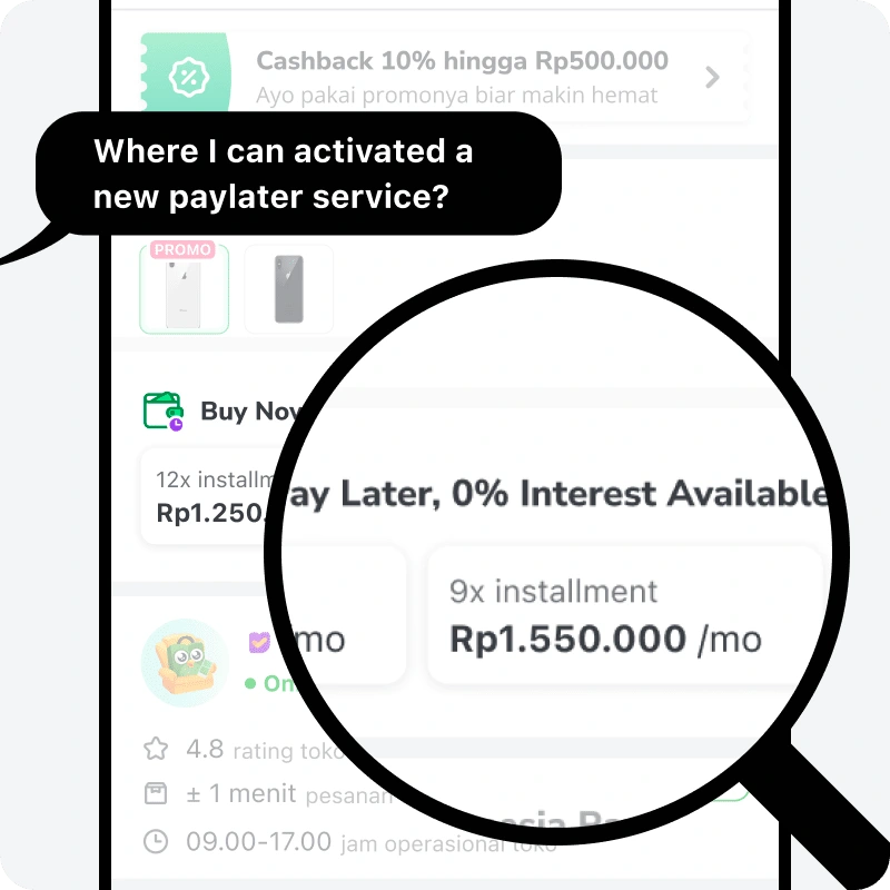
Although most of the participants preferred the new widget when they got asked. "Can you register a paylater service from this page (PDP)?" they don't see the widget as an entry point. While some suggest adding a more prominent button, others suggest changing the title copy of the section.
But both of them are clearly signs that the new widget is not like an open door.
🏃♂️ Iteration: Fixing Usability Issues and Making it Better
Restructure Chips Information
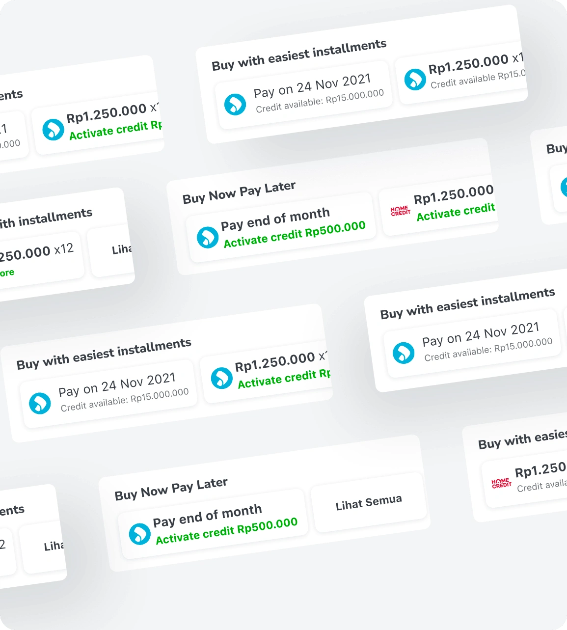
In this iteration, we restructured the chip's information. From tenure based (12 mo, 9 mo, etc.) to service-based (Pay on End of Month and Installment). This is because not all services have pay-end-of-month schemes, so to make it fairer, we split the chips based on this category, installment services or pay-on-end-of-month services.
We also add a prominent link text as CTA to nudge users who want to activate new BNPL services. For whitelisted users even better, we show the approved credit if they activate the service. This will create a loss aversion effect, causing users more likely to activate the service.
Adjusted Copy
We explore all the possibilities to find the best line for our users. From section title to chips title. Aim to convey an engaging value to nudge action.
For example, in the pay-on-end-of-month chip, there is one line to inform when a user must pay the bills. Different services have different bill dates, it will be hard to remember if users have multiple services activated.
1st iteration: “Pay on End of Month”
2nd iteration: “Pay on 24 Nov”
3rd iteration: “Pay 15 days later”
The problem with the first iteration is that it does not always at end of the same month from the checkout date. It is because there is a cut-off date for determining the billing date, whether it’s the end of this month or the end of next month.
While on the third iteration, we want to emphasize the benefit of the service which users can buy now and pay later by specifying the buffer time for their bill.
Design Detailing: To create a reliable solution, we take it one step further and rethink the widget in details
As part of the system thinking, I mapped out all the states of the widget. Each state has its own goals and information to communicate.
End Result: Increased BNPL widget CTR by around 200%* from the previous version. Increased the BNPL adoption rate by 5%*.
We measure the metrics after the new widget is released and the result is astounding. We successfully increase the CTR of the BNPL widget to around 3 times of initial state.
We do aware that these increased metrics could be impacted by our monthly payday campaign. But to see the performance itself is quite fascinating.
Sure there is more to improve, but for now, let’s celebrate this joyful moment.
*Side note: The exact numbers are omitted and rounded due to NDA
Recognition: Thank you to all the teams that contribute to this project and made this project come alive.
Victor Koesnadi as Senior Design Lead, Shinta Tamara as Design Lead, Tarisa Halim as UI Designer, Ardiansyah Nugraha as UI Designer, Frits Eldwido as Project Manager, and Monika Halim as Head of Design, and any other teams that I cannot mention one by one.
Like this project
Posted Jan 20, 2023
Tokopedia is e-commerce with various services in it. One of the services is the buy now pay later service. This service offers multiple buy-now-pay-later provid

