Innovative AI Inspired Technology Logo & Branding Design

Sohil Obor


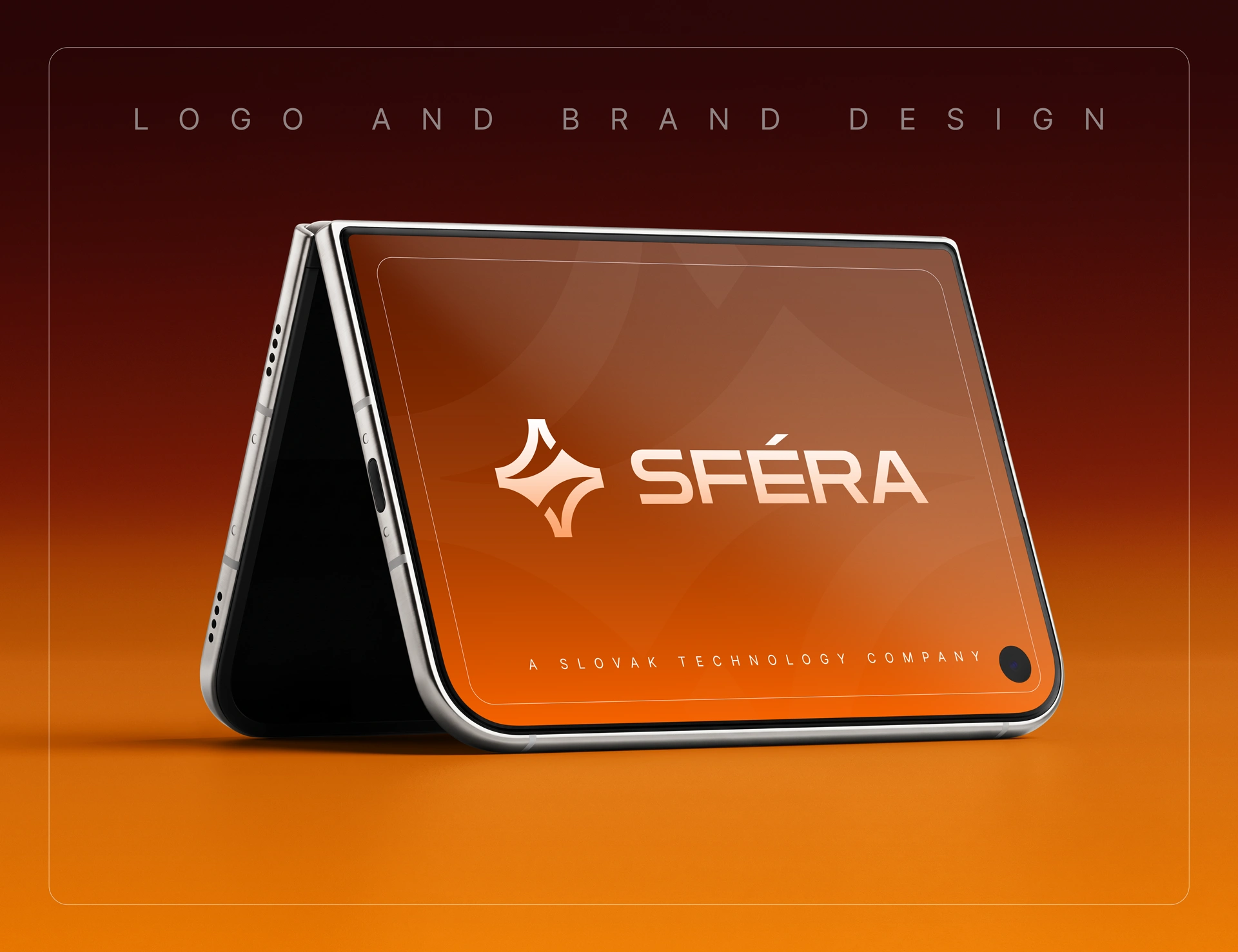
SFERA Technology Logo and Branding Design
Turning an “S” Into a Symbol of Intelligent Technology
SFERA is a technology company operating across the energy, transport, and industrial software industries, where innovation, reliability, and precision matter.
The challenge was to create a modern brand identity that could communicate technology, intelligence, energy, movement, and progress without relying on predictable visual clichés such as circuit boards, lightning bolts, nodes, or generic AI symbols.
The solution started with something already at the heart of the brand:
The letter S.
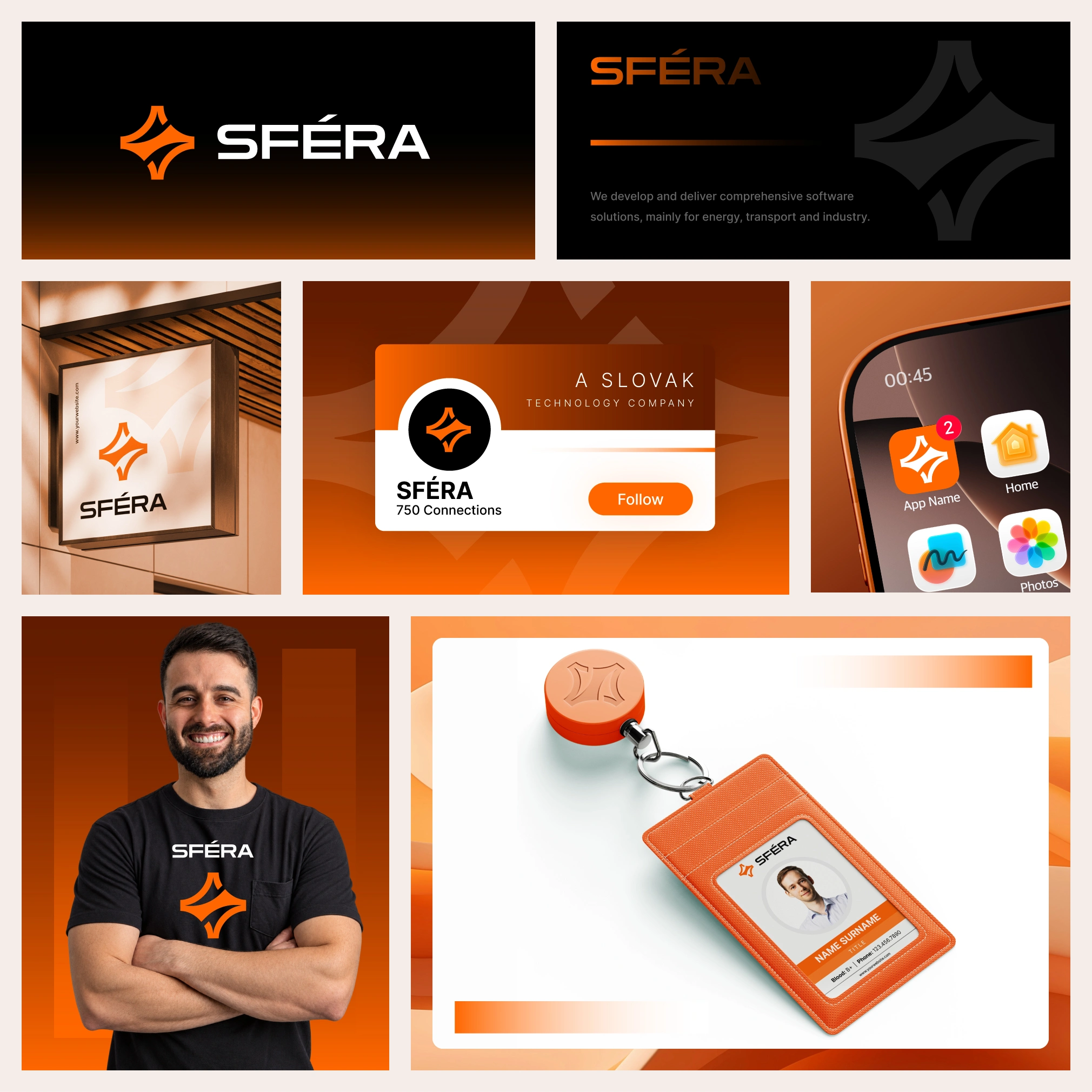
Sfera Logo and Brand Design
The Challenge
Technology and energy brands often occupy a very similar visual space. Blue gradients, digital networks, power symbols, abstract geometry, and futuristic effects are everywhere.
For SFERA, the goal was different.
The identity needed to feel technologically advanced while remaining credible enough for established energy, transport, and industrial environments.
More importantly, the logo needed to create a distinctive visual asset that people could begin to associate specifically with SFERA.
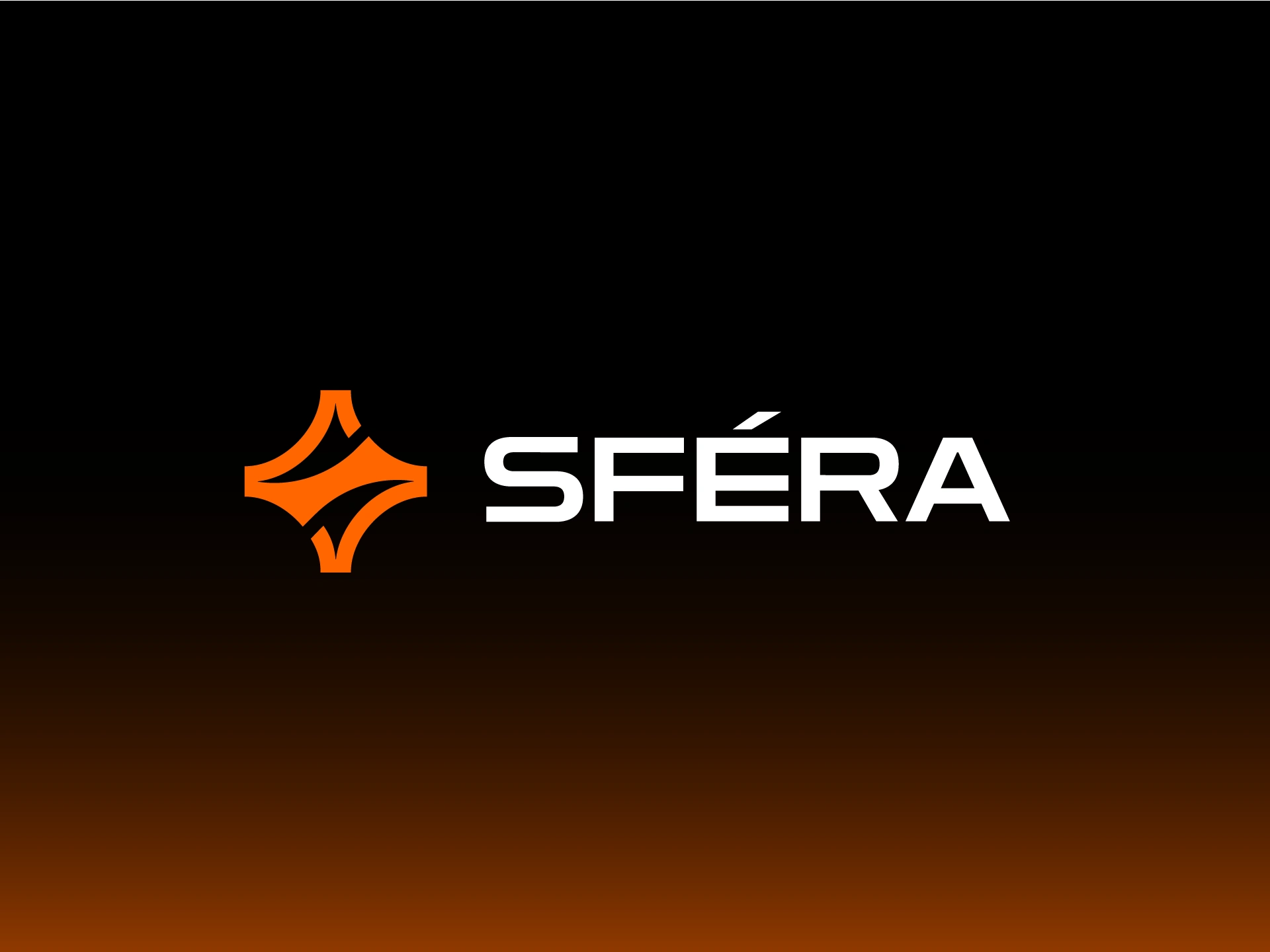
SFERA - Technology and Software Solutions Logo Design
The Big Idea — S + Spark
The flowing geometry gives the symbol a sense of continuous movement—connecting naturally with energy, transformation, technology, and progress.
S → SFERA
Spark → Intelligence
Movement → Innovation
Energy → Progress
Nothing needs to be represented literally. The symbol communicates the character of the company rather than simply illustrating what it does.
Instead of placing a technology symbol next to the company name, I built the idea directly into the identity.
The custom S-shaped symbol forms the foundation of the logo, while an integrated spark introduces a subtle visual reference to intelligence, discovery, AI, innovation, and new possibilities.
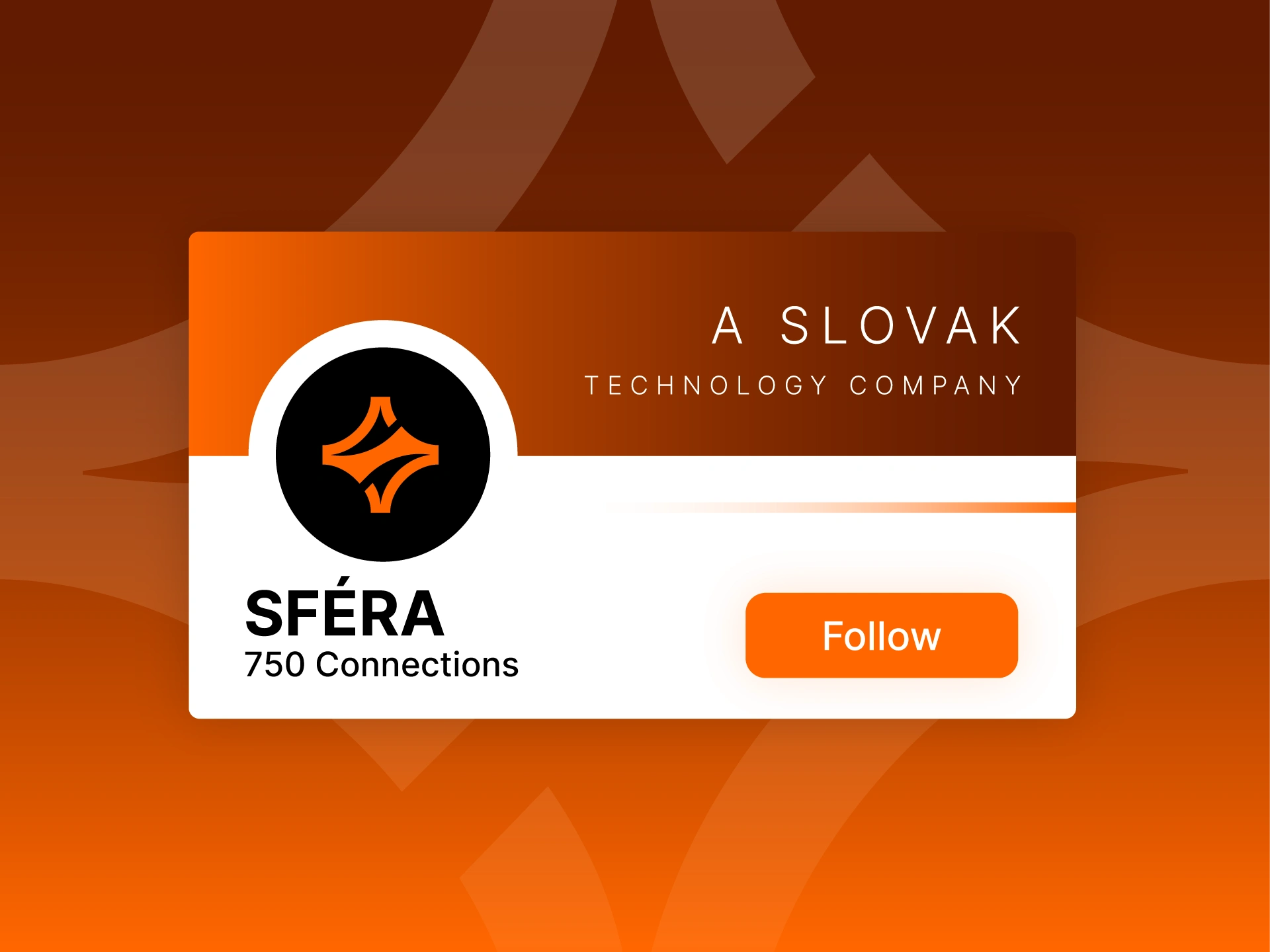
SFÉRA - Technology and Software Solutions Branding
Designing Beyond the Obvious
One of the most important decisions was what not to include.
AI branding increasingly relies on similar visual language—brains, stars, neural networks, circuit patterns, glowing gradients, and futuristic icons. Energy companies face the same problem with lightning bolts, leaves, plugs, and power symbols.
Rather than following those conventions, I wanted SFERA's identity to sit between technology and abstraction.
The spark provides just enough association with intelligence and discovery, while the custom S keeps the identity proprietary to the company.
This creates a brand that can communicate innovation today without becoming dependent on a visual trend that may quickly feel dated.
A Symbol Designed to Stand Alone
The S-mark was designed as more than an element beside the wordmark.
Its simple, recognizable silhouette allows it to become an independent brand asset across:
Software interfaces · App icons · Digital products · Presentations · Social media · Corporate communications · Advertising · Print
This gives SFERA a recognizable visual signature that can grow alongside the company.
Rust Orange — Energy Without the Expected Blue
Technology brands frequently gravitate toward blue and green.
I introduced rust orange to create a warmer and more energetic personality while helping SFERA differentiate itself within the technology and industrial landscape.
The color communicates energy, action, confidence, and momentum while giving the brand a more memorable visual presence.
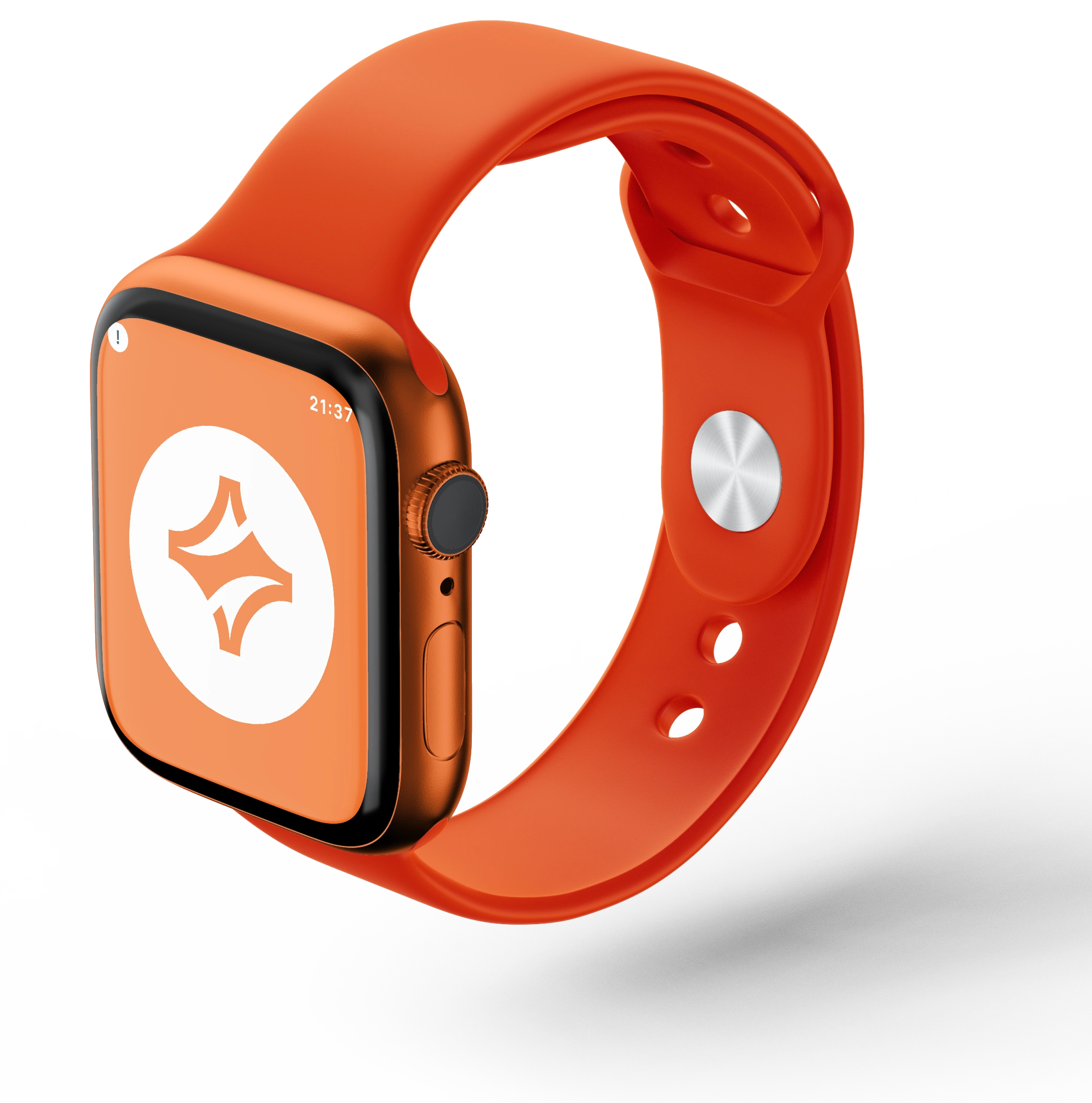
SFÉRA -Smart Watch Mockup Design
From Concept to Brand Identity
01 — Research & Visual Exploration
I explored the visual territory connecting AI, software, energy, transport, and industrial technology, looking specifically for opportunities beyond conventional industry symbolism.
02 — Concept Development
Multiple directions were explored around the SFERA name, with particular attention given to transforming the letter S into a recognizable proprietary brand asset.
03 — Symbol Design
The S-shaped geometry was refined and combined with the spark to create a symbol that feels intelligent and innovative without becoming an obvious AI icon.
04 — Typography & Color
The expressive symbol was paired with clean typography and a distinctive rust-orange palette to balance innovation with corporate credibility.
05 — Brand Applications
The identity was developed to remain consistent across digital interfaces, software products, presentations, advertising, corporate communication, print, and large-format applications.

SFÉRA - Branding - Advertisement - Bus Billboard
Designed for a Technology Brand That Can Evolve
A strong technology identity shouldn't only represent what a company does today—it should leave room for what the company may become tomorrow.
That principle shaped the SFERA system.
Rather than tying the identity to one specific product, technology, or energy application, the visual language represents broader ideas of intelligence, movement, transformation, and progress.
This gives SFERA the flexibility to introduce new software, services, platforms, and technologies while maintaining one recognizable visual identity.
The Result
The final identity gives SFERA a distinctive visual language connecting AI, technology, energy, intelligence, and progress without representing any of them too literally.
Instead of simply saying:
“We are a technology company.”
The identity creates the feeling:
“We build intelligent systems that move industries forward.”
The result is a flexible brand foundation designed to evolve across SFERA's software products, digital experiences, corporate communications, and future technologies.
Outcome & Impact
✓ Custom S-shaped brand symbol built directly from the SFERA name
✓ AI-inspired spark representing intelligence, discovery, and innovation
✓ Distinctive rust-orange palette that moves beyond traditional technology colors
✓ Modern visual identity suitable for energy, transport, software, and industrial technology
✓ Flexible logo system for digital products, interfaces, presentations, advertising, and print
✓ Standalone symbol designed to strengthen long-term brand recognition
✓ Scalable identity system capable of evolving with future products and services
Let’s Build a Brand That Stands Out
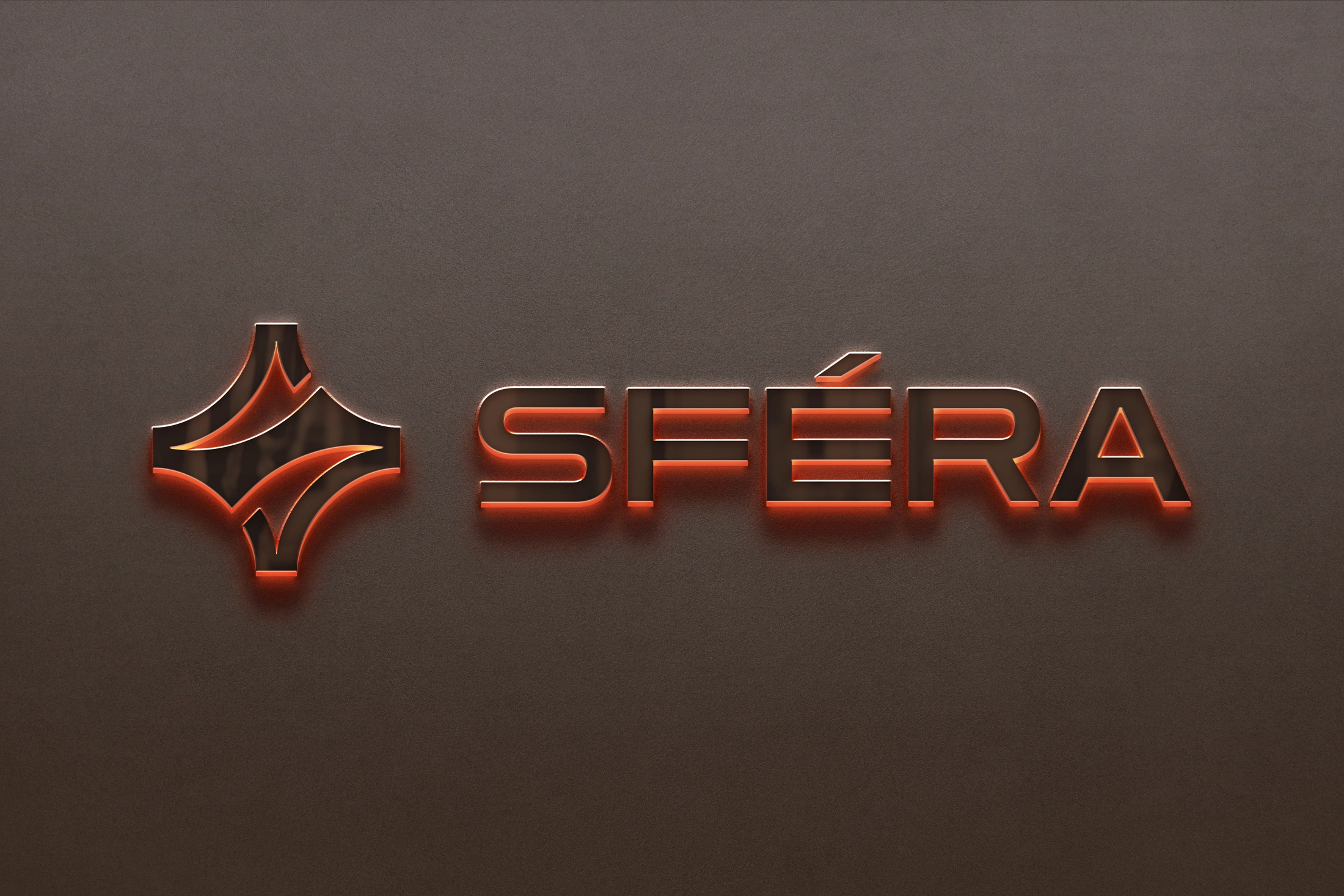
More Than a Logo — A Recognizable Brand Asset
The strongest brand symbols often aren't created by adding more elements. They come from finding a simple idea that already belongs naturally to the brand.
For SFERA, that idea was hidden inside its own name.
The S became the symbol.
The spark gave it intelligence.
Movement gave it energy.
Together, they created a visual identity designed for a technology company moving industries forward.
Looking for a Technology Logo & Brand Identity?
I help technology, SaaS, AI, energy, industrial, and B2B companies turn complex ideas into clear, distinctive, and scalable visual identities.
I help businesses turn complex ideas into clear, distinctive, and memorable visual identities.
If you're launching, repositioning, or evolving a technology, SaaS, energy, or B2B brand, I'd love to help shape its visual direction.
Visit my profile and message me directly to get started on your project.
Like this project
Posted Sep 16, 2026
AI-inspired logo and brand identity for SFERA, blending technology, energy and innovation into a distinctive, future-ready visual identity.
Likes
0
Views
14
Timeline
Sep 12, 2026 - Sep 14, 2026
Clients
99designs