TripNest Travel Agency Landing Page
Olufemi Tofunmi
Posted May 28, 2026
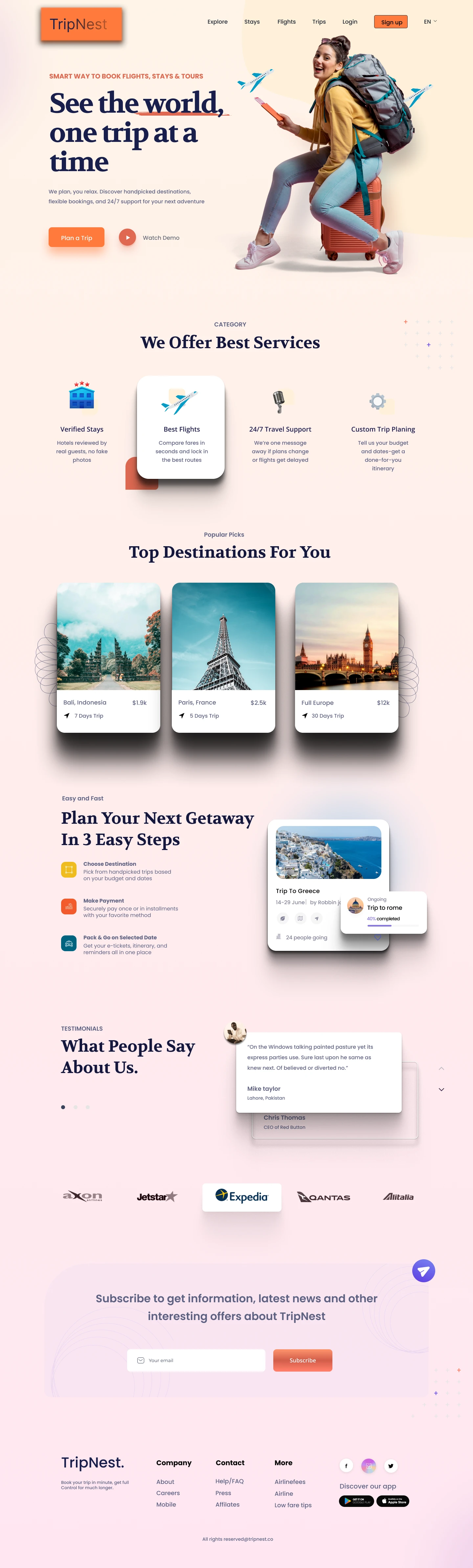
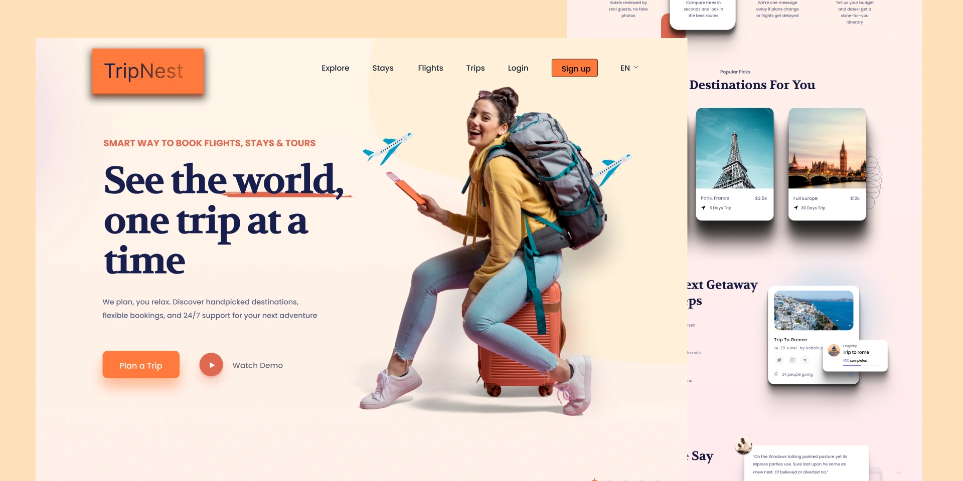
This is a travel agency landing page UI concept designed to make trip planning simple, visual, and trustworthy. The goal was to create a modern hero section, highlight top destinations, and explain the booking process in a clear, friendly way. Problem Many travel websites feel cluttered and confusing. New visitors land on the homepage and don’t know what to do first — search, scroll, or click “Book”. Important information like destinations, prices, and how the service works often gets buried under heavy text and complex layouts. Solution I designed a clean, warm landing page focused on three things: • A clear hero section with a strong headline and primary call-to-action • Visual destination cards showing place, duration, and price • A simple “3 steps” process that explains how booking works