Matcha Haus - Branding Project
Dana Kueks
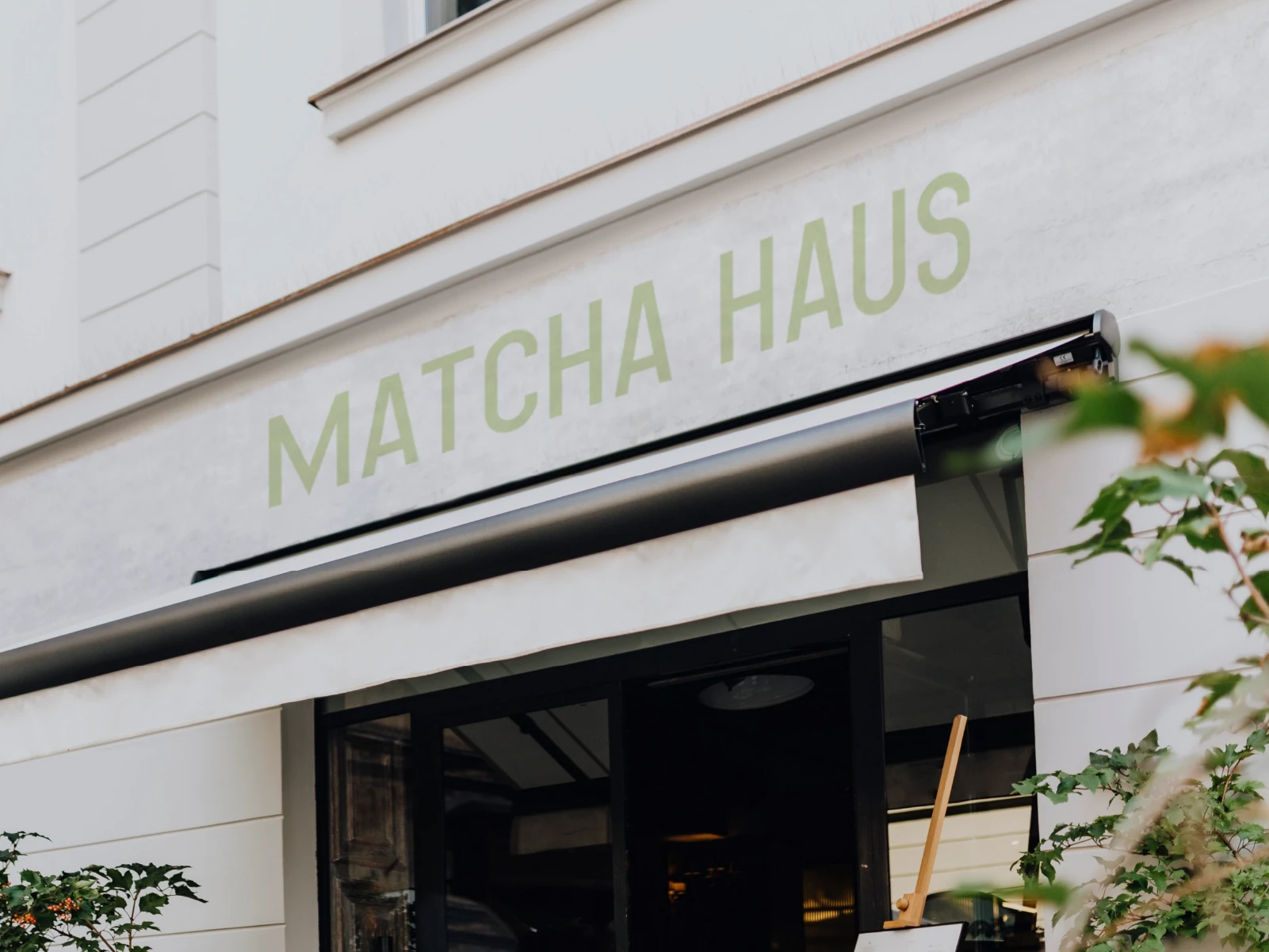
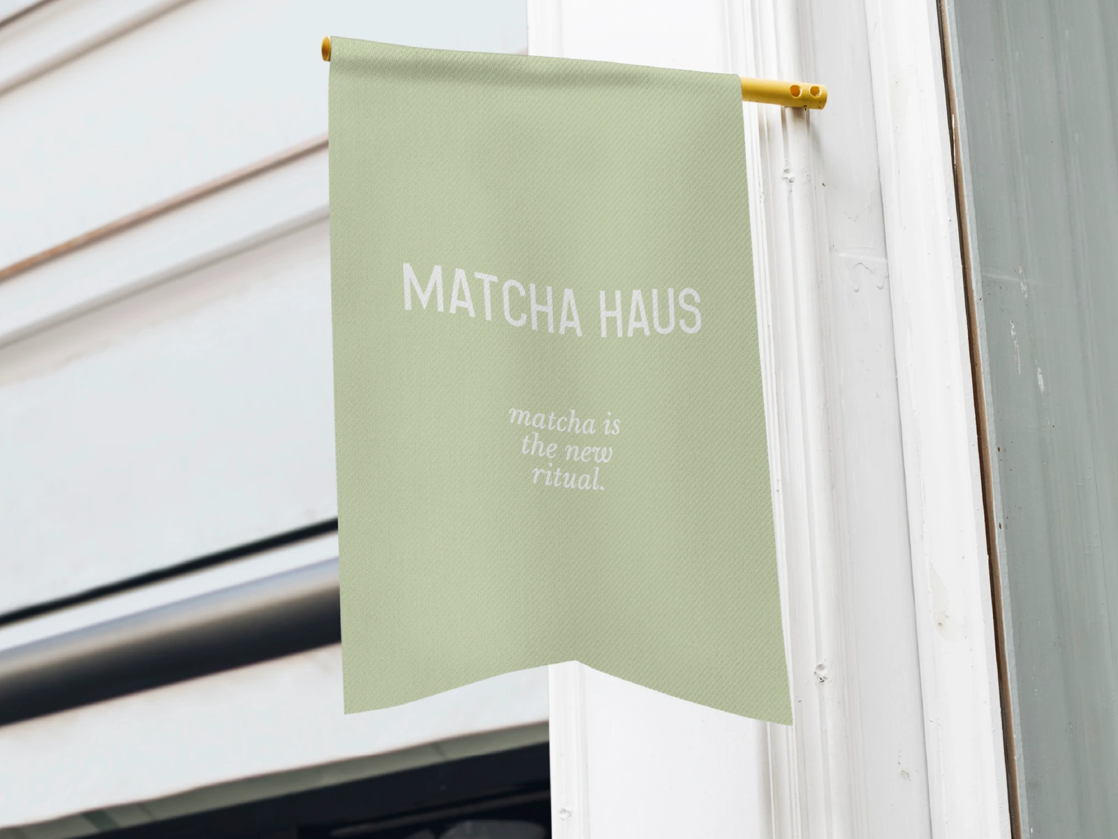
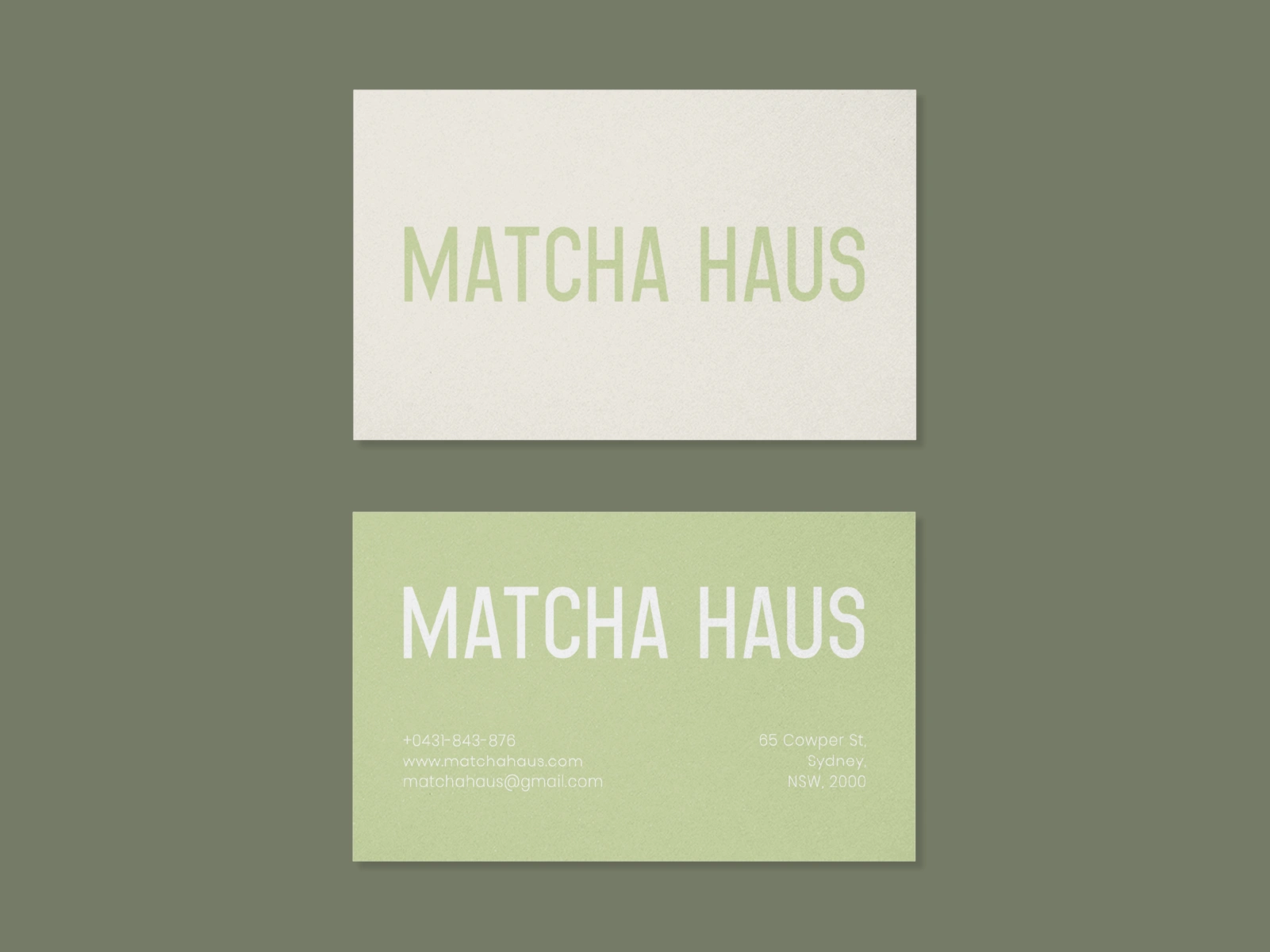
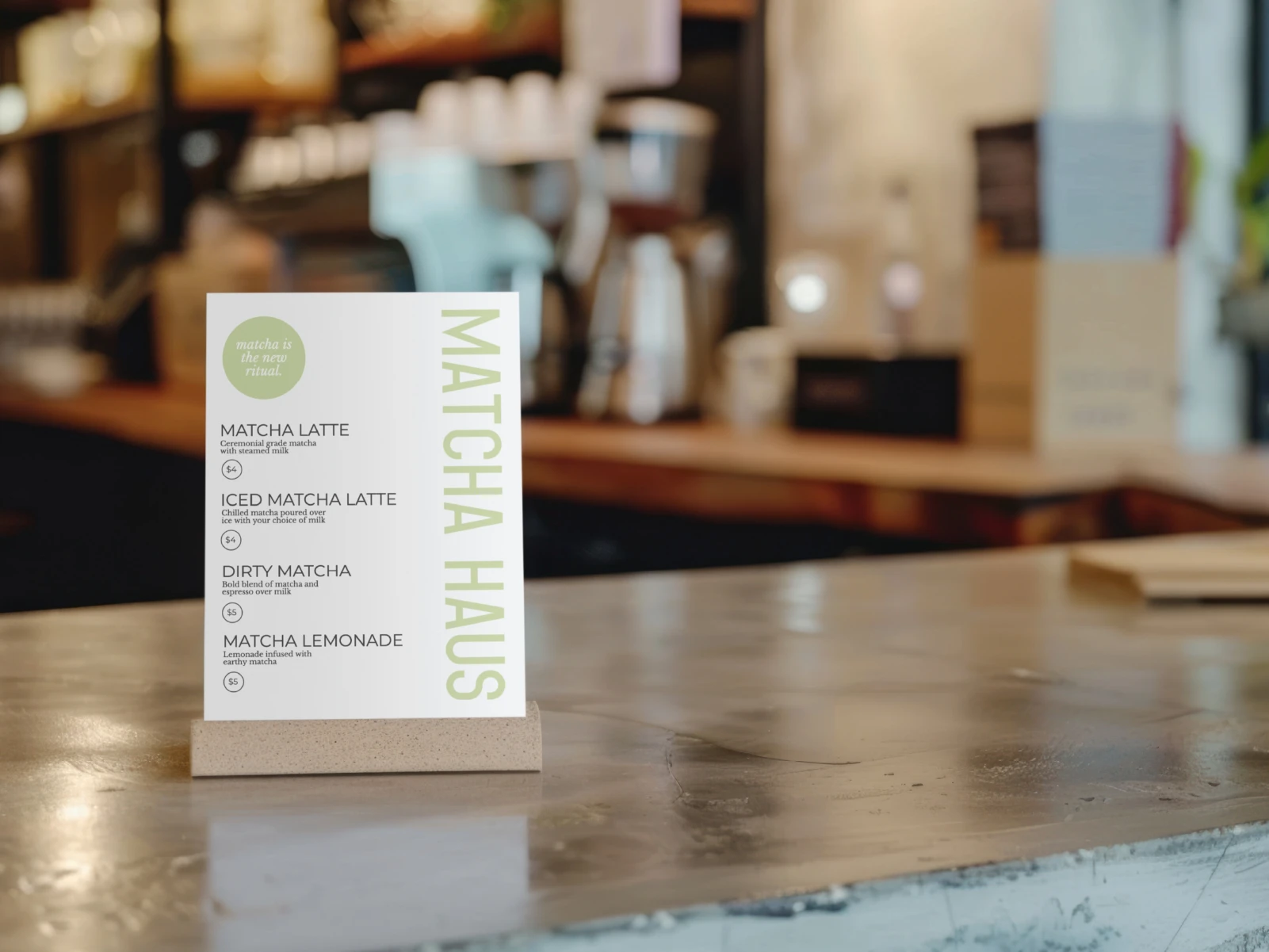
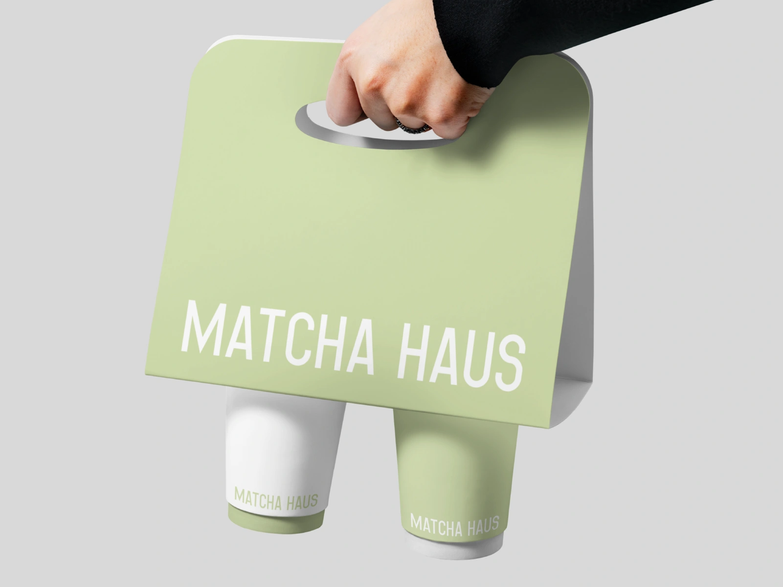
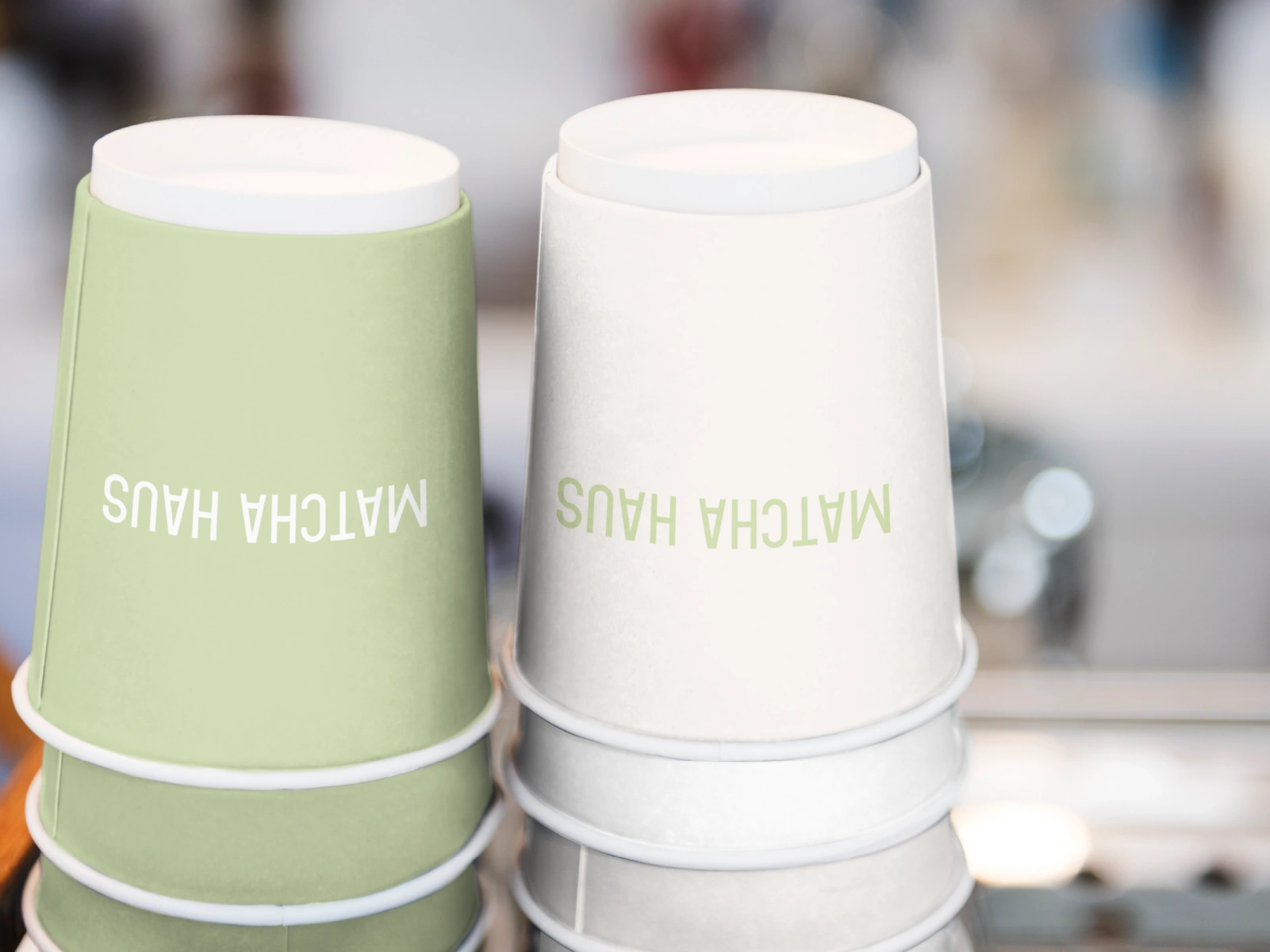
MATCHA HAUS is a minimalist, elevated brand identity crafted for a premium matcha café experience. Soft, earthy tones interlace with clean, modern typography, creating a serene visual language that immediately conveys calm and clarity.
From the moment customers step in—whether they’re greeted by refined signage or unwrapping their takeaway—the aesthetic whispers consistency, intention, and quiet sophistication. Every detail is carefully considered to evoke the comfort and mindfulness intrinsic to the ritual of matcha.
Would you sip matcha here?
We designed this brand to answer that question with a resounding yes: the visuals invite you to pause, indulge, and savor a moment of stillness.
Project highlights:
Harmonious color palette of muted greens and warm neutrals
Sleek typography pairing modern sans‑serifs with soft curves
Thoughtful application across physical and digital touchpoints: in‑cafe signage, packaging, and social media
Tools: Adobe Illustrator & Photoshop
This identity positions Matcha Haus not just as a café, but as a calming retreat—a sanctuary of mindful sipping.
Like this project
Posted Jun 5, 2025
Minimal, serene, and refined—Matcha Haus is a calming brand identity designed to elevate the matcha ritual through earthy tones and modern elegance.