Marjane
About
Marjane (also Marjane Holding) is a Moroccan hypermarket chain. The chain opened its first supermarket, in 1990, in Rabat. In 2008, the company had 33 hypermarkets around Morocco. Its total turnover in 2019 was $1.2 Billion and employs 5,144 people. With more than 18 million customers per annum (2007), Marjane is the leader on the Moroccan market in front of the hypermarket Metro AG Morocco and Aswak Assalam, its principal competitors.
Goals
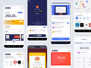
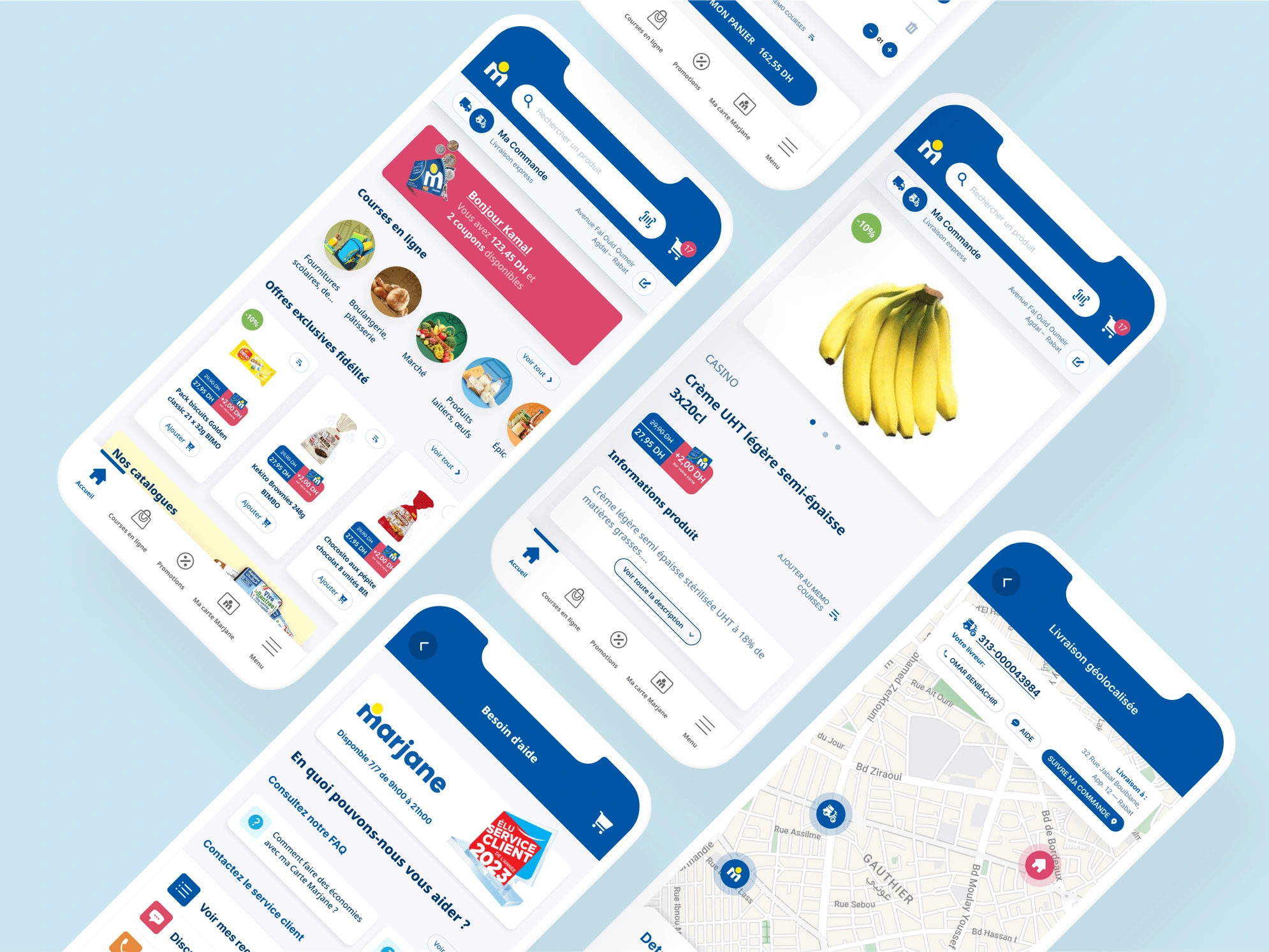
To fortify their dominant market position, Marjane strategically undertook a mobile app and delivery service overhaul. This endeavor aimed to secure their competitive advantage, especially in response to the emergence of new market entrants like Glovo.
To realize this objective, the project also encompassed the design of internal SaaS tools, empowering the team to streamline processes, meticulously monitor each facet of the delivery workflow, and elevate customer satisfaction.
Process
Our Creative Journey: Elevating Marjane's App and Delivery Service
Understanding the Users:
- We kicked off this exciting project by diving headfirst into user feedback from app store comments. We wanted to know what was on users' minds, what made them happy, and what drove them crazy.
- To dig even deeper, we reached out to our most dedicated users - the power users. We had some fantastic chats with 28 of them to get to the bottom of their frustrations and expectations.
- While we were at it, we kept a close eye on the competition, conducting a thorough analysis of our rivals' strategies and offerings.
- Expanding our horizons, we took inspiration from major international players, checking out what they were up to in other parts of the world.
Crafting Our Strategy:
- With a treasure trove of insights at our disposal, we pieced together the puzzle, figuring out what needed to change, what we could add, and how we could make things better for our users.
Streamlining the User Experience:
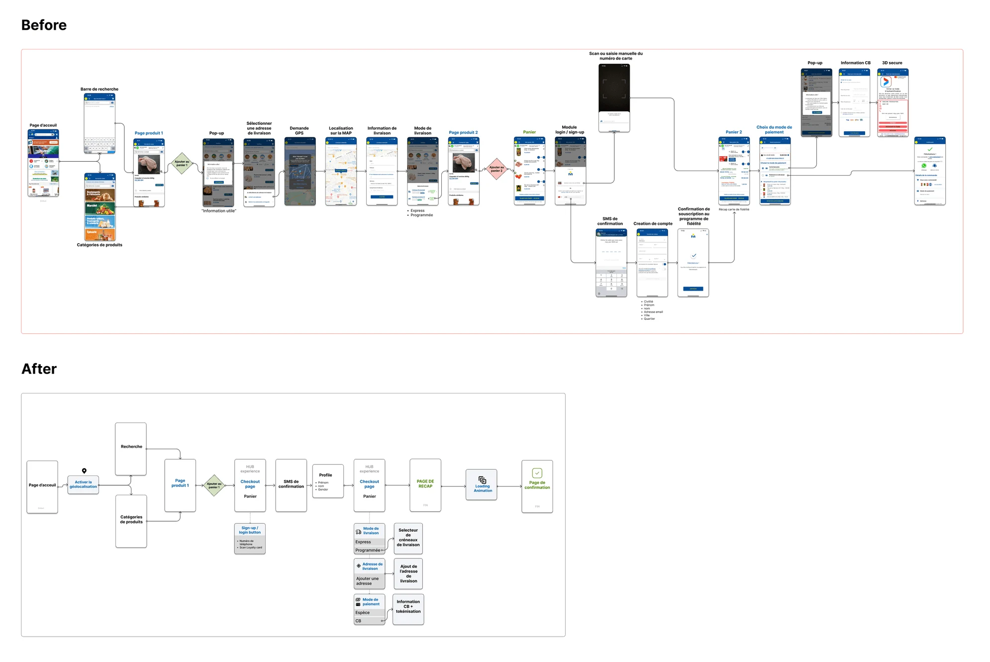
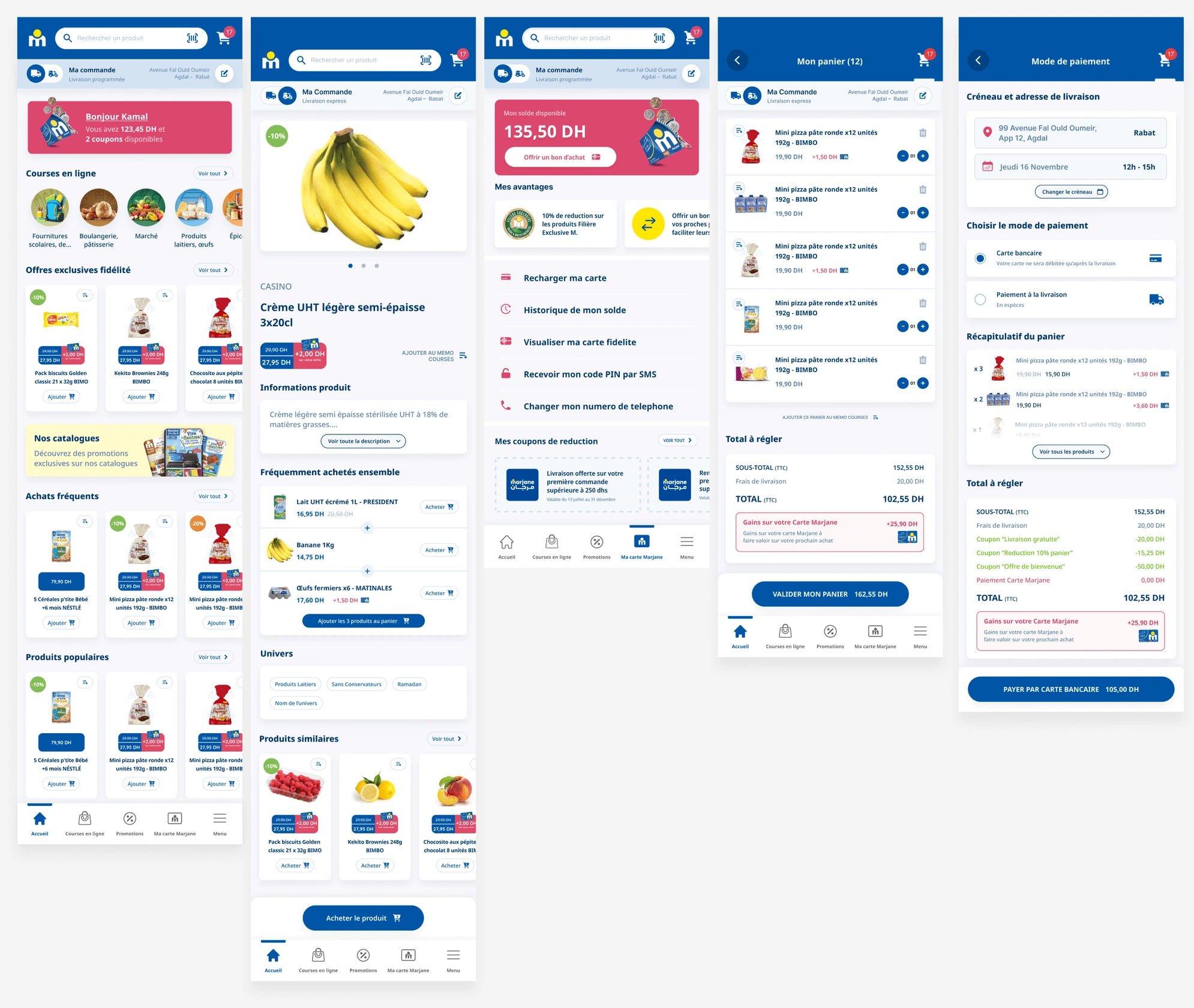
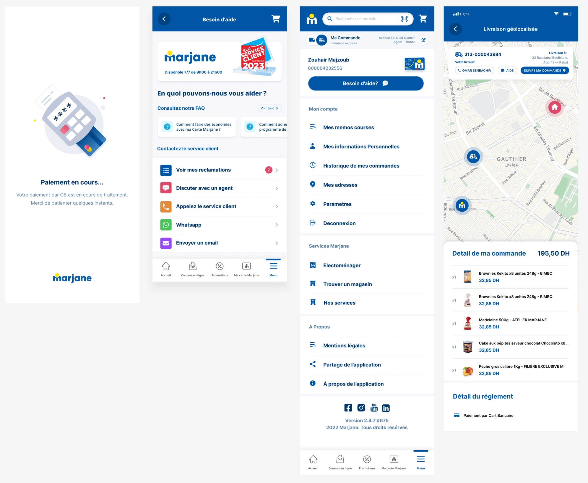
- Time to roll up our sleeves and make the user experience smoother than ever. We went through every user flow with a fine-tooth comb and created wireframes to simplify the process of placing orders. Fewer clicks, happier users!
- Once we had the blueprint, we brought it to life with a slick UI design. We used Figma to whip up a prototype that we could test with our power users and some new faces.
- The user testing phase was golden. We got feedback, made some tweaks, and fine-tuned our design based on what we learned.
- Finally, we polished up the design and handed it over to our development wizards, armed with a comprehensive set of design assets.
Our journey was all about connecting with users, making data-driven decisions, and bringing creativity into every step.
Like this project
Posted Apr 29, 2024
Improving the mobile purchase experience for the largest retail store in Morocco
Likes
0
Views
27


