Meta Pool
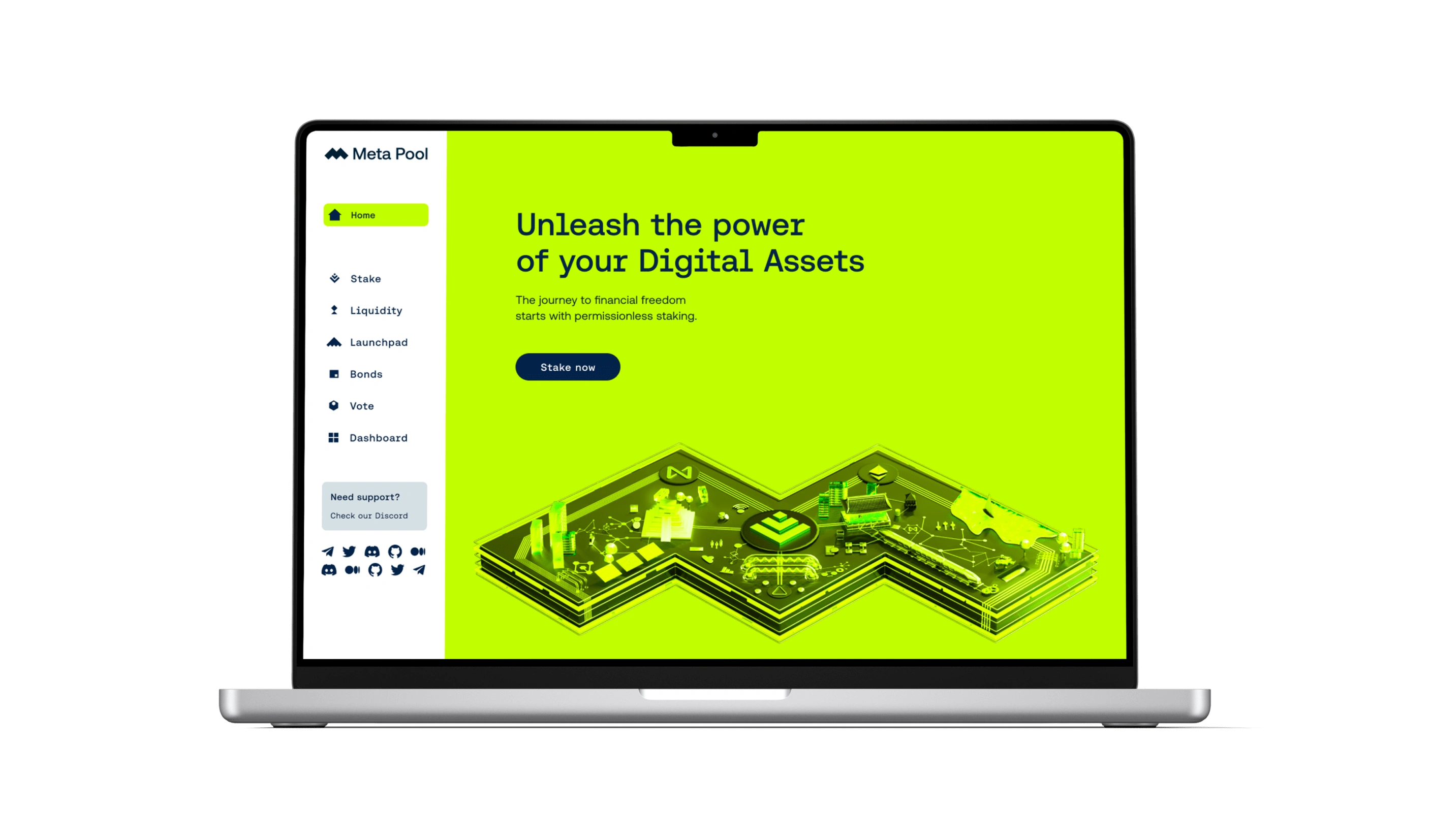
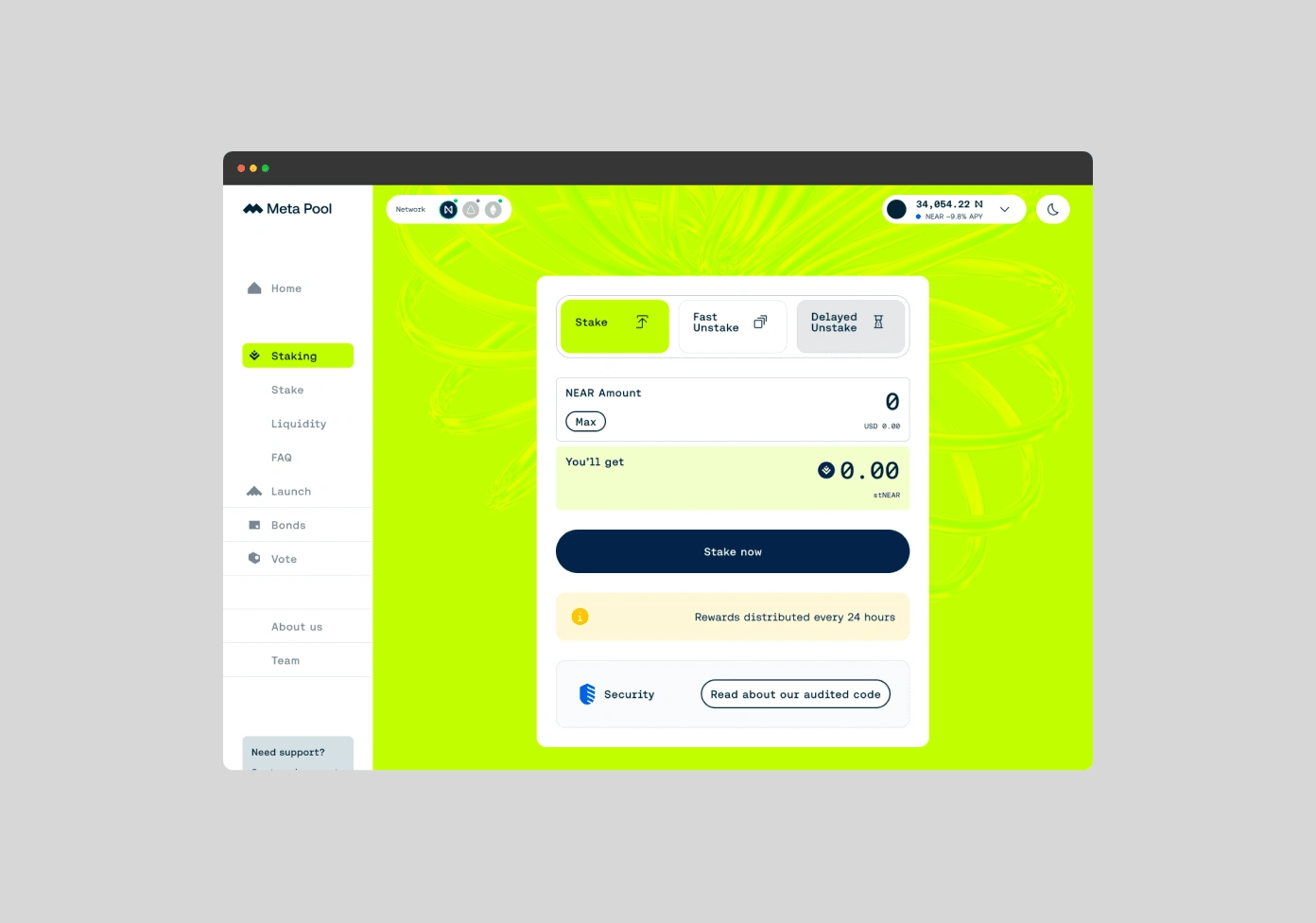
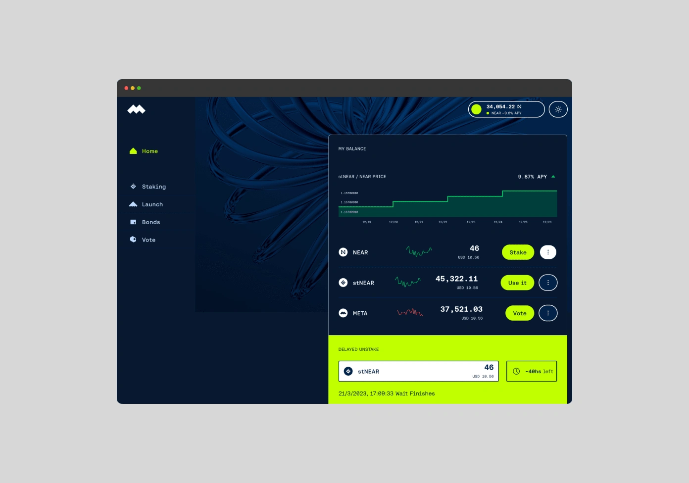
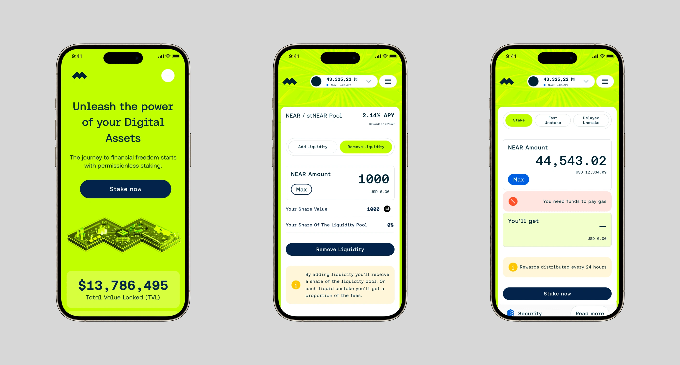
Meta Pool • Crafting User-Centric Digital Experiences to integrate Meta Pool's suite of dApps into a single point of operation to access all the opportunities to earn passive income.
Conceptualizing the Brand
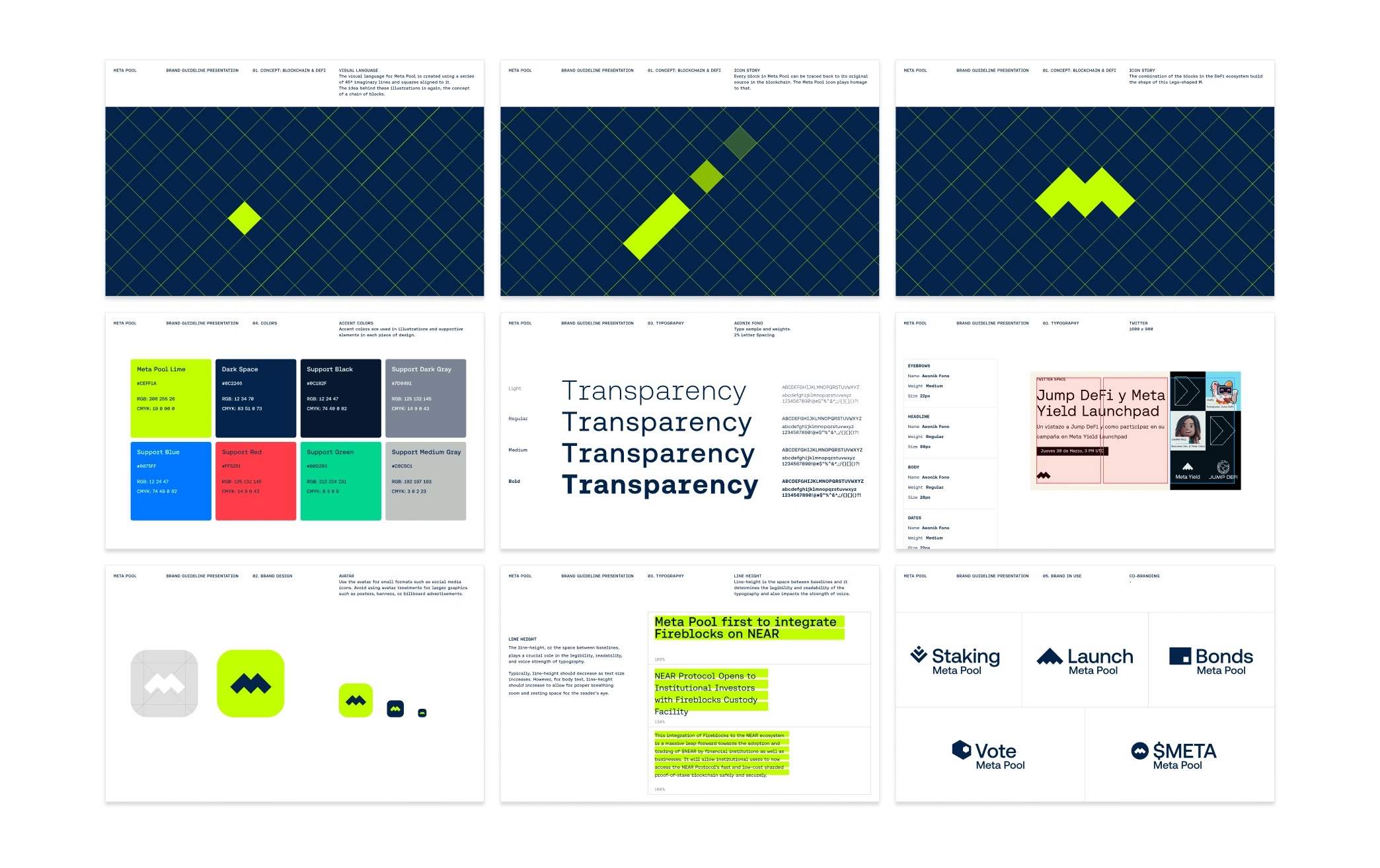
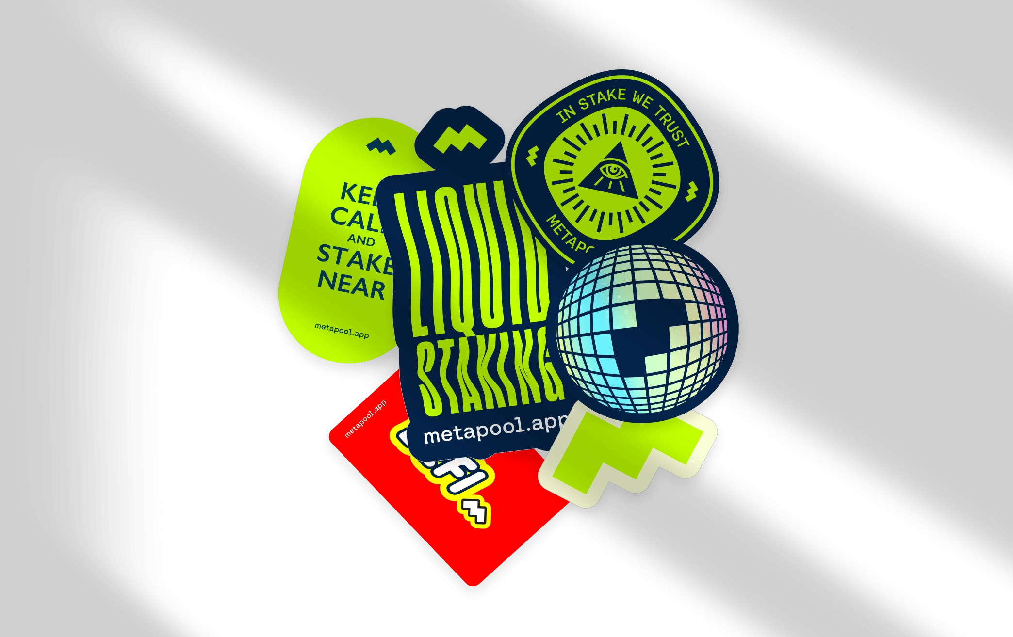
The foundation was laid by unraveling the essence of the blockchain—the very core of Meta Pool's operations. The concept of "block by block, yield is generated" resonated deeply. This translated into our logo, where a rotated grid forming the letter "M" symbolized this process, anchoring the brand in the very principle of crypto growth.



Understanding User Needs and Challenges
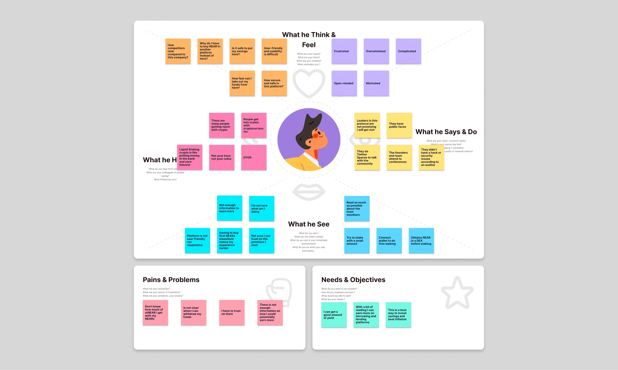
In the volatile crypto market, it was crucial to understand and cater to the specific needs of our user base. Our research highlighted challenges with Meta Pool's brand dilution across dApps and the need for a single access point to Meta Pool’s DeFi services. The aim was clear: to create an accessible and trustworthy platform that resonates with both seasoned crypto enthusiasts and novices alike.
UX Research: A Deep Dive
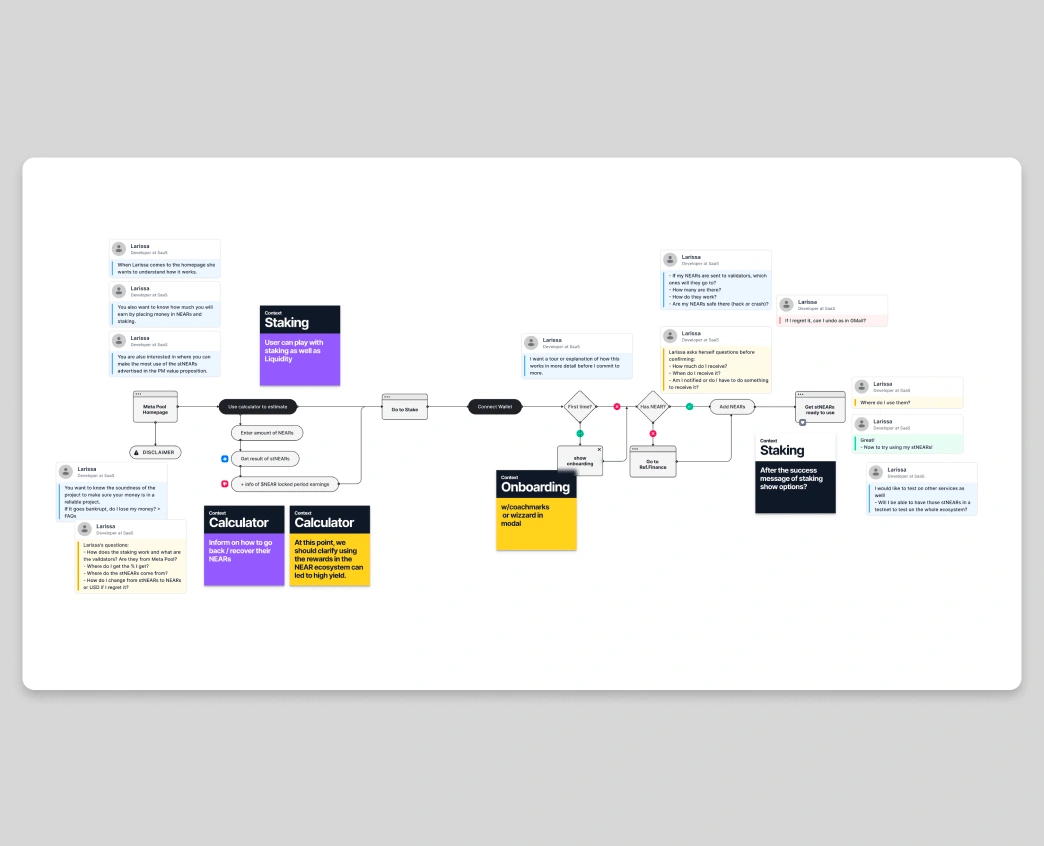
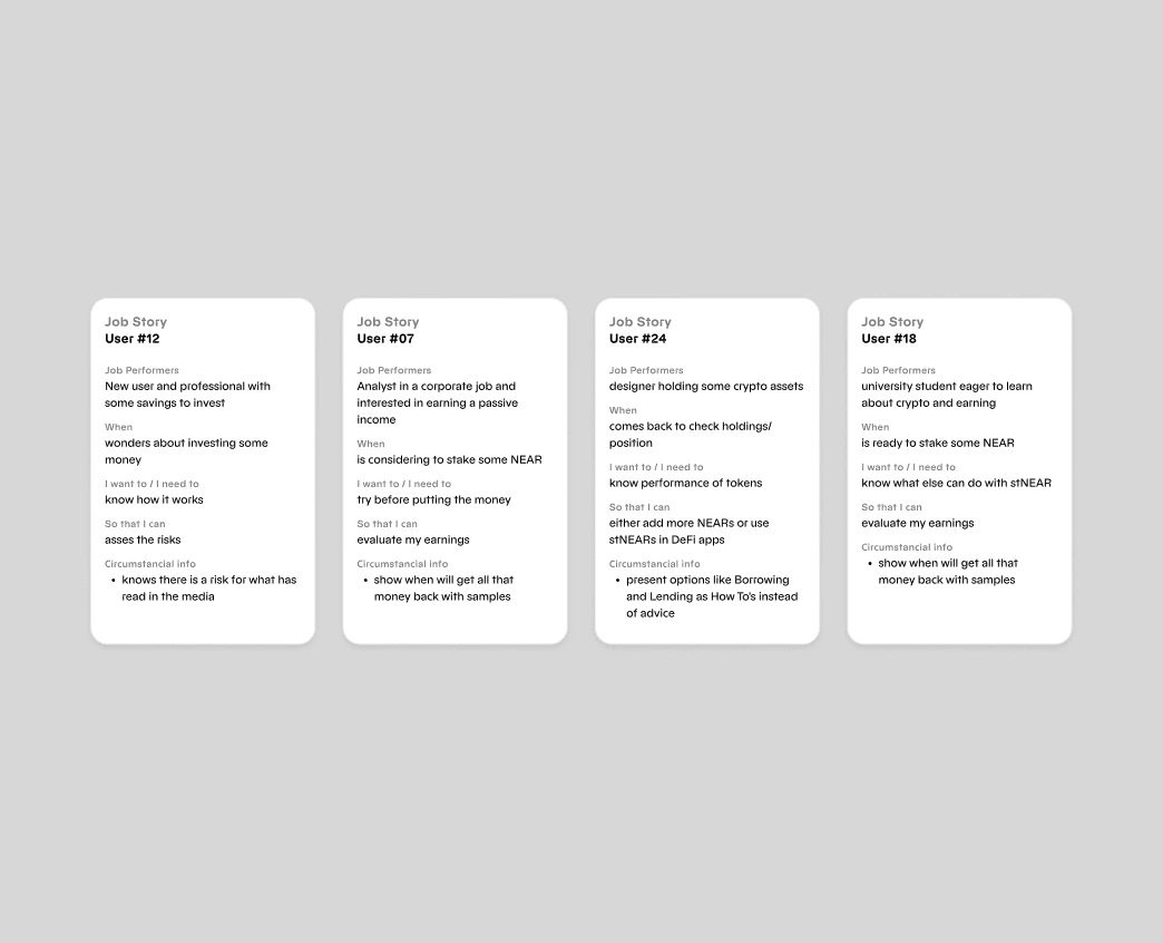
By involving over 30 participants in user interviews, testing, and design sprints, we generated valuable insights.
The Need for Education
A significant chunk of users were unclear about 'staking'. Thus, it became imperative to provide jargon-free explanations and tutorials.
Security as a Priority
Users expressed concerns about the security of their assets. It was paramount to highlight and reassure them about the safety features in place.
Clarity on Liquid Tokens
Users were enthusiastic but also puzzled about liquid tokens. This led us to create a dedicated section explaining their utility and benefits.
Simplicity Overwhelms
Participants preferred an intuitive interface, leading to our decision to adopt a minimalist design approach.
From UX Insights to UI Implementation
Post-research, the design approach became user-centered. With a clear roadmap in place, we emphasized:
Educational Onboarding
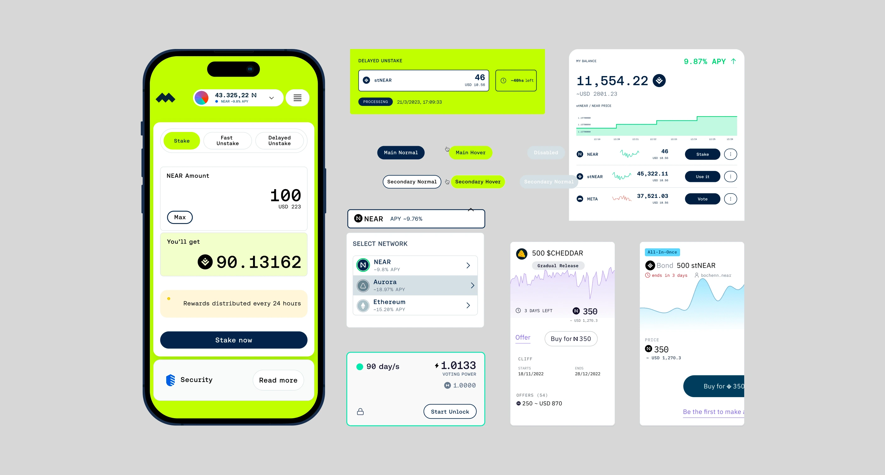
A visual step-by-step guide was integrated to demystify the concept of 'staking'. Trust-Building Elements: Visual trust signals, icons indicating encryption methods, and security badges were sprinkled throughout the platform.
Highlighting Liquid Tokens
A dedicated section with animated infographics was designed to explain liquid tokens in relatable, real-world scenarios.
User-Friendly Design
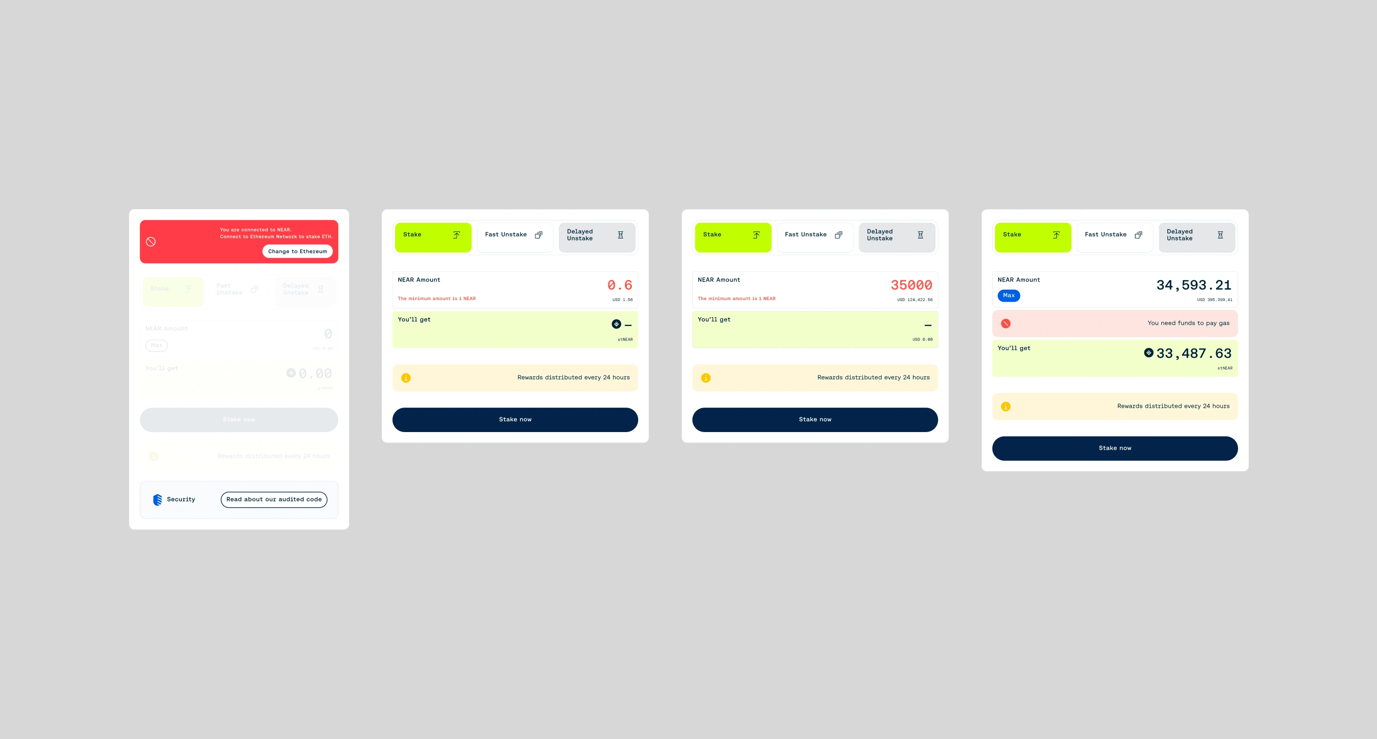
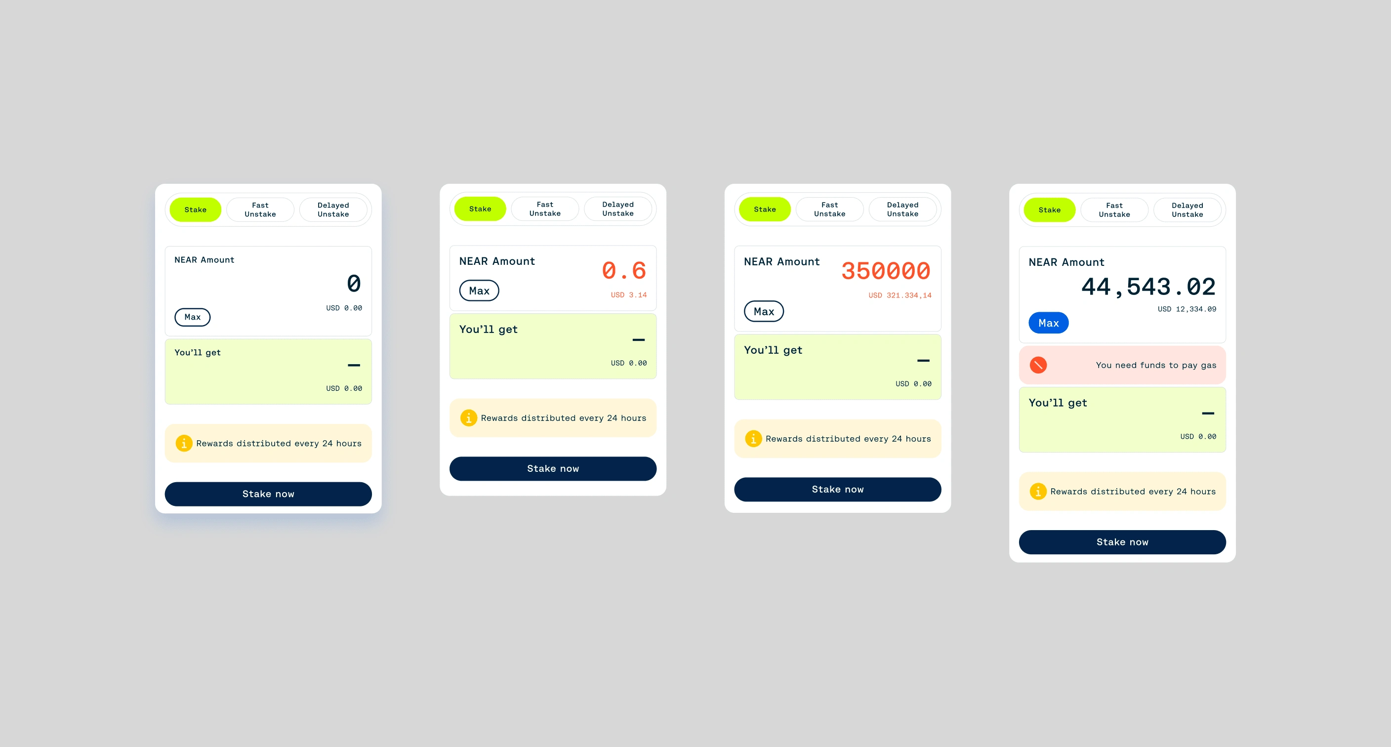
With feedback emphasizing a clean experience, we designed with a focus on essential features and clear CTAs.
Seamless Transactions
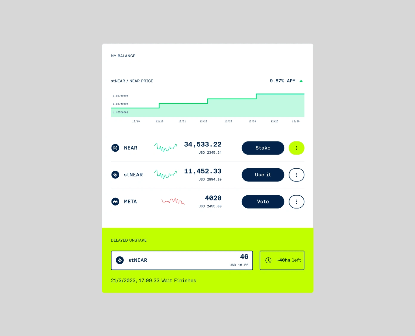
Guided by user feedback, we developed a flow that facilitated easy management and liquidation of assets.
Like this project
Posted Oct 3, 2023
User-Centric Digital Experiences to integrate Meta Pool's suite of dApps into a single point of operation to access all the opportunities to earn passive income


