FR Insurance Branding
Project Overview: Branding for FR Insurance Agency
Objective: To revitalize FR Insurance Agency's brand identity, aligning it with its core values of protection, reliability, and personalized customer service.
Components:
1. Logo Redesign: Two concepts developed - a shield incorporating the letters F and R, symbolizing security and trust; and a minimalistic, geometric design with F and R, emphasizing modernity and precision.
2. Color Palette: Two schemes proposed - one with shades of blue symbolizing trust, depth, and professionalism; and another with vibrant turquoise and deep navy, conveying innovation and reliability.
3. Slogan Creation: Ten slogan options crafted to reflect the agency's commitment to protection, agility, and customer focus.
4. Brand Values Articulation: Four key values identified - Protection, Agility, Reliability, and Responsibility, underscoring the brand's dedication to safeguarding and serving its clientele.
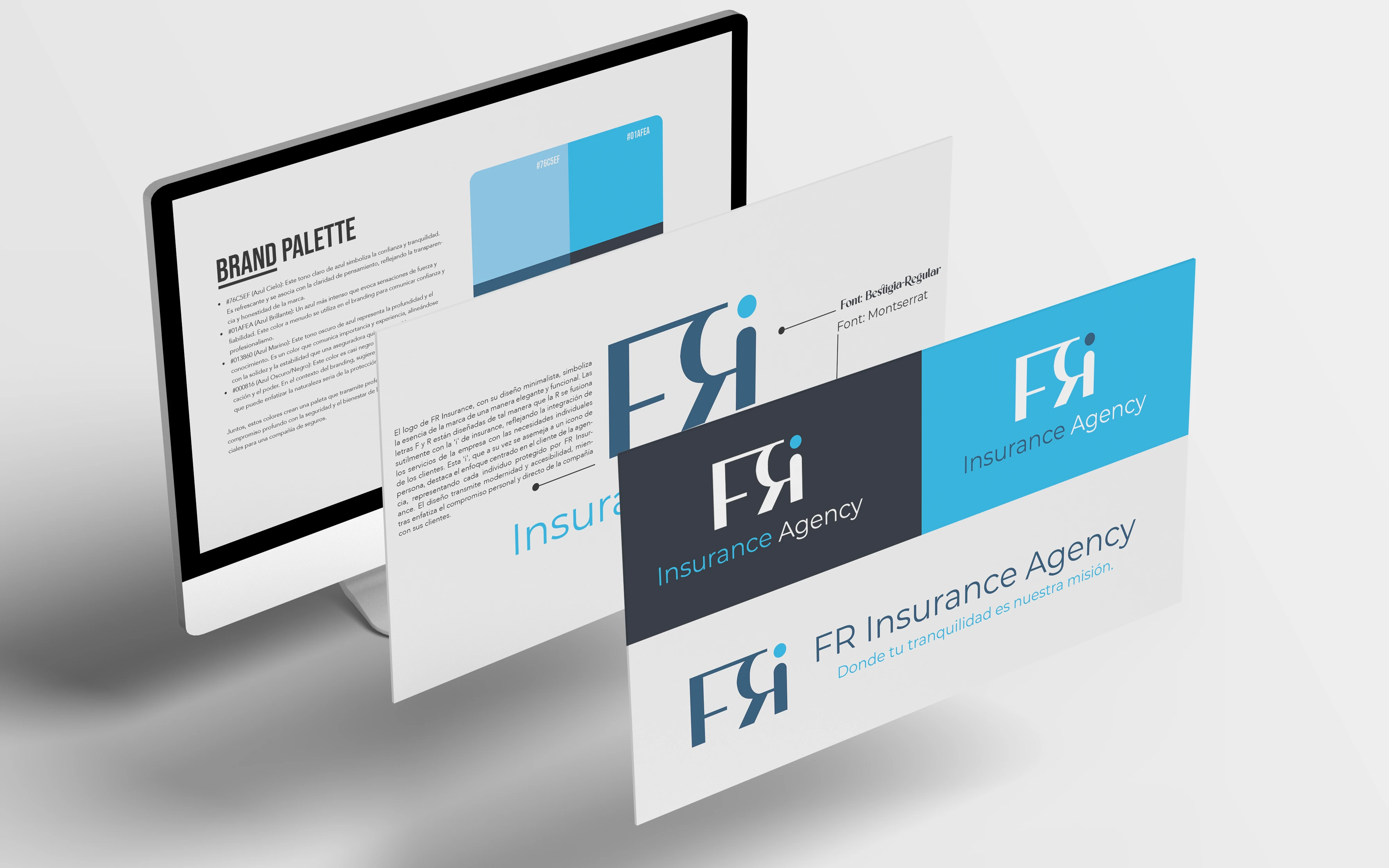
FR Brand Presentation
Goal: To create a cohesive and resonant brand experience that communicates FR Insurance Agency's commitment to quality service and customer-centric solutions in the insurance sector.
Concept: The FR Insurance logo, with its minimalist design, symbolizes the brand's essence in an elegant and functional way. The letters F and R are designed in such a way that the R subtly merges with the 'i' of insurance, reflecting the integration of the company's services with the individual needs of clients. This 'i', which in turn resembles a person icon, highlights the agency's client-centered approach, representing each individual protected by FR Insurance. The design conveys modernity and accessibility, while emphasizing the company's personal and direct commitment to its clients.
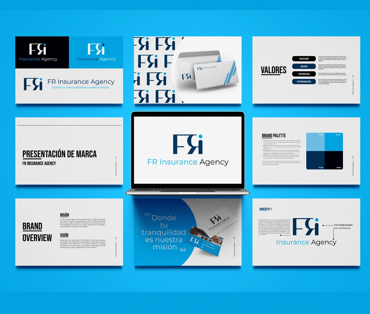
Brand Presentation
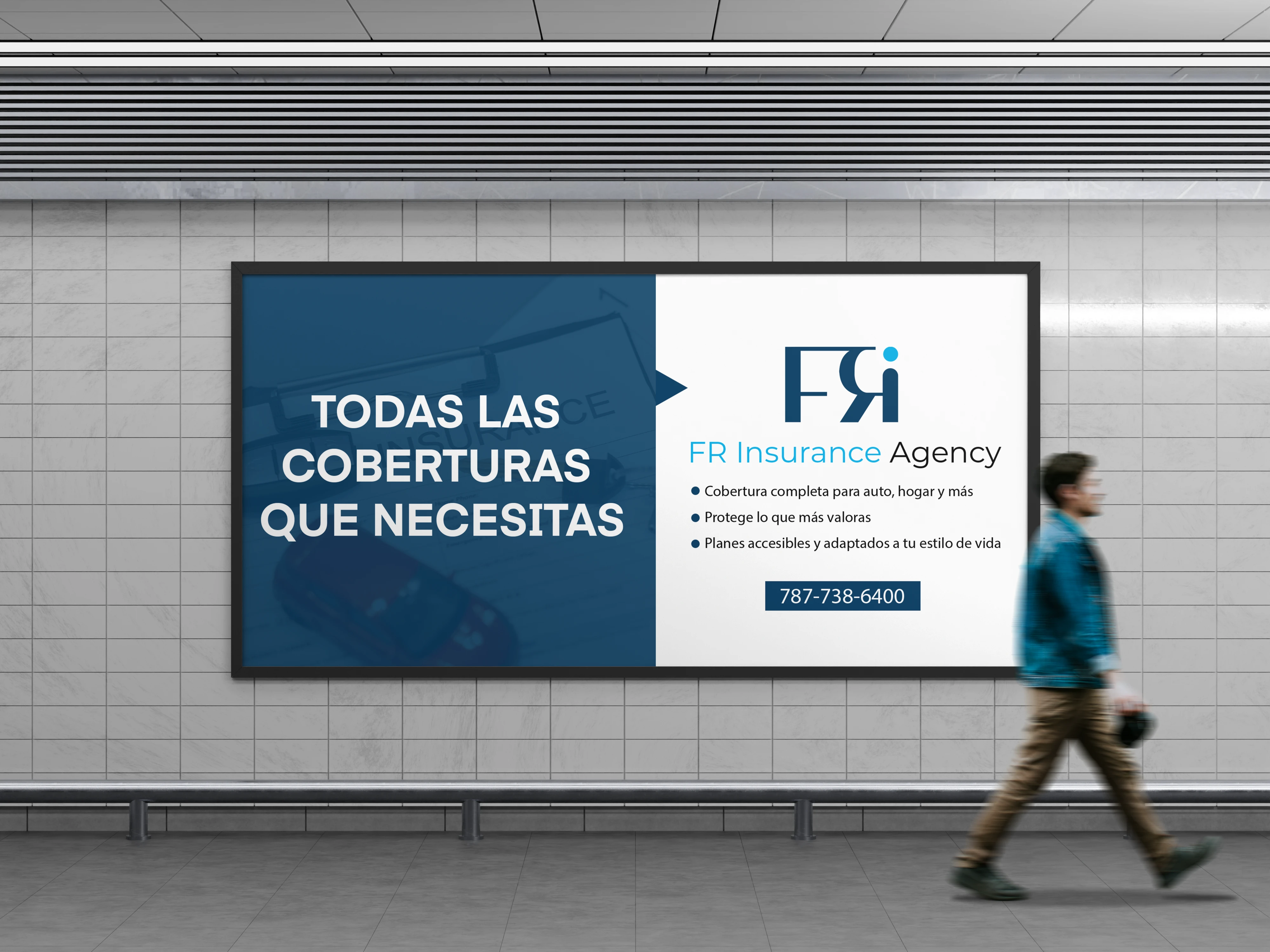
Banner design Mock up

Like this project
Posted Dec 10, 2023
Revitalized FR Insurance's brand with two logo designs, color schemes, slogans, and articulated values, emphasizing trust, innovation, and client focus.


