Rebranding Exercise
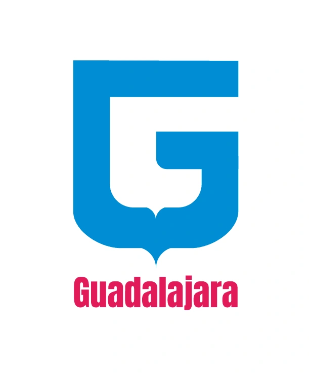
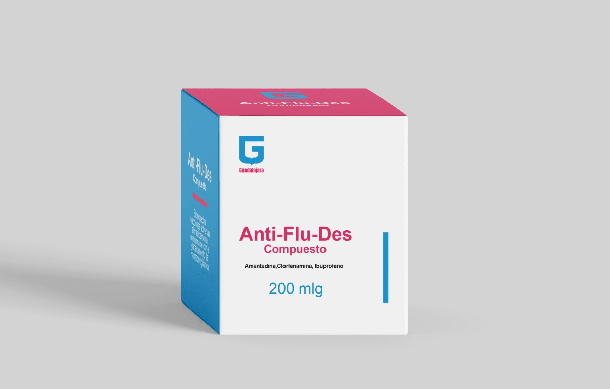
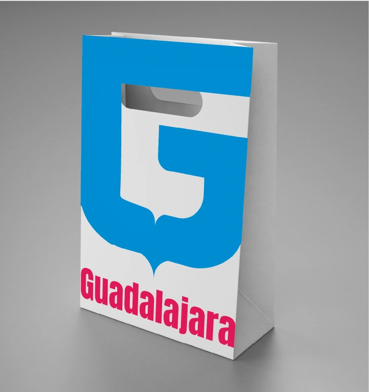
My choice to work with Farmacias Guadalajara for this class exercise stemmed from my experience upon arriving in Monterrey, where I found their logo to be visually overwhelming. The aim of my project was to create a more aesthetically pleasing and streamlined brand identity. The brand's longevity and strong establishment have led it to dominate a distinctive color combination, making it instantly recognizable. Following market research, I found that none of its competitors utilize these tones. In my redesign, I shifted the focus away from explicitly describing the company's services in the logo. Instead, I aimed to create a visually pleasing, cleaner, modern and inviting look. Due to its status I believe the brand is strong enough to rely on these colors and the name Guadalajara alone for their clients to recognize it.
The original design pays tribute to the city of Guadalajara, but due to its excessive elements, like the redundant words, it's hard to appreciate. When thinking about a pharmacy, one wants to associate words like 'orderly,' 'clean,' and 'reliable.' The current logo fails to convey this. In my design process, I aimed to retain a representation of the city in the logo, which is why I drew inspiration from the Guadalajara coat of arms. I used the yellow frame as the foundation for my design.
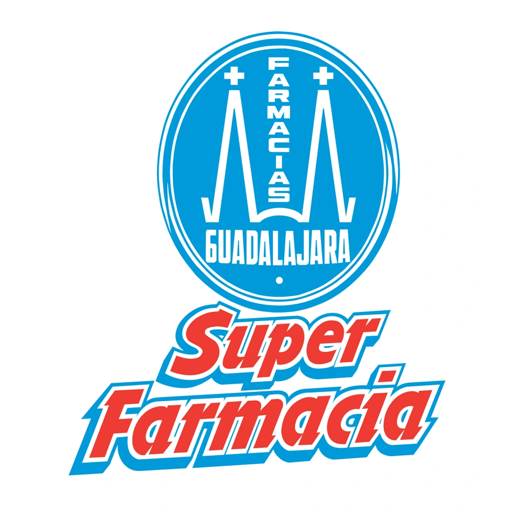
Current design
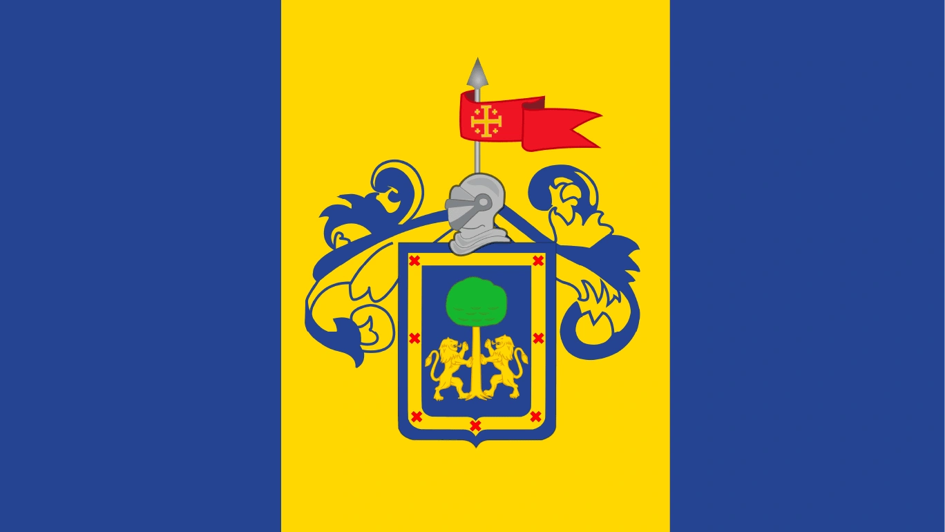
Inspiration
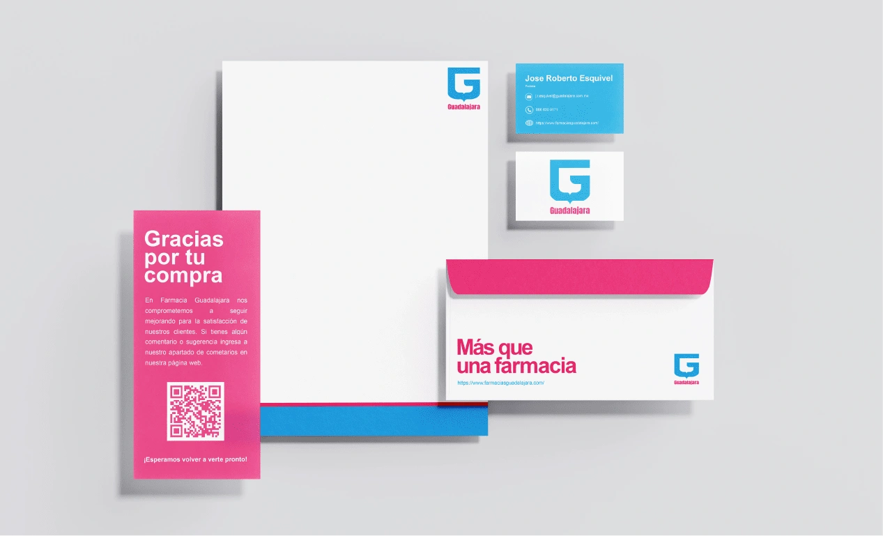
New slogan: Más que una farmacia. It indicates that in Farmacias Guadalajara, you can purchase more than just medicines; they also function as convenience stores.
Like this project
Posted Sep 19, 2023
Class exercise in which we focused on the rebranding process. I undertook the rebranding of Farmacias Guadalajara, a Mexican pharmacy.
Likes
0
Views
15
Clients

Farmacias Guadalajara


