Atlantic Bridge Brand Identity Enhancement

Matthew Dix


Project Overview
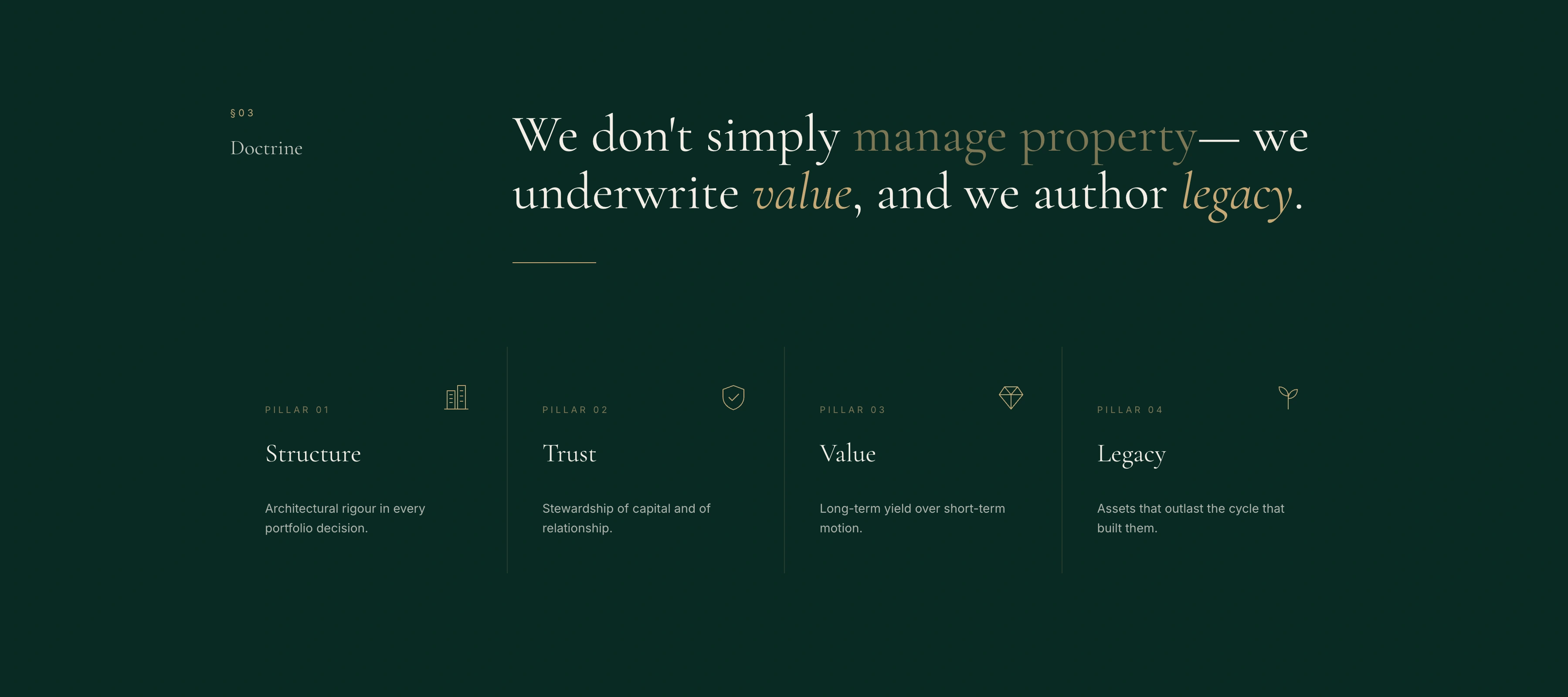
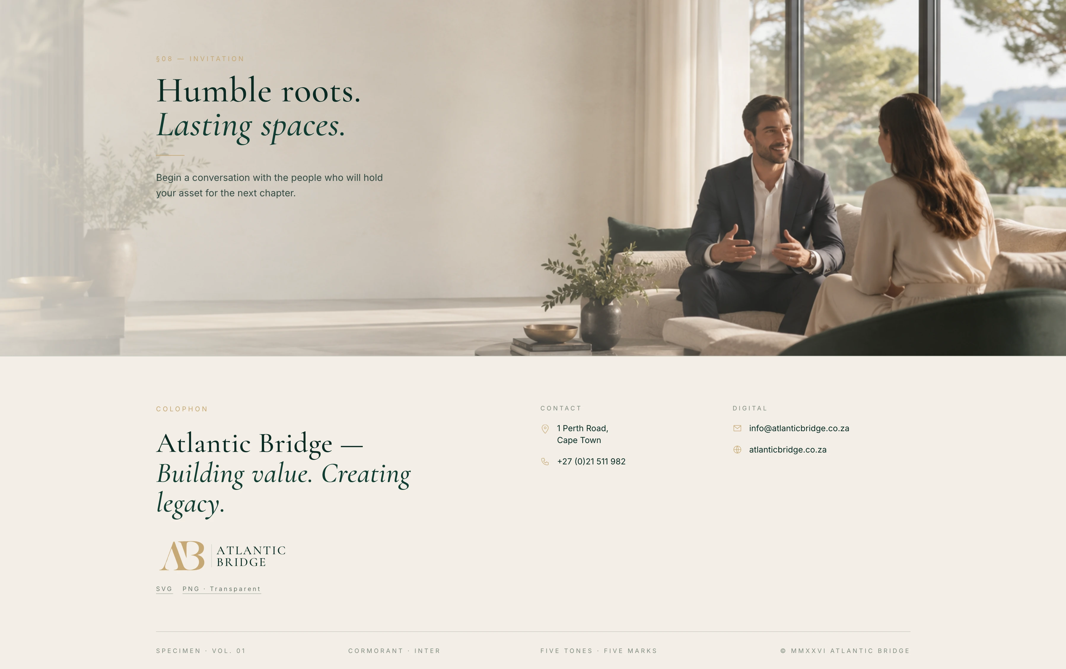
Atlantic Bridge needed more than a visual refresh. The project began with a detailed audit of the existing website, identifying where the brand lacked consistency, hierarchy and the sense of permanence expected from an established property business.
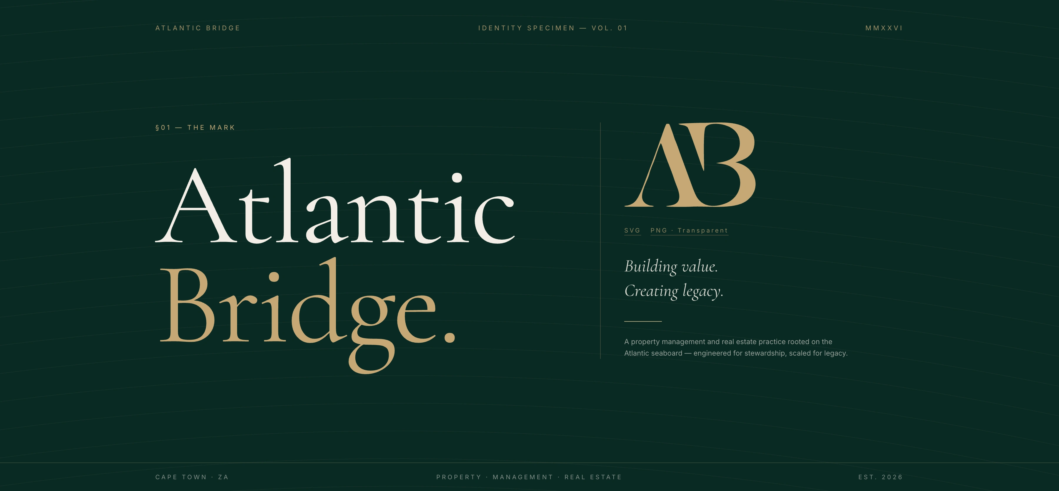
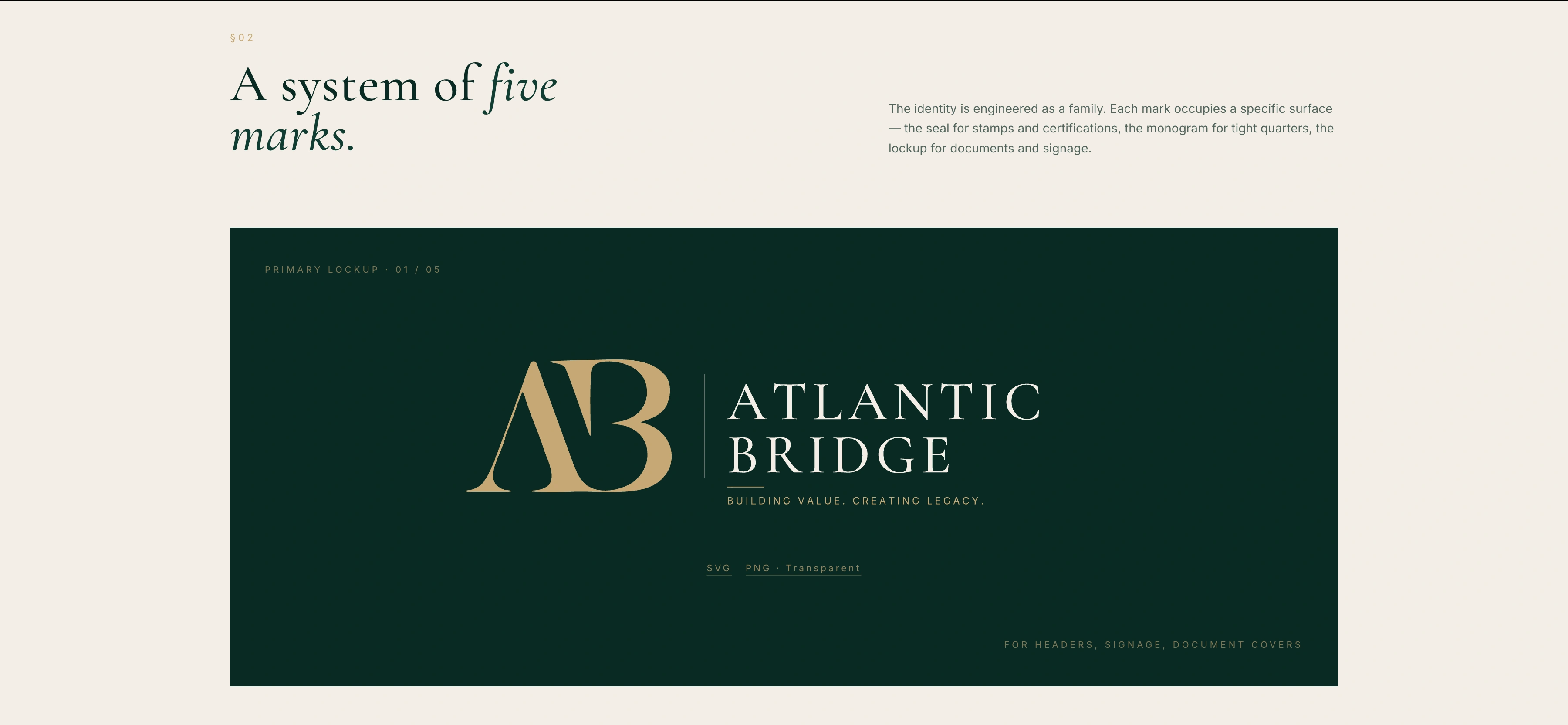
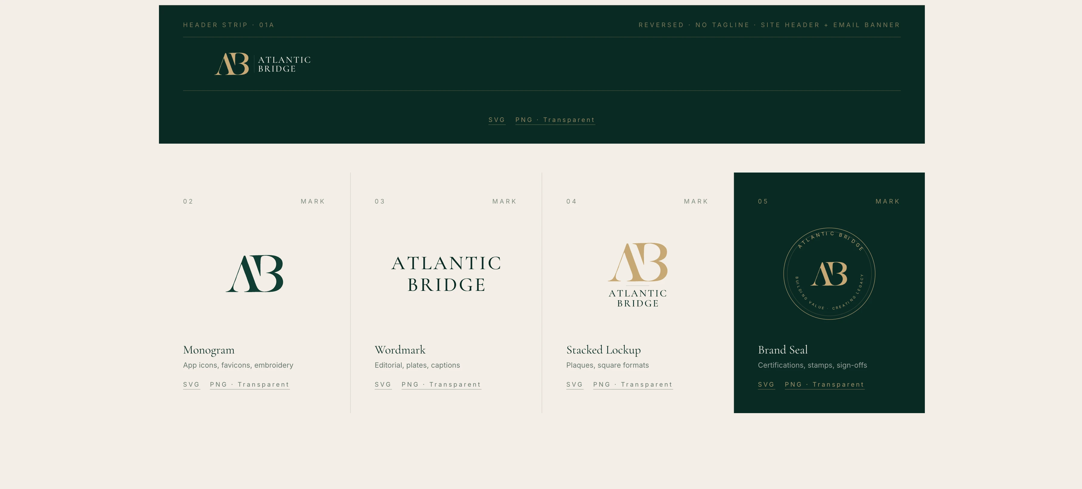
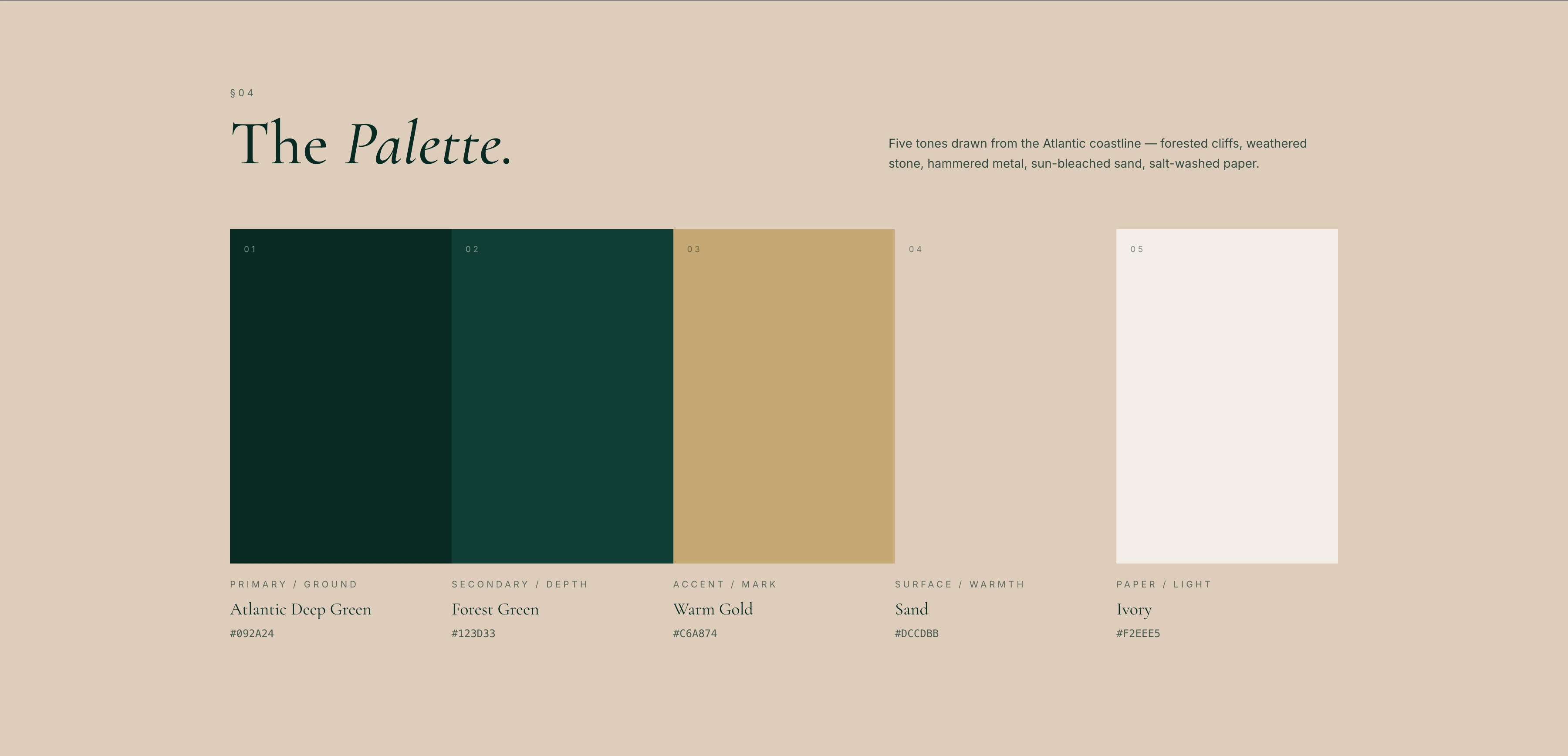
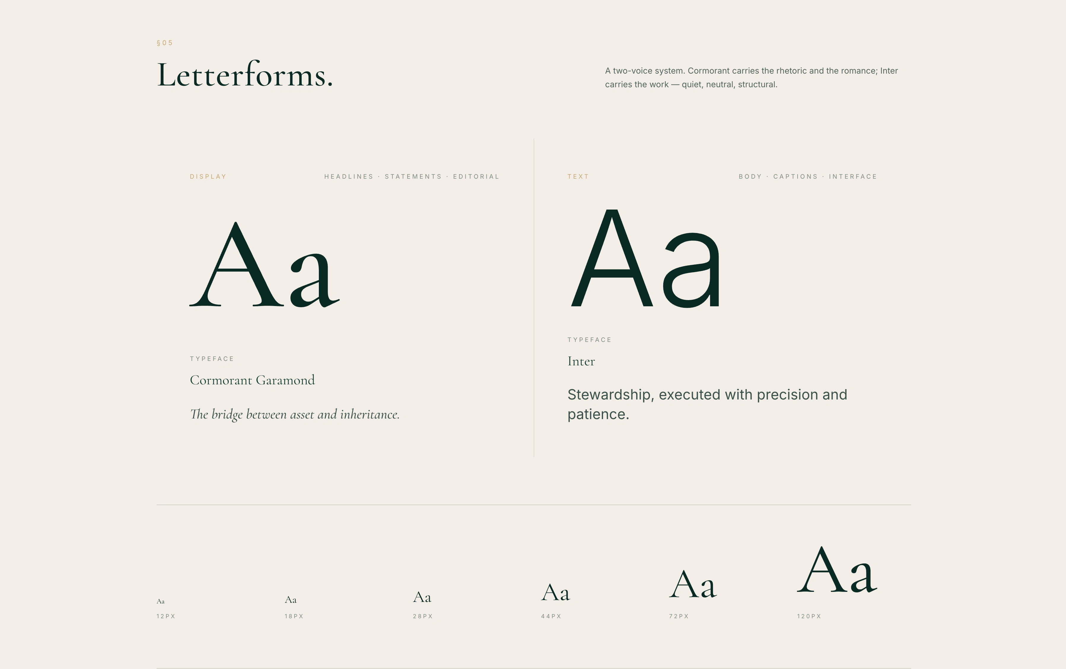
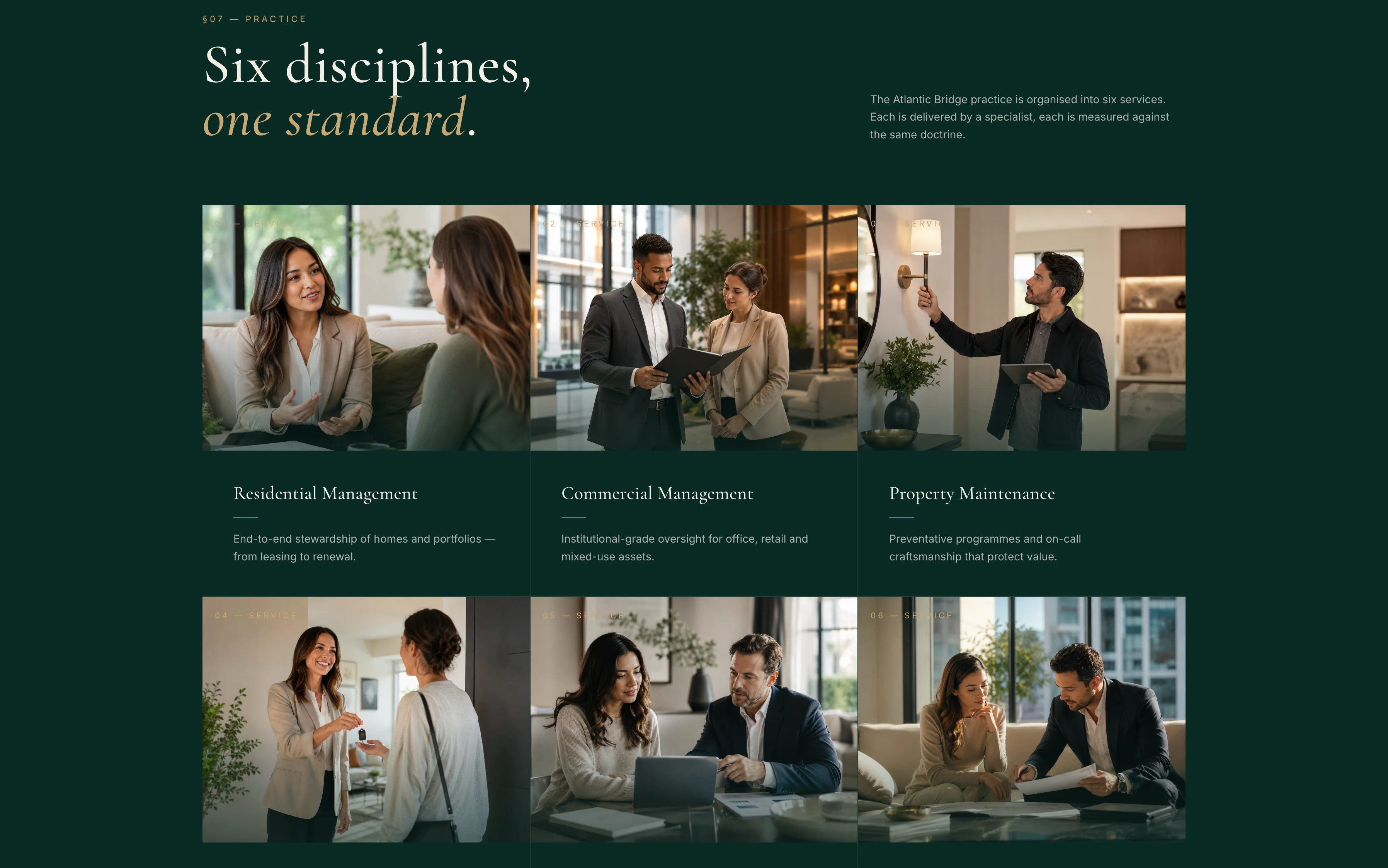
Using the existing logo as a foundation, I developed a more refined and cohesive visual system around it. The work included logo usage and variations, colour specification, typography, spacing, graphic treatments and imagery direction. Every element was designed to reinforce the qualities at the centre of the business: trust, stewardship, longevity and a personal approach to property.

Building a More Premium Brand System
The identity was elevated through a restrained palette of deep green, warm gold and natural paper tones, paired with an editorial serif and a clean contemporary sans serif. This balance introduced a more premium character while keeping the brand accessible and grounded.
The final guide translates the logo into a complete working system, showing how the identity should appear across digital, print and property-facing applications. Rather than treating the brand as a collection of isolated assets, the project established a clear visual language that could support future website development, marketing material, signage and communications with greater consistency.
The result is a brand that feels more established, considered and distinctive, while remaining true to Atlantic Bridge’s original identity.
Like this project
Posted Jul 13, 2026
A comprehensive brand style guide covering logo usage & variations, colour, typography & imagery. The project began auditing the Atlantic Bridge website