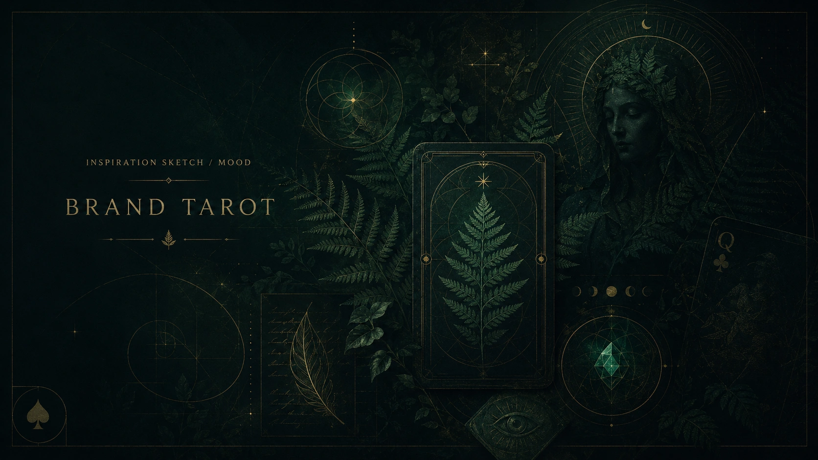
Brand Tarot: Interactive Brand Discovery Tool
Matthew Dix
Project intro
Brand Tarot is an interactive brand discovery flow designed to help founders and creatives turn early ideas into clearer strategic direction.
The project began as an experiment in combining brand strategy, archetypal thinking, and interactive sales funnel logic. I wanted to create something light enough to feel approachable, but structured enough to help someone recognise the emotional, visual, and strategic patterns already living inside their idea.
Before it became Brand Tarot, the project explored a different name and visual direction: Arcanum. That version leaned deeper into mystery, ritual, and sacred symbolism. It had atmosphere, but it also risked becoming too abstract for the actual purpose of the product.
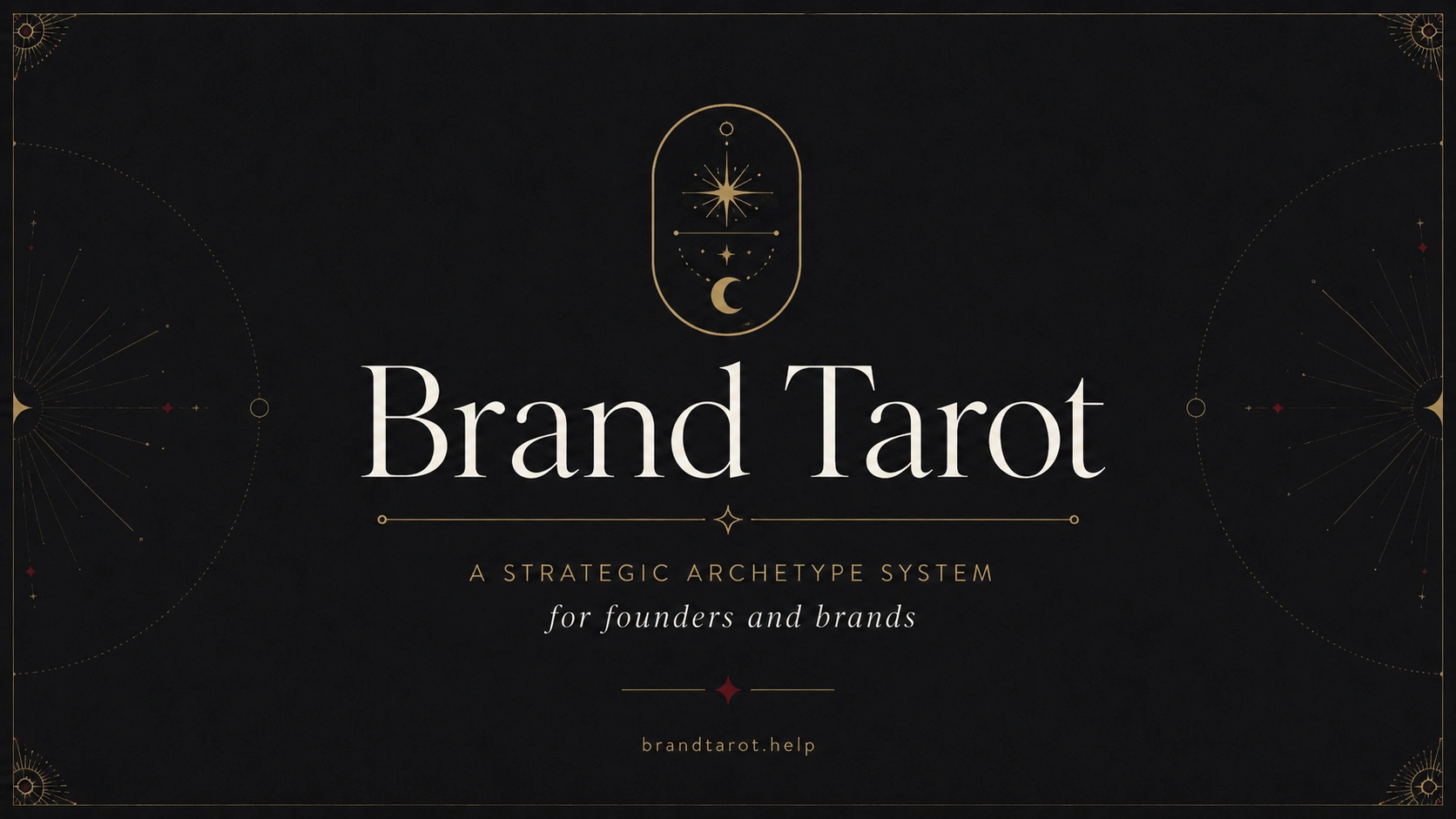
The final direction brought the concept back to clarity. Brand Tarot says what it does. It gives the user a symbolic reading of their brand energy, while still positioning the experience as a practical strategic tool.
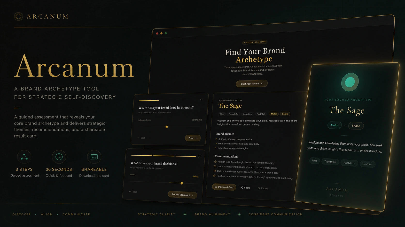
The Arcanum phase
During the early vibe-coding phase, I allowed the AI agent to push the naming, interface, and visual direction. This led to Arcanum, a darker and more mysterious interpretation of the idea.
The screens had strong atmosphere. They felt cinematic, symbolic, and immersive. But the more the product developed, the more I realised that the name and interface were pulling the concept slightly too far into fantasy.
Arcanum looked beautiful, but it required explanation. It began to feel too abstract and even generic in it's UI.
That was the key insight.
For a tool designed to help people move from confusion to clarity, the name needed to do more work upfront.
Committing to a name and domain
The first working version of the product lived under the name Arcanum. It had a polished interface and a darker self-discovery feel, but the name and UI were slightly too abstract for the purpose of the tool. It looked good, but it did not immediately explain what the experience was offering.
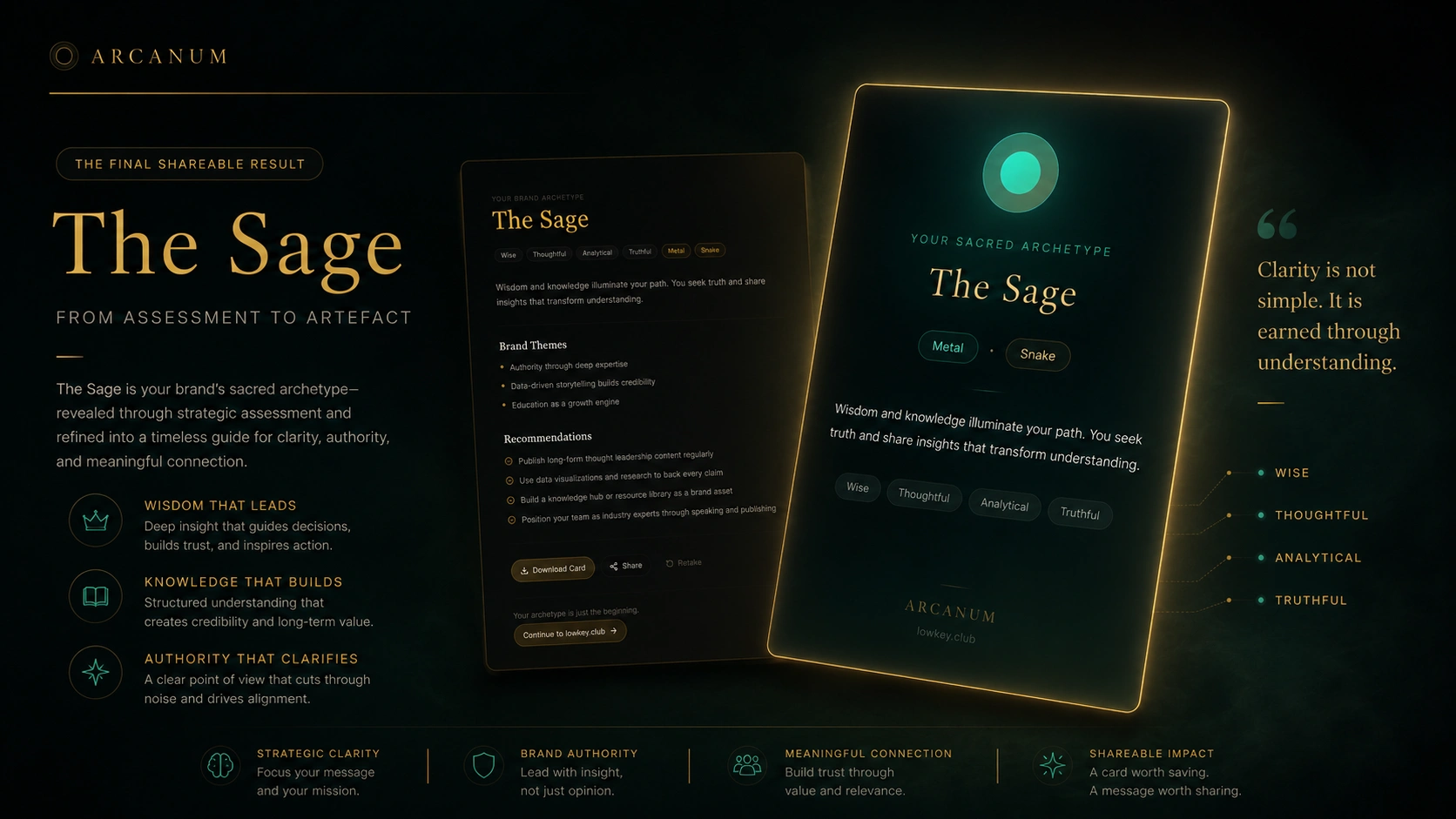
The shift to Brand Tarot made the product sharper. The name is clearer, more ownable, and better aligned with the actual mechanic of the experience: using archetypes, symbols, and guided choices to help people understand the energy behind a brand idea.
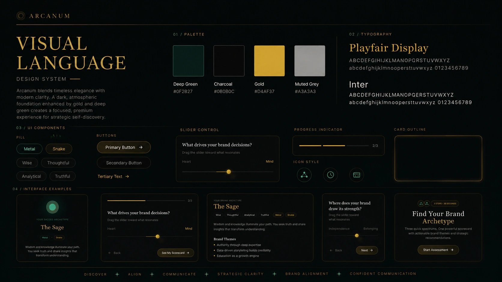
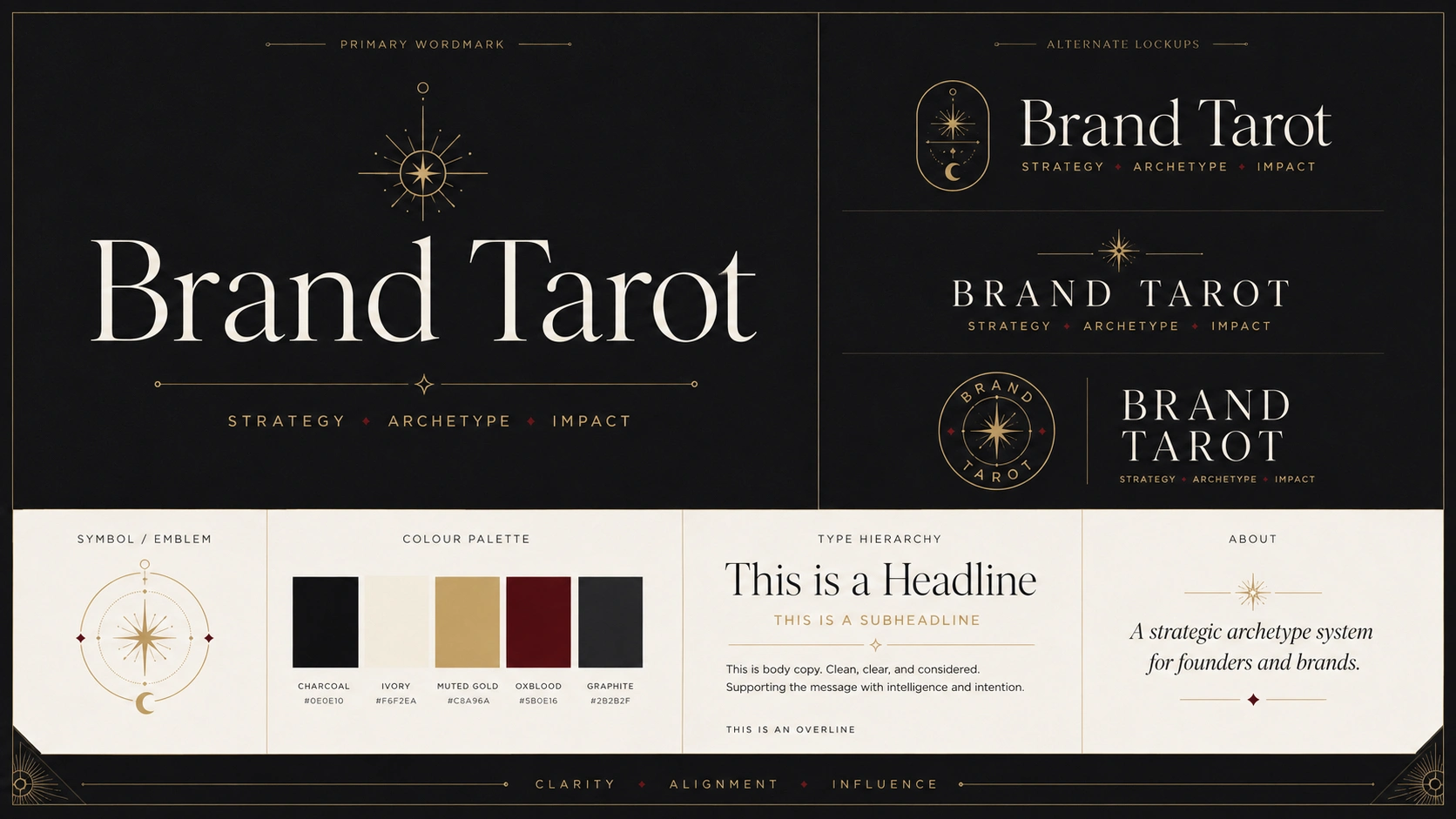
That change also strengthened the identity system. Instead of feeling like a general mystical assessment, the product became a more focused brand discovery tool. The visual language could now lean confidently into tarot-inspired framing, symbolic cards, gold linework, dark editorial styling, and archetypal storytelling, while still staying grounded in strategy.
Arcanum proved the interface. Brand Tarot clarified the product.
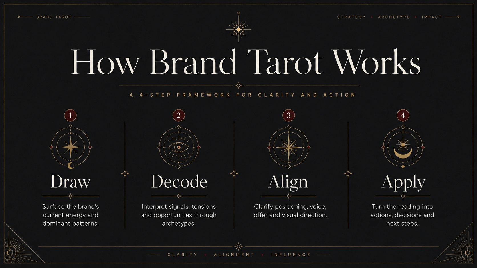
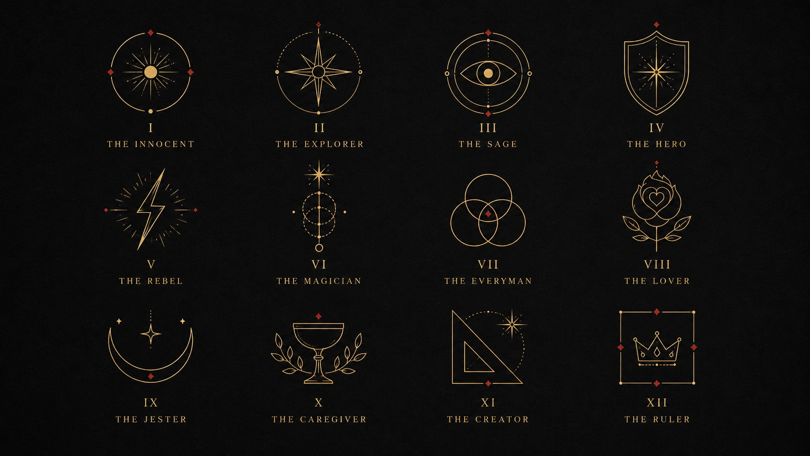
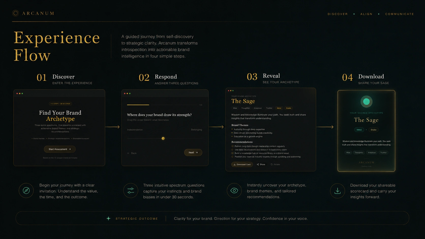
The flow itself works as a simple brand check-in. It helps users make instinctive visual and thematic choices, then uses those signals to surface possible brand archetypes and strategic themes.
The goal is not to replace brand strategy. It is to create the first spark before it.
A low-friction entry point.
A visual prompt.
A reason to begin.
This project became a useful example of my AI-native workflow: using vibe coding and generative tools to explore quickly, while applying human taste, restraint, and strategic judgement to decide what should actually survive.
Arcanum was the exploration. Brand Tarot was the decision.
Like this project
Posted May 17, 2026
Archetype-led brand discovery tool combining strategy, symbolism, and interactive flow. Built prompt architecture in ChatGPT, evaluated AI-generated narrative paths, and shaped interaction logic in Figma and Lovable.