Gadix Product Display Page Design

Abdulmajid Usman

Gadix Product Display Page
A Mobile-first responsive modern tech gadget brand dedicated to providing innovative and high-quality electronic devices.
Introduction
Gadix is a modern tech gadget brand dedicated to providing innovative and high-quality electronic devices that enhance everyday life. With that in mind, I designed a mobile-first responsive product detail page (PDP) that is clean, informative, and easy to use whether users are browsing on their phones or desktop.
This case study walks through the entire design process from initial research to final mockups and highlights key decisions made to align the experience with the Gadix brand.
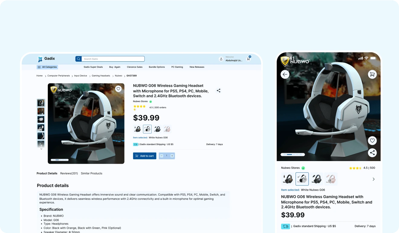
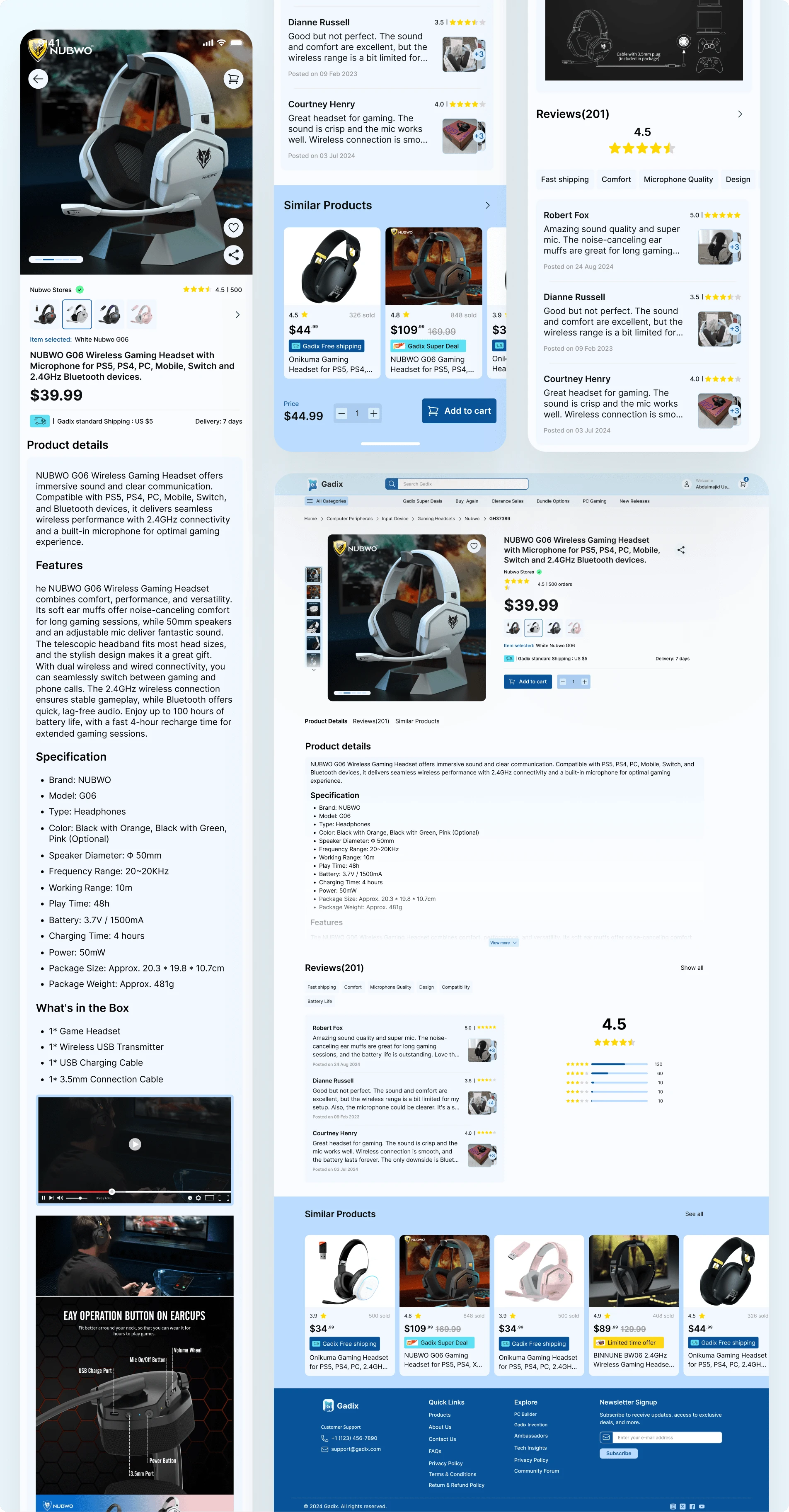
Mobile/Desktop View
Motivation
Gadix needed a user-friendly product display page that feels modern, clean, and easy to interact with, especially on mobile. The goal was to give users the confidence to explore, read reviews, and make fast purchase decisions without facing problems.
Problem
During my research, I noticed a pattern of common issues in eCommerce product pages:
Crowded mobile layouts that made content hard to read
Lack of trust-building elements like visible ratings and reviews
Overwhelming details with no visual separation or priority
Hard-to-use image sections and limited product context
Limited Product Information
These made it difficult for users to quickly understand the product or move toward a purchase.
Solution
I designed a responsive and mobile-first modern product page that:
Shows the product clearly with swipeable image galleries
Highlights price, rating, and essential details upfront
Includes clear tabs for features, specifications, and reviews
Offers simple navigation and consistent layout across screen sizes
Builds trust with user reviews and related product suggestions
The result is a clean, conversion-focused design aligned with modern eCommerce expectations.
Wireframing the Flow
I created a low-fidelity wireframe to map out the core structure. This helped organize key components:
Product image section
Price and add-to-cart flow
Description and specifications
User reviews and star ratings
Related products
✅ This step gave me a clear idea of content priority and helped make space for key mobile interactions.
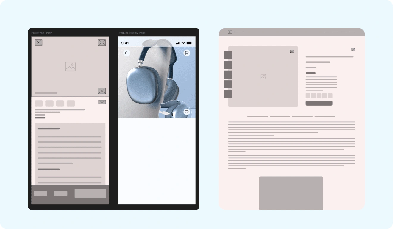
Gadix wireframe
Branding & Component Setup
To keep the visuals consistent and scalable, with the power of Figma I built a component library that included:
Reusable icon buttons
Product star rating systems
A clear typography scale for mobile and desktop
Color tokens based on Gadix’s brand palette
CTAs and review card components
I also created a simple brand logo that reflects Gadix’s identity—tech-forward, simple, and bold as seen below in the image.
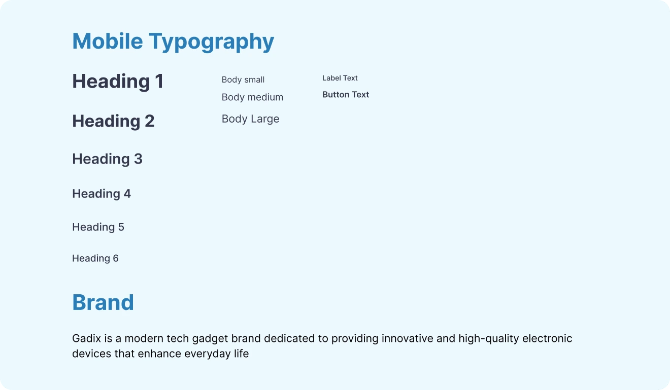
Gadix Typography
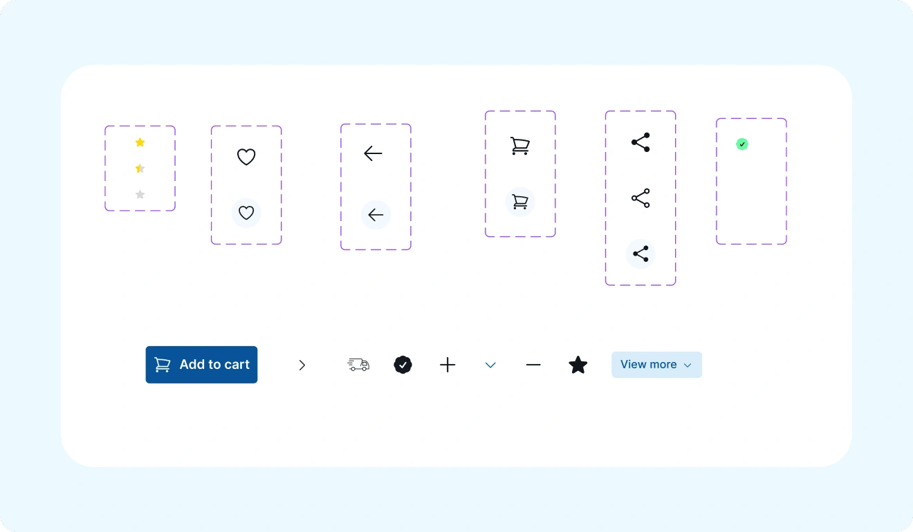
Gadix Component
High-Fidelity Design
Once the wireframes were finalized, I moved on to designing the high-fidelity mockups. Since this was a mobile-first design, I started with the mobile layout and ensured every element was optimized for smaller screens and then scaling up to desktop while keeping consistency across screen sizes. I kept the layout clean with strong visual hierarchy and interactive elements.
Mobile-First Approach
Since this project followed a mobile-first design strategy, the focus was on making the product page usable and intuitive on smaller screens. Every element was intentionally stacked, spaced, and simplified for easy touch interaction.
The product image appears at the top, followed by thumbnails in a swipeable format to give users a quick view of product angles.
Title, rating, price, and Add to Cart button are grouped together to reduce cognitive load and help users make decisions quickly.
The information sections—product details, specs, features, reviews—are clearly divided and styled with visual hierarchy for easy scrolling.
I used a clean tab structure to allow users to switch between sections like Reviews, Similar Products, etc., without getting lost.
Scaling to Desktop
After finalizing the mobile version, I scaled the design up for desktop users while maintaining layout consistency. Here, I was able to use the wider space to enhance readability and interaction:
I placed product images and thumbnails to the left, while product details sat on the right—taking full advantage of the horizontal layout.
More elements could appear side by side (like "Similar Products" and "Review Summary") without clutter.
The navigation and footer were expanded to offer quick access to more features like Gadix Deals, Customer Support, and Community sections.
Consistent Visual Language
Both versions use the Gadix brand system typography, spacing, iconography, buttons, and colors to create a consistent experience. All UI components were reused from the design system, which reduced design time and made the layout more coherent.
Added UX Touches
Interactive states were designed for buttons, icons, and rating stars.
I included trust signals like review count, shipping info, and verified badges.
The “Similar Products” section was optimized to look like a carousel on mobile and a grid on desktop.
Gadix UI Page
Conclusion
Designing for Gadix meant focusing on clarity, usability, and a modern shopping experience. Every element on the page was made to help users make quick and confident decisions, whether they're tech-savvy or just browsing.
This project helped me improve my approach to responsive design systems and user-centered eCommerce layouts.
🚀 Let me know what you think of this design! Would you shop from a page like this?
Mobile View link:
Desktop View Link:
Like this project
Posted Apr 21, 2025
A Mobile-first responsive modern tech gadget brand dedicated to providing innovative and high-quality electronic devices.
Likes
1
Views
7
Timeline
Sep 19, 2024 - Oct 10, 2024