Genesis Cinemas Website Redesign

Abdulmajid Usman

Genesis Cinemas Website Redesign
Redesigned the Genesis Cinemas website to improve its UX and UI.
Introduction
Genesis Cinemas is a leading cinema chain in West Africa, with 12 locations, 47 screens, and over 4,700 seats across Nigeria. Genesis Cinemas has become a household name in hospitality and entertainment. However, despite the brand’s strong presence in the entertainment industry, the Genesis Cinemas website had significant room for improvement in both user experience (UX) and user interface (UI). This redesign project focuses on elevating the digital experience for all movie lovers visiting the site.
Motivation
During my visit to the Genesis Cinemas website, I immediately noticed that the design felt outdated, cluttered, and difficult to navigate. As someone passionate about creating functional and visually appealing digital experiences, I believed the website could better reflect the vibrant and exciting world of cinema. The motivation for this redesign came from the desire to offer users a smoother, more enjoyable journey that would match the high standards Genesis Cinemas is known for.
Problems
Here are some of the core problems discovered during the review of the original website:
Poorly Designed Hero Section
The hero area used an image slider that lacked focus and key information about the featured movies. Instead of drawing users in, the design felt disconnected and underwhelming.
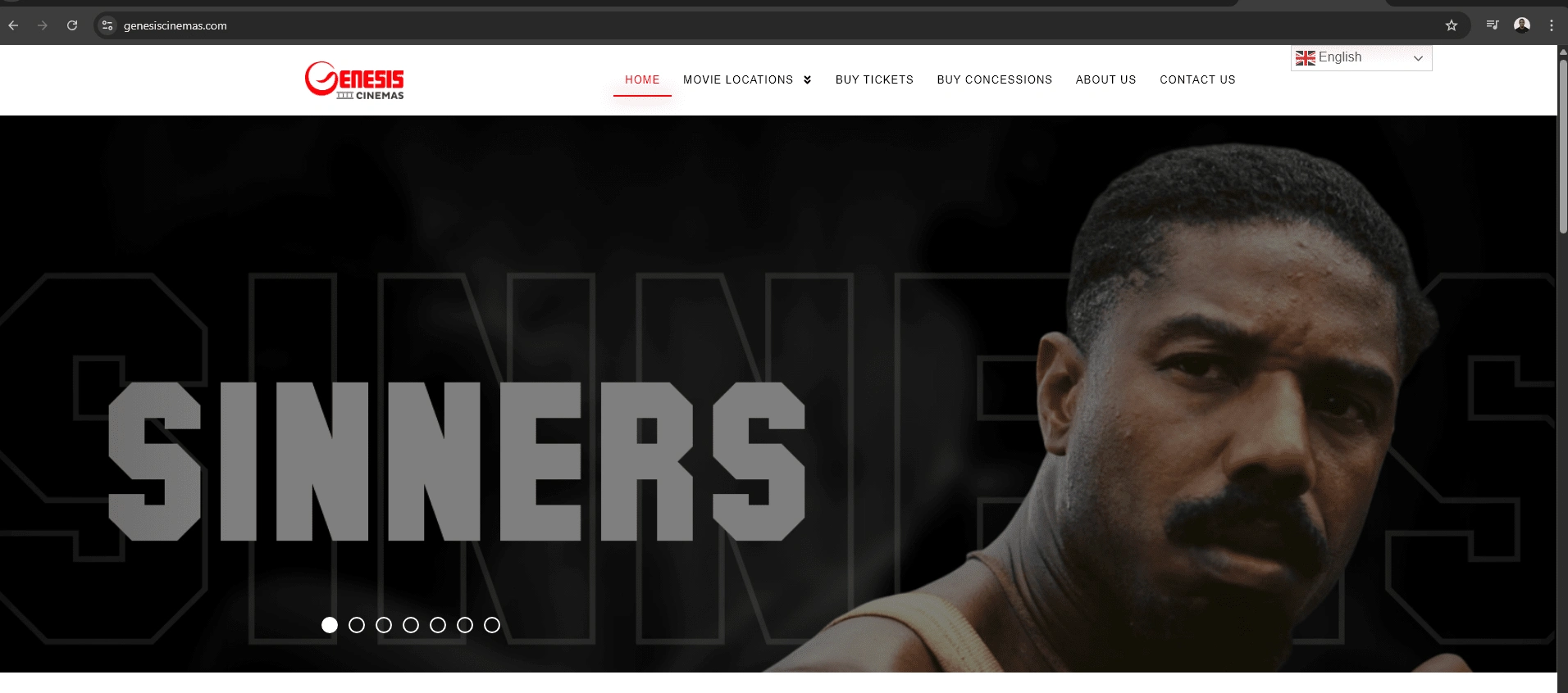
Old Genesis Cinema Hero Section
Lack of Visual Hierarchy
There was no clear structure to the content. Important sections competed for attention, leaving users overwhelmed and unsure of where to look next. For example if a user is visiting the website for the first time, they expected to first select their location before seeing the list of movie showing at the time. However, the current website does not have that visual hierarchy.
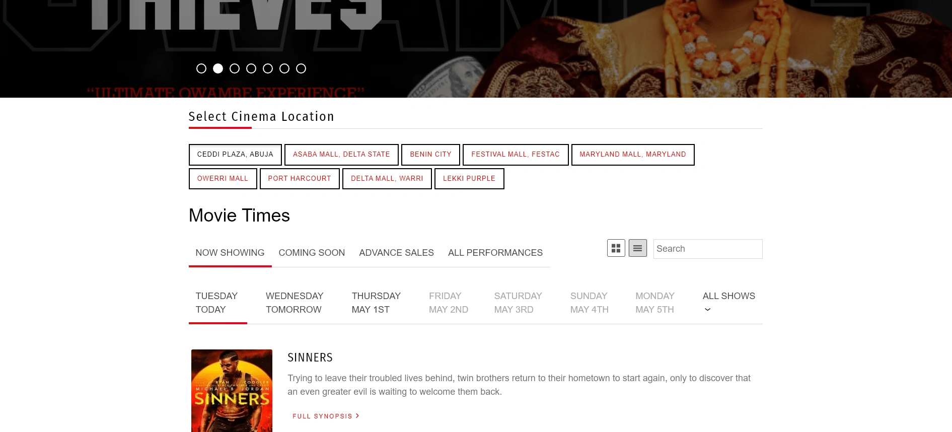
Overwhelming and Dense Content
Information was packed together without enough breathing room. This made it difficult for users to find the information they needed quickly. You can see it below in the picture.
Poor Movie Card Design
The movie cards were visually unappealing and provided minimal useful information, missing an opportunity to captivate users.
Poor User Engagement
The site did not have strategic sections that could engage visitors, such as promotional banners for events or upcoming movie releases. However this is part of the improvement made in the re-designed Version.
Unpolished Header and Navigation
The header area looked outdated and lacked a clear call to action, affecting the overall browsing experience.
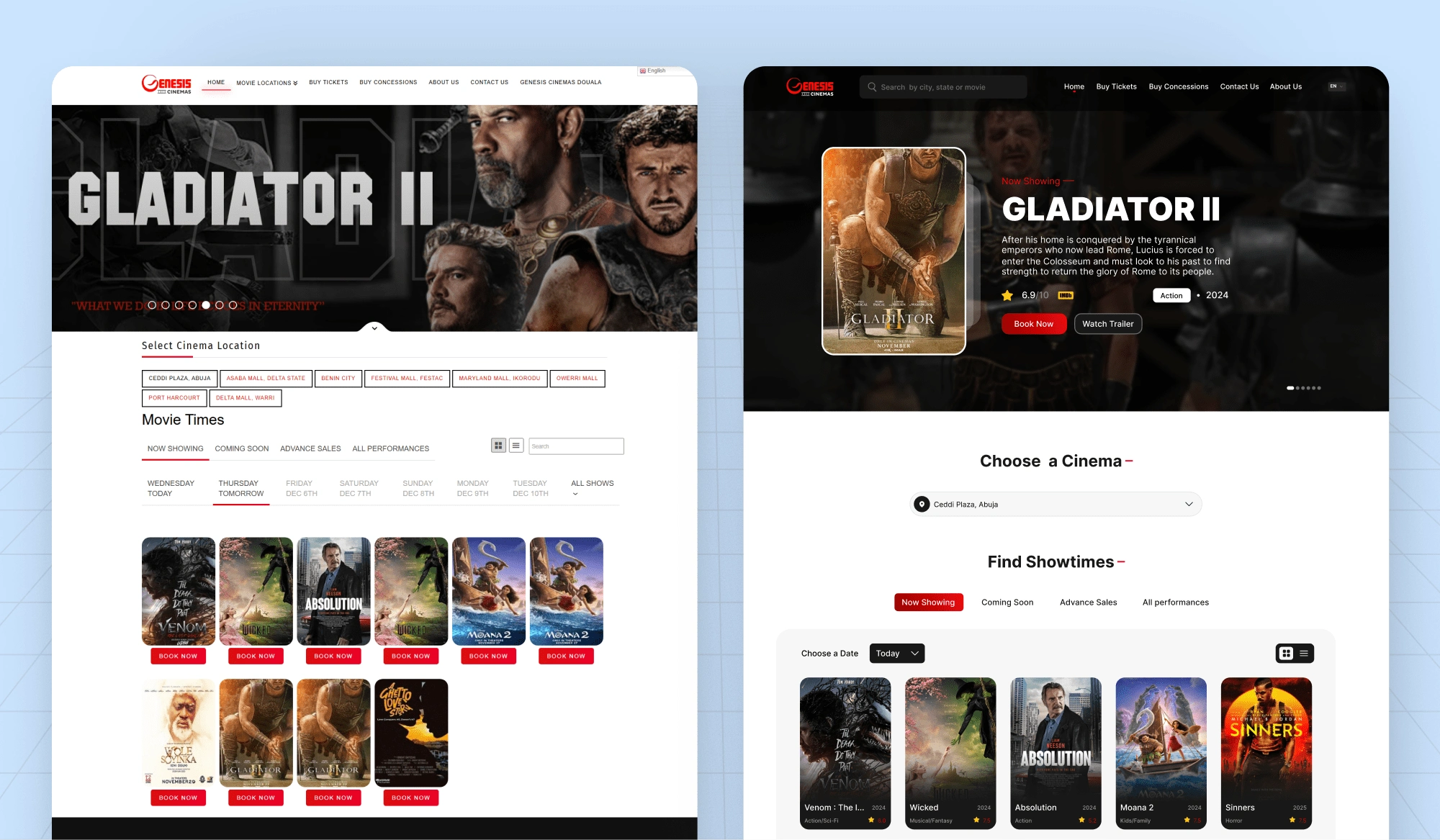
Design Process and Improvements
The redesign was carefully thought out to address these issues and create a user-centered experience that feels modern, clean, and exciting. Below is a breakdown of the design process and major improvements:
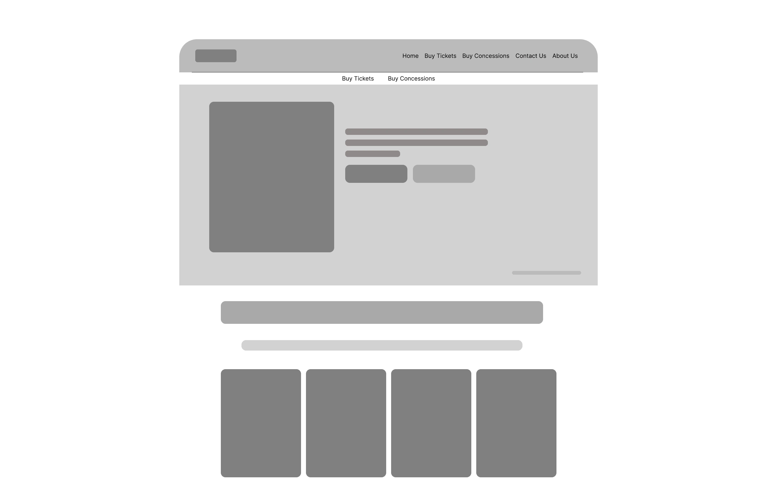
1. Wireframing and Planning
The first step was to map out the new structure with wireframes. The goal was to focus on a cleaner layout that introduces clear sections for key information without overwhelming the user.
2. Enhancing the Header and Navigation
I reworked the header to be more compact, intuitive, and action-driven. Clear navigation links, a visible search bar, and a call-to-action for buying tickets were prioritized.
3. Improving the Website Copy
The original text was revised to be more concise, user-friendly, and emotionally engaging. Instead of just listing information, the new copy invites users to experience the magic of the movies.
4. Organizing Content for Better Structure
Space utilization was a key focus. Each section now has a specific purpose and enough padding, making it easier for users to scan and find what they need.
5. Re-designing the Movie Cards
The movie cards were completely reimagined to display essential details at a glance, such as ratings, genre, and release year. This helps users make quicker decisions and encourages them to explore more films.
6. Adding a Promo/Event Banner and Pre-Release Movies Section
A new banner section was introduced to highlight special events, promotions, or weekend features. This adds energy to the site and keeps users informed about what's happening.
A dedicated section for upcoming movies was also added. By showcasing films that are coming soon, the design builds anticipation and gives users more reasons to return to the site.
8. Modernizing the Visual Design
The new design uses a modern color scheme, cleaner typography, and better image quality. It creates a more cinematic feel while staying professional and inviting.

Conclusion
The redesign of the Genesis Cinemas website was driven by the vision of creating a more user-friendly, visually engaging, and strategically structured platform. Every choice made during the design process was intended to simplify navigation, highlight important information, and deliver a seamless digital experience that matches the excitement of visiting the cinema itself.
By solving the original problems and introducing fresh design elements, the new website not only looks better but is positioned to serve customers more effectively. A well-designed website is not just about aesthetics; it is about connecting with users, guiding them effortlessly, and leaving them excited for their next cinema visit.
Link to Completed Design :
Like this project
Posted Apr 29, 2025
Redesigned the Genesis Cinemas website to improve its UX and UI..
Likes
2
Views
21
Timeline
Mar 3, 2025 - Mar 10, 2025