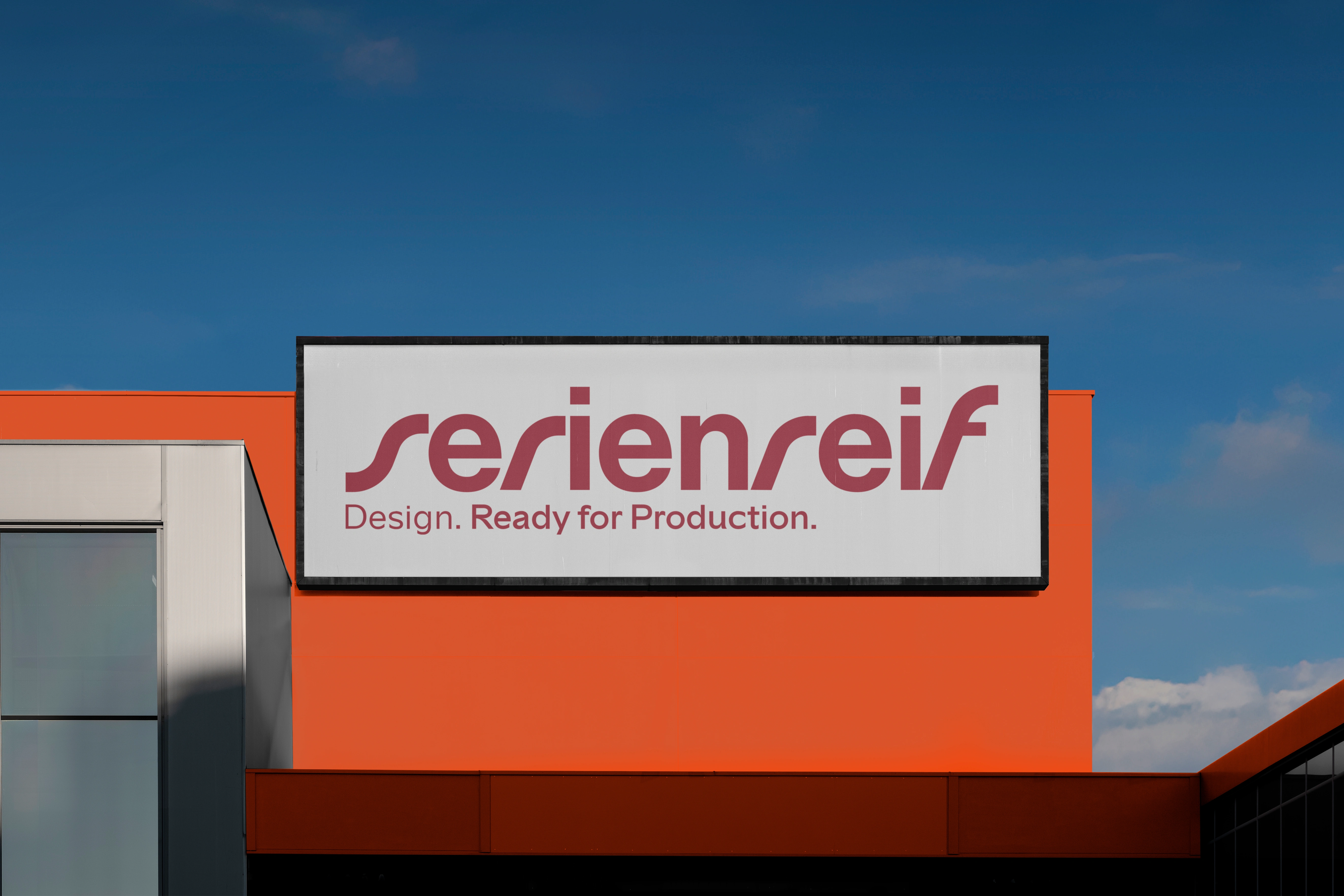
Serienreif — Engineering Partner Branding
Felix Finger
Sign
Making outside the box
Serienreif stands for engineering solutions that withstand the tough judgment of reality – for clients and for their own visions. What it takes: practical relevance, proactivity, and a confident, dynamic team that takes responsibility at every step.
Logo animation
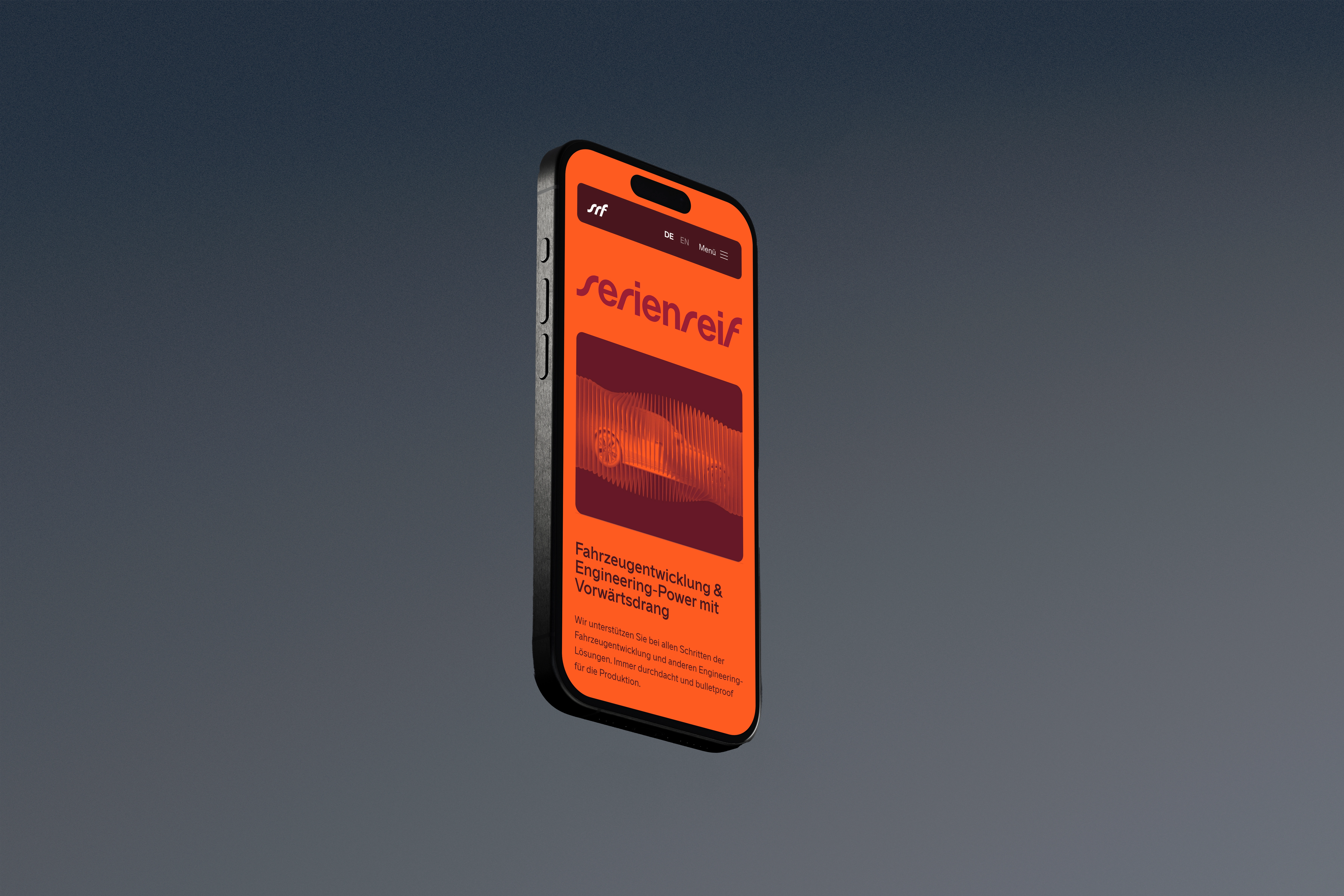
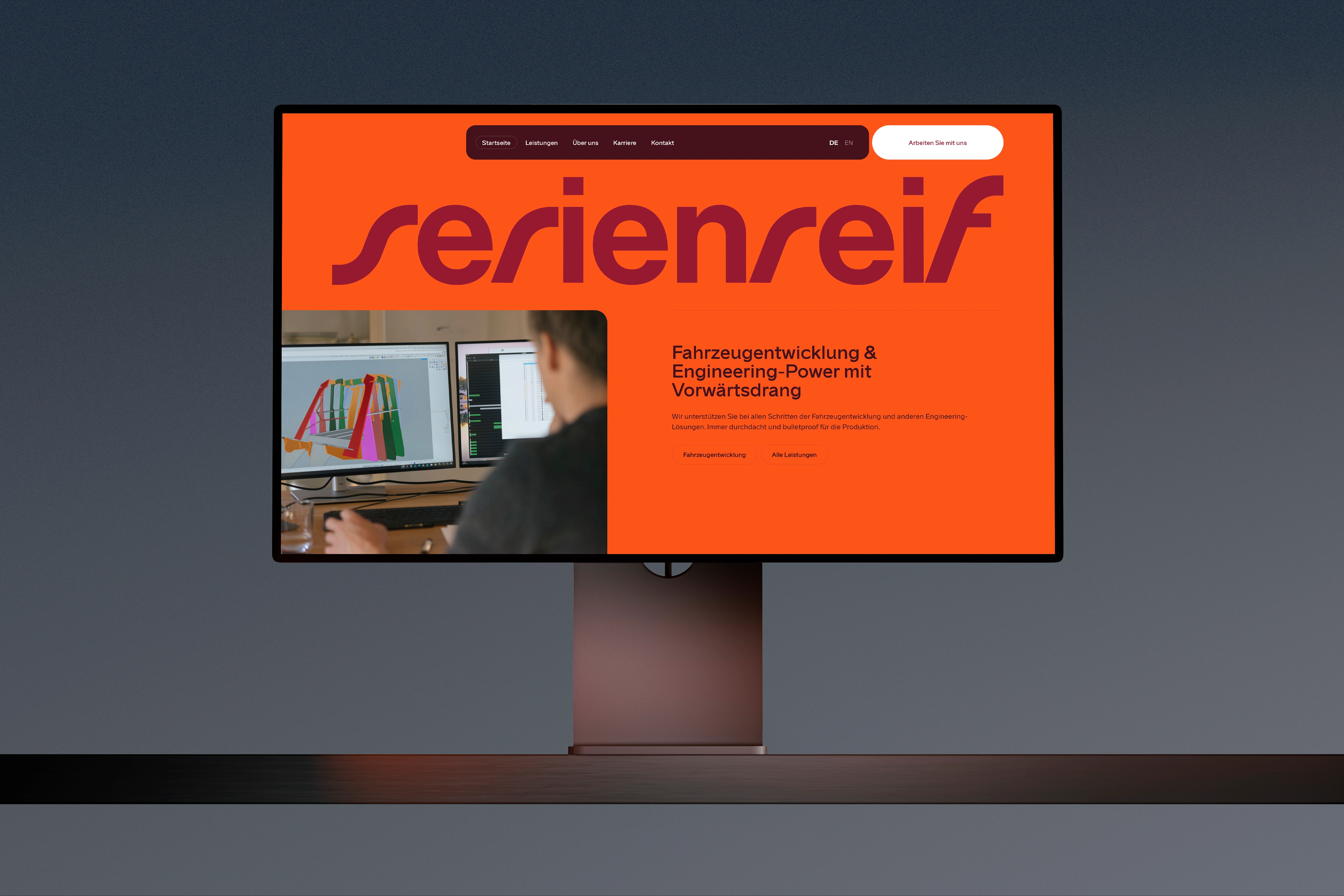
Website
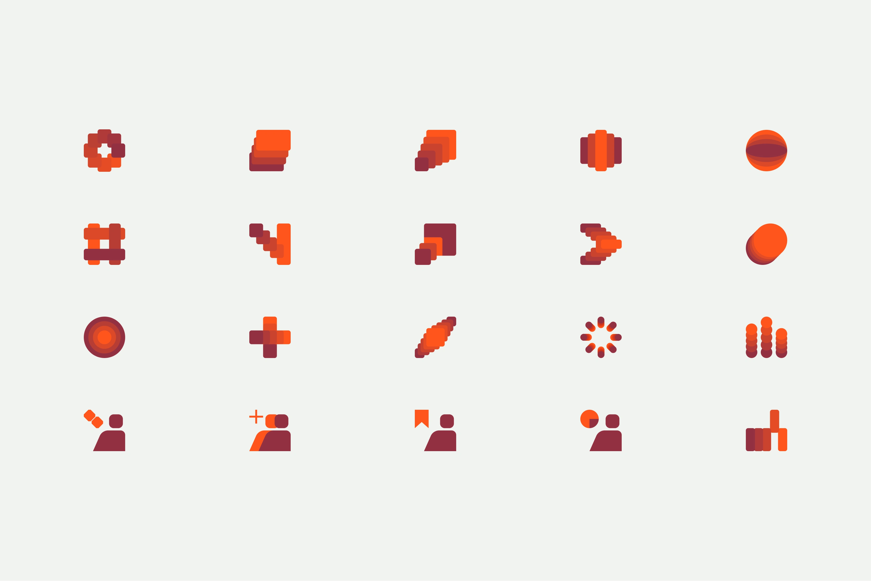
Icon set
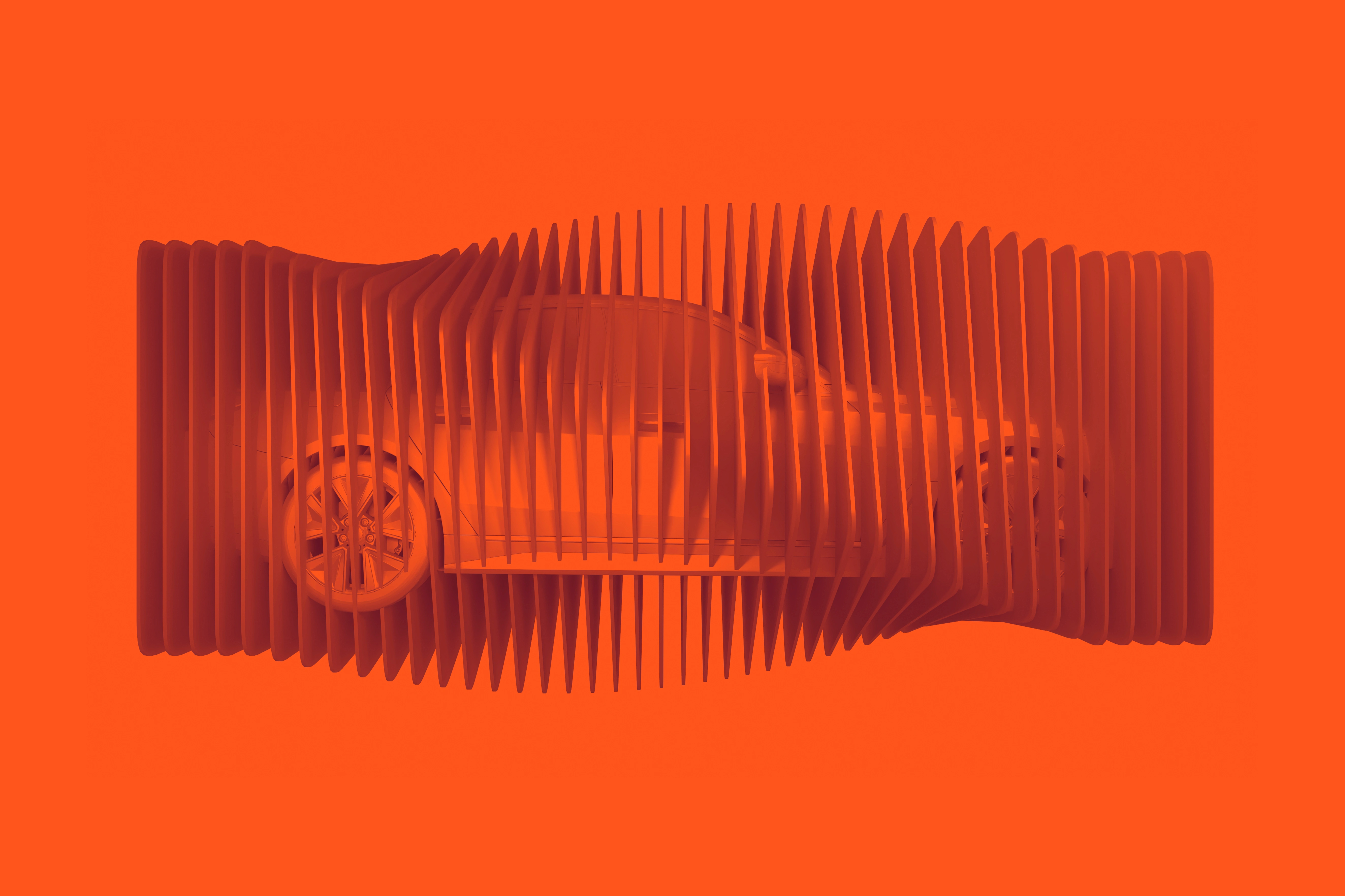
Keyvisual
Design concept
Proactivity, confidence and vitality: These three core values have been translated into a new design concept, bringing the company’s self-perception into the visual now – and creating acceleration for tomorrow.
Layered color fields lend the key visual, UI elements and iconography a sense of dynamism and forward momentum. The bold use of typography and color communicates determination and self-assurance. Depending on the objective, the color palette can accelerate or decelerate perception, giving the brand either warm vitality or rational clarity.
Even the wordmark itself generates a visual rhythm – combining forward-driven dynamism with confident stability. The result: a visual identity that makes the spirit of the brand Serienreif palpable and infuses both internal and external perception with new momentum.
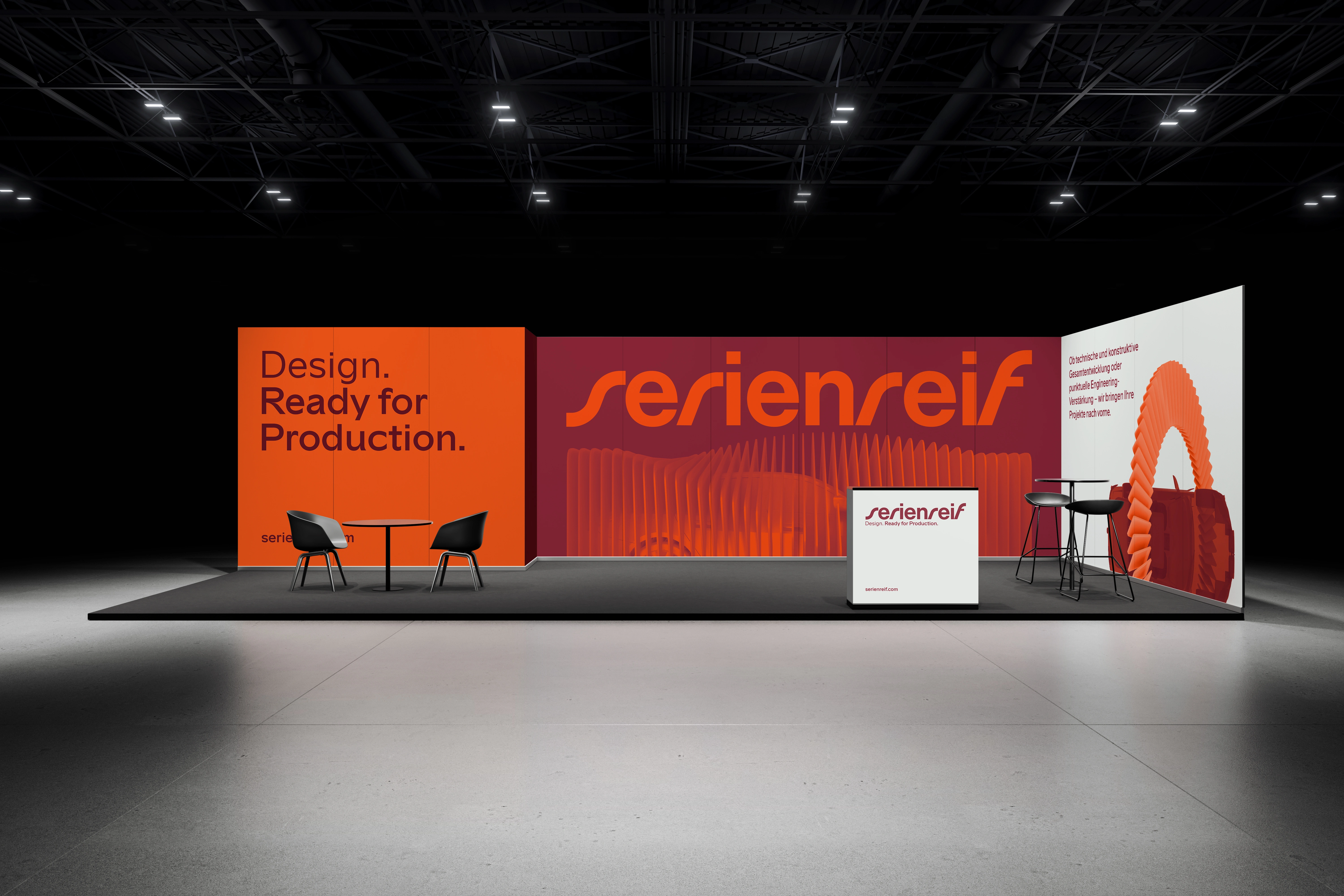
Exhibition stand
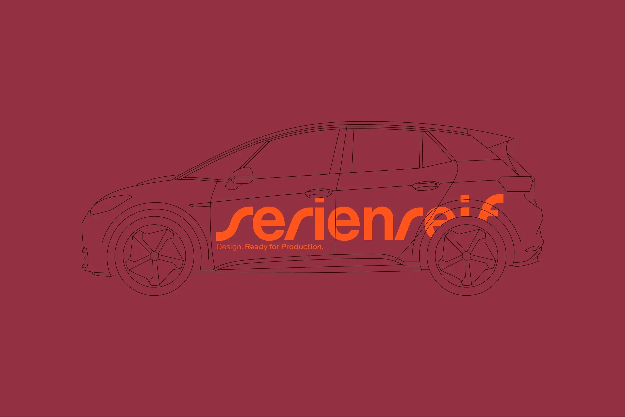
vehicle graphics
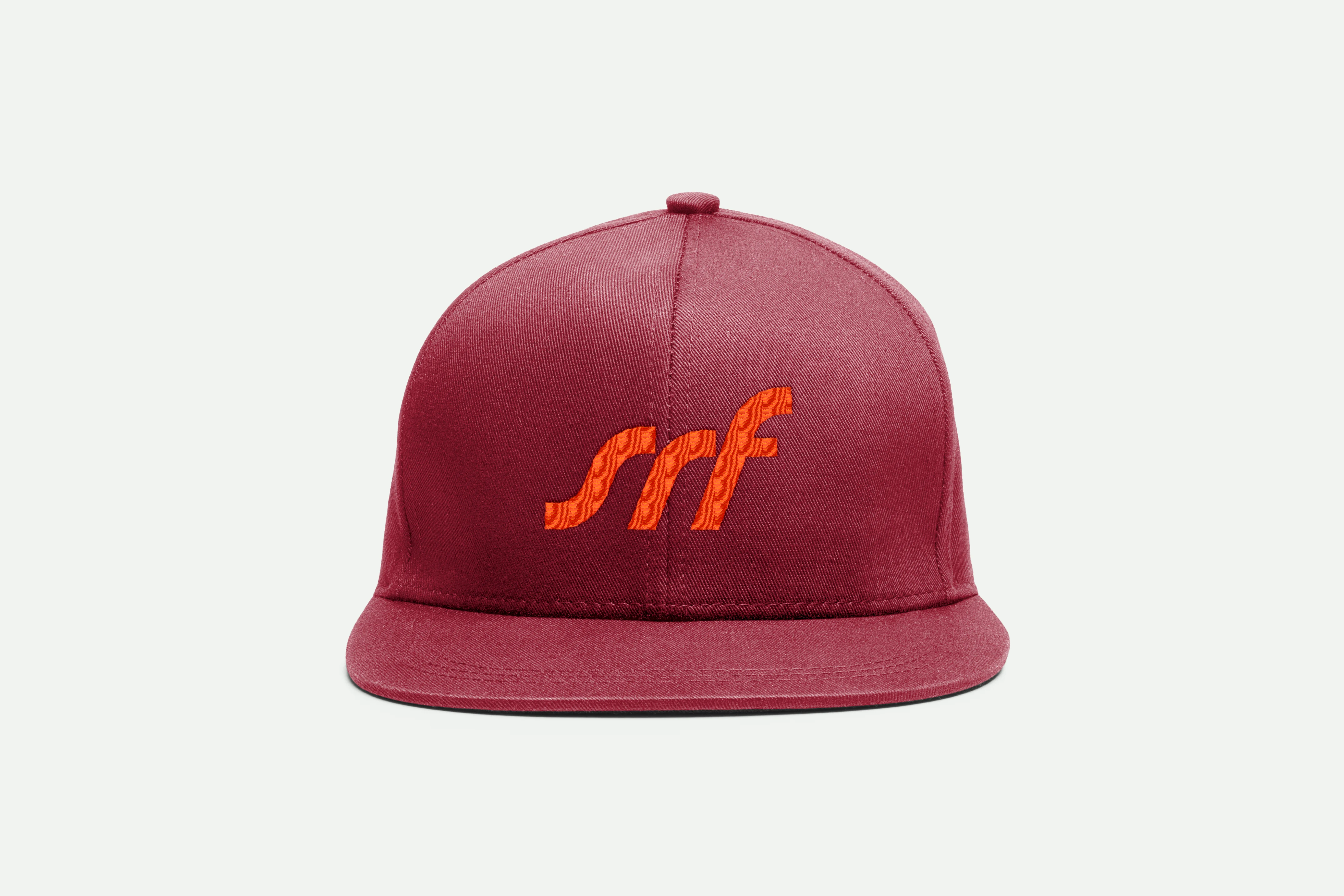
Cap
Marketing
Website
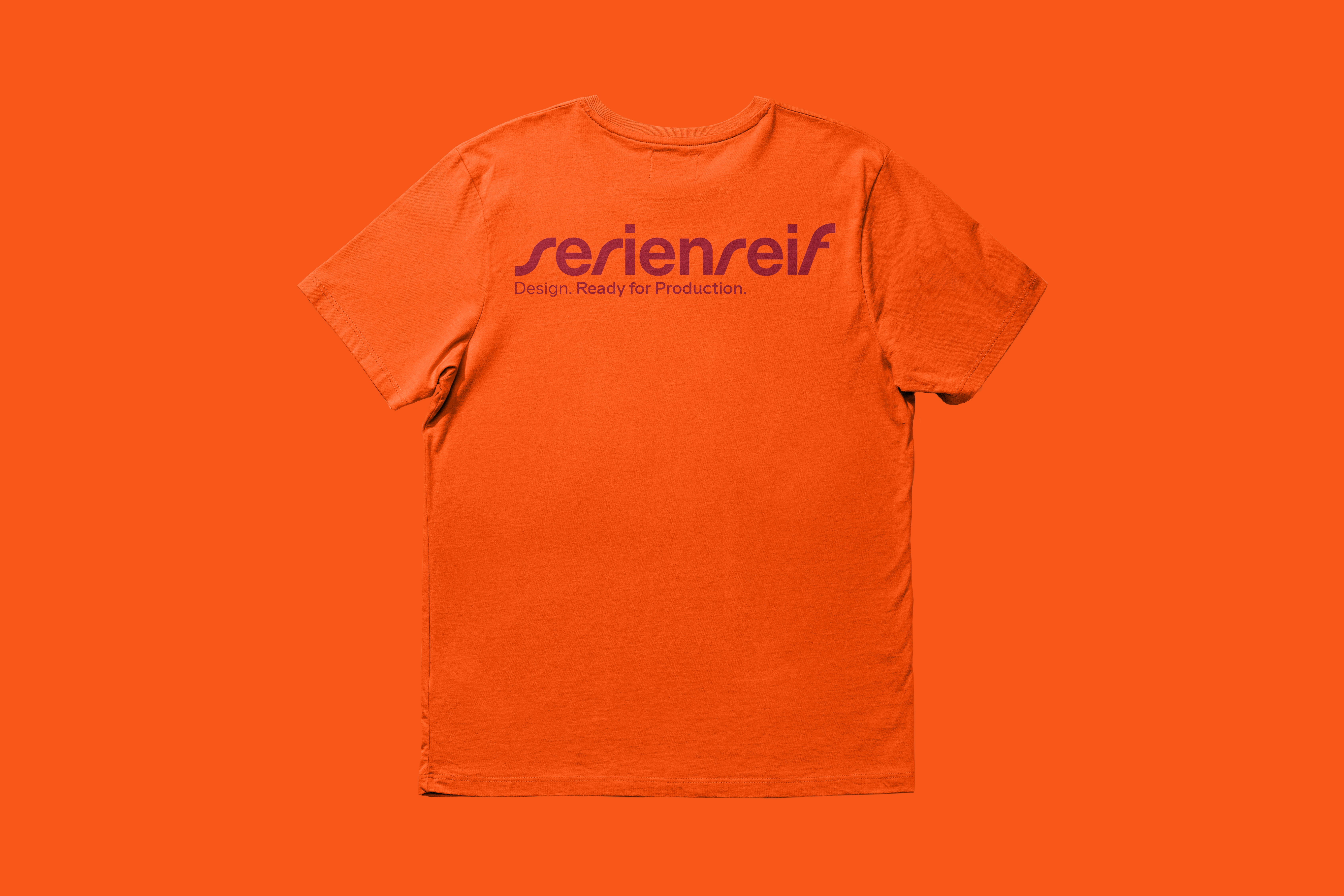
Clothing
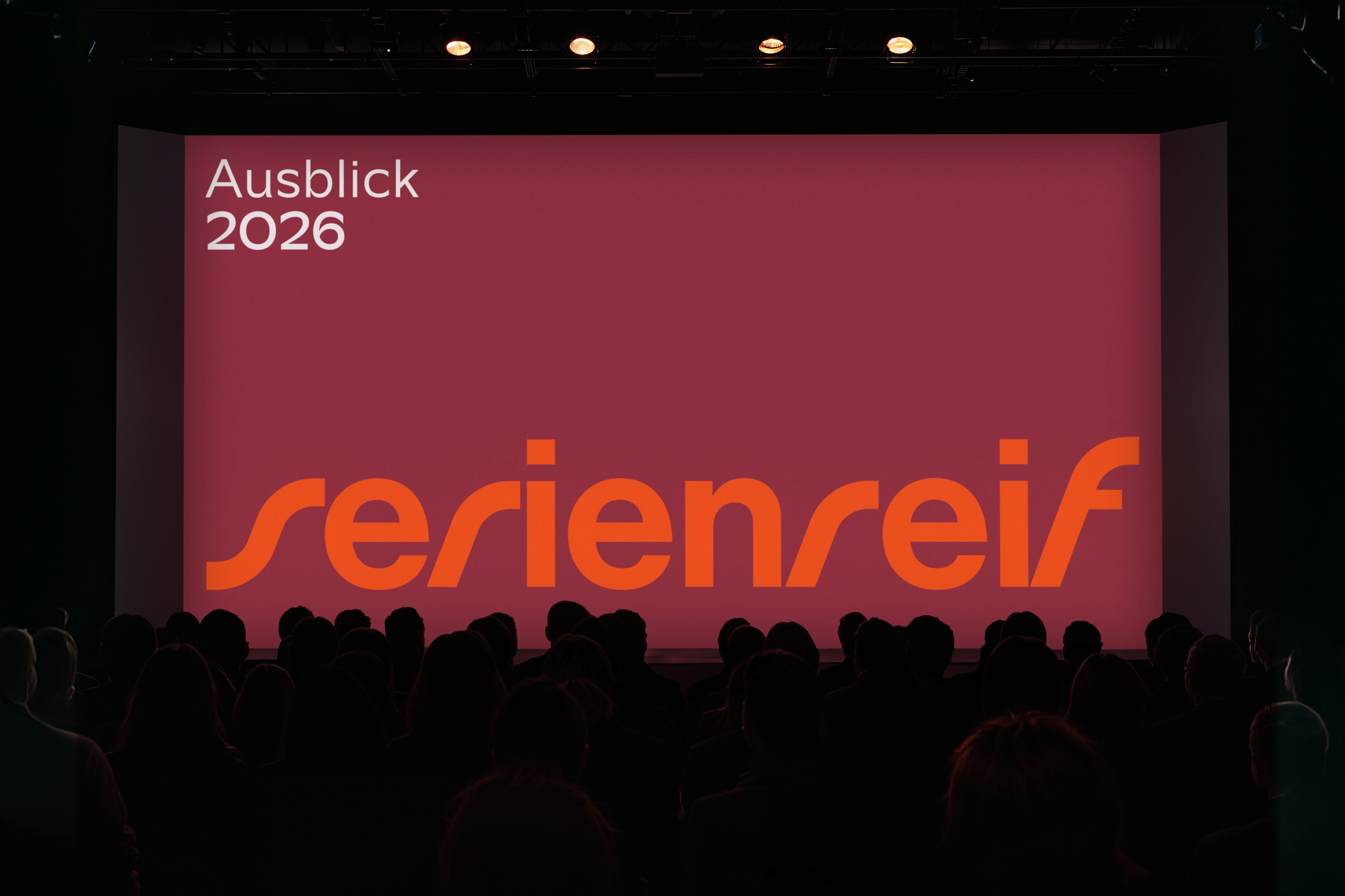
Presentation
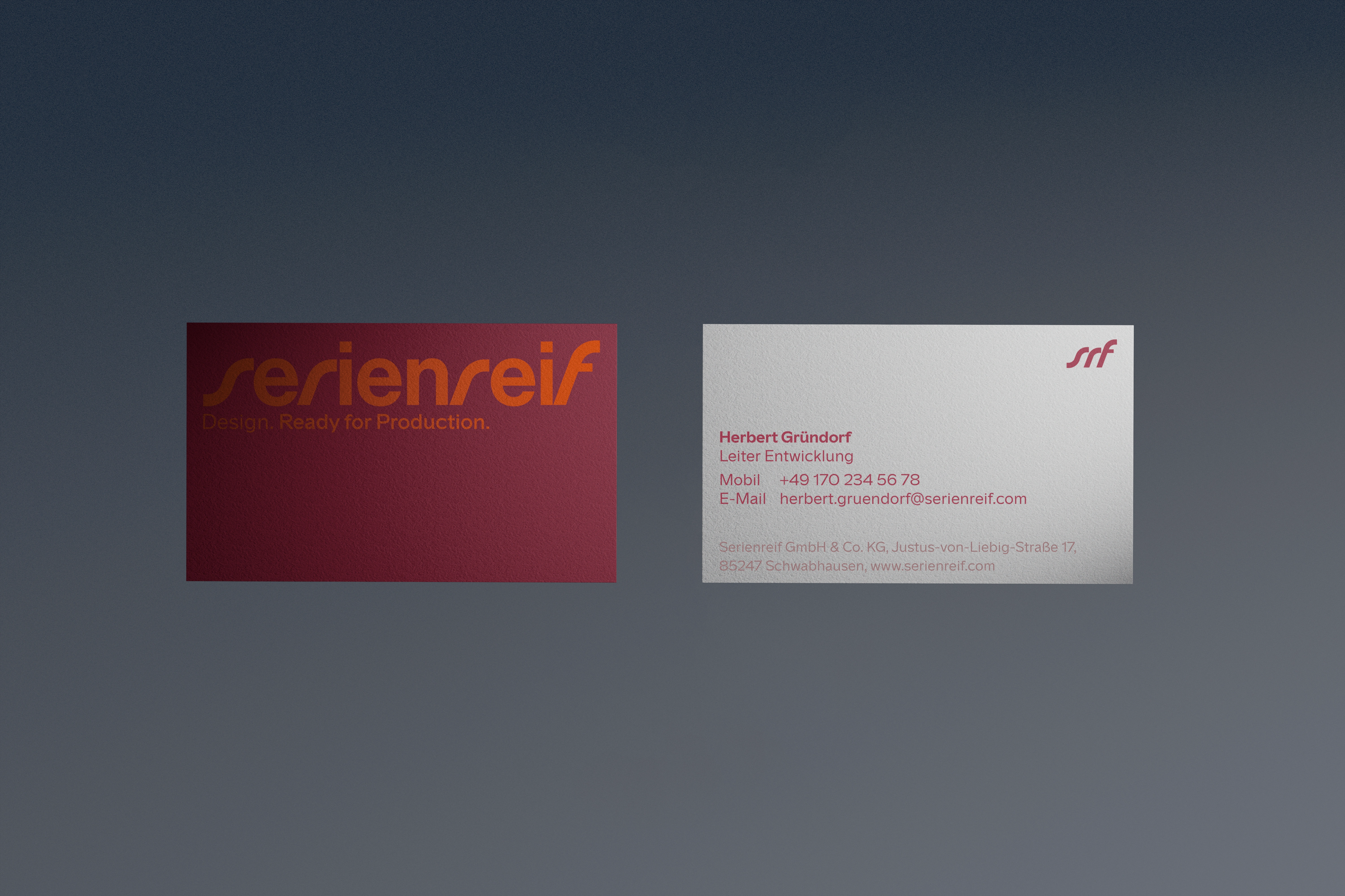
Business cards
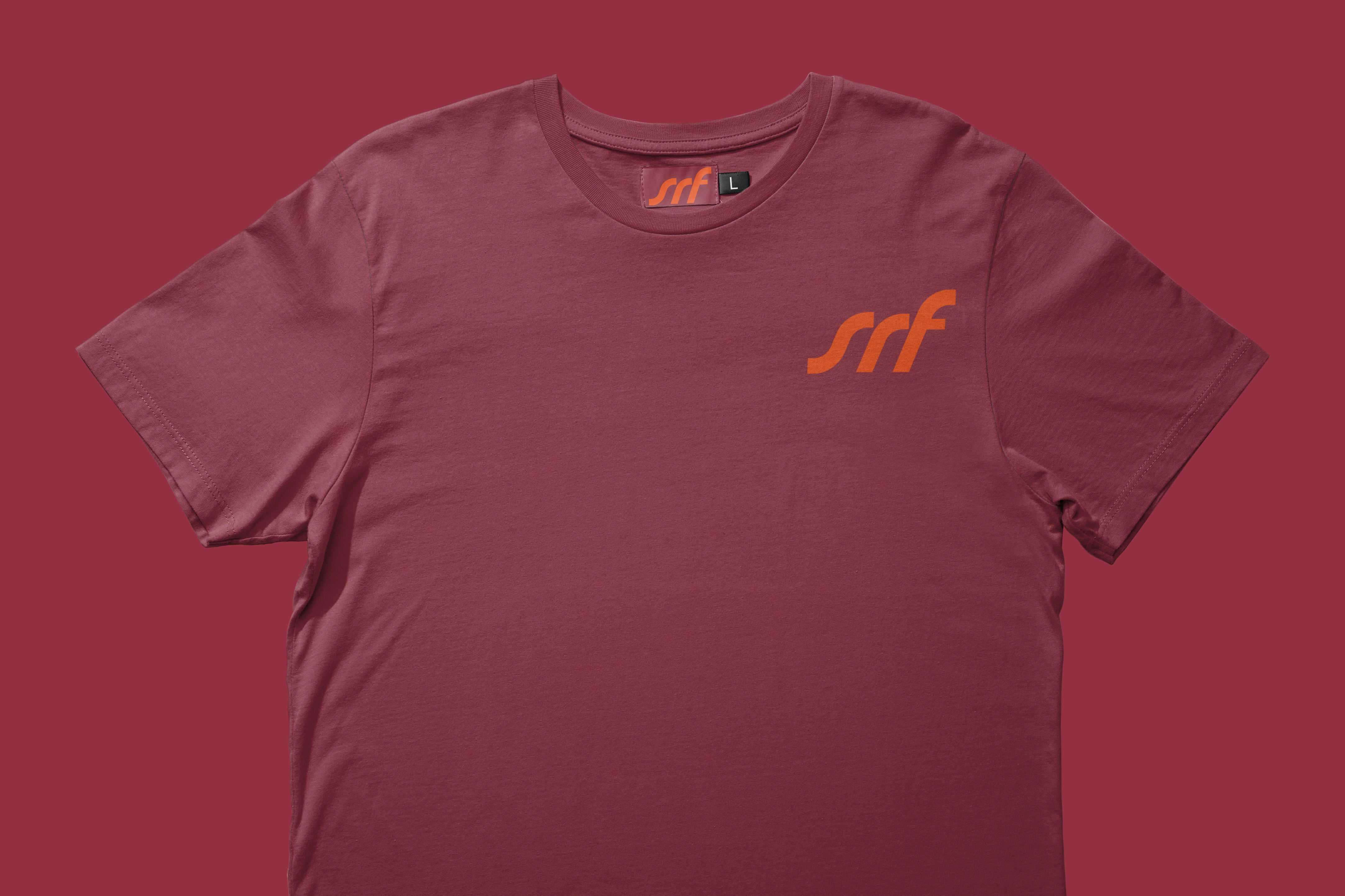
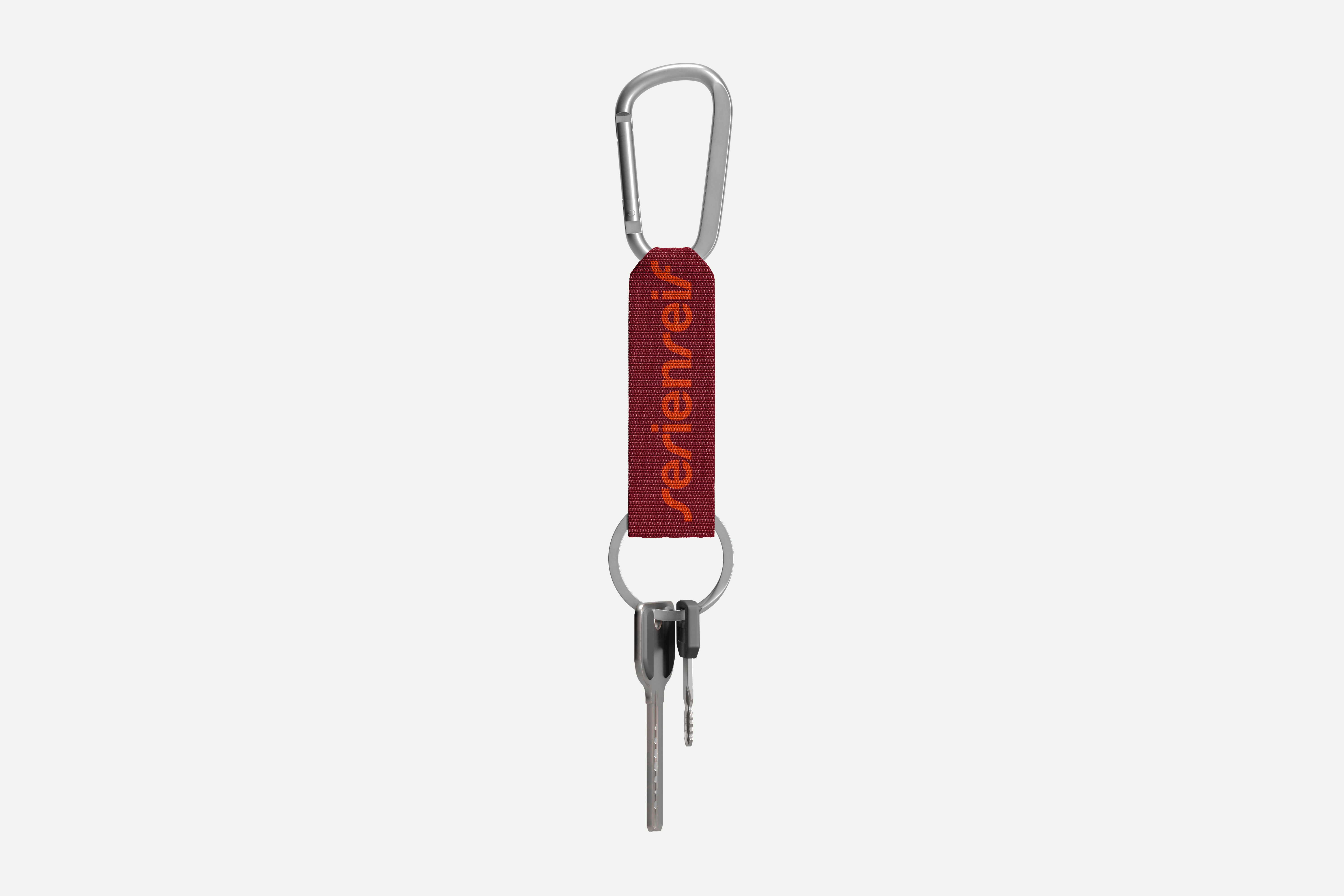
Clothing
ID card
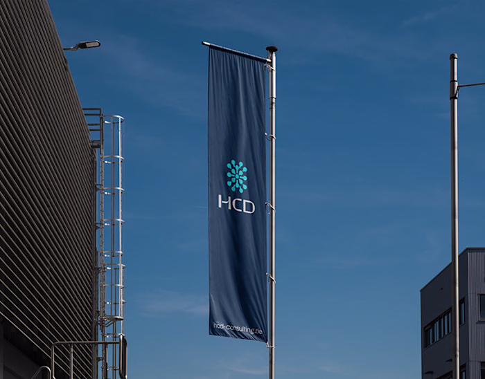
Flags
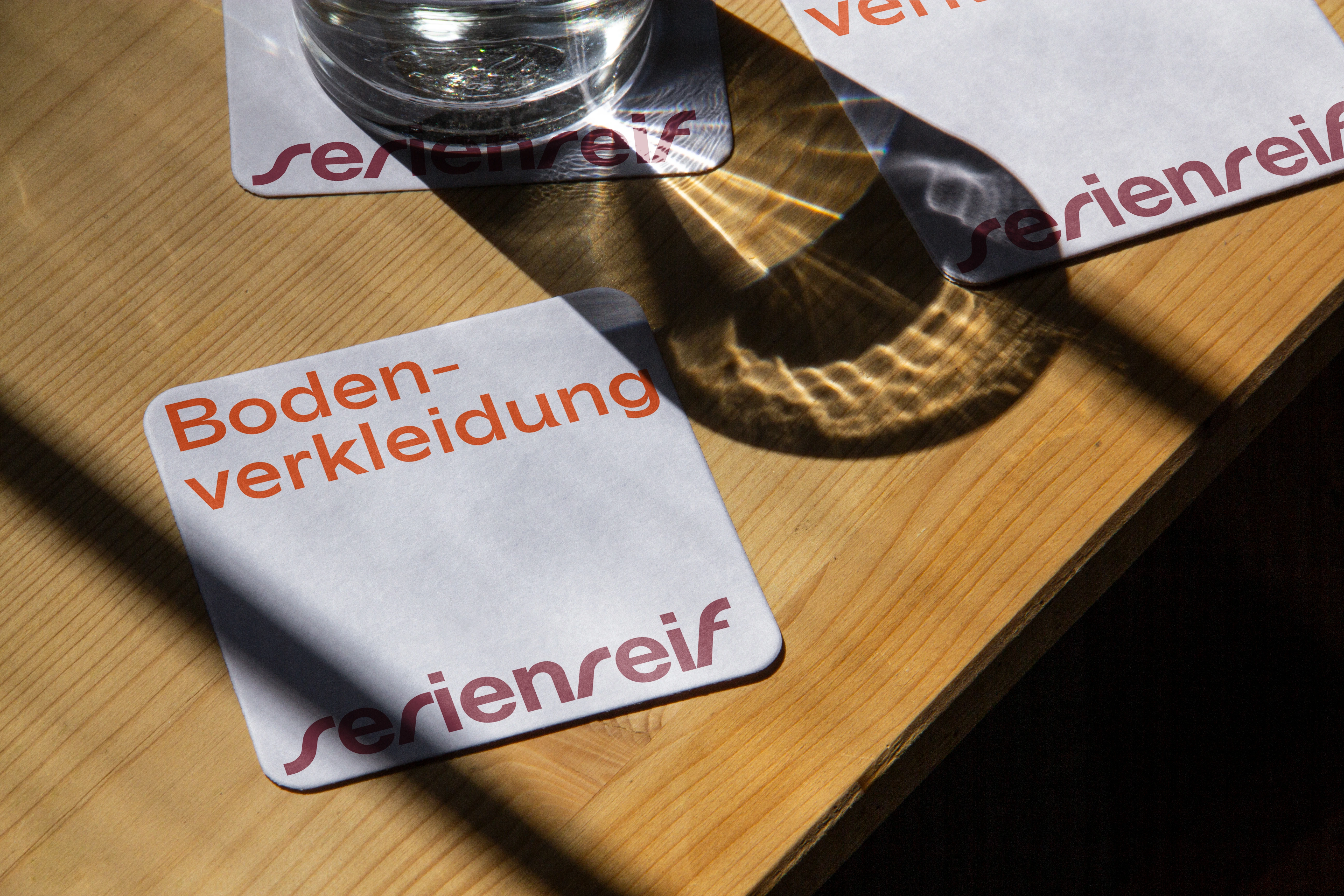
Print
Monogram
Marketing
Let's start your project
Like this project
Posted Oct 21, 2025
Serienreif’s new identity turns proactivity, confidence and vitality into bold colors, layered visuals and dynamic typography for more momentum and clarity.