A Unified Digital Experience for Empack Graphics

Gio Vidaurri


Building a unified digital ecosystem for Empack Graphics
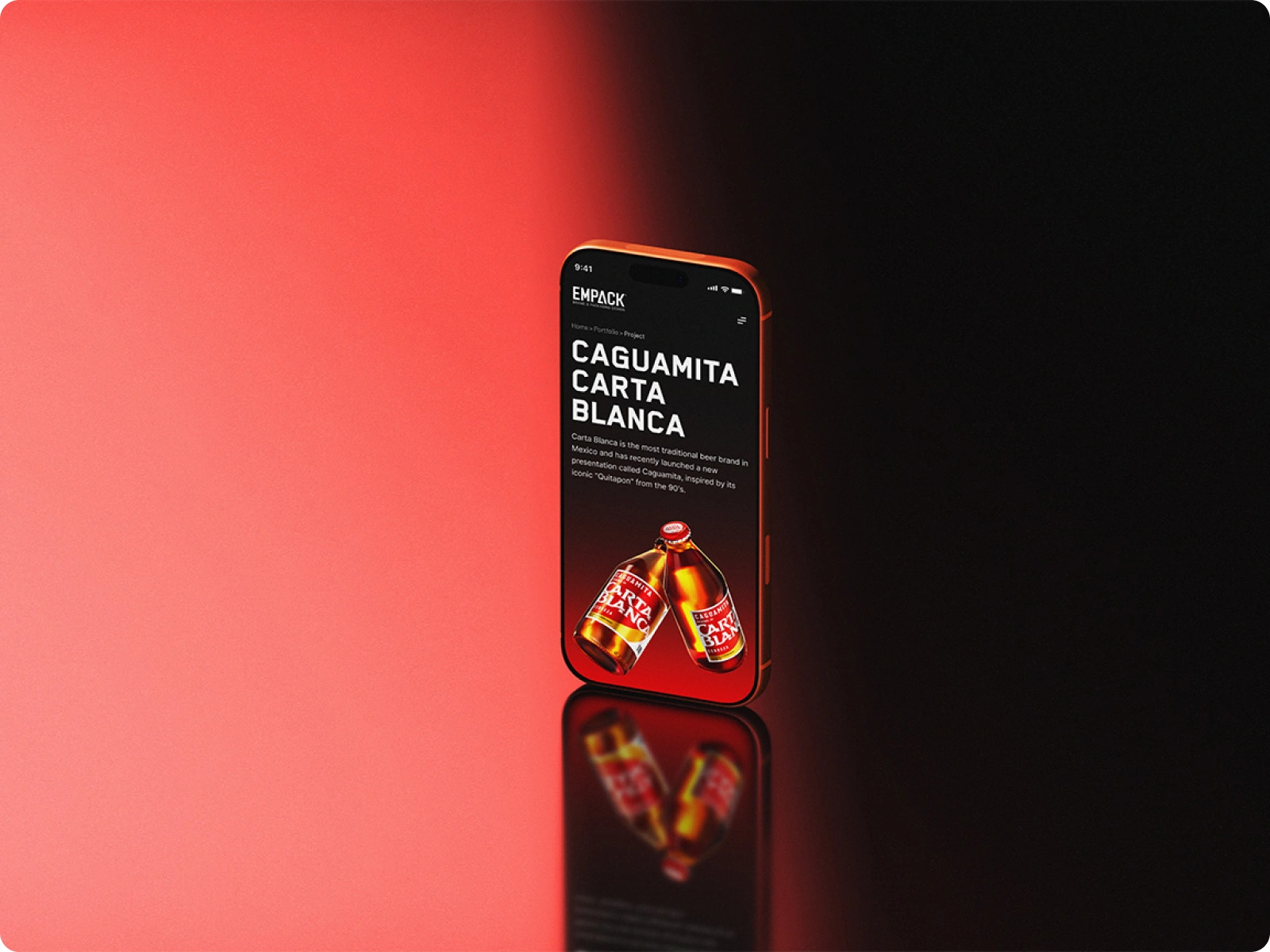
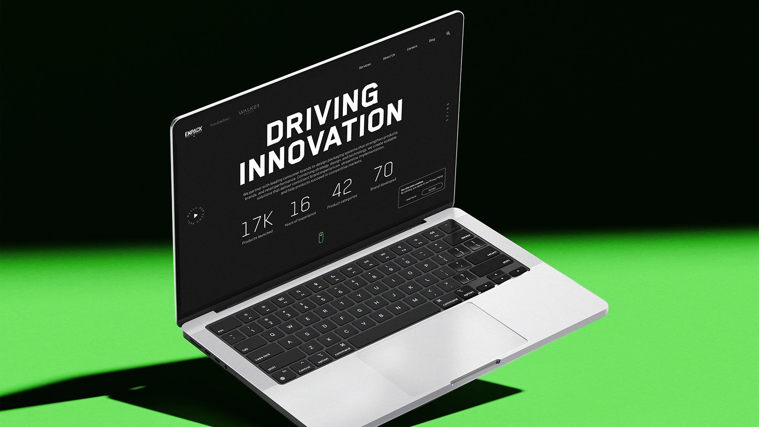
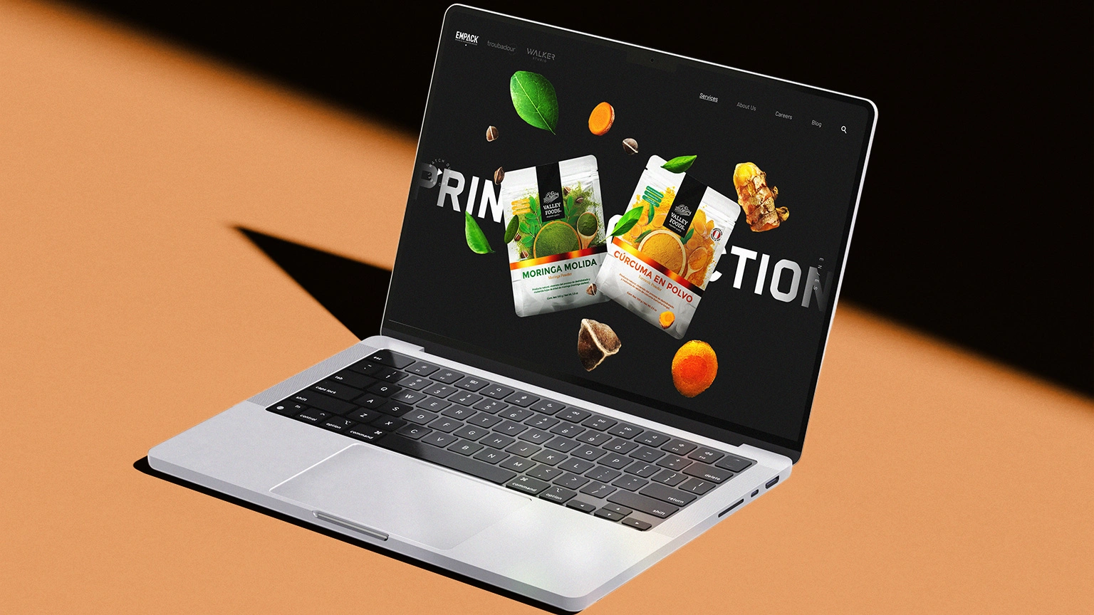
For Empack Graphics, a Monterrey-based group specializing in brand implementation, packaging and creative production, I helped shape a unified digital experience for its three specialized practices: Empack, Troubadour and Walker.
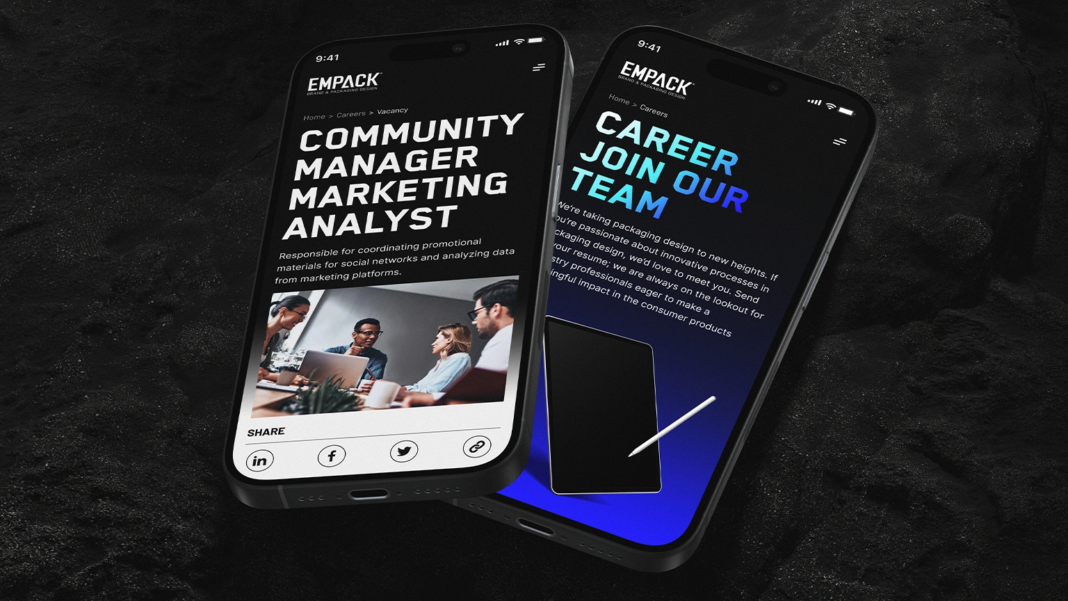
Working with Canvas, I contributed to the art direction and interface design, while leading bilingual SEO research, responsive UI design, interactive prototyping and motion studies. The challenge was to create one coherent ecosystem that could communicate the relationship between print production, creative services and CGI, while allowing each practice to retain its own visual language.
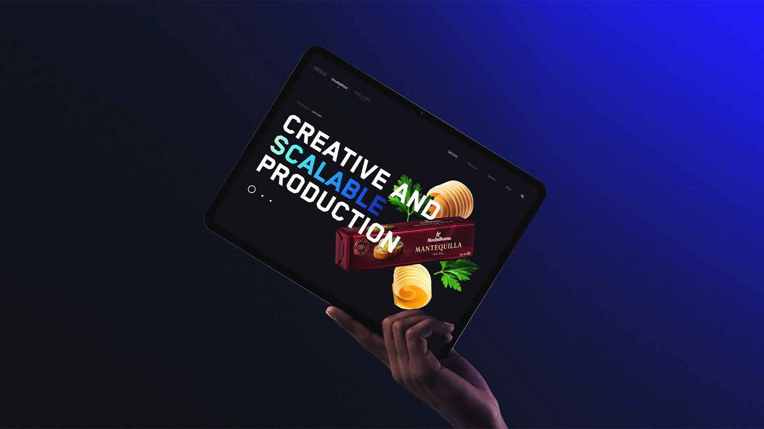
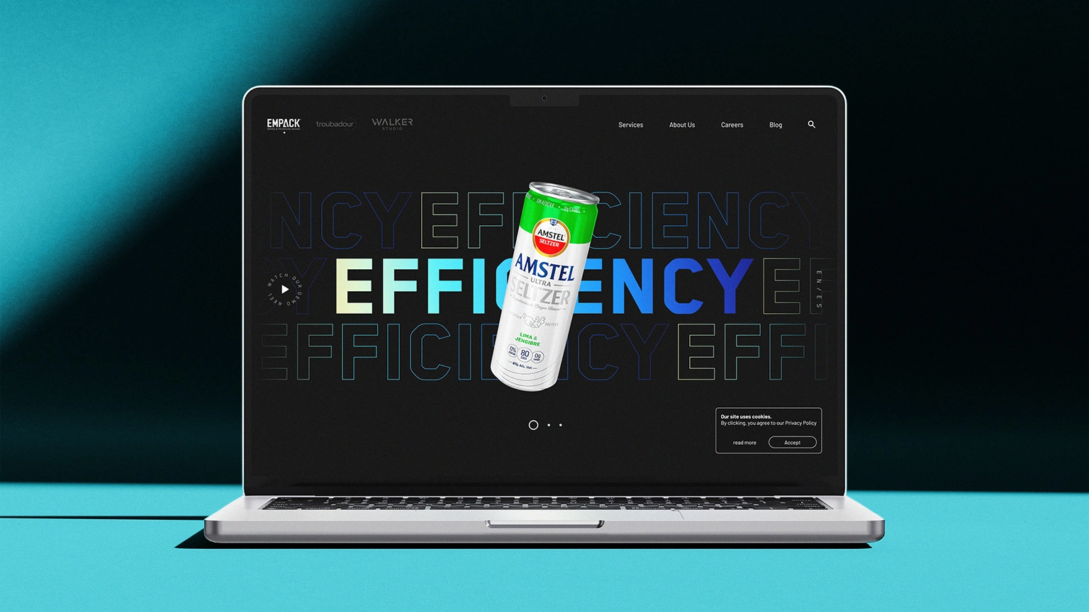
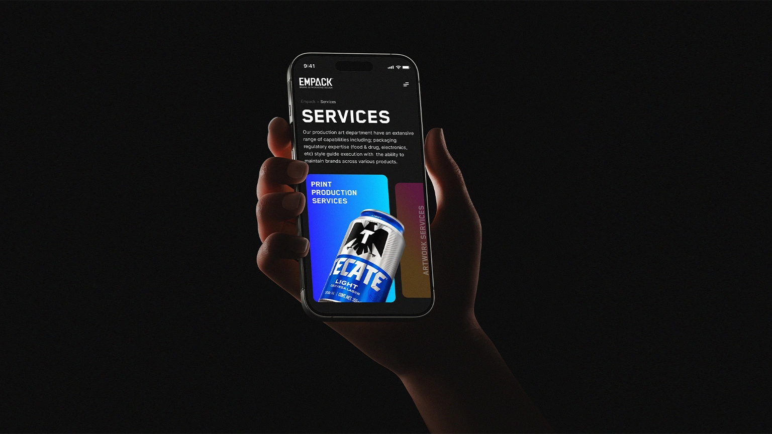
The work began with visual research, sitemap planning and content hierarchy. From there, I developed a flexible design system for desktop and mobile, defining grids, components, navigation behaviours and high-impact editorial layouts. The visual direction used restrained dark and light foundations, large-scale typography and generous space to place the focus on the color, texture and energy of the work.
Motion was treated as part of the interface rather than decoration. I created studies for transitions, typographic movement, product imagery and interaction states to support navigation and give the experience a clear visual rhythm.
Selected design, prototype and motion work shown.
Acknowledgements
Created with Canvas.
— Art Direction & Design — Giovanni Vidaurri and Chan Hernández
— Web Development, CMS Architecture, Frontend Implementation, Animation Systems & Code Optimization — Juan Fuentes
Like this project
Posted Jul 23, 2026
Designed a unified digital experience for Empack Graphics’ three practices, spanning art direction, UI, motion and SEO research.
Likes
0
Views
4
Clients
Empack Graphics