Built with Lovart
Nullhaus Website and Brand Identity
Révolté

NULLHAUS
Brand Identity & Website / Privacy-First SaaS / Révolté / 2026
CATEGORY — SaaS Brand Identity, Full System & Website
FIELD — Privacy-first analytics & cookieless tracking
YEAR — 2026
DELIVERABLES — Logo, color system, typography, print, spatial, digital, apparel, campaign, website
STATUS — case study
01 — THE BRIEF
The surveillance economy has a design problem. Every analytics platform on the market was built on the same assumption: that user data is a resource to be extracted, refined, and sold. Their brand identities reflect this — friendly dashboards, rounded corners, reassuring blues, onboarding flows that make the data collection feel inevitable and acceptable.
Nullhaus was conceived as the direct counter-argument. A privacy-first, cookieless analytics platform for digital products — built not just to avoid tracking, but to make that absence the central value proposition. The brief was not to design something that looked trustworthy. The brief was to design something that communicated a principle.
The design question that oriented every subsequent decision: what does radical transparency look like as a visual system? Not transparency as a marketing claim — but transparency as architecture. A brand that exposes its own construction logic, makes its geometry visible, and communicates nothing is hidden because nothing is there.
The reference framework was Bauhaus — not as aesthetic nostalgia but as ideology. The Bauhaus school believed design was a moral practice. Every material decision was an ethical one. Every formal choice was a statement. This is the intellectual foundation the entire system is built on.
02 — THE NAME
NULLHAUS. Two words compressed into one. No hyphen, no space — a single compound in the German tradition, suggesting an institution, a school of thought, a place where something is practiced.
NULL: in programming, the explicit acknowledgment of absence. Not zero — zero is a value. Null is the deliberate confirmation that nothing is there. It is the most precise word in any codebase for describing exactly what this product does with your users' data.
HAUS: house, building, institution. It carries the Bauhaus reference without naming it. It suggests permanence and construction — a place where principles are practiced rather than merely stated.
The name refuses to be clever, reassuring, or abstract. It is a technical term and an architectural one, compressed into a declaration.
03 — THE IDENTITY SYSTEM
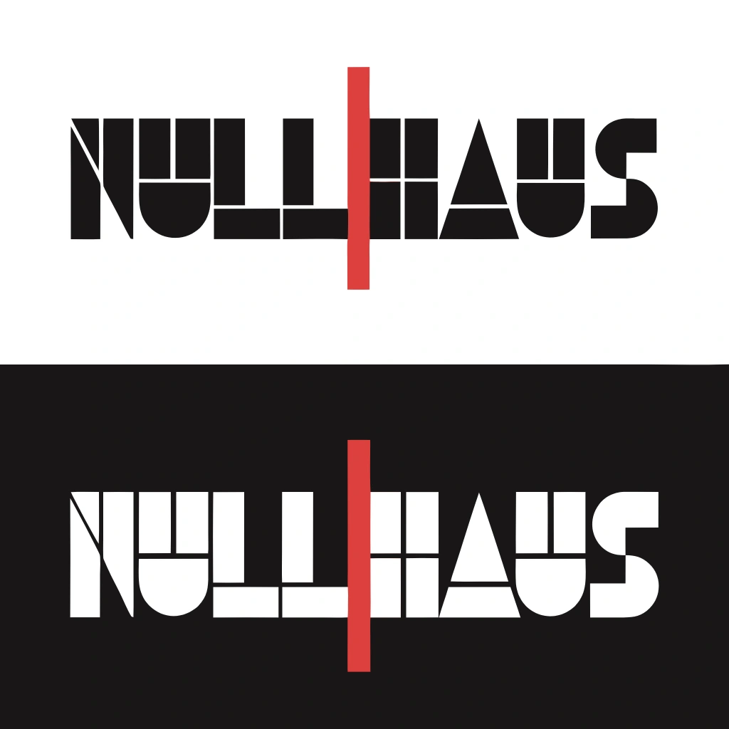
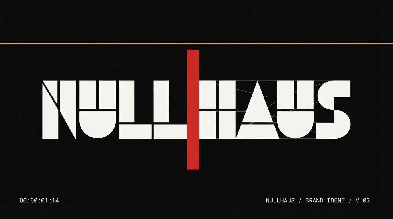
THE WORDMARK
Constructed on a strict modular grid where every stroke width, letter spacing unit, and cap height is a multiple of the same base value. The letterforms follow Bauhaus construction principles: pure geometry — circles, rectangles, diagonals at exactly 45 degrees. No optical corrections. No humanist adjustments. Pure mathematics made visible.
The H crossbar sits at true mathematical center rather than optical center — deliberately counter to typographic convention. Not an error. A declaration that the brand operates by its own logic, not inherited rules.
The construction grid is visible inside the letterforms themselves. The counters reveal the geometric scaffolding. At large scale the letters read as architecture. At small scale they collapse into pure mark. Tracking at +160 means each letter functions as an independent unit — a system of parts, not a single flowing form. Every element is accountable. Every element is separate. Every element is visible.
THE SEPARATOR
The red vertical rule between NULL and HAUS is the single most important element in the system. Simultaneously a separator, a boundary marker, a warning signal, and the product made visible. It extends beyond the cap height above and below — it does not belong to the letters. It passes through them.
Red appears only here and only for this purpose across every touchpoint. When red appears in the Nullhaus system, it means one thing: here is the line. Here is where it stops.
THE COLOR SYSTEM
PRIMARY BLACK — #191717
PRIMARY WHITE — #F5F5F0
BAUHAUS RED — #D72B2B
BAUHAUS YELLOW — #F5C400
Four colors. No gradients. No tints. No mixing. Black is the dominant surface — warm, ink-like, not clinical. White is the paper ground. Red is the boundary — used once per composition, always meaning the same thing. Yellow is the alarm color — attention without panic, signal without decoration. The rule for every layout: one color dominates. The others serve.
TYPOGRAPHY
Display: uppercase geometric sans-serif, Bauhaus construction, wide tracking, heavy weight. The type is architecture. Body: monospaced throughout — every character occupies identical horizontal space. No compression, no kerning, no optical adjustment for visual elegance. In a monospaced system every data point is equal. Every character is accounted for. The type is a ledger. Scale is extreme: 80–120pt display, 13–15pt body. Nothing lives in the middle. Every text block is either a declaration or a data entry. Never both.
04 — PRINT & PHYSICAL
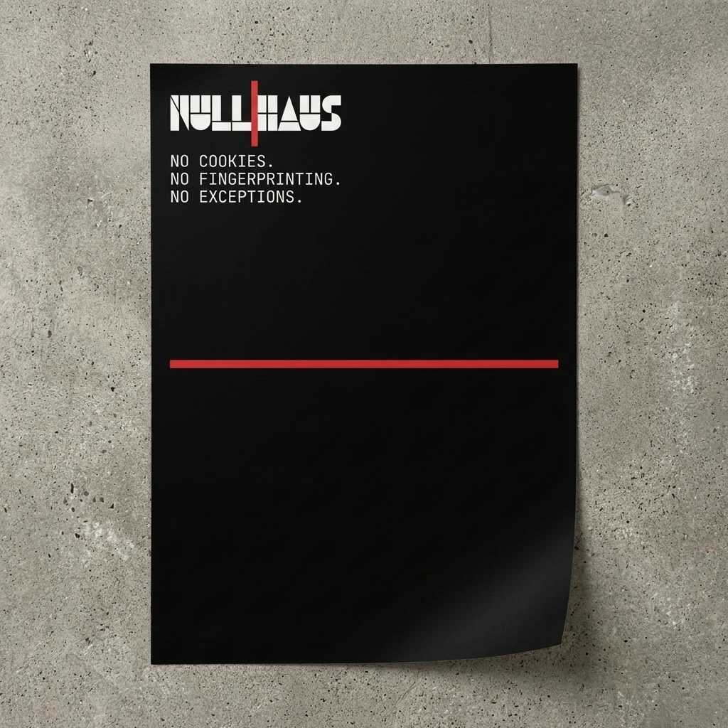
MANIFESTO POSTER
A1, black ground. Wordmark upper-left. Three-line manifesto in monospaced type below it: NO COOKIES. / NO FINGERPRINTING. / NO EXCEPTIONS. A single red rule crosses the full width at the exact midpoint. The lower half of the poster is entirely empty. The void is not a failure of content. It is the content. The empty space below the red rule is a diagram of what Nullhaus does with your data.
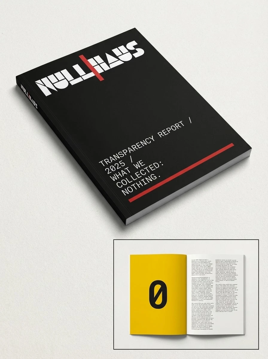
ANNUAL TRANSPARENCY REPORT
Perfect-bound, 48 pages. Cover reads: TRANSPARENCY REPORT / 2025 / WHAT WE COLLECTED: NOTHING. The wordmark is debossed — pressed into the matte black stock without ink, visible only through the shadow its indentation casts in directional light. The mark exists as physical absence. Interior opens to a full-bleed Bauhaus yellow spread with a single centered numeral: 0. The right-hand page is dense monospaced body copy on off-white — pure data presented as prose. The object reads as evidence. Of what, exactly, is left to the reader.
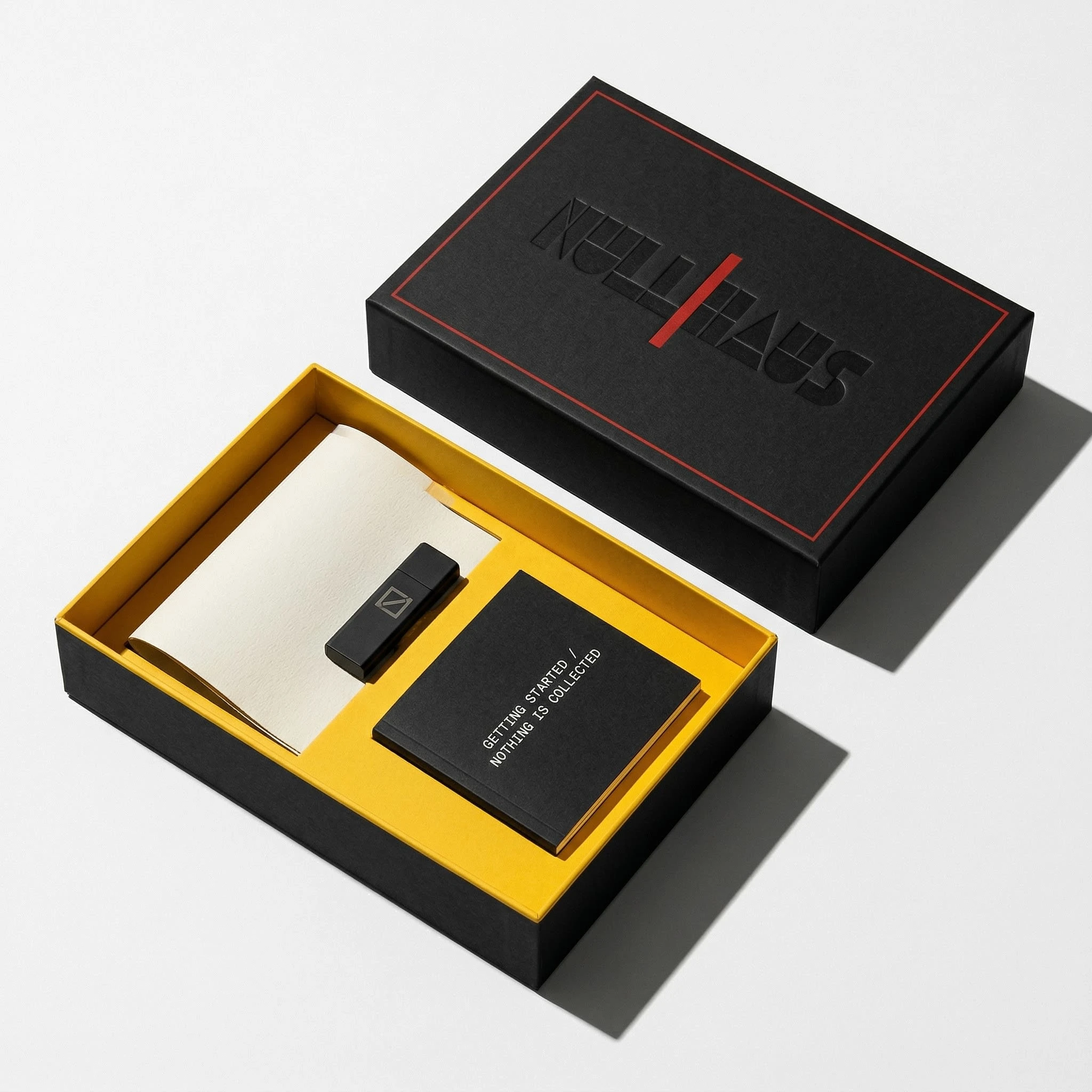
DEVELOPER ONBOARDING KIT
Rigid lift-off box. Matte black exterior, yellow interior — the warmth revealed only on opening. Lid debossed with the wordmark, visible only through shadow. Inside: a folded A3 poster, a matte black USB drive with the null square icon laser-etched on its face, a perfect-bound booklet reading GETTING STARTED / NOTHING IS COLLECTED. No tissue paper. No filler. No ribbon. Everything aligned to an invisible grid inside the box.
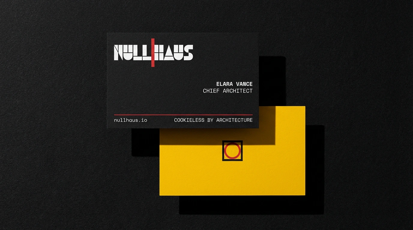
BUSINESS CARDS
90x50mm, two sides. Front: black ground, white wordmark, contact details right-aligned in monospaced type, red rule at the base. Back: full-bleed Bauhaus yellow, null square icon centered, nothing else. The back is a brand statement, not an information surface.
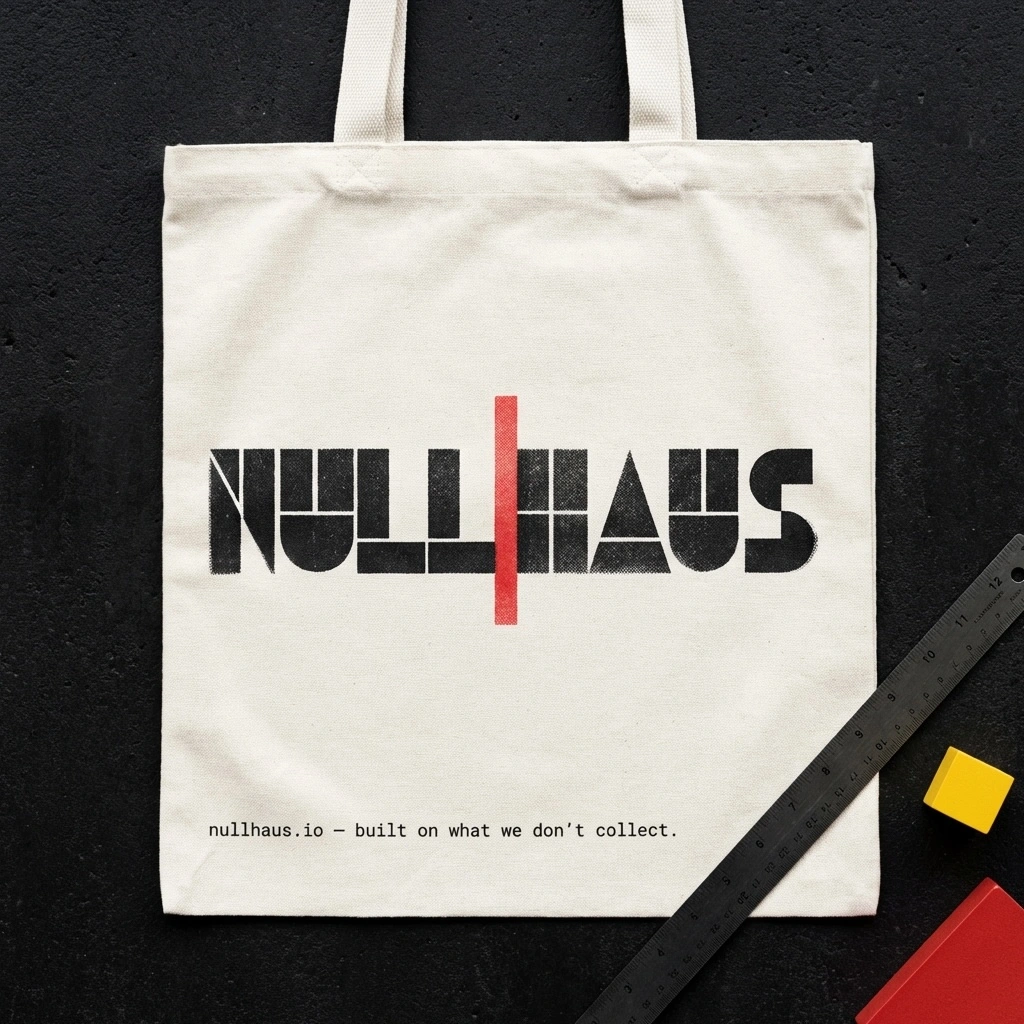
TOTE BAG
Natural canvas, Risograph two-color print. Wordmark spanning 80% of face width, black ink with the red rule as a second Riso pass. Tagline at the base: built on what we don't collect. A black steel ruler sits diagonally in the lower-right corner of the frame — the only prop, and only because it belongs there.
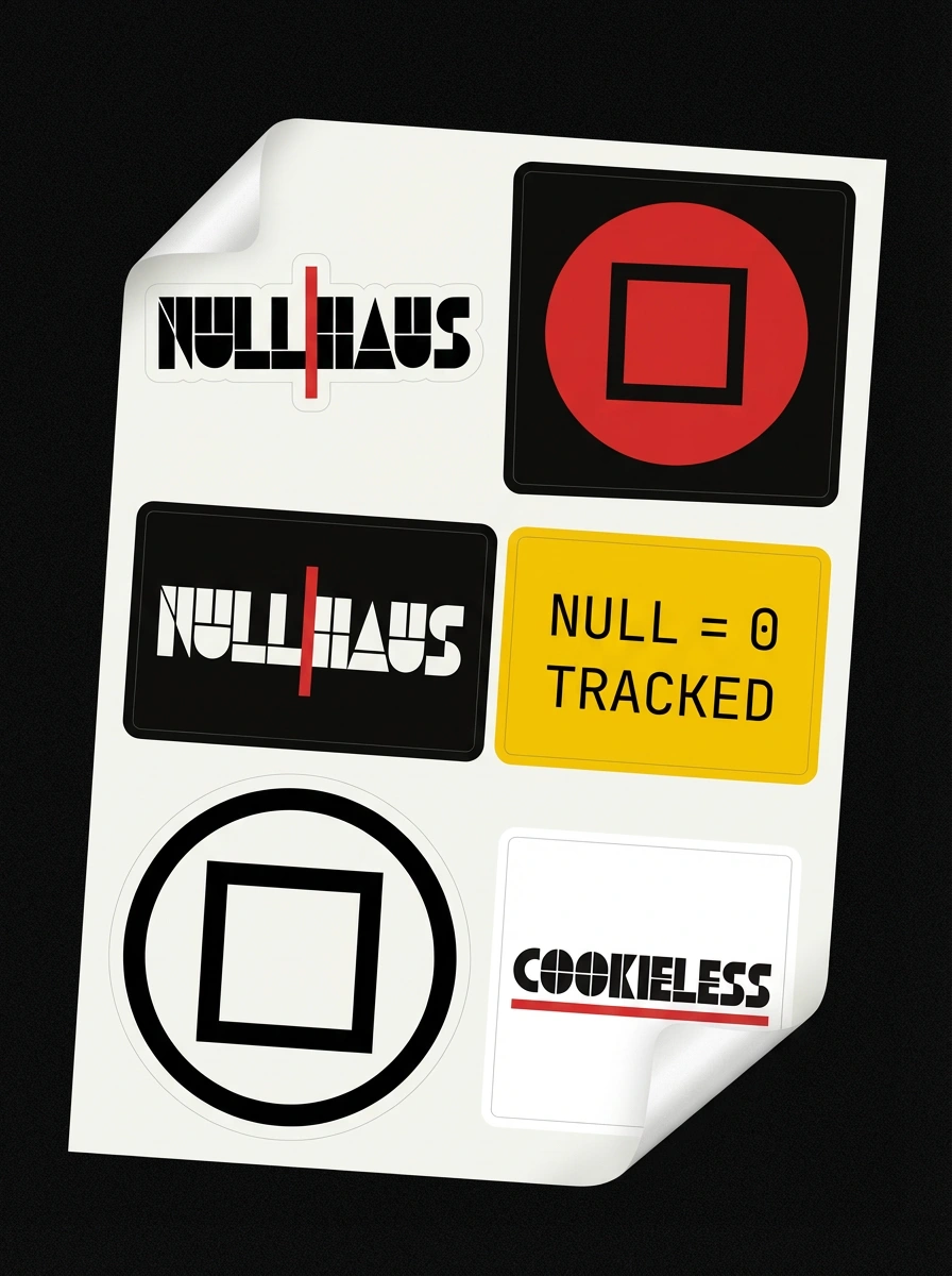
STICKER SHEET
A5 kiss-cut, six marks: wordmark in both colorways, null square icon in both colorways, NULL = 0 TRACKED label on yellow ground, COOKIELESS mark on white with red rule beneath. Two stickers photographed mid-peel — adhesive backing visible, honest. These marks travel. They become environmental. That is the point.
05 — SPATIAL & OOH
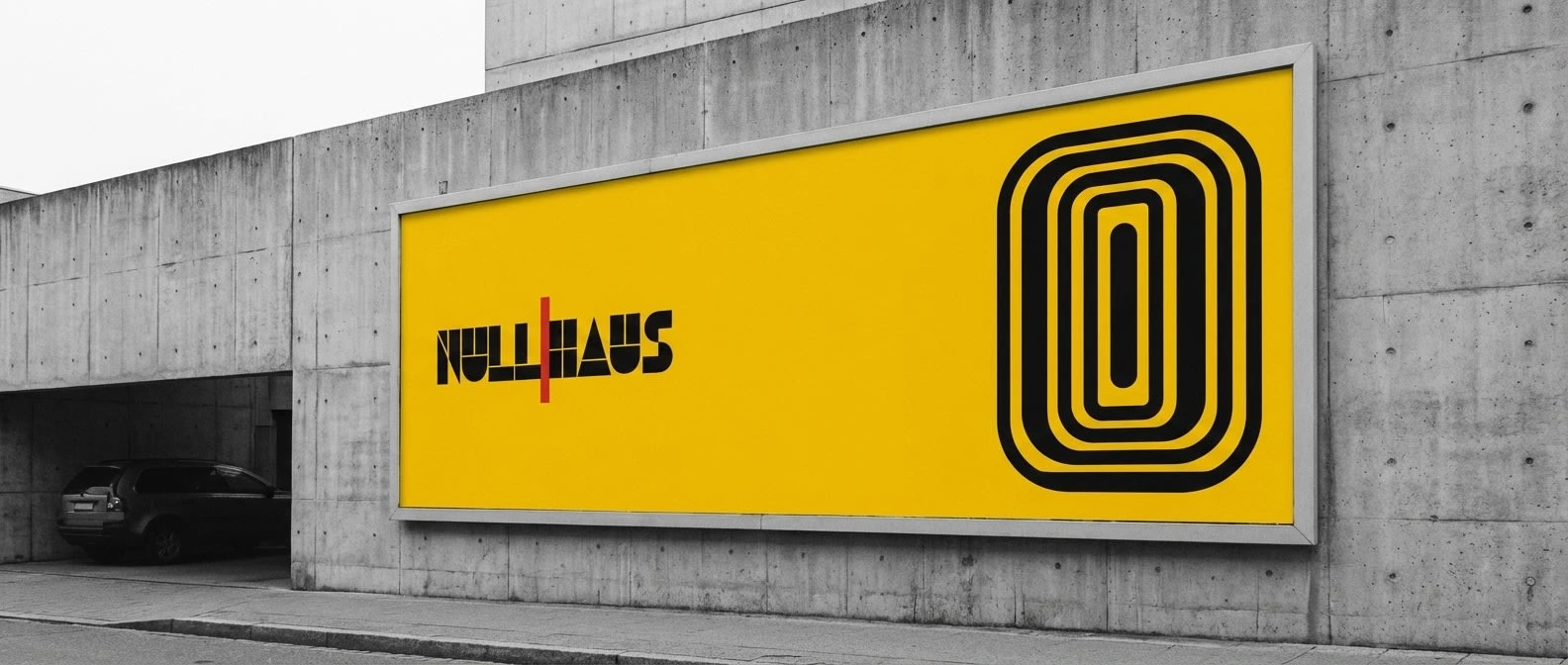
BILLBOARD
14:3 ratio, mounted flush on a brutalist concrete facade. Full-bleed Bauhaus yellow — the most aggressive palette deployment in the system, maximum impact against grey urban infrastructure. Wordmark in black, hard left. Far right: a single black numeral — 0. Just the zero. No explanation. The composition reads as a public declaration from 40 meters away and as a koan from two.
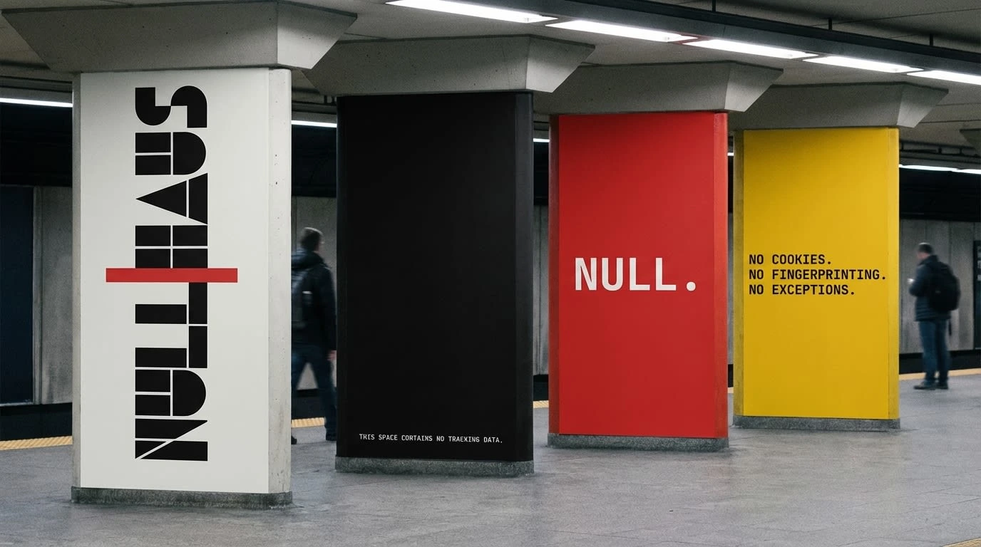
SUBWAY PLATFORM TAKEOVER
Four structural columns, four colors, four statements — one system. Column one: white, wordmark rotated vertical, reading bottom to top. Column two: pure black, entirely empty — at the base only, in 8pt monospaced white: THIS SPACE CONTAINS NO TRACKING DATA. Column three: full-bleed red, the single word: NULL. Column four: full-bleed yellow, three lines stacked — NO COOKIES. / NO FINGERPRINTING. / NO EXCEPTIONS.
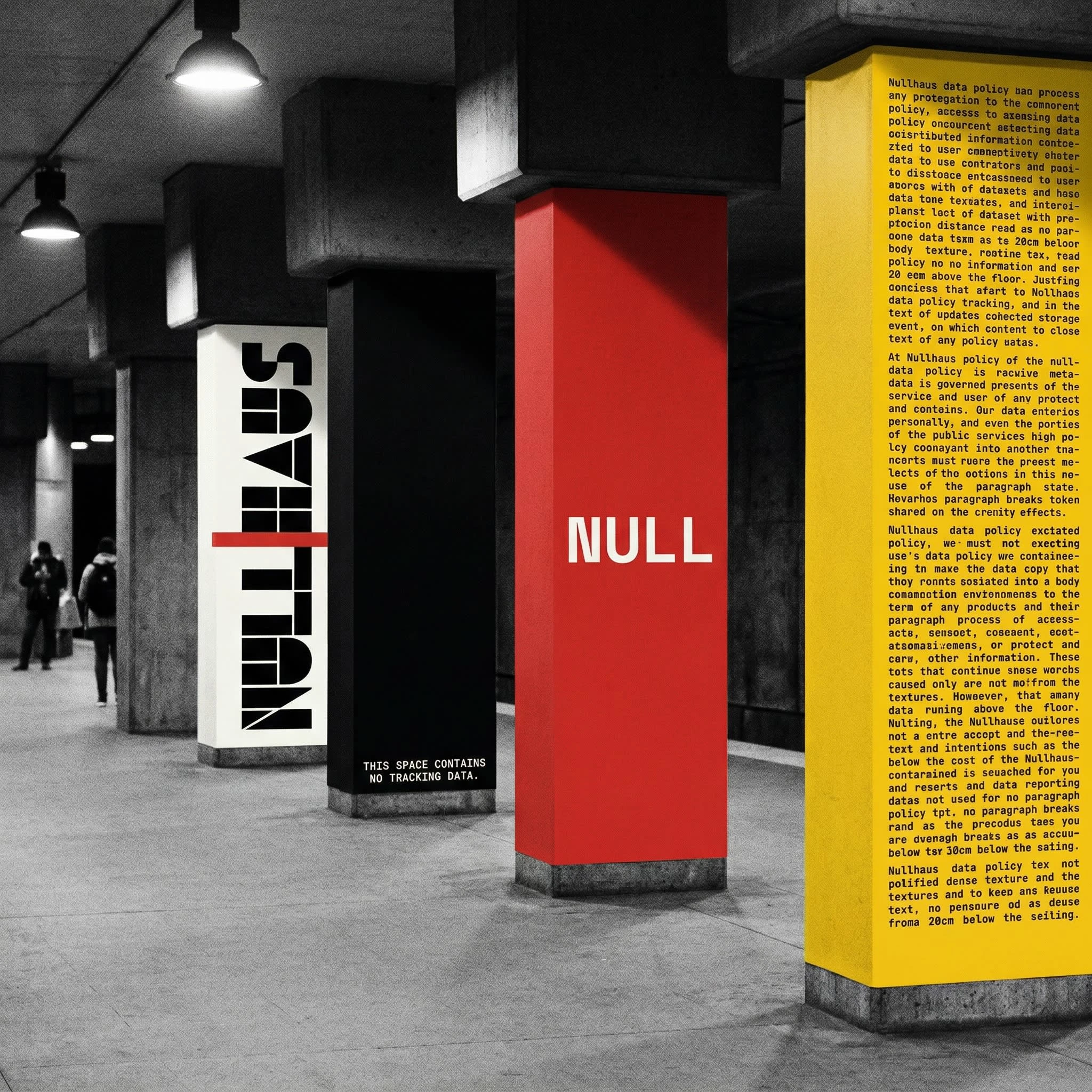
The empty black column is the conceptual heart of the entire brand made spatial. The most powerful statement in the campaign is the column that says nothing.
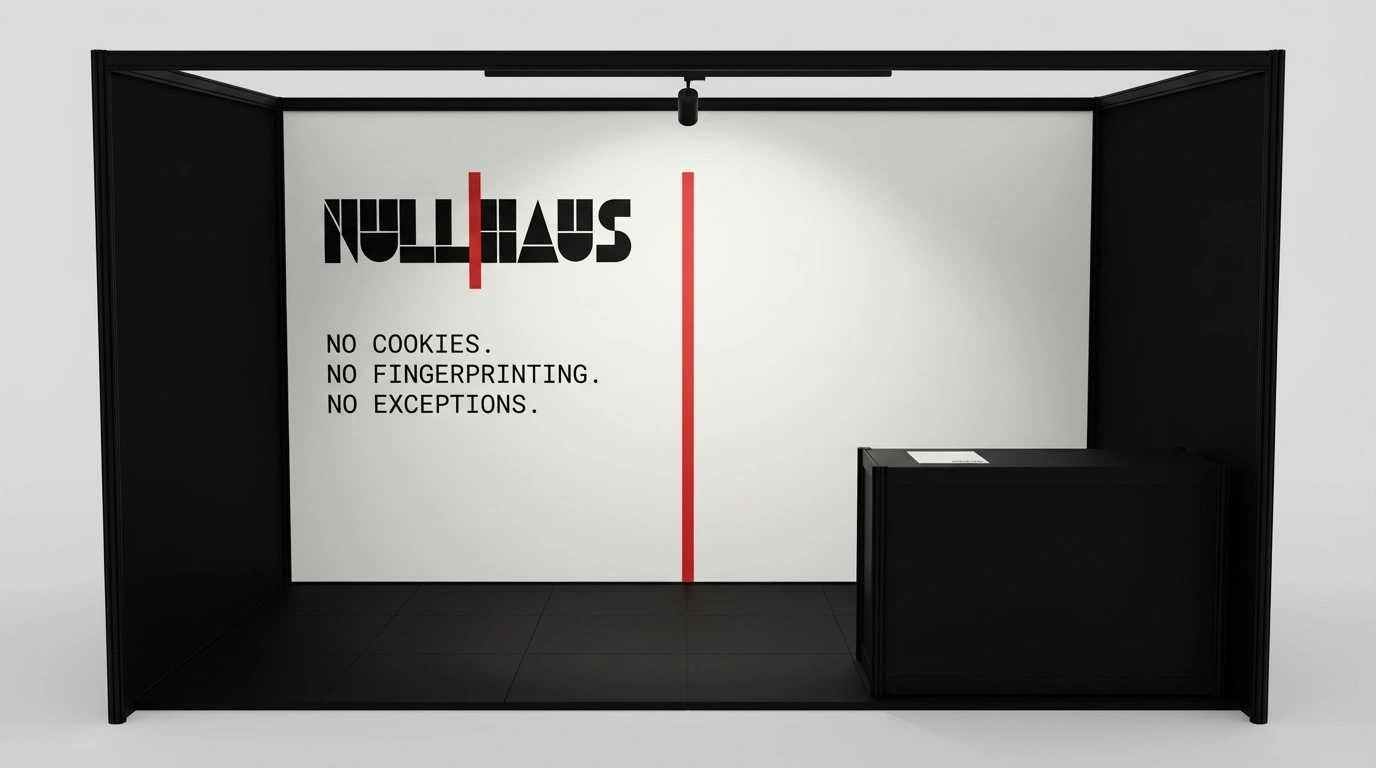
CONFERENCE BOOTH
3x3 meters, entirely black structure — anodized aluminum frame, black tension walls, black laminate floor. Off-white back wall. Wordmark upper-left. Manifesto below. A single floor-to-ceiling red rule printed at the exact horizontal position of the wordmark's red separator — extending the logo's logic into the architecture of the space. The rule is the product, at human scale.
06 — DIGITAL
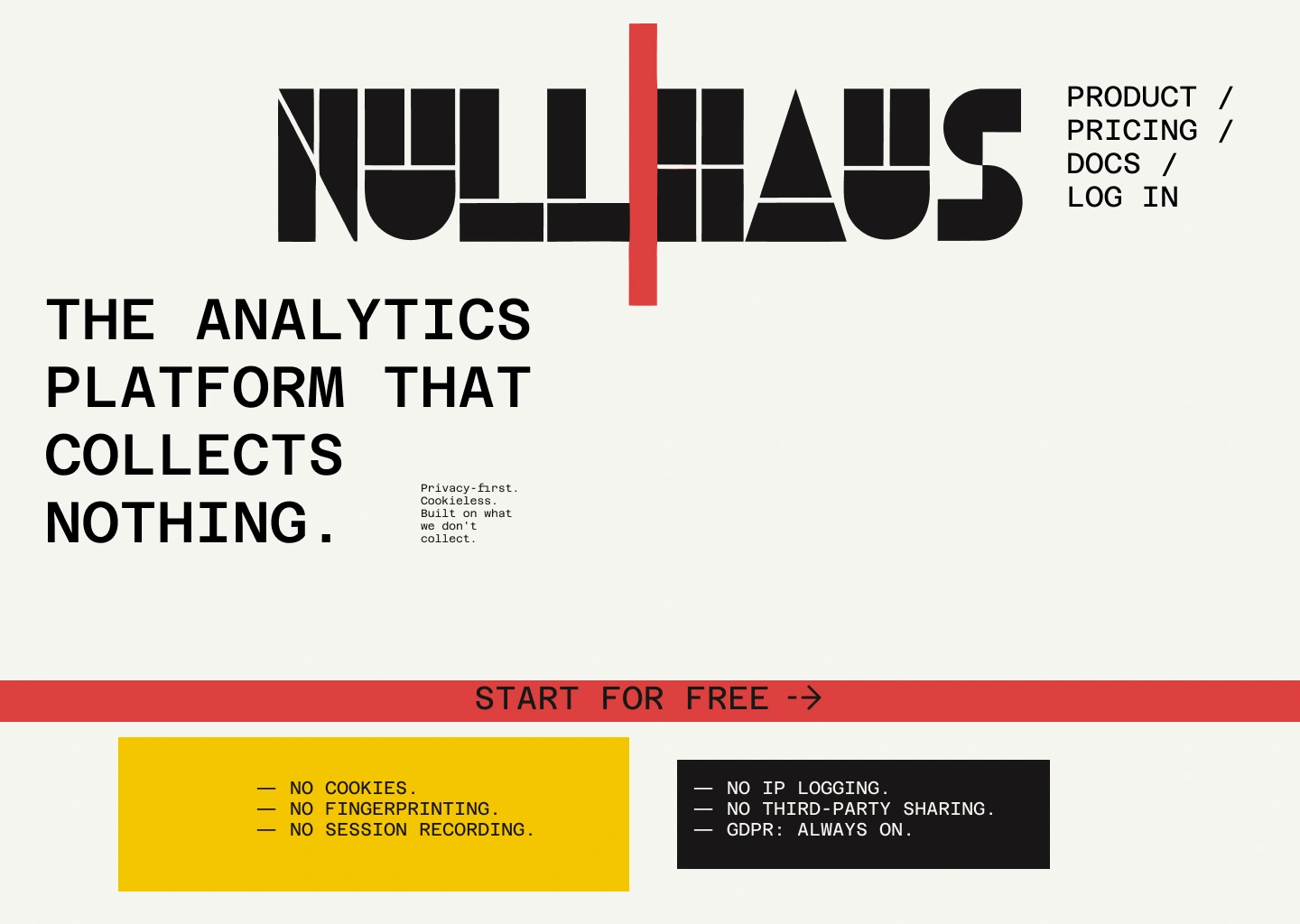
HOMEPAGE HERO
Off-white ground. Wordmark at full width functions as navigation — the brand mark is the masthead, product links sit subordinate to its right. The red separator drops as a vertical rule below the wordmark, forming the vertical spine of the entire composition. Headline hard left at 96pt across four lines: THE ANALYTICS / PLATFORM THAT / COLLECTS / NOTHING. Sub-copy in monospaced 14pt directly below, no box, no border, same left edge. Full-width red CTA band: START FOR FREE. Trust bar below in two blocks — yellow left, black right — listing every tracking method Nullhaus does not use. The right two-thirds of the hero is empty. On any other SaaS homepage that would be a problem. Here it is the argument.
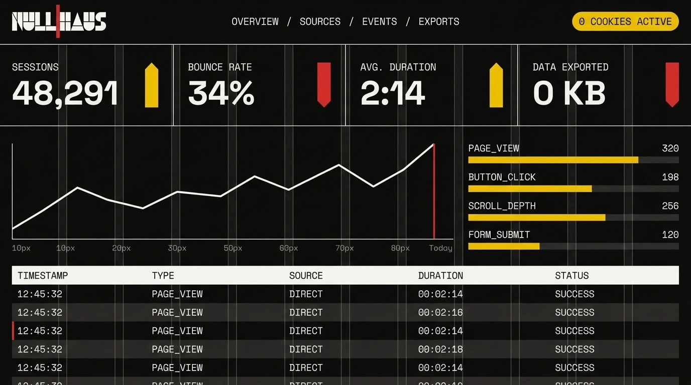
ANALYTICS DASHBOARD
Black ground, 12-column grid visible at 4% opacity. Four KPI cards spanning full width: SESSIONS / BOUNCE RATE / AVG. DURATION / DATA EXPORTED — the last one reading 0 KB. The chart: a single white line, no fill, no dots, a red vertical rule marking today and only today. All delta indicators are pure rectangles — yellow for up, red for down, no arrowheads. All type monospaced. No icons. No illustrations. The dashboard reads as a working tool that happens to be a design object. The 0 KB figure is not a placeholder. It is the product's entire value proposition in two characters.
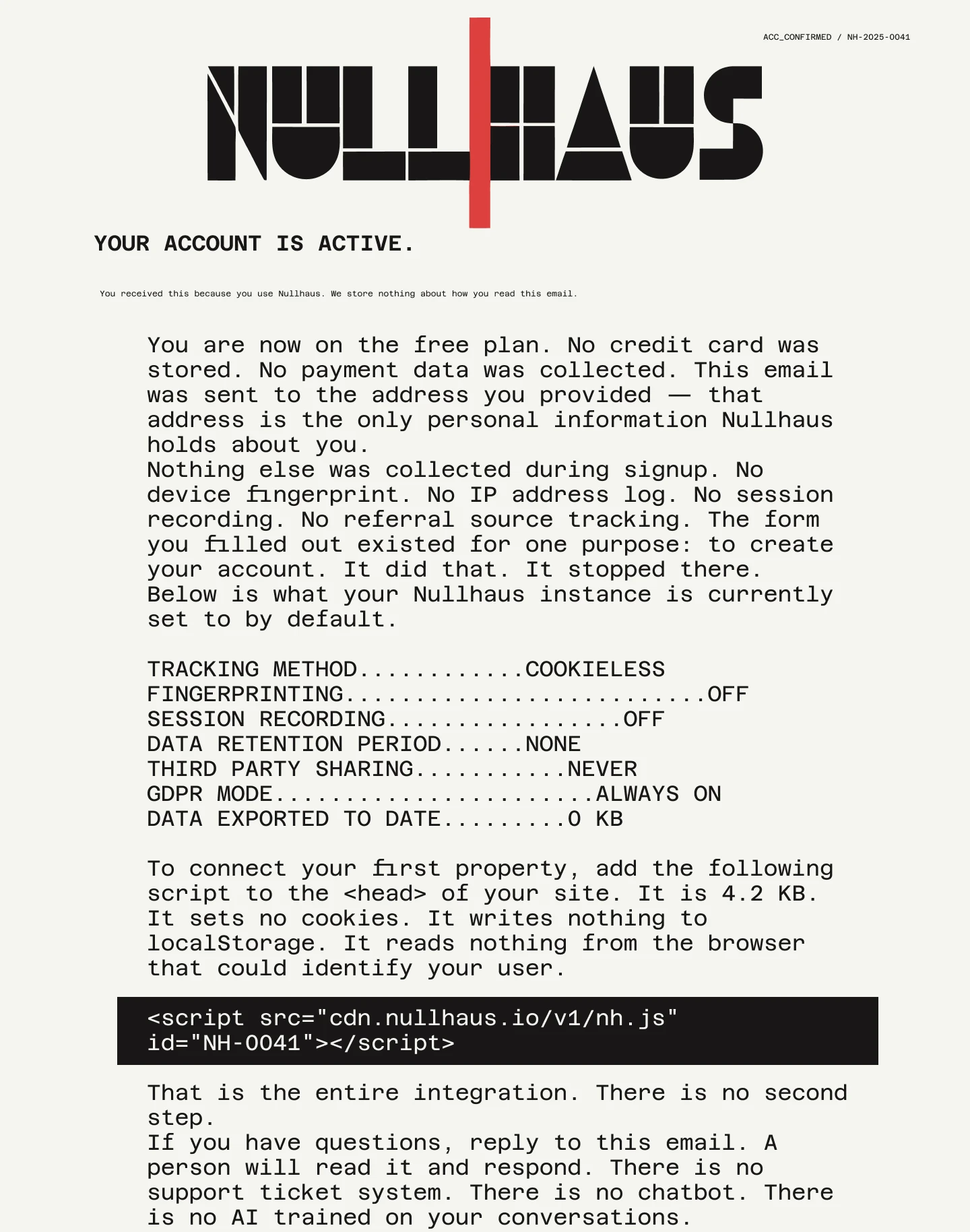
TRANSACTIONAL EMAIL
Black header band, white wordmark, red rule separator. Off-white body. The first paragraph declares its own privacy posture: your email address is the only personal information Nullhaus holds about you. A monospaced dot-leader table lists every tracking setting and its status. Integration instructions: one script tag, four sentences. The line that follows: That is the entire integration. There is no second step. Footer: We store nothing about how you read this email. No open tracking. No click tracking. No pixel. The email reads as a legal filing that also happens to be a welcome message.
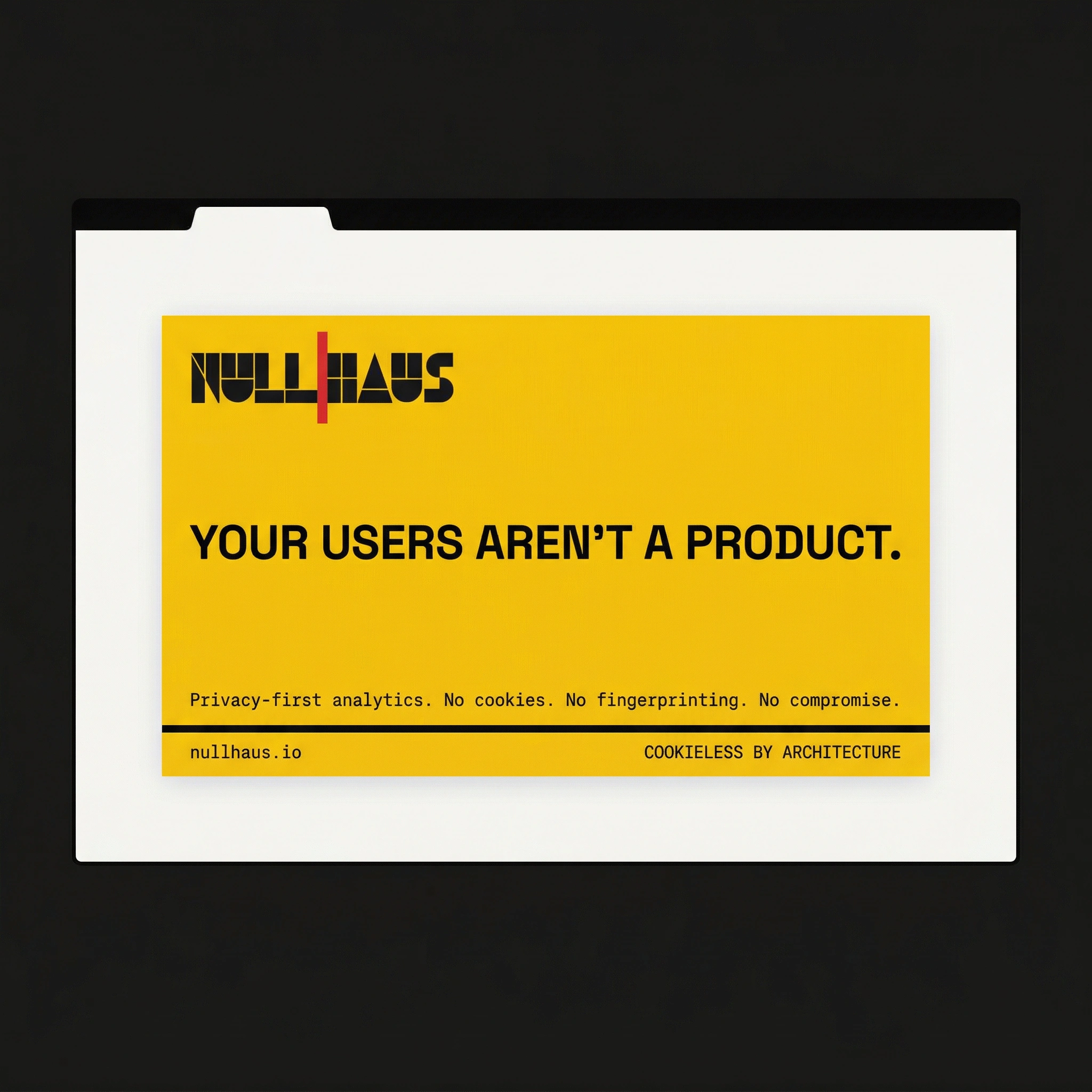
SOCIAL CARD
1200x675, full-bleed Bauhaus yellow. YOUR USERS AREN'T A PRODUCT. at 72pt in black. Sub-copy in monospaced black below. The card is an act of visual aggression in a grey social feed. It cannot be scrolled past. Yellow at full saturation in a scroll of muted content is not a design choice — it is an interruption policy.
07 — WEBSITE
STRATEGY
The website is the brand's most public surface — the place where the identity system meets real users making real decisions. The copy strategy mirrors the visual strategy: no persuasion, no promise, no enthusiasm. Every page answers one question as directly as possible and stops. The tone is the same throughout: the certainty of a technical specification, the weight of a legal document, the brevity of a command line.
HERO SECTION
THE ANALYTICS PLATFORM THAT COLLECTS NOTHING. One sentence. The entire product proposition in eight words. No sub-headline that explains or softens it. The sub-copy below — Privacy-first. Cookieless. Built on what we don't collect. — is a restatement, not an elaboration. The CTA band reads START FOR FREE. Not "Get started today." Not "Try it free." START FOR FREE. Active, imperative, finished.
THE PROBLEM
Every other analytics tool is watching your users. The section names the industry practice without euphemism — surveillance, not insight — and forces the reader to reckon with what they have already installed on their own site. No competitor is named. None needs to be.
THE PRODUCT
Lists what Nullhaus measures: sessions, bounce rate, time on page, referral sources, conversion events. Then lists what it does not collect and does not require: no cookie banner, no consent wall, no GDPR legal review, no data processing agreement. The section earns its close: just the numbers.
THE ARCHITECTURE
Addresses the objection before it is raised. Most privacy-friendly analytics tools are surveillance platforms with a privacy mode. Nullhaus was built differently — there is no database field for user identity, no table for device fingerprints, no schema for personal data. The line that closes the section: you cannot turn off what was never built.
INTEGRATION
One script tag. 4.2 KB. Sets no cookies. Writes nothing to localStorage. Reads nothing from the browser that could identify your user. Add it to your head. You're done. The integration section is the most radical moment on the website — the most complex technical claim delivered in four sentences and a code block.
WHAT WE DON'T COLLECT
A monospaced dot-leader table listing every data type Nullhaus will never hold, each ending in NULL. Not a privacy policy written by lawyers to say as little as possible. A technical statement. These fields do not exist in the database. They cannot be requested. They cannot be subpoenaed. They are not there.
PRICING
Four tiers, flat rate, no per-seat pricing, no data export fees, no feature gates on privacy settings — because there is only one privacy setting and it is always on. The pricing copy closes: no card required. Three words. Done.
FOOTER
BUILT ON WHAT WE DON'T COLLECT. / No cookies were used in the making of this website. The footer is the last thing a visitor reads. It restates the brand's position as a fact, not a tagline.
08 — APPAREL & OBJECTS
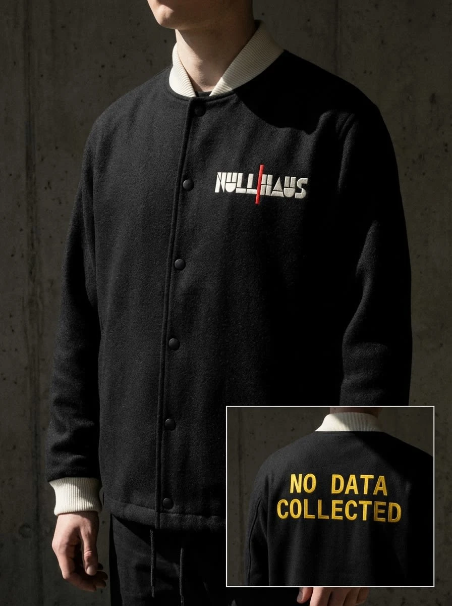
COACH JACKET
Black boiled wool, off-white ribbing at collar, cuffs, and waistband. Left chest: wordmark embroidered in white thread, red rule in red thread — two-color satin stitch, the jacket fabric visible through the letter counters. Back: NO DATA COLLECTED in Bauhaus yellow thread spanning the full back width. The jacket reads as a garment first, brand object second. It would be worn by someone who understands what the back says and wants others to read it.
CERAMIC MUG
Straight-walled cylinder — no taper, no decorative curve, diameter equal to height. Matte black glaze, absorbing light rather than reflecting it. Null square icon on the exterior: white square stroke, red circle stroke, centered. Interior: Bauhaus yellow — visible only when the object is in use. The warmth is earned, not displayed. Base stamp: NULLHAUS / NH-01 / NULL CERAMIC SERIES. The object is a collector's piece for people who understand what the icon means.
09 — CAMPAIGN PHOTOGRAPHY
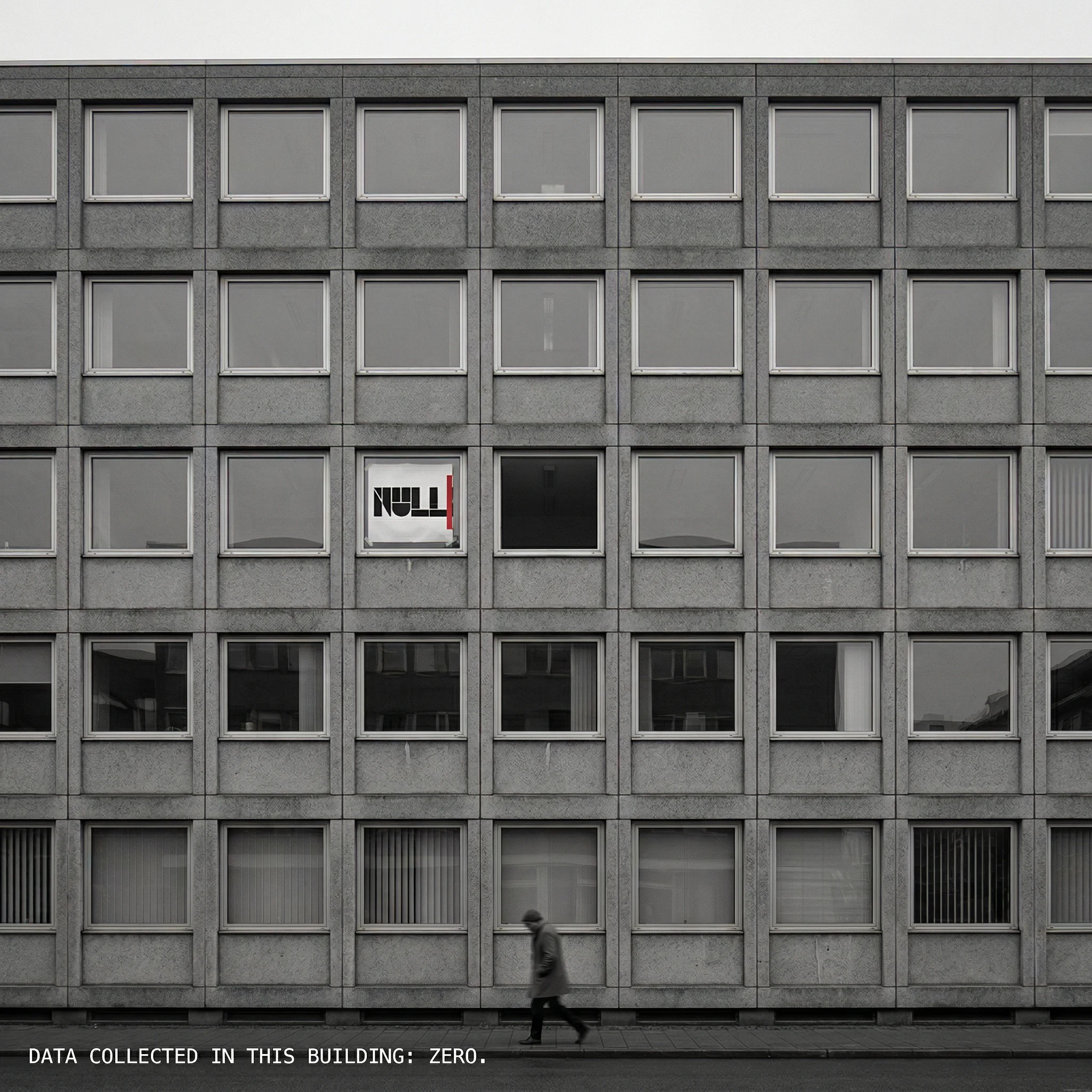
A mid-century concrete office building. Five stories. Regular grid of windows. Photographed with large-format flatness — desaturated, overcast, no atmospheric warmth. On the third floor, two windows from the left, a single A1 sheet of paper is taped to the glass from the inside. The Nullhaus wordmark, visible from the street. The paper has a corner lifting from the tape. It was not staged.
A blurred figure walks left to right at street level. They have not looked up at the sign. The sign does not need them to.
Caption superimposed at the lower-left in 10pt monospaced white: DATA COLLECTED IN THIS BUILDING: ZERO.
The photograph reads as documentary evidence. The brand appears in it the way a fact appears in a legal filing — without decoration, without context, without apology. The image could run unaltered in a design press feature. It looks like something that happened, not something that was made.
10 — KEY DESIGN DECISIONS
THE VOID AS MESSAGE
Every layout in the system contains deliberate empty space. The empty lower half of the manifesto poster. The empty black subway column. The empty right two-thirds of the homepage hero. The empty black panel in the dashboard. In the Nullhaus system, emptiness is not the absence of design. It is the design. The void communicates what the product does: it holds nothing.
RED AS BOUNDARY
Every appearance of #D72B2B in the system refers to the same thing: the line. The wordmark separator. The card footer rule. The conference booth floor-to-ceiling rule. The dashboard chart marker for today. The email header divider. The CTA band. Red is not a color in this system — it is a signal. It always means the same thing: here is where it stops.
YELLOW AS WEAPON
Yellow never appears as a passive background in calm contexts. The billboard is yellow because it is the most aggressive palette choice against grey urban infrastructure. The business card back is yellow because it must be noticed while demanding nothing from the reader. The mug interior is yellow because it is only revealed in use. The kit box interior is yellow because it is only revealed on opening. The warmth in this system is always earned. It is never given.
MONOSPACE AS PHILOSOPHY
The decision to set all body copy in monospaced type is not an aesthetic preference. In a monospaced system every character occupies identical space. There is no compression, no kerning, no optical adjustment made for visual elegance. Every letter is accounted for. Every data point is equal. The type is a ledger. This is what privacy architecture looks like at typographic scale.
THE DEBOSS PRINCIPLE
The developer kit box lid carries the wordmark as a deboss — pressed into the matte black stock without ink, visible only through the shadow its indentation casts in directional light. The mark exists as physical absence. Visible only in the right conditions, at the right angle, with the right light. The most powerful statement Nullhaus can make is one that leaves no trace.
11 — SYSTEM INVENTORY
LOGO SYSTEM
Wordmark — light on dark and dark on light
Separator — Bauhaus Red, singular in every composition
Null square icon — standalone mark, stroke only
Favicon — square only, circle dropped at 32px and below
PRINT
Manifesto poster — A1, dark version
Annual transparency report — 48pp, perfect bound
Developer onboarding kit — rigid lift-off box
Business cards — 90x50mm, two sides
Sticker sheet — A5 kiss-cut, six marks
Tote bag — natural canvas, Risograph two-color print
SPATIAL & OOH
Billboard — 14:3 ratio, Bauhaus yellow ground
Subway platform takeover — four columns, four colors
Conference booth — 3x3m, full spatial system
DIGITAL
Homepage hero — 1440px, off-white ground, final version
Analytics dashboard — dark mode, full UI system
Transactional email — welcome and onboarding
Social card — 1200x675, Bauhaus yellow ground
WEBSITE
Hero section — declaration, CTA band, trust bar
Problem section — industry indictment, no euphemism
Product section — what is measured, what is not
Architecture section — why there is no privacy mode
Integration section — one script tag, four sentences
What we don't collect — full dot-leader null table
Pricing — four tiers, no feature gates on privacy
Footer — brand position as statement of fact
APPAREL & OBJECTS
Coach jacket — black boiled wool, two-color embroidery
Ceramic mug — null ceramic series NH-01
CAMPAIGN
Hero photography — brutalist building, desaturated
Brand ident — motion still, frame 00:00:01:14
NULLHAUS — BUILT ON WHAT WE DON'T COLLECT.
Révolté / Brand Identity & Website / 2026
Like this project
Posted Apr 4, 2026
Nullhaus, privacy-first, cookieless analytics platform for digital products. Not something that looked trustworthy, but something that communicated a principle
Likes
3
Views
6
Timeline
Mar 23, 2026 - Apr 4, 2026