Overwatch League HQ (Concept) | Graphic Design
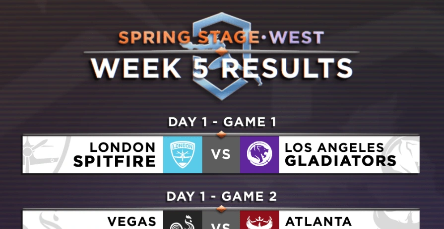
Matches Overview Graphic
My love for Esports and more specifically The Overwatch League and my love for design have always gone hand in hand. In the past I knew I wanted to create things for the league, whether officially or unofficially. This summer, I finally decided to create something, whether it would be seen or not.
The Process
Consistency
One of my main goals in all of my design work is consistency throughout a certain project I'm working on, and it's one of my favorite things to pay attention to. When creating the graphics for this project, I knew the consistency could consist of the team logos, as well as background colors. For example, using the color Purple to correlate the Western Region and Blue for the Eastern Region.
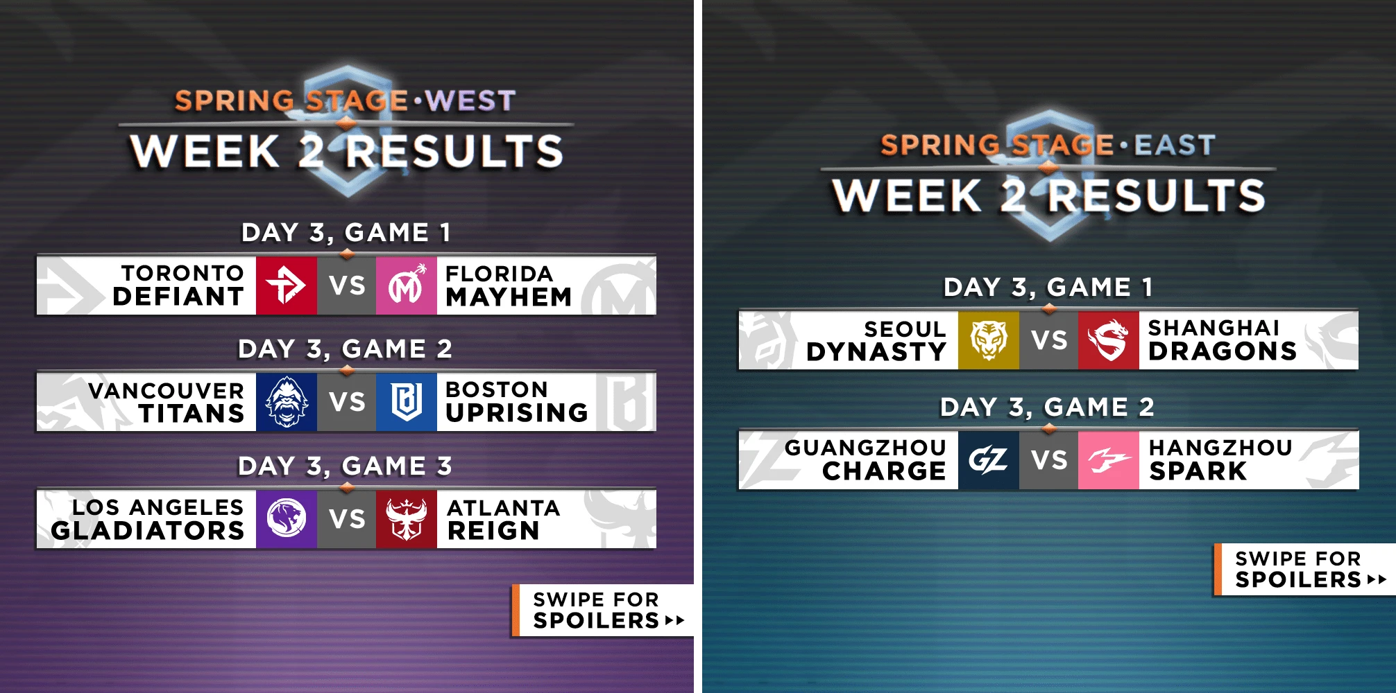
Matches Overview Graphic for the Western and Eastern region.
The same goes for the individual match results, using the color of the winning team to show behind the scoreboard. My goal was to make all the information easy to read, while still having as much relevant information for the match as possible, which includes map names as well as highlighting the score for each map. This also extends to showcasing each teams record, with both teams showing a 1-2 record.
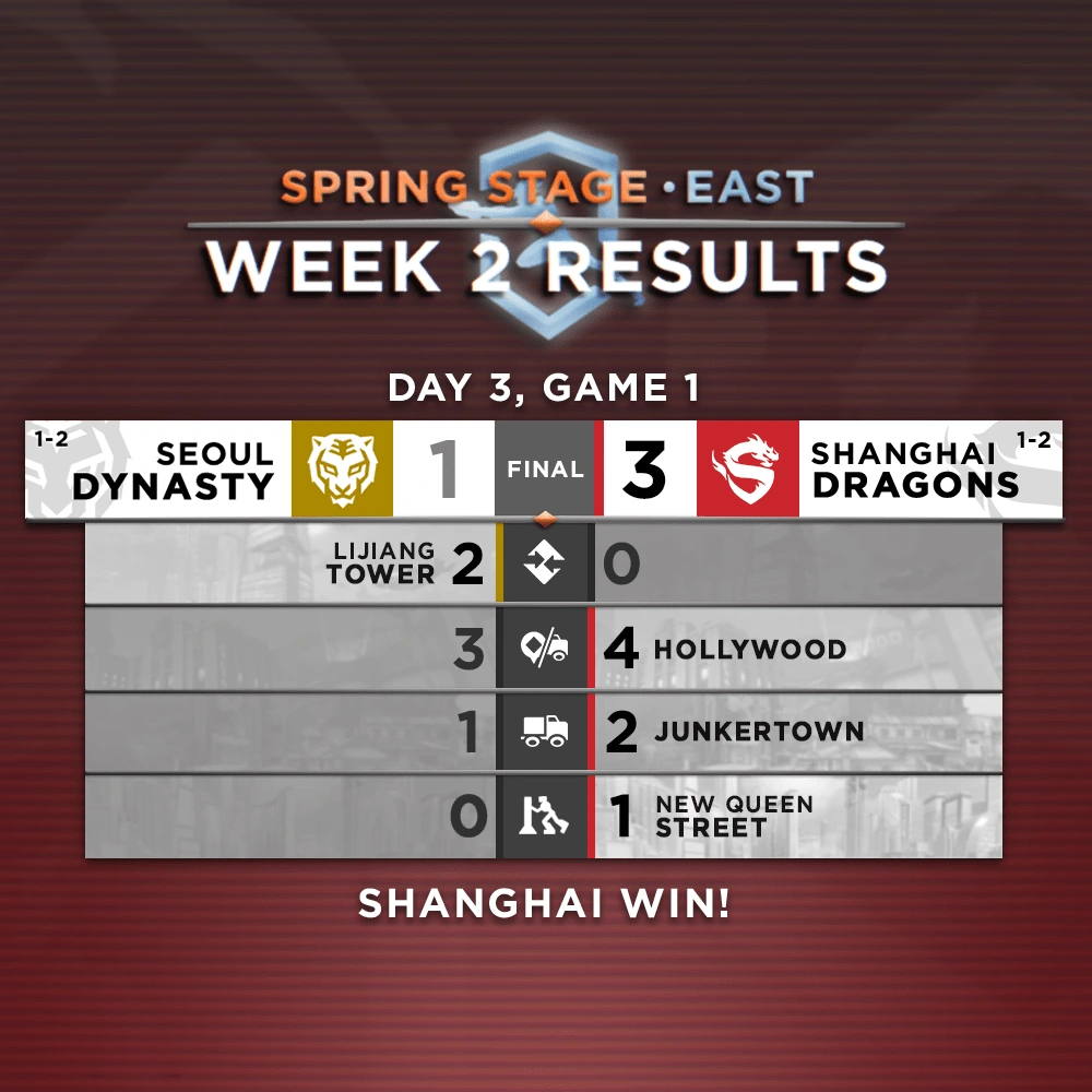
Game Results Graphic for the Seoul Dynasty versus the Shanghai Dragons.
Unique Visuals
Another goal for this project was to create visuals that are unique but still have that "Overwatch League" feel. That feel shows most in the Team of the Week animation, with the Player Cards animating in, revealing the player's name, role, team, as well as photo.
Team of the Week Motion Graphic, showing the best players from each role.
Like this project
Posted May 18, 2023
Graphics and designs that details upcoming Overwatch League matches, match results, team power rankings, and more.
