Lume & Lather: Botanical Brand Identity & Web Design
Victoria Whitlinger
Goal & Target Audience
The goal was to establish a high-end, cohesive digital storefront and brand identity for an artisanal skincare and botanical candle brand. The landing page needed to blend responsive layout design with an elegant, immersive visual storytelling experience that drives product discovery and collection shopping.
Target audience: Conscientious consumers who view skincare and home ambiance as sensory rituals. The ideal customer values premium, handcrafted botanical ingredients, clean luxury, and aesthetic home goods that offer a "ritual for the senses."
Brand Identity Decisions
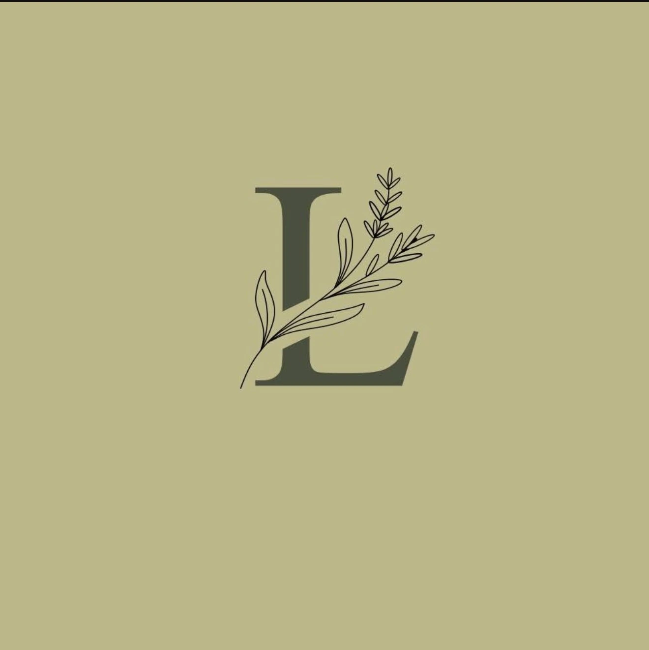
Botanical Direction: Inspired entirely by the raw, natural ingredients of the products (botanical skincare, sea salts, amber, earth). The visual identity needed to feel organic yet sophisticated, bridging raw nature and luxury retail.
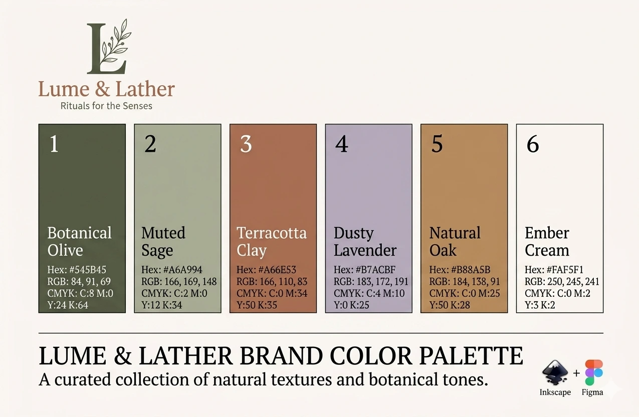
Color Palette: A highly curated, calming, organic palette. Earthy muted sage greens, warm terracottas, and soft cream backgrounds establish an immediate sense of artisanal luxury and tranquility.
Lume & Lather color palette and brand identity
Typography: A sophisticated high-end serif typeface for headers (like "Rituals for the Senses") to communicate heritage and premium quality, paired with a clean minimal sans-serif for body text and navigation for effortless readability and a modern edge.
Web Design Approach
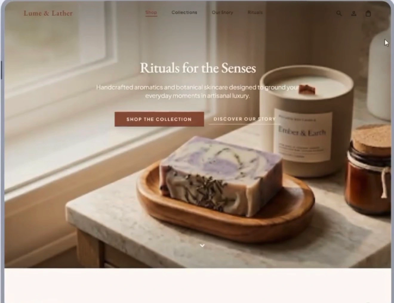
The landing page utilizes a balanced grid that contrasts text-focused minimalism with rich, high-resolution product photography blocks. The structure guides the user from overarching brand philosophy directly into product curation.
The Sensory Hero Section: A striking, full-bleed hero banner with warm photography, high-end typography, and dual call-to-action buttons ("Shop the Collection" and "Discover Our Story") to instantly capture the brand's premium identity.
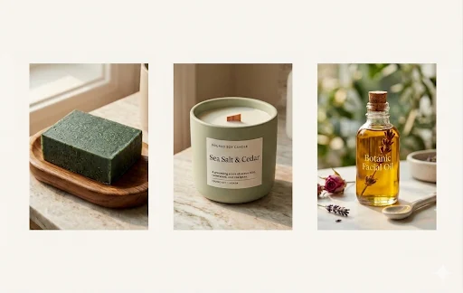
Integrated Product Storytelling: Product groupings (soaps and candles side-by-side) paired with background narratives, carrying the botanical identity seamlessly through the entire user scroll.
Product lifestyle photography
Product detail shot
Brand identity and layout overview
Site Walkthrough
Tools & Process
Figma: Primary design ecosystem for wireframes, visual hierarchy testing, and locking in the UI/UX flow.
Inkscape: Vector asset refinement and logo reconstruction, ensuring custom brand icons and typography vectors were perfectly crisp and scalable.
Stitch: Conversational AI building platform used to rapidly generate responsive structures and orchestrate complex motion design.
Challenges & Pride Points
The Creative Friction Challenge: A major highlight was navigating Stitch's AI-based conversational editing. Relying on prompt-based commands for positioning rather than direct manual element manipulation presented a distinct learning curve for pixel-perfect adjustments.
What I'm Proud Of: Mastering that communication style with the platform to deliver a high-fidelity, fluid layout. Overcoming that "creative friction" unlocked the tool's rapid prototyping and motion capabilities, resulting in a finished layout where every element feels completely dialed in.
Like this project
Posted May 31, 2026
A high-end brand identity and responsive landing page for an artisanal skincare and botanical candle brand, blending organic visual storytelling with premium typography, curated product photography, and scroll-driven product discovery.
Likes
0
Views
8