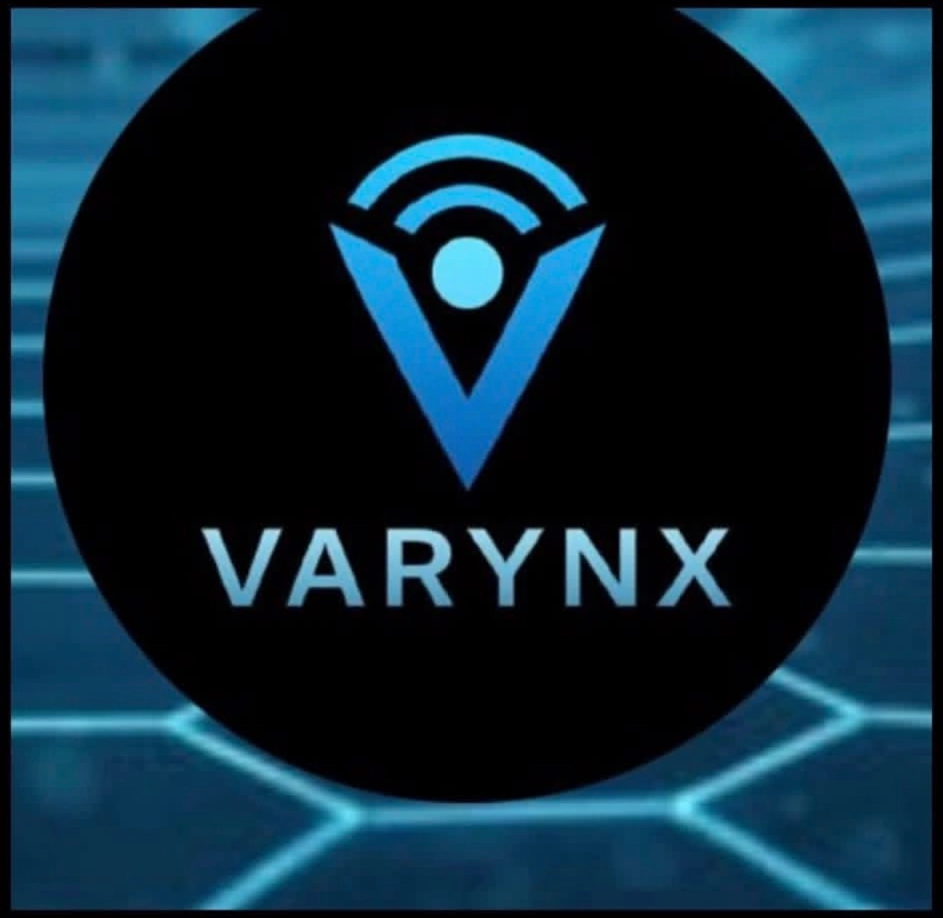
VARYNX Logo & Brand Identity
Victoria Whitlinger
The Brief & Rebrand Need
The original VARYNX branding was built on a simpler, minimal infrastructure that lacked the visual weight and authority required for a competitive cybersecurity product. It felt more like a utility tool than a premium, cutting-edge security platform.
To match the evolution of the application, the identity needed an overhaul to establish immediate trust, communicate enterprise-grade security, and command attention in a crowded tech market. The goal was to pivot from a basic setup to a highly professional, high-fidelity brand presence.
Creative Direction
The Cyber-Neon Aesthetic: We landed on a high-fidelity "Cyber-Neon" dark mode aesthetic to mimic the environments where security professionals actually work.
The Inspiration: The direction was inspired by modern command centers, glowing terminal interfaces, and clean, high-contrast digital architecture. By pairing a deep, premium dark background with vibrant, glowing neon accents, the aesthetic immediately signals advanced tech, real-time monitoring, and modern digital defense.
Logo Design Process & The Final Mark
Concept Exploration & Iterations: The exploration phase focused heavily on themes of protection, connectivity, and structural integrity. Early iterations played with abstract tech shapes, but they felt too generic for a specialized security platform.
AI-generated concept vs. hand-rebuilt vector mark
Why the Final Mark Works: The final logo mark strikes the perfect balance between a sleek, modern tech emblem and a protective shield. It features sharp, geometric lines and a commanding structure that represents an impenetrable barrier. The precise, calculated symmetry of the mark gives it a highly disciplined, engineered feel that is absolutely essential for a security product.
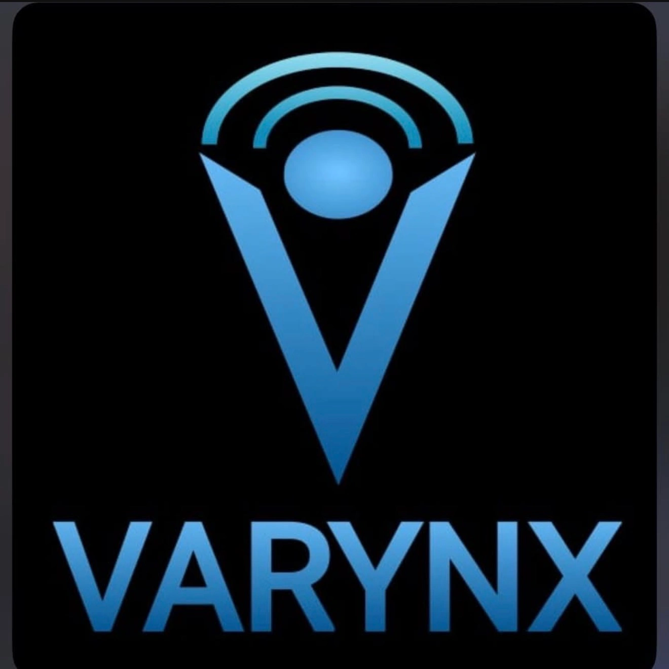
Final VARYNX logo mark
Brand Identity Elements
Color Palette: The palette is anchored by an ultra-premium, deep dark mode background to ensure high contrast. This is paired with vibrant cyber-neon accents (sharp, glowing blue and electric green) to draw the eye to critical interactive elements and navigation points.
Typography: We utilized a crisp, modern, geometric sans-serif typeface. The clean lines and wide tracking of the typography communicate stability, high technical efficiency, and modern sophistication.
Tools & Inkscape Workflow
Inkscape was the absolute workhorse for the actual logo remake and asset construction. I used Inkscape's powerful vector path tools to sketch, refine, and reconstruct the geometric logo mark from scratch. I relied heavily on the grid locking and alignment features to ensure absolute mathematical symmetry across every line and angle. Inkscape was also used to execute the final node editing and export perfectly clean, crisp, and scalable SVG assets that imported flawlessly into the web builder platform.
Outcome & Website Integration
The new identity was an instant hit, providing the exact authoritative, professional, and premium look the product deserved.
The new visual identity seamlessly carried over into a full-scale website migration. The clean typography, cyber-neon accents, and structured vector assets were used to anchor a responsive, high-fidelity landing page. By pairing the new logo with smooth, scroll-triggered text reveals and dynamic asset animations, the finished build feels incredibly snappy, modern, and perfectly dialed in.
Like this project
Posted May 15, 2026
A complete brand overhaul for VARYNX, transforming a basic utility-tool identity into a high-fidelity 'Cyber-Neon' dark mode brand with a custom geometric logo mark, neon accent palette, and scalable vector assets built entirely in Inkscape.