Everything App –– Mobile app design
⚫ Overview
the everything project is building the foundation for a new, circular economy, starting with what’s already in front of us: the things we have, the things we want, and the things we throw away. By collecting this data into an easily-queryable data source, we can transform the internet and create real, tangible change.
✦ About everything app
The everything app is designed to be your personal mobile tool for participating in the new economy. It will help you create an inventory of tangible items and eventually expand to securely store all kinds of personal data, created, managed, and owned solely by you. This data can be used across an ecosystem of applications, marketplaces, and services.
✦ Project goal
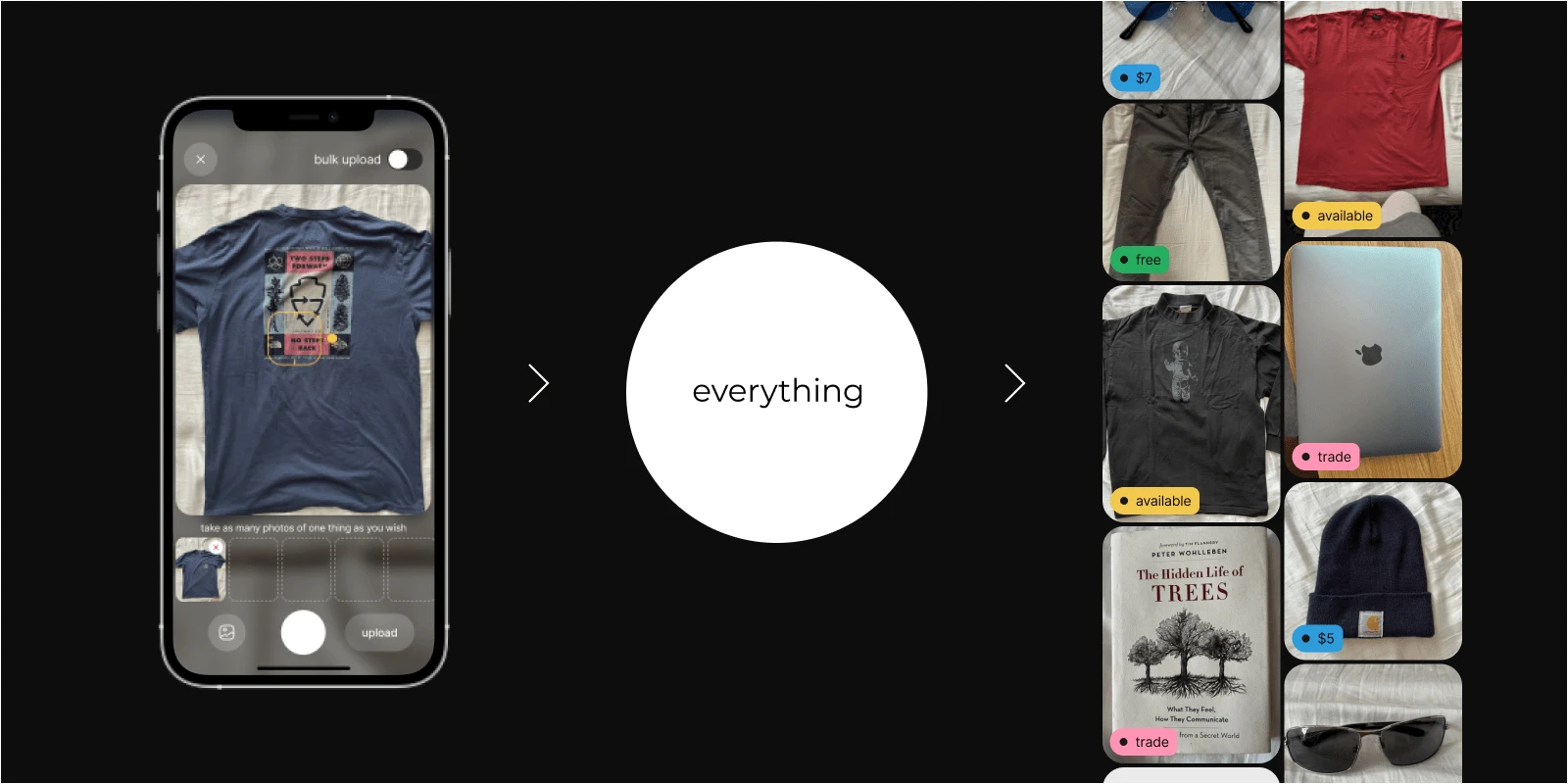
Make it easy for users to participate in the new circular economy by allowing them to upload and manage their personal data. Focus on making sure that uploading things into the app is as simple and straightforward as possible.
💡The initial idea was to use image recognition technologies to gather information from uploaded photos and have user only confirm or edit the description. But due to technical restrictions at the time, it was decided to start with basic manual upload and description flow.

🔍 Research
My research of competitors began with second-hand marketplaces such as
Facebook Marketplace, Depop, Mercari, Poshmark, and OXL. However, they were not suitable for inspiring neither the thing upload, nor the thing description flow. The most relevant inspiration appeared to be Pinterest, “outfit picker” type apps and notes apps.✦ “Describe a thing” survey
To understand how people would describe their things, I conducted a short survey. I gave participants a general idea of the flow and asked them to describe five items they would want in their inventory. Results showed that participants were almost evenly split:
half provided detailed descriptions, breaking down the item into property-value bullet points, and the other half simply gave the item name and colour. To accommodate both types of users, we had to find a solution that would encourage any type of behaviour: allowing people to include more details without pressuring others into filling huge forms.

🪄 Design
✦ App architecture
I created a diagram showcasing main app sections and how they are connected.
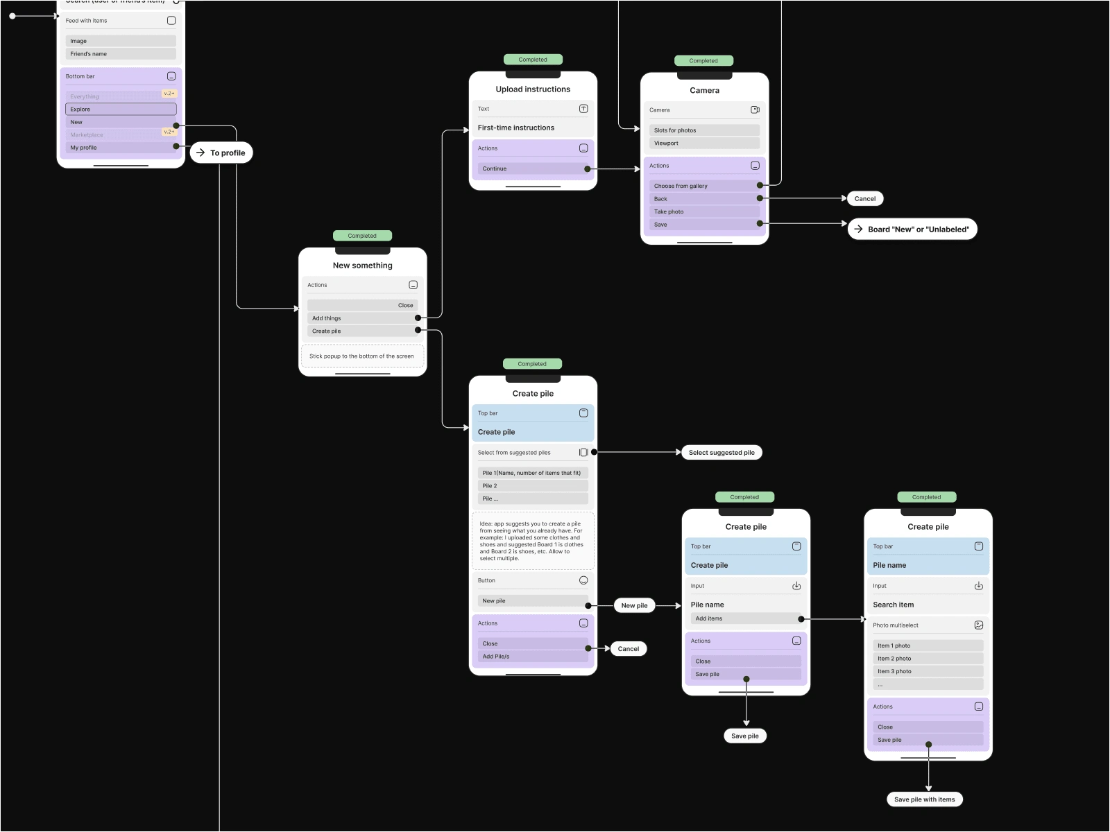
Small part of architecture diagram showing first ideas for "Create" flow
"Upload thing" flow was the most important in the whole design process, so it took a few iterations to make it perfect.
✦ Lo-fi wireframes & clickable prototype
I continued by creating low-fidelity wireframes and a clickable prototype that I used for usability testing. This helped me validate the user experience and ensure that the app met the user's needs and expectations.
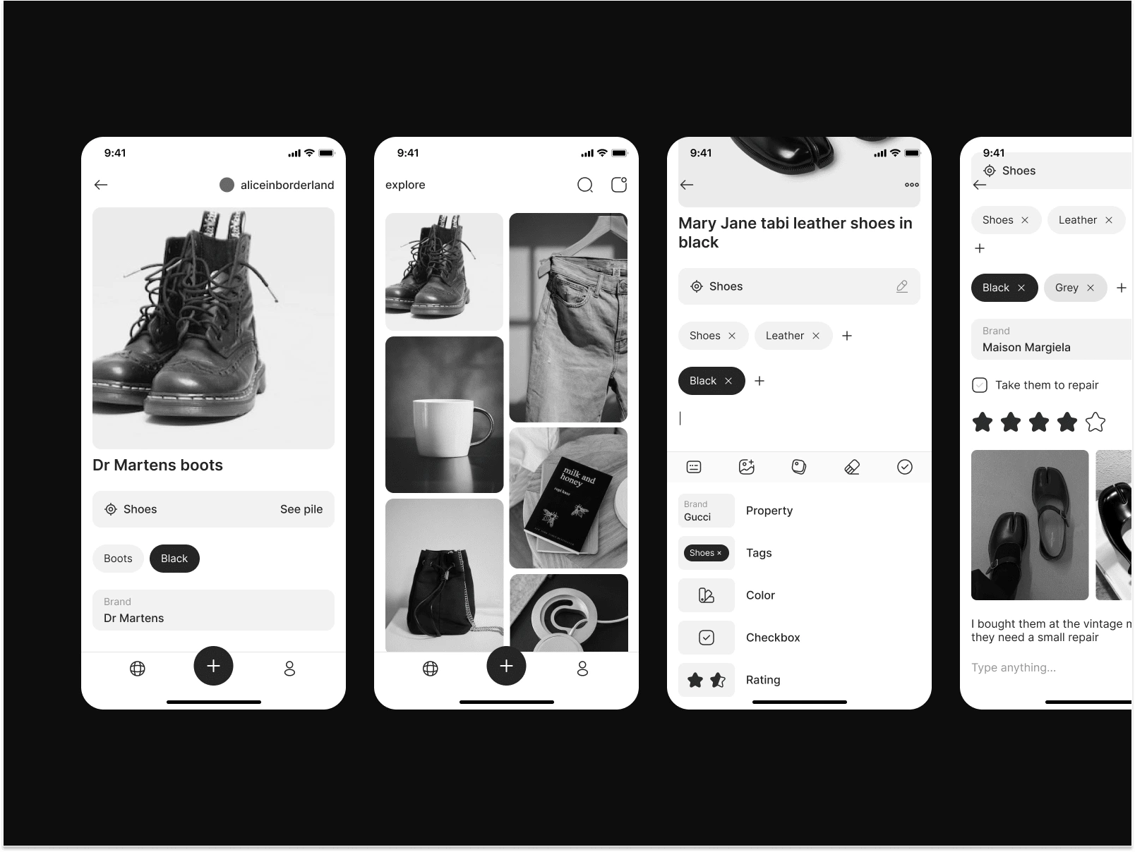
Wireframe examples
Wireframes. Preview of a thing upload flow.
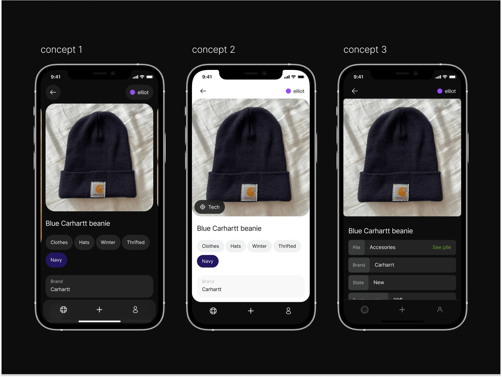
✦ UI Concepts
I designed a few UI concepts for the app and eventually, we ended up combining the best ideas out of every one to create the final concept.

⭐ Results
Upload thing
Users can upload one thing and describe it immediately or upload multiple things that fall under the same category and apply the same template to all of them. The flow was changed after the usability test of lo-fi prototype, as most users were confused about templates and I added this step here to introduce them early with instruction.
"Upload thing" flow prototype.
Edit thing / Add description
The app allows users to provide detailed information about their things, such as:
properties
colors
additional photos
geomarks
title
text description
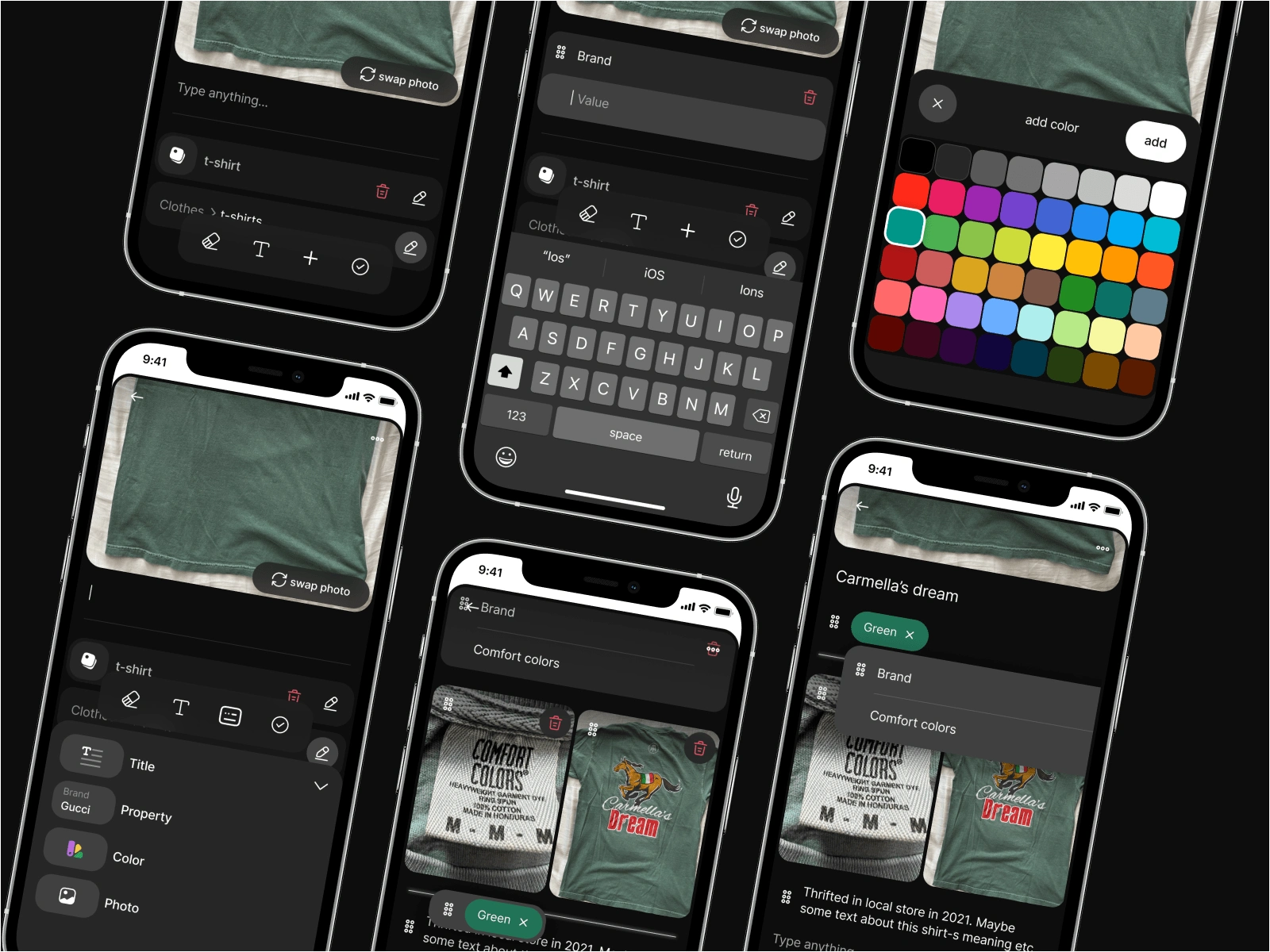
Screens from "Edit thing" flow
Collections & Groups
Users can create collections from their things for more convenient storing.
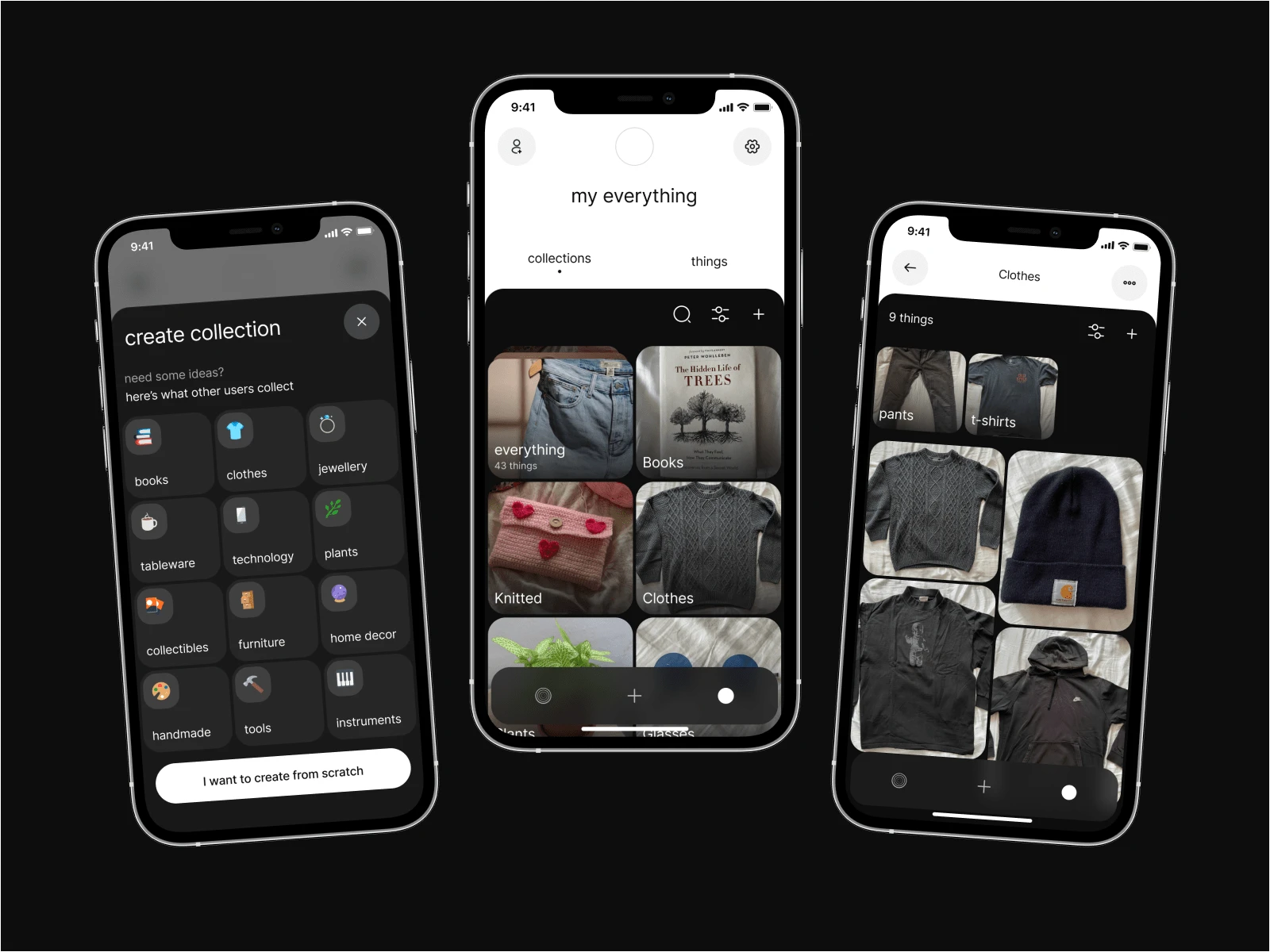
Screens from "Collections" section
Publish thing
Users have the option to publish their things to the Everything Marketplace, where they can either give it away for free or "auction" it, with other users suggesting a price. More options are planned to be added soon, including "for sale", "trade" and "rent".
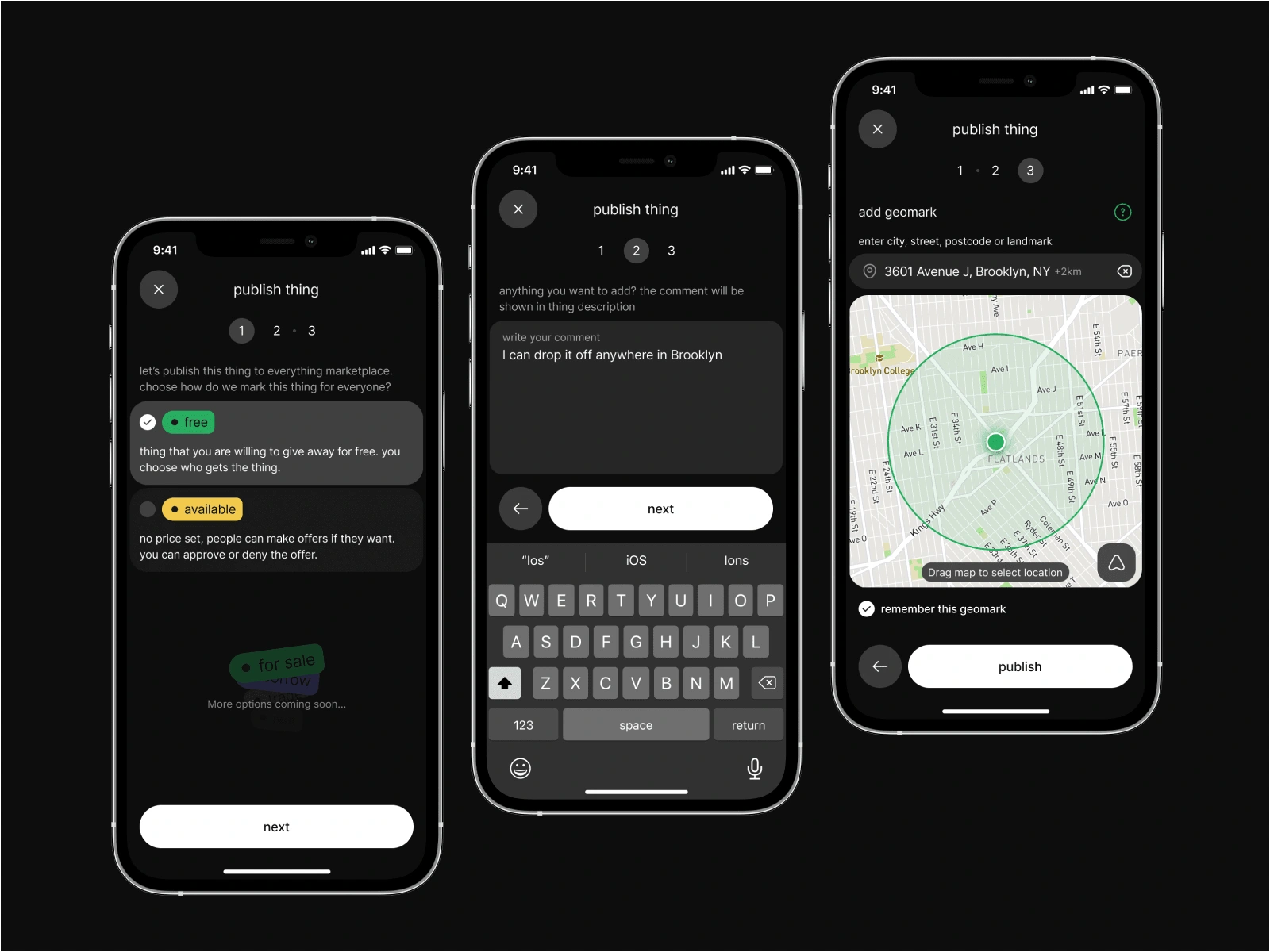
"Publish thing" flow
Explore things / Search
The published things can be discovered through the explore tab in the app. Users can search for a patriculat thing and can filter search results by location, category, and properties included in the thing's template.
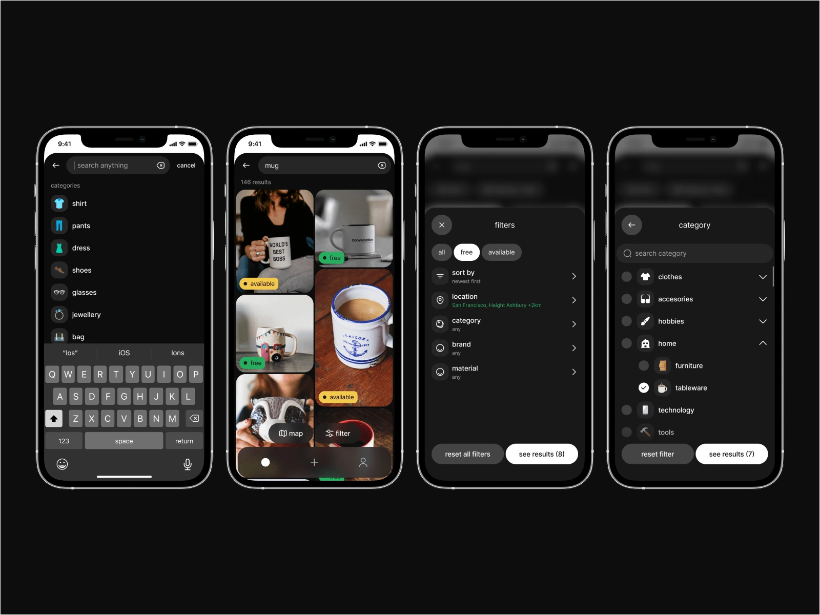
"Search" flow
Users can either browse through a feed of photos or find things close to them on the built-in map.
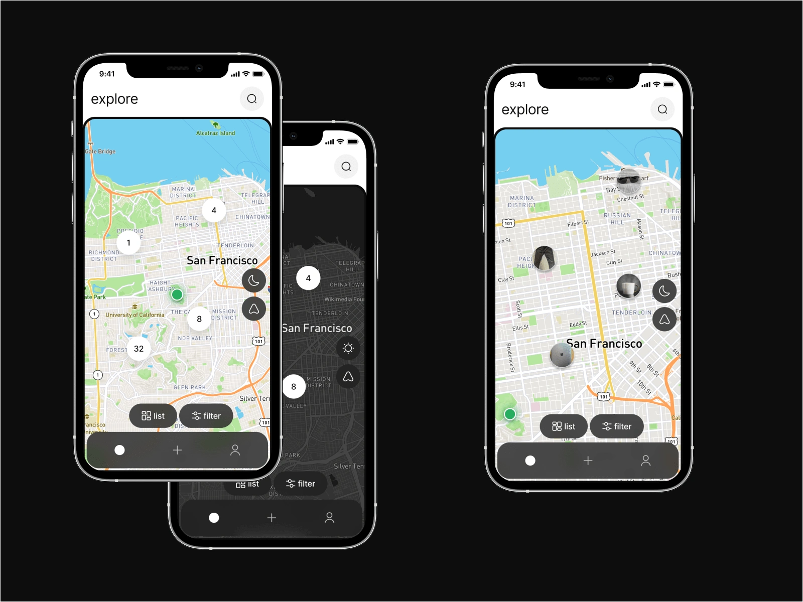
Built-in map
Design system
I organized all designed screens into sections and flows wil annotations.
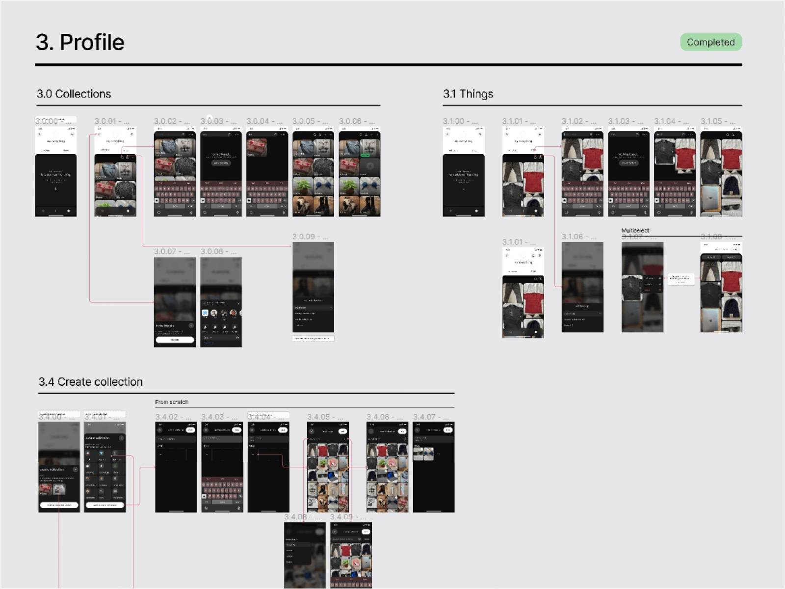
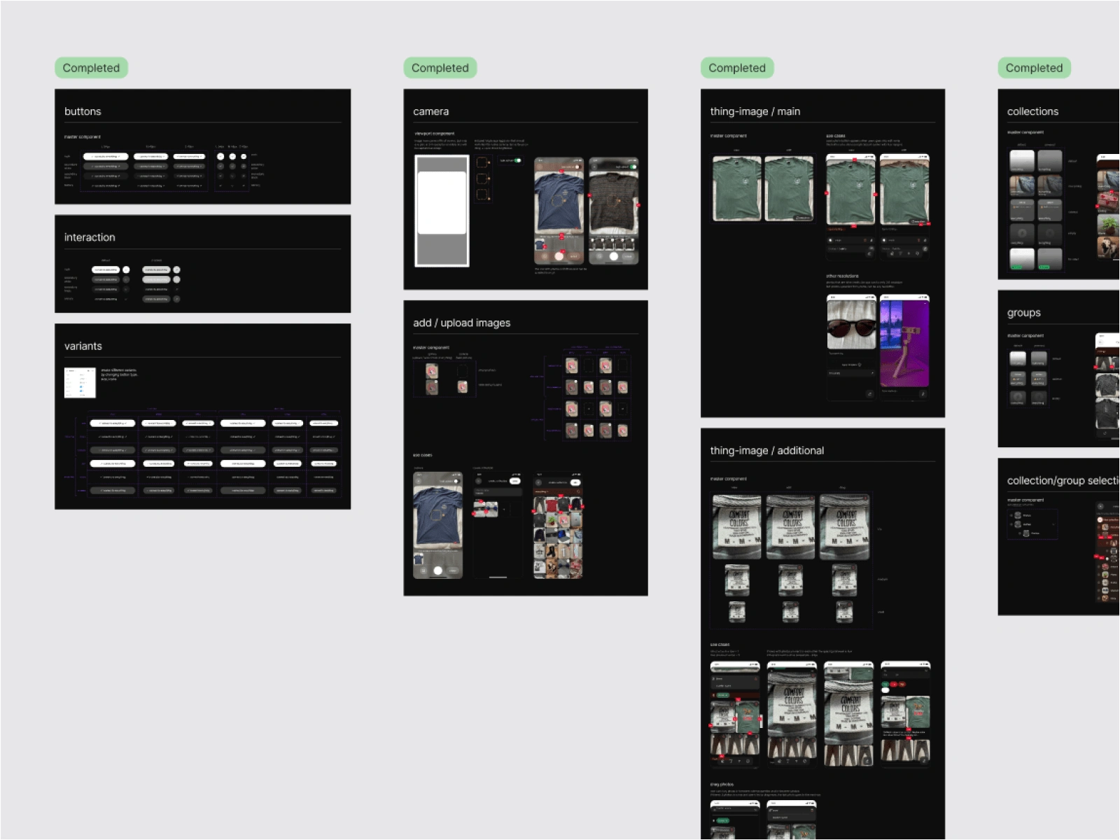
Additionally, I created a design system of components with guidelines on how to use them, ensuring that the design is consistent throughout the app.

Review
My client - Elliot - trusted me with a lot of creative freedom and was very open to my ideas. This made it easy for us to work together and find the best solution. We both had a great understanding of each other, and this helped me to achieve the best result.
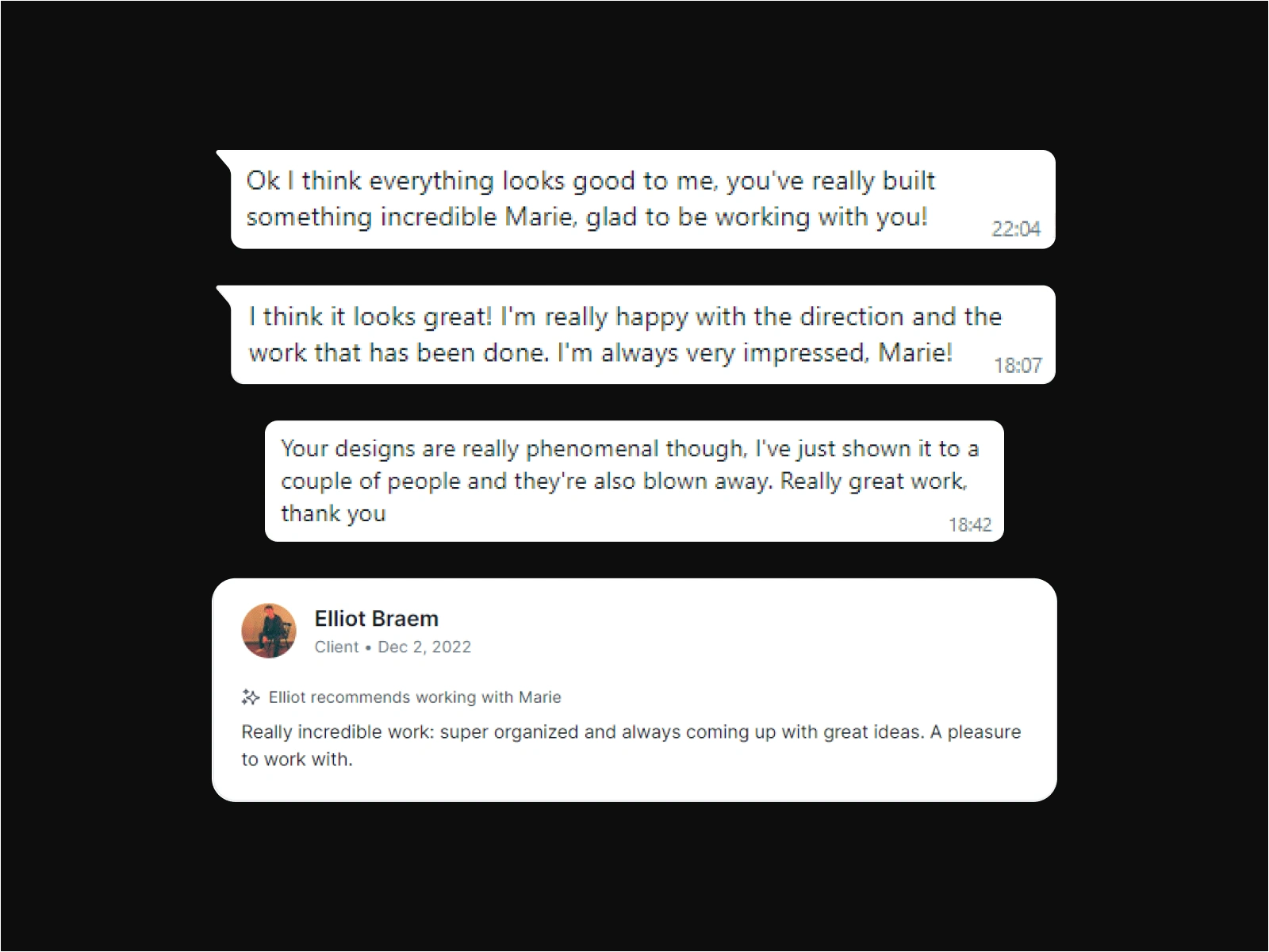
Elliot's feedback to my work from our chat (posted with his permission, of course)

Outcome
The app is currently under development and the MVP (minimum viable product) is expected to launch early spring. This MVP will include the inventory and things upload feature, and the next update will introduce more features, such as the marketplace, the ability to share things and profiles via links, and more privacy settings.
After the MVP launch, we will conduct more detailed usability tests and user interviews to continue improving the app to bring the best experience to our users.
Project timeline:
2,5 months or 300+ hours (from discussion to full UI design showcased in this project)

Like this project
Posted Feb 11, 2023
Digital personal inventory app. Securely store all kinds of personal data, created, managed, and owned solely by you.
Likes
56
Views
3.4K
Timeline
Dec 5, 2022 - Dec 22, 2022
Clients

everything
