Incari Studio - 371 icons drawn for their target size

Dariusz Frączyk

A custom icon set makes sense when an application needs a visual identity of its own. In a feature-rich application with many panels and controls, a shared visual language helps every view feel part of the same product.
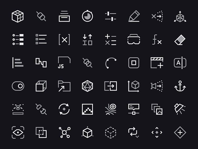
I drew 371 icons for Incari Studio. Each size uses a golden-ratio construction template, from 16 to 64px.
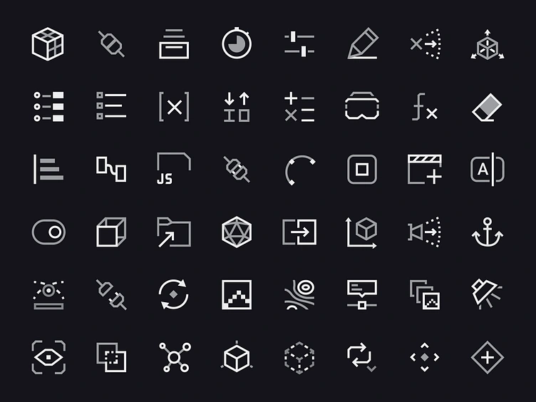
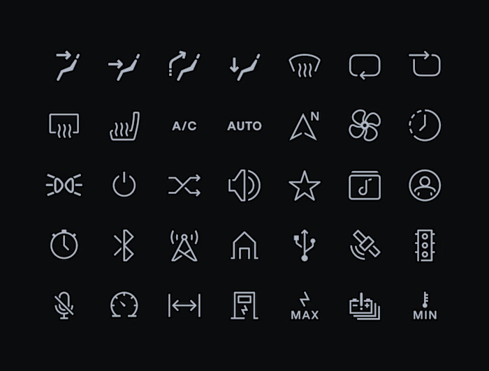
Incari Studio icon set
Both paths use the same colour token, with one at 60% opacity and the other at 95%. Changing that token recolours the whole icon while preserving its two-tone appearance, including when applying semantic colours.
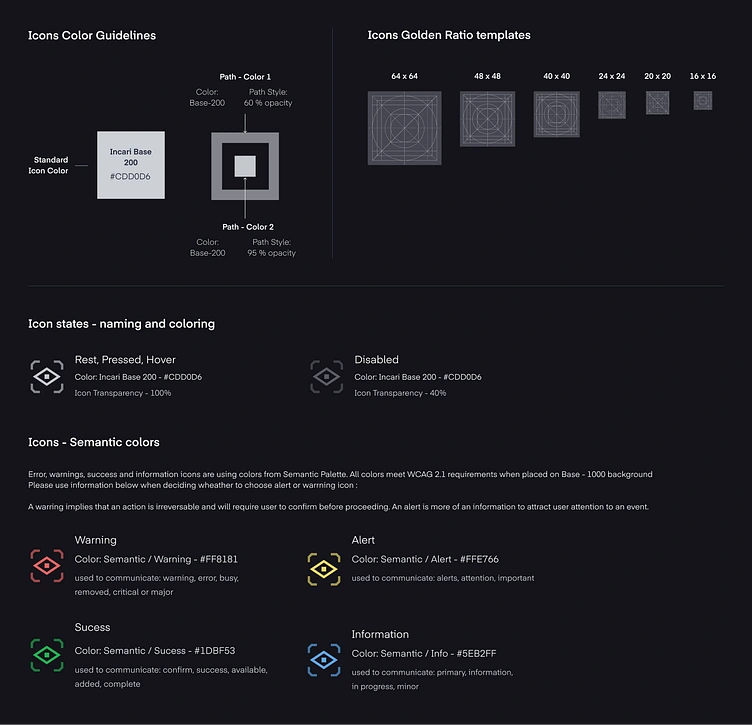
Icon construction templates and colour rules
Rest, pressed and hover keep the icon at 100% opacity. Disabled reduces the whole icon to 40%, preserving the relationship between its two tones.
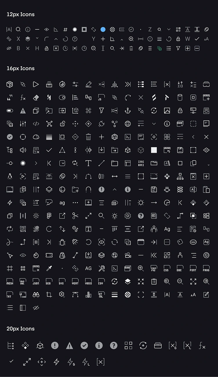
Incari Studio 16px icon set
Need an icon system for a product interface? I'm open to new projects.
Full case study: https://fraczyk.design/work/incari-studio-interface
Like this project
Posted Oct 13, 2026
I drew 371 icons for Incari Studio, using golden-ratio construction templates from 16 to 64px. One colour token recolours both paths while preserving their two-tone appearance.
Likes
0
Views
5
Timeline
Oct 1, 2022 - Sep 30, 2023