
Close Cycle. A warm mark for a cold category.
Close Cycle is an online provider of AI automations for lead generation. The name already holds the idea: in sales, to close means to win the deal, and a cycle is something that keeps running. The brand needed one mark that could carry both.
AI automation brands tend to look alike: dark interfaces, neon gradients, circuit lines, a promise of speed. I went the other way and treated the identity less like software and more like a quality object.
The mark
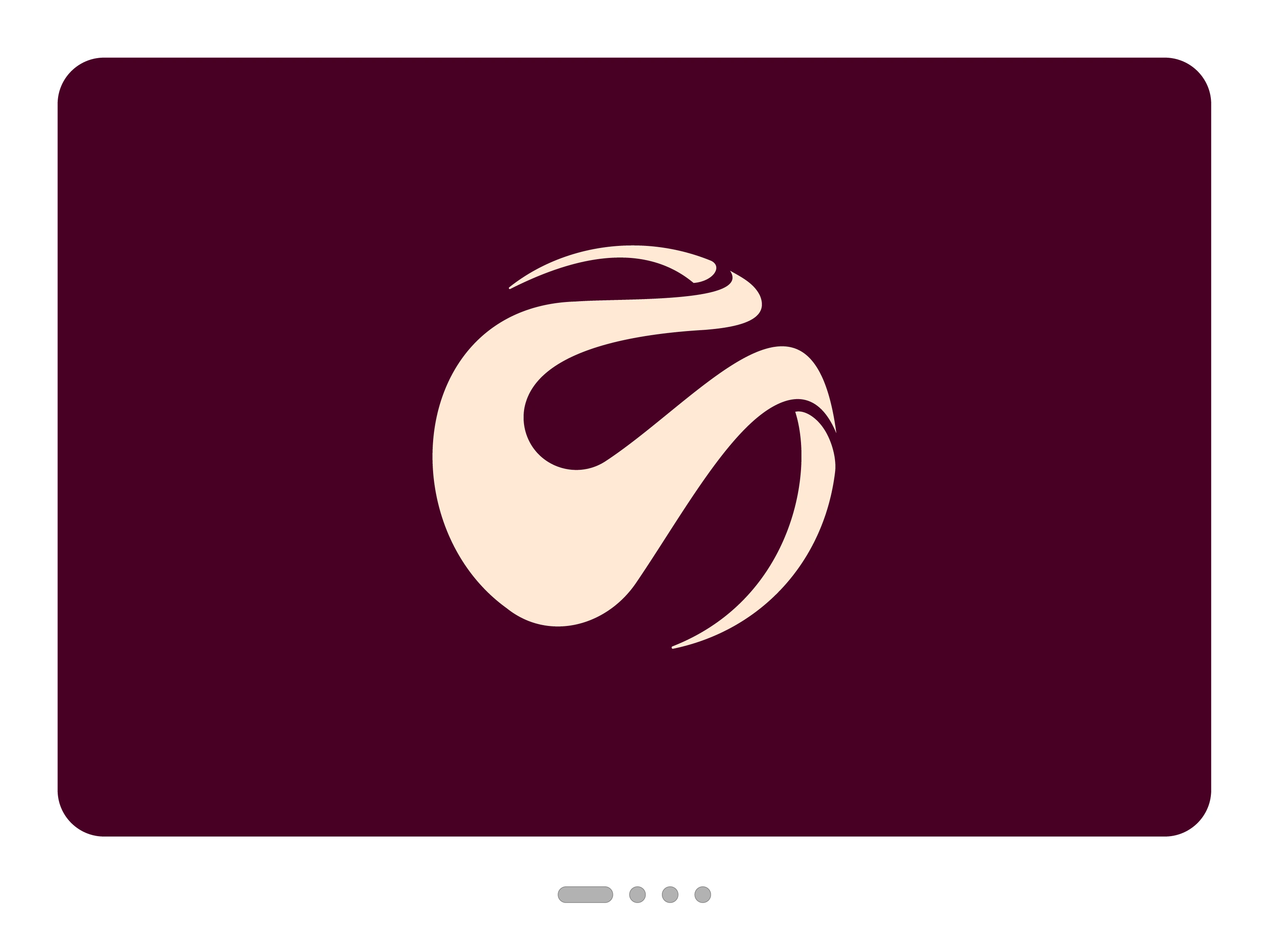
The symbol is a circle that is never fully drawn. You complete it yourself from three separate forms, so the name’s idea happens in the eye of the viewer.
One dominant form. A heavy body swells from a fine point into full weight, then pulls away in a long diagonal. It has the contrast of a brush stroke, with almost no line of even thickness.
Two thin crescents. They trace the outer edge at the top and lower right and taper to hairlines. Next to the mass of the main form, they make the whole mark feel light and in motion.
Negative space as drawing. The teardrop-shaped counter is as carefully built as the forms around it. Narrow channels separate the parts without breaking the circle.
There are no straight edges in the symbol. Everything is curve and tension, so it seems to turn even when it stands still.
The wordmark
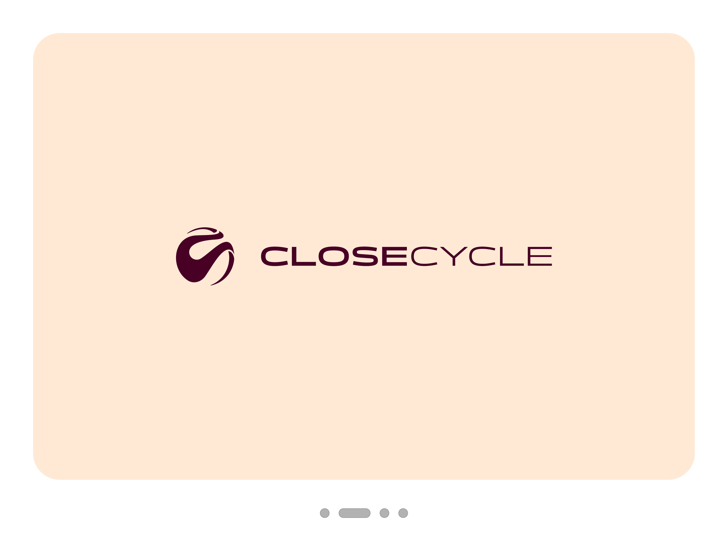
CLOSECYCLE is set as one word in wide, extended capitals, a calm horizontal counterweight to the round, organic symbol. Weight alone divides the name: CLOSE is bold, CYCLE is light. It reads like one movement in two phases, from force to ease, and needs no space, hyphen or second colour.
The colour
Deep bordeaux #480025 and warm beige #FFEAD5. Nothing else. Bordeaux has the depth of black with more warmth, and it brings a sense of value that is rare in tech. Beige replaces clinical white and makes the contrast feel soft without losing strength. The two also switch roles easily, so the mark works equally well light on dark and dark on light.
The path there
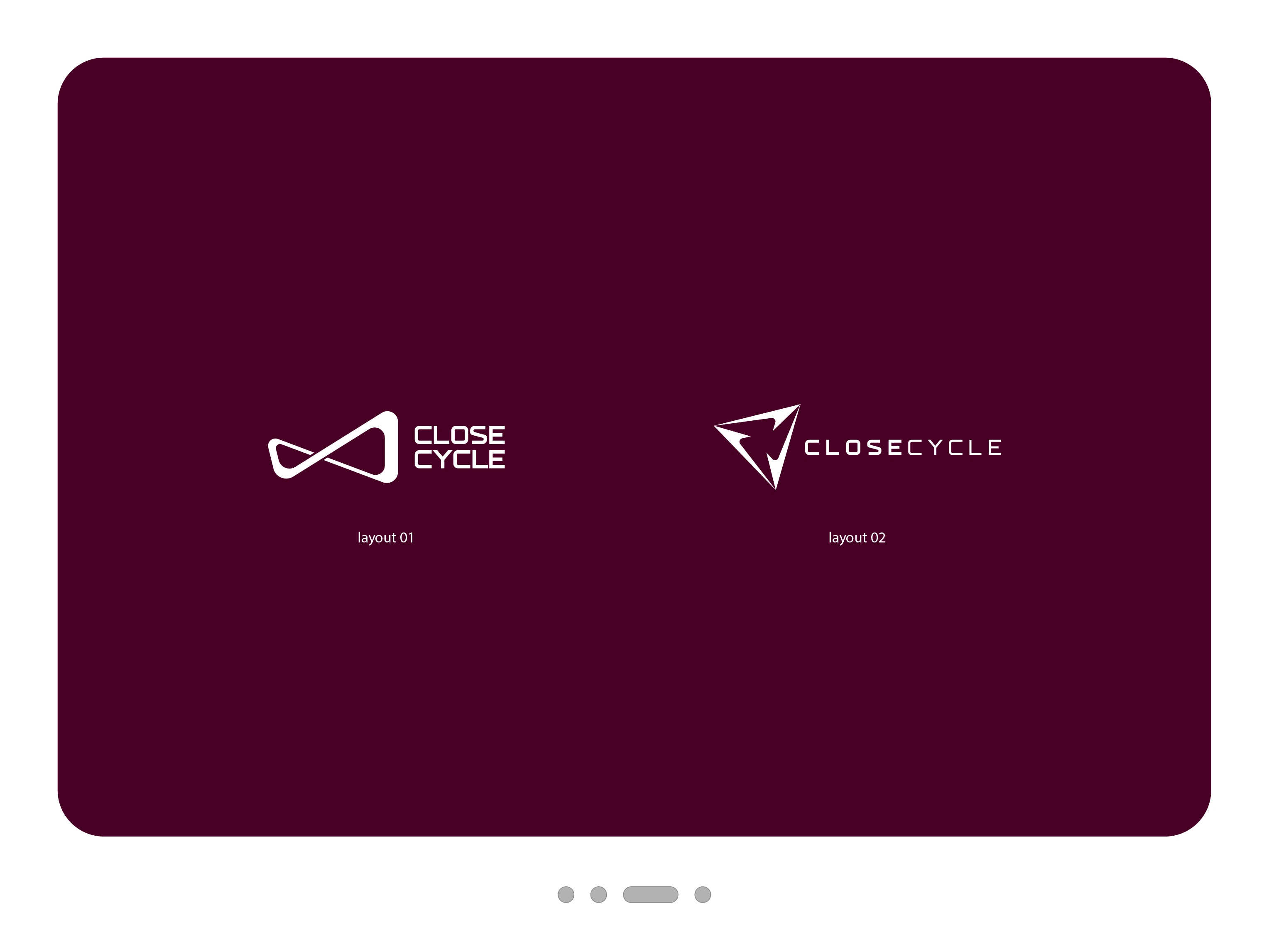
Two earlier routes explored a triangle and an infinity loop, shown here as drafts. The loop said “cycle” most directly. The final round mark says it with fewer words, and leaves the last step to the viewer.
The result
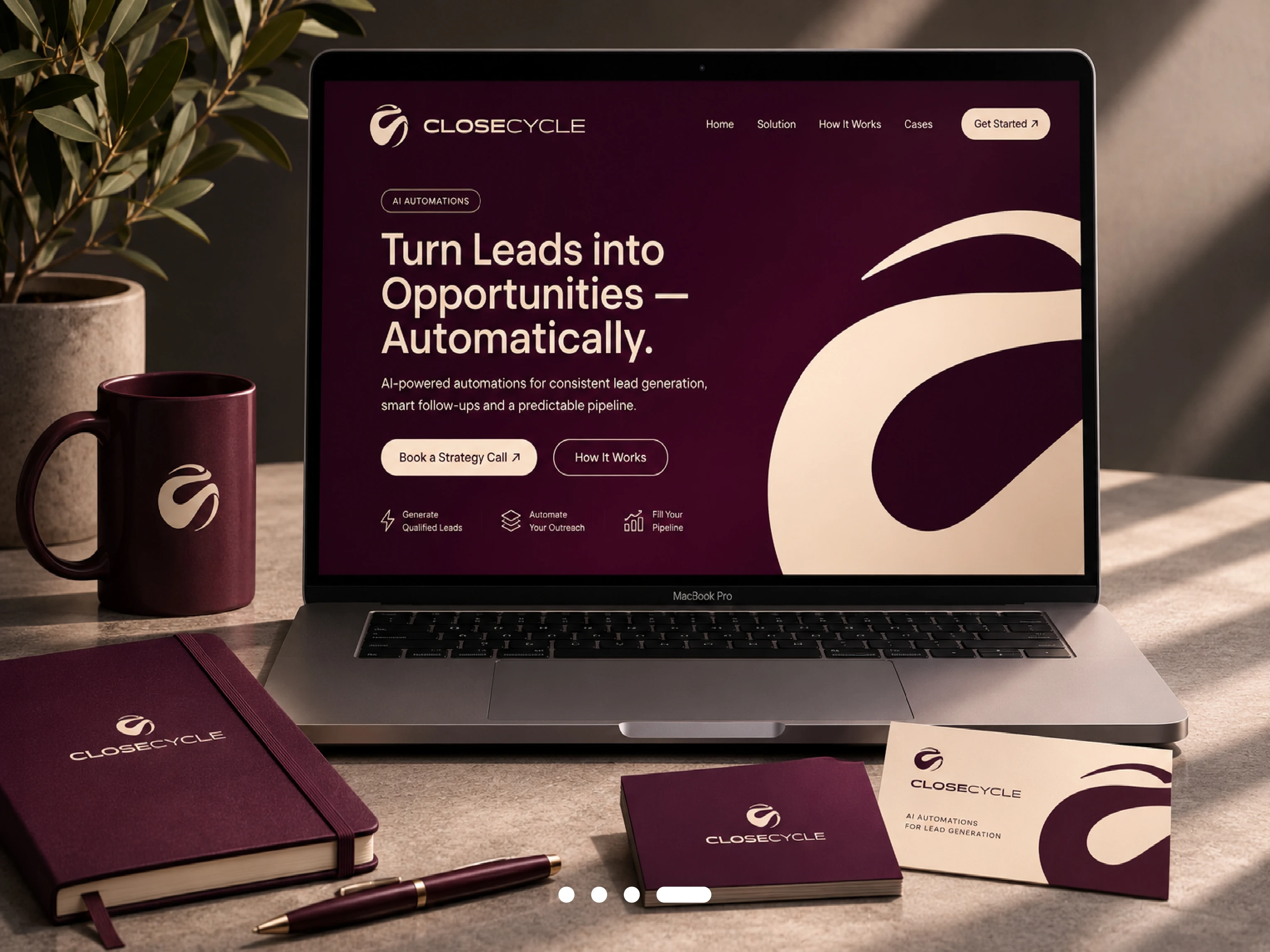
A logo system of symbol, wordmark and combined logo in bordeaux, beige, black and white, plus favicons for small sizes.
0 likes · 1 view · Nov 4, 2026
Close Cycle. A warm mark for a cold category. Close Cycle is an online provider of AI automations for lead generation. The name already holds the idea: in sa...
