
Concrete Coffee Roasters. A mark that changes state.
Concrete is a specialty coffee roastery in Neckarstadt West, one of Mannheim’s most urban districts. The name sounds like an odd fit for coffee, until you look at what the two materials go through.
A solid bean becomes a liquid cup. A liquid mix becomes solid concrete. Both move between states as they are prepared, and both are defined by pressure: coffee is extracted under it, concrete is built to withstand it. That shared change of state became the core idea of the identity.
The mark
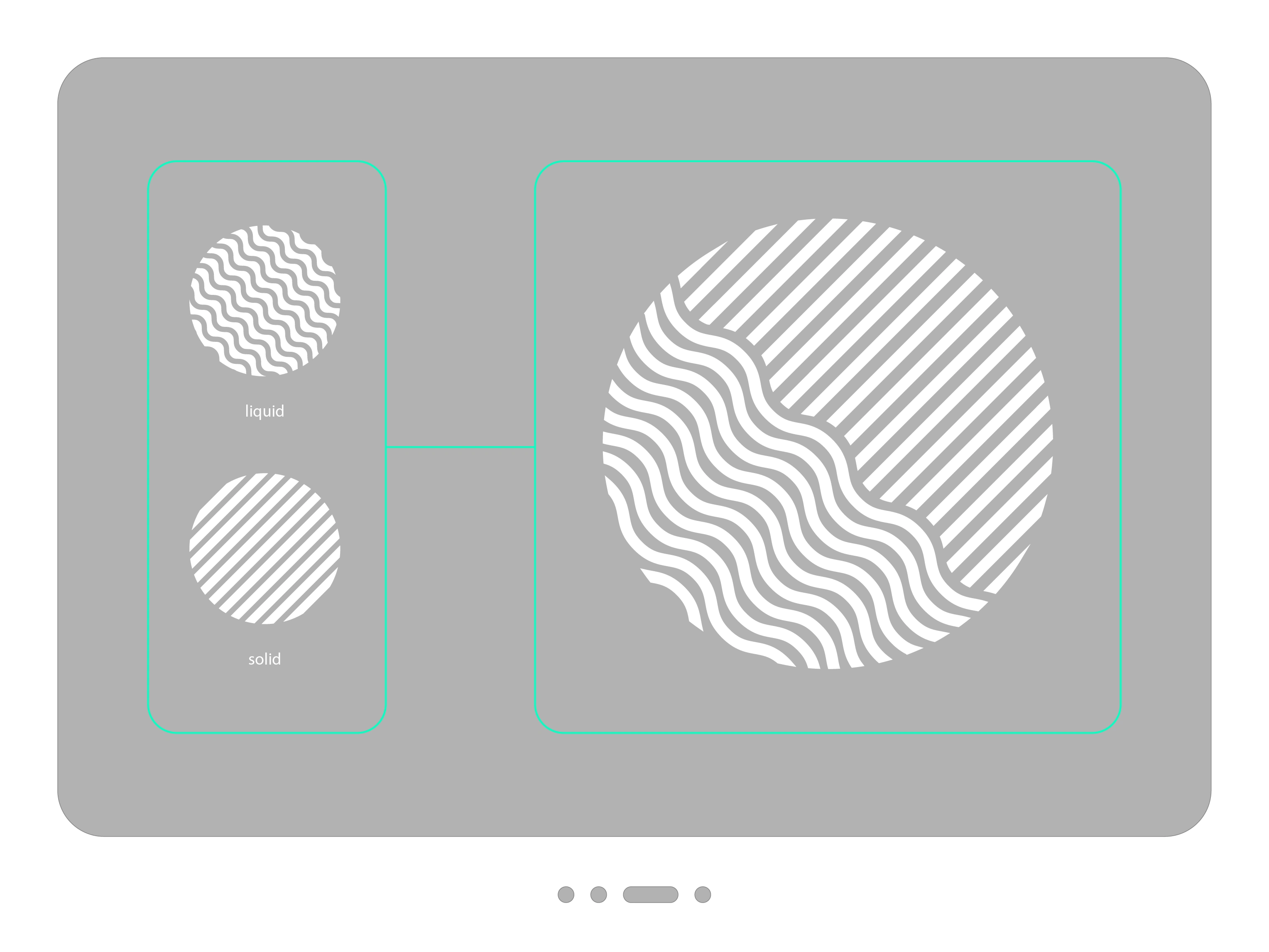
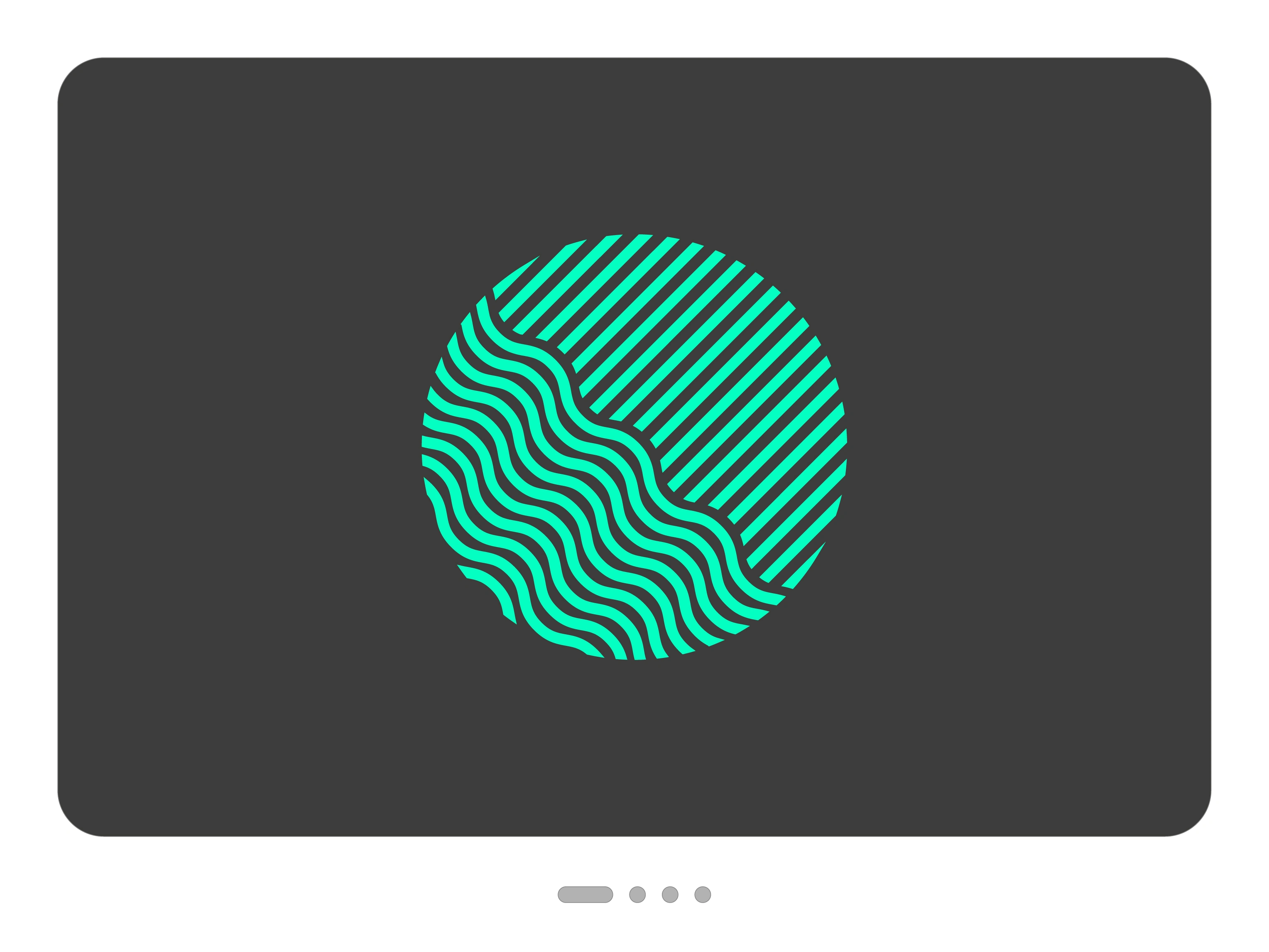
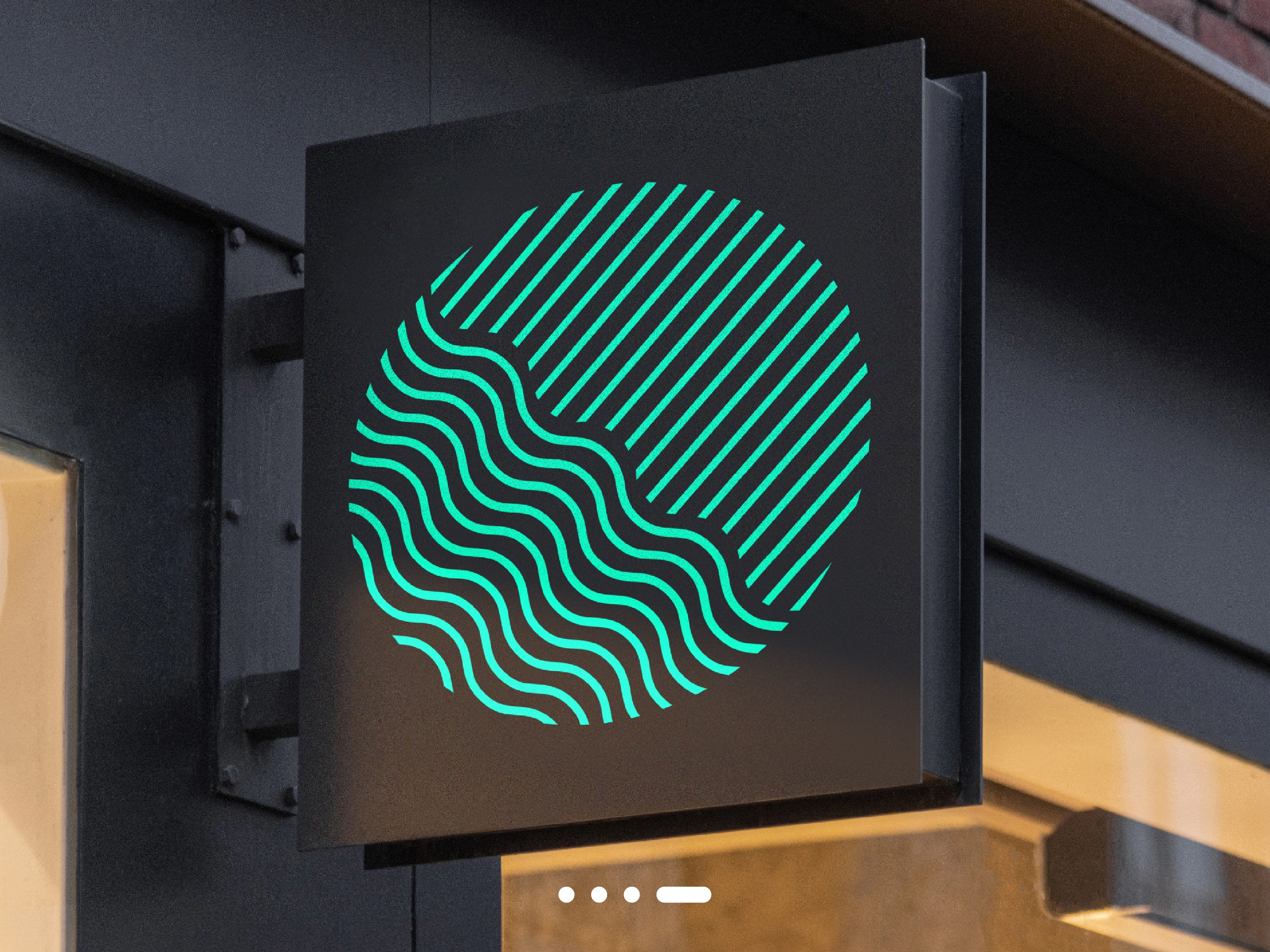
The symbol shows the transformation itself, inside a single circle.
Straight lines are the solid state. Upper right, parallel diagonals run in strict order, as rigid and regular as formwork.
Waves are the liquid state. Lower left, the same lines loosen and begin to flow. Line by line, the same structure takes on a different character.
The boundary is the moment of change. Where the two states meet, an S-shaped line runs through the circle. It also recalls the crease of a coffee bean, so the mark can be read as coffee without showing a literal bean.
The pressure is visible. The straight lines press down on the waves, and the waves push back against the circle until its lower edge begins to break open.
The whole mark is built from one line weight and one idea, with no decoration. That is what makes it recognizable from a distance, and strong enough to stand alone without the name.
The wordmark
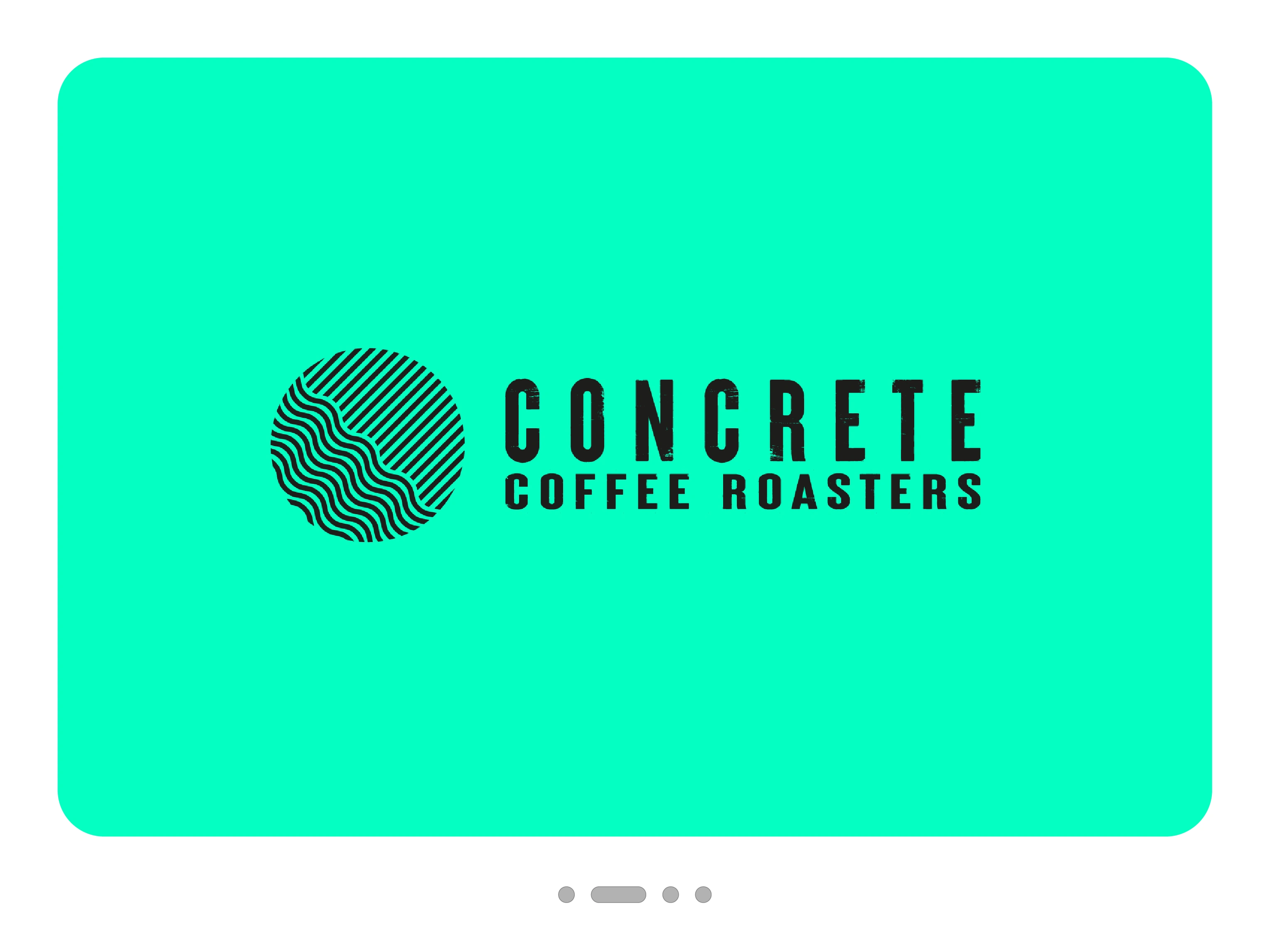
Heavy, condensed capitals with wide tracking give the name the weight of a poured slab. A worn, distressed texture runs through the letters, like the rough surface of concrete after the formwork comes off. COFFEE ROASTERS sits below at the same width, so the lockup forms one solid block next to the round symbol.
The colour
Urban brands tend to reach for grey, and Concrete could easily have stopped there. Grey stays, as the material the name promises. Neon green is the contrast: loud, slightly artificial and impossible to miss. Against concrete grey it behaves like spray paint on a wall, and it makes the brand instantly identifiable in a neighbourhood full of muted tones.
On the pack
On the pouch, the idea leaves the logo. Neon lines flow across the grey surface like the liquid part of the symbol at full scale, and a calm white label holds the information. Even the roast scale stays in the system, with small beans filling up in neon.
Beyond the cup
The identity was built to be worn as much as read. A round, graphic symbol with this much contrast works as well on clothing as it does on a bag of coffee, and people want to carry it. Concrete has since become a popular brand in Mannheim, which is the best test a neighbourhood roastery’s identity can pass.
0 likes · 1 view · Nov 4, 2026
Concrete Coffee Roasters. A mark that changes state. Concrete is a specialty coffee roastery in Neckarstadt West, one of Mannheim’s most urban districts. The...
