
One Logo a Day | Exploring Pure Geometry
For one month, I challenged myself to design a logo every day. These four marks are the abstract side of that challenge. They have no client, no story and no object to depict, only form, and the question of how much personality a few circles and straight lines can hold.
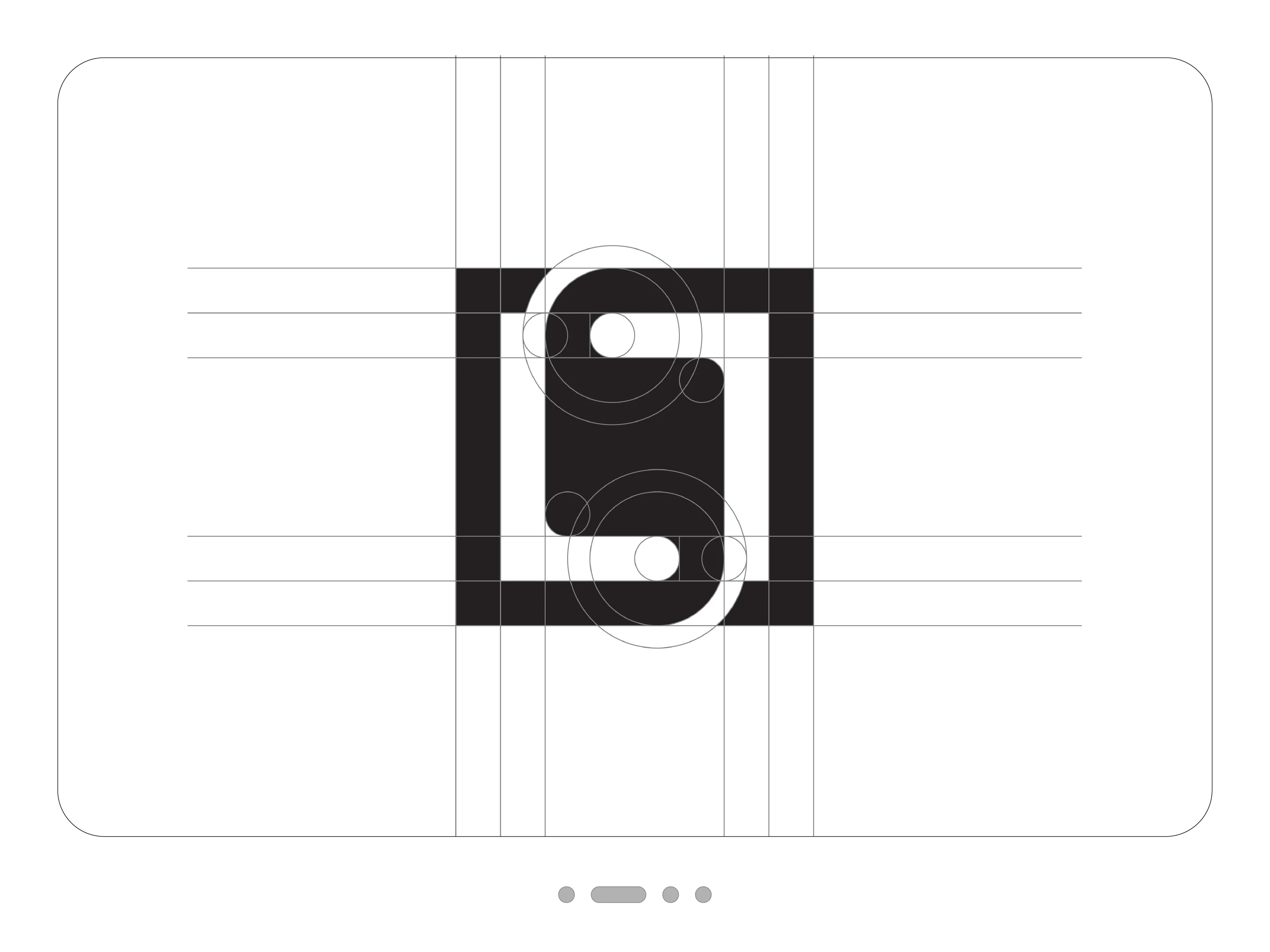
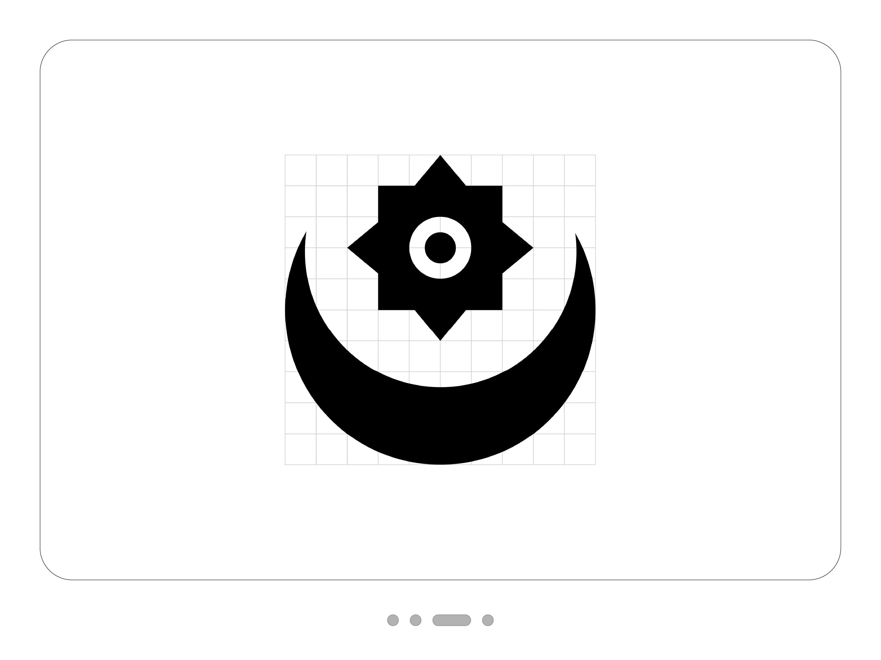
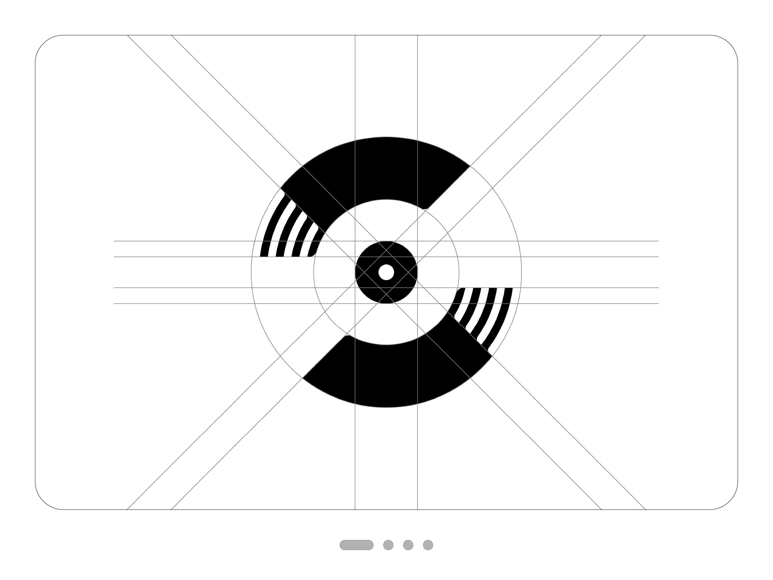
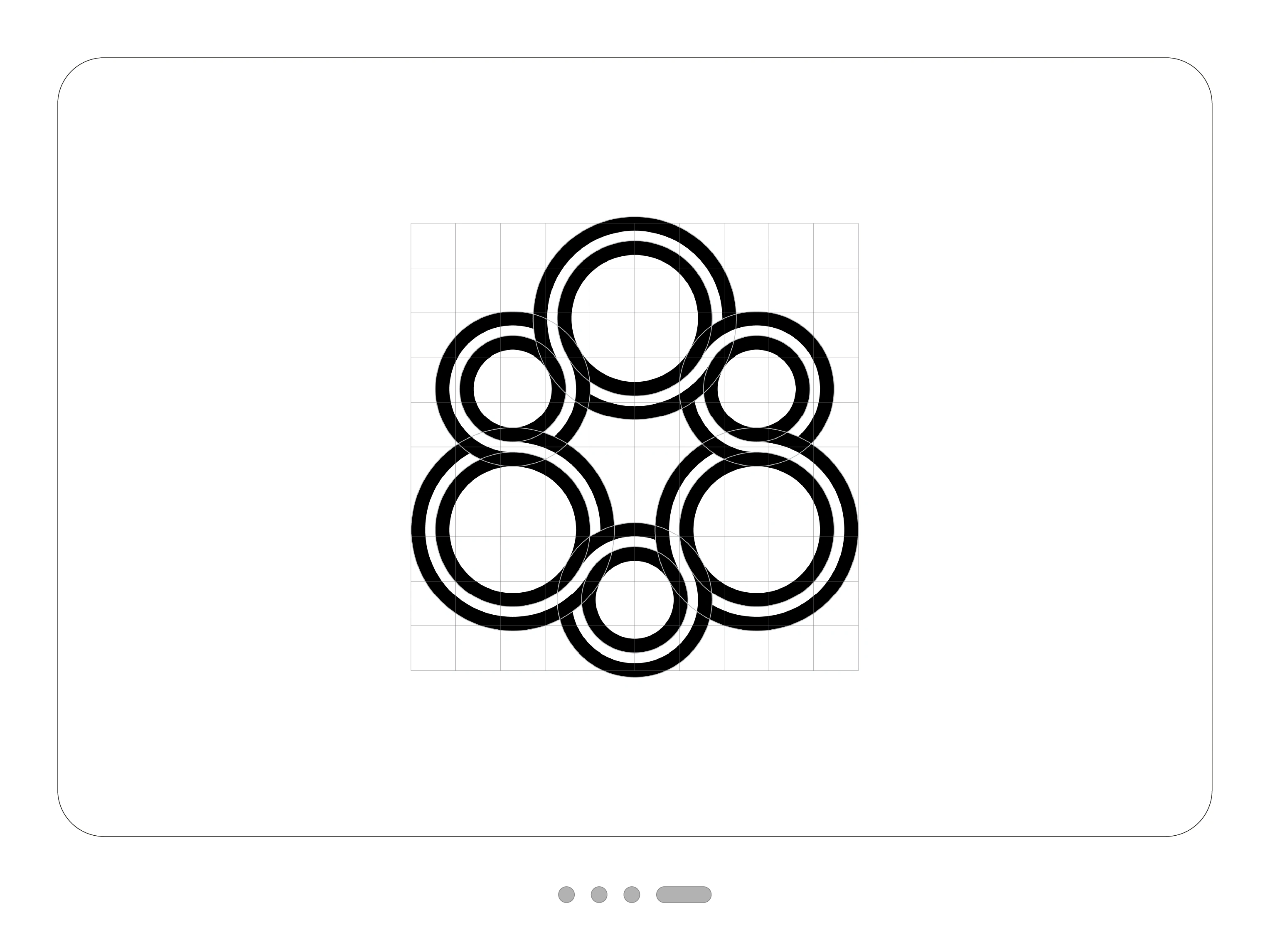
Without a concept to lean on, every proportion is exposed. So I kept the construction grids visible: each curve and cut follows a system, and you can check it.
The record
Two heavy arcs form a C around a central disc with a small hole, which immediately suggests a vinyl record. At each end, the solid arc breaks into fine parallel grooves. Sharp diagonal cuts and two-fold rotational symmetry make the mark look as if it’s spinning, even though it stands still.
The S in the frame
A square frame and a solid S share the same black. The top and bottom of the letter merge with the frame, so figure and container become one shape, and the white counterforms draw the letter as much as the black does. The curves come from a small family of circles, which is why such a heavy mark still feels calm.
The star and crescent
Two of the oldest shapes in visual culture, reduced to pure construction. A sharp eight-pointed star with a ring at its centre sits inside the curve of a wide crescent. Straight edges meet soft arcs, and the two forms never touch. The white gap between them holds the composition together.
The rings
Six circles of alternating size flow into each other as a double line. The two parallel strokes keep an even distance throughout, passing from one circle into the next. Seen as a whole, the mark sits somewhere between a flower, a knot and a molecule, and it doesn’t commit to any of them.
What the series taught me
Abstract marks leave nowhere to hide. If a radius is slightly off, you feel it, even when you can’t name it. This daily practice sharpened the eye I now bring to every client identity: the logo may carry a big idea, but its craft is decided in fractions of a millimetre.
0 likes · 3 views · Nov 4, 2026
One Logo a Day | Exploring Pure Geometry For one month, I challenged myself to design a logo every day. These four marks are the abstract side of that challe...
