SaleUp | Shaping Growth For sales

Michael Bellout

SaleUp | Shaping Growth
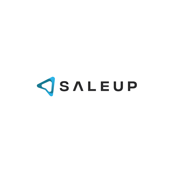
For sales training company SaleUp, I designed a logo that brings direction, progress, and personal development into one distinctive mark.
The symbol features interlocking, ribbon-like forms that create a dynamic, arrow-inspired silhouette. Its directional geometry conveys momentum and ambition, while rounded edges introduce an approachable, human quality suited to a business built around developing people.
Deep teal and vibrant cyan give the folded form depth and dimension, creating a recognizable symbol that can stand independently of the company name.
The wordmark balances this fluidity with bold uppercase lettering and generous spacing, conveying confidence and professionalism. A distinctive detail is the crossbar-free “A,” which echoes the symbol’s triangular geometry and visually connects the typography to the icon.
Together, these elements express SaleUp’s purpose: helping people build confidence, sharpen their skills, and move forward in sales.
Like this project
Posted Nov 1, 2026
SaleUp | Shaping Growth For sales training company SaleUp, I designed a logo that brings direction, progress, and personal development into one distinctive m...
Likes
0
Views
1