German Archaeologists Association: A Logo Redesign

Michael Bellout
The starting point
The German Archaeologists Association needed a logo that translated the physical character of archaeology into a clear, contemporary visual identity.
The idea
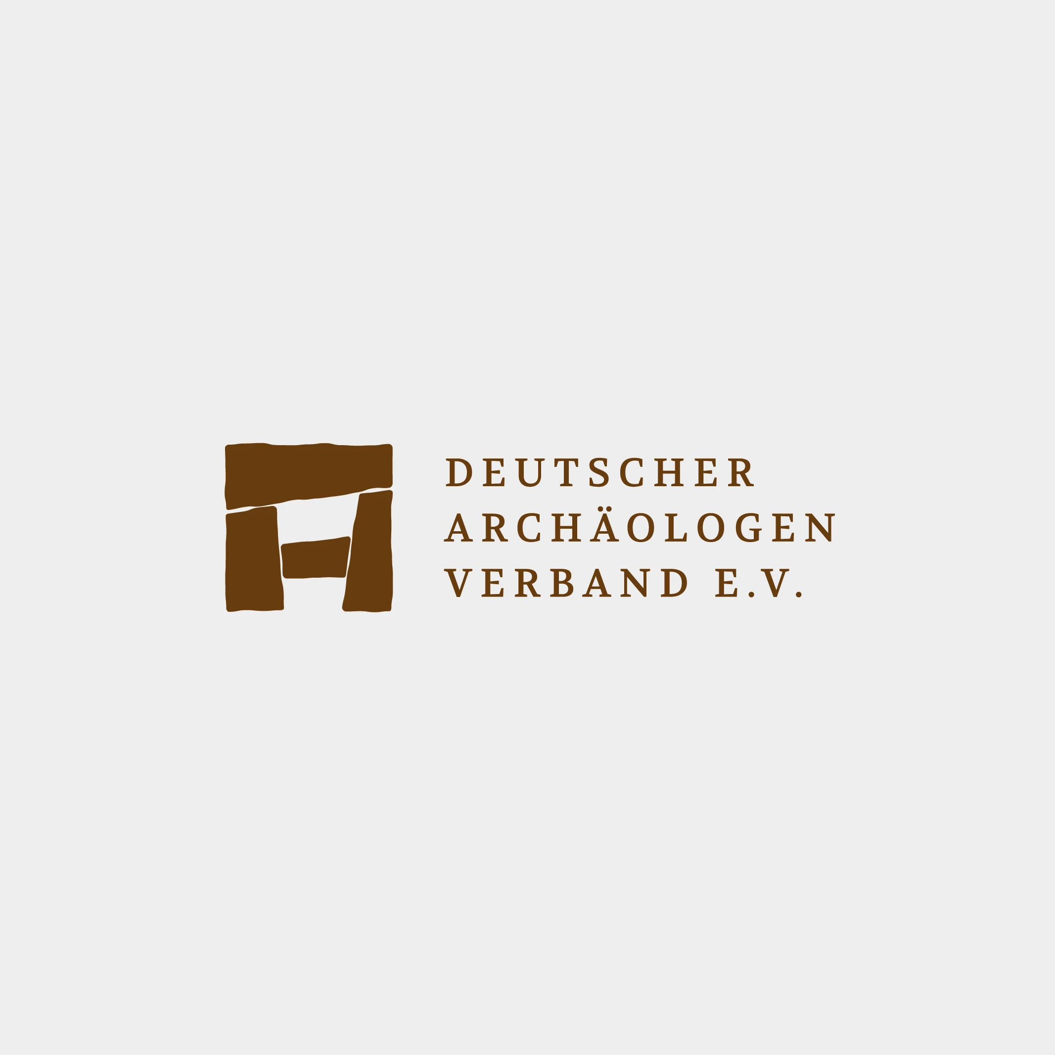
The symbol combines a Stonehenge-inspired structure with an abstract "A" for archaeology. Four stone-like shapes form a compact emblem, with subtly irregular edges that evoke weathered surfaces and ancient construction. Balanced proportions bring structure to these organic contours, connecting historical references with precise graphic design.
The system
Uppercase serif typography adds a scholarly, authoritative character, while generous letter spacing and a structured three-line arrangement give the name clarity and presence. The palette draws on earth, stone and excavation: warm ochre, deep brown and cool mineral grey. The emblem also keeps its distinctive character in simple black and white.
The result
An identity rooted in the material traces of the past, giving the association a confident, contemporary presence.
Like this project
Posted Nov 2, 2026
A logo redesign that translates the physical character of archaeology into a clear, contemporary identity for the German Archaeologists Association.