
180 Grad Wende e.V. has worked for equal opportunities for young people from marginalised communities since 2012. Based in Cologne-Kalk, it is active in over 72 locations and has trained more than 600 multipliers. As part of its in-house communications team, I redesigned the logo and built the assets that carry it.
Overview
The creative problem was recognition. The stencil logo was already known, so any change had to bring it closer to young people without giving up what the organisation had built since 2012. It also had to work everywhere the organisation shows up: on social media, in print and at events.
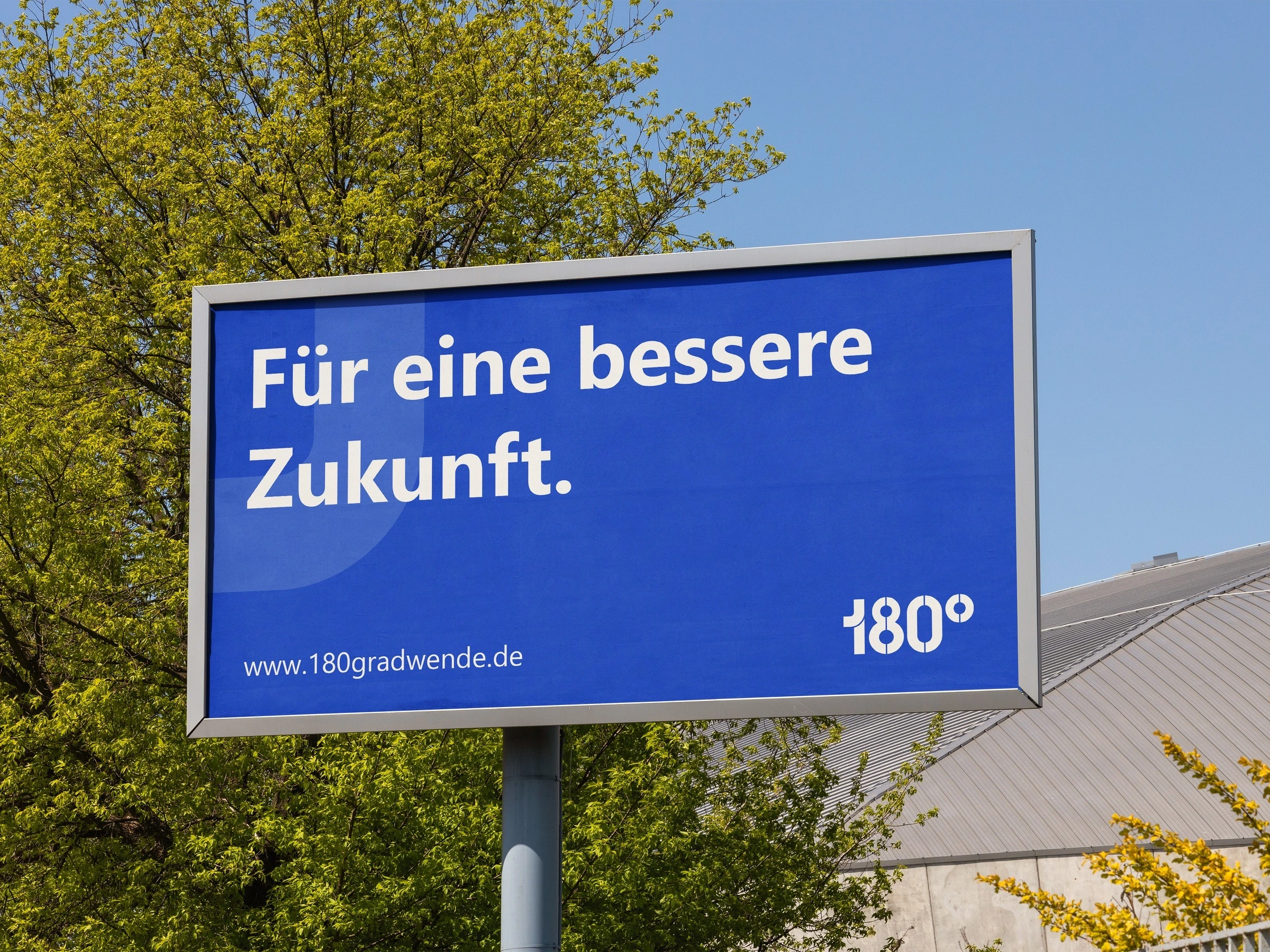
A mark for a street-level organisation has to hold up at street level. This concept mockup puts the compact version, without the vertical WENDE, on a billboard.
Approach
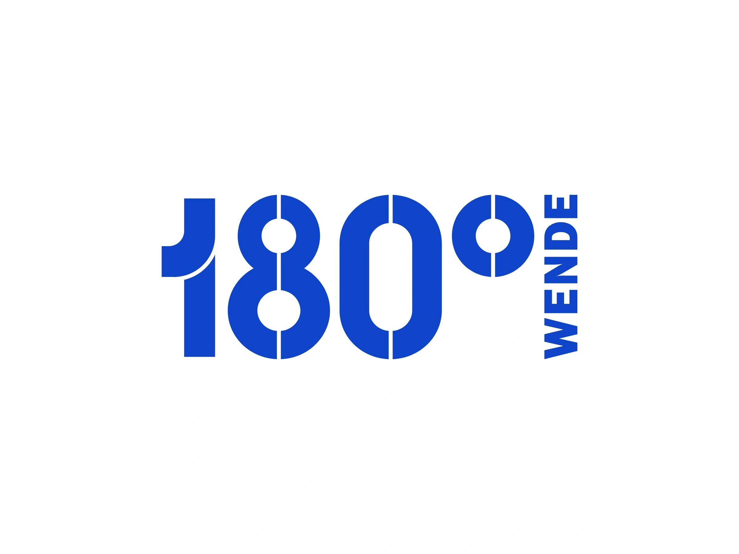
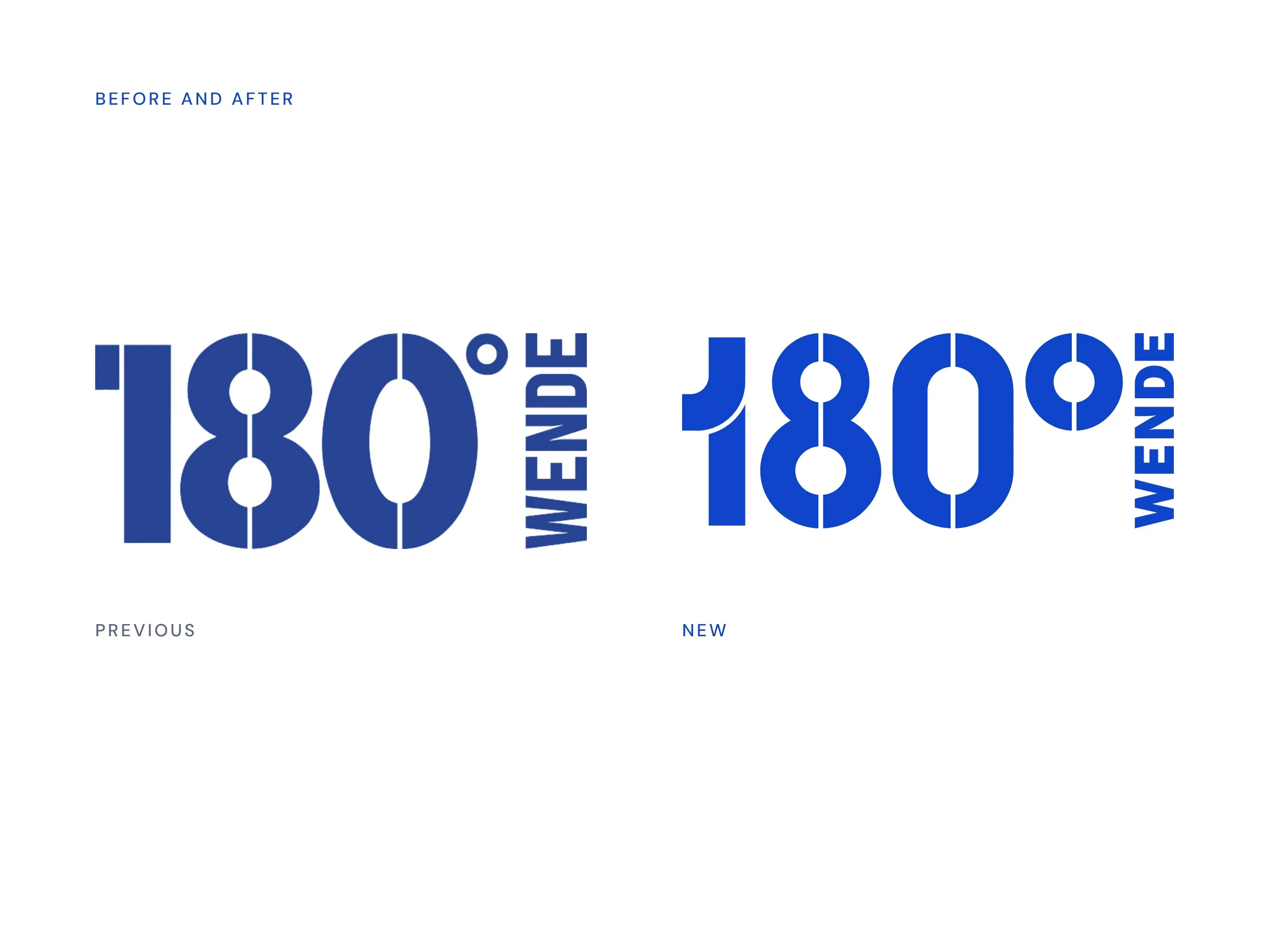
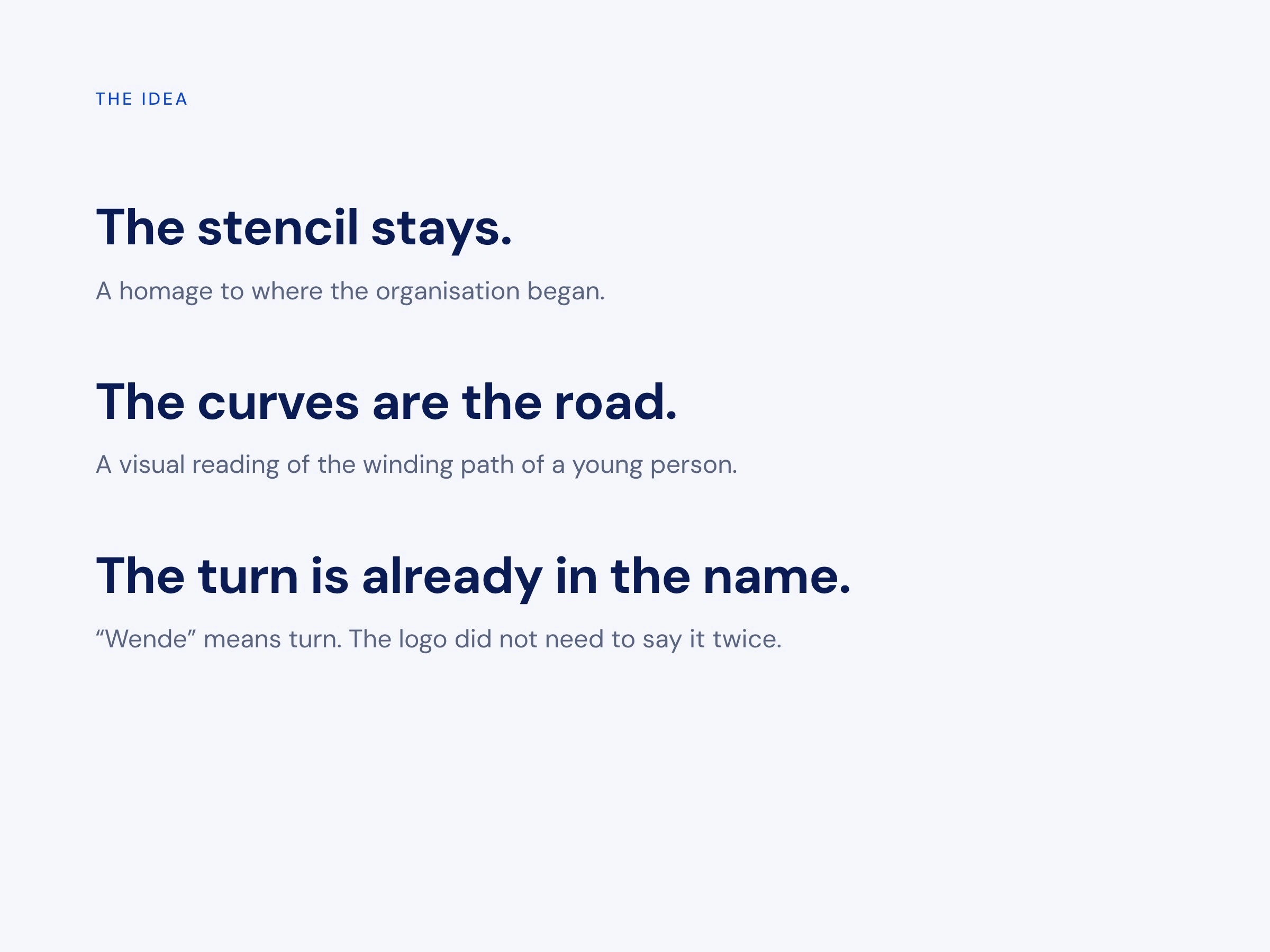
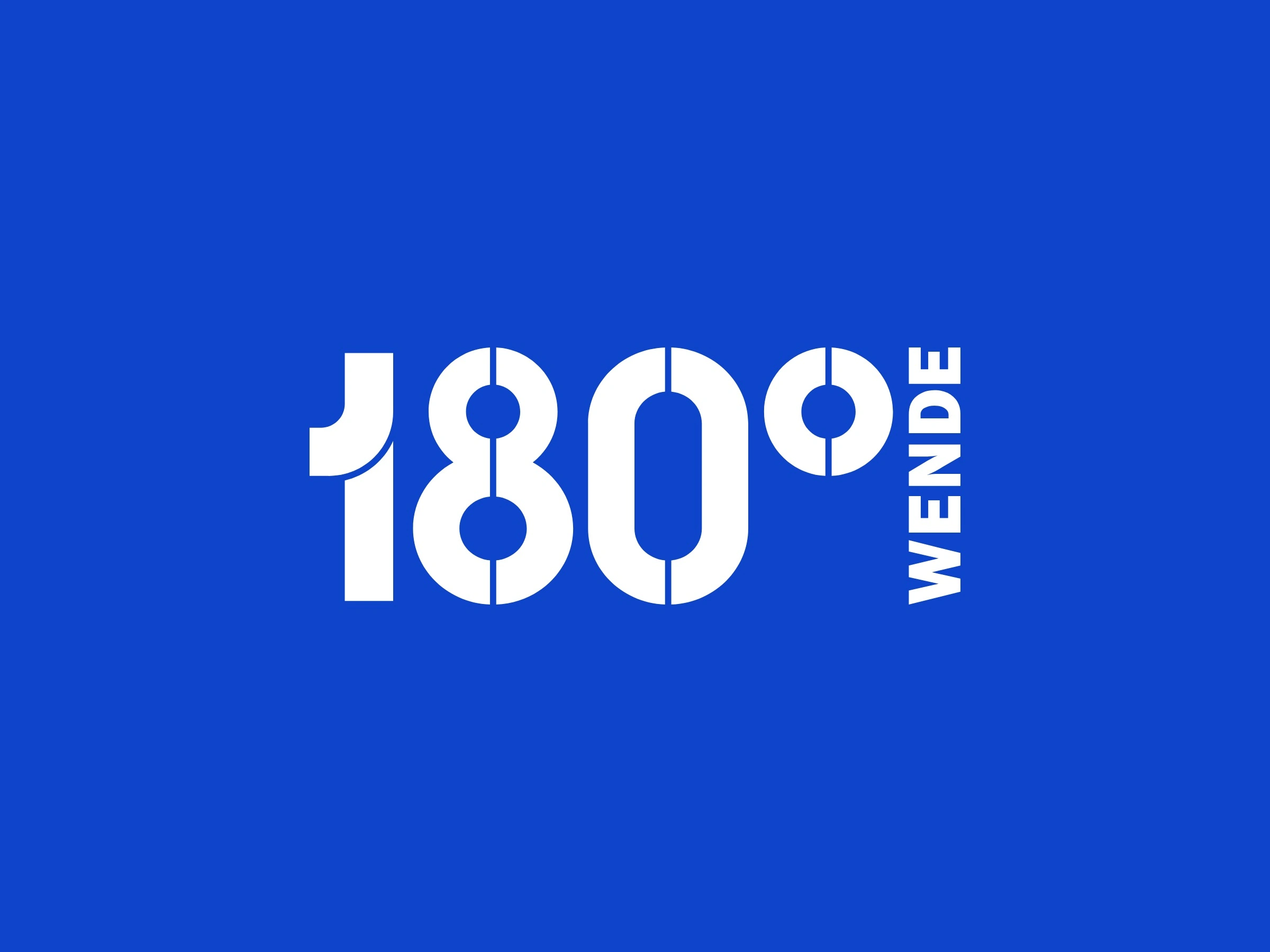
I kept the stencil as a homage to the organisation’s origins. Rounded shapes and curves replace the hard edges, as a visual reading of the winding path of a young person. The idea of a turn doesn’t need its own symbol, because “Wende” is already in the name.
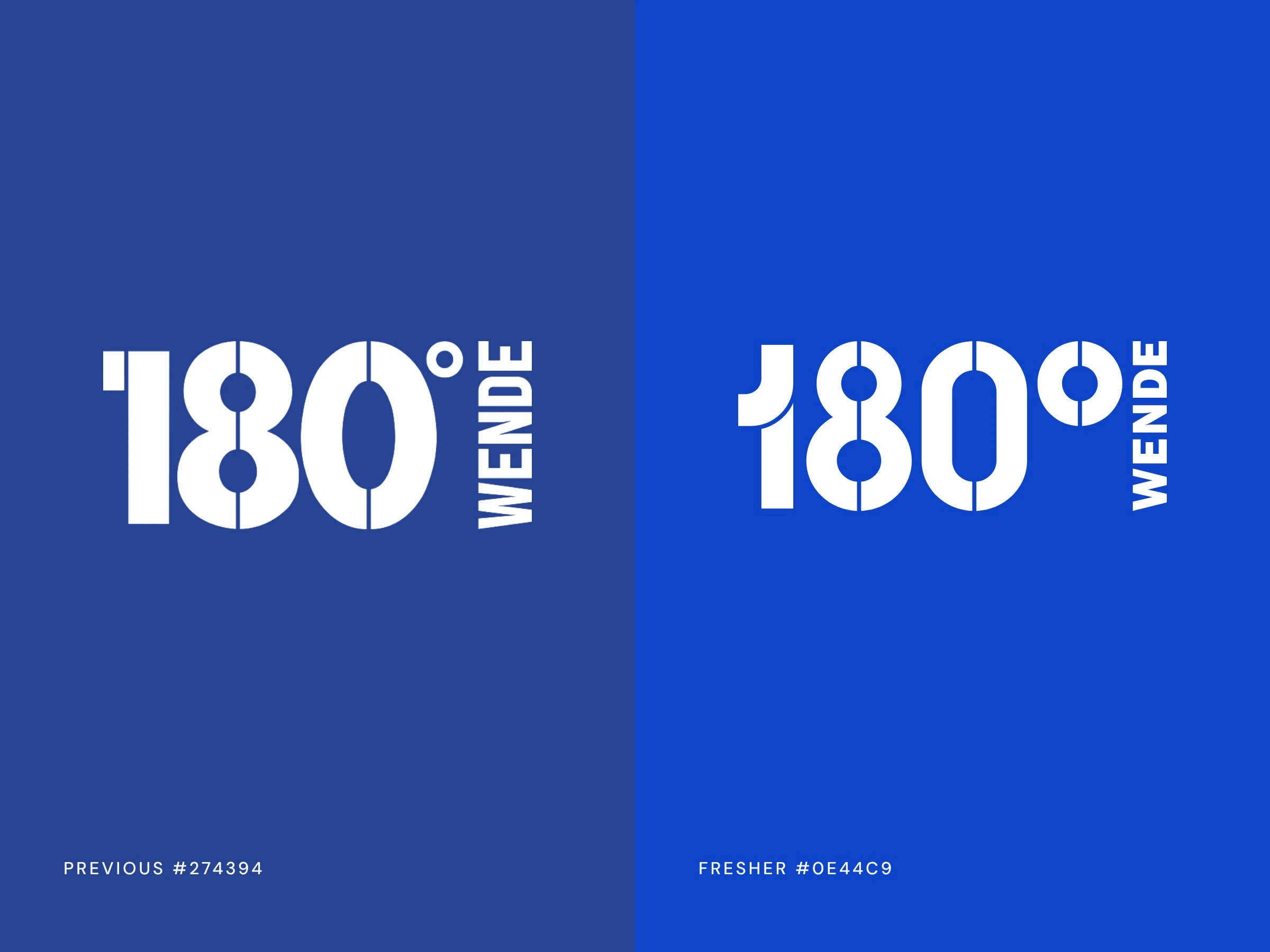
The colour follows the same thinking. The previous blue was darker and more muted. The new blue is brighter and fresher, and it gives the logo more energy without changing its character.
I got there by presenting four routes in July 2026. Three explored bolder ideas from what the organisation stands for: its impact, working together, and the winding paths of real lives. The fourth was a careful evolution of the existing mark.
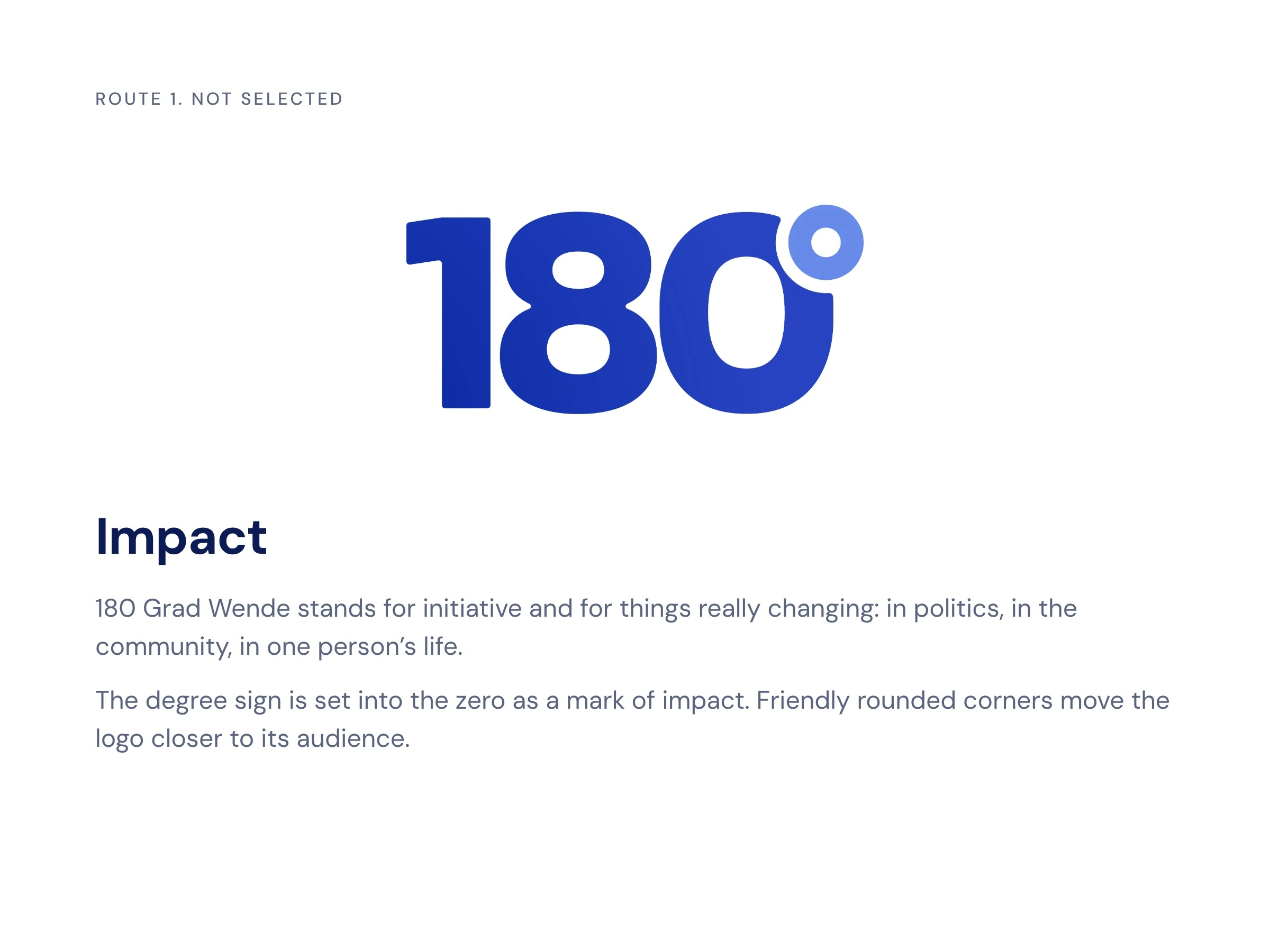
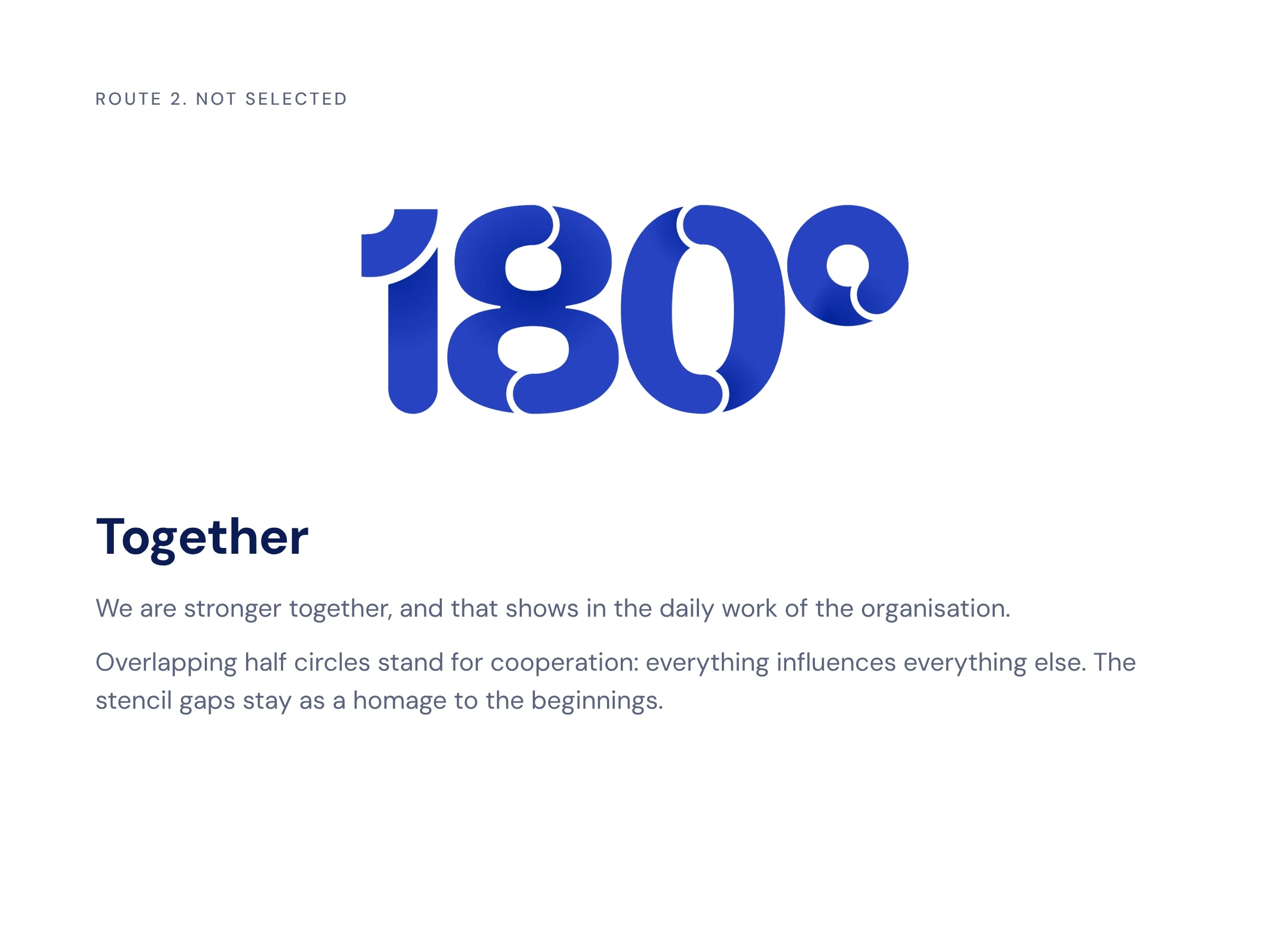
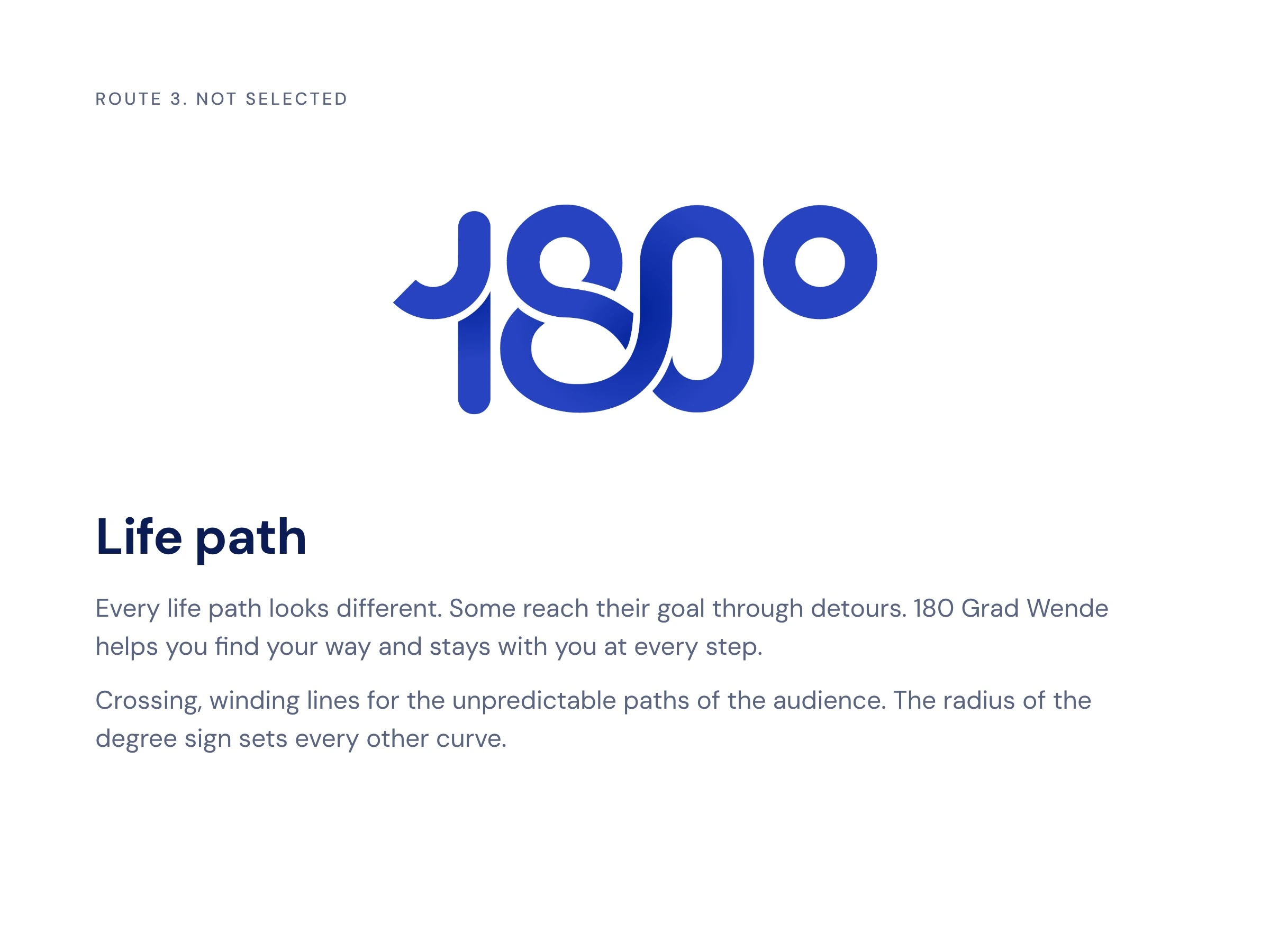
Each of these routes carried a clear idea, but each would also have asked people to learn a new logo.
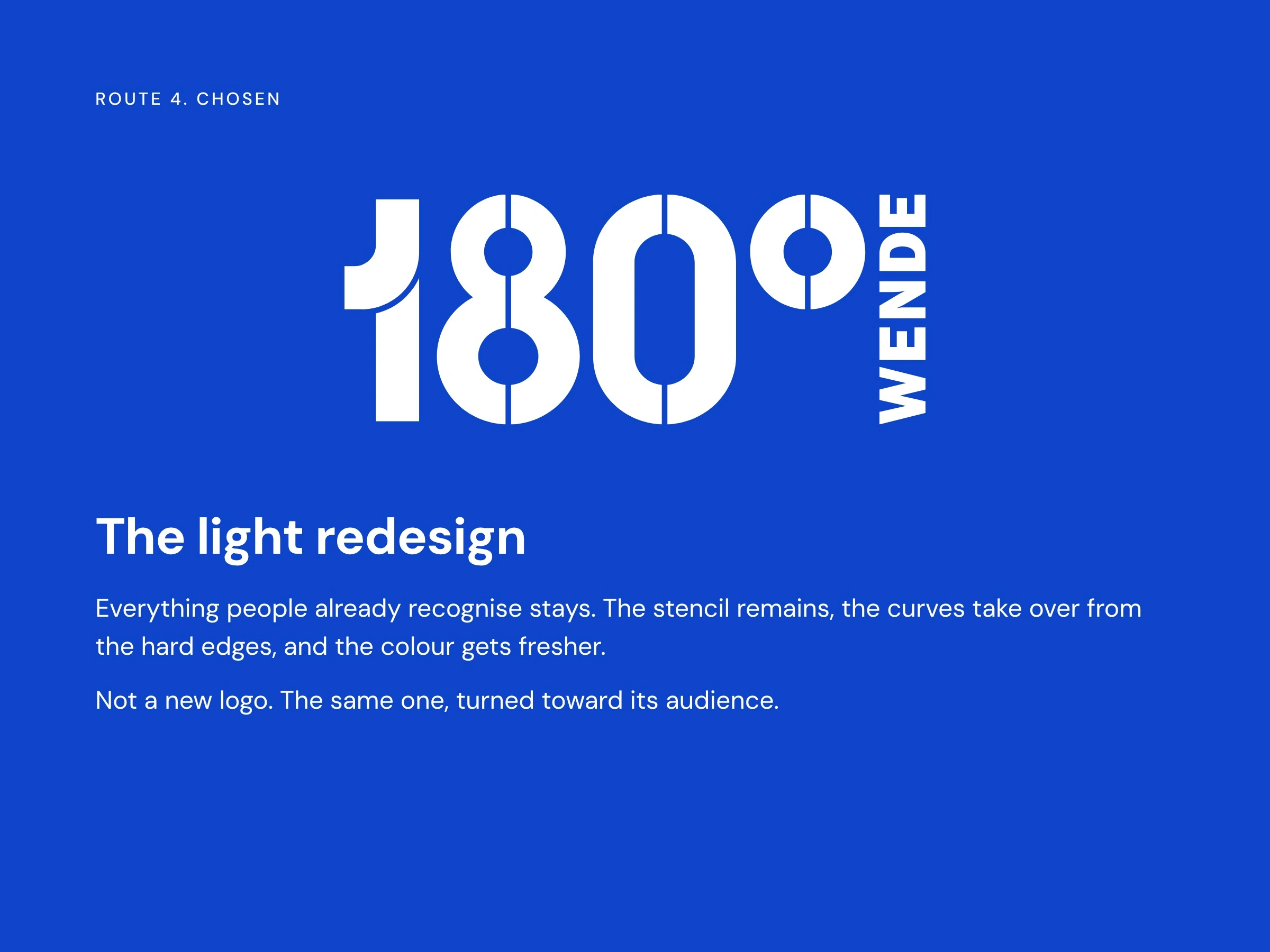
Selected Work
The organisation chose the light redesign. That choice moved the work to a different level: when a logo stays recognisable, everything depends on proportions and curves.
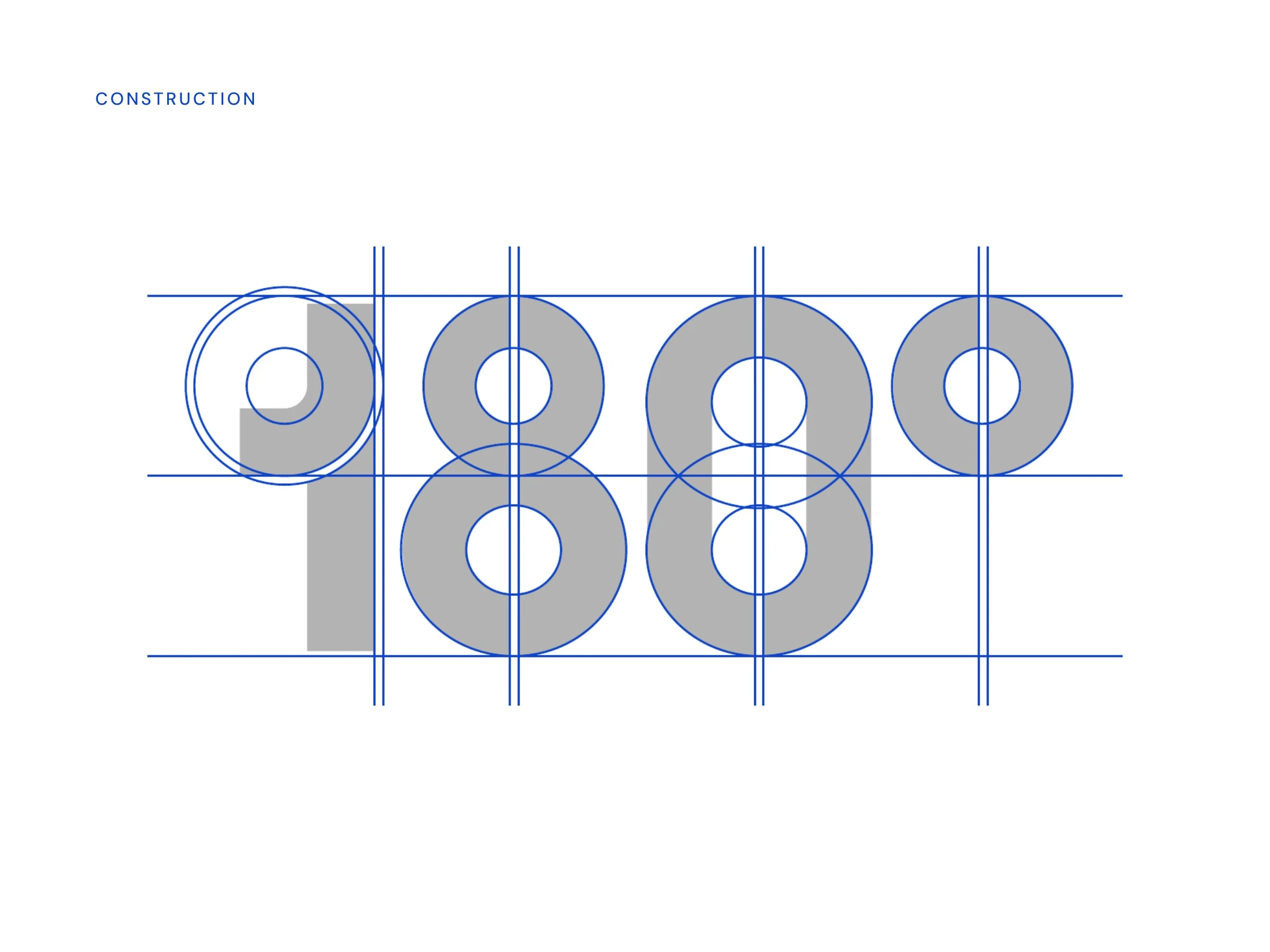
Every figure is built from the same circles and guide lines. That is what makes the numbers read as one word, and it keeps the mark stable at any size.
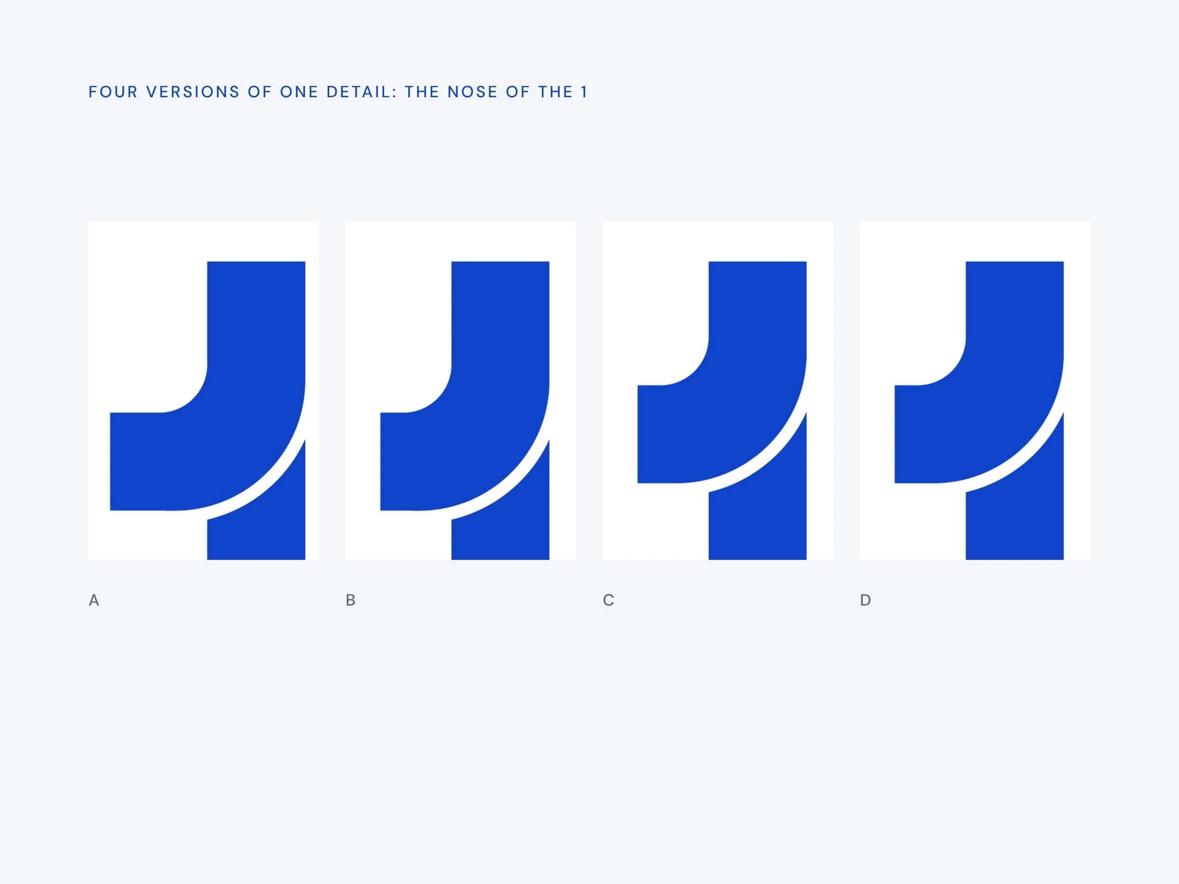
A light redesign leaves nowhere to hide. Most of the work happened at the level of a few millimetres, like the flag on the 1, known internally as the nose. I compared height and curve side by side before anything went out.
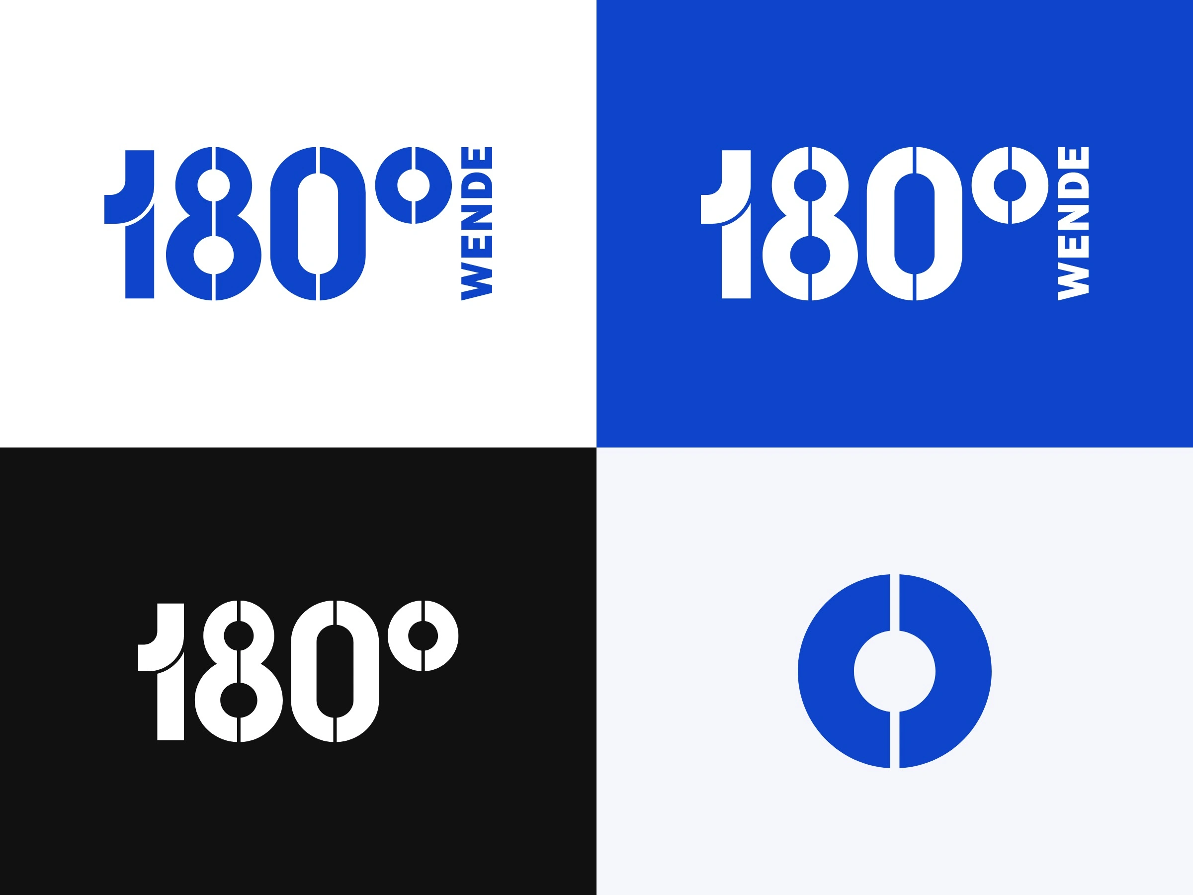
The system stays small on purpose: a primary logo, a compact version without the vertical WENDE, and the degree sign as a standalone icon, in blue, white and black.
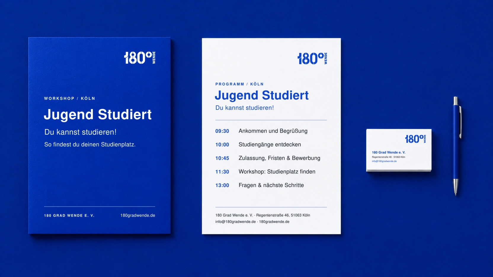
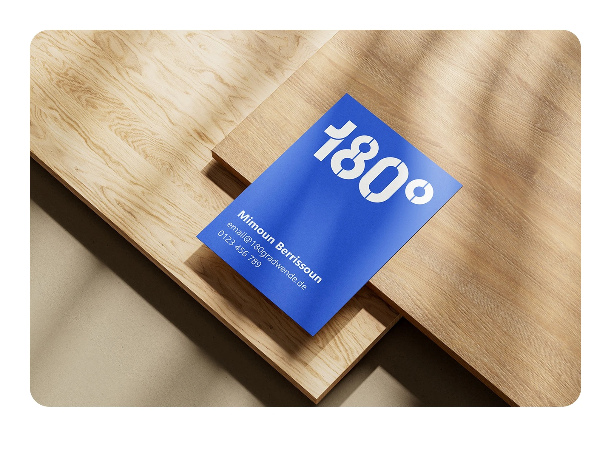
This stationery mockup shows how the system behaves in everyday use, on a folder, a programme sheet and a business card: the logo sits quietly in the corner and lets the content lead.
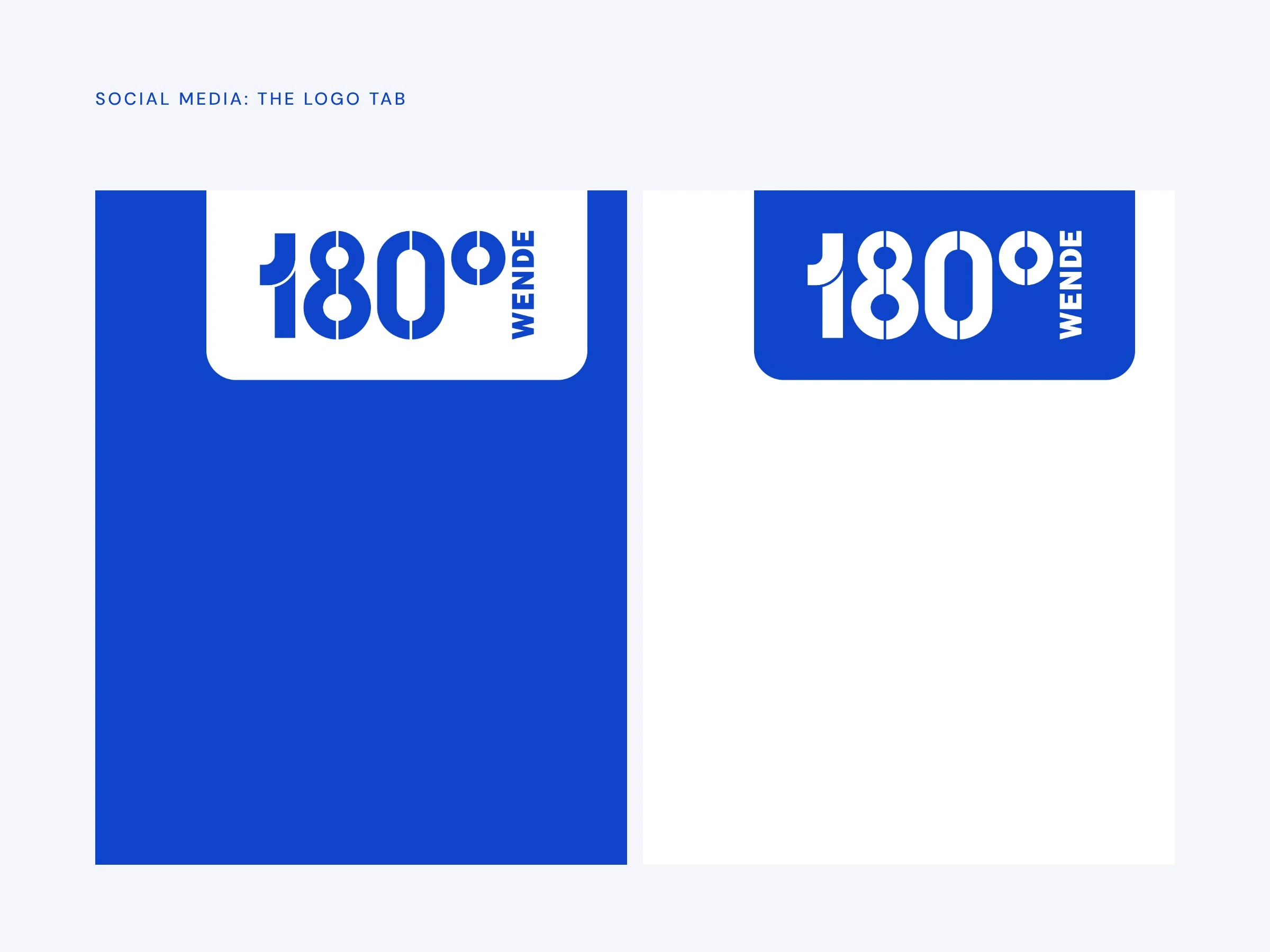
For social media I built a logo tab in white and blue that sits at the top edge of a post, so the mark stays consistent over any image.
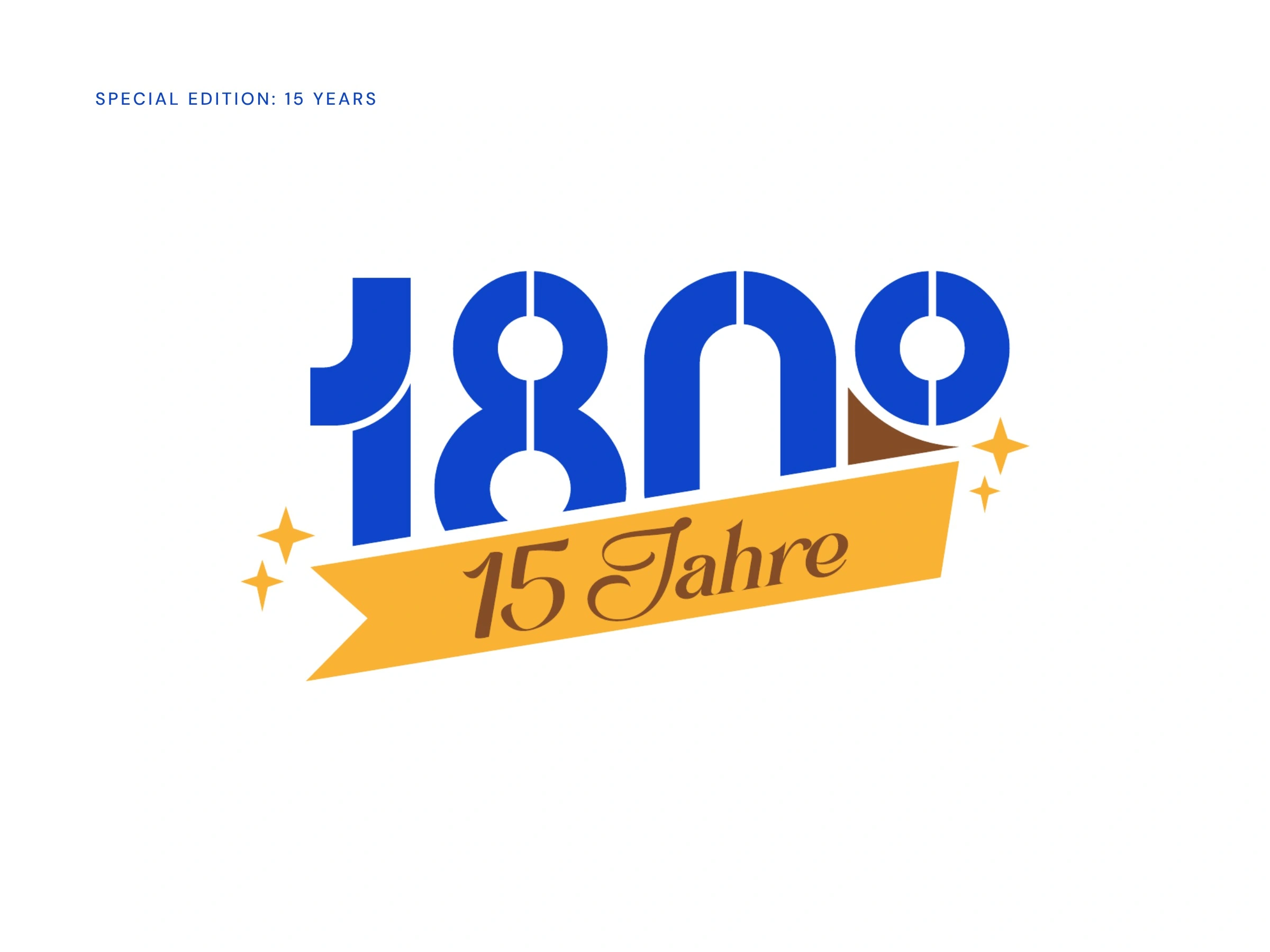
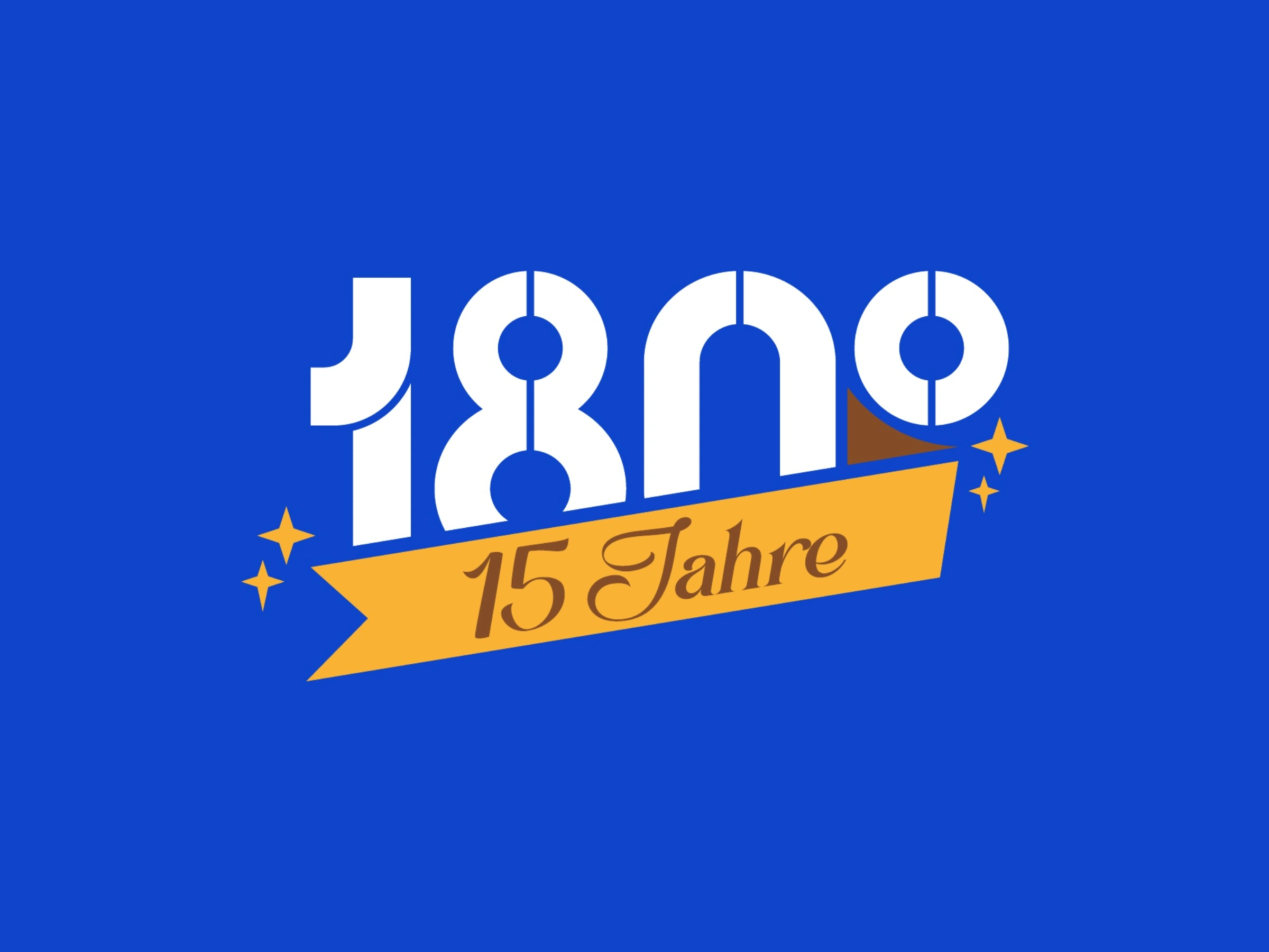
A special edition for the 15th anniversary keeps the same mark and adds a banner and small stars. The warm yellow gives the occasion its own moment, while the logo stays clearly itself.
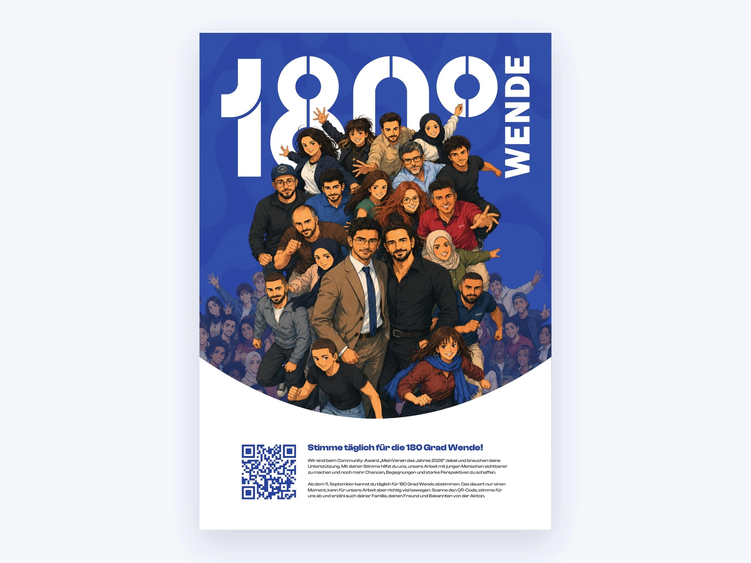
In print, the new mark carries a community award poster, with an AI-generated anime avatars of all team members.
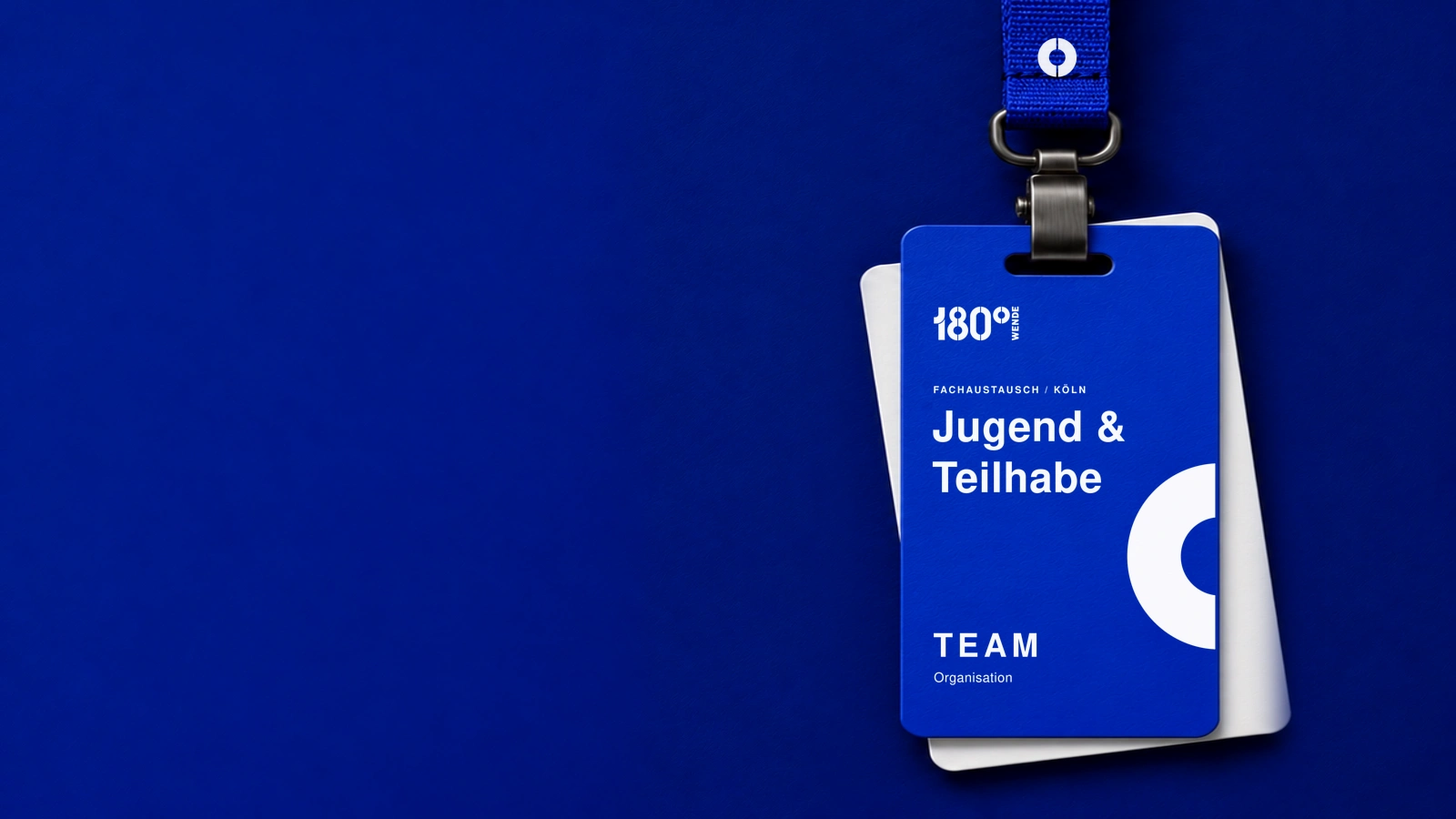
At events, the system carries through to badges and lanyards. The degree sign, cropped large, works as a graphic element of its own.
Outcome
The new logo was handed over as a complete package and is in use on the organisation’s print and social assets. The billboard, stationery and event badge images are concept mockups. Delivered:
Primary, compact and icon versions in blue, white and black, in AI, SVG, PNG and WEBP
Logo tabs for social media
15-year anniversary edition
Community award poster and location lockup
See the logo in daily use on Instagram: @180gradwende.
My Role
Brand Designer and Logo Designer, in-house. I developed all four routes, the final logo and construction, and the applications shown here.
0 likes · 6 views · Nov 5, 2026
An evolution of a known stencil logo for a youth nonprofit, from four routes to a final system, social logo tabs and print applications.
Timeline
Jul 1, 2026 - Jul 31, 2026


